
![]() Motherwell Football Club was established in 1886 at the merging of two Motherwell-based teams: Glencairn FC (established in 1877 and named after the soldier and politician John Glencairn Carter Hamilton, 1st Baron Hamilton of Dalzell) and Alpha FC (established as the Alpha Steam Crane and Engine Works team in 1881).
Motherwell Football Club was established in 1886 at the merging of two Motherwell-based teams: Glencairn FC (established in 1877 and named after the soldier and politician John Glencairn Carter Hamilton, 1st Baron Hamilton of Dalzell) and Alpha FC (established as the Alpha Steam Crane and Engine Works team in 1881).
In 1893, Motherwell became founding members of the Scottish Second Division. By the middle of the 1920s, ‘the Steelmen’ (a reference to the town’s association with heavy industry), were proving themselves in the top tier. Between 1926 and 1934, Motherwell finished every season among the top three in Scottish football. Most notably, they topped the table in the 1931/32 season, becoming the first non-Old Firm club since Third Lanark in 1903/04 and the last until Hibernian in the 1947/48 season to be crowned Scottish champions. Other significant honours include Motherwell’s Scottish League Cup victory of 1950/51 as well as their two Scottish Cup victories in 1951/52 and 1990/91.
Prior to using their current badge (which has been in use since 1982), between 1969 and 1982, Motherwell’s kit featured two versions of the club’s initials, ‘MFC’. The current badge features three fir trees (which represent Fir Park, Motherwell’s home ground since 1895) above a football and the silhouette of the famous Ravenscraig Steelworks (which closed in 1992).
In keeping with Motherwell’s heritage, for my redesign I employed a similar colour scheme and a banner and shield that resemble those found in the current badge. I also updated the fir trees with a wee bit more definition and replaced the steelmill with a cogwheel. The cogwheel represents both the steel industry and the motto found on the Motherwell coat of arms: INDUSTRIA (Latin for ‘diligence’, ‘purpose’ or ‘industry’). The Roman numeral X at the top of the shield is a memorial for Phil O’Donnell, who died of cardiac arrest at age 35 on 29 December 2007, while playing for Motherwell against Dundee United at Fir Park.
![]()
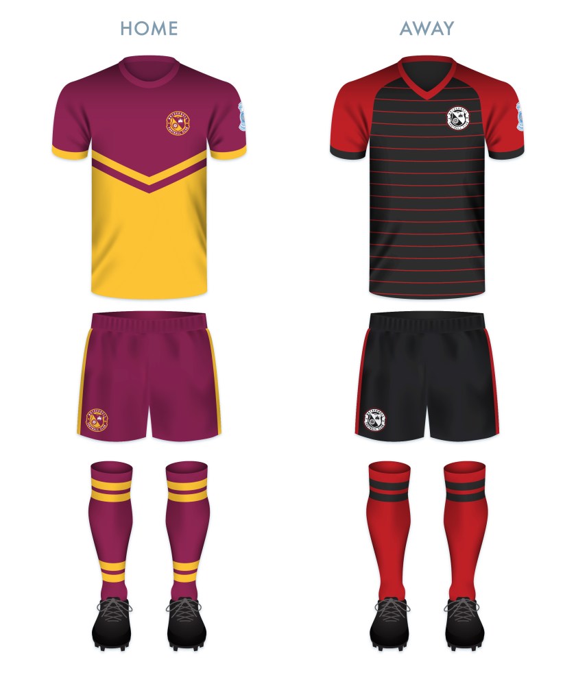
For the shirts, I decided to go with a pronounced chevron design on the home strip and some thin red hoops on the away strip. The away kit also features a white version of the badge.
![]()
As ever, I am indebted to Dave at Historical Football Kits for some of the historical information used above.

9.5/10 for Motherwell, love the blue and white adaptation and the ‘X’.
Hi
I have just came accross your SPL rebranded badges, great to look through them and I will give each one a rating out of 10.
Brilliant work and have you ever thought about customizing other leagues badges e.g BPL, LaLiga etc.
Also an on shirt view would be really good.