
![]() The original East Kilbride Football Club was established in 1871, making it one of the earliest association football clubs in Scotland, after Queen’s Park (1867), Kilmarnock (1869) and Stranraer (1870). East Kilbride’s early years, like many football clubs at that time, were precarious, with the club folding and reforming on several occasions. Ultimately, the club folded for good after about a decade and the town of East Kilbride went unrepresented at the senior level for more than a century.
The original East Kilbride Football Club was established in 1871, making it one of the earliest association football clubs in Scotland, after Queen’s Park (1867), Kilmarnock (1869) and Stranraer (1870). East Kilbride’s early years, like many football clubs at that time, were precarious, with the club folding and reforming on several occasions. Ultimately, the club folded for good after about a decade and the town of East Kilbride went unrepresented at the senior level for more than a century.
In 2010, the local junior sides Stewartfield FC and Jackton Boys Club merged to form a new club, taking the defunct East Kilbride FC name. For the 2012/13 season, East Kilbride competed in the South of Scotland Football League before becoming members of the Lowland Football League in its inaugural season the following year. Since joining the league, East Kilbride have proven very formidable, coming second in 2014/15, winning the league in 2016/17, coming second again in 2017/18 before securing their second league championship in 2018/19.
Having won the Lowland League on two occasions, East Kilbride were eligible to compete in a play-off against the Highland Football League champions for a chance at gaining a place in the Scottish Professional Football League. In 2017, East Kilbride beat Buckie Thistle with an aggregate score of 4-3 in order to advance to the League Two play-offs against last-place Cowdenbeath. The first leg, which took place at East Kilbride’s home ground of K-Park, ended with no score. The second leg ended 1-1 after extra time, forcing a penalty shootout to decide which would compete in the SPFL the following season. The shootout proved heart-breaking for East Kilbride, who lost 5-3.
The club’s second chance at promotion to the SPFL came following their latest league championship (2018/19), though the Kilby lost to the Highland League champions, Cove Rangers with an aggregate score of 5-1 (Cove went on to gain promotion to the SPFL with a 7-0 aggregate victory over Berwick Rangers).
The club’s current badge is attempting to do a lot. It draws its colours from the 1871 club’s colours of gold and dark blue and employs a number of local symbols. The use of the oystercatcher, the cross and the colour red represent St Brigid of Kildare, after whom ‘Kilbride’ is named. The current badge also features the date of the original club’s founding as well as the Latin motto, a priori, meaning ‘from the earlier’, which is yet another reference to the original club.
While I appreciate the symbolism of the current badge, I feel it tries to do too much in its current form. In order to comply with an ancient heraldic Scottish law, my redesigned badge takes the form of a roundel. The central image is an oystercatcher atop a football. The outer circle includes the club’s name, the Latin motto and the years of the founding of the original and current East Kilbride FC.
![]()
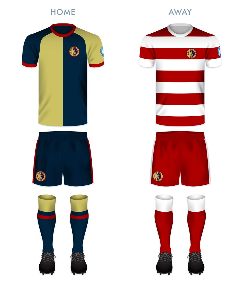
For the home kit redesign, I have gone with the traditional East Kilbride harlequin-style shirt of gold and dark blue and for the away kit I have made use of the current away colour scheme of red and white, though instead of opting for harlequin-style featured in the current away kit, I have gone with bold, thick hoops.
![]()

So much better. I’m from EK and the badge just looks wrong. I like the shield shape, but the text looks bad and everything is in the wrong place. Frankly it’s a clusterf**k and a total mess. I love your design, but you should change the shade of gold to match the original crest. That would be my only advice. (Even though the kit EK play in has the shade of gold shown in your redesigned crest, I just think the original crest’s shade of gold looks classier).
Is there any chance you could post this redesign to the EKFC club website? the url is https://eastkilbridefootballclub.co.uk
Just click on their “contact” link on the menu and send them it in an email, with your explanation/summary of the change included. I actually think there’s a good chance they’d adopt this redesign. You have a real talent for this. Some of your other stuff looks amazing!