ellliottt

design & illustration

Menu

Skip to content
  • HOME
  • ABOUT
  • GRAPHIC
    • ALL GRAPHIC DESIGN
    • AUTOMOTIVUS
    • REBRAND: SPFL
      • Premiership
        • Aberdeen
        • Celtic
        • Dundee United
        • Heart of Midlothian
        • Hibernian
        • Kilmarnock
        • Livingston
        • Motherwell
        • Rangers
        • Ross County
        • St Johnstone
        • St Mirren
      • Championship
        • Arbroath
        • Ayr United
        • Cove Rangers
        • Dundee
        • Greenock Morton
        • Hamilton Academical
        • Inverness CT
        • Partick Thistle
        • Queen’s Park
        • Raith Rovers
      • League One
        • Airdrieonians
        • Alloa Athletic
        • Clyde
        • Dunfermline Athletic
        • FC Edinburgh
        • Falkirk
        • Kelty Hearts
        • Montrose
        • Peterhead
        • Queen of the South
      • League Two
        • Albion Rovers
        • Annan Athletic
        • Bonnyrigg Rose
        • Dumbarton
        • East Fife
        • Elgin City
        • Forfar Athletic
        • Stenhousemuir
        • Stirling Albion
        • Stranraer
    • REBRAND: SHFL
      • Brechin City
      • Brora Rangers
      • Buckie Thistle
      • Clachnacuddin
      • Deveronvale
      • Formartine United
      • Forres Mechanics
      • Fraserburgh
      • Huntly
      • Inverurie Loco Works
      • Keith
      • Lossiemouth
      • Nairn County
      • Rothes
      • Strathspey Thistle
      • Turriff United
      • Wick Academy
    • REBRAND: SLFL
      • Berwick Rangers
      • Bo’ness United
      • Broomhill
      • Caledonian Braves
      • Civil Service Strollers
      • Cowdenbeath
      • Cumbernauld Colts
      • Dalbeattie Star
      • East Kilbride
      • East Stirlingshire
      • Edinburgh University
      • Gala Fairydean Rovers
      • Gretna 2008
      • Spartans
      • Tranent Juniors
      • University of Stirling
  • 2D
  • 3D
    • ALL 3D
    • INSTALLATION
  • PHOTO
  • SHOP

Latin

ReBrand: Gala Fairydean Rovers FC

graphic

GFRFC badge new-01Gala Fairydean Rovers Football Club was established in the Borders town of Galashiels in 1894. Thirteen years later, in 1907, the club split into Gala Fairydean and Gala Rovers, with the Rovers acting as the reserve side for Fairydean. With the outbreak of the First World War, both sides ceased. In 1919, Fairydean alone resumed competition, becoming a founding member of the East of Scotland Football League four years later. It would not be until 1947 that the Gala Rovers name resurfaced, this time, as an amateur side.

Fairydean experienced relative success in the EoSFL, with their most fruitful period taking place in the 1960s. During this time, the club claimed six league championships (1960/61, 1961/62, 1963/64, 1964/65, 1965/66 and 1968/69). Fairydean went on to win the EoSFL championship twice more, in 1988/89 and 1990/91.

Over the coming years, Fairydean applied unsuccessfully to the Scottish Football League on four ocassions. Eventually, in 2013, Fairydean and Rovers merged, forming the modern incarnation of Gala Fairydean Rovers. That same year, the new club was granted membership in the new Lowland League.

At some point during their time as Gala Fairydean, the club began to use a badge which featured the coat of arms of the Burgh of Galashiels. This coat of arms includes two foxes seated at the base of a plum tree, looking upward and a version of this image can be found in the current badge. The current badge also includes a hovering football, the Latin motto, UNITAS EST FORTITUDE (‘unity is strength’) and two red stripes over a black field, representing, in my best estimate, the traditional home kit of Gala Fairydean.

For my redesign, I decided that I wanted to retain the elements from the coat of arms and the Latin motto (which I find especially apt given Gala Fairydean Rovers’ history), but I was not convinced with the way that they are presented in the current badge. I opted to tie the foxes, the plum tree and the football together, with the former resting atop a redesigned, Victorian-styled football in gold. As I don’t feel as if the current badge’s foxes much resemble foxes, I went with a more ‘maximalist’ colour scheme. I also chose to include both the current club’s date of formation as well as the original Gala Fairydean Rovers’ date of formation. The Latin motto has been moved to the outer circle in gold.

GFRFC badge-01

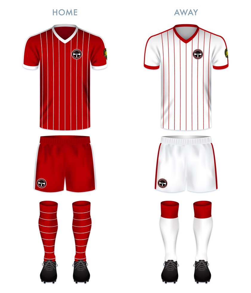
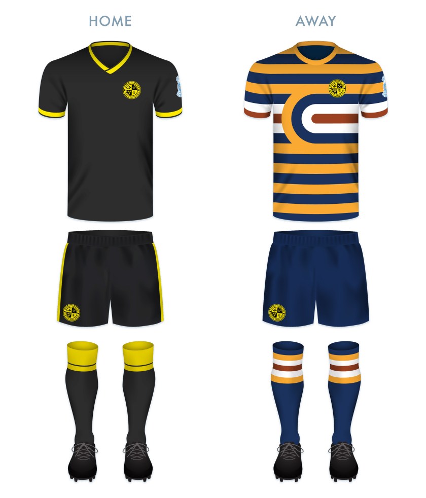
For the kit redesigns, I opted to go with some version of the current kits, bringing back the home kit’s red and black vertical stripes (which are absent from the club’s kit at present).

GFRFC kit-01

GFRFC badge new-01

Advertisement
13 June 201924 February 2020 E Tagged badge, Borders, crest, Europe, Fairydean, football, fox, foxes, Gala, Gala Fairydean, Gala Fairydean FC, Gala Fairydean Football Club, Gala Fairydean Rovers, Gala Fairydean Rovers FC, Gala Fairydean Rovers Football Club, Gala Rovers, Gala Rovers FC, Gala Rovers Football Club, Galashiels, GFR, Latin, LFL, logo, Lowland Football League, Lowlands, rebrand, redesign, Rovers, Scotland, Scottish Borders, Scottish Lowland Football League, SLFL, sport, texture, UK, United Kingdom Leave a comment

ReBrand: East Kilbride FC

graphic

EKFC badge new-01The original East Kilbride Football Club was established in 1871, making it one of the earliest association football clubs in Scotland, after Queen’s Park (1867), Kilmarnock (1869) and Stranraer (1870). East Kilbride’s early years, like many football clubs at that time, were precarious, with the club folding and reforming on several occasions. Ultimately, the club folded for good after about a decade and the town of East Kilbride went unrepresented at the senior level for more than a century.

In 2010, the local junior sides Stewartfield FC and Jackton Boys Club merged to form a new club, taking the defunct East Kilbride FC name. For the 2012/13 season, East Kilbride competed in the South of Scotland Football League before becoming members of the Lowland Football League in its inaugural season the following year. Since joining the league, East Kilbride have proven very formidable, coming second in 2014/15, winning the league in 2016/17, coming second again in 2017/18 before securing their second league championship in 2018/19.

Having won the Lowland League on two occasions, East Kilbride were eligible to compete in a play-off against the Highland Football League champions for a chance at gaining a place in the Scottish Professional Football League. In 2017, East Kilbride beat Buckie Thistle with an aggregate score of 4-3 in order to advance to the League Two play-offs against last-place Cowdenbeath. The first leg, which took place at East Kilbride’s home ground of K-Park, ended with no score. The second leg ended 1-1 after extra time, forcing a penalty shootout to decide which would compete in the SPFL the following season. The shootout proved heart-breaking for East Kilbride, who lost 5-3.

The club’s second chance at promotion to the SPFL came following their latest league championship (2018/19), though the Kilby lost to the Highland League champions, Cove Rangers with an aggregate score of 5-1 (Cove went on to gain promotion to the SPFL with a 7-0 aggregate victory over Berwick Rangers).

The club’s current badge is attempting to do a lot. It draws its colours from the 1871 club’s colours of gold and dark blue and employs a number of local symbols. The use of the oystercatcher, the cross and the colour red represent St Brigid of Kildare, after whom ‘Kilbride’ is named. The current badge also features the date of the original club’s founding as well as the Latin motto, a priori, meaning ‘from the earlier’, which is yet another reference to the original club.

While I appreciate the symbolism of the current badge, I feel it tries to do too much in its current form. In order to comply with an ancient heraldic Scottish law, my redesigned badge takes the form of a roundel. The central image is an oystercatcher atop a football. The outer circle includes the club’s name, the Latin motto and the years of the founding of the original and current East Kilbride FC.

EKFC badge-01

For the home kit redesign, I have gone with the traditional East Kilbride harlequin-style shirt of gold and dark blue and for the away kit I have made use of the current away colour scheme of red and white, though instead of opting for harlequin-style featured in the current away kit, I have gone with bold, thick hoops.

EKFC kit-01

EKFC badge new-01

4 June 201924 February 2020 E Tagged badge, bird, crest, East Kilbride, East Kilbride FC, East Kilbride Football Club, EK, Europe, football, Kilby, Lanarkshire, Latin, LFL, logo, Lowland Football League, Lowlands, oystercatcher, rebrand, redesign, Scotland, Scottish Lowland Football League, SLFL, South Lanarkshire, sport, texture, The Kilby, UK, United Kingdom 1 Comment

ReBrand: Lossiemouth FC

graphic

lfc badge new-01Lossiemouth Football Club was established in 1945 and joined the Highland Football League the following year, where it has played ever since.

Despite competing in the Highland League for nearly three-quarters of a century, Lossiemouth has never won the league, one of only seven HFL clubs to have never achieved the honour (with the remaining six having joined the league much later: Fort William, who joined in 1985, Wick Academy, who joined in 1994, Inverurie Loco Works, who joined in 2001 and Formartine United, Strathspey Thistle and Turriff United, who joined in 2009).

The Coasters have a longstanding rivalry with their neighbours to the south, Elgin City, with City dominating most of their meetings until the early 1990s. The club’s first honour came in 1962, when they won the Highland League Cup. They would not add to their silverware until winning the 1994/95 North of Scotland Cup. They would repeat this victory the following two season and again in 2001 and 2003. The 1996/97 season proved to be Lossiemouth’s most successful, winning both the North of Scotland Cup as well as their second Highland League Cup and finishing the season fourth in the league table, being edged out of the third spot by Peterhead on goal difference alone.

The current Lossiemouth badge features a lighthouse superimposed over a stylised football in red and white, the club’s colours. The lighthouse is a representation of Covesea Skerries Lighthouse, completed in 1846 and located very near the town of Lossiemouth. For my redesign, I wanted to keep the lighthouse image, but decided to depict a version of the lighthouse more true to its actual appearance. As lighthouses function primarily at night and in poor visibility, I depicted a night’s sky in black and a representation of Ursa Major, suggesting the northerly position of Lossiemouth (which sits at the northern tip of Morayshire). I also included the Latin motto PER NOCTEM LUX (which can be translated into English as something like ‘the light through the night’), found on a Lossiemouth and Branderburgh burgh seal from the late nineteenth century. The motto is a play on the town’s patron saint, St Gerardine (or St Gervadius), who, according to legend, would set up flaming torches alone the shore in order to ward ships away from wreckage on the rocks. As Lossiemouth continue to plug away in the Highland Football League, perhaps the prospect of future success can be their ‘light through the night’.

LFC badge-01

I designed the home kit as a clear homage to another LFC, drawing inspiration from 1982 Liverpool home kit in particular. This colour scheme is reversed in the away kit.

LFC kit-01

lfc badge new-01

29 January 201924 February 2020 E Tagged badge, Coasters, Covesea Lighthouse, crest, Europe, football, HFL, Highland Football League, Highlands, Latin, lighthouse, logo, Lossie, Lossiemouth, Lossiemouth FC, Lossiemouth Football Club, Moray, Morayshire, rebrand, redesign, Scotland, Scottish Highland Football League, SHFL, sport, texture, The Coasters, UK, United Kingdom Leave a comment

ReBrand: Queen’s Park FC

graphic

QPFC badge new-01Queen’s Park Football Club was established in 1867, making it the oldest football club in Scotland. It can be argued that no single club has had such an influence on the game of football in Britain—and in turn, the world—than Queen’s Park. They invented the passing game (as opposed to the tactic of a ‘rolling-maul’ like that used in rugby, the primary tactic employed by all other football clubs of this early era), as well as the crossbar on goals, the half-time interval and free kicks.

Having been established in 1871, the [English] Football Association Cup competition predates the Scottish Cup by two years. In these early years, Queen’s Park was invited to participate in the FA Cup and reached the final in 1883/84 and 1884/85, losing to Blackburn Rovers in both. Although other Scottish clubs were invited to participate in early editions of the FA Cup (including Cowlairs, Hearts, Partick Thistle, Rangers, Renton and Third Lanark ), Queen’s Park are the only Scottish club to have ever played in the final.

In Scotland, Queen’s Park won the first three Scottish Cup finals and had amassed ten Scottish Cup final victories between 1873 and 1893. The club’s record would only be surpassed by Celtic in 1922/23 and Rangers in 1935/36. This means that, despite not having won the competition for 125 years, Queen’s Park remain in the third position for all-time Scottish Cup victories.

Another distinguishing feature of this historic club is the fact that Queen’s Park was, until November 2019, an amateur side, reflected in the club’s Latin motto, Ludere causa ludendi, ‘To play for the sake of playing’. So committed had Queen’s Park been to retaining their amateur ideals, that they resisted joining the Scottish Football League when it formed in 1890. Eventually, in 1900, Queen’s Park applied for membership into the SFL and were admitted directly to the top tier. But that season saw Queen’s Park beaten by Celtic in the Scottish Cup final, heralding the end of the amateurs’ dominance of Scottish football.

The Queen’s Park kit did not feature a regular badge until 1928, which has more-or-less remained the same ever since. This badge is heraldic in nature, featuring a black and white hooped shield (reminiscent of the iconic Queen’s Park home shirt, from which their nickname, ‘the Spiders’, is derived) tilted anti-clockwise. The shield is topped by a helmet, from which emerges mantling, a torse and a crest of a lion rampant in red. The club motto is displayed on a scroll beneath the shield.

Given the club’s illustrious history, I found the Spiders’ badge one of the most difficult to redesign. Being that they are the oldest club in Scotland, I found it essential to include the year of their formation, as well as the club’s initials and the Latin motto. I have included all of these features in a typeface of my own design, inspired by the script in several medieval illuminated manuscripts. As a centrepiece, I have included an illustration of a Victorian era football.

QPFC badge-01

Both of the kit redesigns are based on historic Queen’s Park kits. The home kit features the club’s traditional tight black and white hoops (in use since 1873). In particular, this kit is inspired by the 1927/28 home kit and variations on said kit used until 1960. The away kit is inspired primarily by the home kit worn from 1872 to 1873, with dark blue and white hooped socks. This similar dark blue and grey colour scheme was also used in the home kit between 2016 and 2018 to commemorate the club’s 150th anniversary.

QPFC kit-01

QPFC badge new-01

As ever, I am indebted to Dave at Historical Football Kits for some of the historical information used above.

10 June 20189 June 2021 E Tagged badge, Blackburn Rovers, Blackburn Rovers FC, Blackburn Rovers Football Club, crest, emblem, Europe, FA Cup, football, Football Association Cup, Glasgow, insignia, Ladbrokes League 2, Lanarkshire, Latin, logo, QPFC, Queen's Park, Queen's Park FC, Queen's Park Football Club, rebrand, redesign, Scotland, Scottish Cup, Scottish Professional Football League, SPFL, SPFL League 1, SPFL League One, Spiders, sport, The Spiders, UK, United Kingdom 1 Comment

ReBrand: Elgin City FC

graphic

ElgCFC badge new-01Elgin City Football Club was established when two Elgin-based clubs, Rovers FC (1887) and Vale of Lossie FC (1888) united in 1893. For more than a century, the club competed in the Highland Football League, amassing a number of regional honours.

In the 1967/68 Scottish Cup, Elgin City defeated Albion Rovers, Tarff Rovers, Forfar Athletic and Arbroath to teach the quarter-final. Their opponents, Greenock Morton proved too strong for the Highland League outfit and Elgin City left the tournament after a 2-1 loss. No other Highland League club, before or since, has progressed as far in the Scottish Cup.

In 2000, the Scottish Premier League (the top tier in Scottish football at the time) expanded from 10 to 12 clubs, opening the door for the admittance of two new clubs into the bottom tier of the Scottish Football League. Elgin City, along with fellow Highland Leaguers Peterhead, were successful in their application and have competed in the SFL (and subsequent Scottish Professional Football League) ever since.

Throughout the vast majority of the club’s history, Elgin City’s home shirt has consisted of black and white vertical stripes. It was not until 1990 that the kit featured a badge, which is still used today. This badge, a rendering of the coat of arms of the city and royal burgh of Elgin, features the patron saint of Elgin, St Giles, supported by two angels and bears the motto, Sic itur ad astra (Latin for ‘Thus one goes to the stars’ or ‘Such is the way to immortality’, from Virgil’s Aeneid, IX). The angels and motto refer to the legend that at his death, St Giles was brought by angels to heaven.

Despite the conceptual strength of the current badge, I find its execution lacking. While I admire the strength of a minimalist depiction of figures within a badge, I wanted to add more details so as to better resemble traditional depictions of the Elgin coat of arms and to create more depth.

As I wished to include the fine Latin motto, I did away with the shield (so as to avoid conflict with the ancient Scottish heraldic law forbidding the use of lettering within shields that are not approved by the Court of the Lord Lyon) as well as the stone compartment in which the motto was written in the original badge. I placed this redesign within a circular badge and added a football to occupy the negative space above the shield bearing St Giles. The dominant colours of the redesigned badge (red and white) are in line with the specified colours of the Elgin coat of arms, which are taken from the traditional colours of the Moray region.

ElgCFC badge-01

Both kit redesigns make use of traditional Elgin City colours. The home kit redesign is inspired primarily by the Elgin City kit used from 1991 to 1993.

ElgCFC kit-01

ElgCFC badge new-01

As ever, I am indebted to Dave at Historical Football Kits for some of the historical information used above.

4 June 201824 February 2020 E Tagged badge, Black & Whites, Black and Whites, brand, cathedral, city, coat of arms, crest, Elgin, Elgin Cathedral, Elgin City, Elgin City FC, Elgin City Football Club, emblem, football, Ladbrokes League 2, Latin, logo, Moray, Morayshire, Rovers, Rovers FC, Rovers Football Club, Scotland, Scottish League 2, Scottish League Two, Scottish Professional Football League, SPFL, SPFL League 2, SPFL League Two, sport, St Giles, The Black & Whites, The Black and Whites, UK, United Kingdom, Vale of Lossie, Vale of Lossie FC, Vale of Lossie Football Club Leave a comment

ReBrand: Berwick Rangers FC

graphic

BRFC badge new-01Berwick Rangers Football Club was formed in 1884 by a group of railway clerks from Newcastle, England who played a match against a team of millworkers from Dunbar, Scotland.

Until 2019, these ‘Wee Gers’ were the only club in the Scottish Professional Football League that isn’t from Scotland (though, as of July 2019, the squad is made up entirely of Scottish players). Based in Berwick-upon-Tweed, Northumberland, England, just two-and-a-half miles (four kilometres) south of the Scottish border, Berwick Rangers played in the Scottish Football League and subsequent Scottish Professional Football League from 1905 until relegation to the Scottish Lowland Football League in 2019. Their departure from the SPFL came after a devastating 0-7 aggregate loss to Highland League champions Cove Rangers.

Due to the club’s geographic significance, when first designing this badge in 2014, I found it difficult to pin down a single design that captured what their current badge offers – the heraldic symbol of the historic Scottish county of Berwickshire with a bear and a tree, the Scottish lion rampant and the English lion passant. Instead, I shared two simple designs. For the first design I set the bear upright against a football, within a minimalistic yellow shield including the club’s initials above and the year of the club’s founding below. The second design omitted any writing and simply featured a football upon which rested the flags of England and Scotland within shields. Below are these initial designs, which I published on 5 November 2014:

BRFC old

Ultimately, while I appreciated the minimalism of these initial redesigns, I found them lacking, especially as two separate ideas. In 2018, I attempted a second redesign, though I also found this unsatisfying. Now that the Wee Gers are rebuilding in the Lowland League, I’ve decided to give the badge another go. Included are the flags of England and Scotland in a mustard and black colour scheme. I’ve also included the Latin motto of Berwick-upon-Tweed, VICTORIA, GLORIA, MERCES (‘victory, glory, reward’).

BRFC badge-01

The home kit features black and gold vertical stripes, used by the club in nearly every home kit since 1908. The away kit is dominated by the emerald green of the current away kit with gold features.

BRFC kit-01

BRFC badge new-01

As ever, I am indebted to Dave at Historical Football Kits for some of the historical information used above.

23 May 201824 February 2020 E Tagged Berwick, Berwick Rangers FC, Berwick Rangers Football Club, Berwick-upon-Tweed, Black & Gold, Black and Gold, Borderers, brand, branding, BRFC, Dream Team, England, Europe, football, Latin, logo, Lowland Football League, Northumberland, rebrand, redesign, Scottish Lowland Football League, SLFL, sport, The Black & Gold, The Black and Gold, The Borderers, The Dream Team, The Wee Gers, UK, United Kingdom, Wee Gers Leave a comment

ReBrand: Livingston FC

graphic

LFC badge new-01The history of Livingston Football Club is one of the most tumultuous in all of Scottish football.

The club began its life in 1943, as the works team of Ferranti, who had set up a factory at Crewe Toll, Edinburgh for the manufacturing of gyro gunsights for Spitfire aircraft during the Second World War. The original club name was Ferranti Thistle FC. They played under that name until 1974, when the club gained admittance into the Scottish Football League.

Because their home ground, the former City Park, did not meet the SFL’s requirements, and because of controversy arising from a team bearing the name of a commercial company, Ferranti Thistle moved to the Commonwealth Stadium (later called Meadowbank) and changed their name to Meadowbank Thistle FC. The team struggled in the lower divisions for many years and in 1995, they relocated to Livingston, changing their name to Livingston FC in the process.

After this move to West Lothian, Livingston FC began to show promise. By 2001, the club had gained promotion into the top tier and in this first campaign, the Livi finished third in the table, which meant that they qualified for the UEFA Cup (now the Europa League). Livingston would meet further success when they defeated Hibernian in the final of the 2003/04 Scottish League Cup on 14 March 2004. But Livingston’s victory was bittersweet, as the club had entered administration on 3 February, eventually emerging in May 2005. That same month, Livingston avoided relegation narrowly. Ultimately, their stay in the top tier was ended when they finished the 2005/06 season at the bottom of the table.

In 2009, Livingston entered into administration for a second time and were in danger of outright liquidation. As a result of breaching rules on insolvency, the SFL took the decision to demote Livingston to the Third Division (the bottom tier). In the two subsequent seasons, Livingston won consecutive promotions, reaching the First Division in 2011.

In 2013, the SFL was replaced by the Scottish Professional Football League, and the First Division was renamed the Scottish Championship. At the end of the 2015/16 season, Livingston were relegated to League One (the third tier). But their stay in League One lasted only one season, with the club gaining promotion back to the Championship in 2017. In the 2017/18 season, Livingston secured second place in the Championship table. This gave them the opportunity to gain promotion to the top tier for the first time since 2006 via playoff, which they achieved in a 3-1 victory over Partick Thistle over two legs.

When redesigning Livingston’s badge and kit, I kept this challenging history very much in my mind. Because of the abundance of thistles among Scottish football club badges, I opted to omit the thistle image from the new badge (and save it for clubs with ‘thistle’ in their names, like Partick Thistle and Inverness Caledonian Thistle).

Being that the club has been based in Livingston since 1995, I wanted to capitalise on that local identity. The acorns represent West Lothian (whose coat of arms features an ‘oak tree fructed’) and the three cinqfoils are taken from the Livingston family coat of arms. The crossed pickaxes represent Livingston’s historical shale mining industry.

The Latin in the outer ring, Fortiter Omnia Vincit (‘Bravely Conquers All’) is the club motto, which was included in the club’s badge from 1995 until 1999. I feel this motto is especially appropriate given Livingston’s unlikely survival over the years. The lion rampant has featured in the Livingston badge since 1999 and I believe it is fitting for a Scottish club and accompanying the motto above.

LFC badge-01 2

For the home kit, I went with a black body and gold details, a colour scheme used numerous times since the club’s 1995 move. The away strip is more adventurous, calling back to the Ferranti works team who manufactured gyro gunsights for Spitfire. The scheme is based on the Types A.1 and C.1 roundels used on Spitfires during the Second World War.

LFC kit-01

LFC badge new-01

As ever, I am indebted to Dave at Historical Football Kits for some of the historical information used above.

2 May 201824 February 2020 E Tagged badge, brand, crest, Edinburgh, Europe, Ferranti, Ferranti Thistle, football, Ladbrokes Premiership, Latin, lion, Livingston, Livingston FC, Livingston Football Club, logo, Lothians, Meadowbank, Meadowbank Thistle, rebrand, redesign, Scotland, Scottish Premiership, Scottish Professional Football League, SPFL, SPFL Premiership, Spitfire, sport, Supermarine Spitfire, texture, Thistle, UK, United Kingdom, West Lothian Leave a comment

ReBrand: Kilmarnock FC

graphic

KFC badge new-01Kilmarnock Football Club was formed in 1869, making it one of the oldest football clubs in the world. Before this time, Kilmarnock was an established cricket club, playing according to rugby football code in the cricket off-season. This rugby football code history is reflected in the naming of the club’s ground, Rugby Park.

Technically speaking, Killie is the 15th oldest association football club in the world (the fifth oldest still playing league football and the oldest competing in top tier league football) and the second oldest Scottish club now playing according to association football code, after Queen’s Park.

Killie’s honours include one top tier championship (1964/65)—which came after finishing as runners-up in four of the five preceding seasons—as well as three Scottish Cup victories (1919/20, 1928/29 and 1996/97) in eight appearances and one Scottish League Cup (2011/12) in six appearances.

The original Kilmarnock badge, featured on their strip from 1873 to 1887, consisted of a football topped with a hand of blessing. This hand symbol was borrowed from the Kilmarnock coat of arms, which itself is taken from the badge of Clan Boyd, whose seat is based in Kilmarnock. The hand represents the sixth-century disciple of St Columba, St Marnon (Gaelic: Cill Mhearnáig or Cill Mo-Ernóc), from whom the name Kilmarnock derives. From 1887 to 1977, the club’s shirt did not feature a badge.

In 1977, an early version of the current badge was incorporated into the kit.  This badge was altered in 1993 and is still used today. The current badge features a football and the hand of blessing, as well as additional heraldic symbols from the Kilmarnock/Boyd coat of arms, including the two supporting red squirrels and the blue and white heraldic wreath. The top of the badge features the Latin motto, Confidemus (‘We trust’), derived from the Boyd motto, Confido (‘I trust’). Below is my initial Kilmarnock redesign that was published on 10 August 2013:Kilmarnock FC oldI was never quite satisfied with the redesign above. I have long appreciated the content of the current Kilmarnock badge, but have found the execution to be lacking. Ultimately, with my redesign here, I decided to go for something far more minimalistic, calling back to the original badge used from 1873 to 1887.

KFC badge-01 2

As far as the kits go, the home strip utilises the established Kilmarnock vertical stripes, first featured on the 1896 home strip and used throughout most of Killie’s history. The away strip borrows its colour and buttoned collar from some of the club’s earliest home shirts.

KFC kit-01

KFC badge new-01

As ever, I am indebted to Dave at Historical Football Kits for some of the historical information used above.

24 April 20189 June 2021 E Tagged Ayrshire, badge, Confidemus, crest, East Ayrshire, Europe, football, Killie, Kilmarnock, Kilmarnock FC, Kilmarnock Football Club, Latin, logo, rebrand, redesign, Scotland, Scottish Championship, Scottish Professional Football League, SPFL, SPFL Championship, SPFL Scottish Championship, sport, St Marnon, UK, United Kingdom 3 Comments

ReBrand: Hibernian FC

graphic

HFC badge new-01During the challenging years of the Great Famine in the nineteenth century, many Irish emigrated to Scotland, with most settling in and around Glasgow. Smaller groups of Irish immigrants settled in the east, especially in Dundee and Edinburgh. A particularly concentrated Irish population settled in the Cowgate area of Edinburgh and it was there that in 1875, Irish-born priest Canon Edward Joseph Hannon of St Patrick’s Church was encouraged by Michael Whelahan to establish a football club in order to promote a life of temperance and religious adherence among the young Irish Catholic male population in Edinburgh. Hibernian Football Club was thus formed, with Whelahan acting as the club’s first captain and Canon Hannon acting as the club’s first manager.

By the late 1880s, Hibs were experiencing numerous difficulties due to mismanagement. When the Scottish Football League was established in 1890, the Hibees played no part in its formation. In 1891, the club’s lease on their home ground expired and many key players left to join the ranks of Celtic, who were already making their mark on the professional game in Scotland. Hibernian seemed all but lost.

The following year, the club was reconstituted and a new home was acquired, this time at Easter Road in Leith. By 1893, Hibs had joined the SFL. Since that time, the club has proven itself as one of the most competitive sides in Scotland by achieving a number of significant domestic honours. The club has been crowned champions of the top tier on four occasions (tied for third most alongside Aberdeen and Hearts), most recently, at the end of the 1951/52 season. Hibernian have also won both the Scottish Cup and the Scottish League Cup on three occasions each (1886/87, 1901/02 and 2015/16, and 1972/73, 1991/92 and 2006/07, respectively).

The first Hibernian badge consisted of a harp within a shield, reflecting their Irish identity. From 1876 to 1879, their shirts featured the letters ‘HFC’ in blackletter across the chest. The Hibs’ kits featured no badge from 1879 to 1980. It was during this period (1920) that Leith was incorporated into the City of Edinburgh. In 1981 the ‘crown crest’ was introduced, which consisted of a football topped by a crown and flanked by two olive branches. Some version of this badge was used until 1989, when a more modern badge was introduced. Hibs’ current badge has been in use since 2000 and reflects much of their history. It features a ship to represent Leith, a harp to represent their Irish heritage and a castle to represent the City of Edinburgh.

While I consider the current Hibs badge to be very strong, I find it a bit busy and disunited. In my redesign, I opted to go for a full-on vintage look, with a typeface that calls back to the time of their foundation and the reintroduction of a harp as the primary icon. I also desired to include both the Leith and Edinburgh heritage by including both names. I used a ‘V’ instead of the ‘U’ in Edinburgh in order to reflect the city’s current branding and the Latin in the club’s name (Hibernia being the Roman name for the island of Ireland).

HFC badge-01 2

I find the dominance of the white in the redesign especially striking against the green field of the home strip (which is based on the classic Hibernian home strip of a green body and white sleeves). I’ve also incorporated a larger, offset harp in a lighter shade of green on the body of the home shirt. For the away strip, I decided to go with a yellow and dark blue colour scheme and a minimalised harp badge, the harp calling back to the first Hibs kit.

HFC kit-01

HFC badge new-01

As ever, I am indebted to Dave at Historical Football Kits for some of the historical information used above.

24 April 201824 February 2020 E Tagged brand, Cabbage, crest, Edinburgh, Europe, football, Hibees, Hibernian, Hibernian FC, Hibernian Football Club, Hibs, Ireland, Ladbrokes Premiership, Latin, Leith, logo, rebrand, redesign, Scotland, Scottish Premiership, Scottish Professional Football League, SPFL, SPFL Premiership, SPL, The Cabbage, The Hibees, UK, United Kingdom 1 Comment
Widgets
Create a website or blog at WordPress.com
Privacy & Cookies: This site uses cookies. By continuing to use this website, you agree to their use.
To find out more, including how to control cookies, see here: Cookie Policy
  • Follow Following
    • ellliottt
    • Join 53 other followers
    • Already have a WordPress.com account? Log in now.
    • ellliottt
    • Customize
    • Follow Following
    • Sign up
    • Log in
    • Report this content
    • View site in Reader
    • Manage subscriptions
    • Collapse this bar
 

Loading Comments...