ellliottt

design & illustration

Menu

Skip to content
  • HOME
  • ABOUT
  • GRAPHIC
    • ALL GRAPHIC DESIGN
    • AUTOMOTIVUS
    • REBRAND: SPFL
      • Premiership
        • Aberdeen
        • Celtic
        • Dundee United
        • Heart of Midlothian
        • Hibernian
        • Kilmarnock
        • Livingston
        • Motherwell
        • Rangers
        • Ross County
        • St Johnstone
        • St Mirren
      • Championship
        • Arbroath
        • Ayr United
        • Cove Rangers
        • Dundee
        • Greenock Morton
        • Hamilton Academical
        • Inverness CT
        • Partick Thistle
        • Queen’s Park
        • Raith Rovers
      • League One
        • Airdrieonians
        • Alloa Athletic
        • Clyde
        • Dunfermline Athletic
        • FC Edinburgh
        • Falkirk
        • Kelty Hearts
        • Montrose
        • Peterhead
        • Queen of the South
      • League Two
        • Albion Rovers
        • Annan Athletic
        • Bonnyrigg Rose
        • Dumbarton
        • East Fife
        • Elgin City
        • Forfar Athletic
        • Stenhousemuir
        • Stirling Albion
        • Stranraer
    • REBRAND: SHFL
      • Brechin City
      • Brora Rangers
      • Buckie Thistle
      • Clachnacuddin
      • Deveronvale
      • Formartine United
      • Forres Mechanics
      • Fraserburgh
      • Huntly
      • Inverurie Loco Works
      • Keith
      • Lossiemouth
      • Nairn County
      • Rothes
      • Strathspey Thistle
      • Turriff United
      • Wick Academy
    • REBRAND: SLFL
      • Berwick Rangers
      • Bo’ness United
      • Broomhill
      • Caledonian Braves
      • Civil Service Strollers
      • Cowdenbeath
      • Cumbernauld Colts
      • Dalbeattie Star
      • East Kilbride
      • East Stirlingshire
      • Edinburgh University
      • Gala Fairydean Rovers
      • Gretna 2008
      • Spartans
      • Tranent Juniors
      • University of Stirling
  • 2D
  • 3D
    • ALL 3D
    • INSTALLATION
  • PHOTO
  • SHOP

SPL

ReBrand: Hibernian FC

graphic

HFC badge new-01During the challenging years of the Great Famine in the nineteenth century, many Irish emigrated to Scotland, with most settling in and around Glasgow. Smaller groups of Irish immigrants settled in the east, especially in Dundee and Edinburgh. A particularly concentrated Irish population settled in the Cowgate area of Edinburgh and it was there that in 1875, Irish-born priest Canon Edward Joseph Hannon of St Patrick’s Church was encouraged by Michael Whelahan to establish a football club in order to promote a life of temperance and religious adherence among the young Irish Catholic male population in Edinburgh. Hibernian Football Club was thus formed, with Whelahan acting as the club’s first captain and Canon Hannon acting as the club’s first manager.

By the late 1880s, Hibs were experiencing numerous difficulties due to mismanagement. When the Scottish Football League was established in 1890, the Hibees played no part in its formation. In 1891, the club’s lease on their home ground expired and many key players left to join the ranks of Celtic, who were already making their mark on the professional game in Scotland. Hibernian seemed all but lost.

The following year, the club was reconstituted and a new home was acquired, this time at Easter Road in Leith. By 1893, Hibs had joined the SFL. Since that time, the club has proven itself as one of the most competitive sides in Scotland by achieving a number of significant domestic honours. The club has been crowned champions of the top tier on four occasions (tied for third most alongside Aberdeen and Hearts), most recently, at the end of the 1951/52 season. Hibernian have also won both the Scottish Cup and the Scottish League Cup on three occasions each (1886/87, 1901/02 and 2015/16, and 1972/73, 1991/92 and 2006/07, respectively).

The first Hibernian badge consisted of a harp within a shield, reflecting their Irish identity. From 1876 to 1879, their shirts featured the letters ‘HFC’ in blackletter across the chest. The Hibs’ kits featured no badge from 1879 to 1980. It was during this period (1920) that Leith was incorporated into the City of Edinburgh. In 1981 the ‘crown crest’ was introduced, which consisted of a football topped by a crown and flanked by two olive branches. Some version of this badge was used until 1989, when a more modern badge was introduced. Hibs’ current badge has been in use since 2000 and reflects much of their history. It features a ship to represent Leith, a harp to represent their Irish heritage and a castle to represent the City of Edinburgh.

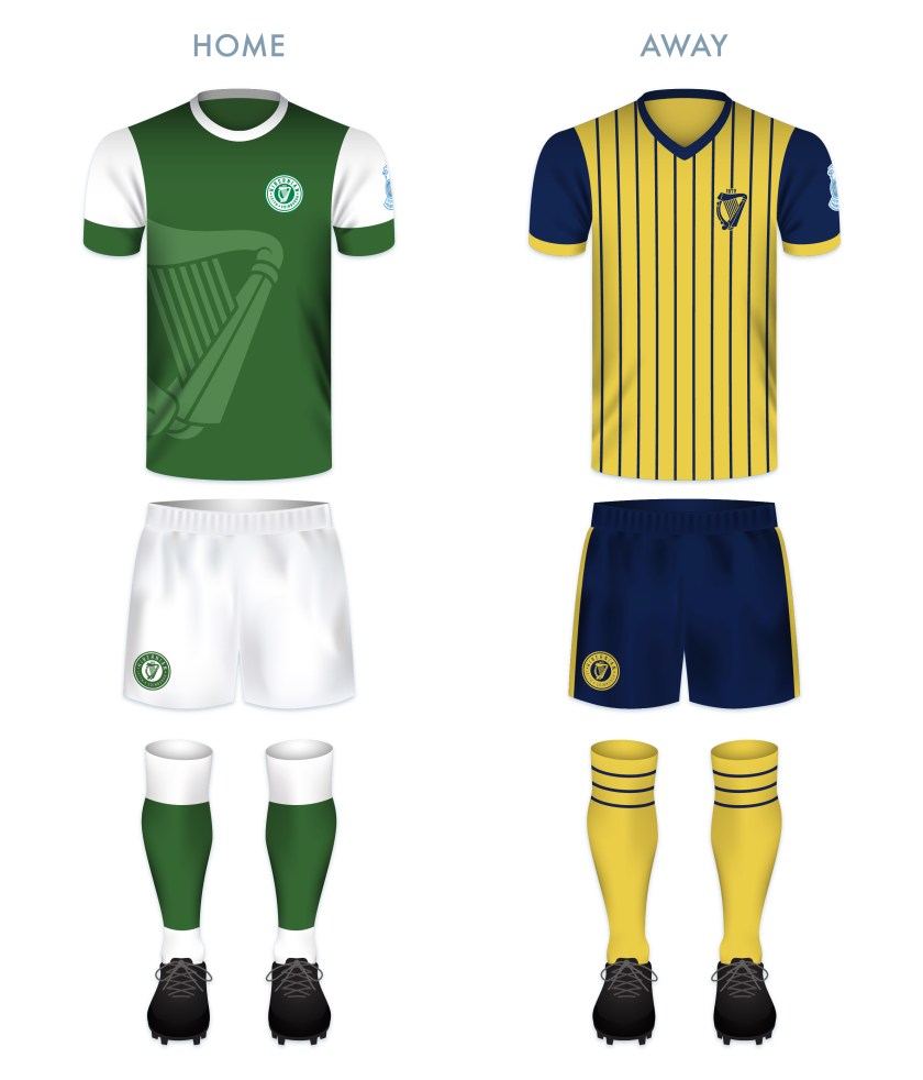
While I consider the current Hibs badge to be very strong, I find it a bit busy and disunited. In my redesign, I opted to go for a full-on vintage look, with a typeface that calls back to the time of their foundation and the reintroduction of a harp as the primary icon. I also desired to include both the Leith and Edinburgh heritage by including both names. I used a ‘V’ instead of the ‘U’ in Edinburgh in order to reflect the city’s current branding and the Latin in the club’s name (Hibernia being the Roman name for the island of Ireland).

HFC badge-01 2

I find the dominance of the white in the redesign especially striking against the green field of the home strip (which is based on the classic Hibernian home strip of a green body and white sleeves). I’ve also incorporated a larger, offset harp in a lighter shade of green on the body of the home shirt. For the away strip, I decided to go with a yellow and dark blue colour scheme and a minimalised harp badge, the harp calling back to the first Hibs kit.

HFC kit-01

HFC badge new-01

As ever, I am indebted to Dave at Historical Football Kits for some of the historical information used above.

Advertisement
24 April 201824 February 2020 E Tagged brand, Cabbage, crest, Edinburgh, Europe, football, Hibees, Hibernian, Hibernian FC, Hibernian Football Club, Hibs, Ireland, Ladbrokes Premiership, Latin, Leith, logo, rebrand, redesign, Scotland, Scottish Premiership, Scottish Professional Football League, SPFL, SPFL Premiership, SPL, The Cabbage, The Hibees, UK, United Kingdom 1 Comment

ReBrand: SPL

graphic

Have you ever noticed how poor some of the designs that we in the Western World are forced to encounter actually are? I’ve noticed. It’s a pathetic thing to get hung up on, but if I was going to go through the effort of raising a sign for my storefront I’d have to make sure that I was satisfied with the aesthetic quality of the sign. That’s probably because I have problems. But say you wanted to investigate a particular establishment—a restaurant, a potential employer, a potential church, anything really—on the Internet and you could barely navigate your way through an out of date website. Some of these websites were never ‘in date’ to begin with. If a newspaper looks too busy or scattered, I don’t want to read it. If I wanted to buy a new pair of running shoes my inclination would be to choose a shop that looked legitimate, aesthetically legitimate. As a designer, the whole package is valuable to me. So, thanks to last night’s insomnia, I finally got around to starting a design project called ‘ReBrand’. My intention is to take common logos and brands and give them a wee bit of an adjustment. I’m not prepared to say that I can make any vast improvements, but I figured that when I’m taking wee breaks from my daily PhD research [anxiety setting in at the mere mention of PhD research…] I could occupy myself with this project. At the very least, I can focus my mind on other things and practise my design technique.

I’ve decided that I’d start this project with something close to my heart – football. And in Scottish football there’s no shortage of lazy designs. I’ll probably focus solely on the Scottish Premier League, as it is the top tier of professional Scottish football. So below you have the current SPL logo, and below it you have a quick wee redesign I’ve been playing with:

SPL old

I thought that the saltire (Scottish flag) on the football was effective in the current logo, so I kept a subtle ball in there and added a bit of a tartan for the white cross. And here’s a texture for more fun…

ReBrand SPL

UPDATE: This summer the SPL was abolished and replaced by the Scottish Premiership which is the top tier of the new Scottish Professional Football League. The new SPFL logo isn’t too bad:

SPFL

20 May 20133 August 2017 E Tagged brand, Europe, football, logo, rebrand, redesign, Scotland, Scottish Premier League, Scottish Premiership, Scottish Professional Football League, SP, SPFL, SPL, sport, texture, UK, United Kingdom 1 Comment
Widgets
Create a website or blog at WordPress.com
Privacy & Cookies: This site uses cookies. By continuing to use this website, you agree to their use.
To find out more, including how to control cookies, see here: Cookie Policy
  • Follow Following
    • ellliottt
    • Join 53 other followers
    • Already have a WordPress.com account? Log in now.
    • ellliottt
    • Customize
    • Follow Following
    • Sign up
    • Log in
    • Report this content
    • View site in Reader
    • Manage subscriptions
    • Collapse this bar
 

Loading Comments...