ellliottt

design & illustration

Menu

Skip to content
  • HOME
  • ABOUT
  • GRAPHIC
    • ALL GRAPHIC DESIGN
    • AUTOMOTIVUS
    • REBRAND: SPFL
      • Premiership
        • Aberdeen
        • Celtic
        • Dundee United
        • Heart of Midlothian
        • Hibernian
        • Kilmarnock
        • Livingston
        • Motherwell
        • Rangers
        • Ross County
        • St Johnstone
        • St Mirren
      • Championship
        • Arbroath
        • Ayr United
        • Cove Rangers
        • Dundee
        • Greenock Morton
        • Hamilton Academical
        • Inverness CT
        • Partick Thistle
        • Queen’s Park
        • Raith Rovers
      • League One
        • Airdrieonians
        • Alloa Athletic
        • Clyde
        • Dunfermline Athletic
        • FC Edinburgh
        • Falkirk
        • Kelty Hearts
        • Montrose
        • Peterhead
        • Queen of the South
      • League Two
        • Albion Rovers
        • Annan Athletic
        • Bonnyrigg Rose
        • Dumbarton
        • East Fife
        • Elgin City
        • Forfar Athletic
        • Stenhousemuir
        • Stirling Albion
        • Stranraer
    • REBRAND: SHFL
      • Brechin City
      • Brora Rangers
      • Buckie Thistle
      • Clachnacuddin
      • Deveronvale
      • Formartine United
      • Forres Mechanics
      • Fraserburgh
      • Huntly
      • Inverurie Loco Works
      • Keith
      • Lossiemouth
      • Nairn County
      • Rothes
      • Strathspey Thistle
      • Turriff United
      • Wick Academy
    • REBRAND: SLFL
      • Berwick Rangers
      • Bo’ness United
      • Broomhill
      • Caledonian Braves
      • Civil Service Strollers
      • Cowdenbeath
      • Cumbernauld Colts
      • Dalbeattie Star
      • East Kilbride
      • East Stirlingshire
      • Edinburgh University
      • Gala Fairydean Rovers
      • Gretna 2008
      • Spartans
      • Tranent Juniors
      • University of Stirling
  • 2D
  • 3D
    • ALL 3D
    • INSTALLATION
  • PHOTO
  • SHOP

SP

ReBrand: Celtic FC

graphic

CFC badge new-01This whole ReBrand project was first inspired by my toying around with the iconic Celtic badge over over many years. Established in 1888, Celtic has become one of the most adorned and respected football clubs in the world. As of the end of the 2018/19 season, their honours include being crowned Scottish champions on 50 occasions, 39 Scottish Cups and 18 Scottish League Cups.

Celtic’s most successful season came in 1966/67, when the club participated in five competitions (the Scottish First Division, the Scottish Cup, the Scottish League Cup, the Glasgow Cup and the European Cup), winning each one. Their 2-1 European Cup victory over Inter Milan made Celtic the first British and only Scottish club to have achieved the honour. In addition to these highlights, for three consecutive seasons (2016/17, 2017/18 and 2018/19), Celtic have won every domestic trophy on offer (nine), completing the first Scottish ‘treble-treble’ (no other Scottish side has even won the domestic treble in two consecutive seasons).

Redesigning the badge of such an iconic football club (with some of the most devoted supporters in the world) was a daunting task, even if my alterations were only for fun.

The beginning of Celtic can be dated from a meeting held in the hall of St Mary’s Catholic Church in the Calton district of Glasgow. The meeting was led by Marist Brother Walfrid (born Andrew Kerins in Ballymote, Ireland), who proposed that a football club be established to raise funds for the alleviation of the rampant poverty in Glasgow’s East End, similar to the mission of Edinburgh’s Hibernian Football Club when it was established in 1875. In fact, on 28 May 1888, when Celtic played their first match (a 5-2 victory over Rangers at Glasgow Green), many of the side’s players were borrowed from Hibernian.

Celtic’s original strip featured a green Celtic cross within a red oval. In 1889 they adopted vertical green and white stripes for their home shirt, without a badge. The vertical stripes were replaced by their now-famous hoops in 1903. During the first half of the twentieth century, the club’s home strip lacked a badge, but their away tops featured a large three-leafed shamrock from time to time between 1925 and 1965. Celtic’s shirts did not feature a regular badge until 1977 (based on a badge that first appeared on the cover of their 50th [Golden] Jubilee Dinner menu in 1938), upon which most of their subsequent badges have been based. In 1988, the club celebrated their centenary with a badge derived from the Celtic cross of their very first badge. The following season they reverted back to their 1977 badge.

In 1994, the badge was updated very slightly and this design remained unaltered until the 2007/08 season, when Celtic celebrated the 40th anniversary of their European Cup victory with the addition of a star.
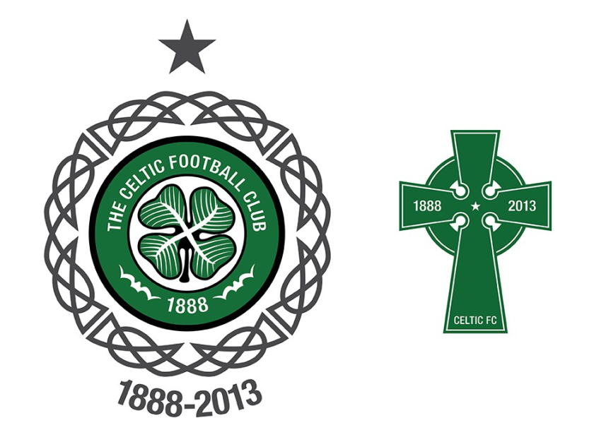
Badge historyAfter the 2007/08 season, the star was retained and the badge remained the same until 2012/13 season, when Celtic celebrated their 125th anniversary by using a 1994 badge encircled by an attractive Celtic knot and an alternative badge featuring a Celtic cross.

125th-badges-sm.jpg

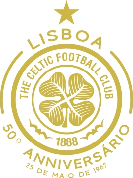
For the 2017/18 season, Celtic utilised the badge below, commemorating 50 years since their historic European Cup victory:

50th anniversary

I found the cross and the knot from the 2012/13 badges too attractive to disregard entirely. For my redesign, I have incorporated both (with the Celtic cross calling back to the original 1888 badge and the 1988 centenary badge). In addition to the Celtic knot and cross, I changed and centred the typeface.

CFC badge-01 2

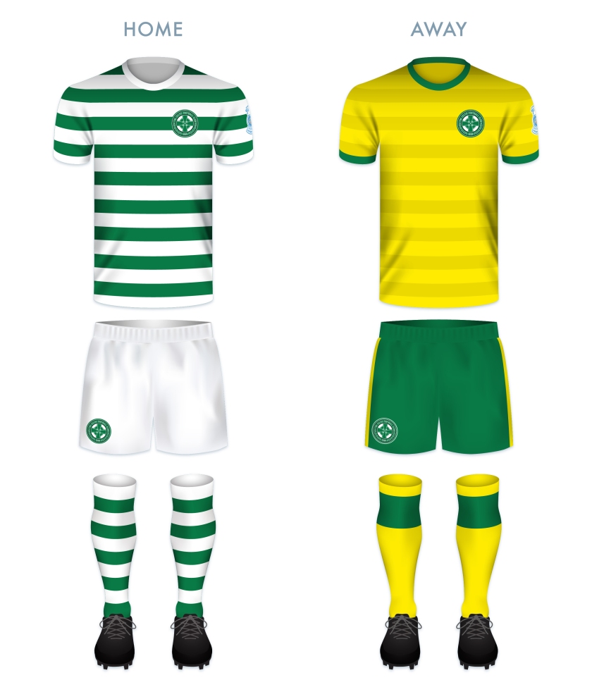
For the home shirt, to depart from the classic hoops would be anathema. I am a particular fan of the narrow hoops, which saw recent use in the 2012/13 shirt. The away kit colour scheme is taken from many historical Celtic away kits dating from 1973.

CFC kit-01

CFC badge new-01

As ever, I am indebted to Dave at Historical Football Kits for some of the historical information used above.

Advertisement
23 April 201824 February 2020 E Tagged badge, Bhoys, brand, Celtic, Celtic cross, Celtic FC, Celtic Football Club, Celtic knot, Celts, crest, cross, Europe, European Cup, football, Glasgow, Glasgow Celtic, history, hoops, Ladbrokes Premiership, Lisbon Lions, logo, rebrand, redesign, Scotland, Scottish Premiership, Scottish Professional Football League, SP, SPFL, SPFL Premiership, sport, star, texture, The Bhoys, The Celts, The Hoops, UK, United Kingdom 4 Comments

ReBrand: Partick Thistle FC Update

graphic

Back in May 2013, I tried my hand at redesigning the Partick Thistle Football Club badge. I wrote,

‘I actually think the current crest is very strong, but I experimented with trying to tie a bit more history into it. Being that Partick Thistle has actually played in Maryhill (as opposed to Partick) since 1909, I wanted to find a way to acknowledge their mixed history by blending elements of both the Partick and Maryhill coats of arms in order to form the crest centrepiece. But that design proved too busy (it might be able to be retooled later). So for Partick Thistle I simply changed the typeface and added a few rings to frame the crest better…’

Truth be told, I was never content with the redesign because it wasn’t much a redesign at all. So I revisited the badge (something I hope to do with some other Scottish Premiership badges in the near future) and came up with something very different:

Partick Thistle FC oldI decided to add a more stylised thistle atop a traditional shield. It’s something like a throwback to 1970s style and I find it different enough to satisfy me.

Partick Thistle FC final

18 November 20143 August 2017 E Tagged association football, badge, crest, Europe, football, Glasgow, logo, Maryhill, Partick, Partick Thistle, Partick Thistle FC, Partick Thistle Football Club, rebrand, redesign, Scotland, Scottish Football Association, Scottish Premiership, Scottish Professional Football League, SFA, SP, SPFL, sport, UK, United Kingdom Leave a comment

ReBrand: SPL

graphic

Have you ever noticed how poor some of the designs that we in the Western World are forced to encounter actually are? I’ve noticed. It’s a pathetic thing to get hung up on, but if I was going to go through the effort of raising a sign for my storefront I’d have to make sure that I was satisfied with the aesthetic quality of the sign. That’s probably because I have problems. But say you wanted to investigate a particular establishment—a restaurant, a potential employer, a potential church, anything really—on the Internet and you could barely navigate your way through an out of date website. Some of these websites were never ‘in date’ to begin with. If a newspaper looks too busy or scattered, I don’t want to read it. If I wanted to buy a new pair of running shoes my inclination would be to choose a shop that looked legitimate, aesthetically legitimate. As a designer, the whole package is valuable to me. So, thanks to last night’s insomnia, I finally got around to starting a design project called ‘ReBrand’. My intention is to take common logos and brands and give them a wee bit of an adjustment. I’m not prepared to say that I can make any vast improvements, but I figured that when I’m taking wee breaks from my daily PhD research [anxiety setting in at the mere mention of PhD research…] I could occupy myself with this project. At the very least, I can focus my mind on other things and practise my design technique.

I’ve decided that I’d start this project with something close to my heart – football. And in Scottish football there’s no shortage of lazy designs. I’ll probably focus solely on the Scottish Premier League, as it is the top tier of professional Scottish football. So below you have the current SPL logo, and below it you have a quick wee redesign I’ve been playing with:

SPL old

I thought that the saltire (Scottish flag) on the football was effective in the current logo, so I kept a subtle ball in there and added a bit of a tartan for the white cross. And here’s a texture for more fun…

ReBrand SPL

UPDATE: This summer the SPL was abolished and replaced by the Scottish Premiership which is the top tier of the new Scottish Professional Football League. The new SPFL logo isn’t too bad:

SPFL

20 May 20133 August 2017 E Tagged brand, Europe, football, logo, rebrand, redesign, Scotland, Scottish Premier League, Scottish Premiership, Scottish Professional Football League, SP, SPFL, SPL, sport, texture, UK, United Kingdom 1 Comment
Widgets
Create a website or blog at WordPress.com
Privacy & Cookies: This site uses cookies. By continuing to use this website, you agree to their use.
To find out more, including how to control cookies, see here: Cookie Policy
  • Follow Following
    • ellliottt
    • Join 53 other followers
    • Already have a WordPress.com account? Log in now.
    • ellliottt
    • Customize
    • Follow Following
    • Sign up
    • Log in
    • Report this content
    • View site in Reader
    • Manage subscriptions
    • Collapse this bar
 

Loading Comments...