ellliottt

design & illustration

Menu

Skip to content
  • HOME
  • ABOUT
  • GRAPHIC
    • ALL GRAPHIC DESIGN
    • AUTOMOTIVUS
    • REBRAND: SPFL
      • Premiership
        • Aberdeen
        • Celtic
        • Dundee United
        • Heart of Midlothian
        • Hibernian
        • Kilmarnock
        • Livingston
        • Motherwell
        • Rangers
        • Ross County
        • St Johnstone
        • St Mirren
      • Championship
        • Arbroath
        • Ayr United
        • Cove Rangers
        • Dundee
        • Greenock Morton
        • Hamilton Academical
        • Inverness CT
        • Partick Thistle
        • Queen’s Park
        • Raith Rovers
      • League One
        • Airdrieonians
        • Alloa Athletic
        • Clyde
        • Dunfermline Athletic
        • FC Edinburgh
        • Falkirk
        • Kelty Hearts
        • Montrose
        • Peterhead
        • Queen of the South
      • League Two
        • Albion Rovers
        • Annan Athletic
        • Bonnyrigg Rose
        • Dumbarton
        • East Fife
        • Elgin City
        • Forfar Athletic
        • Stenhousemuir
        • Stirling Albion
        • Stranraer
    • REBRAND: SHFL
      • Brechin City
      • Brora Rangers
      • Buckie Thistle
      • Clachnacuddin
      • Deveronvale
      • Formartine United
      • Forres Mechanics
      • Fraserburgh
      • Huntly
      • Inverurie Loco Works
      • Keith
      • Lossiemouth
      • Nairn County
      • Rothes
      • Strathspey Thistle
      • Turriff United
      • Wick Academy
    • REBRAND: SLFL
      • Berwick Rangers
      • Bo’ness United
      • Broomhill
      • Caledonian Braves
      • Civil Service Strollers
      • Cowdenbeath
      • Cumbernauld Colts
      • Dalbeattie Star
      • East Kilbride
      • East Stirlingshire
      • Edinburgh University
      • Gala Fairydean Rovers
      • Gretna 2008
      • Spartans
      • Tranent Juniors
      • University of Stirling
  • 2D
  • 3D
    • ALL 3D
    • INSTALLATION
  • PHOTO
  • SHOP

star

ReBrand: Dalbeattie Star FC

graphic

DSFC badge new-01The name Dalbeattie Star Football Club was used as early as 1900 for a team in the Kirkcudbrightshire town which played a number of local friendlies, but it was not until 1905 that Dalbeattie Star began to play competitive fixtures. In 1906, it was decided that the club would compete as a senior side and in August 1907, Dalbeattie Star were admitted into the SFA.

Sporadic local success came to the club until the cessation of football with the outbreak of the First World War. When competition resumed in 1919, the club’s committee decided to pursue professional football, though this proved to be a financial disaster. Even in the midst of financial hardship, the club experienced a number of local honours, winning the South of Scotland League title in 1924/25 and then again for five consecutive seasons from 1920/30 to 1933/34. The following season, the club withdrew from competition for a year and struggled up until the Second World War. In 1948, Dalbeattie Star ceased all operations.

Nearly three decades later, in 1976, the club was resurrected and regained a place in the South of Scotland League. An assortment of local achievements and qualifications in the early rounds of the Scottish Cup would follow. In 2001, Dalbeattie Star became part of the East of Scotland League before rejoining the South of Scotland League for the 2009/10 season. In total, Dalbeattie Star topped the South of Scotland League eleven times before entering the newly-formed Lowland League for the 2013/14 season.

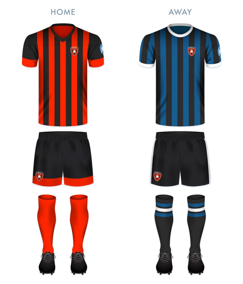
Presumably, the current club badge has been in use for some time. Although the quality of the badge is lacking, it depicts a double-headed eagle taken from the Dalbeattie coat of arms, which itself is taken from the coat of arms of the Maxwell Earls of Nithsdale. For my redesign, I decided to make use of the double-headed eagle and the star, all within a shield. I’ve also added a red background in the hope of making the badge more striking.

DSFC badge-01

For the home kit, I went with the club’s traditional colour scheme and design, namely, the vertical black and red stripes.

DSFC kit-01

DSFC badge new-01

Advertisement
4 June 201924 February 2020 E Tagged badge, crest, Dalbeattie, Dalbeattie Star, Dalbeattie Star FC, Dalbeattie Star Football Club, Dumfries & Galloway, Dumfries and Galloway, Europe, football, Kirkcudbright, Kirkcudbrightshire, LFL, logo, Lowland Football League, Lowlands, Maxwell, rebrand, redesign, Scotland, Scottish Lowland Football League, SLFL, South of Scotland League, sport, star, texture, The Star, UK, United Kingdom Leave a comment

ReBrand: Celtic FC

graphic

CFC badge new-01This whole ReBrand project was first inspired by my toying around with the iconic Celtic badge over over many years. Established in 1888, Celtic has become one of the most adorned and respected football clubs in the world. As of the end of the 2018/19 season, their honours include being crowned Scottish champions on 50 occasions, 39 Scottish Cups and 18 Scottish League Cups.

Celtic’s most successful season came in 1966/67, when the club participated in five competitions (the Scottish First Division, the Scottish Cup, the Scottish League Cup, the Glasgow Cup and the European Cup), winning each one. Their 2-1 European Cup victory over Inter Milan made Celtic the first British and only Scottish club to have achieved the honour. In addition to these highlights, for three consecutive seasons (2016/17, 2017/18 and 2018/19), Celtic have won every domestic trophy on offer (nine), completing the first Scottish ‘treble-treble’ (no other Scottish side has even won the domestic treble in two consecutive seasons).

Redesigning the badge of such an iconic football club (with some of the most devoted supporters in the world) was a daunting task, even if my alterations were only for fun.

The beginning of Celtic can be dated from a meeting held in the hall of St Mary’s Catholic Church in the Calton district of Glasgow. The meeting was led by Marist Brother Walfrid (born Andrew Kerins in Ballymote, Ireland), who proposed that a football club be established to raise funds for the alleviation of the rampant poverty in Glasgow’s East End, similar to the mission of Edinburgh’s Hibernian Football Club when it was established in 1875. In fact, on 28 May 1888, when Celtic played their first match (a 5-2 victory over Rangers at Glasgow Green), many of the side’s players were borrowed from Hibernian.

Celtic’s original strip featured a green Celtic cross within a red oval. In 1889 they adopted vertical green and white stripes for their home shirt, without a badge. The vertical stripes were replaced by their now-famous hoops in 1903. During the first half of the twentieth century, the club’s home strip lacked a badge, but their away tops featured a large three-leafed shamrock from time to time between 1925 and 1965. Celtic’s shirts did not feature a regular badge until 1977 (based on a badge that first appeared on the cover of their 50th [Golden] Jubilee Dinner menu in 1938), upon which most of their subsequent badges have been based. In 1988, the club celebrated their centenary with a badge derived from the Celtic cross of their very first badge. The following season they reverted back to their 1977 badge.

In 1994, the badge was updated very slightly and this design remained unaltered until the 2007/08 season, when Celtic celebrated the 40th anniversary of their European Cup victory with the addition of a star.

Badge historyAfter the 2007/08 season, the star was retained and the badge remained the same until 2012/13 season, when Celtic celebrated their 125th anniversary by using a 1994 badge encircled by an attractive Celtic knot and an alternative badge featuring a Celtic cross.

125th-badges-sm.jpg

For the 2017/18 season, Celtic utilised the badge below, commemorating 50 years since their historic European Cup victory:

50th anniversary

I found the cross and the knot from the 2012/13 badges too attractive to disregard entirely. For my redesign, I have incorporated both (with the Celtic cross calling back to the original 1888 badge and the 1988 centenary badge). In addition to the Celtic knot and cross, I changed and centred the typeface.

CFC badge-01 2

For the home shirt, to depart from the classic hoops would be anathema. I am a particular fan of the narrow hoops, which saw recent use in the 2012/13 shirt. The away kit colour scheme is taken from many historical Celtic away kits dating from 1973.

CFC kit-01

CFC badge new-01

As ever, I am indebted to Dave at Historical Football Kits for some of the historical information used above.

23 April 201824 February 2020 E Tagged badge, Bhoys, brand, Celtic, Celtic cross, Celtic FC, Celtic Football Club, Celtic knot, Celts, crest, cross, Europe, European Cup, football, Glasgow, Glasgow Celtic, history, hoops, Ladbrokes Premiership, Lisbon Lions, logo, rebrand, redesign, Scotland, Scottish Premiership, Scottish Professional Football League, SP, SPFL, SPFL Premiership, sport, star, texture, The Bhoys, The Celts, The Hoops, UK, United Kingdom 4 Comments
Widgets
Create a website or blog at WordPress.com
Privacy & Cookies: This site uses cookies. By continuing to use this website, you agree to their use.
To find out more, including how to control cookies, see here: Cookie Policy
  • Follow Following
    • ellliottt
    • Join 53 other followers
    • Already have a WordPress.com account? Log in now.
    • ellliottt
    • Customize
    • Follow Following
    • Sign up
    • Log in
    • Report this content
    • View site in Reader
    • Manage subscriptions
    • Collapse this bar
 

Loading Comments...