
brand
Kingdom of Fife Football
graphic

Building on my SPFL badge redesigns, I’ve made a wee map of Fife with the new badges and some club information.
ReBrand: Elgin City FC
graphic![]() Elgin City Football Club was established when two Elgin-based clubs, Rovers FC (1887) and Vale of Lossie FC (1888) united in 1893. For more than a century, the club competed in the Highland Football League, amassing a number of regional honours.
Elgin City Football Club was established when two Elgin-based clubs, Rovers FC (1887) and Vale of Lossie FC (1888) united in 1893. For more than a century, the club competed in the Highland Football League, amassing a number of regional honours.
In the 1967/68 Scottish Cup, Elgin City defeated Albion Rovers, Tarff Rovers, Forfar Athletic and Arbroath to teach the quarter-final. Their opponents, Greenock Morton proved too strong for the Highland League outfit and Elgin City left the tournament after a 2-1 loss. No other Highland League club, before or since, has progressed as far in the Scottish Cup.
In 2000, the Scottish Premier League (the top tier in Scottish football at the time) expanded from 10 to 12 clubs, opening the door for the admittance of two new clubs into the bottom tier of the Scottish Football League. Elgin City, along with fellow Highland Leaguers Peterhead, were successful in their application and have competed in the SFL (and subsequent Scottish Professional Football League) ever since.
Throughout the vast majority of the club’s history, Elgin City’s home shirt has consisted of black and white vertical stripes. It was not until 1990 that the kit featured a badge, which is still used today. This badge, a rendering of the coat of arms of the city and royal burgh of Elgin, features the patron saint of Elgin, St Giles, supported by two angels and bears the motto, Sic itur ad astra (Latin for ‘Thus one goes to the stars’ or ‘Such is the way to immortality’, from Virgil’s Aeneid, IX). The angels and motto refer to the legend that at his death, St Giles was brought by angels to heaven.
Despite the conceptual strength of the current badge, I find its execution lacking. While I admire the strength of a minimalist depiction of figures within a badge, I wanted to add more details so as to better resemble traditional depictions of the Elgin coat of arms and to create more depth.
As I wished to include the fine Latin motto, I did away with the shield (so as to avoid conflict with the ancient Scottish heraldic law forbidding the use of lettering within shields that are not approved by the Court of the Lord Lyon) as well as the stone compartment in which the motto was written in the original badge. I placed this redesign within a circular badge and added a football to occupy the negative space above the shield bearing St Giles. The dominant colours of the redesigned badge (red and white) are in line with the specified colours of the Elgin coat of arms, which are taken from the traditional colours of the Moray region.
![]()
Both kit redesigns make use of traditional Elgin City colours. The home kit redesign is inspired primarily by the Elgin City kit used from 1991 to 1993.

![]()
As ever, I am indebted to Dave at Historical Football Kits for some of the historical information used above.
ReBrand: Cowdenbeath FC
graphic![]() The exact year that Cowdenbeath Football Club was established is unclear. The current club had its genesis in the union of two local clubs (Cowdenbeath Rangers and Cowdenbeath Thistle), which took place in 1881. It has been suggested by the club’s historian, David Allan, that the club retained the name ‘Cowdenbeath Rangers’ until 1882, when the club merged with a Raith Rovers FC (not to be confused with the current Raith Rovers). What is known with certainty is that the current club has been playing as Cowdenbeath FC since at least 1882.
The exact year that Cowdenbeath Football Club was established is unclear. The current club had its genesis in the union of two local clubs (Cowdenbeath Rangers and Cowdenbeath Thistle), which took place in 1881. It has been suggested by the club’s historian, David Allan, that the club retained the name ‘Cowdenbeath Rangers’ until 1882, when the club merged with a Raith Rovers FC (not to be confused with the current Raith Rovers). What is known with certainty is that the current club has been playing as Cowdenbeath FC since at least 1882.
Regardless of whether they were established in 1881 or 1882, Cowden is the oldest of the four surviving professional football clubs in Fife (which includes the aforementioned Raith Rovers, established in 1883, Dunfermline Athletic, established in 1885 and East Fife, established in 1903).
Cowden competed in the Fifeshire Football Association from its inaugural season in 1882/83, losing that first Fife Cup 4-1 to the original Dunfermline Football Club. Two years later, against the same Dunfermline, the club would win the first of its 25 Fife Cups with a scoreline of 4-0.
In 1905, Cowden were admitted into the Scottish Football League and, despite having not won any major honours, competed in Scottish league football until the end of the 2021/22 season. Cowden ended up at the bottom of the League Two table and lost their place to Bonnyrigg Rose over two legs. As a result, the clab was relegated to the Scottish Lowland League for the 2022/23 season.
The Cowdenbeath kit did not feature a badge until the 1984/85 season. This badge was based on a design that had been used in the club’s programmes since 1970. The current badge is a variation of this 1984 badge, with the notable addition of a winding wheel, pickaxes and shovels, which call back to the mining history of the town.
The aim for my badge redesign was to create something simple, clear and significant. I omitted the shield entirely, incorporating the badge within a roundel. I did away with the stereotypical Scottish symbolism of the thistles and lion rampant, as well as the two crosses (symbols which I believe may be associated with the club’s ancestors, Cowdenbeath Rangers, Cowdenbeath Thistle and the original Raith Rovers), the meanings of which seem to have been obscured over time.
At the centre of my redesigned badge are a crossed hammer and pickaxe, which reference the town’s mining history. A football is superimposed over these symbols and below is found a banner bearing the Cowdenbeath town motto, Stent nae stent (Scots for ‘Effort always effort’, the term ‘stent’ having a particular association with mining shifts). For the colours, I opted for a light blue and gold, which stands out from the blue of the traditional Cowdenbeath home shirt.
![]()
The home kit design was inspired primarily by the 1974/75 and 1981/82 home kits. The away kit—as a play on the club’s enigmatic nickname, ‘the Blue Brazil’—is based on Brazil kits from 1954 onward, as well as several historical Cowdenbeath away kits.

![]()
As ever, I am indebted to Dave at Historical Football Kits for some of the historical information used above.
ReBrand: Clyde FC
graphic![]() Clyde Football Club was established in 1877. The club’s first home ground was called Barrowfield Park, located near the Glasgow district of Bridgeton, on the northern bank of the River Clyde, from which the club took its name.
Clyde Football Club was established in 1877. The club’s first home ground was called Barrowfield Park, located near the Glasgow district of Bridgeton, on the northern bank of the River Clyde, from which the club took its name.
In 1891, Clyde joined the Scottish Football League and their first league match resulted in a dominant 10-3 victory over Vale of Leven. By 1898, the club had outgrown their home at Barrowfield and relocated to Shawfield in Rutherglen, where they would compete until 1986.
During the first half of the twentieth century, this modest club, nicknamed ‘the Bully Wee’, had become a formidable side within Scottish football. Clyde won the final of the Scottish Cup three occasions (1938/39, 1954/55 and 1957/58) in six appearances.
By the late 1960s, many urban areas in Glasgow were being cleared for new developments. Large swathes of the population in these areas were forced to relocate to more remote regions of the city. A significant number of Clyde’s supporters resided in Bridgeton, Dalmarnock, the Gorbals, Oatlands and Rutherglen, all of which experienced significant population reduction during this period. Clyde’s support dwindled and the club has bounced around the lower divisions ever since their last spell in the top tier, which ended in 1975.
In addition to bouncing around the lower tiers of Scottish football, Clyde has moved their home several times since leaving Shawfield in 1986. And although they are now based in Cumbernauld (where they have played since the middle of the 1994/95 season and some nine miles north of the River Clyde as the crow flies), they retain their original name.
At the end of the 2018/19 season, Clyde finished second in the League Two (the bottom tier of the Scottish Professional Football League) table, qualifying them for the League One play-offs alongside third-placed Edinburgh City and fourth-placed Annan Athletic. In the play-off semi-final, Stenhousemuir, who finished second-bottom in League One, were drawn against Annan, while Clyde faced Edinburgh City. After dispatching Edinburgh City with a 4-0 aggregate score over two legs, Clyde faced Annan in the two-leg play-off final. Annan came out ahead in the first leg with a 1-0 victory over Clyde, but the Bully Wee made up the difference with their 2-0 victory in the second leg, securing their promotion from the bottom tier.
To celebrate their centenary in 1977, a version of the current Clyde badge came into regular use, though some version of it may have appeared as early as 1934. This badge features a ship in full sail encircled by a floral wreath. My redesign is an update of this badge. To commemorate their three Scottish Cup victories, I have included three sails for each of the ship’s three masts.
![]()
The redesigned home kit is inspired in part by the 2012/13 home kit. For the away kit, I decided to go with an all-red number (used as the third kit colour scheme as recently as the 2019/20 season), a reference to the left-wing political movement known as ‘Red Clydeside’, a major figure of which, James Maxton, served as an MP for the Bridgeton district for more than two decades.

![]()
As ever, I am indebted to Dave at Historical Football Kits for some of the historical information used above.
ReBrand: Berwick Rangers FC
graphic![]() Berwick Rangers Football Club was formed in 1884 by a group of railway clerks from Newcastle, England who played a match against a team of millworkers from Dunbar, Scotland.
Berwick Rangers Football Club was formed in 1884 by a group of railway clerks from Newcastle, England who played a match against a team of millworkers from Dunbar, Scotland.
Until 2019, these ‘Wee Gers’ were the only club in the Scottish Professional Football League that isn’t from Scotland (though, as of July 2019, the squad is made up entirely of Scottish players). Based in Berwick-upon-Tweed, Northumberland, England, just two-and-a-half miles (four kilometres) south of the Scottish border, Berwick Rangers played in the Scottish Football League and subsequent Scottish Professional Football League from 1905 until relegation to the Scottish Lowland Football League in 2019. Their departure from the SPFL came after a devastating 0-7 aggregate loss to Highland League champions Cove Rangers.
Due to the club’s geographic significance, when first designing this badge in 2014, I found it difficult to pin down a single design that captured what their current badge offers – the heraldic symbol of the historic Scottish county of Berwickshire with a bear and a tree, the Scottish lion rampant and the English lion passant. Instead, I shared two simple designs. For the first design I set the bear upright against a football, within a minimalistic yellow shield including the club’s initials above and the year of the club’s founding below. The second design omitted any writing and simply featured a football upon which rested the flags of England and Scotland within shields. Below are these initial designs, which I published on 5 November 2014:
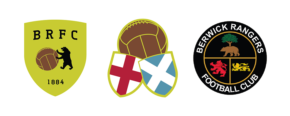
Ultimately, while I appreciated the minimalism of these initial redesigns, I found them lacking, especially as two separate ideas. In 2018, I attempted a second redesign, though I also found this unsatisfying. Now that the Wee Gers are rebuilding in the Lowland League, I’ve decided to give the badge another go. Included are the flags of England and Scotland in a mustard and black colour scheme. I’ve also included the Latin motto of Berwick-upon-Tweed, VICTORIA, GLORIA, MERCES (‘victory, glory, reward’).
![]()
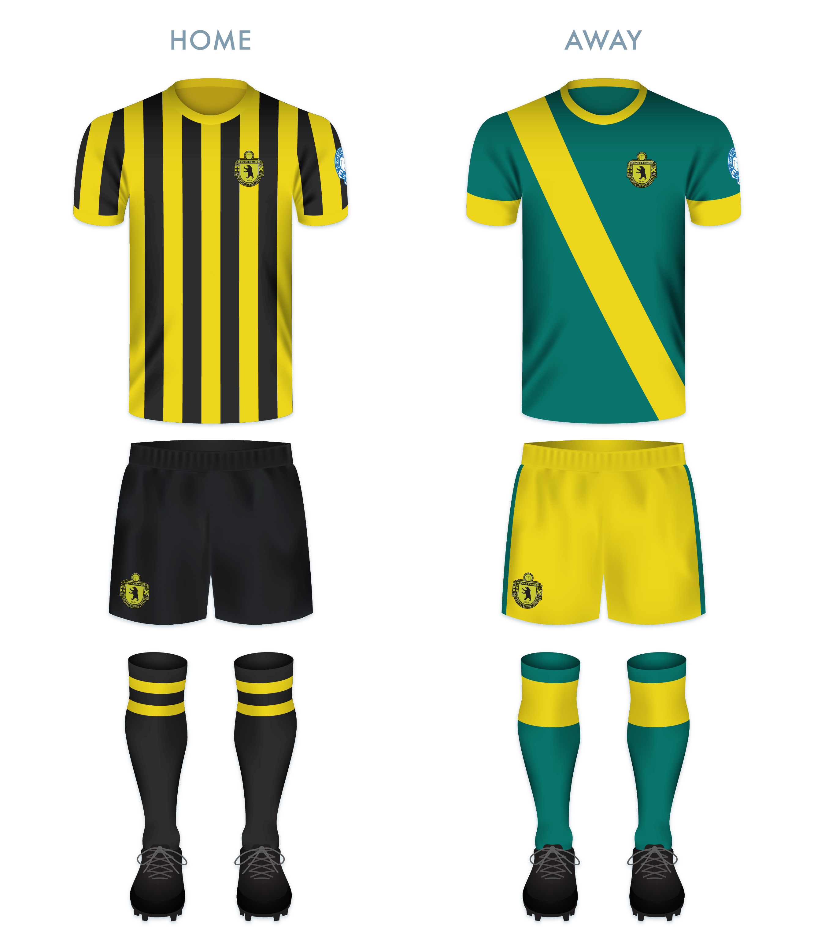
The home kit features black and gold vertical stripes, used by the club in nearly every home kit since 1908. The away kit is dominated by the emerald green of the current away kit with gold features.
![]()
As ever, I am indebted to Dave at Historical Football Kits for some of the historical information used above.
ReBrand: Annan Athletic FC
graphic![]() Annan Athletic Football Club was established as a junior side in 1942. Following the dissolution of the Dumfries and District Junior League in the early 1950s, Annan Athletic joined the Carlisle and District Football League.
Annan Athletic Football Club was established as a junior side in 1942. Following the dissolution of the Dumfries and District Junior League in the early 1950s, Annan Athletic joined the Carlisle and District Football League.
In the 1977/78 season, Annan returned to Scottish football, competing in the South of Scotland Football League. During their spell in the SoSFL, Annan won the league on two occasions (1983/84 and 1986/87). By the 1987/88 season, Annan joined the East of Scotland Football League. They continued their non-professional success, winning the EoSFL four times (1989/90, 1999/2000, 2000/01 and 2006/07).
In 2008, the original Gretna FC folded, making way for the admission of another club into the Scottish Football League. Annan’s application was successful, beating out Cove Rangers, Spartans, Preston Athletic and Edinburgh City. Since joining the SFL, Annan have yet to gain promotion from the bottom tier, but showed promise in the 2015/16 Scottish Cup, advancing to the fifth round before being knocked out by Greenock Morton.
Annan first used a badge on their kits around 1978, and this original badge remains in use today. It features a torch being carried, within a shield, flanked by two thistles. Although Annan are known as ‘the Black and Golds’, the colours of the badge are based upon the colours of the coat of arms of the former royal burgh of Annan.
For my redesign, I opted to go the route of a round badge, with a monogram at its centre. The monogram consists of two ‘A’s, tilted at a 45° anti-clockwise angle so as to resemble the town of Annan’s coat of arms (which features a yellow shield bearing a red saltire). At a stretch, the monogram includes the full ‘AAFC’ initials. A t-panelled football is superimposed over the monogram. The club’s name and two thistles occupy the outer ring.
![]()

Both of the redesigned kits take their colours from Annan’s traditional home and away kits. The home kit is inspired primarily by Annan’s handsome 1989/90 Umbro home kit.
![]()
As ever, I am indebted to Dave at Historical Football Kits for some of the historical information used above.
ReBrand: Stranraer FC
graphic![]() Stranraer Football Club was established in 1870, making it the third-oldest club in Scotland, after Queen’s Park, (1867) and Kilmarnock (1869).
Stranraer Football Club was established in 1870, making it the third-oldest club in Scotland, after Queen’s Park, (1867) and Kilmarnock (1869).
Due to Stranraer’s relatively remote location, fixtures in these early years were often played away from the town, in other parts of Wigtownshire, in Kirkcudbrightshire and even as far north as Ayrshire. Finally, in 1907, a permanent home was found in the town and Stair Park came to be. By the 1955/56 season, Stranraer began competing as full members of the Scottish Football League.
Stranraer first used a badge on their kit in the mid-1950s. This badge consisted of a red shield enclosing the club’s initials in white. This badge was used until 1961, when it was replaced with another red and white shield, this time, with the club’s initials above a ship at sea, the ship taken from the town’s coat of arms. Some variation of this badge remained until 1988, when a shield featuring only a ship at sea was enclosed by a ring with the club’s name and year of founding. The current badge in an updated version of this 1988 badge.
In redesigning Stranraer’s badge, I considered the two other clubs which feature a ship in full sail on their current badge: Greenock Morton (1874) and Clyde (1877). The ship on Clyde’s badge, from what I can tell, came into being in the mid-1930s. Morton’s badge did not feature a ship until 1978. Given the length of time that Clyde’s badge has been in use and given that I did not want my Stranraer badge redesign to be too similar to either the current badge or the Stranraer coat of arms, I decided to include a ship in my redesign of Clyde’s badge alone.
For Stranraer, I settled on a ship’s wheel, as it is distinct among all football badges, it is a timeless symbol (which ties both to the club’s age and to Stranraer’s significance as a port town) and it lends itself to a round badge. I have gone out on a limb so as to include the wheel’s handles beyond the bounds of the badge ring. A t-panelled football sits at the centre of the badge and I have added a second tone of blue to give the badge an extra bit of ‘pop’.
![]()
In redesigning the home kit, I first experimented with a wave pattern, but determined that, along with the ship’s wheel badge, this would be over the top. Instead, I have used the traditional Stranraer blue shirt with white accents, drawing particular inspiration from the very tasteful 2008/09 home shirt. The away shirt is bright yellow, with a mustard harlequin pattern, inspired in part by the 1996/97 home kit.

![]()
As ever, I am indebted to Dave at Historical Football Kits for some of the historical information used above.
ReBrand: Stenhousemuir FC
graphic![]() Stenhousemuir Football Club was established in 1884 after breaking away from local junior side Heather Rangers Football Club. By 1890, the club was playing their home matches at Ochilview Park, where they have played ever since. In 2009, Stenhousemuir became the first football club in Scotland to become a Community Interest Company (CIC).
Stenhousemuir Football Club was established in 1884 after breaking away from local junior side Heather Rangers Football Club. By 1890, the club was playing their home matches at Ochilview Park, where they have played ever since. In 2009, Stenhousemuir became the first football club in Scotland to become a Community Interest Company (CIC).
The club’s shirt did not feature a badge until 1984, marking their centenary year. This first badge was an odd number, featuring the club’s sponsor, Hogan Sports (written as ‘Hogan’s Sports’ on the badge). From 1985 until 1991, Stenhousemuir’s shirts featured a stylised ‘SFC’ monogram. This was replaced by a heraldic badge, which did not find favour with the club’s supporters. The heraldic emblem was abandoned after two seasons, when a round badge, derived from the 1985 monogram, was introduced. The Stenhousemuir badge has been based on this 1993 design ever since.
For my redesign, I wanted to hold to the spirit of the quirky brown-and-amber 1993 badge. I decided that the badge could benefit from a local or historical reference, without diving into a full-on heraldic design. The town of Stenhousemuir comes from a particular stone structure (‘sten house’ = ‘stone house’). This round structure, referred to as ‘Arthur’s O’en’ (‘Arthur’s Oven’) was most likely a Roman temple and stood to the north of the River Carron. It was demolished in 1743, but not before some detailed illustrations of it were made. One particular illustration of the foundation of the temple served as my inspiration as I found that it suited a round badge. The entrance to the temple also serves as a handsome frame for the lowest terminus of the ‘F’ in my new monogram. My redesign featuring a new monogram and an illustration of the temple’s foundation is found below:
![]()
The redesigned kits are based on traditional Stenhousemuir colours, with the home kit inspired primarily by the 2017/18 home kit and the away kit inspired primarily by 2003/04 away kit, with a wee touch of 1980s Adidas kits.

![]()
As ever, I am indebted to Dave at Historical Football Kits for some of the historical information used above.
ReBrand: Raith Rovers FC
graphic![]() Raith Rovers Football Club was established in 1883. The club draws its name, Raith, from a vague historical association with the region of Fife from Kirkcaldy (where the club is based) to Lochgelly.
Raith Rovers Football Club was established in 1883. The club draws its name, Raith, from a vague historical association with the region of Fife from Kirkcaldy (where the club is based) to Lochgelly.
Throughout their history, the Rovers have won the second tier on five occasions and have appeared in the Scottish Cup final once, losing 2-0 to Falkirk in 1912/13. The club reached the final of the 1948/49 Scottish League Cup, but experienced another 2-0 loss, this time to Rangers. The club would have to wait until 1994/95 League Cup final to receive their first and only major honour to date, defeating Celtic 6-5 on penalties after ending extra time 2-2.
The Rovers first used a badge on their kits during the 1912/13 season. This early badge included a lion rampant holding a belt buckle, the latter of which being derived from the Kirkcaldy coat of arms. A variation of this badge was used until the 1949/50 season, when the Scottish royal coat of arms, featuring a yellow shield with a red lion rampant, was used to mark the Rovers’ promotion to the Scottish top tier. The following season, the more traditional badge returned to the kit.
By the 1960s, crests became less popular in Scottish football in favour of calligraphic club initials. A new badge was used intermittently between 1976 and 1985, when another badge came into use. By 1998, the traditional badge was again reinstated and some variation of this badge has been used ever since.
For years I assumed, having only seen the badge at a relative distance or in a low resolution, that the Rovers’ insignia was a depiction of a horse holding a globus cruciger (Latin for ‘cross-bearing orb’), a medieval symbol representing the authority of Christ or Christianity over the world. For my redesign, I sought to make both the lion rampant and the buckle more identifiable. I have also included the club’s name within a banner, which resembles the Scottish Football Association crest used until 2012. This is also a call back to the 1949/50 season, when the Rovers were promoted to the top tier and their badge was nearly identical to that used by the Scottish national team.
![]()
The home kit is inspired by the Rovers’ home kits from 1950 to 1954, in particular, the kit worn during the 1953/54 season. The away kit is a hooped version of the Rovers’ traditional red away colour scheme.
![]()
As ever, I am indebted to Dave at Historical Football Kits for some of the historical information used above.
