ellliottt

design & illustration

Menu

Skip to content
  • HOME
  • ABOUT
  • GRAPHIC
    • ALL GRAPHIC DESIGN
    • AUTOMOTIVUS
    • REBRAND: SPFL
      • Premiership
        • Aberdeen
        • Celtic
        • Dundee United
        • Heart of Midlothian
        • Hibernian
        • Kilmarnock
        • Livingston
        • Motherwell
        • Rangers
        • Ross County
        • St Johnstone
        • St Mirren
      • Championship
        • Arbroath
        • Ayr United
        • Cove Rangers
        • Dundee
        • Greenock Morton
        • Hamilton Academical
        • Inverness CT
        • Partick Thistle
        • Queen’s Park
        • Raith Rovers
      • League One
        • Airdrieonians
        • Alloa Athletic
        • Clyde
        • Dunfermline Athletic
        • FC Edinburgh
        • Falkirk
        • Kelty Hearts
        • Montrose
        • Peterhead
        • Queen of the South
      • League Two
        • Albion Rovers
        • Annan Athletic
        • Bonnyrigg Rose
        • Dumbarton
        • East Fife
        • Elgin City
        • Forfar Athletic
        • Stenhousemuir
        • Stirling Albion
        • Stranraer
    • REBRAND: SHFL
      • Brechin City
      • Brora Rangers
      • Buckie Thistle
      • Clachnacuddin
      • Deveronvale
      • Formartine United
      • Forres Mechanics
      • Fraserburgh
      • Huntly
      • Inverurie Loco Works
      • Keith
      • Lossiemouth
      • Nairn County
      • Rothes
      • Strathspey Thistle
      • Turriff United
      • Wick Academy
    • REBRAND: SLFL
      • Berwick Rangers
      • Bo’ness United
      • Broomhill
      • Caledonian Braves
      • Civil Service Strollers
      • Cowdenbeath
      • Cumbernauld Colts
      • Dalbeattie Star
      • East Kilbride
      • East Stirlingshire
      • Edinburgh University
      • Gala Fairydean Rovers
      • Gretna 2008
      • Spartans
      • Tranent Juniors
      • University of Stirling
  • 2D
  • 3D
    • ALL 3D
    • INSTALLATION
  • PHOTO
  • SHOP

The Black and Golds

ReBrand: Huntly FC

graphic

hfc badge new-01Huntly Football Club was established in 1928. and was admitted to the Highland Football League that same year. By their second season, they had won the league title. But this early success was not indicative of the club’s future form. Over the next six decades, Huntly would win two Highland League Cups and two Aberdeenshire Cups, but another league title evaded them.

The 1990s proved to be the club’s most successful decade to date. In 1992, they won the Aberdeenshire Cup and in 1993, they won both the Highland League Cup and the Scottish Qualifying Cup (North). The following season, Huntly secured the Highland League title for the first time in 64 years. This triumph was accompanied by their second consecutive Highland League Cup and another Aberdeenshire Cup – a Highland treble. The club would go on to win a record five consecutive Highland League titles (1993/94, 1994/95, 1995/96, 1996/97, 1997/98), during which time they also won an additional Highland League Cup (1995/96), three consecutive Aberdeenshire Cups (1993/94, 1994/95, 1995/96) and two Scottish Qualifying Cups (North) (1994/95, 1996/97). The club would add to their silverware tally in the 1999/2000 season, winning one more Aberdeenshire Cup and one more Scottish Qualifying Cup (North). Huntly’s most recent Highland League title came in 2005.

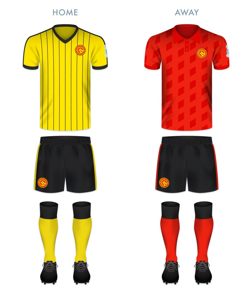
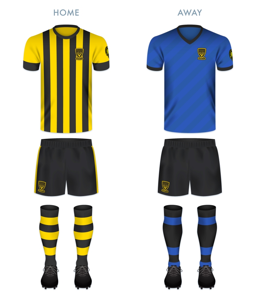
The current Huntly badge (and the overall Huntly colour scheme) is derived from the black and gold heraldic blazon of the Stewart Earls of Atholl (who were the Lords of Strathbogie, the former name of Huntly, in the Middle Ages). The stylised stag’s head comes from the arms of the Earl (and later, Marquess) of Huntly. For my redesign, I sought to keep the main features of the current badge, but to bring it into compliance with the heraldic laws of Scotland by removing the club’s initials from the shield itself. Although the stylised stag’s head is a striking design feature, my mind interprets the ears as the stag’s eyes. I decided to make a more anatomically accurate stag’s head for my redesign. The laurel wreath and five stars represent Huntly’s dominant form in the 1990s and standing record of five consecutive Highland League championships.

HFC badge-01

HFC kit-01

hfc badge new-01

Advertisement
28 January 201928 February 2020 E Tagged Aberdeenshire, badge, Black and Golds, crest, Europe, football, HFL, Highland Football League, Highlands, Huntly, Huntly FC, Huntly Football Club, logo, rebrand, redesign, Scotland, Scottish Highland Football League, SHFL, sport, texture, The Black and Golds, UK, United Kingdom Leave a comment

ReBrand: Annan Athletic FC

graphic

AAFC badge new-01Annan Athletic Football Club was established as a junior side in 1942. Following the dissolution of the Dumfries and District Junior League in the early 1950s, Annan Athletic joined the Carlisle and District Football League.

In the 1977/78 season, Annan returned to Scottish football, competing in the South of Scotland Football League. During their spell in the SoSFL, Annan won the league on two occasions (1983/84 and 1986/87). By the 1987/88 season, Annan joined the East of Scotland Football League. They continued their non-professional success, winning the EoSFL four times (1989/90, 1999/2000, 2000/01 and 2006/07).

In 2008, the original Gretna FC folded, making way for the admission of another club into the Scottish Football League. Annan’s application was successful, beating out Cove Rangers, Spartans, Preston Athletic and Edinburgh City. Since joining the SFL, Annan have yet to gain promotion from the bottom tier, but showed promise in the 2015/16 Scottish Cup, advancing to the fifth round before being knocked out by Greenock Morton.

Annan first used a badge on their kits around 1978, and this original badge remains in use today. It features a torch being carried, within a shield, flanked by two thistles. Although Annan are known as ‘the Black and Golds’, the colours of the badge are based upon the colours of the coat of arms of the former royal burgh of Annan.

For my redesign, I opted to go the route of a round badge, with a monogram at its centre. The monogram consists of two ‘A’s, tilted at a 45° anti-clockwise angle so as to resemble the town of Annan’s coat of arms (which features a yellow shield bearing a red saltire). At a stretch, the monogram includes the full ‘AAFC’ initials. A t-panelled football is superimposed over the monogram. The club’s name and two thistles occupy the outer ring.

AAFC badge-01 2

AAFC monogram breakdown-01

Both of the redesigned kits take their colours from Annan’s traditional home and away kits. The home kit is inspired primarily by Annan’s handsome 1989/90 Umbro home kit.

AAFC kit-01

AAFC badge new-01

As ever, I am indebted to Dave at Historical Football Kits for some of the historical information used above.


19 May 201824 February 2020 E Tagged Annan, Annan Athletic, Annan Athletic FC, Annan Athletic Football Club, badge, Black and Golds, brand, crest, Dumfries and Galloway, Europe, football, Galabankies, Ladbrokes League 2, logo, monogram, rebrand, redesign, Scotland, Scottish League 2, Scottish League Two, Scottish Professional Football League, SPFL, SPFL League 2, SPFL League Two, sport, The Black and Golds, UK, United Kingdom Leave a comment
Widgets
Create a website or blog at WordPress.com
Privacy & Cookies: This site uses cookies. By continuing to use this website, you agree to their use.
To find out more, including how to control cookies, see here: Cookie Policy
  • Follow Following
    • ellliottt
    • Join 53 other followers
    • Already have a WordPress.com account? Log in now.
    • ellliottt
    • Customize
    • Follow Following
    • Sign up
    • Log in
    • Report this content
    • View site in Reader
    • Manage subscriptions
    • Collapse this bar
 

Loading Comments...