ellliottt

design & illustration

Menu

Skip to content
  • HOME
  • ABOUT
  • GRAPHIC
    • ALL GRAPHIC DESIGN
    • AUTOMOTIVUS
    • REBRAND: SPFL
      • Premiership
        • Aberdeen
        • Celtic
        • Dundee United
        • Heart of Midlothian
        • Hibernian
        • Kilmarnock
        • Livingston
        • Motherwell
        • Rangers
        • Ross County
        • St Johnstone
        • St Mirren
      • Championship
        • Arbroath
        • Ayr United
        • Cove Rangers
        • Dundee
        • Greenock Morton
        • Hamilton Academical
        • Inverness CT
        • Partick Thistle
        • Queen’s Park
        • Raith Rovers
      • League One
        • Airdrieonians
        • Alloa Athletic
        • Clyde
        • Dunfermline Athletic
        • FC Edinburgh
        • Falkirk
        • Kelty Hearts
        • Montrose
        • Peterhead
        • Queen of the South
      • League Two
        • Albion Rovers
        • Annan Athletic
        • Bonnyrigg Rose
        • Dumbarton
        • East Fife
        • Elgin City
        • Forfar Athletic
        • Stenhousemuir
        • Stirling Albion
        • Stranraer
    • REBRAND: SHFL
      • Brechin City
      • Brora Rangers
      • Buckie Thistle
      • Clachnacuddin
      • Deveronvale
      • Formartine United
      • Forres Mechanics
      • Fraserburgh
      • Huntly
      • Inverurie Loco Works
      • Keith
      • Lossiemouth
      • Nairn County
      • Rothes
      • Strathspey Thistle
      • Turriff United
      • Wick Academy
    • REBRAND: SLFL
      • Berwick Rangers
      • Bo’ness United
      • Broomhill
      • Caledonian Braves
      • Civil Service Strollers
      • Cowdenbeath
      • Cumbernauld Colts
      • Dalbeattie Star
      • East Kilbride
      • East Stirlingshire
      • Edinburgh University
      • Gala Fairydean Rovers
      • Gretna 2008
      • Spartans
      • Tranent Juniors
      • University of Stirling
  • 2D
  • 3D
    • ALL 3D
    • INSTALLATION
  • PHOTO
  • SHOP

Ladbrokes League 2

ReBrand: Stirling Albion FC

graphic

SAFC badge new-01Stirling Albion Football Club was established in 1945. The club’s formation was tied closely to the end of the Second World War and the dissolution of an earlier Stirling-based club, King’s Park FC (1875). King’s Park were members of the Scottish Football League from 1931 until 1939. In 1940, their home ground, Forthbank Park, was bombed by the Luftwaffe and King’s Park never played again.

After the war, coal magnate and former managing director of King’s Park, Tom Fergusson, purchased the Annfield Estate in Stirling, developing the site as a new football ground and establishing a new football club, Stirling Albion. This new club was accepted into the Scottish Football League for the 1946/47 season and has remained there ever since.

For the first two decades of their existence, Stirling Albion hopped between the top and second tiers, earning the unfortunate nickname, ‘the Yo-Yos’. The club has never soared to especially great heights, their best finish being 12th in the top tier in the 1958/59 season. To date, the 1967/68 season was Stirling Albion’s last spell in top flight football.

The club’s first badge consisted of a rendering of the Stirling coat of arms, composed primarily of a Saltire and lion rampant within a shield. This badge was used from 1961 until 1964. In 1966, Stirling Albion became the first British club to tour Japan. During this tour, a new badge was designed for the club’s blazers. Annfield House, the club’s offices and changing rooms, formed the centrepiece of this badge. Rather humorously, this badge also featured a yo-yo running through its centre. In 1987, the club began to use this badge on their kits.

In 1993, the club left Annfield for a new stadium, called Forthbank after King’s Park FC’s Forthbank Park. The badge featuring Annfield House remained until 2000, when the current badge was chosen as its replacement. The centrepiece of this badge consists of the National Wallace Monument atop Abbey Craig, with the Ochil Hills in the background.

Although the Wallace Monument is a striking structure, being neither ancient (built between 1861 and 1869) nor very central, I find its inclusion to be relatively unrepresentative of both Stirling and the football club. I opted to stay away from a depiction of an architectural landmark and instead, I designed a modern monogram of the club’s initials. The wide-set ‘A’ resembles a set of goals, while the ‘S’ cradles a football into the net (or is it being saved by the keeper?). I decided to keep the red and black colour scheme of the current badge, though, on my kit renderings, the monogram is displayed in one colour.

SAFC badge-01

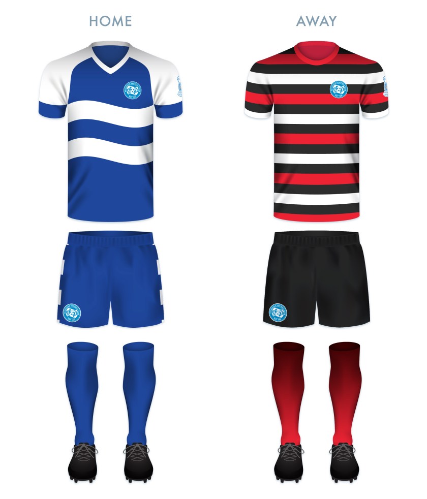
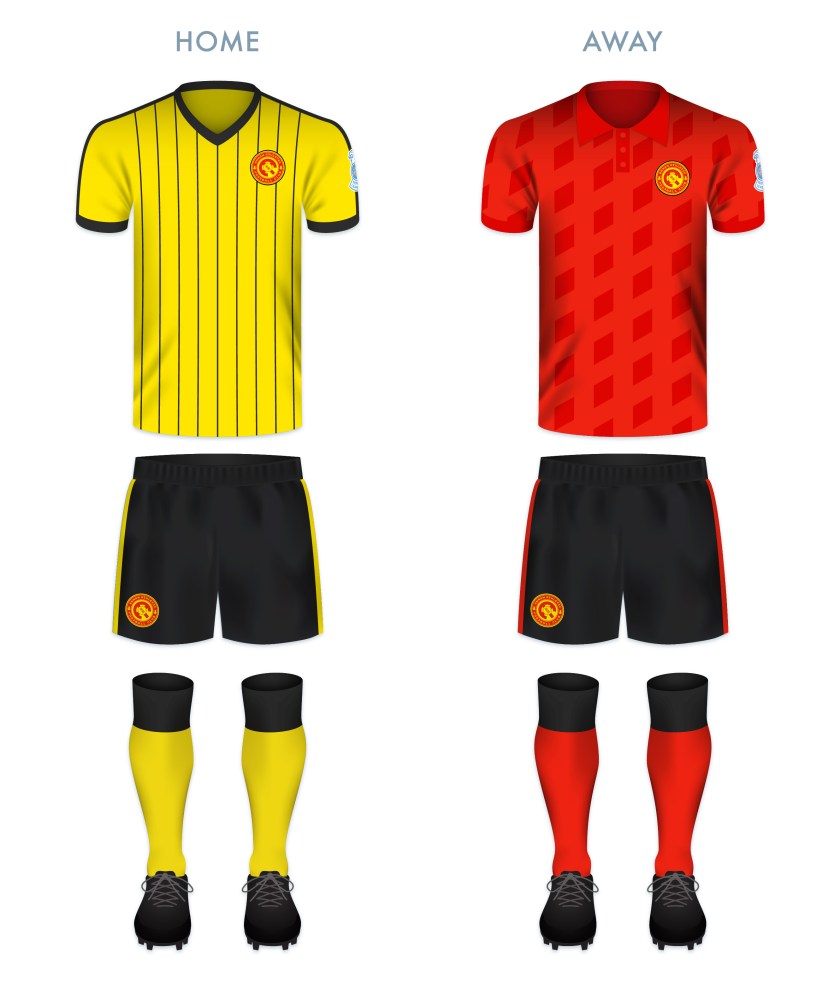
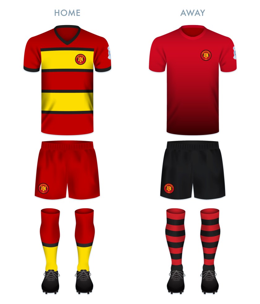
The home kit is inspired by the classic Stirling Albion home kits from the late 1950s through the mid-1960s, particularly the home kit from the 1964/65 season. The away kit is inspired primarily by the handsome Macron 2015/16 away kit. On this kit, the monogram is presented in yellow on the dark blue field.

SAFC kit-01

SAFC badge new-01

As ever, I am indebted to Dave at Historical Football Kits for some of the historical information used above.

Advertisement
11 June 201824 February 2020 E Tagged badge, Binos, crest, emblem, Europe, football, insignia, King's Park, King's Park FC, King's Park Football Club, Ladbrokes League 2, logo, monogram, rebrand, redesign, Scotland, Scottish League 2, Scottish League Two, Scottish Professional Football League, SPFL, SPFL League 2, SPFL League Two, sport, Stirling, Stirlingshire, The Binos, The Yo-Yos, UK, United Kingdom, Yo-Yos Leave a comment

ReBrand: Queen’s Park FC

graphic

QPFC badge new-01Queen’s Park Football Club was established in 1867, making it the oldest football club in Scotland. It can be argued that no single club has had such an influence on the game of football in Britain—and in turn, the world—than Queen’s Park. They invented the passing game (as opposed to the tactic of a ‘rolling-maul’ like that used in rugby, the primary tactic employed by all other football clubs of this early era), as well as the crossbar on goals, the half-time interval and free kicks.

Having been established in 1871, the [English] Football Association Cup competition predates the Scottish Cup by two years. In these early years, Queen’s Park was invited to participate in the FA Cup and reached the final in 1883/84 and 1884/85, losing to Blackburn Rovers in both. Although other Scottish clubs were invited to participate in early editions of the FA Cup (including Cowlairs, Hearts, Partick Thistle, Rangers, Renton and Third Lanark ), Queen’s Park are the only Scottish club to have ever played in the final.

In Scotland, Queen’s Park won the first three Scottish Cup finals and had amassed ten Scottish Cup final victories between 1873 and 1893. The club’s record would only be surpassed by Celtic in 1922/23 and Rangers in 1935/36. This means that, despite not having won the competition for 125 years, Queen’s Park remain in the third position for all-time Scottish Cup victories.

Another distinguishing feature of this historic club is the fact that Queen’s Park was, until November 2019, an amateur side, reflected in the club’s Latin motto, Ludere causa ludendi, ‘To play for the sake of playing’. So committed had Queen’s Park been to retaining their amateur ideals, that they resisted joining the Scottish Football League when it formed in 1890. Eventually, in 1900, Queen’s Park applied for membership into the SFL and were admitted directly to the top tier. But that season saw Queen’s Park beaten by Celtic in the Scottish Cup final, heralding the end of the amateurs’ dominance of Scottish football.

The Queen’s Park kit did not feature a regular badge until 1928, which has more-or-less remained the same ever since. This badge is heraldic in nature, featuring a black and white hooped shield (reminiscent of the iconic Queen’s Park home shirt, from which their nickname, ‘the Spiders’, is derived) tilted anti-clockwise. The shield is topped by a helmet, from which emerges mantling, a torse and a crest of a lion rampant in red. The club motto is displayed on a scroll beneath the shield.

Given the club’s illustrious history, I found the Spiders’ badge one of the most difficult to redesign. Being that they are the oldest club in Scotland, I found it essential to include the year of their formation, as well as the club’s initials and the Latin motto. I have included all of these features in a typeface of my own design, inspired by the script in several medieval illuminated manuscripts. As a centrepiece, I have included an illustration of a Victorian era football.

QPFC badge-01

Both of the kit redesigns are based on historic Queen’s Park kits. The home kit features the club’s traditional tight black and white hoops (in use since 1873). In particular, this kit is inspired by the 1927/28 home kit and variations on said kit used until 1960. The away kit is inspired primarily by the home kit worn from 1872 to 1873, with dark blue and white hooped socks. This similar dark blue and grey colour scheme was also used in the home kit between 2016 and 2018 to commemorate the club’s 150th anniversary.

QPFC kit-01

QPFC badge new-01

As ever, I am indebted to Dave at Historical Football Kits for some of the historical information used above.

10 June 20189 June 2021 E Tagged badge, Blackburn Rovers, Blackburn Rovers FC, Blackburn Rovers Football Club, crest, emblem, Europe, FA Cup, football, Football Association Cup, Glasgow, insignia, Ladbrokes League 2, Lanarkshire, Latin, logo, QPFC, Queen's Park, Queen's Park FC, Queen's Park Football Club, rebrand, redesign, Scotland, Scottish Cup, Scottish Professional Football League, SPFL, SPFL League 1, SPFL League One, Spiders, sport, The Spiders, UK, United Kingdom 1 Comment

ReBrand: Peterhead FC

graphic

PFC badge new-01Peterhead Football Club was established in 1891 by a number of local football enthusiasts. The passion of this young club caught the attention of the town’s Feuars Managers and a plot of land was gifted to the club within Peterhead’s Raemoss Park. Recreation Park, as it this original home ground was called, opened that same year. Although the stage was set for competition, Peterhead would have to wait until their admittance into the small Aberdeenshire Football Association (consisting of only six sides) in 1900 before playing competitive football.

In 1931, Peterhead would join the larger Highland Football League, where they would be crowned champions three times in four seasons (1946/47, 1948/49, 1949/50) and then twice more, in 1988/89 and 1998/99. The club also won the Highland League Cup on five occasions (1962/63, 1965/66, 1967/68, 1980/81 and 1988/89).

After competing for over a century as a non-league side, Peterhead would gain admittance into the Scottish Football League in 2000. Their application was aided by their relocation to Balmoor in 1997.

In 2013/14, Peterhead topped the Scottish League Two table, gaining promotion to League One. Their stay in League One lasted only three seasons, though they came close to returning to the third tier after finishing second in the 2017/18 League Two season. This led to a play-off, in which the club was defeated by fellow League Two side, Stenhousemuir over two legs, despite the latter having finished the season 22 points behind Peterhead. Undeterred, Peterhead returned to the third tier after winning League Two in the 2018/19 season.

Peterhead adopted their nickname ‘the Blue Toon’, from their town, which itself probably comes from the fact that the historical fishermen of the port town were known for wearing blue worsted stockings. Accordingly, blue has been Peterhead FC’s primary colour since their early days.

The club’s kit first featured a badge in 1947. This badge consisted of the club’s ‘PFC’ initials within a shield and was used for one season before being revived during the early 1960s. Several variations of the club’s initials appeared on their kits at various points in the 1980s.

In 1989, when Peterhead won the Highland League title (their first such honour since 1950), the club adopted a new badge to celebrate the achievement. This badge featured of a version of the Peterhead coat of arms. In 1993, the club became a limited company and adopted their current badge. This badge consists of a downward-pointing triangle with a wavy top, representing the sea. Within the triangle is an illustration of a football and a fish—the fish representing the town’s fishing industry—superimposed over a net. The badge also features an outer ring and the club’s nickname.

For my redesign, I wanted to create something more unified and balanced than the current badge. I decided to omit the triangle so as to avoid any resemblance to the much older Dunfermline Athletic badge. I illustrated a new football, encircled by two haddock fishes for the centrepiece of the badge. I also included blue and white waves to represent the sea.

PFC badge-01

For Peterhead’s home shirt, I employed a blue and white colour scheme, with the waves on the body of the kit echoing the waves in the badge. The home socks are all blue, calling back to the blue worsted stockings from which the Blue Toon gets its nickname. The away shirt colour scheme of red, white and black is taken from many historical Peterhead away strips.

PFC kit-01

PFC badge new-01

As ever, I am indebted to Dave at Historical Football Kits for some of the historical information used above.

5 June 201824 February 2020 E Tagged Aberdeenshire, badge, Blue Toon, crest, emblem, Europe, fish, football, herringbone, insignia, Ladbrokes League 2, logo, Peterhead, Peterhead FC, Peterhead Football Club, rebrand, redesign, Scotland, Scottish League 2, Scottish League Two, Scottish Professional Football League, SPFL, SPFL League 2, SPFL League Two, sport, The Blue Toon, UK, United Kingdom 1 Comment

ReBrand: Elgin City FC

graphic

ElgCFC badge new-01Elgin City Football Club was established when two Elgin-based clubs, Rovers FC (1887) and Vale of Lossie FC (1888) united in 1893. For more than a century, the club competed in the Highland Football League, amassing a number of regional honours.

In the 1967/68 Scottish Cup, Elgin City defeated Albion Rovers, Tarff Rovers, Forfar Athletic and Arbroath to teach the quarter-final. Their opponents, Greenock Morton proved too strong for the Highland League outfit and Elgin City left the tournament after a 2-1 loss. No other Highland League club, before or since, has progressed as far in the Scottish Cup.

In 2000, the Scottish Premier League (the top tier in Scottish football at the time) expanded from 10 to 12 clubs, opening the door for the admittance of two new clubs into the bottom tier of the Scottish Football League. Elgin City, along with fellow Highland Leaguers Peterhead, were successful in their application and have competed in the SFL (and subsequent Scottish Professional Football League) ever since.

Throughout the vast majority of the club’s history, Elgin City’s home shirt has consisted of black and white vertical stripes. It was not until 1990 that the kit featured a badge, which is still used today. This badge, a rendering of the coat of arms of the city and royal burgh of Elgin, features the patron saint of Elgin, St Giles, supported by two angels and bears the motto, Sic itur ad astra (Latin for ‘Thus one goes to the stars’ or ‘Such is the way to immortality’, from Virgil’s Aeneid, IX). The angels and motto refer to the legend that at his death, St Giles was brought by angels to heaven.

Despite the conceptual strength of the current badge, I find its execution lacking. While I admire the strength of a minimalist depiction of figures within a badge, I wanted to add more details so as to better resemble traditional depictions of the Elgin coat of arms and to create more depth.

As I wished to include the fine Latin motto, I did away with the shield (so as to avoid conflict with the ancient Scottish heraldic law forbidding the use of lettering within shields that are not approved by the Court of the Lord Lyon) as well as the stone compartment in which the motto was written in the original badge. I placed this redesign within a circular badge and added a football to occupy the negative space above the shield bearing St Giles. The dominant colours of the redesigned badge (red and white) are in line with the specified colours of the Elgin coat of arms, which are taken from the traditional colours of the Moray region.

ElgCFC badge-01

Both kit redesigns make use of traditional Elgin City colours. The home kit redesign is inspired primarily by the Elgin City kit used from 1991 to 1993.

ElgCFC kit-01

ElgCFC badge new-01

As ever, I am indebted to Dave at Historical Football Kits for some of the historical information used above.

4 June 201824 February 2020 E Tagged badge, Black & Whites, Black and Whites, brand, cathedral, city, coat of arms, crest, Elgin, Elgin Cathedral, Elgin City, Elgin City FC, Elgin City Football Club, emblem, football, Ladbrokes League 2, Latin, logo, Moray, Morayshire, Rovers, Rovers FC, Rovers Football Club, Scotland, Scottish League 2, Scottish League Two, Scottish Professional Football League, SPFL, SPFL League 2, SPFL League Two, sport, St Giles, The Black & Whites, The Black and Whites, UK, United Kingdom, Vale of Lossie, Vale of Lossie FC, Vale of Lossie Football Club Leave a comment

ReBrand: FC Edinburgh

graphic

FCE badge newThe Football Club of Edinburgh was first formed in 1928 as an amateur side, akin to Queen’s Park. Although the club joined the Scottish Football League in 1931, they struggled throughout the fifteen subsequent seasons and reverted to junior status in 1946. By 1955, the lease at their playing ground (City Park) expired and the football club folded, continuing only as a social club.

In 1966, Postal United Football Club was established and adopted the Edinburgh City name in 1986. By the mid-1990s, this new incarnation of Edinburgh City FC became members of the Scottish Football Association. After competing in the East of Scotland Football League for a number of years, Edinburgh City, along with Gretna 2008, Preston Athletic, Spartans, the University of Stirling, Vale of Leithen and Whitehill Welfare, transferred to the new Lowland Football League for the 2013/14 season.

Edinburgh City were crowned Lowland League champions in the second year of the competition, giving them the opportunity to compete in the Scottish League Two play-off semi-final for a spot in the Scottish Professional Football League. Unfortunately, Edinburgh City lost to the Highland Football League champions, Brora Rangers over two legs. (Brora Rangers would go on to lose to last-place League Two side, Montrose 3-2 on aggregate.)

Edinburgh City would have better luck when they won the Lowland League again in the 2015/16 season. This time, the club faced Cove Rangers in the semi-final. After winning with a 4-1 aggregate score over two legs, Edinburgh City faced the last-place League Two side, East Stirlingshire. The first leg ended in a 1-1 draw. In the second leg, Edinburgh City took the spoils with a 0-1 victory, gaining promotion to the SPFL.

Edinburgh City performed well during its first few seasons in League Two and finished the 2021/22 season in fourth place. This enabled them to enter into the SPFL League One play-off, where they first faced Dumbarton. The Citizens advanced to the next round after having defeated Dumbarton 5-2 over two legs. Next came Annan Athletic, who Edinburgh City beat narrowly (3-2), securing their admittance into League One. After the end of the season, Edinburgh City announced their latest name change and begame the Football Club of Edinburgh, or simply FC Edinburgh.

In their early years, the kit of the original Edinburgh City FC featured the coat of arms of Edinburgh. By 1938, the club used an ‘ECFC’ monogram as their badge. Upon the adoption of the Edinburgh City name by Postal United, a new badge, featuring a castle above the club’s initials was used. In 1998, a new club badge was launched, featuring the same castle from 1986, encircled by the club’s full name. For the 2018/19 season, an update on this badge was introduced which included a gold accent. With the most recent renaming of the club, a simple castle is used as the club’s badge.

For this redesign, I opted to include a varation on the stylised football ECFC monogram I had employed in an earlier design, topped with a version of the castle in current use:

FCE badge

The redesigned home kit consists of a white top with black shorts, the traditional colour scheme since 1928. The top features black details in a scheme resembling Admiral strips from the early 1980s. The away kit is inspired primarily by the 2016/17 Edinburgh City away kit.

FCE kit

FCE badge new

As ever, I am indebted to Dave at Historical Football Kits for some of the historical information used above.

31 May 20183 August 2022 E Tagged badge, crest, Edinburgh, Edinburgh City, Edinburgh City FC, Edinburgh City Football Club, Europe, football, Ladbrokes League 2, logo, monogram, Postal United, Postal United FC, Postal United Football Club, rebrand, redesign, Scotland, Scottish Football Association, Scottish League 2, Scottish League Two, Scottish Professional Football League, SPFL, SPFL League 2, SPFL League Two, sport, UK, United Kingdom Leave a comment

ReBrand: Cowdenbeath FC

graphic

CowFC badge new-01The exact year that Cowdenbeath Football Club was established is unclear. The current club had its genesis in the union of two local clubs (Cowdenbeath Rangers and Cowdenbeath Thistle), which took place in 1881. It has been suggested by the club’s historian, David Allan, that the club retained the name ‘Cowdenbeath Rangers’ until 1882, when the club merged with a Raith Rovers FC (not to be confused with the current Raith Rovers). What is known with certainty is that the current club has been playing as Cowdenbeath FC since at least 1882.

Regardless of whether they were established in 1881 or 1882, Cowden is the oldest of the four surviving professional football clubs in Fife (which includes the aforementioned Raith Rovers, established in 1883, Dunfermline Athletic, established in 1885 and East Fife, established in 1903).

Cowden competed in the Fifeshire Football Association from its inaugural season in 1882/83, losing that first Fife Cup 4-1 to the original Dunfermline Football Club. Two years later, against the same Dunfermline, the club would win the first of its 25 Fife Cups with a scoreline of 4-0.

In 1905, Cowden were admitted into the Scottish Football League and, despite having not won any major honours, competed in Scottish league football until the end of the 2021/22 season. Cowden ended up at the bottom of the League Two table and lost their place to Bonnyrigg Rose over two legs. As a result, the clab was relegated to the Scottish Lowland League for the 2022/23 season.

The Cowdenbeath kit did not feature a badge until the 1984/85 season. This badge was based on a design that had been used in the club’s programmes since 1970. The current badge is a variation of this 1984 badge, with the notable addition of a winding wheel, pickaxes and shovels, which call back to the mining history of the town.

The aim for my badge redesign was to create something simple, clear and significant. I omitted the shield entirely, incorporating the badge within a roundel. I did away with the stereotypical Scottish symbolism of the thistles and lion rampant, as well as the two crosses (symbols which I believe may be associated with the club’s ancestors, Cowdenbeath Rangers, Cowdenbeath Thistle and the original Raith Rovers), the meanings of which seem to have been obscured over time.

At the centre of my redesigned badge are a crossed hammer and pickaxe, which reference the town’s mining history. A football is superimposed over these symbols and below is found a banner bearing the Cowdenbeath town motto, Stent nae stent (Scots for ‘Effort always effort’, the term ‘stent’ having a particular association with mining shifts). For the colours, I opted for a light blue and gold, which stands out from the blue of the traditional Cowdenbeath home shirt.

CowFC badge-01

The home kit design was inspired primarily by the 1974/75 and 1981/82 home kits. The away kit—as a play on the club’s enigmatic nickname, ‘the Blue Brazil’—is based on Brazil kits from 1954 onward, as well as several historical Cowdenbeath away kits.

CowFC kit-01

CowFC badge new-01

As ever, I am indebted to Dave at Historical Football Kits for some of the historical information used above.

30 May 20181 August 2022 E Tagged badge, Beath, Blue Brazil, brand, branding, Brazil, Cowden, Cowdenbeath, Cowdenbeath FC, Cowdenbeath Football Club, Cowdenbeath Rangers, Cowdenbeath Rangers FC, Cowdenbeath Rangers Football Club, Cowdenbeath Thistle, Cowdenbeath Thistle FC, Cowdenbeath Thistle Football Club, Europe, Fife, football, Kingdom of Fife, Ladbrokes League 2, logo, Miners, Raith Rovers, Raith Rovers FC, Raith Rovers Football Club, rebrand, redesign, Scotland, Scots, Scottish League 2, Scottish League Two, Scottish Professional Football League, SPFL, SPFL League 2, SPFL League Two, sport, The Beath, The Blue Brazil, The Miners, UK, United Kingdom Leave a comment

ReBrand: Annan Athletic FC

graphic

AAFC badge new-01Annan Athletic Football Club was established as a junior side in 1942. Following the dissolution of the Dumfries and District Junior League in the early 1950s, Annan Athletic joined the Carlisle and District Football League.

In the 1977/78 season, Annan returned to Scottish football, competing in the South of Scotland Football League. During their spell in the SoSFL, Annan won the league on two occasions (1983/84 and 1986/87). By the 1987/88 season, Annan joined the East of Scotland Football League. They continued their non-professional success, winning the EoSFL four times (1989/90, 1999/2000, 2000/01 and 2006/07).

In 2008, the original Gretna FC folded, making way for the admission of another club into the Scottish Football League. Annan’s application was successful, beating out Cove Rangers, Spartans, Preston Athletic and Edinburgh City. Since joining the SFL, Annan have yet to gain promotion from the bottom tier, but showed promise in the 2015/16 Scottish Cup, advancing to the fifth round before being knocked out by Greenock Morton.

Annan first used a badge on their kits around 1978, and this original badge remains in use today. It features a torch being carried, within a shield, flanked by two thistles. Although Annan are known as ‘the Black and Golds’, the colours of the badge are based upon the colours of the coat of arms of the former royal burgh of Annan.

For my redesign, I opted to go the route of a round badge, with a monogram at its centre. The monogram consists of two ‘A’s, tilted at a 45° anti-clockwise angle so as to resemble the town of Annan’s coat of arms (which features a yellow shield bearing a red saltire). At a stretch, the monogram includes the full ‘AAFC’ initials. A t-panelled football is superimposed over the monogram. The club’s name and two thistles occupy the outer ring.

AAFC badge-01 2

AAFC monogram breakdown-01

Both of the redesigned kits take their colours from Annan’s traditional home and away kits. The home kit is inspired primarily by Annan’s handsome 1989/90 Umbro home kit.

AAFC kit-01

AAFC badge new-01

As ever, I am indebted to Dave at Historical Football Kits for some of the historical information used above.


19 May 201824 February 2020 E Tagged Annan, Annan Athletic, Annan Athletic FC, Annan Athletic Football Club, badge, Black and Golds, brand, crest, Dumfries and Galloway, Europe, football, Galabankies, Ladbrokes League 2, logo, monogram, rebrand, redesign, Scotland, Scottish League 2, Scottish League Two, Scottish Professional Football League, SPFL, SPFL League 2, SPFL League Two, sport, The Black and Golds, UK, United Kingdom Leave a comment

ReBrand: Albion Rovers FC

graphic

ARFC badge new-01In 1882, two Coatbridge-based football clubs, Albion FC and Rovers FC, merged to form Albion Rovers Football Club. In 1903, these ‘Wee Rovers’ joined the Scottish Football League, competing in the Second Division. During the First World War, the Second Division was suspended and the Rovers would not return to the SFL until 1919. With that season came the club’s greatest achievement.

In the 1919/20 Scottish Cup, the Rovers first defeated Dykehead, advanced through the second round after their match with Huntingtower was scrapped and defeated St Bernard’s in the third round.

The Rovers’ first real challenge in the competition came when they faced Aberdeen in the fourth round. The Wee Rovers prevailed with a 2-1 victory, setting the stage for a semi-final against Rangers. The first match of the semi-final resulted in a 1-1 draw, necessitating a replay. This replay resulted in a 0-0 stalemate. Finally, by the third semi-final match, the Rovers pulled ahead with a 2-0 victory over Rangers.

In the final, the Rovers faced a rampant Kilmarnock side at Celtic Park. Kilmarnock edged their opposition narrowly with a 3-2 victory and the Rovers had to settle for leaving the tournament as runners-up.

Although greater success has eluded Albion Rovers ever since, they have demonstrated their ingenuity and ability to adapt to change by introducing a ‘pay what you can’ season ticket scheme for the 2014/15 season.

In 1961, the Rovers’ first introduced a badge, featuring symbols of the two parent clubs: a rose superimposed over a pair of crossing cutlasses. A variation of this badge has been in use since that time.

Being that the full ‘Albion Rovers’ name has never featured on the club’s kit, I included this within an outer ring. I also included the club’s founding date. For the central shield, I decided to divide the space into triangular quadrants, with a football in the top position and with redesigned versions of Albion FC’s rose and Rovers FC’s cutlasses in the left and right positions, respectively. In the bottom quadrant, I have placed an anvil below a flame. The latter images represent the Rovers’ locale, namely, Coatbridge. The Coatbridge coat of arms features a tower topped with flames, representing the iron and steel industries of Coatbridge. The Coatbridge burgh seal, introduced after the town gained burgh status in 1885, features an assortment of industrial images, including an anvil.

ARFC badge-01

The kit designs make use of the black, red and gold, a colour scheme used in various combinations since the introduction of the first badge in 1961.

ARFC kit-01

ARFC badge new-01


As ever, I am indebted to Dave at Historical Football Kits for some of the historical information used above.


7 May 201824 February 2020 E Tagged Albion FC, Albion Football Club, Albion Rovers, Albion Rovers FC, Albion Rovers Football Club, badge, branding, Coatbridge, crest, Europe, football, Ladbrokes League 2, logo, North Lanarkshire, rebrand, redesign, Rovers, Rovers FC, Rovers Football Club, Scotland, Scottish Cup, Scottish Football Association, Scottish Professional Football League, shield, SPFL League 2, SPFL League Two, sport, The Wee Rovers, UK, United Kingdom, Wee Rovers Leave a comment
Widgets
Create a website or blog at WordPress.com
Privacy & Cookies: This site uses cookies. By continuing to use this website, you agree to their use.
To find out more, including how to control cookies, see here: Cookie Policy
  • Follow Following
    • ellliottt
    • Join 53 other followers
    • Already have a WordPress.com account? Log in now.
    • ellliottt
    • Customize
    • Follow Following
    • Sign up
    • Log in
    • Report this content
    • View site in Reader
    • Manage subscriptions
    • Collapse this bar
 

Loading Comments...