ellliottt

design & illustration

Menu

Skip to content
  • HOME
  • ABOUT
  • GRAPHIC
    • ALL GRAPHIC DESIGN
    • AUTOMOTIVUS
    • REBRAND: SPFL
      • Premiership
        • Aberdeen
        • Celtic
        • Dundee United
        • Heart of Midlothian
        • Hibernian
        • Kilmarnock
        • Livingston
        • Motherwell
        • Rangers
        • Ross County
        • St Johnstone
        • St Mirren
      • Championship
        • Arbroath
        • Ayr United
        • Cove Rangers
        • Dundee
        • Greenock Morton
        • Hamilton Academical
        • Inverness CT
        • Partick Thistle
        • Queen’s Park
        • Raith Rovers
      • League One
        • Airdrieonians
        • Alloa Athletic
        • Clyde
        • Dunfermline Athletic
        • FC Edinburgh
        • Falkirk
        • Kelty Hearts
        • Montrose
        • Peterhead
        • Queen of the South
      • League Two
        • Albion Rovers
        • Annan Athletic
        • Bonnyrigg Rose
        • Dumbarton
        • East Fife
        • Elgin City
        • Forfar Athletic
        • Stenhousemuir
        • Stirling Albion
        • Stranraer
    • REBRAND: SHFL
      • Brechin City
      • Brora Rangers
      • Buckie Thistle
      • Clachnacuddin
      • Deveronvale
      • Formartine United
      • Forres Mechanics
      • Fraserburgh
      • Huntly
      • Inverurie Loco Works
      • Keith
      • Lossiemouth
      • Nairn County
      • Rothes
      • Strathspey Thistle
      • Turriff United
      • Wick Academy
    • REBRAND: SLFL
      • Berwick Rangers
      • Bo’ness United
      • Broomhill
      • Caledonian Braves
      • Civil Service Strollers
      • Cowdenbeath
      • Cumbernauld Colts
      • Dalbeattie Star
      • East Kilbride
      • East Stirlingshire
      • Edinburgh University
      • Gala Fairydean Rovers
      • Gretna 2008
      • Spartans
      • Tranent Juniors
      • University of Stirling
  • 2D
  • 3D
    • ALL 3D
    • INSTALLATION
  • PHOTO
  • SHOP

SPFL League One

ReBrand: SPFL

graphic

SPFL badge new-01I first began redesigning Scottish football badges in 2013 as a personal challenge. Eventually, I lost a bit of steam, but have found myself reembarking on the endeavour as of late. In 2018, I set myself the task of tweaking or completely redesigning my initial rebrandings, particularly those which I have found uninspiring or too similar to current badges. I have also expanded beyond my original redesigns (the 2013/14 top tier and a smattering of lower division clubs) to include the entirety of the Scottish Professional Football League, as well as redesigns of home and away strips. As part of this project, I have also redesigned the SPFL logo and badges for the respective SPFL divisions. The lion’s head of this design derives heavily from the last Scottish Football League logo (used until the merger of the SFL and the Scottish Premier League in 2013, which resulted in the formation of the SPFL). The somewhat playful design of the football and ‘SPFL’ lettering is a direct reaction to what seems to be a move toward overly ‘futuristic’ league branding, not only in Scotland, but throughout the world.

SPFL badge-01

SPFL badge new-01

SPFL SP badge new-01

SPFL badges-01


Advertisement
22 September 201824 February 2020 E Tagged Europe, football, Ladbrokes Premiership, lion, logo, rebrand, redesign, Scotland, Scottish Championship, Scottish League 1, Scottish League 2, Scottish League One, Scottish League Two, Scottish Premiership, Scottish Professional Football League, SPFL, SPFL Championship, SPFL League 1, SPFL League 2, SPFL League One, SPFL League Two, SPFL Premiership, sport, texture, UK, United Kingdom Leave a comment

ReBrand: Queen’s Park FC

graphic

QPFC badge new-01Queen’s Park Football Club was established in 1867, making it the oldest football club in Scotland. It can be argued that no single club has had such an influence on the game of football in Britain—and in turn, the world—than Queen’s Park. They invented the passing game (as opposed to the tactic of a ‘rolling-maul’ like that used in rugby, the primary tactic employed by all other football clubs of this early era), as well as the crossbar on goals, the half-time interval and free kicks.

Having been established in 1871, the [English] Football Association Cup competition predates the Scottish Cup by two years. In these early years, Queen’s Park was invited to participate in the FA Cup and reached the final in 1883/84 and 1884/85, losing to Blackburn Rovers in both. Although other Scottish clubs were invited to participate in early editions of the FA Cup (including Cowlairs, Hearts, Partick Thistle, Rangers, Renton and Third Lanark ), Queen’s Park are the only Scottish club to have ever played in the final.

In Scotland, Queen’s Park won the first three Scottish Cup finals and had amassed ten Scottish Cup final victories between 1873 and 1893. The club’s record would only be surpassed by Celtic in 1922/23 and Rangers in 1935/36. This means that, despite not having won the competition for 125 years, Queen’s Park remain in the third position for all-time Scottish Cup victories.

Another distinguishing feature of this historic club is the fact that Queen’s Park was, until November 2019, an amateur side, reflected in the club’s Latin motto, Ludere causa ludendi, ‘To play for the sake of playing’. So committed had Queen’s Park been to retaining their amateur ideals, that they resisted joining the Scottish Football League when it formed in 1890. Eventually, in 1900, Queen’s Park applied for membership into the SFL and were admitted directly to the top tier. But that season saw Queen’s Park beaten by Celtic in the Scottish Cup final, heralding the end of the amateurs’ dominance of Scottish football.

The Queen’s Park kit did not feature a regular badge until 1928, which has more-or-less remained the same ever since. This badge is heraldic in nature, featuring a black and white hooped shield (reminiscent of the iconic Queen’s Park home shirt, from which their nickname, ‘the Spiders’, is derived) tilted anti-clockwise. The shield is topped by a helmet, from which emerges mantling, a torse and a crest of a lion rampant in red. The club motto is displayed on a scroll beneath the shield.

Given the club’s illustrious history, I found the Spiders’ badge one of the most difficult to redesign. Being that they are the oldest club in Scotland, I found it essential to include the year of their formation, as well as the club’s initials and the Latin motto. I have included all of these features in a typeface of my own design, inspired by the script in several medieval illuminated manuscripts. As a centrepiece, I have included an illustration of a Victorian era football.

QPFC badge-01

Both of the kit redesigns are based on historic Queen’s Park kits. The home kit features the club’s traditional tight black and white hoops (in use since 1873). In particular, this kit is inspired by the 1927/28 home kit and variations on said kit used until 1960. The away kit is inspired primarily by the home kit worn from 1872 to 1873, with dark blue and white hooped socks. This similar dark blue and grey colour scheme was also used in the home kit between 2016 and 2018 to commemorate the club’s 150th anniversary.

QPFC kit-01

QPFC badge new-01

As ever, I am indebted to Dave at Historical Football Kits for some of the historical information used above.

10 June 20189 June 2021 E Tagged badge, Blackburn Rovers, Blackburn Rovers FC, Blackburn Rovers Football Club, crest, emblem, Europe, FA Cup, football, Football Association Cup, Glasgow, insignia, Ladbrokes League 2, Lanarkshire, Latin, logo, QPFC, Queen's Park, Queen's Park FC, Queen's Park Football Club, rebrand, redesign, Scotland, Scottish Cup, Scottish Professional Football League, SPFL, SPFL League 1, SPFL League One, Spiders, sport, The Spiders, UK, United Kingdom 1 Comment

ReBrand: Clyde FC

graphic

ClyFC badge new-01Clyde Football Club was established in 1877. The club’s first home ground was called Barrowfield Park, located near the Glasgow district of Bridgeton, on the northern bank of the River Clyde, from which the club took its name.

In 1891, Clyde joined the Scottish Football League and their first league match resulted in a dominant 10-3 victory over Vale of Leven. By 1898, the club had outgrown their home at Barrowfield and relocated to Shawfield in Rutherglen, where they would compete until 1986.

During the first half of the twentieth century, this modest club, nicknamed ‘the Bully Wee’, had become a formidable side within Scottish football. Clyde won the final of the Scottish Cup three occasions (1938/39, 1954/55 and 1957/58) in six appearances.

By the late 1960s, many urban areas in Glasgow were being cleared for new developments. Large swathes of the population in these areas were forced to relocate to more remote regions of the city. A significant number of Clyde’s supporters resided in Bridgeton, Dalmarnock, the Gorbals, Oatlands and Rutherglen, all of which experienced significant population reduction during this period. Clyde’s support dwindled and the club has bounced around the lower divisions ever since their last spell in the top tier, which ended in 1975.

In addition to bouncing around the lower tiers of Scottish football, Clyde has moved their home several times since leaving Shawfield in 1986. And although they are now based in Cumbernauld (where they have played since the middle of the 1994/95 season and some nine miles north of the River Clyde as the crow flies), they retain their original name.

At the end of the 2018/19 season, Clyde finished second in the League Two (the bottom tier of the Scottish Professional Football League) table, qualifying them for the League One play-offs alongside third-placed Edinburgh City and fourth-placed Annan Athletic. In the play-off semi-final, Stenhousemuir, who finished second-bottom in League One, were drawn against Annan, while Clyde faced Edinburgh City. After dispatching Edinburgh City with a 4-0 aggregate score over two legs, Clyde faced Annan in the two-leg play-off final. Annan came out ahead in the first leg with a 1-0 victory over Clyde, but the Bully Wee made up the difference with their 2-0 victory in the second leg, securing their promotion from the bottom tier.

To celebrate their centenary in 1977, a version of the current Clyde badge came into regular use, though some version of it may have appeared as early as 1934. This badge features a ship in full sail encircled by a floral wreath. My redesign is an update of this badge. To commemorate their three Scottish Cup victories, I have included three sails for each of the ship’s three masts.

ClyFC badge-01

The redesigned home kit is inspired in part by the 2012/13 home kit. For the away kit, I decided to go with an all-red number (used as the third kit colour scheme as recently as the 2019/20 season), a reference to the left-wing political movement known as ‘Red Clydeside’, a major figure of which, James Maxton, served as an MP for the Bridgeton district for more than two decades.

ClyFC kit-01

ClyFC badge new-01

As ever, I am indebted to Dave at Historical Football Kits for some of the historical information used above.

23 May 201824 February 2020 E Tagged badge, brand, branding, Clyde FC, Clyde Football Club, Cumbernauld, East Kilbride, Europe, football, Glasgow, Hamilton, Ladbrokes League 1, Ladbrokes League One, logo, North Lanarkshire, rebrand, redesign, River Clyde, Scotland, Scottish Cup, Scottish League 1, Scottish League One, Scottish Professional Football League, South Lanarkshire, SPFL, SPFL League 1, SPFL League One, sport, UK, United Kingdom Leave a comment

ReBrand: Raith Rovers FC

graphic

RRFC badge new-01Raith Rovers Football Club was established in 1883. The club draws its name, Raith, from a vague historical association with the region of Fife from Kirkcaldy (where the club is based) to Lochgelly.

Throughout their history, the Rovers have won the second tier on five occasions and have appeared in the Scottish Cup final once, losing 2-0 to Falkirk in 1912/13. The club reached the final of the 1948/49 Scottish League Cup, but experienced another 2-0 loss, this time to Rangers. The club would have to wait until 1994/95 League Cup final to receive their first and only major honour to date, defeating Celtic 6-5 on penalties after ending extra time 2-2.

The Rovers first used a badge on their kits during the 1912/13 season. This early badge included a lion rampant holding a belt buckle, the latter of which being derived from the Kirkcaldy coat of arms. A variation of this badge was used until the 1949/50 season, when the Scottish royal coat of arms, featuring a yellow shield with a red lion rampant, was used to mark the Rovers’ promotion to the Scottish top tier. The following season, the more traditional badge returned to the kit.

By the 1960s, crests became less popular in Scottish football in favour of calligraphic club initials. A new badge was used intermittently between 1976 and 1985, when another badge came into use. By 1998, the traditional badge was again reinstated and some variation of this badge has been used ever since.

For years I assumed, having only seen the badge at a relative distance or in a low resolution, that the Rovers’ insignia was a depiction of a horse holding a globus cruciger (Latin for ‘cross-bearing orb’), a medieval symbol representing the authority of Christ or Christianity over the world. For my redesign, I sought to make both the lion rampant and the buckle more identifiable. I have also included the club’s name within a banner, which resembles the Scottish Football Association crest used until 2012. This is also a call back to the 1949/50 season, when the Rovers were promoted to the top tier and their badge was nearly identical to that used by the Scottish national team.

RRFC badge-01

The home kit is inspired by the Rovers’ home kits from 1950 to 1954, in particular, the kit worn during the 1953/54 season. The away kit is a hooped version of the Rovers’ traditional red away colour scheme.

RRFC kit-01

RRFC badge new-01

As ever, I am indebted to Dave at Historical Football Kits for some of the historical information used above.

16 May 201824 February 2020 E Tagged badge, brand, buckle, crest, design, Europe, Ferguson, Fife, football, Kirkcaldy, lion rampant, logo, Raith, Raith Rovers, Raith Rovers FC, Raith Rovers Football Club, rebrand, redesign, Rovers, RRFC, Scotland, Scottish League 1, Scottish League One, Scottish Professional Football League, SPFL, SPFL League 1, SPFL League One, sport, The Rovers, UK, United Kingdom 1 Comment

ReBrand: Montrose FC

graphic

MoFC badge new-01Established in 1879, Montrose Football Club were founding members of the Forfarshire Football Association in 1883. It would be another 40 years before Montrose would join the ranks of the Scottish Football League. Since that time, the club has been been hacking away in the lower leagues of Scottish football with little to show for it apart from local cup victories (they are ten-time winners of the Forfarshire Cup) and a handful of appearances in the later stages of the Scottish Cup and Scottish League Cup.

Despite a history of many disappointments, the 2017/18 season was strong for Montrose, with the club finishing at the top of the Scottish League Two table, thus gaining promotion to League One (Montrose’s first departure from the bottom tier since the 1995/96 season). This is all the more significant due to the fact that only a few seasons earlier, in 2014/15, Montrose narrowly avoided losing their place in the Scottish Professional Football League by defeating the Highland Football League champions, Brora Rangers in a play-off.

Except for different versions of the club’s initials, the current badge, introduced in 1990, is the only badge that Montrose has ever used. This features a rose (from the folk etymology of Montrose, ‘Mount of Roses’), a football, the club name and the date of the club’s founding.

I first attempted to redesign the Montrose badge in 2014. For this initial redesign, I drew inspiration from a badge that was used for only one season (1973/74), featuring an ‘M’ flanked by an ‘F’ and a ‘C’. In this initial redesign, the diagonal strokes on the ‘M’ meet well below the baseline. In addition to the very deep crotch on the ‘M’, I decided to add the rose and the date of the club’s founding to create a stronger sense of centrality. This initial redesign, on the left below, was published on 3 November 2014:

Montrose FC oldI was quite sold on my 2014 redesign, but I thought that I ought to challenge myself further in this round by tackling the badge from another angle. Using the same rose motif, I constructed a round badge, with the rose superimposed over a football. I was aiming for clean and basic with this design.

MoFC badge-01

The home kit is inspired by Montrose kits from 1959 to 1970. The away strip makes use of the colour scheme of the badge, dominated by red. The shorts for both kits feature only the central badge image of the rose superimposed over the football.

MoFC kit-01

MoFC badge new-01

As ever, I am indebted to Dave at Historical Football Kits for some of the historical information used above.

15 May 201824 February 2020 E Tagged Angus, badge, brand, branding, crest, Europe, football, Gable Endies, Ladbrokes League 1, Ladbrokes League One, logo, Montrose, Montrose FC, Montrose Football Club, rebrand, redesign, rose, Scotland, Scottish League 1, Scottish League One, Scottish Professional Football League, SPFL, SPFL League 1, SPFL League One, sport, The Gable Endies, UK, United Kingdom Leave a comment

ReBrand: Forfar Athletic FC

graphic

FAFC badge new-01Forfar Athletic Football Club was established when the now-defunct Angus Athletic Football Club (1883-1885) second team of the broke away from their mother club in 1885. This young team, dubbed ‘the Loons’ (East Angus Scots for ‘young men’) proved their meddle early on, defeating the established Dundonian club, Our Boys, 1-0 in their first match on 16 May 1885.

Since joining the Scottish Football League for the 1921/22 season, the Loons have competed in the professional game in Scotland, but have yet to reach the top tier. Their best Scottish League Cup and Scottish Cup performances came in the 1977/78 and 1981/82 seasons, respectively. In both competitions, the Loons reached the semi-finals, where they lost to Rangers on both occasions. The first was a 5-2 loss in the 1977/78 League Cup, which Rangers would go on to win. In the 1981/82 Scottish Cup, Forfar Athletic forced a replay against Rangers after a 0-0 draw. Unfortunately for the Loons, the replay resulted in a 3-1 loss and the club would go away empty-handed once again.

The Loons’ 1960/61 shirt featured a badge consisting of the four heraldic symbols of the former royal burgh of Forfar within a shield: a Scots fir tree, a bull’s head, a stag’s head and a depiction of the former Castle of Forfar with three towers. A round badge featuring these symbols without a shield came into regular use in 1980. Some version of this badge has been used ever since, with the current badge, in use since 2007, placing the heraldic symbols within a shield once again.

For my redesign, I considered working with the current badge, but decided that, as these symbols are so far removed from the people of Forfar (the castle being destroyed in 1313), I would go another route. This began with a sketch of a highly-stylised, round monogram. Eventually, I placed the monogram within a ring. The outer ring contains two jute plant flowers, a reference to the contribution of the jute industry to the growth of the town in the nineteenth and twentieth centuries. The textile theme is recalled once again by the knot that borders the badge.

FAFC badge-01

For the home strip, I went with the Loons’ classic light blue colour scheme. This particular rendering is inspired by the kits used between 1983 and 1986. The away strip is inspired by an odd move for the club. Between 1955 and 1967, Forfar Athletic departed from their traditional blues in favour of a green home strip. My design draws mostly from the kit used from August to December 1967, but with vertical stripes composed of a diamond pattern.

FAFC kit-01

FAFC badge new-01

Thank you to Forfar Athletic supporter David Carnegie and to Dave at Historical Football Kits for some of the historical information used above.

14 May 201824 February 2020 E Tagged Angus, Angus Athletic, Angus Athletic FC, Angus Athletic Football Club, badge, brand, branding, Europe, football, Forfar, Forfar Athletic, Forfar Athletic FC, Forfar Athletic Football Club, Forfarshire, jute, Ladbrokes League 1, Ladbrokes League One, logo, Loons, monogram, Our Boys, Our Boys FC, Our Boys Football Club, rebrand, redesign, Scotland, Scottish League 1, Scottish League One, Scottish Professional Football League, Sky Blues, SPFL, SPFL League 1, SPFL League One, sport, texture, The Loons, The Sky Blues, UK, United Kingdom Leave a comment

ReBrand: East Fife FC

graphic

EFFC badge new-01The history of football in the conurbation of Levenmouth, East Fife dates from as early as 1879, when junior side Cameron Bridge Football Club was formed. A number of other junior clubs were formed in the late nineteenth century, most notably, Leven Thistle (in the late 1880s), Methil Rovers (1893) and Buckhaven United (1890-91, and then again in 1897). In 1901, Methil Rovers folded and the following year, Leven Thistle, who had changed home ground numerous times, settled in their final home, Town Hall Park, Methil.

As a result of local demand for a senior football club in Levenmouth, East Fife Football Club was established in early 1903. This new club purchased Leven Thistle’s Town Hall Park and renamed it Bayview Park. Soon after, Leven Thistle decided to close up shop. Buckhaven United continued to compete as a junior side until 1912.

After applying for entry into the Scottish Football League on a number of occasions, East Fife joined the reformed Scottish Second Division in 1921 with the incorporation of their Central Football League (which the club had first joined in 1909) into the SFL.

East Fife holds a special place in the history of Scottish football. The Fifers have appeared in three Scottish Cup finals (1926/27, 1937/38, 1949/50), reigning victorious against Kilmarnock in the final replay before a crowd of 92,716 at Hampden Park on 27 April 1938. Until Hibernian defeated Rangers in the 2015/16 Scottish Cup final, East Fife was the only non-top tier club to have ever achieved the honour. It’s also worth noting that East Fife has also won the Scottish League Cup three times (1947/48, 1949/50, 1953/54), a first among all Scottish clubs.

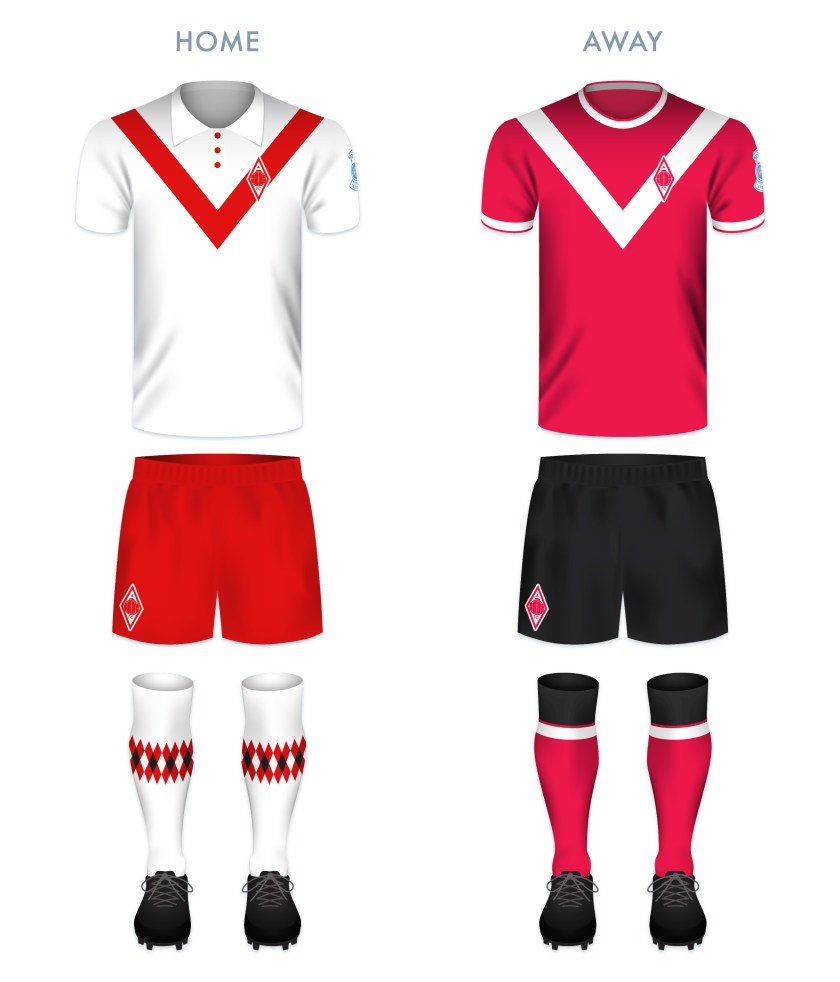
The club’s first kit consisted of a shirt of green and white hoops, similar to those first adopted by Celtic that same year. In 1911, the green and white was swapped for black and gold, which has remained the club’s primary colour scheme ever since.

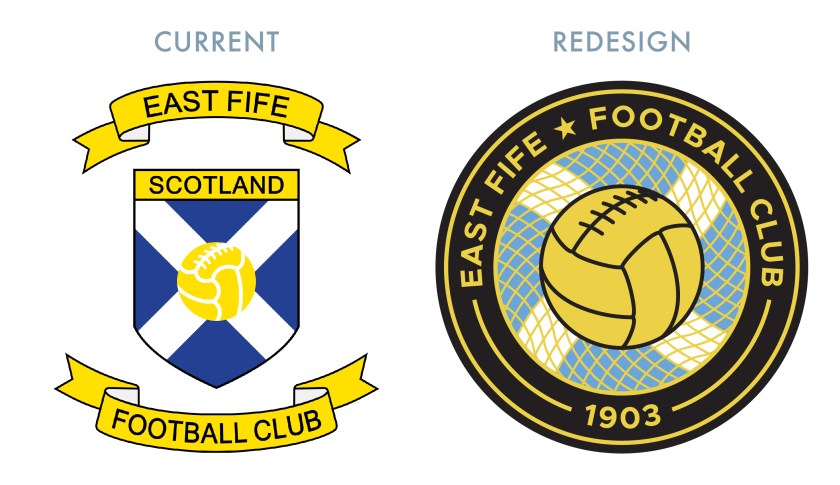
The Fifers first began using a badge on their kit in 1950. This original badge consisted of a shield, divided into thirds. The top portion of the shield featured the club’s initials, while the middle featured a Saltire and the bottom featured a thistle. This badge was used until 1970, when it was replaced by the club’s initials alone. Some variation of the initials remained until 1991, when the first version of the current badge was introduced. Like the 1950 badge, the current badge features a Saltire, with the addition of a superimposed football.

With my redesign, I decided to move away from the above monogram, as well as the current shield, in favour of a round badge. I included the Saltire in my latest redesign as it is the only consistent feature among East Fife’s historical badges. (The omission of a Saltire within a shield also avoids a potential confrontation with the Court of the Lord Lyon.) The Saltire is enclosed in a circle, behind a gold fishing net, a reference to the prevalent fishing industry in East Fife. The historic burgh seals of every settlement on the coast in East Fife feature either the Firth of Forth, fishing boats, fishing nets or fish (or a combination of several of these), including the burgh seal of Buckhaven, Methil and Innerleven, the locale of East Fife FC. The fishing net also acts as a goal net, receiving a football. Lastly, I placed a star in the outer ring, commemorating East Fife’s 1937/38 Scottish Cup victory.

EFFC badge-01

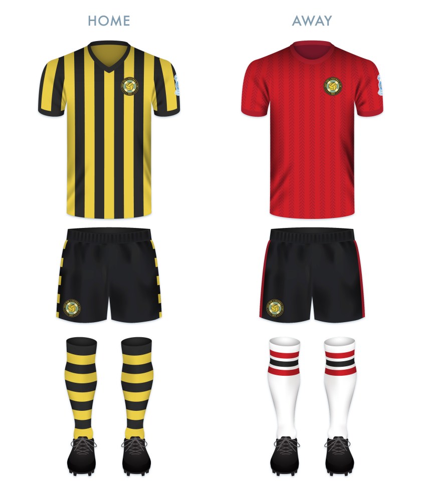
For the home kit, I went with the club’s traditional black and gold vertical stripes with black shorts. I also included black and gold hooped socks, last worn in 1939. For the away shirt, I employed red with dark red herringbone stripes.

EFFC kit-01

EFFC badge new-01

As ever, I am indebted to Dave at Historical Football Kits for some of the historical information used above.

13 May 201824 February 2020 E Tagged badge, brand, branding, East Fife, East Fife FC, East Fife Football Club, Europe, Fife, Fifers, football, Kingdom of Fife, Ladbrokes League 1, Ladbrokes League One, logo, Methil, monogram, rebrand, redesign, Saltire, Scotland, Scottish Cup, Scottish League 1, Scottish League Cup, Scottish League One, Scottish Professional Football League, SPFL, SPFL League 1, SPFL League One, sport, texture, The Fife, The Fifers, UK, United Kingdom Leave a comment

ReBrand: Alloa Athletic FC

graphic

AAFC badge new-01Alloa Athletic Football Club was established as Clackmannan County Football Club in 1878. The following season, the club changed its name to the Alloa Association Football Club. The local press misinterpreted ‘AAFC’ as Alloa Athletic Football Club, which became the club’s official name from 1883. That same year, the club was admitted to the Scottish Football Association.

In these early decades, Alloa competed in the now-defunct Scottish Football Union and then the Central Football League. After the First World War, in 1921, the Central Football League was absorbed into the Scottish Football League as the Second Division. That season, Alloa won the title, gaining promotion to the top flight for the first time. This spell was short-lived, as the club was relegated after only one season. Alloa returned to the top flight in the 1938/39 season, but with the outbreak of the Second World War, regular league football was put on hold and Alloa would not return to the top tier.

Alloa’s first shirt, from its Clackmannan County days, consisted of black and orange hoops. From 1898 until 1972, the black and orange (or gold) hoops became the club’s standard and they gained the nickname ‘the Wasps’. (The hoops disappeared for a couple of decades, apparently as a cost-saving measure.) Alloa’s kit first featured a badge in 1985. This badge consisted of a more-or-less anatomically accurate rendering of a wasp within a shield. Some version of this badge remained until the current badge was adopted in 2010.

Due to the state of the club’s current badge—in my opinion, far and away the most absurd badge in all of Scottish professional football—I have had my sights set on redesigning Alloa’s badge from several years. Ignoring the illustrative style (which I consider to be farcical, at best), I have difficulty connecting the sleeveless, muscular wasp (with only two limbs, neither of which are legs) with a football club. I toyed with utilising a more identifiably wasp-like illustration, similar to those used by the club from 1985 until 2010, but ultimately, I found the use of the wasp altogether unsatisfactory.

In searching for an alternative, the hexagonal honeycomb concept came to mind. Wolverhampton Wanderers have used a hexagonal badge since 2002 (adapted from the shape of their minimalistic wolf’s head, first used in 1979), though their badge, which sees the hexagon set at 30°, played no influence in my redesign.

The football at the centre of my redesigned badge is of nineteenth-century design, though its sharp angles are made to emphasise the modernistic feel of the new badge. The black band running through the centre of the badge, which bears the year of the club’s founding, echoes the hoop design of the traditional Alloa home shirt.

AAFC badge-01

For the home kit redesign, I went with the classic black and gold hoops, complete with a 1970s-styled collar (an admitted anachronism given that this type of collar was used during the ‘cost-saving-no-hoops’ kits of the 1970s). Clean lines throughout emphasise the modern element of the kit. The away kit a variation of the current away kit, with an inadvertent Boca Juniors feel.

AAFC kit-01

AAFC badge new-01

As ever, I am indebted to Dave at Historical Football Kits for some of the historical information used above.

11 May 20189 June 2021 E Tagged Alloa, Alloa AFC, Alloa Association FC, Alloa Association Football Club, Alloa Athletic, Alloa Athletic FC, Alloa Athletic Football Club, badge, brand, Championship Division, Clackmannan County, Clackmannan County FC, Clackmannan County Football Club, Clackmannanshire, crest, Europe, football, logo, rebrand, redesign, Scotland, Scottish Professional Football League, SPFL, SPFL League 1, SPFL League One, sport, texture, The Wasps, UK, Wasps Leave a comment

ReBrand: Airdrieonians FC

graphic

AirFC badge new-01The original Airdrieonians Football Club began its life as Excelsior Football Club in 1878. In 1881, the club’s name was changed to Airdrieonians and it continued as such until its demise in 2002.

Throughout the 1920s, this original Airdrieonians FC proved to be a competitive side within Scottish football. The club finished second in the league on four consecutive occasions from the 1922/23 season until the 1925/26 season (behind Rangers for the first three and Celtic for the fourth) and defeated Hibernian 2-0 in the 1923/24 Scottish Cup final. But after this era, Airdrieonians never again rose to such great heights.

In 1912, Airdrieonians adopted its distinctive shirt designs – a white field featuring a red ‘diamond’ (seen as a ‘V’ on both the front and backs of the club’s shirts). As a result of this design, which the club used throughout the remainder of its existence, Airdrieonians became known as ‘the Diamonds’.

After this original club folded, a new Airdrie club, called Airdrie United, was formed. Technically speaking, Airdrie United’s admittance into the Scottish Football League was the result of the organisation’s buyout and subsequent renaming of the original Clydebank FC. Airdrie United then became, for all intents and purposes, the new Airdrieonians, using the same home ground (Excelsior Stadium) and wearing the same diamond motif on its white shirts. This club became known as Airdrie in 2012 and then revived the Airdrieonians name in 2013.

As far as badges go, recently, the club has been the subject of a rather widely-publicised campaign. The Airdrieonians badge, first used by the original AFC in 1974 and then adopted by the new AFC when it revived the name in 2013, featured a shield, within which were the club’s initials and two lions passant, one above and one below the initials. In March 2015, the Court of the Lord Lyon informed the club that this badge did not comply with an ancient Scottish law forbidding the use of lettering within an heraldic device, such as a shield (a legal challenge that has proven or could prove problematic with a number of other clubs). In response, the club adopted an altered badge, omitting the shield though all but implying it by including a red chevron shape where the base of the shield once was. This chevron was included so as to mirror the ‘diamond’ that had adorned the AFC kits for more than a century.

For my redesign, I considered the heraldic images in the current badge, but took minor issue with the current badge’s use of the chevron shape. It has long been the conviction of Airdrieonians supporters that the ‘V’ on the front of the shirt is, in fact, neither a ‘V’ nor a chevron, but one half of a diamond. Being that the club’s nickname is ‘the Diamonds’, I wanted to emphasise that shape. When elongated horizontally, the diamond would bear too much resemblance to the Umbro logo. A vertically-elongated diamond badge is used by the German club Borussia Mönchengladbach, but I thought that I might be able to produce a very different badge within the same shape.

I illustrated a nineteenth-century football to occupy the middle of the badge and built the simple ‘AFC’ lettering around it, which can be seen below. I include no founding date as the current club has only existed since 2002. But for those who see the current Airdrieonians FC as a continuation of the original club, I believe that both the retro football and the diamond shape call back to that heritage sufficiently.

AirFC badge-01

While I made a clear departure from the 1974 badge, I see the ‘Airdrie Diamond’ as the classic and essential AFC kit and for my kit redesigns, I only added my own personal touch, including the argyle-patterned socks.

AirFC kit-01

AirFC badge new-01

As ever, I am indebted to Dave at Historical Football Kits for some of the historical information used above.

6 May 201824 February 2020 E Tagged Airdrie, Airdrie FC, Airdrie Football Club, Airdrie United, Airdrie United FC, Airdrie United Football Club, Airdrieonians, Airdrieonians FC, Airdrieonians Football Club, badge, brand, Clydebank, Clydebank FC, Clydebank Football Club, Court of the Lord Lyon, crest, design, Europe, Excelsior, Excelsior FC, Excelsior Football Club, Excelsior Stadium, football, Ladbrokes League 1, Ladbrokes League One, League 1, League One, logo, Lord Lyon, Lord Lyon King of Arms, North Lanarkshire, rebrand, redesign, Scotland, Scottish Professional Football League, SPFL, SPFL League 1, SPFL League One, sport, texture, UK, United Kingdom Leave a comment

ReBrand: Falkirk FC

graphic

FFC badge new-01Falkirk Football Club was established in 1876 and joined the Scottish Football Association two years later. During these early years, ‘the Bairns’ (a [primarily] eastern Scots word meaning ‘children’ and for natives of Falkirk, in general) competed in the early rounds of the Scottish Cup and played matches as part of the Stirlingshire Football Association.

In 1902, the top tier of the Scottish Football League expanded from 10 to 12 clubs, which opened two vacancies in the second tier. These went to Raith Rovers and Falkirk. After only three seasons, the Bairns were promoted to the top flight.

The club boasts such honours as two Scottish Cup victories (1912/13 and 1956/57) in five appearances, as well as the somewhat dubious honour of having won the Scottish Challenge Cup—a competition open only to clubs that do not play in the top tier—a record-tying four times (an honour shared with St Johnstone).

More recently, as a result of reaching the final of the 2008/09 Scottish Cup, Falkirk competed in the inaugural UEFA Europa League competition in the 2009/10 season. Despite tasting European competition for the first time, Falkirk was relegated from the top tier of the Scottish Professional Football League by the end of the season. The Bairns competed in the second tier until the end of the 2018/19 season, when the club was relegated to League One (the third tier) after finishing at the bottom of the table.

Some of Falkirk’s early shirts featured what may or may not be Masonic crosses as badges, but the club did not feature a regular badge until 1909, when a crest was utilised. This crest was based on the coat of arms of the burgh of Falkirk and featured a crowned lion supporting a shield which bore the coat of arms of the Callendar family, who long held a seat of power in Falkirk. The Falkirk shirt bore two other badges before 1974, when a variation of the current badge first appeared. This badge features a football bearing a highly-stylised silhouette of the Falkirk Town Steeple. With the exception of the 2007/08 season, the steeple-fronted football has remained the primary badge for the club.

Falkirk’s badge redesign is one with which I have wrestled for a time. Because of the effectiveness of this 1974 badge, I found it very difficult to depart from the steeple image. Despite this, given that the depiction of the steeple on the current badge in no way resembles the actual Falkirk Town Steeple, and because I don’t find the steeple particularly inspiring as far as what might be affected in the viewer from a more realistic rendering, I decided to do away with the steeple image all together – no doubt, a very controversial move to Falkirk supporters. Instead, I opted for something more in line with the traditional heraldry associated with the town and club.

The shape of the central shield is inspired by the shield that enclosed the steeple badge on the Falkirk strip from 2010 to 2013. The image in the shield is a depiction of the Callendar family coat of arms, used in the Falkirk coat of arms and similar to what was used in the original 1909 badge. This shows two sets of three billets (sheets of paper), divided by an embattled bend (a normal bend would appear as a solid ribbon running diagonally across a shield), representing the Antonine Wall (built by the Romans between 142 and c.154), which passed through the town. Within the bend we find two sets of shields and swords. These represent two significant battles in Falkirk history: King Edward I of England’s defeat of Sir William Wallace in 1298 and the Jacobite victory over the Hanoverian army in 1746. Between the two is a church, the ‘Fa’ Kirk’ (which may mean either ‘the speckled church’ or the ‘church by the wall’) from which the town gets its name.

FFC badge-01 2

The kits are built on traditional Falkirk colour schemes. The home kit is inspired specifically by the 1937/38 home kit.

FFC kit-01

FFC badge new-01

As ever, I am indebted to Dave at Historical Football Kits for some of the historical information used above.

29 April 201824 February 2020 E Tagged badge, Bairns, brand, crest, Europe, Falkirk, Falkirk FC, Falkirk Football Club, football, logo, rebrand, redesign, Scotland, Scottish League 1, Scottish League One, Scottish Professional Football League, SPFL, SPFL Championship, SPFL League 1, SPFL League One, sport, texture, The Bairns, UK Leave a comment

Posts navigation

← Previous
Widgets
Create a website or blog at WordPress.com
Privacy & Cookies: This site uses cookies. By continuing to use this website, you agree to their use.
To find out more, including how to control cookies, see here: Cookie Policy
  • Follow Following
    • ellliottt
    • Join 53 other followers
    • Already have a WordPress.com account? Log in now.
    • ellliottt
    • Customize
    • Follow Following
    • Sign up
    • Log in
    • Report this content
    • View site in Reader
    • Manage subscriptions
    • Collapse this bar
 

Loading Comments...