ellliottt

design & illustration

Menu

Skip to content
  • HOME
  • ABOUT
  • GRAPHIC
    • ALL GRAPHIC DESIGN
    • AUTOMOTIVUS
    • REBRAND: SPFL
      • Premiership
        • Aberdeen
        • Celtic
        • Dundee United
        • Heart of Midlothian
        • Hibernian
        • Kilmarnock
        • Livingston
        • Motherwell
        • Rangers
        • Ross County
        • St Johnstone
        • St Mirren
      • Championship
        • Arbroath
        • Ayr United
        • Cove Rangers
        • Dundee
        • Greenock Morton
        • Hamilton Academical
        • Inverness CT
        • Partick Thistle
        • Queen’s Park
        • Raith Rovers
      • League One
        • Airdrieonians
        • Alloa Athletic
        • Clyde
        • Dunfermline Athletic
        • FC Edinburgh
        • Falkirk
        • Kelty Hearts
        • Montrose
        • Peterhead
        • Queen of the South
      • League Two
        • Albion Rovers
        • Annan Athletic
        • Bonnyrigg Rose
        • Dumbarton
        • East Fife
        • Elgin City
        • Forfar Athletic
        • Stenhousemuir
        • Stirling Albion
        • Stranraer
    • REBRAND: SHFL
      • Brechin City
      • Brora Rangers
      • Buckie Thistle
      • Clachnacuddin
      • Deveronvale
      • Formartine United
      • Forres Mechanics
      • Fraserburgh
      • Huntly
      • Inverurie Loco Works
      • Keith
      • Lossiemouth
      • Nairn County
      • Rothes
      • Strathspey Thistle
      • Turriff United
      • Wick Academy
    • REBRAND: SLFL
      • Berwick Rangers
      • Bo’ness United
      • Broomhill
      • Caledonian Braves
      • Civil Service Strollers
      • Cowdenbeath
      • Cumbernauld Colts
      • Dalbeattie Star
      • East Kilbride
      • East Stirlingshire
      • Edinburgh University
      • Gala Fairydean Rovers
      • Gretna 2008
      • Spartans
      • Tranent Juniors
      • University of Stirling
  • 2D
  • 3D
    • ALL 3D
    • INSTALLATION
  • PHOTO
  • SHOP

design

ReBrand: Stranraer FC

graphic

StrFC badge new-01Stranraer Football Club was established in 1870, making it the third-oldest club in Scotland, after Queen’s Park, (1867) and Kilmarnock (1869).

Due to Stranraer’s relatively remote location, fixtures in these early years were often played away from the town, in other parts of Wigtownshire, in Kirkcudbrightshire and even as far north as Ayrshire. Finally, in 1907, a permanent home was found in the town and Stair Park came to be. By the 1955/56 season, Stranraer began competing as full members of the Scottish Football League.

Stranraer first used a badge on their kit in the mid-1950s. This badge consisted of a red shield enclosing the club’s initials in white. This badge was used until 1961, when it was replaced with another red and white shield, this time, with the club’s initials above a ship at sea, the ship taken from the town’s coat of arms. Some variation of this badge remained until 1988, when a shield featuring only a ship at sea was enclosed by a ring with the club’s name and year of founding. The current badge in an updated version of this 1988 badge.

In redesigning Stranraer’s badge, I considered the two other clubs which feature a ship in full sail on their current badge: Greenock Morton (1874) and Clyde (1877). The ship on Clyde’s badge, from what I can tell, came into being in the mid-1930s. Morton’s badge did not feature a ship until 1978. Given the length of time that Clyde’s badge has been in use and given that I did not want my Stranraer badge redesign to be too similar to either the current badge or the Stranraer coat of arms, I decided to include a ship in my redesign of Clyde’s badge alone.

For Stranraer, I settled on a ship’s wheel, as it is distinct among all football badges, it is a timeless symbol (which ties both to the club’s age and to Stranraer’s significance as a port town) and it lends itself to a round badge. I have gone out on a limb so as to include the wheel’s handles beyond the bounds of the badge ring. A t-panelled football sits at the centre of the badge and I have added a second tone of blue to give the badge an extra bit of ‘pop’.

StrFC badge-01

In redesigning the home kit, I first experimented with a wave pattern, but determined that, along with the ship’s wheel badge, this would be over the top. Instead, I have used the traditional Stranraer blue shirt with white accents, drawing particular inspiration from the very tasteful 2008/09 home shirt. The away shirt is bright yellow, with a mustard harlequin pattern, inspired in part by the 1996/97 home kit.

StrFC kit-01

StrFC badge new-01

As ever, I am indebted to Dave at Historical Football Kits for some of the historical information used above.

Advertisement
18 May 201816 June 2020 E Tagged badge, Blues, brand, crest, design, Dumfries and Galloway, Dumfriesshire, Europe, football, Inch, logo, rebrand, redesign, Scotland, Scottish League 2, Scottish League Two, Scottish Professional Football League, SPFL, SPFL League 2, SPFL League Two, sport, Stranraer, Stranraer FC, Stranraer Football Club, The Blues, UK, United Kingdom Leave a comment

ReBrand: Stenhousemuir FC

graphic

SteFC badge new-01.jpgStenhousemuir Football Club was established in 1884 after breaking away from local junior side Heather Rangers Football Club. By 1890, the club was playing their home matches at Ochilview Park, where they have played ever since. In 2009, Stenhousemuir became the first football club in Scotland to become a Community Interest Company (CIC).

The club’s shirt did not feature a badge until 1984, marking their centenary year. This first badge was an odd number, featuring the club’s sponsor, Hogan Sports (written as ‘Hogan’s Sports’ on the badge). From 1985 until 1991, Stenhousemuir’s shirts featured a stylised ‘SFC’ monogram. This was replaced by a heraldic badge, which did not find favour with the club’s supporters. The heraldic emblem was abandoned after two seasons, when a round badge, derived from the 1985 monogram, was introduced. The Stenhousemuir badge has been based on this 1993 design ever since.

For my redesign, I wanted to hold to the spirit of the quirky brown-and-amber 1993 badge. I decided that the badge could benefit from a local or historical reference, without diving into a full-on heraldic design. The town of Stenhousemuir comes from a particular stone structure (‘sten house’ = ‘stone house’). This round structure, referred to as ‘Arthur’s O’en’ (‘Arthur’s Oven’) was most likely a Roman temple and stood to the north of the River Carron. It was demolished in 1743, but not before some detailed illustrations of it were made. One particular illustration of the foundation of the temple served as my inspiration as I found that it suited a round badge. The entrance to the temple also serves as a handsome frame for the lowest terminus of the ‘F’ in my new monogram. My redesign featuring a new monogram and an illustration of the temple’s foundation is found below:

SteFC badge-01

The redesigned kits are based on traditional Stenhousemuir colours, with the home kit inspired primarily by the 2017/18 home kit and the away kit inspired primarily by 2003/04 away kit, with a wee touch of 1980s Adidas kits.

SteFC kit-01

SteFC badge new-01.jpg

As ever, I am indebted to Dave at Historical Football Kits for some of the historical information used above.

16 May 201824 February 2020 E Tagged badge, brand, CIC, Community Interest Company, crest, design, Europe, Falkirk, football, Heather Rangers, Heather Rangers FC, Heather Rangers Football Club, Heather Rangers Juniors, logo, rebrand, redesign, Scotland, Scottish League 2, Scottish League Two, Scottish Professional Football League, SPFL, SPFL League 2, SPFL League Two, sport, Stenhousemuir, Stenhousemuir FC, Stenhousemuir Football Club, Stenhousemuir Football Club Community Interest Company, Stenny, Stenny FC, The Warriors, UK, United Kingdom, Warriors Leave a comment

ReBrand: Raith Rovers FC

graphic

RRFC badge new-01Raith Rovers Football Club was established in 1883. The club draws its name, Raith, from a vague historical association with the region of Fife from Kirkcaldy (where the club is based) to Lochgelly.

Throughout their history, the Rovers have won the second tier on five occasions and have appeared in the Scottish Cup final once, losing 2-0 to Falkirk in 1912/13. The club reached the final of the 1948/49 Scottish League Cup, but experienced another 2-0 loss, this time to Rangers. The club would have to wait until 1994/95 League Cup final to receive their first and only major honour to date, defeating Celtic 6-5 on penalties after ending extra time 2-2.

The Rovers first used a badge on their kits during the 1912/13 season. This early badge included a lion rampant holding a belt buckle, the latter of which being derived from the Kirkcaldy coat of arms. A variation of this badge was used until the 1949/50 season, when the Scottish royal coat of arms, featuring a yellow shield with a red lion rampant, was used to mark the Rovers’ promotion to the Scottish top tier. The following season, the more traditional badge returned to the kit.

By the 1960s, crests became less popular in Scottish football in favour of calligraphic club initials. A new badge was used intermittently between 1976 and 1985, when another badge came into use. By 1998, the traditional badge was again reinstated and some variation of this badge has been used ever since.

For years I assumed, having only seen the badge at a relative distance or in a low resolution, that the Rovers’ insignia was a depiction of a horse holding a globus cruciger (Latin for ‘cross-bearing orb’), a medieval symbol representing the authority of Christ or Christianity over the world. For my redesign, I sought to make both the lion rampant and the buckle more identifiable. I have also included the club’s name within a banner, which resembles the Scottish Football Association crest used until 2012. This is also a call back to the 1949/50 season, when the Rovers were promoted to the top tier and their badge was nearly identical to that used by the Scottish national team.

RRFC badge-01

The home kit is inspired by the Rovers’ home kits from 1950 to 1954, in particular, the kit worn during the 1953/54 season. The away kit is a hooped version of the Rovers’ traditional red away colour scheme.

RRFC kit-01

RRFC badge new-01

As ever, I am indebted to Dave at Historical Football Kits for some of the historical information used above.

16 May 201824 February 2020 E Tagged badge, brand, buckle, crest, design, Europe, Ferguson, Fife, football, Kirkcaldy, lion rampant, logo, Raith, Raith Rovers, Raith Rovers FC, Raith Rovers Football Club, rebrand, redesign, Rovers, RRFC, Scotland, Scottish League 1, Scottish League One, Scottish Professional Football League, SPFL, SPFL League 1, SPFL League One, sport, The Rovers, UK, United Kingdom 1 Comment

ReBrand: Airdrieonians FC

graphic

AirFC badge new-01The original Airdrieonians Football Club began its life as Excelsior Football Club in 1878. In 1881, the club’s name was changed to Airdrieonians and it continued as such until its demise in 2002.

Throughout the 1920s, this original Airdrieonians FC proved to be a competitive side within Scottish football. The club finished second in the league on four consecutive occasions from the 1922/23 season until the 1925/26 season (behind Rangers for the first three and Celtic for the fourth) and defeated Hibernian 2-0 in the 1923/24 Scottish Cup final. But after this era, Airdrieonians never again rose to such great heights.

In 1912, Airdrieonians adopted its distinctive shirt designs – a white field featuring a red ‘diamond’ (seen as a ‘V’ on both the front and backs of the club’s shirts). As a result of this design, which the club used throughout the remainder of its existence, Airdrieonians became known as ‘the Diamonds’.

After this original club folded, a new Airdrie club, called Airdrie United, was formed. Technically speaking, Airdrie United’s admittance into the Scottish Football League was the result of the organisation’s buyout and subsequent renaming of the original Clydebank FC. Airdrie United then became, for all intents and purposes, the new Airdrieonians, using the same home ground (Excelsior Stadium) and wearing the same diamond motif on its white shirts. This club became known as Airdrie in 2012 and then revived the Airdrieonians name in 2013.

As far as badges go, recently, the club has been the subject of a rather widely-publicised campaign. The Airdrieonians badge, first used by the original AFC in 1974 and then adopted by the new AFC when it revived the name in 2013, featured a shield, within which were the club’s initials and two lions passant, one above and one below the initials. In March 2015, the Court of the Lord Lyon informed the club that this badge did not comply with an ancient Scottish law forbidding the use of lettering within an heraldic device, such as a shield (a legal challenge that has proven or could prove problematic with a number of other clubs). In response, the club adopted an altered badge, omitting the shield though all but implying it by including a red chevron shape where the base of the shield once was. This chevron was included so as to mirror the ‘diamond’ that had adorned the AFC kits for more than a century.

For my redesign, I considered the heraldic images in the current badge, but took minor issue with the current badge’s use of the chevron shape. It has long been the conviction of Airdrieonians supporters that the ‘V’ on the front of the shirt is, in fact, neither a ‘V’ nor a chevron, but one half of a diamond. Being that the club’s nickname is ‘the Diamonds’, I wanted to emphasise that shape. When elongated horizontally, the diamond would bear too much resemblance to the Umbro logo. A vertically-elongated diamond badge is used by the German club Borussia Mönchengladbach, but I thought that I might be able to produce a very different badge within the same shape.

I illustrated a nineteenth-century football to occupy the middle of the badge and built the simple ‘AFC’ lettering around it, which can be seen below. I include no founding date as the current club has only existed since 2002. But for those who see the current Airdrieonians FC as a continuation of the original club, I believe that both the retro football and the diamond shape call back to that heritage sufficiently.

AirFC badge-01

While I made a clear departure from the 1974 badge, I see the ‘Airdrie Diamond’ as the classic and essential AFC kit and for my kit redesigns, I only added my own personal touch, including the argyle-patterned socks.

AirFC kit-01

AirFC badge new-01

As ever, I am indebted to Dave at Historical Football Kits for some of the historical information used above.

6 May 201824 February 2020 E Tagged Airdrie, Airdrie FC, Airdrie Football Club, Airdrie United, Airdrie United FC, Airdrie United Football Club, Airdrieonians, Airdrieonians FC, Airdrieonians Football Club, badge, brand, Clydebank, Clydebank FC, Clydebank Football Club, Court of the Lord Lyon, crest, design, Europe, Excelsior, Excelsior FC, Excelsior Football Club, Excelsior Stadium, football, Ladbrokes League 1, Ladbrokes League One, League 1, League One, logo, Lord Lyon, Lord Lyon King of Arms, North Lanarkshire, rebrand, redesign, Scotland, Scottish Professional Football League, SPFL, SPFL League 1, SPFL League One, sport, texture, UK, United Kingdom Leave a comment

ReBrand: Dunfermline Athletic FC

graphic

DAFC badge new-01The history of association football in Scotland is tied inextricably to cricket. Along with clubs such as Kilmarnock, St Johnstone, St Mirren and potentially Heart of Midlothian, Dunfermline Athletic was established as a winter sporting pursuit in the cricket off-season.

The original club was called Dunfermline Football Club and was established in 1874. In order that non-cricket club members could join, Dunfermline FC broke away from the cricket club and became Dunfermline Athletic FC in 1885.

Dunfermline Athletic, or ‘the Pars’, as they are known, had a shot at their first major honour when they reached the final of the 1949/50 Scottish League Cup at Hampden Park. There, they faced their fellow Fifers, East Fife, who had won the competition two years earlier. The Pars were unlucky that day, losing 3-0, but a decade later they would have another opportunity at silverware.

On 26 April 1961, the Pars defeated Celtic 2-0 in the Scottish Cup final replay. Celtic would return the favour by defeating the Pars 3-2 in the 1964/65 final of the same competition. But the Pars’ tenacity brought the Scottish Cup back to East End Park after the club defeated Hearts in the 1967/68 final. It should also be noted that the Pars beat holders Celtic, fresh off of their illustrious 1966/67 season, in the first round of the 1967/68 Scottish Cup.

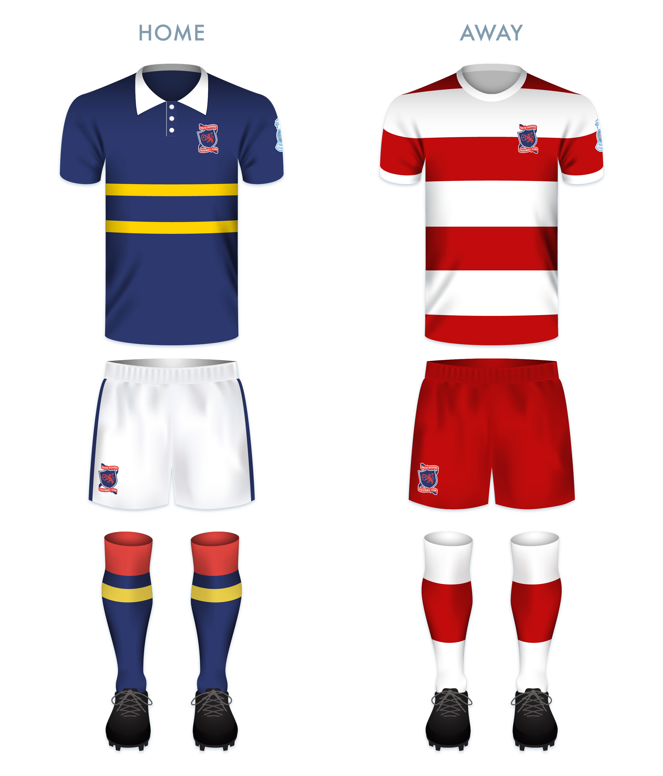
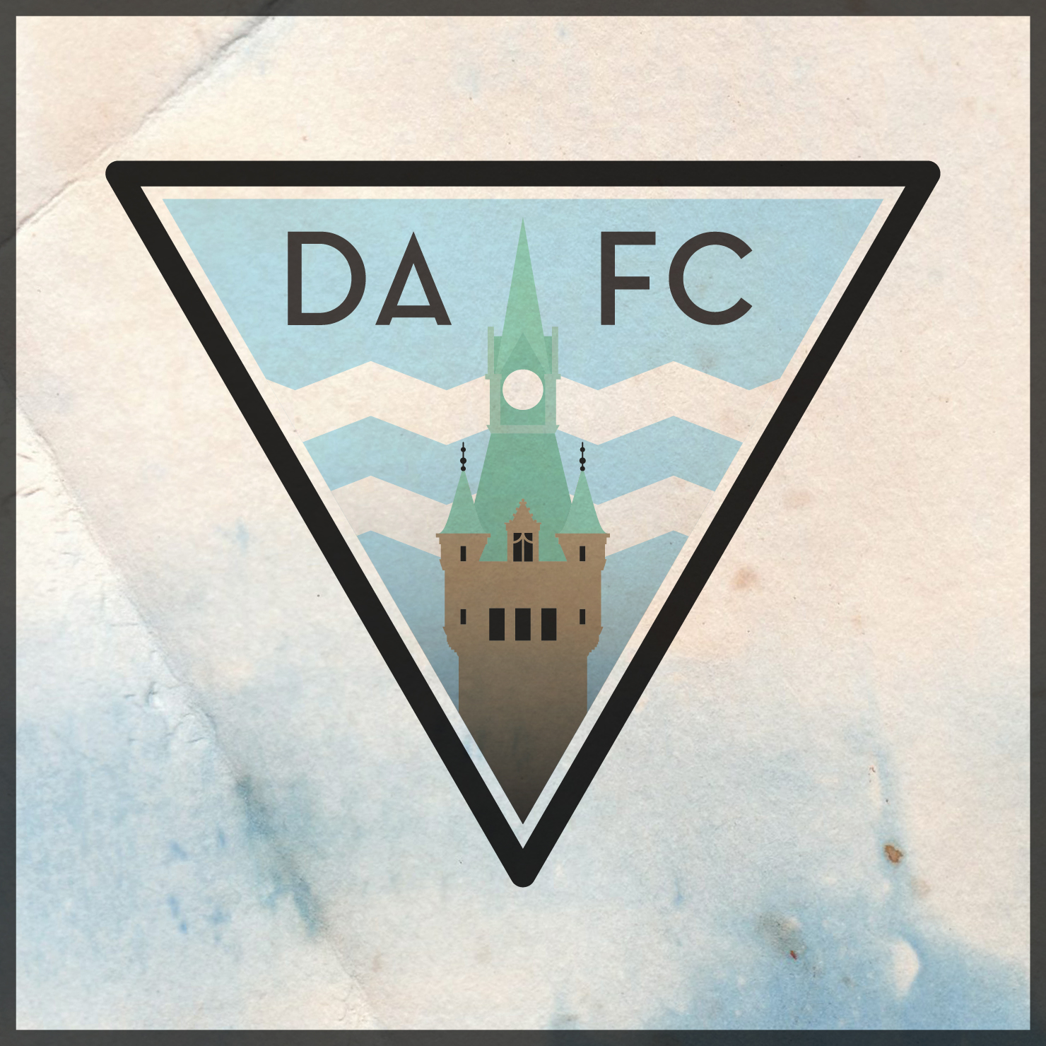
The Dunfermline Athletic kit did not include a badge until the 1958/59 season, when the club employed the skills of Dunfermline High School art teacher Colin Dymock. Dymock’s badge was thoroughly modern in shape, colour and design. It took the shape of a downward-pointing triangle and featured Malcolm’s Tower, a local landmark, as its centrepiece. This original badge was dropped from the kit in 1962.

The Pars’ shirt featured an encircled ‘DAFC’ monogram for the 1971/72 season and then from 1977 until 1986, home shirts featured the club’s initials alone. For the 1986/87 season, the club began to use a slight variation on Dymock’s 1958 badge design, and similar badges have adorned the breast of the Dunfermline Athletic shirt ever since.

The current Dunfermline Athletic badge is a cracker. When the first version was introduced in 1958, it would have been ground-breaking (and perhaps polarising). But it has become a cherished staple of the Dunfermline Athletic identity. That being stated, I find the badge very unrelatable. Malcolm’s Tower, named after Malcolm III of Scotland (Gaelic: Máel Coluim mac Donnchada, who reigned from 1058 to 1093), is a very historically significant site as it marks the move of the seat of royal power from Forteviot in Strathearn (modern-day Perth and Kinross) to Dunfermline. A crude depiction of the tower has featured in the Dunfermline coat of arms for centuries. But all that remains of the tower today is a foundational ruin and its precise design is unknown. As a result, Dymock’s design is simply an interpretation of what the tower might have looked like, and in a fragmented, modern style.

The challenge of redesigning such a unique and iconic badge has been floating around in my mind for a while now. I struggled while considering what iconography I might employ. Given my perception of the unrelatable nature of the 1958 badge, I wanted to offer something either more familiar or entirely different. I opted to retain the iconic triangular shape of the badge, but instead of Malcolm’s Tower, I decided to make use of one of Dunfermline’s most physically prominent and handsome landmarks: the clock tower of the City Chambers. With its striking green roof of oxidised copper and its skilful combination of French, Gothic and Scots baronial architectural styles, I believe that the clock tower proves to be a very fitting centrepiece for the redesigned badge. I also incorporated the zig-zagged white cloud stripes from the 1958 badge and lightened the blue background to sky blue.

DAFC badge-01

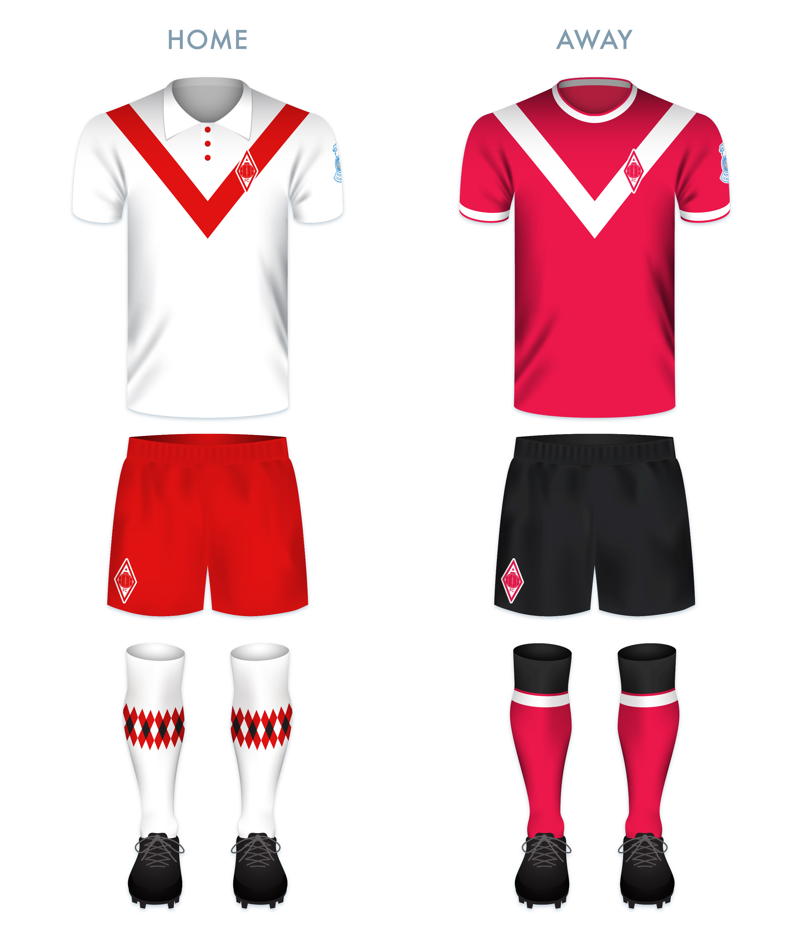
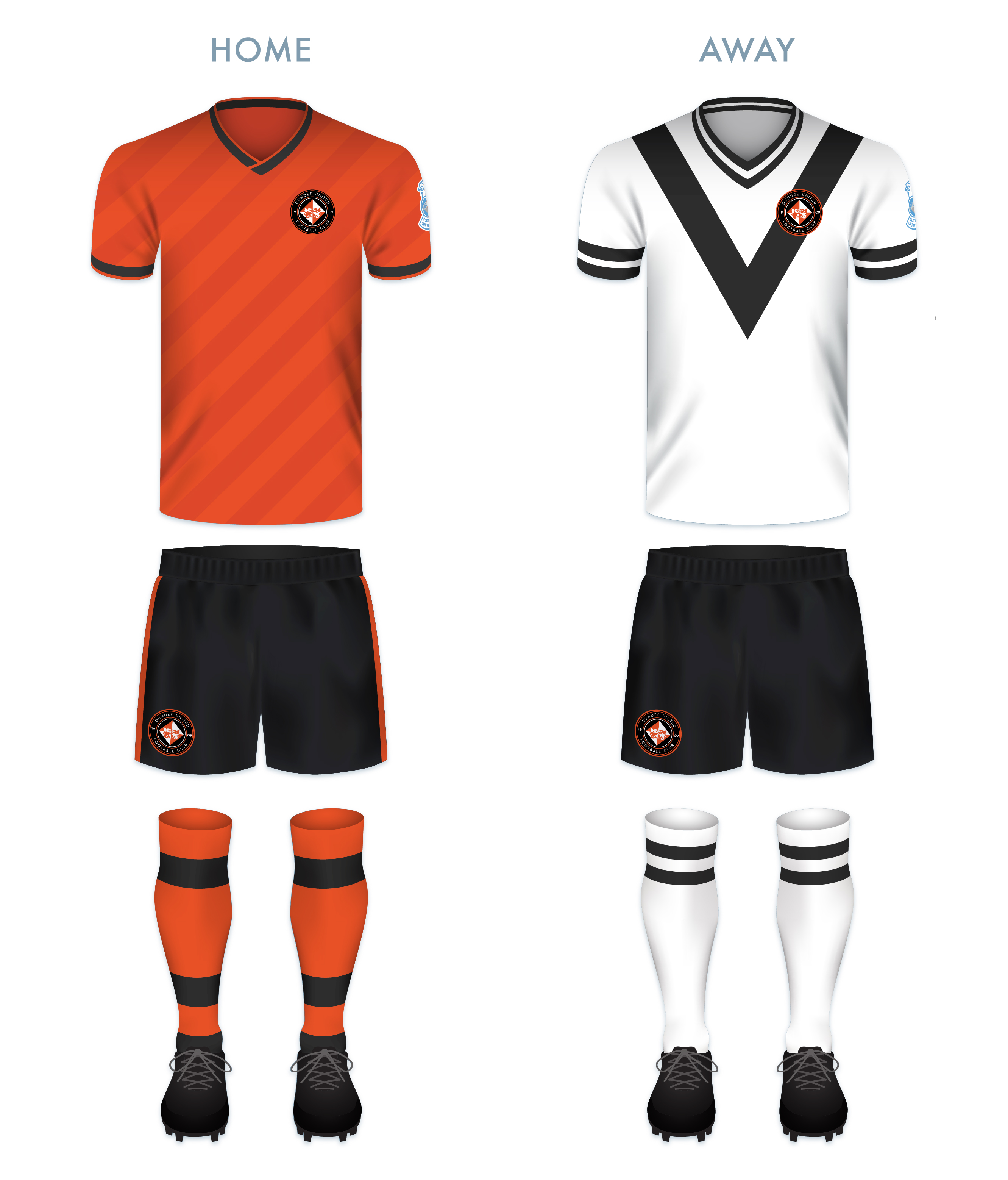
For the home shirt, I decided to continue with the Pars’ long tradition of black and white vertical stripes (in near-constant use since 1909), but with a pattern that echoes the triangular badge. For the away strip, I decided to make use of red (the predominant away strip colour over the last two decades) with a black gingham pattern (inspired by the 1996/97 home strip).

DAFC kit-01

DAFC badge new-01

As ever, I am indebted to Dave at Historical Football Kits for some of the historical information used above.

28 April 201824 February 2020 E Tagged badge, brand, Championship Division, Colin Dymock, crest, DAFC, design, Dunfermline, Dunfermline Athletic, Dunfermline Athletic FC, Dunfermline Athletic Football Club, Dunfermline City Chambers, Dunfermline Cricket Club, Dunfermline FC, Dunfermline Football Club, emblem, Europe, Fife, football, James Campbell Walker, Kingdom of Fife, Ladbrokes Championship, logo, Malcolm III, Malcolm III of Scotland, Pars, rebrand, redesign, Scotland, Scottish Championship, Scottish Professional Football League, SPFL, SPFL Championship, sport, texture, The Pars, UK, United Kingdom 2 Comments

ReBrand: Dundee United FC

graphic

DUFC badge new-01It is recorded that by the middle of the nineteenth century, nearly 20% of Dundee’s population were Irish-born immigrants. As Hibernian had been established in 1875 in order to provide opportunity for young Irish Catholic immigrants in Edinburgh, the Irish Catholic community in Dundee formed their own club in 1879 – Dundee Harp.

One match of note took place on 12 September 1885, when Dundee Harp racked up a remarkable 35-0 victory over Aberdeen Rovers (who competed from 1884 until 1889). What makes this feat even more peculiar is that it happened on the very same day that Arbroath achieved their record 36-0 victory over Bon Accord, the largest margin of victory in world football until 2002. Needless to say, 12 September 1885 was a bad day to be an Aberdonian club.

By 1894, Dundee Harp was facing serious financial difficulties, resulting in suspension by the SFA and eventual dissolution.

In 1909, Dundee Hibernian Football Club was formed with a mission similar to that of Edinburgh’s Hibernian, Dundee Harp and Celtic. After only one season, Dundee Hibernian were admitted into the Scottish Football League. In order to appeal to a base beyond the Irish Catholic community in Dundee, the club changed their name to Dundee United in 1923. The name ‘Dundee City FC’ had been floated, but this was protested by the club’s cross-town rivals, Dundee FC.

In the 1924/25 season, Dundee United secured promotion to the top tier for the first time. They remained there for two seasons, being relegated in 1927 and then returning in 1929. This 1928/29 second tier championship would be United’s last major honour for more than 50 years, when they won two consecutive Scottish League Cups (1979/80 and 1980/81). These League Cup victories signalled the beginning of the ‘New Firm’, when both United and Aberdeen would prove themselves as worthy competitors against Celtic and Rangers. United was also a relatively formidable football club on the European scene in the mid-1980s.

More recently, United won the 2009/10 Scottish Cup (their second victory in ten Scottish Cup final appearances). Having experienced a period of bad form in the 2015/16 season, United were relegated from the top tier. With the events of the COVID-19 pandemic, the 2019/20 season ended prematurely. At that point, United had all but won the second-tier championship with a commanding 14-point lead after 28 matches. Although the second-place Inverness Caledonian Thistle had a game in-hand, the final decision regarding the table placement came down to a ‘points per game’ ranking in which United’s 2.11 secured their first-place finish over ICT’s 1.67.

With my redesign, I have decided to stick with the somewhat jarring black and tangerine colour scheme because it’s been a ‘DUFC’ trademark since the late 1960s. But I found the black text on an orange field very unpleasing to the eye. I replaced the clunky, emboldened (and overused) Roman typeface and added the year of the club’s founding, 1909. The lion rampant has been replaced by two dragons for historical reasons, as the former Dundee Hibernian’s original crest was inspired by the Dundee coat of arms, featuring two dragons supporting an entwined ‘DH’. This was done away with when the club was renamed Dundee United. The lion rampant, which had featured on match programmes from 1956, was incorporated into a badge in 1967.

DUFC badge-01

Because of Dundee United’s place as part of the ‘New Firm’ that dominated Scottish football in the 1980s, the home strip redesign is inspired by the classic Adidas kits worn during that period. The away strip redesign is inspired by United home shirts from the late 1920s.

DUFC kit-01

DUFC badge new-01

As ever, I am indebted to Dave at Historical Football Kits for some of the historical information used above.


26 April 201816 June 2020 E Tagged Aberdeen, Aberdeen FC, Aberdeen Football Club, Aberdeen Rovers, Aberdeen Rovers FC, Aberdeen Rovers Football Club, Arabs, badge, brand, Championship Division, crest, design, dragon, DUFC, Dundee, Dundee Harp, Dundee Harp FC, Dundee Harp Football Club, Dundee Hibernian, Dundee Hibernian FC, Dundee Hibernian Football Club, Dundee United FC, Dundee United Football Club, emblem, Europe, football, Hibernian, Hibernian FC, Hibernian Football Club, Ladbrokes Championship, Ladbrokes Premiership, logo, New Firm, rebrand, redesign, Scotland, Scottish Premiership, Scottish Professional Football League, SPFL, SPFL Premiership, sport, Tangerines, Terrors, texture, The Arabs, The Tangerines, The Terrors, UK, United Kingdom 3 Comments
Widgets
Create a website or blog at WordPress.com
Privacy & Cookies: This site uses cookies. By continuing to use this website, you agree to their use.
To find out more, including how to control cookies, see here: Cookie Policy
  • Follow Following
    • ellliottt
    • Join 53 other followers
    • Already have a WordPress.com account? Log in now.
    • ellliottt
    • Customize
    • Follow Following
    • Sign up
    • Log in
    • Report this content
    • View site in Reader
    • Manage subscriptions
    • Collapse this bar
 

Loading Comments...