Building on my SPFL badge redesigns, I’ve made a wee map of Fife with the new badges and some club information.

Building on my SPFL badge redesigns, I’ve made a wee map of Fife with the new badges and some club information.
 The history of association football in Scotland is tied inextricably to cricket. Along with clubs such as Kilmarnock, St Johnstone, St Mirren and potentially Heart of Midlothian, Dunfermline Athletic was established as a winter sporting pursuit in the cricket off-season.
The original club was called Dunfermline Football Club and was established in 1874. In order that non-cricket club members could join, Dunfermline FC broke away from the cricket club and became Dunfermline Athletic FC in 1885.
Dunfermline Athletic, or ‘the Pars’, as they are known, had a shot at their first major honour when they reached the final of the 1949/50 Scottish League Cup at Hampden Park. There, they faced their fellow Fifers, East Fife, who had won the competition two years earlier. The Pars were unlucky that day, losing 3-0, but a decade later they would have another opportunity at silverware.
On 26 April 1961, the Pars defeated Celtic 2-0 in the Scottish Cup final replay. Celtic would return the favour by defeating the Pars 3-2 in the 1964/65 final of the same competition. But the Pars’ tenacity brought the Scottish Cup back to East End Park after the club defeated Hearts in the 1967/68 final. It should also be noted that the Pars beat holders Celtic, fresh off of their illustrious 1966/67 season, in the first round of the 1967/68 Scottish Cup.
The Dunfermline Athletic kit did not include a badge until the 1958/59 season, when the club employed the skills of Dunfermline High School art teacher Colin Dymock. Dymock’s badge was thoroughly modern in shape, colour and design. It took the shape of a downward-pointing triangle and featured Malcolm’s Tower, a local landmark, as its centrepiece. This original badge was dropped from the kit in 1962.
The Pars’ shirt featured an encircled ‘DAFC’ monogram for the 1971/72 season and then from 1977 until 1986, home shirts featured the club’s initials alone. For the 1986/87 season, the club began to use a slight variation on Dymock’s 1958 badge design, and similar badges have adorned the breast of the Dunfermline Athletic shirt ever since.
The current Dunfermline Athletic badge is a cracker. When the first version was introduced in 1958, it would have been ground-breaking (and perhaps polarising). But it has become a cherished staple of the Dunfermline Athletic identity. That being stated, I find the badge very unrelatable. Malcolm’s Tower, named after Malcolm III of Scotland (Gaelic: Máel Coluim mac Donnchada, who reigned from 1058 to 1093), is a very historically significant site as it marks the move of the seat of royal power from Forteviot in Strathearn (modern-day Perth and Kinross) to Dunfermline. A crude depiction of the tower has featured in the Dunfermline coat of arms for centuries. But all that remains of the tower today is a foundational ruin and its precise design is unknown. As a result, Dymock’s design is simply an interpretation of what the tower might have looked like, and in a fragmented, modern style.
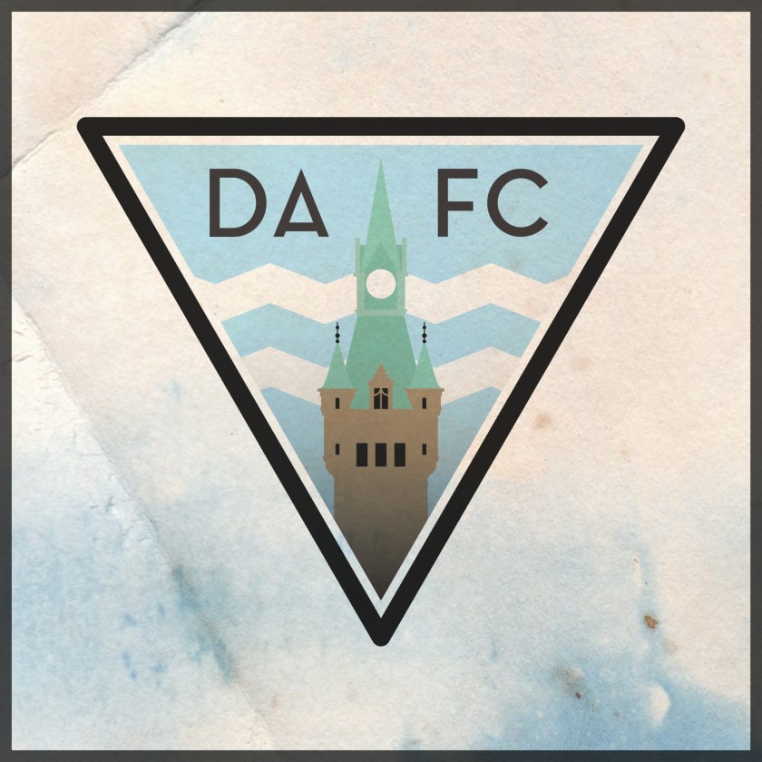
The challenge of redesigning such a unique and iconic badge has been floating around in my mind for a while now. I struggled while considering what iconography I might employ. Given my perception of the unrelatable nature of the 1958 badge, I wanted to offer something either more familiar or entirely different. I opted to retain the iconic triangular shape of the badge, but instead of Malcolm’s Tower, I decided to make use of one of Dunfermline’s most physically prominent and handsome landmarks: the clock tower of the City Chambers. With its striking green roof of oxidised copper and its skilful combination of French, Gothic and Scots baronial architectural styles, I believe that the clock tower proves to be a very fitting centrepiece for the redesigned badge. I also incorporated the zig-zagged white cloud stripes from the 1958 badge and lightened the blue background to sky blue.

For the home shirt, I decided to continue with the Pars’ long tradition of black and white vertical stripes (in near-constant use since 1909), but with a pattern that echoes the triangular badge. For the away strip, I decided to make use of red (the predominant away strip colour over the last two decades) with a black gingham pattern (inspired by the 1996/97 home strip).


As ever, I am indebted to Dave at Historical Football Kits for some of the historical information used above.