ellliottt

design & illustration

Menu

Skip to content
  • HOME
  • ABOUT
  • GRAPHIC
    • ALL GRAPHIC DESIGN
    • AUTOMOTIVUS
    • REBRAND: SPFL
      • Premiership
        • Aberdeen
        • Celtic
        • Dundee United
        • Heart of Midlothian
        • Hibernian
        • Kilmarnock
        • Livingston
        • Motherwell
        • Rangers
        • Ross County
        • St Johnstone
        • St Mirren
      • Championship
        • Arbroath
        • Ayr United
        • Cove Rangers
        • Dundee
        • Greenock Morton
        • Hamilton Academical
        • Inverness CT
        • Partick Thistle
        • Queen’s Park
        • Raith Rovers
      • League One
        • Airdrieonians
        • Alloa Athletic
        • Clyde
        • Dunfermline Athletic
        • FC Edinburgh
        • Falkirk
        • Kelty Hearts
        • Montrose
        • Peterhead
        • Queen of the South
      • League Two
        • Albion Rovers
        • Annan Athletic
        • Bonnyrigg Rose
        • Dumbarton
        • East Fife
        • Elgin City
        • Forfar Athletic
        • Stenhousemuir
        • Stirling Albion
        • Stranraer
    • REBRAND: SHFL
      • Brechin City
      • Brora Rangers
      • Buckie Thistle
      • Clachnacuddin
      • Deveronvale
      • Formartine United
      • Forres Mechanics
      • Fraserburgh
      • Huntly
      • Inverurie Loco Works
      • Keith
      • Lossiemouth
      • Nairn County
      • Rothes
      • Strathspey Thistle
      • Turriff United
      • Wick Academy
    • REBRAND: SLFL
      • Berwick Rangers
      • Bo’ness United
      • Broomhill
      • Caledonian Braves
      • Civil Service Strollers
      • Cowdenbeath
      • Cumbernauld Colts
      • Dalbeattie Star
      • East Kilbride
      • East Stirlingshire
      • Edinburgh University
      • Gala Fairydean Rovers
      • Gretna 2008
      • Spartans
      • Tranent Juniors
      • University of Stirling
  • 2D
  • 3D
    • ALL 3D
    • INSTALLATION
  • PHOTO
  • SHOP

Rovers

ReBrand: Gala Fairydean Rovers FC

graphic

GFRFC badge new-01Gala Fairydean Rovers Football Club was established in the Borders town of Galashiels in 1894. Thirteen years later, in 1907, the club split into Gala Fairydean and Gala Rovers, with the Rovers acting as the reserve side for Fairydean. With the outbreak of the First World War, both sides ceased. In 1919, Fairydean alone resumed competition, becoming a founding member of the East of Scotland Football League four years later. It would not be until 1947 that the Gala Rovers name resurfaced, this time, as an amateur side.

Fairydean experienced relative success in the EoSFL, with their most fruitful period taking place in the 1960s. During this time, the club claimed six league championships (1960/61, 1961/62, 1963/64, 1964/65, 1965/66 and 1968/69). Fairydean went on to win the EoSFL championship twice more, in 1988/89 and 1990/91.

Over the coming years, Fairydean applied unsuccessfully to the Scottish Football League on four ocassions. Eventually, in 2013, Fairydean and Rovers merged, forming the modern incarnation of Gala Fairydean Rovers. That same year, the new club was granted membership in the new Lowland League.

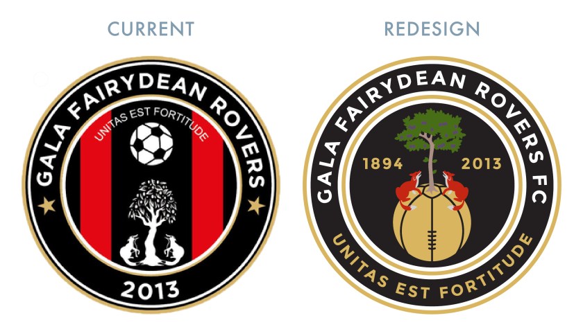
At some point during their time as Gala Fairydean, the club began to use a badge which featured the coat of arms of the Burgh of Galashiels. This coat of arms includes two foxes seated at the base of a plum tree, looking upward and a version of this image can be found in the current badge. The current badge also includes a hovering football, the Latin motto, UNITAS EST FORTITUDE (‘unity is strength’) and two red stripes over a black field, representing, in my best estimate, the traditional home kit of Gala Fairydean.

For my redesign, I decided that I wanted to retain the elements from the coat of arms and the Latin motto (which I find especially apt given Gala Fairydean Rovers’ history), but I was not convinced with the way that they are presented in the current badge. I opted to tie the foxes, the plum tree and the football together, with the former resting atop a redesigned, Victorian-styled football in gold. As I don’t feel as if the current badge’s foxes much resemble foxes, I went with a more ‘maximalist’ colour scheme. I also chose to include both the current club’s date of formation as well as the original Gala Fairydean Rovers’ date of formation. The Latin motto has been moved to the outer circle in gold.
GFRFC badge-01

For the kit redesigns, I opted to go with some version of the current kits, bringing back the home kit’s red and black vertical stripes (which are absent from the club’s kit at present).

GFRFC kit-01

GFRFC badge new-01

Advertisement
13 June 201924 February 2020 E Tagged badge, Borders, crest, Europe, Fairydean, football, fox, foxes, Gala, Gala Fairydean, Gala Fairydean FC, Gala Fairydean Football Club, Gala Fairydean Rovers, Gala Fairydean Rovers FC, Gala Fairydean Rovers Football Club, Gala Rovers, Gala Rovers FC, Gala Rovers Football Club, Galashiels, GFR, Latin, LFL, logo, Lowland Football League, Lowlands, rebrand, redesign, Rovers, Scotland, Scottish Borders, Scottish Lowland Football League, SLFL, sport, texture, UK, United Kingdom Leave a comment

Kingdom of Fife Football

graphic

Kingdom of Football-01

Building on my SPFL badge redesigns, I’ve made a wee map of Fife with the new badges and some club information.

6 August 2018 E Tagged badge, Beath, Blue Brazil, brand, branding, Cowden, Cowdenbeath, Cowdenbeath FC, Cowdenbeath Football Club, crest, DAFC, Dunfermline Athletic, Dunfermline Athletic FC, Dunfermline Athletic Football Club, East Fife, East Fife FC, East Fife Football Club, EFFC, emblem, Europe, Fife, Fifers, football, Kingdom of Fife, Kirkcaldy, logo, map, Methil, Miners, Pars, Raith, Raith Rovers, Raith Rovers FC, Raith Rovers Football Club, rebrand, redesign, Rovers, RRFC, Scotland, Scottish Professional Football League, SPFL, sport, texture, UK, United Kingdom 1 Comment

ReBrand: Elgin City FC

graphic

ElgCFC badge new-01Elgin City Football Club was established when two Elgin-based clubs, Rovers FC (1887) and Vale of Lossie FC (1888) united in 1893. For more than a century, the club competed in the Highland Football League, amassing a number of regional honours.

In the 1967/68 Scottish Cup, Elgin City defeated Albion Rovers, Tarff Rovers, Forfar Athletic and Arbroath to teach the quarter-final. Their opponents, Greenock Morton proved too strong for the Highland League outfit and Elgin City left the tournament after a 2-1 loss. No other Highland League club, before or since, has progressed as far in the Scottish Cup.

In 2000, the Scottish Premier League (the top tier in Scottish football at the time) expanded from 10 to 12 clubs, opening the door for the admittance of two new clubs into the bottom tier of the Scottish Football League. Elgin City, along with fellow Highland Leaguers Peterhead, were successful in their application and have competed in the SFL (and subsequent Scottish Professional Football League) ever since.

Throughout the vast majority of the club’s history, Elgin City’s home shirt has consisted of black and white vertical stripes. It was not until 1990 that the kit featured a badge, which is still used today. This badge, a rendering of the coat of arms of the city and royal burgh of Elgin, features the patron saint of Elgin, St Giles, supported by two angels and bears the motto, Sic itur ad astra (Latin for ‘Thus one goes to the stars’ or ‘Such is the way to immortality’, from Virgil’s Aeneid, IX). The angels and motto refer to the legend that at his death, St Giles was brought by angels to heaven.

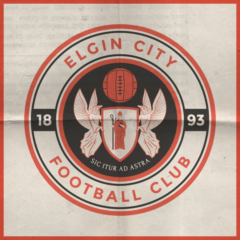
Despite the conceptual strength of the current badge, I find its execution lacking. While I admire the strength of a minimalist depiction of figures within a badge, I wanted to add more details so as to better resemble traditional depictions of the Elgin coat of arms and to create more depth.

As I wished to include the fine Latin motto, I did away with the shield (so as to avoid conflict with the ancient Scottish heraldic law forbidding the use of lettering within shields that are not approved by the Court of the Lord Lyon) as well as the stone compartment in which the motto was written in the original badge. I placed this redesign within a circular badge and added a football to occupy the negative space above the shield bearing St Giles. The dominant colours of the redesigned badge (red and white) are in line with the specified colours of the Elgin coat of arms, which are taken from the traditional colours of the Moray region.

ElgCFC badge-01

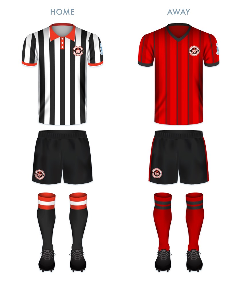
Both kit redesigns make use of traditional Elgin City colours. The home kit redesign is inspired primarily by the Elgin City kit used from 1991 to 1993.

ElgCFC kit-01

ElgCFC badge new-01

As ever, I am indebted to Dave at Historical Football Kits for some of the historical information used above.

4 June 201824 February 2020 E Tagged badge, Black & Whites, Black and Whites, brand, cathedral, city, coat of arms, crest, Elgin, Elgin Cathedral, Elgin City, Elgin City FC, Elgin City Football Club, emblem, football, Ladbrokes League 2, Latin, logo, Moray, Morayshire, Rovers, Rovers FC, Rovers Football Club, Scotland, Scottish League 2, Scottish League Two, Scottish Professional Football League, SPFL, SPFL League 2, SPFL League Two, sport, St Giles, The Black & Whites, The Black and Whites, UK, United Kingdom, Vale of Lossie, Vale of Lossie FC, Vale of Lossie Football Club Leave a comment

ReBrand: Raith Rovers FC

graphic

RRFC badge new-01Raith Rovers Football Club was established in 1883. The club draws its name, Raith, from a vague historical association with the region of Fife from Kirkcaldy (where the club is based) to Lochgelly.

Throughout their history, the Rovers have won the second tier on five occasions and have appeared in the Scottish Cup final once, losing 2-0 to Falkirk in 1912/13. The club reached the final of the 1948/49 Scottish League Cup, but experienced another 2-0 loss, this time to Rangers. The club would have to wait until 1994/95 League Cup final to receive their first and only major honour to date, defeating Celtic 6-5 on penalties after ending extra time 2-2.

The Rovers first used a badge on their kits during the 1912/13 season. This early badge included a lion rampant holding a belt buckle, the latter of which being derived from the Kirkcaldy coat of arms. A variation of this badge was used until the 1949/50 season, when the Scottish royal coat of arms, featuring a yellow shield with a red lion rampant, was used to mark the Rovers’ promotion to the Scottish top tier. The following season, the more traditional badge returned to the kit.

By the 1960s, crests became less popular in Scottish football in favour of calligraphic club initials. A new badge was used intermittently between 1976 and 1985, when another badge came into use. By 1998, the traditional badge was again reinstated and some variation of this badge has been used ever since.

For years I assumed, having only seen the badge at a relative distance or in a low resolution, that the Rovers’ insignia was a depiction of a horse holding a globus cruciger (Latin for ‘cross-bearing orb’), a medieval symbol representing the authority of Christ or Christianity over the world. For my redesign, I sought to make both the lion rampant and the buckle more identifiable. I have also included the club’s name within a banner, which resembles the Scottish Football Association crest used until 2012. This is also a call back to the 1949/50 season, when the Rovers were promoted to the top tier and their badge was nearly identical to that used by the Scottish national team.

RRFC badge-01

The home kit is inspired by the Rovers’ home kits from 1950 to 1954, in particular, the kit worn during the 1953/54 season. The away kit is a hooped version of the Rovers’ traditional red away colour scheme.

RRFC kit-01

RRFC badge new-01

As ever, I am indebted to Dave at Historical Football Kits for some of the historical information used above.

16 May 201824 February 2020 E Tagged badge, brand, buckle, crest, design, Europe, Ferguson, Fife, football, Kirkcaldy, lion rampant, logo, Raith, Raith Rovers, Raith Rovers FC, Raith Rovers Football Club, rebrand, redesign, Rovers, RRFC, Scotland, Scottish League 1, Scottish League One, Scottish Professional Football League, SPFL, SPFL League 1, SPFL League One, sport, The Rovers, UK, United Kingdom 1 Comment

ReBrand: Albion Rovers FC

graphic

ARFC badge new-01In 1882, two Coatbridge-based football clubs, Albion FC and Rovers FC, merged to form Albion Rovers Football Club. In 1903, these ‘Wee Rovers’ joined the Scottish Football League, competing in the Second Division. During the First World War, the Second Division was suspended and the Rovers would not return to the SFL until 1919. With that season came the club’s greatest achievement.
In the 1919/20 Scottish Cup, the Rovers first defeated Dykehead, advanced through the second round after their match with Huntingtower was scrapped and defeated St Bernard’s in the third round.

The Rovers’ first real challenge in the competition came when they faced Aberdeen in the fourth round. The Wee Rovers prevailed with a 2-1 victory, setting the stage for a semi-final against Rangers. The first match of the semi-final resulted in a 1-1 draw, necessitating a replay. This replay resulted in a 0-0 stalemate. Finally, by the third semi-final match, the Rovers pulled ahead with a 2-0 victory over Rangers.

In the final, the Rovers faced a rampant Kilmarnock side at Celtic Park. Kilmarnock edged their opposition narrowly with a 3-2 victory and the Rovers had to settle for leaving the tournament as runners-up.

Although greater success has eluded Albion Rovers ever since, they have demonstrated their ingenuity and ability to adapt to change by introducing a ‘pay what you can’ season ticket scheme for the 2014/15 season.

In 1961, the Rovers’ first introduced a badge, featuring symbols of the two parent clubs: a rose superimposed over a pair of crossing cutlasses. A variation of this badge has been in use since that time.

Being that the full ‘Albion Rovers’ name has never featured on the club’s kit, I included this within an outer ring. I also included the club’s founding date. For the central shield, I decided to divide the space into triangular quadrants, with a football in the top position and with redesigned versions of Albion FC’s rose and Rovers FC’s cutlasses in the left and right positions, respectively. In the bottom quadrant, I have placed an anvil below a flame. The latter images represent the Rovers’ locale, namely, Coatbridge. The Coatbridge coat of arms features a tower topped with flames, representing the iron and steel industries of Coatbridge. The Coatbridge burgh seal, introduced after the town gained burgh status in 1885, features an assortment of industrial images, including an anvil.

ARFC badge-01

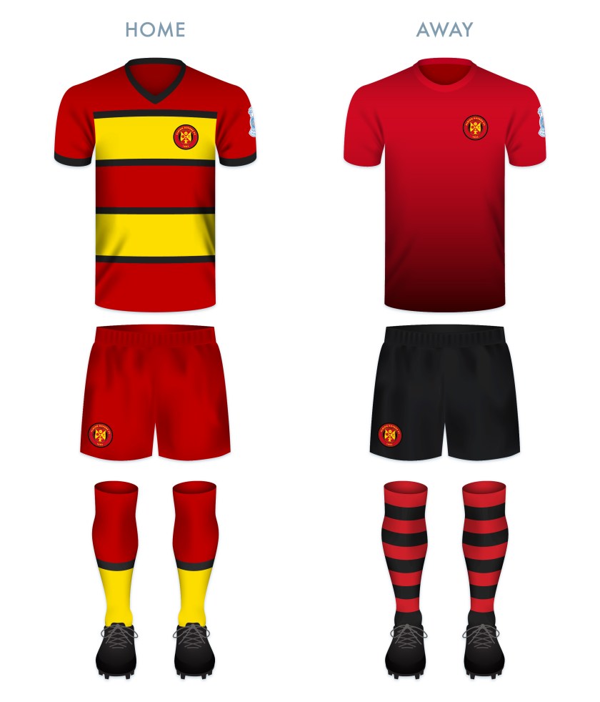
The kit designs make use of the black, red and gold, a colour scheme used in various combinations since the introduction of the first badge in 1961.

ARFC kit-01

ARFC badge new-01


As ever, I am indebted to Dave at Historical Football Kits for some of the historical information used above.


7 May 201824 February 2020 E Tagged Albion FC, Albion Football Club, Albion Rovers, Albion Rovers FC, Albion Rovers Football Club, badge, branding, Coatbridge, crest, Europe, football, Ladbrokes League 2, logo, North Lanarkshire, rebrand, redesign, Rovers, Rovers FC, Rovers Football Club, Scotland, Scottish Cup, Scottish Football Association, Scottish Professional Football League, shield, SPFL League 2, SPFL League Two, sport, The Wee Rovers, UK, United Kingdom, Wee Rovers Leave a comment
Widgets
Create a website or blog at WordPress.com
Privacy & Cookies: This site uses cookies. By continuing to use this website, you agree to their use.
To find out more, including how to control cookies, see here: Cookie Policy
  • Follow Following
    • ellliottt
    • Join 53 other followers
    • Already have a WordPress.com account? Log in now.
    • ellliottt
    • Customize
    • Follow Following
    • Sign up
    • Log in
    • Report this content
    • View site in Reader
    • Manage subscriptions
    • Collapse this bar
 

Loading Comments...