ellliottt

design & illustration

Menu

Skip to content
  • HOME
  • ABOUT
  • GRAPHIC
    • ALL GRAPHIC DESIGN
    • AUTOMOTIVUS
    • REBRAND: SPFL
      • Premiership
        • Aberdeen
        • Celtic
        • Dundee United
        • Heart of Midlothian
        • Hibernian
        • Kilmarnock
        • Livingston
        • Motherwell
        • Rangers
        • Ross County
        • St Johnstone
        • St Mirren
      • Championship
        • Arbroath
        • Ayr United
        • Cove Rangers
        • Dundee
        • Greenock Morton
        • Hamilton Academical
        • Inverness CT
        • Partick Thistle
        • Queen’s Park
        • Raith Rovers
      • League One
        • Airdrieonians
        • Alloa Athletic
        • Clyde
        • Dunfermline Athletic
        • FC Edinburgh
        • Falkirk
        • Kelty Hearts
        • Montrose
        • Peterhead
        • Queen of the South
      • League Two
        • Albion Rovers
        • Annan Athletic
        • Bonnyrigg Rose
        • Dumbarton
        • East Fife
        • Elgin City
        • Forfar Athletic
        • Stenhousemuir
        • Stirling Albion
        • Stranraer
    • REBRAND: SHFL
      • Brechin City
      • Brora Rangers
      • Buckie Thistle
      • Clachnacuddin
      • Deveronvale
      • Formartine United
      • Forres Mechanics
      • Fraserburgh
      • Huntly
      • Inverurie Loco Works
      • Keith
      • Lossiemouth
      • Nairn County
      • Rothes
      • Strathspey Thistle
      • Turriff United
      • Wick Academy
    • REBRAND: SLFL
      • Berwick Rangers
      • Bo’ness United
      • Broomhill
      • Caledonian Braves
      • Civil Service Strollers
      • Cowdenbeath
      • Cumbernauld Colts
      • Dalbeattie Star
      • East Kilbride
      • East Stirlingshire
      • Edinburgh University
      • Gala Fairydean Rovers
      • Gretna 2008
      • Spartans
      • Tranent Juniors
      • University of Stirling
  • 2D
  • 3D
    • ALL 3D
    • INSTALLATION
  • PHOTO
  • SHOP

Fife

ReBrand: Kelty Hearts FC

graphic

KHFC badge new-01Kelty Hearts Football Club was established as an amateur side in 1975. After the 1978/79 season, five of the club’s players were signed by Halbeath Juniors, prompting the amateurs to become a junior side in order to remain competitive. In June 1980, the club was accepted into the Scottish Junior Football Association, where they competed for the better part of the next three decades.

During their time as a junior side, the Hearts reached the Scottish Junior Cup final twice, in 1999 and in 2007, though finished as runners up on both occasions. By the 2010s, the club was looking more dominant in the East Region Super League, winning the league in 2015 and 2017. After their second league victory, Kelty Hearts applied for admission into the Scottish Football Association, which was granted in December 2017.

The club entered the East of Scotland Football League in 2018 and finished at the top of the table that same season. As EoSFL champions, the Hearts played Threave Rovers for a chance at gaining another promotion. Over two legs, the Hearts dominated the Rovers, amassing a comprehensive 10-0 aggregate score to seal their entry into the Lowland Football League.

Kelty’s success continued in the Lowland League, placing third in their inaugural season (behind East Kilbride and BSC Glasgow, in first and second place, respectively). They topped the table in both of the curtailed (as a result of the COVID-19 pandemic) 2019-20 and 2020-21 seasons. Because of the pandemic, neither the Highland nor Lowland League champions were given the chance to compete for promotion into the SPFL in the 2019-20 season. Despite having only played 13 matches in the 2020-21 season, Kelty were given the opportunity to play Brora Rangers, the Highland League champions, who they defeated 6-1 over two legs. Kelty then faced SPFL League Two bottom side, Brechin City. With their 3-1 victory over Brechin over two legs, Kelty gained promotion to the SPFL for the first time in their history and will compete in League Two for the 2021-22 season.

The current Kelty Hearts badge is quite a sight to behold. I imagine, judging from the design, that this badge has been used since the 1970s. While I admire its uniqueness, with the text set on straight lines within a circle, there is very little design coherence. All four linear elements — the heart, the club name, the date and football and the ‘F.C.’ banner — utilise completely different styles. In order to bring them into some sort of unity, I decided to incorporate each element within a new circular badge.

KHFC badge-01

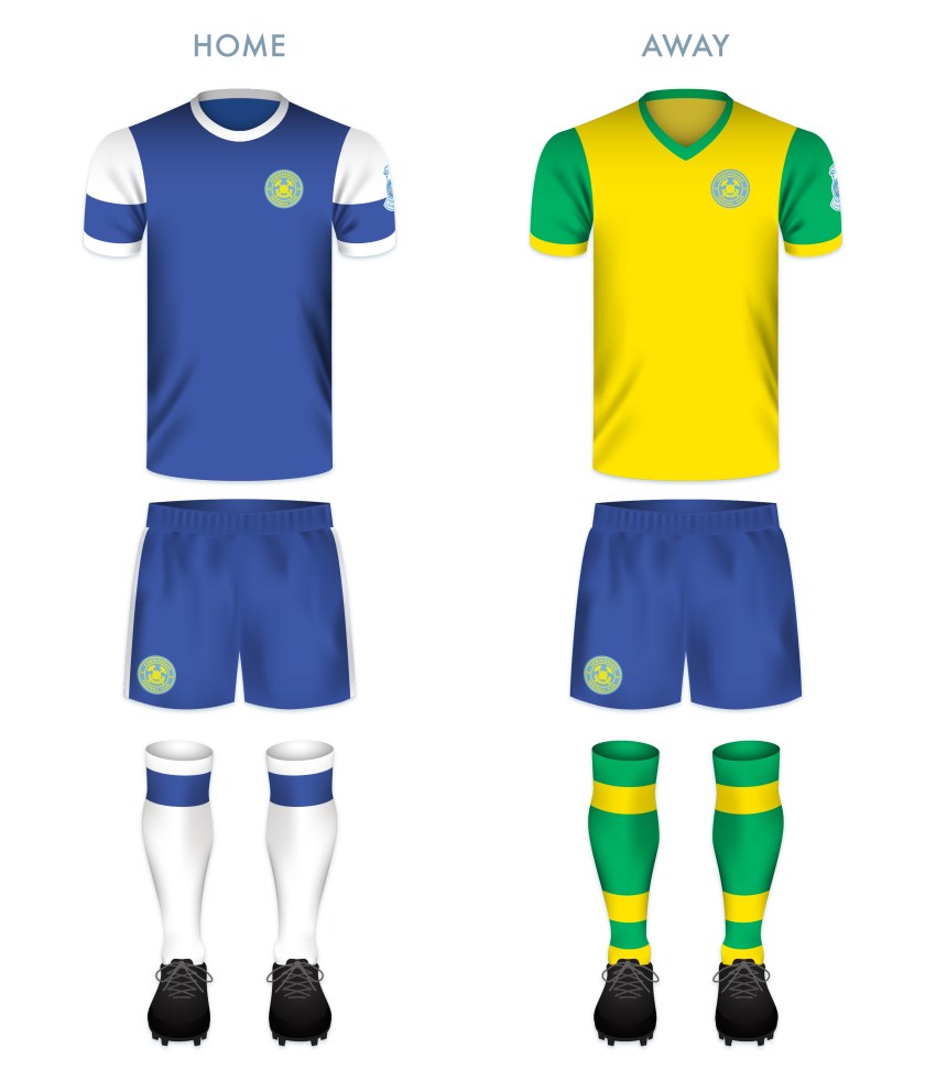
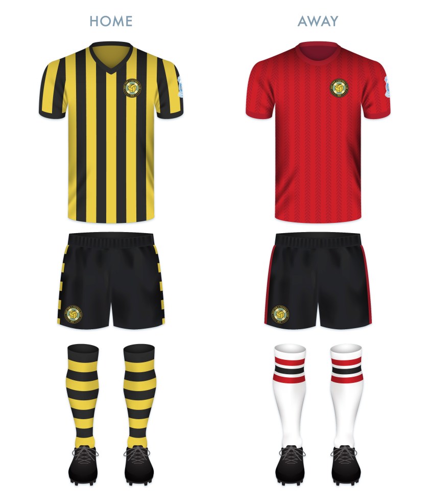
Both the home and away kits make use of the traditional Kelty Hearts colours and have been inspired by 1970s kit styles.

KHFC kit

KHFC badge new-01

Advertisement
26 June 20199 June 2021 E Tagged badge, crest, Europe, Fife, football, Hearts, Jambos, Kelty, Kelty Hearts, Kelty Hearts FC, Kelty Hearts Football Club, logo, rebrand, redesign, Scotland, SPFL, SPFL Division 2, SPFL Division Two, SPFL League 2, SPFL League Two, sport, texture, The Hearts, The Jambos, UK, United Kingdom Leave a comment

Kingdom of Fife Football

graphic

Kingdom of Football-01

Building on my SPFL badge redesigns, I’ve made a wee map of Fife with the new badges and some club information.

6 August 2018 E Tagged badge, Beath, Blue Brazil, brand, branding, Cowden, Cowdenbeath, Cowdenbeath FC, Cowdenbeath Football Club, crest, DAFC, Dunfermline Athletic, Dunfermline Athletic FC, Dunfermline Athletic Football Club, East Fife, East Fife FC, East Fife Football Club, EFFC, emblem, Europe, Fife, Fifers, football, Kingdom of Fife, Kirkcaldy, logo, map, Methil, Miners, Pars, Raith, Raith Rovers, Raith Rovers FC, Raith Rovers Football Club, rebrand, redesign, Rovers, RRFC, Scotland, Scottish Professional Football League, SPFL, sport, texture, UK, United Kingdom 1 Comment

ReBrand: Cowdenbeath FC

graphic

CowFC badge new-01The exact year that Cowdenbeath Football Club was established is unclear. The current club had its genesis in the union of two local clubs (Cowdenbeath Rangers and Cowdenbeath Thistle), which took place in 1881. It has been suggested by the club’s historian, David Allan, that the club retained the name ‘Cowdenbeath Rangers’ until 1882, when the club merged with a Raith Rovers FC (not to be confused with the current Raith Rovers). What is known with certainty is that the current club has been playing as Cowdenbeath FC since at least 1882.

Regardless of whether they were established in 1881 or 1882, Cowden is the oldest of the four surviving professional football clubs in Fife (which includes the aforementioned Raith Rovers, established in 1883, Dunfermline Athletic, established in 1885 and East Fife, established in 1903).

Cowden competed in the Fifeshire Football Association from its inaugural season in 1882/83, losing that first Fife Cup 4-1 to the original Dunfermline Football Club. Two years later, against the same Dunfermline, the club would win the first of its 25 Fife Cups with a scoreline of 4-0.

In 1905, Cowden were admitted into the Scottish Football League and, despite having not won any major honours, competed in Scottish league football until the end of the 2021/22 season. Cowden ended up at the bottom of the League Two table and lost their place to Bonnyrigg Rose over two legs. As a result, the clab was relegated to the Scottish Lowland League for the 2022/23 season.

The Cowdenbeath kit did not feature a badge until the 1984/85 season. This badge was based on a design that had been used in the club’s programmes since 1970. The current badge is a variation of this 1984 badge, with the notable addition of a winding wheel, pickaxes and shovels, which call back to the mining history of the town.

The aim for my badge redesign was to create something simple, clear and significant. I omitted the shield entirely, incorporating the badge within a roundel. I did away with the stereotypical Scottish symbolism of the thistles and lion rampant, as well as the two crosses (symbols which I believe may be associated with the club’s ancestors, Cowdenbeath Rangers, Cowdenbeath Thistle and the original Raith Rovers), the meanings of which seem to have been obscured over time.

At the centre of my redesigned badge are a crossed hammer and pickaxe, which reference the town’s mining history. A football is superimposed over these symbols and below is found a banner bearing the Cowdenbeath town motto, Stent nae stent (Scots for ‘Effort always effort’, the term ‘stent’ having a particular association with mining shifts). For the colours, I opted for a light blue and gold, which stands out from the blue of the traditional Cowdenbeath home shirt.

CowFC badge-01

The home kit design was inspired primarily by the 1974/75 and 1981/82 home kits. The away kit—as a play on the club’s enigmatic nickname, ‘the Blue Brazil’—is based on Brazil kits from 1954 onward, as well as several historical Cowdenbeath away kits.

CowFC kit-01

CowFC badge new-01

As ever, I am indebted to Dave at Historical Football Kits for some of the historical information used above.

30 May 20181 August 2022 E Tagged badge, Beath, Blue Brazil, brand, branding, Brazil, Cowden, Cowdenbeath, Cowdenbeath FC, Cowdenbeath Football Club, Cowdenbeath Rangers, Cowdenbeath Rangers FC, Cowdenbeath Rangers Football Club, Cowdenbeath Thistle, Cowdenbeath Thistle FC, Cowdenbeath Thistle Football Club, Europe, Fife, football, Kingdom of Fife, Ladbrokes League 2, logo, Miners, Raith Rovers, Raith Rovers FC, Raith Rovers Football Club, rebrand, redesign, Scotland, Scots, Scottish League 2, Scottish League Two, Scottish Professional Football League, SPFL, SPFL League 2, SPFL League Two, sport, The Beath, The Blue Brazil, The Miners, UK, United Kingdom Leave a comment

ReBrand: Raith Rovers FC

graphic

RRFC badge new-01Raith Rovers Football Club was established in 1883. The club draws its name, Raith, from a vague historical association with the region of Fife from Kirkcaldy (where the club is based) to Lochgelly.

Throughout their history, the Rovers have won the second tier on five occasions and have appeared in the Scottish Cup final once, losing 2-0 to Falkirk in 1912/13. The club reached the final of the 1948/49 Scottish League Cup, but experienced another 2-0 loss, this time to Rangers. The club would have to wait until 1994/95 League Cup final to receive their first and only major honour to date, defeating Celtic 6-5 on penalties after ending extra time 2-2.

The Rovers first used a badge on their kits during the 1912/13 season. This early badge included a lion rampant holding a belt buckle, the latter of which being derived from the Kirkcaldy coat of arms. A variation of this badge was used until the 1949/50 season, when the Scottish royal coat of arms, featuring a yellow shield with a red lion rampant, was used to mark the Rovers’ promotion to the Scottish top tier. The following season, the more traditional badge returned to the kit.

By the 1960s, crests became less popular in Scottish football in favour of calligraphic club initials. A new badge was used intermittently between 1976 and 1985, when another badge came into use. By 1998, the traditional badge was again reinstated and some variation of this badge has been used ever since.

For years I assumed, having only seen the badge at a relative distance or in a low resolution, that the Rovers’ insignia was a depiction of a horse holding a globus cruciger (Latin for ‘cross-bearing orb’), a medieval symbol representing the authority of Christ or Christianity over the world. For my redesign, I sought to make both the lion rampant and the buckle more identifiable. I have also included the club’s name within a banner, which resembles the Scottish Football Association crest used until 2012. This is also a call back to the 1949/50 season, when the Rovers were promoted to the top tier and their badge was nearly identical to that used by the Scottish national team.

RRFC badge-01

The home kit is inspired by the Rovers’ home kits from 1950 to 1954, in particular, the kit worn during the 1953/54 season. The away kit is a hooped version of the Rovers’ traditional red away colour scheme.

RRFC kit-01

RRFC badge new-01

As ever, I am indebted to Dave at Historical Football Kits for some of the historical information used above.

16 May 201824 February 2020 E Tagged badge, brand, buckle, crest, design, Europe, Ferguson, Fife, football, Kirkcaldy, lion rampant, logo, Raith, Raith Rovers, Raith Rovers FC, Raith Rovers Football Club, rebrand, redesign, Rovers, RRFC, Scotland, Scottish League 1, Scottish League One, Scottish Professional Football League, SPFL, SPFL League 1, SPFL League One, sport, The Rovers, UK, United Kingdom 1 Comment

ReBrand: East Fife FC

graphic

EFFC badge new-01The history of football in the conurbation of Levenmouth, East Fife dates from as early as 1879, when junior side Cameron Bridge Football Club was formed. A number of other junior clubs were formed in the late nineteenth century, most notably, Leven Thistle (in the late 1880s), Methil Rovers (1893) and Buckhaven United (1890-91, and then again in 1897). In 1901, Methil Rovers folded and the following year, Leven Thistle, who had changed home ground numerous times, settled in their final home, Town Hall Park, Methil.

As a result of local demand for a senior football club in Levenmouth, East Fife Football Club was established in early 1903. This new club purchased Leven Thistle’s Town Hall Park and renamed it Bayview Park. Soon after, Leven Thistle decided to close up shop. Buckhaven United continued to compete as a junior side until 1912.

After applying for entry into the Scottish Football League on a number of occasions, East Fife joined the reformed Scottish Second Division in 1921 with the incorporation of their Central Football League (which the club had first joined in 1909) into the SFL.

East Fife holds a special place in the history of Scottish football. The Fifers have appeared in three Scottish Cup finals (1926/27, 1937/38, 1949/50), reigning victorious against Kilmarnock in the final replay before a crowd of 92,716 at Hampden Park on 27 April 1938. Until Hibernian defeated Rangers in the 2015/16 Scottish Cup final, East Fife was the only non-top tier club to have ever achieved the honour. It’s also worth noting that East Fife has also won the Scottish League Cup three times (1947/48, 1949/50, 1953/54), a first among all Scottish clubs.

The club’s first kit consisted of a shirt of green and white hoops, similar to those first adopted by Celtic that same year. In 1911, the green and white was swapped for black and gold, which has remained the club’s primary colour scheme ever since.

The Fifers first began using a badge on their kit in 1950. This original badge consisted of a shield, divided into thirds. The top portion of the shield featured the club’s initials, while the middle featured a Saltire and the bottom featured a thistle. This badge was used until 1970, when it was replaced by the club’s initials alone. Some variation of the initials remained until 1991, when the first version of the current badge was introduced. Like the 1950 badge, the current badge features a Saltire, with the addition of a superimposed football.

With my redesign, I decided to move away from the above monogram, as well as the current shield, in favour of a round badge. I included the Saltire in my latest redesign as it is the only consistent feature among East Fife’s historical badges. (The omission of a Saltire within a shield also avoids a potential confrontation with the Court of the Lord Lyon.) The Saltire is enclosed in a circle, behind a gold fishing net, a reference to the prevalent fishing industry in East Fife. The historic burgh seals of every settlement on the coast in East Fife feature either the Firth of Forth, fishing boats, fishing nets or fish (or a combination of several of these), including the burgh seal of Buckhaven, Methil and Innerleven, the locale of East Fife FC. The fishing net also acts as a goal net, receiving a football. Lastly, I placed a star in the outer ring, commemorating East Fife’s 1937/38 Scottish Cup victory.

EFFC badge-01

For the home kit, I went with the club’s traditional black and gold vertical stripes with black shorts. I also included black and gold hooped socks, last worn in 1939. For the away shirt, I employed red with dark red herringbone stripes.

EFFC kit-01

EFFC badge new-01

As ever, I am indebted to Dave at Historical Football Kits for some of the historical information used above.

13 May 201824 February 2020 E Tagged badge, brand, branding, East Fife, East Fife FC, East Fife Football Club, Europe, Fife, Fifers, football, Kingdom of Fife, Ladbrokes League 1, Ladbrokes League One, logo, Methil, monogram, rebrand, redesign, Saltire, Scotland, Scottish Cup, Scottish League 1, Scottish League Cup, Scottish League One, Scottish Professional Football League, SPFL, SPFL League 1, SPFL League One, sport, texture, The Fife, The Fifers, UK, United Kingdom Leave a comment

ReBrand: Dunfermline Athletic FC

graphic

DAFC badge new-01The history of association football in Scotland is tied inextricably to cricket. Along with clubs such as Kilmarnock, St Johnstone, St Mirren and potentially Heart of Midlothian, Dunfermline Athletic was established as a winter sporting pursuit in the cricket off-season.

The original club was called Dunfermline Football Club and was established in 1874. In order that non-cricket club members could join, Dunfermline FC broke away from the cricket club and became Dunfermline Athletic FC in 1885.

Dunfermline Athletic, or ‘the Pars’, as they are known, had a shot at their first major honour when they reached the final of the 1949/50 Scottish League Cup at Hampden Park. There, they faced their fellow Fifers, East Fife, who had won the competition two years earlier. The Pars were unlucky that day, losing 3-0, but a decade later they would have another opportunity at silverware.

On 26 April 1961, the Pars defeated Celtic 2-0 in the Scottish Cup final replay. Celtic would return the favour by defeating the Pars 3-2 in the 1964/65 final of the same competition. But the Pars’ tenacity brought the Scottish Cup back to East End Park after the club defeated Hearts in the 1967/68 final. It should also be noted that the Pars beat holders Celtic, fresh off of their illustrious 1966/67 season, in the first round of the 1967/68 Scottish Cup.

The Dunfermline Athletic kit did not include a badge until the 1958/59 season, when the club employed the skills of Dunfermline High School art teacher Colin Dymock. Dymock’s badge was thoroughly modern in shape, colour and design. It took the shape of a downward-pointing triangle and featured Malcolm’s Tower, a local landmark, as its centrepiece. This original badge was dropped from the kit in 1962.

The Pars’ shirt featured an encircled ‘DAFC’ monogram for the 1971/72 season and then from 1977 until 1986, home shirts featured the club’s initials alone. For the 1986/87 season, the club began to use a slight variation on Dymock’s 1958 badge design, and similar badges have adorned the breast of the Dunfermline Athletic shirt ever since.

The current Dunfermline Athletic badge is a cracker. When the first version was introduced in 1958, it would have been ground-breaking (and perhaps polarising). But it has become a cherished staple of the Dunfermline Athletic identity. That being stated, I find the badge very unrelatable. Malcolm’s Tower, named after Malcolm III of Scotland (Gaelic: Máel Coluim mac Donnchada, who reigned from 1058 to 1093), is a very historically significant site as it marks the move of the seat of royal power from Forteviot in Strathearn (modern-day Perth and Kinross) to Dunfermline. A crude depiction of the tower has featured in the Dunfermline coat of arms for centuries. But all that remains of the tower today is a foundational ruin and its precise design is unknown. As a result, Dymock’s design is simply an interpretation of what the tower might have looked like, and in a fragmented, modern style.

The challenge of redesigning such a unique and iconic badge has been floating around in my mind for a while now. I struggled while considering what iconography I might employ. Given my perception of the unrelatable nature of the 1958 badge, I wanted to offer something either more familiar or entirely different. I opted to retain the iconic triangular shape of the badge, but instead of Malcolm’s Tower, I decided to make use of one of Dunfermline’s most physically prominent and handsome landmarks: the clock tower of the City Chambers. With its striking green roof of oxidised copper and its skilful combination of French, Gothic and Scots baronial architectural styles, I believe that the clock tower proves to be a very fitting centrepiece for the redesigned badge. I also incorporated the zig-zagged white cloud stripes from the 1958 badge and lightened the blue background to sky blue.

DAFC badge-01

For the home shirt, I decided to continue with the Pars’ long tradition of black and white vertical stripes (in near-constant use since 1909), but with a pattern that echoes the triangular badge. For the away strip, I decided to make use of red (the predominant away strip colour over the last two decades) with a black gingham pattern (inspired by the 1996/97 home strip).

DAFC kit-01

DAFC badge new-01

As ever, I am indebted to Dave at Historical Football Kits for some of the historical information used above.

28 April 201824 February 2020 E Tagged badge, brand, Championship Division, Colin Dymock, crest, DAFC, design, Dunfermline, Dunfermline Athletic, Dunfermline Athletic FC, Dunfermline Athletic Football Club, Dunfermline City Chambers, Dunfermline Cricket Club, Dunfermline FC, Dunfermline Football Club, emblem, Europe, Fife, football, James Campbell Walker, Kingdom of Fife, Ladbrokes Championship, logo, Malcolm III, Malcolm III of Scotland, Pars, rebrand, redesign, Scotland, Scottish Championship, Scottish Professional Football League, SPFL, SPFL Championship, sport, texture, The Pars, UK, United Kingdom 2 Comments

St Monans

photo

St Monans 01
St Monans, Fife, Scotland, 2012

20 April 201215 September 2014 E Tagged architecture, Europe, Fife, nature, Scotland, single use camera, sky, St Monans, St Monans Parish Church, UK Leave a comment

St Monans’ organ

photo

St Monans' organ
St Monans, Fife, Scotland, 2011

11 November 201126 May 2014 E Tagged architecture, Christianity, church, Europe, Fife, music, organ, religion, Scotland, St Monans, St Monans Parish Church, UK Leave a comment

Dunfermline Abbey

photo

Dunfermline Abbey
Dunfermline, Fife, Scotland, 2011

11 October 201126 May 2014 E Tagged architecture, Christianity, church, colour, Dunfermline, Dunfermline Abbey, Europe, Fife, light, religion, Scotland, stained glass, UK Leave a comment

Spacemen

photo

Spacemen
St Andrews, Fife, Scotland, 2011

10 October 201126 May 2014 E Tagged Apollo, Europe, Fife, miniature, model, moon, Scotland, space, St Andrews, UK Leave a comment

Posts navigation

← Previous
Widgets
Create a website or blog at WordPress.com
Privacy & Cookies: This site uses cookies. By continuing to use this website, you agree to their use.
To find out more, including how to control cookies, see here: Cookie Policy
  • Follow Following
    • ellliottt
    • Join 53 other followers
    • Already have a WordPress.com account? Log in now.
    • ellliottt
    • Customize
    • Follow Following
    • Sign up
    • Log in
    • Report this content
    • View site in Reader
    • Manage subscriptions
    • Collapse this bar
 

Loading Comments...