ellliottt

design & illustration

Menu

Skip to content
  • HOME
  • ABOUT
  • GRAPHIC
    • ALL GRAPHIC DESIGN
    • AUTOMOTIVUS
    • REBRAND: SPFL
      • Premiership
        • Aberdeen
        • Celtic
        • Dundee United
        • Heart of Midlothian
        • Hibernian
        • Kilmarnock
        • Livingston
        • Motherwell
        • Rangers
        • Ross County
        • St Johnstone
        • St Mirren
      • Championship
        • Arbroath
        • Ayr United
        • Cove Rangers
        • Dundee
        • Greenock Morton
        • Hamilton Academical
        • Inverness CT
        • Partick Thistle
        • Queen’s Park
        • Raith Rovers
      • League One
        • Airdrieonians
        • Alloa Athletic
        • Clyde
        • Dunfermline Athletic
        • FC Edinburgh
        • Falkirk
        • Kelty Hearts
        • Montrose
        • Peterhead
        • Queen of the South
      • League Two
        • Albion Rovers
        • Annan Athletic
        • Bonnyrigg Rose
        • Dumbarton
        • East Fife
        • Elgin City
        • Forfar Athletic
        • Stenhousemuir
        • Stirling Albion
        • Stranraer
    • REBRAND: SHFL
      • Brechin City
      • Brora Rangers
      • Buckie Thistle
      • Clachnacuddin
      • Deveronvale
      • Formartine United
      • Forres Mechanics
      • Fraserburgh
      • Huntly
      • Inverurie Loco Works
      • Keith
      • Lossiemouth
      • Nairn County
      • Rothes
      • Strathspey Thistle
      • Turriff United
      • Wick Academy
    • REBRAND: SLFL
      • Berwick Rangers
      • Bo’ness United
      • Broomhill
      • Caledonian Braves
      • Civil Service Strollers
      • Cowdenbeath
      • Cumbernauld Colts
      • Dalbeattie Star
      • East Kilbride
      • East Stirlingshire
      • Edinburgh University
      • Gala Fairydean Rovers
      • Gretna 2008
      • Spartans
      • Tranent Juniors
      • University of Stirling
  • 2D
  • 3D
    • ALL 3D
    • INSTALLATION
  • PHOTO
  • SHOP

monogram

ReBrand: Tranent Juniors FC

graphic

TJFC badge newTranent Juniors Football Club was established in 1911 in the town of Tranent, East Lothian. The Belters, as they are known, competed in the Scottish Junior Football Assocation for the vast majority of their existence. During their pre-Lowland League days, the greatest honour they enjoyed was winning the 1934/35 Scottish Junior Cup with a landslide 6–1 victory over Petershill at Ibrox Park (home of Rangers FC).

For the 2018/19 season, Tranent joined the East of Scotland League. Their time in this league was short, with the club winning the league in the 2021/22 season (finishing with 80 points, the same as Penicuik Athletic, but overwhelming the second-placed side with a +59 to +38 goal difference). This achievment reserved the Belters a spot in the three-match round robin Lowland League play-off. They faced the winners of the South of Scotland and West of Scotland Football Leagues (St Cuthbert Wanderers and Darvel, respectively).

During the mini-tournament, they trounced their opponents, finishing without conceding a goal and accumulating nine goals and two victories in the process. For the 2022/23 season, Tranent replaced Vale of Leithen (who were relegated from the Lowland League after finishing the 2021/22 season with a dismal record of one win, two draws and 31 losses). Upon entering the Lowland League, Tranent Juniors retained their name, despite having reached the heights of senior football, in order to call back to their long junior league heritage.

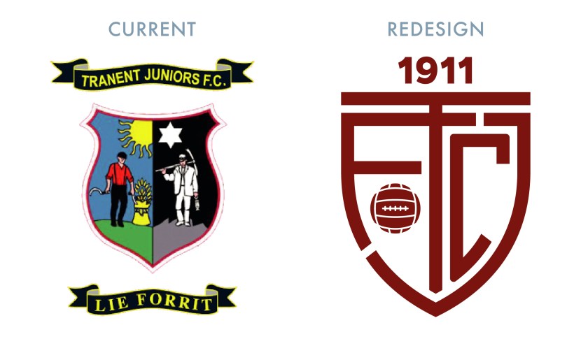
The current Tranent badge consists of a centerpiece of the Tranent coat of arms, topped with a banner containing the club’s name and another banner containing the club’s motto on the bottom. In redesigning this badge, I kept wanting to move away from the busy detail of the current badge. The Tranent coat of arms references the town’s assocaition with agriculture and coal-mining, with the left half portraying a farm worker harvesting by day and the right half portraying a coal-miner working by night. A crossed hammer and sickle would have served as an excellent minimalistic image, but its other associations would detract from the meaning of the badge. And while I appreciate the Scots ‘LIE FORRIT’ (‘lie forward’) motto, I decided to do away with all but the club’s initials (TJFC) and year of founding in the redesigned badge.
TJFC badge

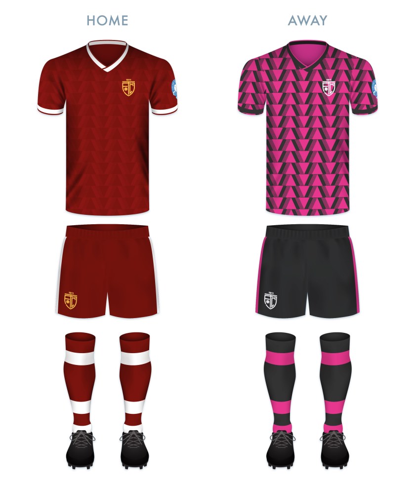
The kit redesigns are based on Tranent’s historical colour scheme (maroon and white) and current away colour scheme:
TJFC kit

TJFC badge new

Advertisement
3 August 2022 E Tagged East Lothian, Europe, football, LFL, logo, Lowland Football League, Lowlands, monogram, rebrand, redesign, Scotland, Scottish Lowland Football League, SLFL, sport, texture, Tranent, Tranent Juniors, Tranent Juniors FC, Tranent Juniors Football Club, UK, United Kingdom Leave a comment

ReBrand: Caledonian Braves

graphic

CBFC badge newEdusport Academy was established as a residential football academy in 2011 with the aim of developing young French players and giving them the opportunity to improve their English language skills. The purpose behind refining these skills was to give the young footballers an edge in entering into the professional game in Britain.

The academy continues to operate as such, but in 2014, applied successfully to become members of the South of Scotland Football League, becoming the first private academy to participate in a senior league recognised by FIFA. The following season, Edusport applied to the Lowland Football League, but was rejected. This did not deter the club for long, as they were crowned champions of the South of Scotland League in 2017, gaining promotion to the Lowland League.

In 2018, club founder Chris Ewing launched ‘Our Football Club‘, an online membership scheme, giving supporters the opportunity to have a more democratic voice in the affairs of the club. With this, Ewing expressed the goal of establishing the senior Edusport team as a separate club in its own right with the ambitious aim of reaching the top tier of Scottish football by 2025.

In 2019, the club was rebranded as Caledonian Braves FC, complete with a new badge. The original badge employed the colours of the French tricolore and featured a small Saltire within its central football, representing the link between France and Scotland. While I appreciated the aim of this badge, I found it somewhat difficult to see as more than a relatively weak corporate brand. For a start, I found the colour scheme of ‘Edusport’ reminiscent of the uninspiring SportsDirect.com logo. Additionally, the original badge featured text within a shield – a ‘no-no’ under ancient Scottish heraldic law. For my first redesign, I went for a roundel which featured the club’s name with the French definite article le (l’). I also included the French name for Scotland, Écosse, which is recognised quite readily in Scotland. The centre of this first redesigned badge featured a stylised ‘EA’ monogram and a red circle representing a football.

EAFC badge-01

I assume the current badge is the result a great deal of consultation with the club’s stakeholders. It futures the club’s name as part of a shield. The centrepiece of the current badge is an eagle in dark blue, behind which is what seems to be a fleur-de-lis in a lighter blue (perhaps a reference to the club’s French connection). The football and saltire from the original badge is found on the breast of the eagle. Being that this new badge continues to violate ancient Scottish heraldic law, I decided to have another shot at this redesign. The new design is very similar to my redesign of the original badge. Instead of the ‘EA’ monogram, the centre of the badge features a similar design to that of the current badge. The fleur-de-lis is depicted in red, with its side petals crossing over the eagle’s wings and the triple stalk acting as the eagle’s tailfeathers. I decided to omit the saltire as ‘Caledonian’ seems a sufficient reference to Scotland.

CBFC badge-01

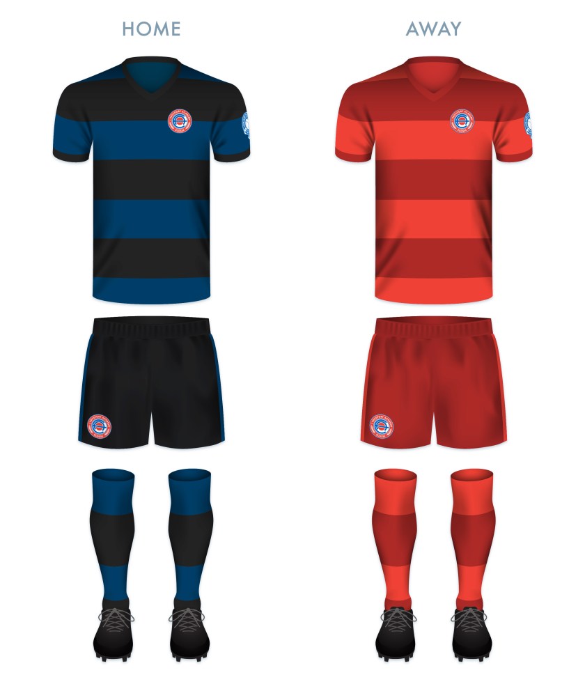
The kits are based upon previous incarnations of Edusport kits, with thick blue and black hoops on the home kit and red and dark red hoops on the away kit. To me, these seem simple, clean and dramatic.

CBFC kit-01

CBFC badge new

28 October 201924 February 2020 E Tagged academy, Annan, badge, crest, Dumfries and Galloway, Dumfriesshire, eagle, Edusport, Edusport Academy, Europe, fleur-de-lis, football, France, French, Galabank, LFL, logo, Lowland Football League, Lowlands, monogram, Our Football Club, rebrand, redesign, Scotland, Scottish Lowland Football League, SLFL, sport, texture, UK, United Kingdom Leave a comment

ReBrand: Edusport Academy

graphic

EAFC badge new-01Edusport Academy was established as a residential football academy in 2011 with the aim of developing young French players and giving them the opportunity to improve their English language skills. The purpose behind refining these skills was to give the young footballers an edge in entering into the professional game in Britain.

The academy continues to operate as such, but in 2014, applied successfully to become members of the South of Scotland Football League, becoming the first private academy to participate in a senior league recognised by FIFA. The following season, Edusport applied to the Lowland Football League, but was rejected. This did not deter the club for long, as they were crowned champions of the South of Scotland League in 2017, gaining promotion to the Lowland League.

In 2018, club founder Chris Ewing launched ‘Our Football Club‘, an online membership scheme, giving supporters the opportunity to have a more democratic voice in the affairs of the club. With this, Ewing expressed the goal of establishing the senior Edusport team as a separate club in its own right with the ambitious aim of reaching the top tier of Scottish football by 2025.

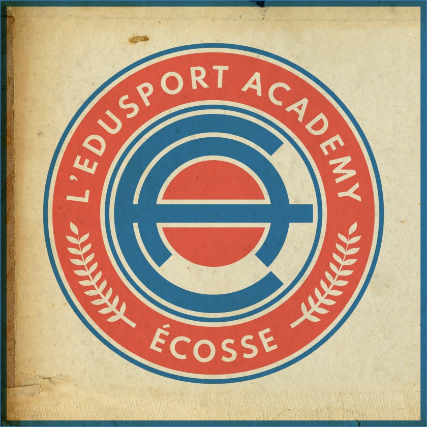
The current badge employs the colours of the French tricolore and features a small Saltire within its central football, representing the link between France and Scotland. While I appreciate the aim of this badge, I find it somewhat difficult to see as more than a relatively weak corporate brand. For a start, the colour scheme of ‘Edusport’ is reminiscent of the uninspiring SportsDirect.com logo. Additionally, the current badge features text within a shield – a ‘no-no’ under ancient Scottish heraldic law. For my redesign, I went for a roundel which features the club’s name with the French definite article le (l’). I have also included the French name for Scotland, Écosse, which is recognised quite readily in Scotland. Also within the outer circlet are found laurel branches, which are found in the current badge. The centre of the redesigned badge features a stylised ‘EA’ monogram and a red circle representing a football.

EAFC badge-01

The kits are based upon previous incarnations of Edusport kits, with thick blue and black hoops on the home kit and red and dark red hoops on the away kit. To me, these seem simple, clean and dramatic.

EAFC kit-01

EAFC badge new-01

13 June 201922 August 2019 E Tagged academy, Annan, badge, crest, Dumfries and Galloway, Dumfriesshire, Edusport, Edusport Academy, Europe, football, France, French, Galabank, LFL, logo, Lowland Football League, Lowlands, monogram, Our Football Club, rebrand, redesign, Scotland, Scottish Lowland Football League, SLFL, sport, texture, UK, United Kingdom Leave a comment

ReBrand: Nairn County FC

graphic

NCFC badge new-01Nairn County Football Club was established in 1914 and gained admittance into the Highland Football League that same year. Due to the disruption caused by the First World War, the cllub would not play its first Highland League match until 1919.
Nairn County’s first significant honour came in the 1956/57 season, when the club won the first of their seven North of Scotland Cups. Their second North of Scotland Cup came in the 1962/63 season. The following year, Nairn County repeated this feat, with the addition of their first of two Highland League Cups. The club’s greatest honour came in the 1975/76 season, when they were crowned Highland League Champions after a hard-fought victory in extra time in a play-off against Fraserburgh.

More recently, Nairn County advanced to the third round of the 2012/13 Scottish Cup, having bested Preston Athletic and league side Clyde, before bringing Forfar Athletic to a replay, which the Wee County lost 2-3 at their home ground of Station Park. But the club wouldn’t end the season empty handed, winning the North of Scotland Cup after defeating Wick Academy 1-2 in extra time.

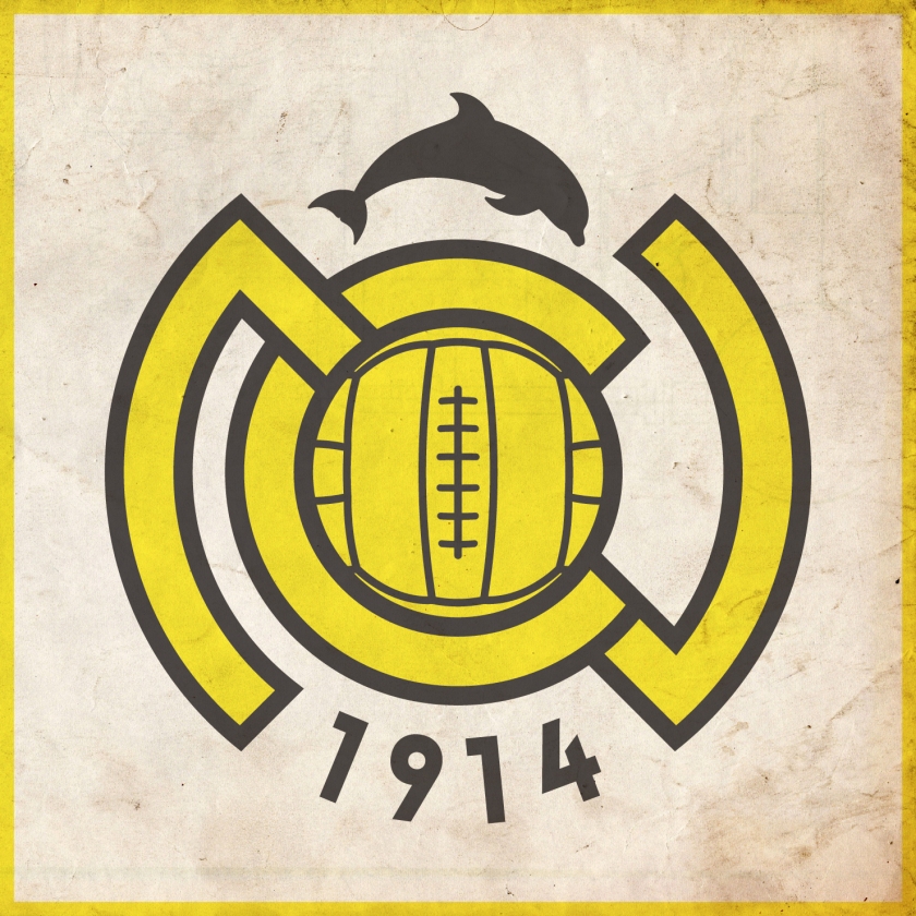
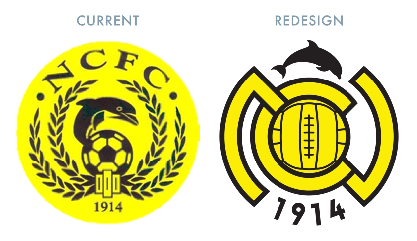
In designing a new badge for the club, I wanted to go for something bolder, opting for an ‘NC’ monogram topped by a silhouette of a more anatomically-correct dolphin than the one in current use.

NCFC badge-01

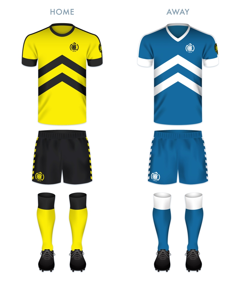
The kit redesigns are based on the current colours used by the club, with their classic ‘maize yellow’ and black v in the home shirt and their blue and white scheme for the away kit. The upward-pointing chevron on the shirts echoes the Nairnshire coat of arms.

NCFC kit-01

NCFC badge new-01

7 February 201924 February 2020 E Tagged A' Ghàidhealtachd, badge, crest, dolphin, Europe, football, HFL, Highland Football League, Highlands, logo, monogram, Nairn, Nairn County, Nairn County FC, Nairn County Football Club, Nairnshire, rebrand, redesign, Scotland, Scottish Highland Football League, SHFL, sport, texture, The Wee County, UK, United Kingdom, Wee County 1 Comment

ReBrand: Cove Rangers FC

graphic

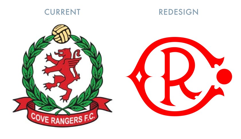
crfc badge new-01Cove Rangers Football Club was established in 1922. The club takes its name from Cove Bay, located in the southeastern corner of the city of Aberdeen, in which they play.
In 1947, the club became a founding member of the Aberdeen Amateur Football Association. That season, Cove Rangers won the first of their 11 amateur championships. In 1948, they began to play at Allen Park. Among them, their highlight came in the 1964/65 season, when the club went unbeaten in the league.

Cove Rangers competed as amateurs until 1985, when they became a junior side. The following season, they became a senior side and joined the Highland Football League. By the 1990s, Cove Rangers began to rack up local silverware and in 2001, they won the first of their six Highland League championships. In 2016, in order to comply with SPFL regulations, the club relocated from Allen Park to their new Balmoral Stadium ground.

The club continued their dominance of the Highland League, finishing at the top of the table over two consecutive seasons between 2017 and 2019. After being crowned league champions at the end of the 2017/18 season, Cove Rangers secured an SPFL promotion playoff by defeating the Lowland League champions Spartans. Ultimately, Cove Rangers lost 3-2 to Cowdenbeath over two legs to remain in the Highland League. The club remained competitive and secured another SPFL promotion playoff the following season with a 5-1 aggregate victory over Lowland League champions East Kilbride over two legs. This time, Cove Rangers faced Berwick Rangers. The Aberdeen side dominated Berwick, winning 0-7 over two legs and gaining promotion into the bottom tier of the SPFL for the 2019/20 season.

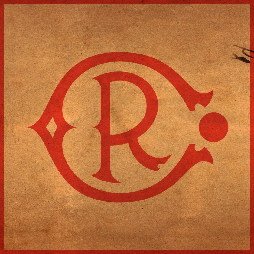
In redesigning the Cove Rangers badge, I wanted to call back to the early twentieth century. I was unconvinced by the olive branches encircling a griffin rampant and decided on a stylised monogram. After first illustrating the ‘C’, I realised that the ends of the legs resembled boots and decided to place a circle, representing a football, between them.

CRFC badge-01

For the home kit, I was inspired by the Cove home kit from the 1982/83 season. The layout of the away kit is also inspired by a Cove home kit from the 1980s – that used in the 1986/87 season.

CRFC kit-01

crfc badge new-01

14 January 201924 February 2020 E Tagged Aberdeen, badge, Cove, Cove Bay, Cove Rangers, Cove Rangers FC, Cove Rangers Football Club, crest, Europe, football, HFL, Highland Football League, Highlands, logo, monogram, rebrand, redesign, Scotland, Scottish Highland Football League, Scottish League 2, Scottish League Two, Scottish Professional Football League, SHFL, SPFL, SPFL League 2, SPFL League Two, sport, texture, Toonsers, typography, UK, United Kingdom, Wee Rangers Leave a comment

ReBrand: Stirling Albion FC

graphic

SAFC badge new-01Stirling Albion Football Club was established in 1945. The club’s formation was tied closely to the end of the Second World War and the dissolution of an earlier Stirling-based club, King’s Park FC (1875). King’s Park were members of the Scottish Football League from 1931 until 1939. In 1940, their home ground, Forthbank Park, was bombed by the Luftwaffe and King’s Park never played again.


After the war, coal magnate and former managing director of King’s Park, Tom Fergusson, purchased the Annfield Estate in Stirling, developing the site as a new football ground and establishing a new football club, Stirling Albion. This new club was accepted into the Scottish Football League for the 1946/47 season and has remained there ever since.

For the first two decades of their existence, Stirling Albion hopped between the top and second tiers, earning the unfortunate nickname, ‘the Yo-Yos’. The club has never soared to especially great heights, their best finish being 12th in the top tier in the 1958/59 season. To date, the 1967/68 season was Stirling Albion’s last spell in top flight football.

The club’s first badge consisted of a rendering of the Stirling coat of arms, composed primarily of a Saltire and lion rampant within a shield. This badge was used from 1961 until 1964. In 1966, Stirling Albion became the first British club to tour Japan. During this tour, a new badge was designed for the club’s blazers. Annfield House, the club’s offices and changing rooms, formed the centrepiece of this badge. Rather humorously, this badge also featured a yo-yo running through its centre. In 1987, the club began to use this badge on their kits.

In 1993, the club left Annfield for a new stadium, called Forthbank after King’s Park FC’s Forthbank Park. The badge featuring Annfield House remained until 2000, when the current badge was chosen as its replacement. The centrepiece of this badge consists of the National Wallace Monument atop Abbey Craig, with the Ochil Hills in the background.

Although the Wallace Monument is a striking structure, being neither ancient (built between 1861 and 1869) nor very central, I find its inclusion to be relatively unrepresentative of both Stirling and the football club. I opted to stay away from a depiction of an architectural landmark and instead, I designed a modern monogram of the club’s initials. The wide-set ‘A’ resembles a set of goals, while the ‘S’ cradles a football into the net (or is it being saved by the keeper?). I decided to keep the red and black colour scheme of the current badge, though, on my kit renderings, the monogram is displayed in one colour.

SAFC badge-01

The home kit is inspired by the classic Stirling Albion home kits from the late 1950s through the mid-1960s, particularly the home kit from the 1964/65 season. The away kit is inspired primarily by the handsome Macron 2015/16 away kit. On this kit, the monogram is presented in yellow on the dark blue field.

SAFC kit-01

SAFC badge new-01

As ever, I am indebted to Dave at Historical Football Kits for some of the historical information used above.

11 June 201824 February 2020 E Tagged badge, Binos, crest, emblem, Europe, football, insignia, King's Park, King's Park FC, King's Park Football Club, Ladbrokes League 2, logo, monogram, rebrand, redesign, Scotland, Scottish League 2, Scottish League Two, Scottish Professional Football League, SPFL, SPFL League 2, SPFL League Two, sport, Stirling, Stirlingshire, The Binos, The Yo-Yos, UK, United Kingdom, Yo-Yos Leave a comment

ReBrand: FC Edinburgh

graphic

FCE badge newThe Football Club of Edinburgh was first formed in 1928 as an amateur side, akin to Queen’s Park. Although the club joined the Scottish Football League in 1931, they struggled throughout the fifteen subsequent seasons and reverted to junior status in 1946. By 1955, the lease at their playing ground (City Park) expired and the football club folded, continuing only as a social club.
In 1966, Postal United Football Club was established and adopted the Edinburgh City name in 1986. By the mid-1990s, this new incarnation of Edinburgh City FC became members of the Scottish Football Association. After competing in the East of Scotland Football League for a number of years, Edinburgh City, along with Gretna 2008, Preston Athletic, Spartans, the University of Stirling, Vale of Leithen and Whitehill Welfare, transferred to the new Lowland Football League for the 2013/14 season.

Edinburgh City were crowned Lowland League champions in the second year of the competition, giving them the opportunity to compete in the Scottish League Two play-off semi-final for a spot in the Scottish Professional Football League. Unfortunately, Edinburgh City lost to the Highland Football League champions, Brora Rangers over two legs. (Brora Rangers would go on to lose to last-place League Two side, Montrose 3-2 on aggregate.)

Edinburgh City would have better luck when they won the Lowland League again in the 2015/16 season. This time, the club faced Cove Rangers in the semi-final. After winning with a 4-1 aggregate score over two legs, Edinburgh City faced the last-place League Two side, East Stirlingshire. The first leg ended in a 1-1 draw. In the second leg, Edinburgh City took the spoils with a 0-1 victory, gaining promotion to the SPFL.

Edinburgh City performed well during its first few seasons in League Two and finished the 2021/22 season in fourth place. This enabled them to enter into the SPFL League One play-off, where they first faced Dumbarton. The Citizens advanced to the next round after having defeated Dumbarton 5-2 over two legs. Next came Annan Athletic, who Edinburgh City beat narrowly (3-2), securing their admittance into League One. After the end of the season, Edinburgh City announced their latest name change and begame the Football Club of Edinburgh, or simply FC Edinburgh.

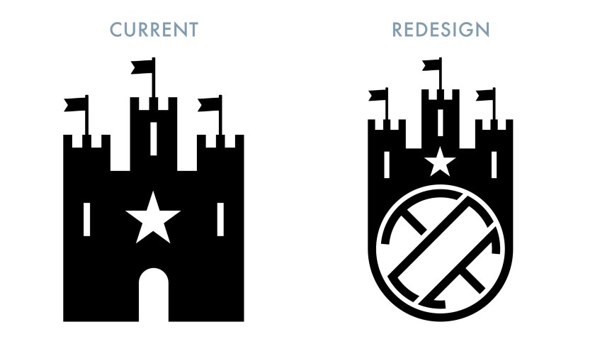
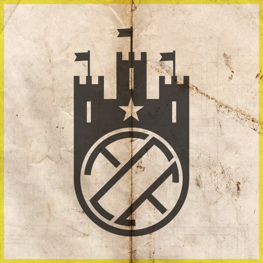
In their early years, the kit of the original Edinburgh City FC featured the coat of arms of Edinburgh. By 1938, the club used an ‘ECFC’ monogram as their badge. Upon the adoption of the Edinburgh City name by Postal United, a new badge, featuring a castle above the club’s initials was used. In 1998, a new club badge was launched, featuring the same castle from 1986, encircled by the club’s full name. For the 2018/19 season, an update on this badge was introduced which included a gold accent. With the most recent renaming of the club, a simple castle is used as the club’s badge.

For this redesign, I opted to include a varation on the stylised football ECFC monogram I had employed in an earlier design, topped with a version of the castle in current use:

FCE badge

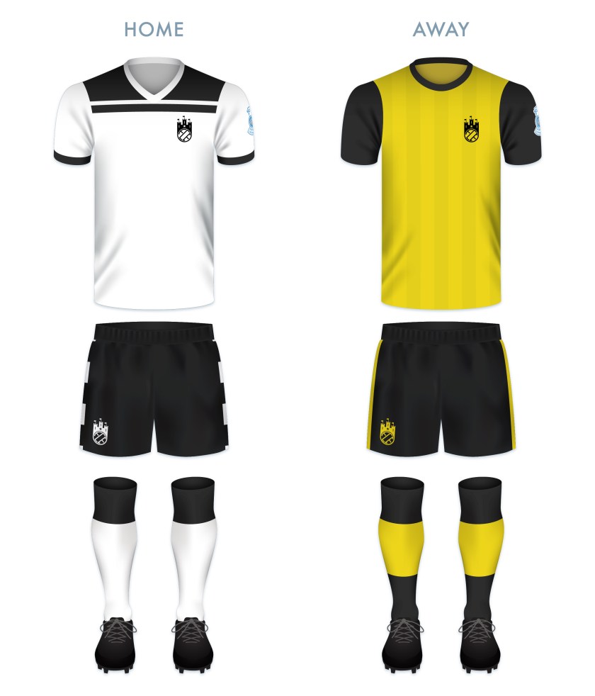
The redesigned home kit consists of a white top with black shorts, the traditional colour scheme since 1928. The top features black details in a scheme resembling Admiral strips from the early 1980s. The away kit is inspired primarily by the 2016/17 Edinburgh City away kit.

FCE kit

FCE badge new

As ever, I am indebted to Dave at Historical Football Kits for some of the historical information used above.

31 May 20183 August 2022 E Tagged badge, crest, Edinburgh, Edinburgh City, Edinburgh City FC, Edinburgh City Football Club, Europe, football, Ladbrokes League 2, logo, monogram, Postal United, Postal United FC, Postal United Football Club, rebrand, redesign, Scotland, Scottish Football Association, Scottish League 2, Scottish League Two, Scottish Professional Football League, SPFL, SPFL League 2, SPFL League Two, sport, UK, United Kingdom Leave a comment

ReBrand: Annan Athletic FC

graphic

AAFC badge new-01Annan Athletic Football Club was established as a junior side in 1942. Following the dissolution of the Dumfries and District Junior League in the early 1950s, Annan Athletic joined the Carlisle and District Football League.

In the 1977/78 season, Annan returned to Scottish football, competing in the South of Scotland Football League. During their spell in the SoSFL, Annan won the league on two occasions (1983/84 and 1986/87). By the 1987/88 season, Annan joined the East of Scotland Football League. They continued their non-professional success, winning the EoSFL four times (1989/90, 1999/2000, 2000/01 and 2006/07).

In 2008, the original Gretna FC folded, making way for the admission of another club into the Scottish Football League. Annan’s application was successful, beating out Cove Rangers, Spartans, Preston Athletic and Edinburgh City. Since joining the SFL, Annan have yet to gain promotion from the bottom tier, but showed promise in the 2015/16 Scottish Cup, advancing to the fifth round before being knocked out by Greenock Morton.

Annan first used a badge on their kits around 1978, and this original badge remains in use today. It features a torch being carried, within a shield, flanked by two thistles. Although Annan are known as ‘the Black and Golds’, the colours of the badge are based upon the colours of the coat of arms of the former royal burgh of Annan.

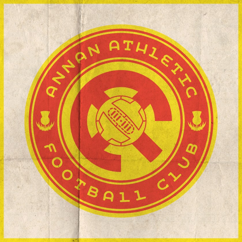
For my redesign, I opted to go the route of a round badge, with a monogram at its centre. The monogram consists of two ‘A’s, tilted at a 45° anti-clockwise angle so as to resemble the town of Annan’s coat of arms (which features a yellow shield bearing a red saltire). At a stretch, the monogram includes the full ‘AAFC’ initials. A t-panelled football is superimposed over the monogram. The club’s name and two thistles occupy the outer ring.

AAFC badge-01 2

AAFC monogram breakdown-01

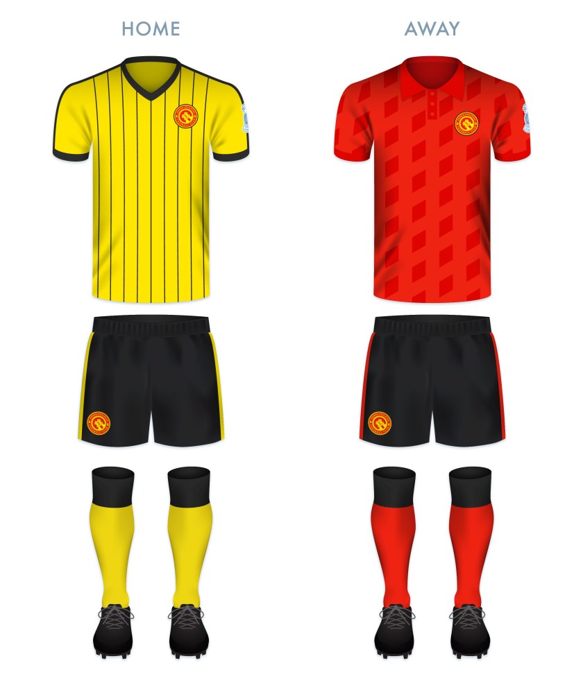
Both of the redesigned kits take their colours from Annan’s traditional home and away kits. The home kit is inspired primarily by Annan’s handsome 1989/90 Umbro home kit.

AAFC kit-01

AAFC badge new-01

As ever, I am indebted to Dave at Historical Football Kits for some of the historical information used above.


19 May 201824 February 2020 E Tagged Annan, Annan Athletic, Annan Athletic FC, Annan Athletic Football Club, badge, Black and Golds, brand, crest, Dumfries and Galloway, Europe, football, Galabankies, Ladbrokes League 2, logo, monogram, rebrand, redesign, Scotland, Scottish League 2, Scottish League Two, Scottish Professional Football League, SPFL, SPFL League 2, SPFL League Two, sport, The Black and Golds, UK, United Kingdom Leave a comment

ReBrand: Forfar Athletic FC

graphic

FAFC badge new-01Forfar Athletic Football Club was established when the now-defunct Angus Athletic Football Club (1883-1885) second team of the broke away from their mother club in 1885. This young team, dubbed ‘the Loons’ (East Angus Scots for ‘young men’) proved their meddle early on, defeating the established Dundonian club, Our Boys, 1-0 in their first match on 16 May 1885.

Since joining the Scottish Football League for the 1921/22 season, the Loons have competed in the professional game in Scotland, but have yet to reach the top tier. Their best Scottish League Cup and Scottish Cup performances came in the 1977/78 and 1981/82 seasons, respectively. In both competitions, the Loons reached the semi-finals, where they lost to Rangers on both occasions. The first was a 5-2 loss in the 1977/78 League Cup, which Rangers would go on to win. In the 1981/82 Scottish Cup, Forfar Athletic forced a replay against Rangers after a 0-0 draw. Unfortunately for the Loons, the replay resulted in a 3-1 loss and the club would go away empty-handed once again.

The Loons’ 1960/61 shirt featured a badge consisting of the four heraldic symbols of the former royal burgh of Forfar within a shield: a Scots fir tree, a bull’s head, a stag’s head and a depiction of the former Castle of Forfar with three towers. A round badge featuring these symbols without a shield came into regular use in 1980. Some version of this badge has been used ever since, with the current badge, in use since 2007, placing the heraldic symbols within a shield once again.

For my redesign, I considered working with the current badge, but decided that, as these symbols are so far removed from the people of Forfar (the castle being destroyed in 1313), I would go another route. This began with a sketch of a highly-stylised, round monogram. Eventually, I placed the monogram within a ring. The outer ring contains two jute plant flowers, a reference to the contribution of the jute industry to the growth of the town in the nineteenth and twentieth centuries. The textile theme is recalled once again by the knot that borders the badge.

FAFC badge-01

For the home strip, I went with the Loons’ classic light blue colour scheme. This particular rendering is inspired by the kits used between 1983 and 1986. The away strip is inspired by an odd move for the club. Between 1955 and 1967, Forfar Athletic departed from their traditional blues in favour of a green home strip. My design draws mostly from the kit used from August to December 1967, but with vertical stripes composed of a diamond pattern.

FAFC kit-01

FAFC badge new-01

Thank you to Forfar Athletic supporter David Carnegie and to Dave at Historical Football Kits for some of the historical information used above.

14 May 201824 February 2020 E Tagged Angus, Angus Athletic, Angus Athletic FC, Angus Athletic Football Club, badge, brand, branding, Europe, football, Forfar, Forfar Athletic, Forfar Athletic FC, Forfar Athletic Football Club, Forfarshire, jute, Ladbrokes League 1, Ladbrokes League One, logo, Loons, monogram, Our Boys, Our Boys FC, Our Boys Football Club, rebrand, redesign, Scotland, Scottish League 1, Scottish League One, Scottish Professional Football League, Sky Blues, SPFL, SPFL League 1, SPFL League One, sport, texture, The Loons, The Sky Blues, UK, United Kingdom Leave a comment

ReBrand: East Fife FC

graphic

EFFC badge new-01The history of football in the conurbation of Levenmouth, East Fife dates from as early as 1879, when junior side Cameron Bridge Football Club was formed. A number of other junior clubs were formed in the late nineteenth century, most notably, Leven Thistle (in the late 1880s), Methil Rovers (1893) and Buckhaven United (1890-91, and then again in 1897). In 1901, Methil Rovers folded and the following year, Leven Thistle, who had changed home ground numerous times, settled in their final home, Town Hall Park, Methil.
As a result of local demand for a senior football club in Levenmouth, East Fife Football Club was established in early 1903. This new club purchased Leven Thistle’s Town Hall Park and renamed it Bayview Park. Soon after, Leven Thistle decided to close up shop. Buckhaven United continued to compete as a junior side until 1912.

After applying for entry into the Scottish Football League on a number of occasions, East Fife joined the reformed Scottish Second Division in 1921 with the incorporation of their Central Football League (which the club had first joined in 1909) into the SFL.

East Fife holds a special place in the history of Scottish football. The Fifers have appeared in three Scottish Cup finals (1926/27, 1937/38, 1949/50), reigning victorious against Kilmarnock in the final replay before a crowd of 92,716 at Hampden Park on 27 April 1938. Until Hibernian defeated Rangers in the 2015/16 Scottish Cup final, East Fife was the only non-top tier club to have ever achieved the honour. It’s also worth noting that East Fife has also won the Scottish League Cup three times (1947/48, 1949/50, 1953/54), a first among all Scottish clubs.

The club’s first kit consisted of a shirt of green and white hoops, similar to those first adopted by Celtic that same year. In 1911, the green and white was swapped for black and gold, which has remained the club’s primary colour scheme ever since.

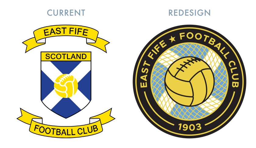
The Fifers first began using a badge on their kit in 1950. This original badge consisted of a shield, divided into thirds. The top portion of the shield featured the club’s initials, while the middle featured a Saltire and the bottom featured a thistle. This badge was used until 1970, when it was replaced by the club’s initials alone. Some variation of the initials remained until 1991, when the first version of the current badge was introduced. Like the 1950 badge, the current badge features a Saltire, with the addition of a superimposed football.

With my redesign, I decided to move away from the above monogram, as well as the current shield, in favour of a round badge. I included the Saltire in my latest redesign as it is the only consistent feature among East Fife’s historical badges. (The omission of a Saltire within a shield also avoids a potential confrontation with the Court of the Lord Lyon.) The Saltire is enclosed in a circle, behind a gold fishing net, a reference to the prevalent fishing industry in East Fife. The historic burgh seals of every settlement on the coast in East Fife feature either the Firth of Forth, fishing boats, fishing nets or fish (or a combination of several of these), including the burgh seal of Buckhaven, Methil and Innerleven, the locale of East Fife FC. The fishing net also acts as a goal net, receiving a football. Lastly, I placed a star in the outer ring, commemorating East Fife’s 1937/38 Scottish Cup victory.

EFFC badge-01

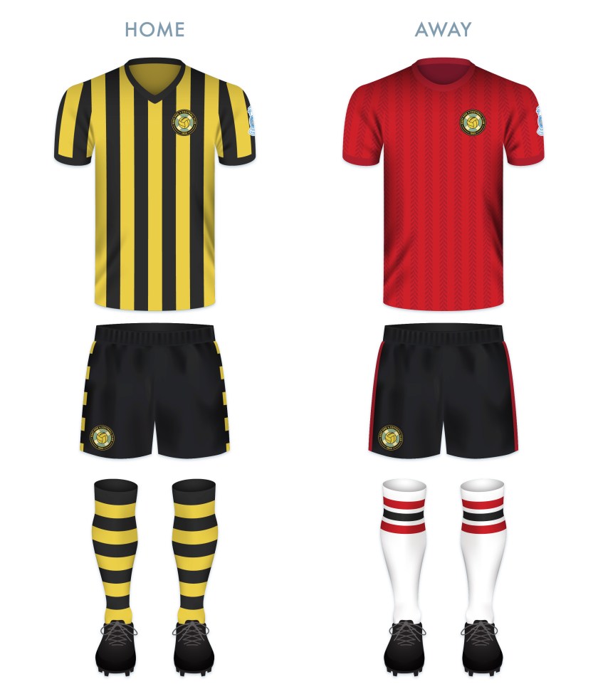
For the home kit, I went with the club’s traditional black and gold vertical stripes with black shorts. I also included black and gold hooped socks, last worn in 1939. For the away shirt, I employed red with dark red herringbone stripes.

EFFC kit-01

EFFC badge new-01

As ever, I am indebted to Dave at Historical Football Kits for some of the historical information used above.

13 May 201824 February 2020 E Tagged badge, brand, branding, East Fife, East Fife FC, East Fife Football Club, Europe, Fife, Fifers, football, Kingdom of Fife, Ladbrokes League 1, Ladbrokes League One, logo, Methil, monogram, rebrand, redesign, Saltire, Scotland, Scottish Cup, Scottish League 1, Scottish League Cup, Scottish League One, Scottish Professional Football League, SPFL, SPFL League 1, SPFL League One, sport, texture, The Fife, The Fifers, UK, United Kingdom Leave a comment

Posts navigation

← Previous
Widgets
Create a website or blog at WordPress.com
Privacy & Cookies: This site uses cookies. By continuing to use this website, you agree to their use.
To find out more, including how to control cookies, see here: Cookie Policy
  • Follow Following
    • ellliottt
    • Join 53 other followers
    • Already have a WordPress.com account? Log in now.
    • ellliottt
    • Customize
    • Follow Following
    • Sign up
    • Log in
    • Report this content
    • View site in Reader
    • Manage subscriptions
    • Collapse this bar
 

Loading Comments...