ellliottt

design & illustration

Menu

Skip to content
  • HOME
  • ABOUT
  • GRAPHIC
    • ALL GRAPHIC DESIGN
    • REBRAND: SPFL
      • Premiership
        • Aberdeen
        • Celtic
        • Dundee
        • Dundee United
        • Heart of Midlothian
        • Hibernian
        • Livingston
        • Motherwell
        • Rangers
        • Ross County
        • St Johnstone
        • St Mirren
      • Championship
        • Arbroath
        • Ayr United
        • Dunfermline Athletic
        • Greenock Morton
        • Hamilton Academical
        • Inverness CT
        • Kilmarnock
        • Partick Thistle
        • Queen of the South
        • Raith Rovers
      • League One
        • Airdrieonians
        • Alloa Athletic
        • Clyde
        • Cove Rangers
        • Dumbarton
        • East Fife
        • Falkirk
        • Montrose
        • Peterhead
        • Queen’s Park
      • League Two
        • Albion Rovers
        • Annan Athletic
        • Cowdenbeath
        • Edinburgh City
        • Elgin City
        • Forfar Athletic
        • Kelty Hearts
        • Stenhousemuir
        • Stirling Albion
        • Stranraer
    • REBRAND: SHFL
      • Brechin City
      • Brora Rangers
      • Buckie Thistle
      • Clachnacuddin
      • Deveronvale
      • Formartine United
      • Forres Mechanics
      • Fort William
      • Fraserburgh
      • Huntly
      • Inverurie Loco Works
      • Keith
      • Lossiemouth
      • Nairn County
      • Rothes
      • Strathspey Thistle
      • Turriff United
      • Wick Academy
    • REBRAND: SLFL
      • Berwick Rangers
      • Bo’ness United
      • Bonnyrigg Rose
      • BSC Glasgow
      • Caledonian Braves
      • Civil Service Strollers
      • Cumbernauld Colts
      • Dalbeattie Star
      • East Kilbride
      • East Stirlingshire
      • Edinburgh University
      • Gala Fairydean Rovers
      • Gretna 2008
      • Spartans
      • University of Stirling
      • Vale of Leithen
  • 2D
  • 3D
    • ALL 3D
    • INSTALLATION
  • PHOTO

Stirling

ReBrand: University of Stirling FC

graphic

USFC badge new-01The University of Stirling was established in 1967. Two years later, the eponymous football club was founded. Among the six teams operated by USFC, the most senior of which has been competing in the Lowland Football League since its inaugural season in 2013/14.

Prior to competing in the Lowland League, in 2008, USFC was admitted to the East of Scotland Football League. In only their second season in the league, USFC won the First Division (at the time, the sole second tier in the EoSFL) title. This saw USFC compete in the Premier Division, the top tier of the EoSFL, in the 2010/11 season. That season, the club secure a second-place finish to Spartans. By the following season, 2011/12, USFC clinched the top spot in the Premier Division.

The 2012/13 season finished with Whitehill Welfare as champions and USFC finishing as runners-up, ahead of Spartans. The following season saw the transfer of these three, alongside Edinburgh City, Gretna 2008, Preston Athletic and Vale of Leithen admitted into the new Lowland League. In that inaugural season, USFC finished in second place, only four points behind the league champion Spartans.

As far as the club’s aesthetics go, the current badge is excellent. The features of the badge come directly from the coat of arms of the university. The university website states:

The coat of arms may be described as an arched bridge topped by a tower and surrounded by open books. The bridge may represent a governor or magistrate, the tower safety and guardianship, while the open books have clear associations with learning and knowledge. The imagery portrays the University as an official guardian entrusted with the safekeeping of the process of imparting knowledge, whilst willingly serving the public.

On a more visual level, the three elements of the coat of arms may be interpreted as a reflection of the University’s striking location in a historic Scotland, suggesting as they do Stirling Bridge, the National Wallace Monument and the University itself.

With the simplicity and cleanliness of the current badge, certain elements might not come across as clearly. For instance, without colour, the wavy lines, which represent water running under the bridge (perhaps the River Forth running under the Old Stirling Bridge) are not as obvious. I decided to stick with the simple design features of the current badge, adjusting various bits and pieces for aesthetic purposes (the normalisation of the ascending and descending arches of the bridge, the increased simplification—even a suggested digitisation—of the open books) and including colours which are akin to those in the official university coat of arms.

USFC badge-01

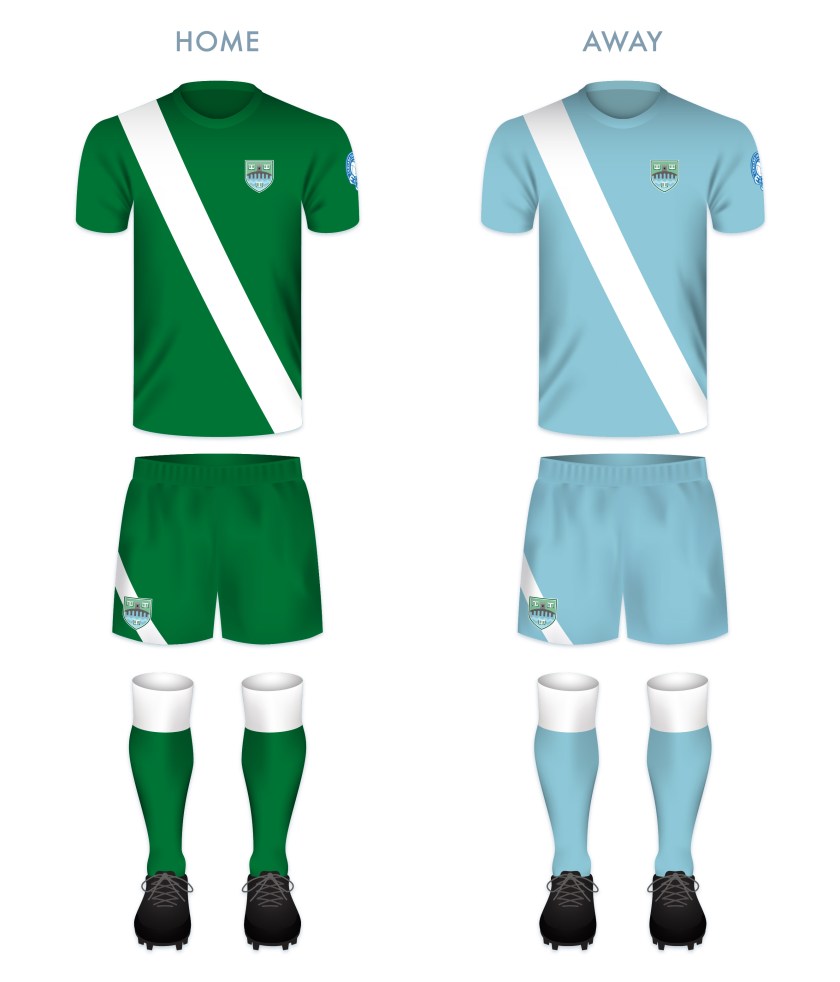
The home and away kits derive their colour schemes from the badge redesign. The predominantly green kit is the colour scheme of the traditional USFC home kit.

USFC kit-01

USFC badge new-01

1 July 201924 February 2020 E Tagged badge, crest, Europe, football, LFL, logo, Lowland Football League, Lowlands, rebrand, redesign, Scotland, Scottish Lowland Football League, SLFL, sport, Stirling, Stirling University, Stirling University FC, Stirling University Football Club, Stirlingshire, texture, UK, United Kingdom, University of Stirling, University of Stirling FC, University of Stirling Football Club Leave a comment

ReBrand: Stirling Albion FC

graphic

SAFC badge new-01Stirling Albion Football Club was established in 1945. The club’s formation was tied closely to the end of the Second World War and the dissolution of an earlier Stirling-based club, King’s Park FC (1875). King’s Park were members of the Scottish Football League from 1931 until 1939. In 1940, their home ground, Forthbank Park, was bombed by the Luftwaffe and King’s Park never played again.

After the war, coal magnate and former managing director of King’s Park, Tom Fergusson, purchased the Annfield Estate in Stirling, developing the site as a new football ground and establishing a new football club, Stirling Albion. This new club was accepted into the Scottish Football League for the 1946/47 season and has remained there ever since.

For the first two decades of their existence, Stirling Albion hopped between the top and second tiers, earning the unfortunate nickname, ‘the Yo-Yos’. The club has never soared to especially great heights, their best finish being 12th in the top tier in the 1958/59 season. To date, the 1967/68 season was Stirling Albion’s last spell in top flight football.

The club’s first badge consisted of a rendering of the Stirling coat of arms, composed primarily of a Saltire and lion rampant within a shield. This badge was used from 1961 until 1964. In 1966, Stirling Albion became the first British club to tour Japan. During this tour, a new badge was designed for the club’s blazers. Annfield House, the club’s offices and changing rooms, formed the centrepiece of this badge. Rather humorously, this badge also featured a yo-yo running through its centre. In 1987, the club began to use this badge on their kits.

In 1993, the club left Annfield for a new stadium, called Forthbank after King’s Park FC’s Forthbank Park. The badge featuring Annfield House remained until 2000, when the current badge was chosen as its replacement. The centrepiece of this badge consists of the National Wallace Monument atop Abbey Craig, with the Ochil Hills in the background.

Although the Wallace Monument is a striking structure, being neither ancient (built between 1861 and 1869) nor very central, I find its inclusion to be relatively unrepresentative of both Stirling and the football club. I opted to stay away from a depiction of an architectural landmark and instead, I designed a modern monogram of the club’s initials. The wide-set ‘A’ resembles a set of goals, while the ‘S’ cradles a football into the net (or is it being saved by the keeper?). I decided to keep the red and black colour scheme of the current badge, though, on my kit renderings, the monogram is displayed in one colour.

SAFC badge-01

The home kit is inspired by the classic Stirling Albion home kits from the late 1950s through the mid-1960s, particularly the home kit from the 1964/65 season. The away kit is inspired primarily by the handsome Macron 2015/16 away kit. On this kit, the monogram is presented in yellow on the dark blue field.

SAFC kit-01

SAFC badge new-01

As ever, I am indebted to Dave at Historical Football Kits for some of the historical information used above.

11 June 201824 February 2020 E Tagged badge, Binos, crest, emblem, Europe, football, insignia, King's Park, King's Park FC, King's Park Football Club, Ladbrokes League 2, logo, monogram, rebrand, redesign, Scotland, Scottish League 2, Scottish League Two, Scottish Professional Football League, SPFL, SPFL League 2, SPFL League Two, sport, Stirling, Stirlingshire, The Binos, The Yo-Yos, UK, United Kingdom, Yo-Yos Leave a comment

Stairs

photo

DSC_1118 01DSC_1149 01DSC_1127 01DSC_1135 01
Gartmore, Scotland, 2014

31 January 201428 May 2014 E Tagged architecture, country house, estate, Europe, fire escape, Gartmore, Gartmore House, rust, Scotland, stairs, Stirling, Stirlingshire, UK, United Kingdom Leave a comment
Widgets
Create a website or blog at WordPress.com
Privacy & Cookies: This site uses cookies. By continuing to use this website, you agree to their use.
To find out more, including how to control cookies, see here: Cookie Policy
  • Follow Following
    • ellliottt
    • Join 53 other followers
    • Already have a WordPress.com account? Log in now.
    • ellliottt
    • Customize
    • Follow Following
    • Sign up
    • Log in
    • Report this content
    • View site in Reader
    • Manage subscriptions
    • Collapse this bar
 

Loading Comments...