
Building on my SPFL badge redesigns, I’ve made a wee map of Fife with the new badges and some club information.

Building on my SPFL badge redesigns, I’ve made a wee map of Fife with the new badges and some club information.
![]() Stirling Albion Football Club was established in 1945. The club’s formation was tied closely to the end of the Second World War and the dissolution of an earlier Stirling-based club, King’s Park FC (1875). King’s Park were members of the Scottish Football League from 1931 until 1939. In 1940, their home ground, Forthbank Park, was bombed by the Luftwaffe and King’s Park never played again.
Stirling Albion Football Club was established in 1945. The club’s formation was tied closely to the end of the Second World War and the dissolution of an earlier Stirling-based club, King’s Park FC (1875). King’s Park were members of the Scottish Football League from 1931 until 1939. In 1940, their home ground, Forthbank Park, was bombed by the Luftwaffe and King’s Park never played again.
After the war, coal magnate and former managing director of King’s Park, Tom Fergusson, purchased the Annfield Estate in Stirling, developing the site as a new football ground and establishing a new football club, Stirling Albion. This new club was accepted into the Scottish Football League for the 1946/47 season and has remained there ever since.
For the first two decades of their existence, Stirling Albion hopped between the top and second tiers, earning the unfortunate nickname, ‘the Yo-Yos’. The club has never soared to especially great heights, their best finish being 12th in the top tier in the 1958/59 season. To date, the 1967/68 season was Stirling Albion’s last spell in top flight football.
The club’s first badge consisted of a rendering of the Stirling coat of arms, composed primarily of a Saltire and lion rampant within a shield. This badge was used from 1961 until 1964. In 1966, Stirling Albion became the first British club to tour Japan. During this tour, a new badge was designed for the club’s blazers. Annfield House, the club’s offices and changing rooms, formed the centrepiece of this badge. Rather humorously, this badge also featured a yo-yo running through its centre. In 1987, the club began to use this badge on their kits.
In 1993, the club left Annfield for a new stadium, called Forthbank after King’s Park FC’s Forthbank Park. The badge featuring Annfield House remained until 2000, when the current badge was chosen as its replacement. The centrepiece of this badge consists of the National Wallace Monument atop Abbey Craig, with the Ochil Hills in the background.
Although the Wallace Monument is a striking structure, being neither ancient (built between 1861 and 1869) nor very central, I find its inclusion to be relatively unrepresentative of both Stirling and the football club. I opted to stay away from a depiction of an architectural landmark and instead, I designed a modern monogram of the club’s initials. The wide-set ‘A’ resembles a set of goals, while the ‘S’ cradles a football into the net (or is it being saved by the keeper?). I decided to keep the red and black colour scheme of the current badge, though, on my kit renderings, the monogram is displayed in one colour.
![]()
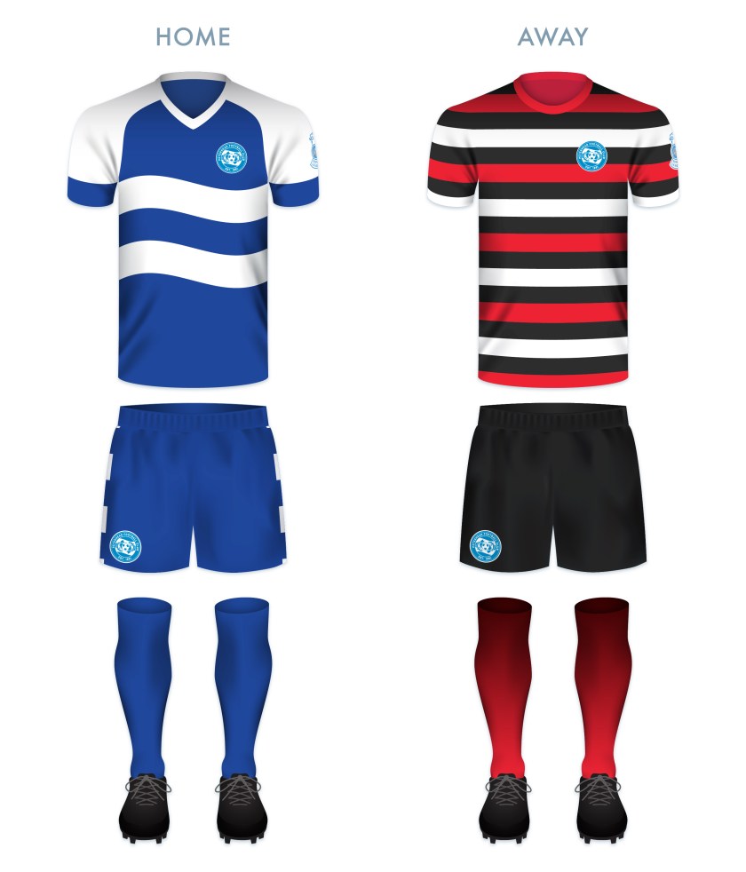
The home kit is inspired by the classic Stirling Albion home kits from the late 1950s through the mid-1960s, particularly the home kit from the 1964/65 season. The away kit is inspired primarily by the handsome Macron 2015/16 away kit. On this kit, the monogram is presented in yellow on the dark blue field.

![]()
As ever, I am indebted to Dave at Historical Football Kits for some of the historical information used above.
![]() Queen’s Park Football Club was established in 1867, making it the oldest football club in Scotland. It can be argued that no single club has had such an influence on the game of football in Britain—and in turn, the world—than Queen’s Park. They invented the passing game (as opposed to the tactic of a ‘rolling-maul’ like that used in rugby, the primary tactic employed by all other football clubs of this early era), as well as the crossbar on goals, the half-time interval and free kicks.
Queen’s Park Football Club was established in 1867, making it the oldest football club in Scotland. It can be argued that no single club has had such an influence on the game of football in Britain—and in turn, the world—than Queen’s Park. They invented the passing game (as opposed to the tactic of a ‘rolling-maul’ like that used in rugby, the primary tactic employed by all other football clubs of this early era), as well as the crossbar on goals, the half-time interval and free kicks.
Having been established in 1871, the [English] Football Association Cup competition predates the Scottish Cup by two years. In these early years, Queen’s Park was invited to participate in the FA Cup and reached the final in 1883/84 and 1884/85, losing to Blackburn Rovers in both. Although other Scottish clubs were invited to participate in early editions of the FA Cup (including Cowlairs, Hearts, Partick Thistle, Rangers, Renton and Third Lanark ), Queen’s Park are the only Scottish club to have ever played in the final.
In Scotland, Queen’s Park won the first three Scottish Cup finals and had amassed ten Scottish Cup final victories between 1873 and 1893. The club’s record would only be surpassed by Celtic in 1922/23 and Rangers in 1935/36. This means that, despite not having won the competition for 125 years, Queen’s Park remain in the third position for all-time Scottish Cup victories.
Another distinguishing feature of this historic club is the fact that Queen’s Park was, until November 2019, an amateur side, reflected in the club’s Latin motto, Ludere causa ludendi, ‘To play for the sake of playing’. So committed had Queen’s Park been to retaining their amateur ideals, that they resisted joining the Scottish Football League when it formed in 1890. Eventually, in 1900, Queen’s Park applied for membership into the SFL and were admitted directly to the top tier. But that season saw Queen’s Park beaten by Celtic in the Scottish Cup final, heralding the end of the amateurs’ dominance of Scottish football.
The Queen’s Park kit did not feature a regular badge until 1928, which has more-or-less remained the same ever since. This badge is heraldic in nature, featuring a black and white hooped shield (reminiscent of the iconic Queen’s Park home shirt, from which their nickname, ‘the Spiders’, is derived) tilted anti-clockwise. The shield is topped by a helmet, from which emerges mantling, a torse and a crest of a lion rampant in red. The club motto is displayed on a scroll beneath the shield.
Given the club’s illustrious history, I found the Spiders’ badge one of the most difficult to redesign. Being that they are the oldest club in Scotland, I found it essential to include the year of their formation, as well as the club’s initials and the Latin motto. I have included all of these features in a typeface of my own design, inspired by the script in several medieval illuminated manuscripts. As a centrepiece, I have included an illustration of a Victorian era football.
![]()
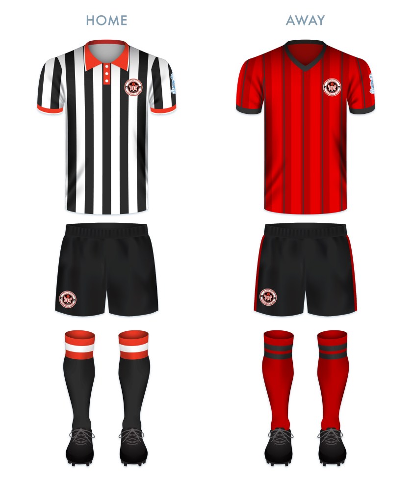
Both of the kit redesigns are based on historic Queen’s Park kits. The home kit features the club’s traditional tight black and white hoops (in use since 1873). In particular, this kit is inspired by the 1927/28 home kit and variations on said kit used until 1960. The away kit is inspired primarily by the home kit worn from 1872 to 1873, with dark blue and white hooped socks. This similar dark blue and grey colour scheme was also used in the home kit between 2016 and 2018 to commemorate the club’s 150th anniversary.

![]()
As ever, I am indebted to Dave at Historical Football Kits for some of the historical information used above.
![]() Peterhead Football Club was established in 1891 by a number of local football enthusiasts. The passion of this young club caught the attention of the town’s Feuars Managers and a plot of land was gifted to the club within Peterhead’s Raemoss Park. Recreation Park, as it this original home ground was called, opened that same year. Although the stage was set for competition, Peterhead would have to wait until their admittance into the small Aberdeenshire Football Association (consisting of only six sides) in 1900 before playing competitive football.
Peterhead Football Club was established in 1891 by a number of local football enthusiasts. The passion of this young club caught the attention of the town’s Feuars Managers and a plot of land was gifted to the club within Peterhead’s Raemoss Park. Recreation Park, as it this original home ground was called, opened that same year. Although the stage was set for competition, Peterhead would have to wait until their admittance into the small Aberdeenshire Football Association (consisting of only six sides) in 1900 before playing competitive football.
In 1931, Peterhead would join the larger Highland Football League, where they would be crowned champions three times in four seasons (1946/47, 1948/49, 1949/50) and then twice more, in 1988/89 and 1998/99. The club also won the Highland League Cup on five occasions (1962/63, 1965/66, 1967/68, 1980/81 and 1988/89).
After competing for over a century as a non-league side, Peterhead would gain admittance into the Scottish Football League in 2000. Their application was aided by their relocation to Balmoor in 1997.
In 2013/14, Peterhead topped the Scottish League Two table, gaining promotion to League One. Their stay in League One lasted only three seasons, though they came close to returning to the third tier after finishing second in the 2017/18 League Two season. This led to a play-off, in which the club was defeated by fellow League Two side, Stenhousemuir over two legs, despite the latter having finished the season 22 points behind Peterhead. Undeterred, Peterhead returned to the third tier after winning League Two in the 2018/19 season.
Peterhead adopted their nickname ‘the Blue Toon’, from their town, which itself probably comes from the fact that the historical fishermen of the port town were known for wearing blue worsted stockings. Accordingly, blue has been Peterhead FC’s primary colour since their early days.
The club’s kit first featured a badge in 1947. This badge consisted of the club’s ‘PFC’ initials within a shield and was used for one season before being revived during the early 1960s. Several variations of the club’s initials appeared on their kits at various points in the 1980s.
In 1989, when Peterhead won the Highland League title (their first such honour since 1950), the club adopted a new badge to celebrate the achievement. This badge featured of a version of the Peterhead coat of arms. In 1993, the club became a limited company and adopted their current badge. This badge consists of a downward-pointing triangle with a wavy top, representing the sea. Within the triangle is an illustration of a football and a fish—the fish representing the town’s fishing industry—superimposed over a net. The badge also features an outer ring and the club’s nickname.
For my redesign, I wanted to create something more unified and balanced than the current badge. I decided to omit the triangle so as to avoid any resemblance to the much older Dunfermline Athletic badge. I illustrated a new football, encircled by two haddock fishes for the centrepiece of the badge. I also included blue and white waves to represent the sea.
![]()
For Peterhead’s home shirt, I employed a blue and white colour scheme, with the waves on the body of the kit echoing the waves in the badge. The home socks are all blue, calling back to the blue worsted stockings from which the Blue Toon gets its nickname. The away shirt colour scheme of red, white and black is taken from many historical Peterhead away strips.
![]()
As ever, I am indebted to Dave at Historical Football Kits for some of the historical information used above.
![]() Elgin City Football Club was established when two Elgin-based clubs, Rovers FC (1887) and Vale of Lossie FC (1888) united in 1893. For more than a century, the club competed in the Highland Football League, amassing a number of regional honours.
Elgin City Football Club was established when two Elgin-based clubs, Rovers FC (1887) and Vale of Lossie FC (1888) united in 1893. For more than a century, the club competed in the Highland Football League, amassing a number of regional honours.
In the 1967/68 Scottish Cup, Elgin City defeated Albion Rovers, Tarff Rovers, Forfar Athletic and Arbroath to teach the quarter-final. Their opponents, Greenock Morton proved too strong for the Highland League outfit and Elgin City left the tournament after a 2-1 loss. No other Highland League club, before or since, has progressed as far in the Scottish Cup.
In 2000, the Scottish Premier League (the top tier in Scottish football at the time) expanded from 10 to 12 clubs, opening the door for the admittance of two new clubs into the bottom tier of the Scottish Football League. Elgin City, along with fellow Highland Leaguers Peterhead, were successful in their application and have competed in the SFL (and subsequent Scottish Professional Football League) ever since.
Throughout the vast majority of the club’s history, Elgin City’s home shirt has consisted of black and white vertical stripes. It was not until 1990 that the kit featured a badge, which is still used today. This badge, a rendering of the coat of arms of the city and royal burgh of Elgin, features the patron saint of Elgin, St Giles, supported by two angels and bears the motto, Sic itur ad astra (Latin for ‘Thus one goes to the stars’ or ‘Such is the way to immortality’, from Virgil’s Aeneid, IX). The angels and motto refer to the legend that at his death, St Giles was brought by angels to heaven.
Despite the conceptual strength of the current badge, I find its execution lacking. While I admire the strength of a minimalist depiction of figures within a badge, I wanted to add more details so as to better resemble traditional depictions of the Elgin coat of arms and to create more depth.
As I wished to include the fine Latin motto, I did away with the shield (so as to avoid conflict with the ancient Scottish heraldic law forbidding the use of lettering within shields that are not approved by the Court of the Lord Lyon) as well as the stone compartment in which the motto was written in the original badge. I placed this redesign within a circular badge and added a football to occupy the negative space above the shield bearing St Giles. The dominant colours of the redesigned badge (red and white) are in line with the specified colours of the Elgin coat of arms, which are taken from the traditional colours of the Moray region.
![]()
Both kit redesigns make use of traditional Elgin City colours. The home kit redesign is inspired primarily by the Elgin City kit used from 1991 to 1993.
![]()
As ever, I am indebted to Dave at Historical Football Kits for some of the historical information used above.
![]() The history of association football in Scotland is tied inextricably to cricket. Along with clubs such as Kilmarnock, St Johnstone, St Mirren and potentially Heart of Midlothian, Dunfermline Athletic was established as a winter sporting pursuit in the cricket off-season.
The history of association football in Scotland is tied inextricably to cricket. Along with clubs such as Kilmarnock, St Johnstone, St Mirren and potentially Heart of Midlothian, Dunfermline Athletic was established as a winter sporting pursuit in the cricket off-season.
The original club was called Dunfermline Football Club and was established in 1874. In order that non-cricket club members could join, Dunfermline FC broke away from the cricket club and became Dunfermline Athletic FC in 1885.
Dunfermline Athletic, or ‘the Pars’, as they are known, had a shot at their first major honour when they reached the final of the 1949/50 Scottish League Cup at Hampden Park. There, they faced their fellow Fifers, East Fife, who had won the competition two years earlier. The Pars were unlucky that day, losing 3-0, but a decade later they would have another opportunity at silverware.
On 26 April 1961, the Pars defeated Celtic 2-0 in the Scottish Cup final replay. Celtic would return the favour by defeating the Pars 3-2 in the 1964/65 final of the same competition. But the Pars’ tenacity brought the Scottish Cup back to East End Park after the club defeated Hearts in the 1967/68 final. It should also be noted that the Pars beat holders Celtic, fresh off of their illustrious 1966/67 season, in the first round of the 1967/68 Scottish Cup.
The Dunfermline Athletic kit did not include a badge until the 1958/59 season, when the club employed the skills of Dunfermline High School art teacher Colin Dymock. Dymock’s badge was thoroughly modern in shape, colour and design. It took the shape of a downward-pointing triangle and featured Malcolm’s Tower, a local landmark, as its centrepiece. This original badge was dropped from the kit in 1962.
The Pars’ shirt featured an encircled ‘DAFC’ monogram for the 1971/72 season and then from 1977 until 1986, home shirts featured the club’s initials alone. For the 1986/87 season, the club began to use a slight variation on Dymock’s 1958 badge design, and similar badges have adorned the breast of the Dunfermline Athletic shirt ever since.
The current Dunfermline Athletic badge is a cracker. When the first version was introduced in 1958, it would have been ground-breaking (and perhaps polarising). But it has become a cherished staple of the Dunfermline Athletic identity. That being stated, I find the badge very unrelatable. Malcolm’s Tower, named after Malcolm III of Scotland (Gaelic: Máel Coluim mac Donnchada, who reigned from 1058 to 1093), is a very historically significant site as it marks the move of the seat of royal power from Forteviot in Strathearn (modern-day Perth and Kinross) to Dunfermline. A crude depiction of the tower has featured in the Dunfermline coat of arms for centuries. But all that remains of the tower today is a foundational ruin and its precise design is unknown. As a result, Dymock’s design is simply an interpretation of what the tower might have looked like, and in a fragmented, modern style.
The challenge of redesigning such a unique and iconic badge has been floating around in my mind for a while now. I struggled while considering what iconography I might employ. Given my perception of the unrelatable nature of the 1958 badge, I wanted to offer something either more familiar or entirely different. I opted to retain the iconic triangular shape of the badge, but instead of Malcolm’s Tower, I decided to make use of one of Dunfermline’s most physically prominent and handsome landmarks: the clock tower of the City Chambers. With its striking green roof of oxidised copper and its skilful combination of French, Gothic and Scots baronial architectural styles, I believe that the clock tower proves to be a very fitting centrepiece for the redesigned badge. I also incorporated the zig-zagged white cloud stripes from the 1958 badge and lightened the blue background to sky blue.
![]()
For the home shirt, I decided to continue with the Pars’ long tradition of black and white vertical stripes (in near-constant use since 1909), but with a pattern that echoes the triangular badge. For the away strip, I decided to make use of red (the predominant away strip colour over the last two decades) with a black gingham pattern (inspired by the 1996/97 home strip).

![]()
As ever, I am indebted to Dave at Historical Football Kits for some of the historical information used above.
![]() It is recorded that by the middle of the nineteenth century, nearly 20% of Dundee’s population were Irish-born immigrants. As Hibernian had been established in 1875 in order to provide opportunity for young Irish Catholic immigrants in Edinburgh, the Irish Catholic community in Dundee formed their own club in 1879 – Dundee Harp.
It is recorded that by the middle of the nineteenth century, nearly 20% of Dundee’s population were Irish-born immigrants. As Hibernian had been established in 1875 in order to provide opportunity for young Irish Catholic immigrants in Edinburgh, the Irish Catholic community in Dundee formed their own club in 1879 – Dundee Harp.
One match of note took place on 12 September 1885, when Dundee Harp racked up a remarkable 35-0 victory over Aberdeen Rovers (who competed from 1884 until 1889). What makes this feat even more peculiar is that it happened on the very same day that Arbroath achieved their record 36-0 victory over Bon Accord, the largest margin of victory in world football until 2002. Needless to say, 12 September 1885 was a bad day to be an Aberdonian club.
By 1894, Dundee Harp was facing serious financial difficulties, resulting in suspension by the SFA and eventual dissolution.
In 1909, Dundee Hibernian Football Club was formed with a mission similar to that of Edinburgh’s Hibernian, Dundee Harp and Celtic. After only one season, Dundee Hibernian were admitted into the Scottish Football League. In order to appeal to a base beyond the Irish Catholic community in Dundee, the club changed their name to Dundee United in 1923. The name ‘Dundee City FC’ had been floated, but this was protested by the club’s cross-town rivals, Dundee FC.
In the 1924/25 season, Dundee United secured promotion to the top tier for the first time. They remained there for two seasons, being relegated in 1927 and then returning in 1929. This 1928/29 second tier championship would be United’s last major honour for more than 50 years, when they won two consecutive Scottish League Cups (1979/80 and 1980/81). These League Cup victories signalled the beginning of the ‘New Firm’, when both United and Aberdeen would prove themselves as worthy competitors against Celtic and Rangers. United was also a relatively formidable football club on the European scene in the mid-1980s.
More recently, United won the 2009/10 Scottish Cup (their second victory in ten Scottish Cup final appearances). Having experienced a period of bad form in the 2015/16 season, United were relegated from the top tier. With the events of the COVID-19 pandemic, the 2019/20 season ended prematurely. At that point, United had all but won the second-tier championship with a commanding 14-point lead after 28 matches. Although the second-place Inverness Caledonian Thistle had a game in-hand, the final decision regarding the table placement came down to a ‘points per game’ ranking in which United’s 2.11 secured their first-place finish over ICT’s 1.67.
With my redesign, I have decided to stick with the somewhat jarring black and tangerine colour scheme because it’s been a ‘DUFC’ trademark since the late 1960s. But I found the black text on an orange field very unpleasing to the eye. I replaced the clunky, emboldened (and overused) Roman typeface and added the year of the club’s founding, 1909. The lion rampant has been replaced by two dragons for historical reasons, as the former Dundee Hibernian’s original crest was inspired by the Dundee coat of arms, featuring two dragons supporting an entwined ‘DH’. This was done away with when the club was renamed Dundee United. The lion rampant, which had featured on match programmes from 1956, was incorporated into a badge in 1967.
![]()
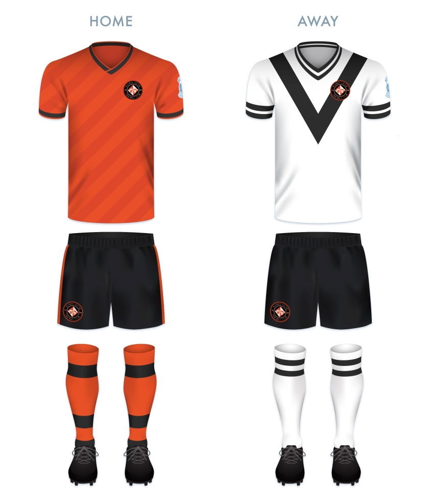
Because of Dundee United’s place as part of the ‘New Firm’ that dominated Scottish football in the 1980s, the home strip redesign is inspired by the classic Adidas kits worn during that period. The away strip redesign is inspired by United home shirts from the late 1920s.
![]()
As ever, I am indebted to Dave at Historical Football Kits for some of the historical information used above.
![]() Dumbarton Football Club was established in 1872, making it the fourth oldest association football club in Scotland, after Queen’s Park (1867), Kilmarnock (1869) and Stranraer (1870).
Dumbarton Football Club was established in 1872, making it the fourth oldest association football club in Scotland, after Queen’s Park (1867), Kilmarnock (1869) and Stranraer (1870).
During these early years, Dumbarton—or ‘the Sons’, as they are known—were one of the most competitive sides in Scottish football. They were regular features in the Scottish Cup (winning in 1882/83 and coming runners-up on five occasions between 1880 and 1897). Dumbarton also have the distinction of being crowned Scottish champions for the first two seasons of the Scottish Football League (1890/91 and 1891/92) and of being one of only two clubs (the other being Rangers) to win each of the four tiers in Scottish professional football.
Over the years, I have found it difficult to pursue a redesign of the Dumbarton badge. Put simply, the current badge is excellent. To even consider redesigning it is a daunting task. Still, I thought of what was possibly missing from the current badge. Certainly, the year the club was founded is of note. Being that the elephant in the current badge represents Dumbarton Rock (mounted by Dumbarton Castle) and given the fact that Dumbarton’s home ground is at the foot of the rock, I also saw an opportunity to incorporate a football at the elephant’s foot.
Ultimately, I decided that I wanted to retain an elephant image. With that exception, I departed fully from Dumbarton’s handsome badge. 1 FC Köln and Derby County FC, with their iconic animal badges, came to mind. But I wanted something yet more simple. Very intentionally, the elephant in my redesign is unbridled and more lively than the one in the current Dumbarton badge—and it’s ever-so-slightly more anatomically correct, while maintaining a light, minimalistic feel.
![]()
The home shirt I designed has a 1970s feel, with alternating vertical bars of two shades of gold. The away strip takes its colours and hoops from the 1881 to 1885 home strip used by Dumbarton Athletic FC (which merged with Dumbarton in 1889).

![]()
As ever, I am indebted to Dave at Historical Football Kits for some of the historical information used above.
![]() The 2017/18 season was unpleasant for Brechin City Football Club. They finished at the bottom of the Scottish Championship table, having failed to win a single match and having amassed only four points from four draws. The following season, in League One, Brechin City was able to amass 36 points (9 wins, 9 draws, 18 losses), but this was not enough to save the club from their second consecutive relegation.
The 2017/18 season was unpleasant for Brechin City Football Club. They finished at the bottom of the Scottish Championship table, having failed to win a single match and having amassed only four points from four draws. The following season, in League One, Brechin City was able to amass 36 points (9 wins, 9 draws, 18 losses), but this was not enough to save the club from their second consecutive relegation.
Brechin’s woes continued in the 2019/20 season, when they finished at the bottom of the League Two table. This and the following season were cut short due to the COVID-19 pandemic, and despite having finished at the bottom of the table in their first season in League Two, promotions into and relegations from the league were suspended. Unfortunately, the 2020/21 season spelled the end of Brechin City’s run in the SPFL, finishing at the bottom of the table again and losing a two-leg play-off 3-1 to Lowland League champions Kelty Hearts. As a result, Brechin City were relegated from the professional league for the first time in 67 years and will compete in the Highland League for the 2021/22 season.
Not wanting to add insult to injury, here is a badge redesign with which I can say that I am pleased.
Brechin City FC was established in 1906 by players from two Brechin-based junior sides (Brechin Harp and Brechin Hearts). The club name, ‘Brechin City’, derives from an historic designation of Brechin as a ‘city’, the result of the presence of its medieval cathedral (which dates from the 13th century). A simple illustration of the cathedral itself (now only a ‘cathedral’ in name as it is home to a Church of Scotland congregation, thus having no bishop) was first featured in the 1985 badge, which was updated to the current badge in 1995. For the 2006/07 season, the Brechin City badge featured different colours and a special centenary banner.
For my redesign, I had originally explored using some of the heraldic symbols of Brechin. While mulling over options, I rendered a simple, but more detailed and accurate illustration of the main tower of Brechin Cathedral than the one used in the current badge. This image took my fancy and I built a simple badge around it, which is seen on the right below. A subtle detail in the redesign is found in the clock, which shows six minutes past seven, or 19:06, symbolising the founding of the club.
![]()
For the home shirt, I went with Brechin City’s red (in constant use since 1955) and a black sash with a white border (mirrored in the collar). For the away shirt, I employed a white and light blue harlequin design, which was used in the 1909/10 season.

![]()
As ever, I am indebted to Dave at Historical Football Kits for some of the historical information used above.
![]() Dingwall-based Ross County Football Club were formed in 1929. Although the club was not admitted into the Scottish Football League until 1994, County has a long history of faring well against league sides in early rounds of the Scottish Cup while members of the Highland Football League. Since entering the SFL (and later Scottish Professional Football League), County have worked their way up the ranks. They reached their only Scottish Cup final in 2009/10, though they lost 3-0 to Dundee United.
Dingwall-based Ross County Football Club were formed in 1929. Although the club was not admitted into the Scottish Football League until 1994, County has a long history of faring well against league sides in early rounds of the Scottish Cup while members of the Highland Football League. Since entering the SFL (and later Scottish Professional Football League), County have worked their way up the ranks. They reached their only Scottish Cup final in 2009/10, though they lost 3-0 to Dundee United.
In 2013, County reached the top tier for the first time in their 80+ year history. That season was an anomaly as Rangers had been booted down to the SFL Third Division (now the Scottish League Two) after a series of administrative issues, thus opening the door for the promotion of two second tier clubs. The second club, Dundee, did not fare well, and like Dunfermline Athletic of the 2011/12 season, Hamilton Academical of the 2010/11 season and many other newly promoted clubs, Dundee was relegated back to the second tier after only one season in the top. The same was not so for Ross County, who ended the 2012/13 season in the fifth spot on the table, just one point behind their Highland rivals, Inverness Caledonian Thistle.
In January 2016, County beat Celtic 3-1 in the 2015/16 Scottish League Cup semi-final, securing a spot against Hibernian in the final. On 13 March, Ross County earned their first professional cup with a 2-1 win against Hibs. But their fortunes didn’t last forever. County finished the 2017/18 season at the bottom of the Premiership table and were relegated to the second tier. Fortunately, their stay in the second tier came to an end at the end of the 2018/19 season, when County finished top of the Championship table and gained promotion back to the Premiership.
While I appreciate the minimalism of the current badge, in use since 1990, for my redesign, I decided to capitalise on the heritage of the historic County of Ross and Cromarty, both in colour and in symbolism. The shield in the middle of the badge is a retooling of the Ross and Cromarty coat of arms. The three lions rampant are taken from the old Earldom of Ross. The stag’s head is taken from the arms of the MacKenzies of Kintail, Earls of Seaforth. The flaming beacon is taken from the crest of the MacKenzies and the arms of the MacLeods of Lewis.
![]()
Unintentionally, my home shirt redesign resembles a hybrid of the traditional Ajax and Paris Saint-Germain home strips. I find the red and dark blue striking. The away shirt is inspired by original Ross County home strip used from 1929 to 1939. I also employed a stag’s head for the away badge, inspired by the County badge in use from 1953 to 1959, and then again from 1982 to 1987.

![]()
As ever, I am indebted to Dave at Historical Football Kits for some of the historical information used above.
