 Established in 1879, Montrose Football Club were founding members of the Forfarshire Football Association in 1883. It would be another 40 years before Montrose would join the ranks of the Scottish Football League. Since that time, the club has been been hacking away in the lower leagues of Scottish football with little to show for it apart from local cup victories (they are ten-time winners of the Forfarshire Cup) and a handful of appearances in the later stages of the Scottish Cup and Scottish League Cup.
Despite a history of many disappointments, the 2017/18 season was strong for Montrose, with the club finishing at the top of the Scottish League Two table, thus gaining promotion to League One (Montrose’s first departure from the bottom tier since the 1995/96 season). This is all the more significant due to the fact that only a few seasons earlier, in 2014/15, Montrose narrowly avoided losing their place in the Scottish Professional Football League by defeating the Highland Football League champions, Brora Rangers in a play-off.
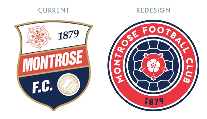
Except for different versions of the club’s initials, the current badge, introduced in 1990, is the only badge that Montrose has ever used. This features a rose (from the folk etymology of Montrose, ‘Mount of Roses’), a football, the club name and the date of the club’s founding.
I first attempted to redesign the Montrose badge in 2014. For this initial redesign, I drew inspiration from a badge that was used for only one season (1973/74), featuring an ‘M’ flanked by an ‘F’ and a ‘C’. In this initial redesign, the diagonal strokes on the ‘M’ meet well below the baseline. In addition to the very deep crotch on the ‘M’, I decided to add the rose and the date of the club’s founding to create a stronger sense of centrality. This initial redesign, on the left below, was published on 3 November 2014:
 I was quite sold on my 2014 redesign, but I thought that I ought to challenge myself further in this round by tackling the badge from another angle. Using the same rose motif, I constructed a round badge, with the rose superimposed over a football. I was aiming for clean and basic with this design.

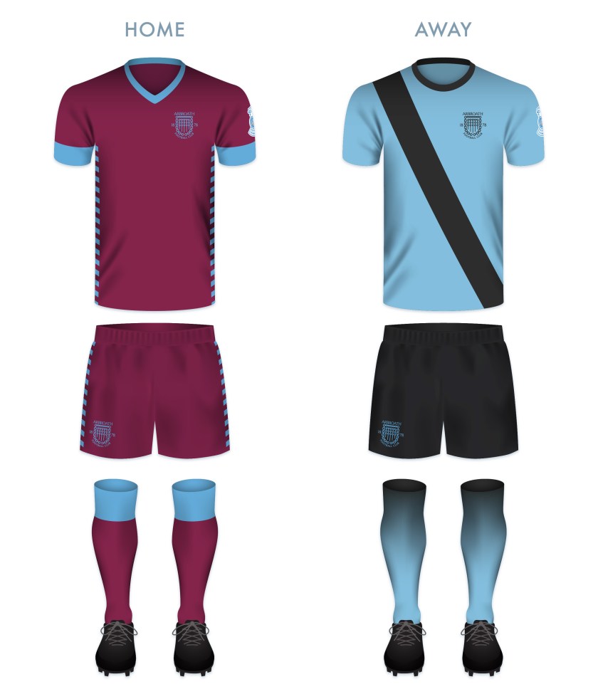
The home kit is inspired by Montrose kits from 1959 to 1970. The away strip makes use of the colour scheme of the badge, dominated by red. The shorts for both kits feature only the central badge image of the rose superimposed over the football.


As ever, I am indebted to Dave at Historical Football Kits for some of the historical information used above.

 Forfar Athletic Football Club was established when the now-defunct Angus Athletic Football Club (1883-1885) second team of the broke away from their mother club in 1885. This young team, dubbed ‘the Loons’ (East Angus Scots for ‘young men’) proved their meddle early on, defeating the established Dundonian club, Our Boys, 1-0 in their first match on 16 May 1885.


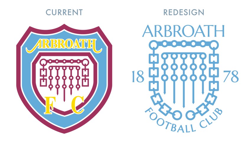
 Arbroath Football Cub was established in 1878 and as early as 1885, their shirts featured a badge consisting of a golden portcullis sewn into a large shield, representing the entrance to the ruined Arbroath Abbey (famous, in part, for its association with the


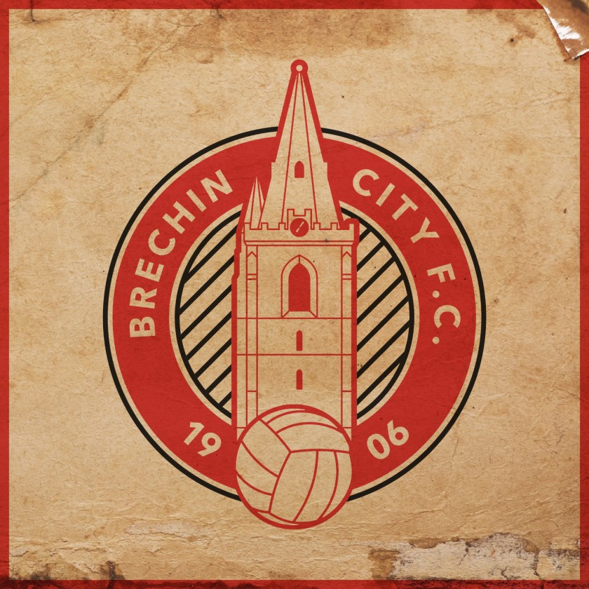
 The 2017/18 season was unpleasant for Brechin City Football Club. They finished at the bottom of the

