
Building on my SPFL badge redesigns, I’ve made a wee map of Fife with the new badges and some club information.

Building on my SPFL badge redesigns, I’ve made a wee map of Fife with the new badges and some club information.
![]() The exact year that Cowdenbeath Football Club was established is unclear. The current club had its genesis in the union of two local clubs (Cowdenbeath Rangers and Cowdenbeath Thistle), which took place in 1881. It has been suggested by the club’s historian, David Allan, that the club retained the name ‘Cowdenbeath Rangers’ until 1882, when the club merged with a Raith Rovers FC (not to be confused with the current Raith Rovers). What is known with certainty is that the current club has been playing as Cowdenbeath FC since at least 1882.
The exact year that Cowdenbeath Football Club was established is unclear. The current club had its genesis in the union of two local clubs (Cowdenbeath Rangers and Cowdenbeath Thistle), which took place in 1881. It has been suggested by the club’s historian, David Allan, that the club retained the name ‘Cowdenbeath Rangers’ until 1882, when the club merged with a Raith Rovers FC (not to be confused with the current Raith Rovers). What is known with certainty is that the current club has been playing as Cowdenbeath FC since at least 1882.
Regardless of whether they were established in 1881 or 1882, Cowden is the oldest of the four surviving professional football clubs in Fife (which includes the aforementioned Raith Rovers, established in 1883, Dunfermline Athletic, established in 1885 and East Fife, established in 1903).
Cowden competed in the Fifeshire Football Association from its inaugural season in 1882/83, losing that first Fife Cup 4-1 to the original Dunfermline Football Club. Two years later, against the same Dunfermline, the club would win the first of its 25 Fife Cups with a scoreline of 4-0.
In 1905, Cowden were admitted into the Scottish Football League and, despite having not won any major honours, competed in Scottish league football until the end of the 2021/22 season. Cowden ended up at the bottom of the League Two table and lost their place to Bonnyrigg Rose over two legs. As a result, the clab was relegated to the Scottish Lowland League for the 2022/23 season.
The Cowdenbeath kit did not feature a badge until the 1984/85 season. This badge was based on a design that had been used in the club’s programmes since 1970. The current badge is a variation of this 1984 badge, with the notable addition of a winding wheel, pickaxes and shovels, which call back to the mining history of the town.
The aim for my badge redesign was to create something simple, clear and significant. I omitted the shield entirely, incorporating the badge within a roundel. I did away with the stereotypical Scottish symbolism of the thistles and lion rampant, as well as the two crosses (symbols which I believe may be associated with the club’s ancestors, Cowdenbeath Rangers, Cowdenbeath Thistle and the original Raith Rovers), the meanings of which seem to have been obscured over time.
At the centre of my redesigned badge are a crossed hammer and pickaxe, which reference the town’s mining history. A football is superimposed over these symbols and below is found a banner bearing the Cowdenbeath town motto, Stent nae stent (Scots for ‘Effort always effort’, the term ‘stent’ having a particular association with mining shifts). For the colours, I opted for a light blue and gold, which stands out from the blue of the traditional Cowdenbeath home shirt.
![]()
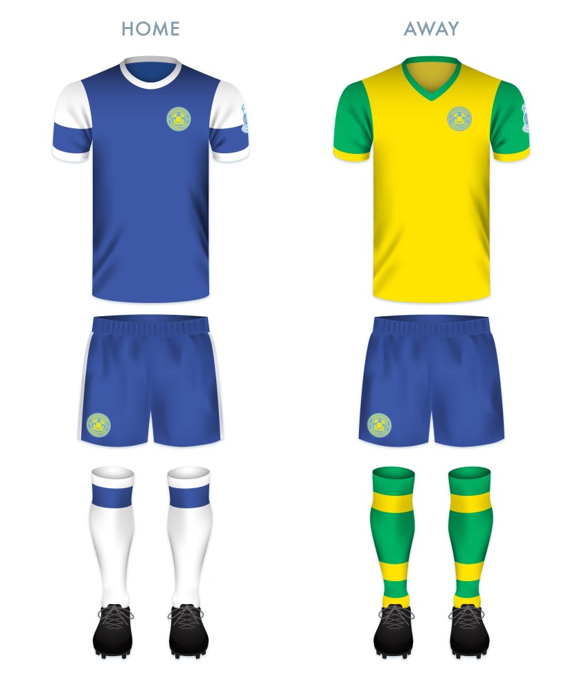
The home kit design was inspired primarily by the 1974/75 and 1981/82 home kits. The away kit—as a play on the club’s enigmatic nickname, ‘the Blue Brazil’—is based on Brazil kits from 1954 onward, as well as several historical Cowdenbeath away kits.
![]()
As ever, I am indebted to Dave at Historical Football Kits for some of the historical information used above.
![]() Clyde Football Club was established in 1877. The club’s first home ground was called Barrowfield Park, located near the Glasgow district of Bridgeton, on the northern bank of the River Clyde, from which the club took its name.
Clyde Football Club was established in 1877. The club’s first home ground was called Barrowfield Park, located near the Glasgow district of Bridgeton, on the northern bank of the River Clyde, from which the club took its name.
In 1891, Clyde joined the Scottish Football League and their first league match resulted in a dominant 10-3 victory over Vale of Leven. By 1898, the club had outgrown their home at Barrowfield and relocated to Shawfield in Rutherglen, where they would compete until 1986.
During the first half of the twentieth century, this modest club, nicknamed ‘the Bully Wee’, had become a formidable side within Scottish football. Clyde won the final of the Scottish Cup three occasions (1938/39, 1954/55 and 1957/58) in six appearances.
By the late 1960s, many urban areas in Glasgow were being cleared for new developments. Large swathes of the population in these areas were forced to relocate to more remote regions of the city. A significant number of Clyde’s supporters resided in Bridgeton, Dalmarnock, the Gorbals, Oatlands and Rutherglen, all of which experienced significant population reduction during this period. Clyde’s support dwindled and the club has bounced around the lower divisions ever since their last spell in the top tier, which ended in 1975.
In addition to bouncing around the lower tiers of Scottish football, Clyde has moved their home several times since leaving Shawfield in 1986. And although they are now based in Cumbernauld (where they have played since the middle of the 1994/95 season and some nine miles north of the River Clyde as the crow flies), they retain their original name.
At the end of the 2018/19 season, Clyde finished second in the League Two (the bottom tier of the Scottish Professional Football League) table, qualifying them for the League One play-offs alongside third-placed Edinburgh City and fourth-placed Annan Athletic. In the play-off semi-final, Stenhousemuir, who finished second-bottom in League One, were drawn against Annan, while Clyde faced Edinburgh City. After dispatching Edinburgh City with a 4-0 aggregate score over two legs, Clyde faced Annan in the two-leg play-off final. Annan came out ahead in the first leg with a 1-0 victory over Clyde, but the Bully Wee made up the difference with their 2-0 victory in the second leg, securing their promotion from the bottom tier.
To celebrate their centenary in 1977, a version of the current Clyde badge came into regular use, though some version of it may have appeared as early as 1934. This badge features a ship in full sail encircled by a floral wreath. My redesign is an update of this badge. To commemorate their three Scottish Cup victories, I have included three sails for each of the ship’s three masts.
![]()
The redesigned home kit is inspired in part by the 2012/13 home kit. For the away kit, I decided to go with an all-red number (used as the third kit colour scheme as recently as the 2019/20 season), a reference to the left-wing political movement known as ‘Red Clydeside’, a major figure of which, James Maxton, served as an MP for the Bridgeton district for more than two decades.

![]()
As ever, I am indebted to Dave at Historical Football Kits for some of the historical information used above.
![]() Berwick Rangers Football Club was formed in 1884 by a group of railway clerks from Newcastle, England who played a match against a team of millworkers from Dunbar, Scotland.
Berwick Rangers Football Club was formed in 1884 by a group of railway clerks from Newcastle, England who played a match against a team of millworkers from Dunbar, Scotland.
Until 2019, these ‘Wee Gers’ were the only club in the Scottish Professional Football League that isn’t from Scotland (though, as of July 2019, the squad is made up entirely of Scottish players). Based in Berwick-upon-Tweed, Northumberland, England, just two-and-a-half miles (four kilometres) south of the Scottish border, Berwick Rangers played in the Scottish Football League and subsequent Scottish Professional Football League from 1905 until relegation to the Scottish Lowland Football League in 2019. Their departure from the SPFL came after a devastating 0-7 aggregate loss to Highland League champions Cove Rangers.
Due to the club’s geographic significance, when first designing this badge in 2014, I found it difficult to pin down a single design that captured what their current badge offers – the heraldic symbol of the historic Scottish county of Berwickshire with a bear and a tree, the Scottish lion rampant and the English lion passant. Instead, I shared two simple designs. For the first design I set the bear upright against a football, within a minimalistic yellow shield including the club’s initials above and the year of the club’s founding below. The second design omitted any writing and simply featured a football upon which rested the flags of England and Scotland within shields. Below are these initial designs, which I published on 5 November 2014:

Ultimately, while I appreciated the minimalism of these initial redesigns, I found them lacking, especially as two separate ideas. In 2018, I attempted a second redesign, though I also found this unsatisfying. Now that the Wee Gers are rebuilding in the Lowland League, I’ve decided to give the badge another go. Included are the flags of England and Scotland in a mustard and black colour scheme. I’ve also included the Latin motto of Berwick-upon-Tweed, VICTORIA, GLORIA, MERCES (‘victory, glory, reward’).
![]()
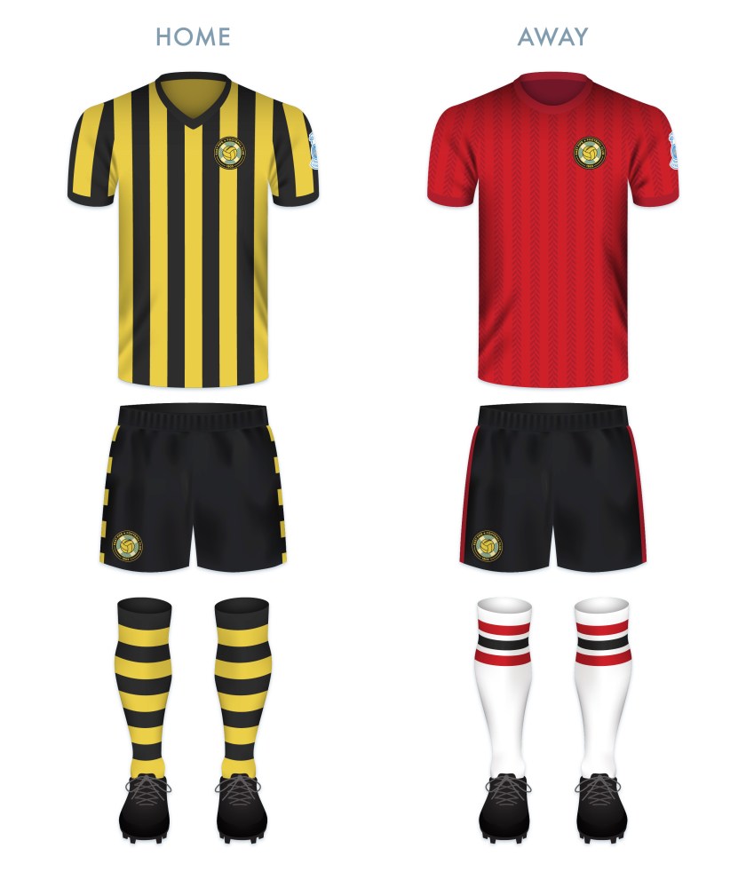
The home kit features black and gold vertical stripes, used by the club in nearly every home kit since 1908. The away kit is dominated by the emerald green of the current away kit with gold features.

![]()
As ever, I am indebted to Dave at Historical Football Kits for some of the historical information used above.
![]() Established in 1879, Montrose Football Club were founding members of the Forfarshire Football Association in 1883. It would be another 40 years before Montrose would join the ranks of the Scottish Football League. Since that time, the club has been been hacking away in the lower leagues of Scottish football with little to show for it apart from local cup victories (they are ten-time winners of the Forfarshire Cup) and a handful of appearances in the later stages of the Scottish Cup and Scottish League Cup.
Established in 1879, Montrose Football Club were founding members of the Forfarshire Football Association in 1883. It would be another 40 years before Montrose would join the ranks of the Scottish Football League. Since that time, the club has been been hacking away in the lower leagues of Scottish football with little to show for it apart from local cup victories (they are ten-time winners of the Forfarshire Cup) and a handful of appearances in the later stages of the Scottish Cup and Scottish League Cup.
Despite a history of many disappointments, the 2017/18 season was strong for Montrose, with the club finishing at the top of the Scottish League Two table, thus gaining promotion to League One (Montrose’s first departure from the bottom tier since the 1995/96 season). This is all the more significant due to the fact that only a few seasons earlier, in 2014/15, Montrose narrowly avoided losing their place in the Scottish Professional Football League by defeating the Highland Football League champions, Brora Rangers in a play-off.
Except for different versions of the club’s initials, the current badge, introduced in 1990, is the only badge that Montrose has ever used. This features a rose (from the folk etymology of Montrose, ‘Mount of Roses’), a football, the club name and the date of the club’s founding.
I first attempted to redesign the Montrose badge in 2014. For this initial redesign, I drew inspiration from a badge that was used for only one season (1973/74), featuring an ‘M’ flanked by an ‘F’ and a ‘C’. In this initial redesign, the diagonal strokes on the ‘M’ meet well below the baseline. In addition to the very deep crotch on the ‘M’, I decided to add the rose and the date of the club’s founding to create a stronger sense of centrality. This initial redesign, on the left below, was published on 3 November 2014:
 I was quite sold on my 2014 redesign, but I thought that I ought to challenge myself further in this round by tackling the badge from another angle. Using the same rose motif, I constructed a round badge, with the rose superimposed over a football. I was aiming for clean and basic with this design.
![]()
The home kit is inspired by Montrose kits from 1959 to 1970. The away strip makes use of the colour scheme of the badge, dominated by red. The shorts for both kits feature only the central badge image of the rose superimposed over the football.

![]()
As ever, I am indebted to Dave at Historical Football Kits for some of the historical information used above.
![]() Forfar Athletic Football Club was established when the now-defunct Angus Athletic Football Club (1883-1885) second team of the broke away from their mother club in 1885. This young team, dubbed ‘the Loons’ (East Angus Scots for ‘young men’) proved their meddle early on, defeating the established Dundonian club, Our Boys, 1-0 in their first match on 16 May 1885.
Forfar Athletic Football Club was established when the now-defunct Angus Athletic Football Club (1883-1885) second team of the broke away from their mother club in 1885. This young team, dubbed ‘the Loons’ (East Angus Scots for ‘young men’) proved their meddle early on, defeating the established Dundonian club, Our Boys, 1-0 in their first match on 16 May 1885.
Since joining the Scottish Football League for the 1921/22 season, the Loons have competed in the professional game in Scotland, but have yet to reach the top tier. Their best Scottish League Cup and Scottish Cup performances came in the 1977/78 and 1981/82 seasons, respectively. In both competitions, the Loons reached the semi-finals, where they lost to Rangers on both occasions. The first was a 5-2 loss in the 1977/78 League Cup, which Rangers would go on to win. In the 1981/82 Scottish Cup, Forfar Athletic forced a replay against Rangers after a 0-0 draw. Unfortunately for the Loons, the replay resulted in a 3-1 loss and the club would go away empty-handed once again.
The Loons’ 1960/61 shirt featured a badge consisting of the four heraldic symbols of the former royal burgh of Forfar within a shield: a Scots fir tree, a bull’s head, a stag’s head and a depiction of the former Castle of Forfar with three towers. A round badge featuring these symbols without a shield came into regular use in 1980. Some version of this badge has been used ever since, with the current badge, in use since 2007, placing the heraldic symbols within a shield once again.
For my redesign, I considered working with the current badge, but decided that, as these symbols are so far removed from the people of Forfar (the castle being destroyed in 1313), I would go another route. This began with a sketch of a highly-stylised, round monogram. Eventually, I placed the monogram within a ring. The outer ring contains two jute plant flowers, a reference to the contribution of the jute industry to the growth of the town in the nineteenth and twentieth centuries. The textile theme is recalled once again by the knot that borders the badge.
![]()
For the home strip, I went with the Loons’ classic light blue colour scheme. This particular rendering is inspired by the kits used between 1983 and 1986. The away strip is inspired by an odd move for the club. Between 1955 and 1967, Forfar Athletic departed from their traditional blues in favour of a green home strip. My design draws mostly from the kit used from August to December 1967, but with vertical stripes composed of a diamond pattern.

![]()
Thank you to Forfar Athletic supporter David Carnegie and to Dave at Historical Football Kits for some of the historical information used above.
![]() The history of football in the conurbation of Levenmouth, East Fife dates from as early as 1879, when junior side Cameron Bridge Football Club was formed. A number of other junior clubs were formed in the late nineteenth century, most notably, Leven Thistle (in the late 1880s), Methil Rovers (1893) and Buckhaven United (1890-91, and then again in 1897). In 1901, Methil Rovers folded and the following year, Leven Thistle, who had changed home ground numerous times, settled in their final home, Town Hall Park, Methil.
The history of football in the conurbation of Levenmouth, East Fife dates from as early as 1879, when junior side Cameron Bridge Football Club was formed. A number of other junior clubs were formed in the late nineteenth century, most notably, Leven Thistle (in the late 1880s), Methil Rovers (1893) and Buckhaven United (1890-91, and then again in 1897). In 1901, Methil Rovers folded and the following year, Leven Thistle, who had changed home ground numerous times, settled in their final home, Town Hall Park, Methil.
As a result of local demand for a senior football club in Levenmouth, East Fife Football Club was established in early 1903. This new club purchased Leven Thistle’s Town Hall Park and renamed it Bayview Park. Soon after, Leven Thistle decided to close up shop. Buckhaven United continued to compete as a junior side until 1912.
After applying for entry into the Scottish Football League on a number of occasions, East Fife joined the reformed Scottish Second Division in 1921 with the incorporation of their Central Football League (which the club had first joined in 1909) into the SFL.
East Fife holds a special place in the history of Scottish football. The Fifers have appeared in three Scottish Cup finals (1926/27, 1937/38, 1949/50), reigning victorious against Kilmarnock in the final replay before a crowd of 92,716 at Hampden Park on 27 April 1938. Until Hibernian defeated Rangers in the 2015/16 Scottish Cup final, East Fife was the only non-top tier club to have ever achieved the honour. It’s also worth noting that East Fife has also won the Scottish League Cup three times (1947/48, 1949/50, 1953/54), a first among all Scottish clubs.
The club’s first kit consisted of a shirt of green and white hoops, similar to those first adopted by Celtic that same year. In 1911, the green and white was swapped for black and gold, which has remained the club’s primary colour scheme ever since.
The Fifers first began using a badge on their kit in 1950. This original badge consisted of a shield, divided into thirds. The top portion of the shield featured the club’s initials, while the middle featured a Saltire and the bottom featured a thistle. This badge was used until 1970, when it was replaced by the club’s initials alone. Some variation of the initials remained until 1991, when the first version of the current badge was introduced. Like the 1950 badge, the current badge features a Saltire, with the addition of a superimposed football.
With my redesign, I decided to move away from the above monogram, as well as the current shield, in favour of a round badge. I included the Saltire in my latest redesign as it is the only consistent feature among East Fife’s historical badges. (The omission of a Saltire within a shield also avoids a potential confrontation with the Court of the Lord Lyon.) The Saltire is enclosed in a circle, behind a gold fishing net, a reference to the prevalent fishing industry in East Fife. The historic burgh seals of every settlement on the coast in East Fife feature either the Firth of Forth, fishing boats, fishing nets or fish (or a combination of several of these), including the burgh seal of Buckhaven, Methil and Innerleven, the locale of East Fife FC. The fishing net also acts as a goal net, receiving a football. Lastly, I placed a star in the outer ring, commemorating East Fife’s 1937/38 Scottish Cup victory.
![]()
For the home kit, I went with the club’s traditional black and gold vertical stripes with black shorts. I also included black and gold hooped socks, last worn in 1939. For the away shirt, I employed red with dark red herringbone stripes.
![]()
As ever, I am indebted to Dave at Historical Football Kits for some of the historical information used above.
![]() In 1910, the two rival football clubs in Ayr, Ayr FC and Ayr Parkhouse FC, determined that their town was too small to both support two senior teams and for those teams to rival the leading Scottish clubs. The result of this realisation was the formation of Ayr United Football Club. (Historically, Ayr Football Club had already formed as an amalgamation of several clubs, the earliest of which was Ayr Eglinton, formed in 1875.)
In 1910, the two rival football clubs in Ayr, Ayr FC and Ayr Parkhouse FC, determined that their town was too small to both support two senior teams and for those teams to rival the leading Scottish clubs. The result of this realisation was the formation of Ayr United Football Club. (Historically, Ayr Football Club had already formed as an amalgamation of several clubs, the earliest of which was Ayr Eglinton, formed in 1875.)
Despite the noble intentions of the two clubs that formed Ayr United in 1910, the club has never been counted among the most competitive in Scotland. Still, they continue to survive, boasting such honours as reaching the final of the 2001/02 Scottish League Cup (where they were defeated by Rangers) and being crowned champions of the second tier on six occasions (1911/12, 1912/13, 1927/28, 1936/37, 1958/59 and 1965/66). More recently, Ayr United gained promotion to the Scottish Championship after topping the League One table in the 2017/18 season.
Ayr United’s kit first featured a badge in 1938. This badge consisted of a stylised black anchor within a white shield with a black border and was used until 1948. Another badge appeared for the 1967/68 season, though regular use of a badge wouldn’t feature until 1977. From that time until 2017, some form of this 1967/68 badge was used.
In 2016, an anonymous complaint to the Court of the Lord Lyon challenged the use of the club’s badge, noting that it featured both a Saltire and the club’s initials within a shield, both a breach of an ancient heraldic law in Scotland, the same which caused bother for Airdrieonians in 2015. Reluctantly, in 2016, Ayr United opened up a competition in which fans could vote on their favourite badge from a pool of finalists. A badge designed by Jamie Stevenson, a Scottish Ayr United supporter living abroad, came out on top, ganering 48% of the vote. This new badge, seen on the left below, was then incorporated into the kit for the 2017/18 season.
The current badge utilises several features from the previous badge, including the Saltire and a football within a cord of rope, the rope recalling the town’s maritime heritage. At the bottom of the badge is the club’s nickname, ‘The Honest Men’, which comes from the Robert Burns poem ‘Tam o’ Shanter’ (1790). The second verse of the poem reads,
‘This truth fand honest Tam o’ Shanter,
As he frae Ayr ae night did canter,
(Auld Ayr, wham ne’er a town surpasses,
For honest men and bonny lasses.)’
For my redesign, I decided to make use of some of the historical imagery of the club, though with a significant departure from the club’s current badge. The colours used—black, white and red—are consistent with the historic club colours. I omitted the Saltire in favour of a singular image of a horse rampant upon an anchor. The anchor calls back to the original Ayr United badge from 1938.
The stylised horse with a missing tail is a visual reference—which, in a badge, I prefer over an overt, written reference—to ‘Tam o’ Shanter’ and the club’s nickname. In the narrative poem, the eponymous character, Tam, is depicted as having a ‘gray mare, Meg’. In the climax of the poem, Tam, demonstrating his ‘honest’ character, is escaping from a ‘hellish legion’ of the devil, warlocks, and witches who have begun to shed their clothing (noting one particularly attractive witch, Nannie Dee, with an undersized ‘cutty-sark’ or ‘shirt’). When Tam is fleeing upon his trusty Meg, Nannie is able to grab hold of Meg’s ‘gray tail’, which is left behind.
![]()
The home kit is based upon Ayr United’s traditional home colour scheme of a white top with black shorts. The away strip makes use of the club colours in a vertical stripe running down a dark blue kit, borrowing from the old Ayr FC’s early colours.

![]()
As ever, I am indebted to Dave at Historical Football Kits for some of the historical information used above.
![]() Arbroath Football Cub was established in 1878 and as early as 1885, their shirts featured a badge consisting of a golden portcullis sewn into a large shield, representing the entrance to the ruined Arbroath Abbey (famous, in part, for its association with the Declaration of Arbroath), derived from the Arbroath coat of arms. That same year, Arbroath boasted a victory of 36-0 against the now-defunct Aberdonian side Bon Accord FC (who competed from 1884 until 1892), the largest margin of victory in world football until 2002 (the current record of 149-0 between Malagasy sides AS Adema and SO l’Emyrne was thrown, with SO l’Emyrne scoring 149 own-goals in protest to a previous refereeing decision made which saw them out of contention for the Malagasy title).
Arbroath Football Cub was established in 1878 and as early as 1885, their shirts featured a badge consisting of a golden portcullis sewn into a large shield, representing the entrance to the ruined Arbroath Abbey (famous, in part, for its association with the Declaration of Arbroath), derived from the Arbroath coat of arms. That same year, Arbroath boasted a victory of 36-0 against the now-defunct Aberdonian side Bon Accord FC (who competed from 1884 until 1892), the largest margin of victory in world football until 2002 (the current record of 149-0 between Malagasy sides AS Adema and SO l’Emyrne was thrown, with SO l’Emyrne scoring 149 own-goals in protest to a previous refereeing decision made which saw them out of contention for the Malagasy title).
After competing in the Northern Football League for a number of years, Arbroath joined the Central Football League from its formation in 1909. Twelve years later, the Central League was incorporated into the Scottish Football League.
During their years in the SFL, ‘the Red Lichties’ have advanced to the semi-finals of the Scottish Cup and Scottish League Cup on two occasions. In the 1946/47 Scottish Cup, Arbroath triumphed over Stenhousemuir, Raith Rovers and Hearts before losing 0-2 to Aberdeen, who would go on to win the tournament. Arbroath reached their second major cup semi-final in the 1959/60 season, losing 3-0 to Third Lanark.
At the end of the 2018/19 season, Arbroath finished at the top of the League One table, securing promotion to the Scottish Championship (the second tier) for the first time since their relegation to the third tier after the 2002/03 season.
For several periods from 1953 until 1992, the Arbroath kit featured some variation of the club initials, sometimes in a shield. In 1980, a single colour version of the current badge saw regular use. This badge was updated with light blue and yellow in 1992. In recent years, the colours have been more in line with the 1980 version.
I have always been impressed with Arbroath’s 1992 badge. I would commend its timelessness, if not for the dated typeface and colours. For my redesign, I stripped the shield away and retooled the portcullis so that it forms something similar to a traditional Iberian shield found in some historical depictions of the Arbroath coat of arms. I also swapped the typeface for something more Romanesque, recalling the historical significance of the town.
![]()
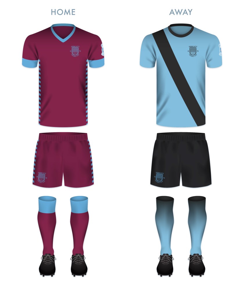
The Arbroath home shirt first featured in maroon in 1882. Typically, this was accompanied with white details and shorts, not dissimilar to Hearts kits over the years. Arbroath first used a fully maroon kit in 1997 (Hearts did not use this scheme until 2002). I decided to capitalise on the attractive look of a fully maroon kit, with light blue details. My redesigned away kit is dominated by this light blue, with black shorts and details.
![]()
As ever, I am indebted to Dave at Historical Football Kits for some of the historical information used above.
![]() In 1882, two Coatbridge-based football clubs, Albion FC and Rovers FC, merged to form Albion Rovers Football Club. In 1903, these ‘Wee Rovers’ joined the Scottish Football League, competing in the Second Division. During the First World War, the Second Division was suspended and the Rovers would not return to the SFL until 1919. With that season came the club’s greatest achievement.
In 1882, two Coatbridge-based football clubs, Albion FC and Rovers FC, merged to form Albion Rovers Football Club. In 1903, these ‘Wee Rovers’ joined the Scottish Football League, competing in the Second Division. During the First World War, the Second Division was suspended and the Rovers would not return to the SFL until 1919. With that season came the club’s greatest achievement.
In the 1919/20 Scottish Cup, the Rovers first defeated Dykehead, advanced through the second round after their match with Huntingtower was scrapped and defeated St Bernard’s in the third round.
The Rovers’ first real challenge in the competition came when they faced Aberdeen in the fourth round. The Wee Rovers prevailed with a 2-1 victory, setting the stage for a semi-final against Rangers. The first match of the semi-final resulted in a 1-1 draw, necessitating a replay. This replay resulted in a 0-0 stalemate. Finally, by the third semi-final match, the Rovers pulled ahead with a 2-0 victory over Rangers.
In the final, the Rovers faced a rampant Kilmarnock side at Celtic Park. Kilmarnock edged their opposition narrowly with a 3-2 victory and the Rovers had to settle for leaving the tournament as runners-up.
Although greater success has eluded Albion Rovers ever since, they have demonstrated their ingenuity and ability to adapt to change by introducing a ‘pay what you can’ season ticket scheme for the 2014/15 season.
In 1961, the Rovers’ first introduced a badge, featuring symbols of the two parent clubs: a rose superimposed over a pair of crossing cutlasses. A variation of this badge has been in use since that time.
Being that the full ‘Albion Rovers’ name has never featured on the club’s kit, I included this within an outer ring. I also included the club’s founding date. For the central shield, I decided to divide the space into triangular quadrants, with a football in the top position and with redesigned versions of Albion FC’s rose and Rovers FC’s cutlasses in the left and right positions, respectively. In the bottom quadrant, I have placed an anvil below a flame. The latter images represent the Rovers’ locale, namely, Coatbridge. The Coatbridge coat of arms features a tower topped with flames, representing the iron and steel industries of Coatbridge. The Coatbridge burgh seal, introduced after the town gained burgh status in 1885, features an assortment of industrial images, including an anvil.
![]()
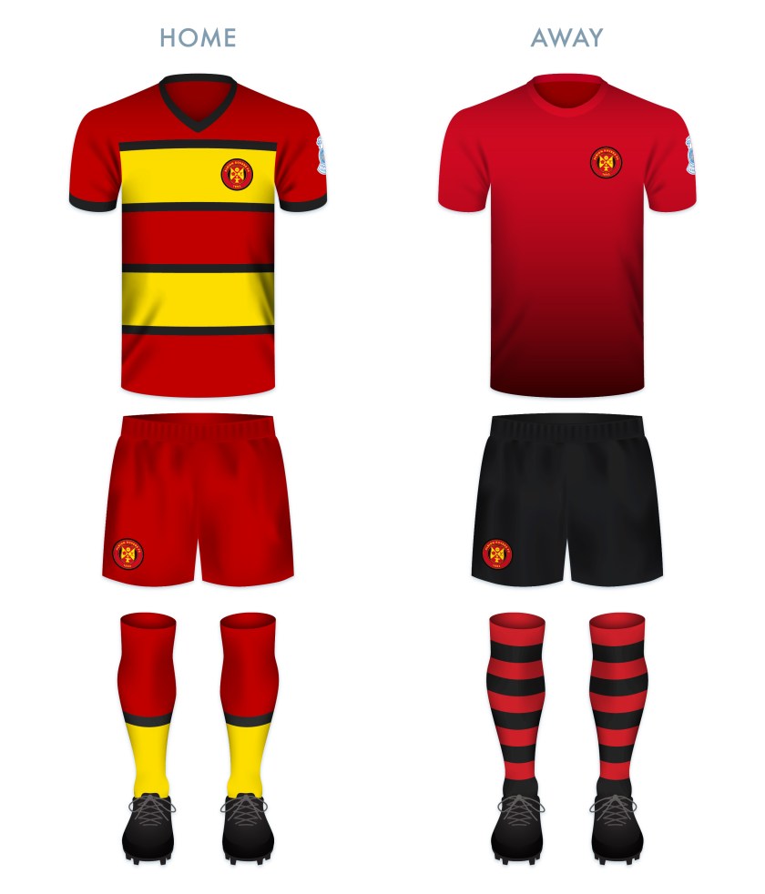
The kit designs make use of the black, red and gold, a colour scheme used in various combinations since the introduction of the first badge in 1961.
![]()
As ever, I am indebted to Dave at Historical Football Kits for some of the historical information used above.
