Alongside AUTOMOTIVUS, one of my most recent projects is an ongoing experiment in type design and graphic design, rendering vintage aerospace marques digitally, called AERONAUTICUS. Below are several samples. Visit the AERONAUTICUS section to see many more.
Author: E
AUTOMOTIVUS
2D, graphicOne of my recent project is an ongoing experiment in type design and graphic design, rendering vintage automotive and industrial marques digitally, called AUTOMOTIVUS. Below are several samples. Visit the AUTOMOTIVUS section to see hundreds more. Also visit the AERONAUTICUS section to see many more such renders from the aerospace industry.
ellliottt
2D, graphicLAUNCHCRAFT
2D, graphicSPACE SHUTTLE
2D, graphicAPOLLO
2D, graphicGEMINI
2D, graphicMERCURY
2D, graphicReBrand: Banks O’ Dee FC
graphicBanks O’ Dee Football Club was established in 1902. The club was originally called the Rechabites, the origins of which are quite peculiar. In the late nineteenth and early twentieth century, the temperance movement was at its height in the United Kingdom. The Independent Order of Rechabites is a fraternal organisation that was established in England in 1835. It was established based on a commitment to total abstinence from alcoholic beverages. (The name was related to the biblical people called the Rechabites, who were committed to abstaining from wine and living a nomadic life.) It was in this vein of thinking that the club set up shop beside the River Dee in Aberdeen. As the story goes, a club committee member discovered that some of the players were enjoying a bevvy in a local hostelry and the Rechabites name was abandoned in 1920 in favour of the current Banks O’ Dee.
For most of its existence, the Dee has competed in regional junior leagues. They have amassed a large number of junior league honours, including winning the Aberdeen District Junior League seven times, the subsequent North East Premier Division eleven times, and the current SJFA North Superleague five times. These figures set Banks O’ Dee apart from other regional junior clubs, though success on a broader stage has evaded the club. Perhaps Banks O’ Dee’s greatest success came in their first-ever participation in the 2008/09 Scottish Cup tournament. Their first-round 10–0 victory against then-Highland League outfit Fort William is of particular note. The following season, the Dee applied to join the Highland League, but were unsuccessful. Despite this, the club became full members of the Scottish Football Association in 2014.
After the ascendence of Cove Rangers from the Highland League to the SPFL in 2019, Banks O’ Dee was invited to submit an application to take Cove’s place in the Highland League. The Dee declined the offer, remaining in the SJFA North Superleague. Their continued participation in the North Superleague wouldn’t last long as the Dee won the league by an overwhelming margin (with 24 wins, two draws and no losses and amassing a +117 goal difference) in the 2021/22 season. This set them up for a two-leg play-off against Fort William for a place in the Highland League. Due to player eligibility rules, Fort William were forced to withdraw, cementing Banks O’ Dee’s admittance into the Highland League, where they compete presently.
I find the current Banks O’ Dee badge endearing in its home-grown minimalism. My redesign is a ‘light’ reboot of the current badge, having clearned up the thistle design and incorporated a more bounded roundel.
The kit redesigns are based on the current colours used by the club.
ReBrand: Tranent Juniors FC
graphicTranent Juniors Football Club was established in 1911 in the town of Tranent, East Lothian. The Belters, as they are known, competed in the Scottish Junior Football Assocation for the vast majority of their existence. During their pre-Lowland League days, the greatest honour they enjoyed was winning the 1934/35 Scottish Junior Cup with a landslide 6–1 victory over Petershill at Ibrox Park (home of Rangers FC).
For the 2018/19 season, Tranent joined the East of Scotland League. Their time in this league was short, with the club winning the league in the 2021/22 season (finishing with 80 points, the same as Penicuik Athletic, but overwhelming the second-placed side with a +59 to +38 goal difference). This achievment reserved the Belters a spot in the three-match round robin Lowland League play-off. They faced the winners of the South of Scotland and West of Scotland Football Leagues (St Cuthbert Wanderers and Darvel, respectively).
During the mini-tournament, they trounced their opponents, finishing without conceding a goal and accumulating nine goals and two victories in the process. For the 2022/23 season, Tranent replaced Vale of Leithen (who were relegated from the Lowland League after finishing the 2021/22 season with a dismal record of one win, two draws and 31 losses). Upon entering the Lowland League, Tranent Juniors retained their name, despite having reached the heights of senior football, in order to call back to their long junior league heritage.
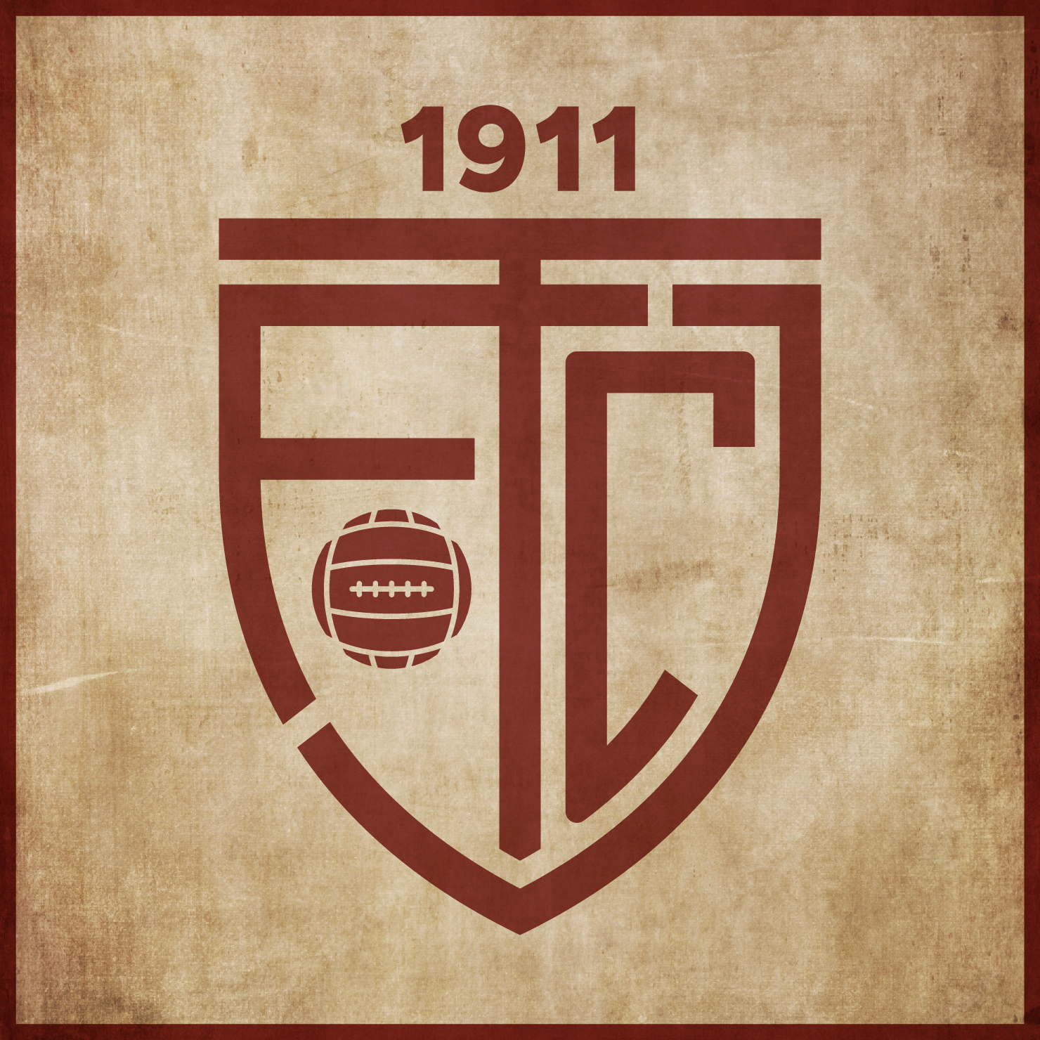
The current Tranent badge consists of a centerpiece of the Tranent coat of arms, topped with a banner containing the club’s name and another banner containing the club’s motto on the bottom. In redesigning this badge, I kept wanting to move away from the busy detail of the current badge. The Tranent coat of arms references the town’s assocaition with agriculture and coal-mining, with the left half portraying a farm worker harvesting by day and the right half portraying a coal-miner working by night. A crossed hammer and sickle would have served as an excellent minimalistic image, but its other associations would detract from the meaning of the badge. And while I appreciate the Scots ‘LIE FORRIT’ (‘lie forward’) motto, I decided to do away with all but the club’s initials (TJFC) and year of founding in the redesigned badge.
The kit redesigns are based on Tranent’s historical colour scheme (maroon and white) and current away colour scheme: