ellliottt

design & illustration

Menu

Skip to content
  • HOME
  • ABOUT
  • GRAPHIC
    • ALL GRAPHIC DESIGN
    • AUTOMOTIVUS
    • REBRAND: SPFL
      • Premiership
        • Aberdeen
        • Celtic
        • Dundee United
        • Heart of Midlothian
        • Hibernian
        • Kilmarnock
        • Livingston
        • Motherwell
        • Rangers
        • Ross County
        • St Johnstone
        • St Mirren
      • Championship
        • Arbroath
        • Ayr United
        • Cove Rangers
        • Dundee
        • Greenock Morton
        • Hamilton Academical
        • Inverness CT
        • Partick Thistle
        • Queen’s Park
        • Raith Rovers
      • League One
        • Airdrieonians
        • Alloa Athletic
        • Clyde
        • Dunfermline Athletic
        • FC Edinburgh
        • Falkirk
        • Kelty Hearts
        • Montrose
        • Peterhead
        • Queen of the South
      • League Two
        • Albion Rovers
        • Annan Athletic
        • Bonnyrigg Rose
        • Dumbarton
        • East Fife
        • Elgin City
        • Forfar Athletic
        • Stenhousemuir
        • Stirling Albion
        • Stranraer
    • REBRAND: SHFL
      • Brechin City
      • Brora Rangers
      • Buckie Thistle
      • Clachnacuddin
      • Deveronvale
      • Formartine United
      • Forres Mechanics
      • Fraserburgh
      • Huntly
      • Inverurie Loco Works
      • Keith
      • Lossiemouth
      • Nairn County
      • Rothes
      • Strathspey Thistle
      • Turriff United
      • Wick Academy
    • REBRAND: SLFL
      • Berwick Rangers
      • Bo’ness United
      • Broomhill
      • Caledonian Braves
      • Civil Service Strollers
      • Cowdenbeath
      • Cumbernauld Colts
      • Dalbeattie Star
      • East Kilbride
      • East Stirlingshire
      • Edinburgh University
      • Gala Fairydean Rovers
      • Gretna 2008
      • Spartans
      • Tranent Juniors
      • University of Stirling
  • 2D
  • 3D
    • ALL 3D
    • INSTALLATION
  • PHOTO
  • SHOP

Highlands

ReBrand: Banks O’ Dee FC

graphic

BDFC badge new

Banks O’ Dee Football Club was established in 1902. The club was originally called the Rechabites, the origins of which are quite peculiar. In the late nineteenth and early twentieth century, the temperance movement was at its height in the United Kingdom. The Independent Order of Rechabites is a fraternal organisation that was established in England in 1835. It was established based on a commitment to total abstinence from alcoholic beverages. (The name was related to the biblical people called the Rechabites, who were committed to abstaining from wine and living a nomadic life.) It was in this vein of thinking that the club set up shop beside the River Dee in Aberdeen. As the story goes, a club committee member discovered that some of the players were enjoying a bevvy in a local hostelry and the Rechabites name was abandoned in 1920 in favour of the current Banks O’ Dee.

For most of its existence, the Dee has competed in regional junior leagues. They have amassed a large number of junior league honours, including winning the Aberdeen District Junior League seven times, the subsequent North East Premier Division eleven times, and the current SJFA North Superleague five times. These figures set Banks O’ Dee apart from other regional junior clubs, though success on a broader stage has evaded the club. Perhaps Banks O’ Dee’s greatest success came in their first-ever participation in the 2008/09 Scottish Cup tournament. Their first-round 10–0 victory against then-Highland League outfit Fort William is of particular note. The following season, the Dee applied to join the Highland League, but were unsuccessful. Despite this, the club became full members of the Scottish Football Association in 2014.

After the ascendence of Cove Rangers from the Highland League to the SPFL in 2019, Banks O’ Dee was invited to submit an application to take Cove’s place in the Highland League. The Dee declined the offer, remaining in the SJFA North Superleague. Their continued participation in the North Superleague wouldn’t last long as the Dee won the league by an overwhelming margin (with 24 wins, two draws and no losses and amassing a +117 goal difference) in the 2021/22 season. This set them up for a two-leg play-off against Fort William for a place in the Highland League. Due to player eligibility rules, Fort William were forced to withdraw, cementing Banks O’ Dee’s admittance into the Highland League, where they compete presently.

I find the current Banks O’ Dee badge endearing in its home-grown minimalism. My redesign is a ‘light’ reboot of the current badge, having clearned up the thistle design and incorporated a more bounded roundel.

BDFC badge

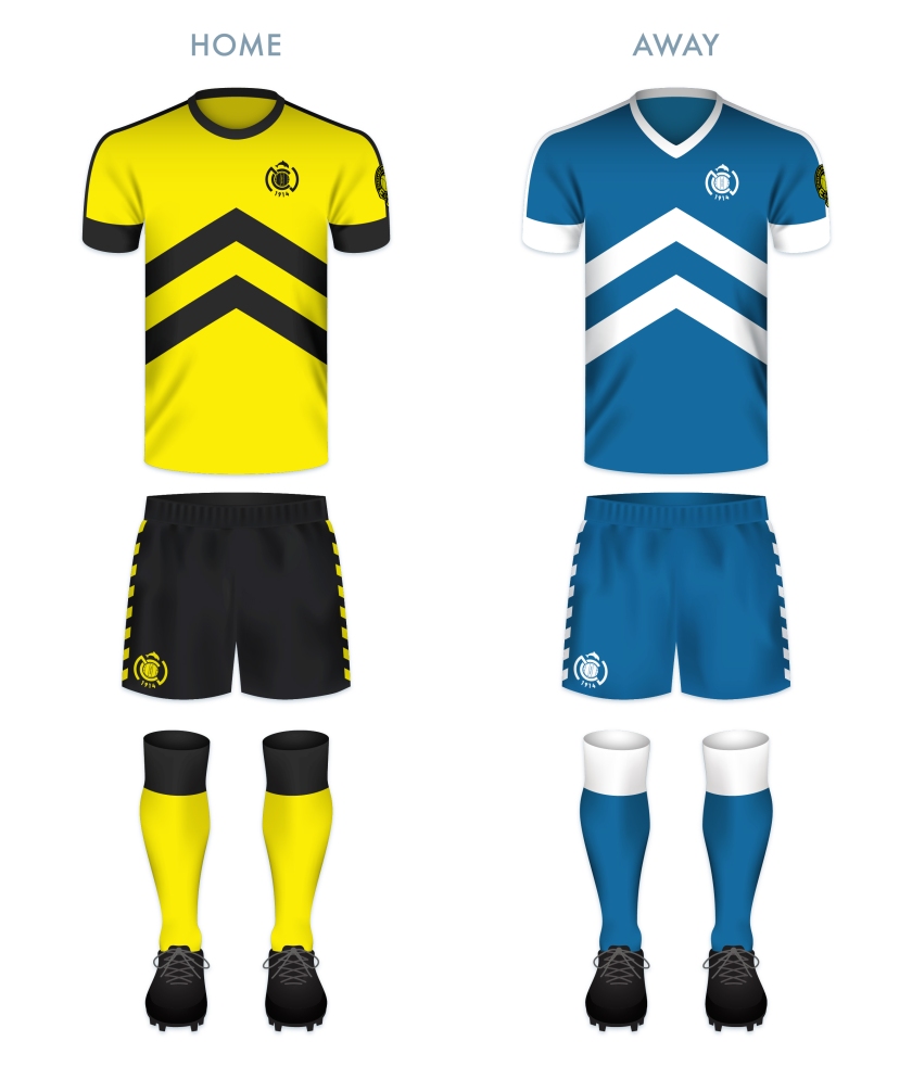
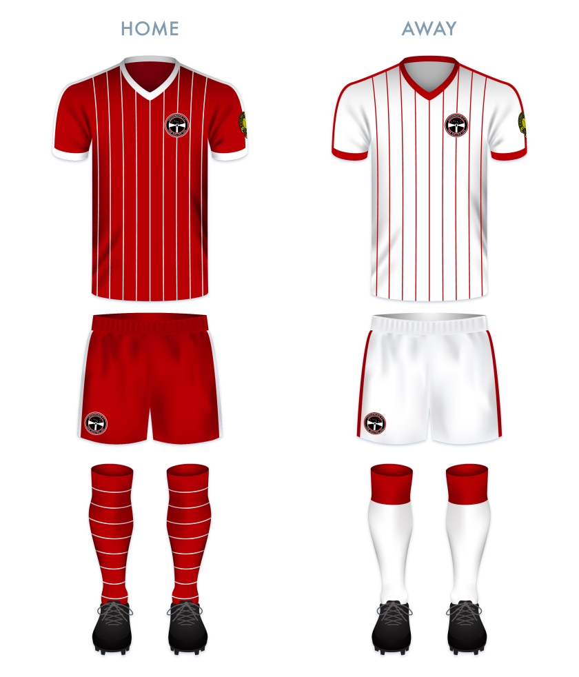
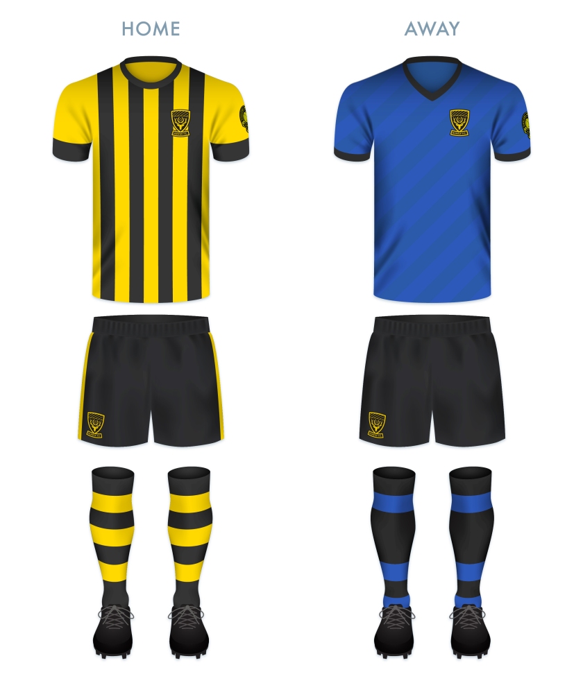
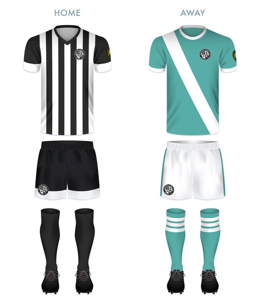
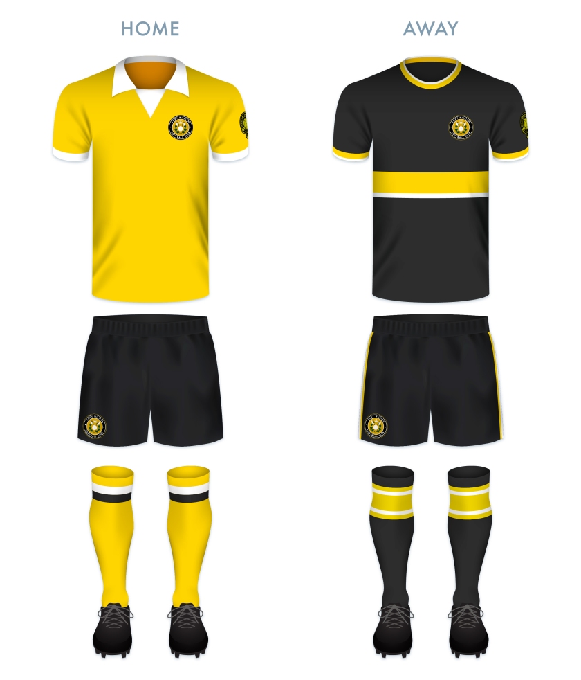
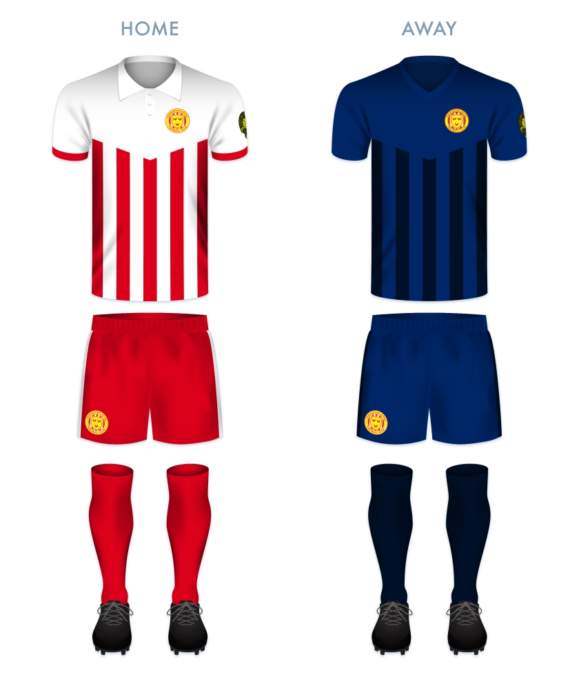
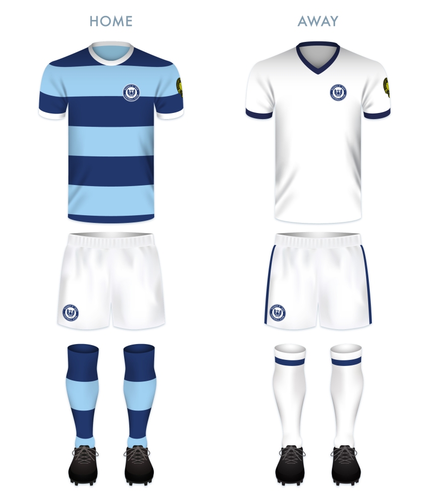
The kit redesigns are based on the current colours used by the club.

BDFC kit

BDFC badge new

Advertisement
4 August 2022 E Tagged Aberdeen, badge, Banks O' Dee, Banks O' Dee FC, Banks O' Dee Football Club, crest, Dee, Europe, football, HFL, Highland Football League, Highlands, logo, rebrand, Rechabites, redesign, Scotland, Scottish Highland Football League, SHFL, sport, texture, UK, United Kingdom Leave a comment

ReBrand: Nairn County FC

graphic

NCFC badge new-01Nairn County Football Club was established in 1914 and gained admittance into the Highland Football League that same year. Due to the disruption caused by the First World War, the cllub would not play its first Highland League match until 1919.

Nairn County’s first significant honour came in the 1956/57 season, when the club won the first of their seven North of Scotland Cups. Their second North of Scotland Cup came in the 1962/63 season. The following year, Nairn County repeated this feat, with the addition of their first of two Highland League Cups. The club’s greatest honour came in the 1975/76 season, when they were crowned Highland League Champions after a hard-fought victory in extra time in a play-off against Fraserburgh.

More recently, Nairn County advanced to the third round of the 2012/13 Scottish Cup, having bested Preston Athletic and league side Clyde, before bringing Forfar Athletic to a replay, which the Wee County lost 2-3 at their home ground of Station Park. But the club wouldn’t end the season empty handed, winning the North of Scotland Cup after defeating Wick Academy 1-2 in extra time.

In designing a new badge for the club, I wanted to go for something bolder, opting for an ‘NC’ monogram topped by a silhouette of a more anatomically-correct dolphin than the one in current use.

NCFC badge-01

The kit redesigns are based on the current colours used by the club, with their classic ‘maize yellow’ and black v in the home shirt and their blue and white scheme for the away kit. The upward-pointing chevron on the shirts echoes the Nairnshire coat of arms.

NCFC kit-01

NCFC badge new-01

7 February 201924 February 2020 E Tagged A' Ghàidhealtachd, badge, crest, dolphin, Europe, football, HFL, Highland Football League, Highlands, logo, monogram, Nairn, Nairn County, Nairn County FC, Nairn County Football Club, Nairnshire, rebrand, redesign, Scotland, Scottish Highland Football League, SHFL, sport, texture, The Wee County, UK, United Kingdom, Wee County 1 Comment

ReBrand: Lossiemouth FC

graphic

lfc badge new-01Lossiemouth Football Club was established in 1945 and joined the Highland Football League the following year, where it has played ever since.

Despite competing in the Highland League for nearly three-quarters of a century, Lossiemouth has never won the league, one of only seven HFL clubs to have never achieved the honour (with the remaining six having joined the league much later: Fort William, who joined in 1985, Wick Academy, who joined in 1994, Inverurie Loco Works, who joined in 2001 and Formartine United, Strathspey Thistle and Turriff United, who joined in 2009).

The Coasters have a longstanding rivalry with their neighbours to the south, Elgin City, with City dominating most of their meetings until the early 1990s. The club’s first honour came in 1962, when they won the Highland League Cup. They would not add to their silverware until winning the 1994/95 North of Scotland Cup. They would repeat this victory the following two season and again in 2001 and 2003. The 1996/97 season proved to be Lossiemouth’s most successful, winning both the North of Scotland Cup as well as their second Highland League Cup and finishing the season fourth in the league table, being edged out of the third spot by Peterhead on goal difference alone.

The current Lossiemouth badge features a lighthouse superimposed over a stylised football in red and white, the club’s colours. The lighthouse is a representation of Covesea Skerries Lighthouse, completed in 1846 and located very near the town of Lossiemouth. For my redesign, I wanted to keep the lighthouse image, but decided to depict a version of the lighthouse more true to its actual appearance. As lighthouses function primarily at night and in poor visibility, I depicted a night’s sky in black and a representation of Ursa Major, suggesting the northerly position of Lossiemouth (which sits at the northern tip of Morayshire). I also included the Latin motto PER NOCTEM LUX (which can be translated into English as something like ‘the light through the night’), found on a Lossiemouth and Branderburgh burgh seal from the late nineteenth century. The motto is a play on the town’s patron saint, St Gerardine (or St Gervadius), who, according to legend, would set up flaming torches alone the shore in order to ward ships away from wreckage on the rocks. As Lossiemouth continue to plug away in the Highland Football League, perhaps the prospect of future success can be their ‘light through the night’.

LFC badge-01

I designed the home kit as a clear homage to another LFC, drawing inspiration from 1982 Liverpool home kit in particular. This colour scheme is reversed in the away kit.

LFC kit-01

lfc badge new-01

29 January 201924 February 2020 E Tagged badge, Coasters, Covesea Lighthouse, crest, Europe, football, HFL, Highland Football League, Highlands, Latin, lighthouse, logo, Lossie, Lossiemouth, Lossiemouth FC, Lossiemouth Football Club, Moray, Morayshire, rebrand, redesign, Scotland, Scottish Highland Football League, SHFL, sport, texture, The Coasters, UK, United Kingdom Leave a comment

ReBrand: Keith FC

graphic

KFC badge new-01Keith Football Club was established in 1910 in the small Banffshire town from which it gets its name. The club competed on a junior level until it was admitted into the Highland Football League in 1924.

Throughout their history, Keith have experienced sporadic regional success. They have won the Highland Football League on seven occasions, including three consecutive seasons, between 1979 and 1981. The club boast ten Highland League Cups, including another span of three consecutive victories between 1974 and 1976. Keith have also been Aberdeenshire Cup holders on eight occasions and have won the Scottish Qualifying Cup (North) four times. But the club’s experience of the Scottish Cup might leave a bad taste in some supporters’ mouths, with a notable 1-10 defeat to Rangers in the 1995/96 Scottish Cup, which drew national attention for all the wrong reasons.

The current Keith badge is what I would describe as, ‘nothing to look at’. Not only does it violate ancient Scottish heraldic laws, but it also features the club’s initials, which is unfortunate due to their sharing of these initials with a more famous institution. For my redesign, I have decided to incorporate the symbols found in the Keith coat of arms. The first, in the upper-left position, symbolises the ancient Kirkton of Keith and the historical tenure of the Lordship of Regality, the land upon which the town of Keith is located. This Regality—granted by King William I, or ‘William the Lion’, who reigned from 1165 to 1214—was held by the Cistercian Abbey of Kinloss. As a result, this part of Keith’s history is represented by the Cistercian Order’s blue field with fleur-de-lys.

The upper-right position features a crowned lion from the Ogilvy coat of arms. This represents James Ogilvy, 5th Earl of Findlater and 2nd Earl of Seafield, and Fife, who united and enlarged the communities of Old and New Keith to form the settlement of Keith in 1750. The bottom position features a shell which represents the Duff coat of arms, also relating to James Ogilvy. These symbols have all been adapted to the colour scheme of Keith FC and are enclosed within a circle, indicating the club’s name and year of foundation.

KFC badge-01

As the club has used their signature maroon home strip for many years—this giving the club its nickname, ‘the Maroons’—I decided to use maroon as the primary colour of the home strip, highlighted with light blue vertical stripes and accents. The away strip is again dominated by maroon and has white accents.

KFC kit-01

KFC badge new-01

28 January 201924 February 2020 E Tagged badge, Banffshire, crest, Europe, fleur-de-lis, fleur-de-lys, football, HFL, Highland Football League, Highlands, Keith, Keith FC, Keith Football Club, lion, logo, Maroons, Moray, Morayshire, rebrand, redesign, Scotland, Scottish Highland Football League, shell, SHFL, sport, texture, The Maroons, UK, United Kingdom 1 Comment

ReBrand: Inverurie Loco Works FC

graphic

ILWFC badge new-01Inverurie Loco Works Football Club was established as a junior side by the workers of said locomotive workshops in 1903. Originally, these workshops were operated by the Great North of Scotland Railway (1854-1922) before becoming part of the London and North Eastern Railway (1923-1947).

In 1948, the railway was nationalised with the forming of British Rail Engineering Limited and in 1969, the workshops closed in Inverurie. With the workshops closed, the club continued to compete at the junior level. In 2001, the Locos were admitted into the Highland Football League and became a senior side.

Since joining the Highland League, the Locos have won the Highland League Cup on two occasions (2007/08 and 2008/09). They also boast three Aberdeenshire Shields and two Scottish Qualifying Cups (North), but the Highland League title has eluded them.

The current badge is very strong, incorporating the club’s classic colour scheme, though giving far less of a hint of the club’s history and unusual name than a previous incarnation, which featured a generic steam engine in a round badge. For my redesign, I sought to avoid a breach of Scottish heraldic law by avoiding a shield. I also sought to incorporate something more symbolic of the historic Inverurie Locomotive Workshops. I decided upon the use of the distinctive Class F Gordon Highlander engine, which was restored at Inverurie (only ten locomotives would ever be built at Inverurie – the rest of the work done consisted of restorations and enhancements).

ILWFC badge-01

ILWFC kit-01

ILWFC badge new-01

28 January 201924 February 2020 E Tagged 62277 Gordon Highlander, Aberdeenshire, badge, BR 62277, BR 62277 Gordon Highlander, Class F, Class F Gordon Highlander, crest, Europe, football, GNSR, GNSR 49, GNSR 49 Gordon Highlander, Gordon, Gordon Highlander, Great North of Scotland Railway, HFL, Highland Football League, Highlands, Inverurie, Inverurie Loco Works, Inverurie Loco Works FC, Inverurie Loco Works Football Club, Inverurie Locomotive Works, LNER 6849, LNER 6849 Gordon Highlander, Locies, locomotive, Locos, logo, rebrand, redesign, Scotland, Scottish Highland Football League, SHFL, sport, texture, The Locies, The Locos, train, trains, UK, United Kingdom Leave a comment

ReBrand: Huntly FC

graphic

hfc badge new-01Huntly Football Club was established in 1928. and was admitted to the Highland Football League that same year. By their second season, they had won the league title. But this early success was not indicative of the club’s future form. Over the next six decades, Huntly would win two Highland League Cups and two Aberdeenshire Cups, but another league title evaded them.

The 1990s proved to be the club’s most successful decade to date. In 1992, they won the Aberdeenshire Cup and in 1993, they won both the Highland League Cup and the Scottish Qualifying Cup (North). The following season, Huntly secured the Highland League title for the first time in 64 years. This triumph was accompanied by their second consecutive Highland League Cup and another Aberdeenshire Cup – a Highland treble. The club would go on to win a record five consecutive Highland League titles (1993/94, 1994/95, 1995/96, 1996/97, 1997/98), during which time they also won an additional Highland League Cup (1995/96), three consecutive Aberdeenshire Cups (1993/94, 1994/95, 1995/96) and two Scottish Qualifying Cups (North) (1994/95, 1996/97). The club would add to their silverware tally in the 1999/2000 season, winning one more Aberdeenshire Cup and one more Scottish Qualifying Cup (North). Huntly’s most recent Highland League title came in 2005.

The current Huntly badge (and the overall Huntly colour scheme) is derived from the black and gold heraldic blazon of the Stewart Earls of Atholl (who were the Lords of Strathbogie, the former name of Huntly, in the Middle Ages). The stylised stag’s head comes from the arms of the Earl (and later, Marquess) of Huntly. For my redesign, I sought to keep the main features of the current badge, but to bring it into compliance with the heraldic laws of Scotland by removing the club’s initials from the shield itself. Although the stylised stag’s head is a striking design feature, my mind interprets the ears as the stag’s eyes. I decided to make a more anatomically accurate stag’s head for my redesign. The laurel wreath and five stars represent Huntly’s dominant form in the 1990s and standing record of five consecutive Highland League championships.

HFC badge-01

HFC kit-01

hfc badge new-01

28 January 201928 February 2020 E Tagged Aberdeenshire, badge, Black and Golds, crest, Europe, football, HFL, Highland Football League, Highlands, Huntly, Huntly FC, Huntly Football Club, logo, rebrand, redesign, Scotland, Scottish Highland Football League, SHFL, sport, texture, The Black and Golds, UK, United Kingdom Leave a comment

ReBrand: Fraserburgh FC

graphic

ffc badge new-01Fraserburgh Football Club was established in 1910. In 1921, they gained admittance to the Highland Football League. Since that time, the club have won the league three times and have won the Highland League Cup on two occasions.

When the Scottish Qualifying Cup (North) was still used to give non-professional clubs the chance to compete in the tournament, Fraserburgh progressed on three occasions. Their most notable appearance came in January 1959, when they faced Dundee at their home ground of Bellslea Park in the first round of the Scottish Cup. At that time, Dundee were a competitive side in the top tier of the Scottish Football League and would finish the season in fourth place before topping the table in 1962. Fraserburgh’s victory was seen as a significant shock. Ultimately, the club would progress no further than the second round, losing narrowly to Stirling Albion 3-4 at home.

The home kit scheme of black and white vertical stripes has been used by the club for many years. It is said to have been inspired by the kit of Newcastle United by way of a local fisherman. Fraserburgh first used a badge on their kit in 1990 to celebrate their 80th anniversary. The centrepiece of this badge consisted of a shield divided into three segments, with the top left displaying two crossing flags, the top right displaying a football and the bottom portion displaying a lion rampant. The shield was topped with a thistle and flanked by mantling. A banner ran underneath the shield bearing the club’s name.

In 2010, the current badge came into use to commemorate the club’s centenary. The club’s nickname, ‘The Broch’, is taken from the Scots word for Fraserburgh. I find this current badge to be somewhat striking in concept, though lacking in execution. The ‘kink’ on the sides of the shield as it begins to curve in the lower-third rubs me the wrong way. Additionally, the presentation of the text is very basic (though I suspect that this is intentional) and apart from the nickname, it displays no symbols linking it to the club’s history nor the locality. I won’t even get started on the issue that the Court of the Lord Lyon might have with this badge.

In redesigning this badge, I wanted to keep with the stark black-and-white colour scheme, but I wanted to present something that echoes some of the club and town’s history. Inspired by the Fraserburgh coat of arms, I designed a shield and divided it into four parts. The three cinquefoils and lion rampant mirror those included on the coat of arms. In the lower left quadrant, I included a shell as Fraserburgh is the largest shellfish port in Scotland and one of the largest in Europe.

FFC badge-01

For the home kit, I did not stray from the boldness of Fraserburgh’s traditional black and white vertical stripes. The current away kit uses a sky blue, but I opted for a more of a sea green, reflecting the community’s dependence on the sea.

FFC kit-01

ffc badge new-01


15 January 201924 February 2020 E Tagged Aberdeenshire, badge, Broch, crest, Europe, football, Fraserburgh, Fraserburgh FC, Fraserburgh Football Club, HFL, Highland Football League, Highlands, logo, rebrand, redesign, Scotland, Scottish Highland Football League, SHFL, sport, texture, The Broch, UK, United Kingdom Leave a comment

ReBrand: Fort William FC

graphic

fwfc badge new-01Fort William Football Club was established in 1974, making the club the second-youngest in the Highland Football League (after Strathspey Thistle, established in 1993). From their formation, Fort William had campaigned unsuccessfully to gain admittance into the Highland Football League. They would not participate in a competitive league until joining the North Caledonian League in 1983.

In their first season with the NCL, Fort William finished second-top in the league table. By the end of the following season, they were crowned league champions. After this success, the club was finally granted a place in the Highland League.

Fort William’s time in the Highland League can be characterised as rocky. They have yet to achieve any honours and in 2018, all six club directors resigned. The club has survived, but the 2018/19 season is not proving especially fruitful, having won two points from two draws and having been deducted nine points to finish December at the bottom of the table with -7 points and a -149 goal difference after 21 matches.

Things are looking quite bleak for Fort William these days, but here’s hoping that the club can find some inspiration to fight on and produce some significant results.

For the badge redesign, I decided to retool the current badge, which features a version of the Fort William coat of arms. The minimalism of the current badge is to be admired, though I have several issues with it. The first is that the Lochaber axes, crossed to form a Saltire – well, they don’t much resemble axes to me. Additionally, the Fort William coat of arms features a chaplet of oak branches, not of what appears to be olive branches. Lastly, the football takes the place of the crown found in the actual coat of arms. Cards on the table, I am not a monarchist, but the Fort William coat of arms is more about the town’s history than the present, with Fort ‘William’ having been named after William of Orange. Although the initial fort had been constructed during the rule of Oliver Cromwell, by the eighteenth century, it was used as an outpost against Jacobite forces.

For my redesign, I decided to include all of the traditional elements of the Fort William coat of arms and place a football, similar to the one in the current badge, at the centre. In order to avoid a clear association with ‘one side’ or the ‘other’ (read: Scottish sectarianism), I have also included two small white cinquefoils in the outer circlet, symbolising the Jacobite history of the region.

FWFC badge-01

For the home kit redesign, I went with something that calls back to the club’s formation in 1974. The away kit makes use of the current black-dominated away colour scheme.

FWFC kit-01

fwfc badge new-01


15 January 201924 February 2020 E Tagged A' Ghàidhealtachd, badge, crest, Europe, football, Fort, Fort William, HFL, Highland, Highland Football League, Highlands, Lochaber, logo, rebrand, redesign, Scotland, Scottish Highland Football League, SHFL, sport, texture, The Fort, UK, United Kingdom Leave a comment

ReBrand: Forres Mechanics FC

graphic

FMFC badge new-01Forres Mechanics Football Club was established in 1884. Several different theories have been posited to explain the club’s unusual name. One theory suggests that the club was formed when students at an establishment called the Forres Mechanics Institute (a number of Mechanics Institutes were established throughout the United Kingdom and former British Empire from 1821) formed their own club.

A more likely explanation is found in the research of Colin G. Watson. In his 1984 book, Forres Mechanics: The First Hundred Years, Watson argues that the club was formed when players left a pre-existing club based in the town, St Lawrence (now, a cricket club exclusively). Watson also argues that the name ‘Mechanics’ has nothing to do with the Mechanics Institute, but rather, is a reference to the occupations of these early players.

The Highland Football League was established in 1893 by members of the Inverness Workman’s Club. Forres Mechanics were among the founding members of the league, which also included Caledonian, Cameron Highlanders, Clachnacuddin, Inverness Citadel, Inverness Thistle and Inverness Union. Cameron Highlanders, Inverness Citadel and Inverness Union have all ceased operations. In 1994, Caledonian and Inverness Thistle merged to form Inverness Caledonian Thistle, who have competed as professionals since that time. Of these founding members, only Clachnacuddin and Forres Mechanics remain.

The Mechanics’ honours include two Highland League titles, seven Highland League Cups, eight North of Scotland Cups and the 1963/64 Scottish Qualifying Cup (North). In 2016, the Mechanics qualified for the Scottish Cup competition and reached the third round—their highest ever advancement in the tournament—where they lost to League One side Stenhousemuir over two legs (having drawn the first 2-2 at home).

The current Forres Mechanics badge is distinctive. Its centrepiece is a version of the Forres coat of arms, which originates from at least the fifteenth century. It features the town’s patron saint, St Lawrence, standing between two victory palms. He holds the Gospels as well as a gridiron, upon which he met his martyrdom. It is most likely that the crescent and star relate to a paraphrase of Psalm 139.12 associated with Lawrence: ‘The darkness is no darkness to me, but the night is all as clear as the morning that shineth more and more unto the perfect day.’

I have great affection for the current badge, but in my redesign I wanted to present something that was not simply a version of the town’s coat of arms. In wishing to tie in both the town and the ‘mechanics’ side of the club’s name and history, I included the crescent and star of St Lawrence, which are flanking a hammer, all set in front of a cog. Upon the head of the hammer is found the year of the club’s founding. I have also included three six-pointed stars on either side of the outer ring, calling back to the current badge. For the primary colour scheme, I utilised the club’s traditional gold and brown.

FMFC badge-01

The kit designs were made in keeping with the club’s traditional colours and occasional use of hoops, both of which I find particularly attractive.

FMFC kit-01

FMFC badge new-01

15 January 201924 February 2020 E Tagged badge, Can Cans, Cans, crest, Europe, football, Forres, Forres Mechanics, Forres Mechanics FC, Forres Mechanics Football Club, HFL, Highland Football League, Highlands, logo, Mighty Cans, Moray, Morayshire, rebrand, redesign, Scotland, Scottish Highland Football League, SHFL, sport, texture, UK, United Kingdom Leave a comment

ReBrand: Formartine United FC

graphic

fufc badge new-01Formartine United Football Club was established in the village of Pitmedden, Aberdeenshire, in 1948. The exact circumstances of the club’s formation are something of a mystery. It is known that an amateur club, Pitmedden FC, played in the village prior to the founding of United, but the relationship between the two is unclear.

Formartine United played in the amateur league in Aberdeenshire until 1960, when they became a junior side. They continued to compete as a junior side for the nearly 50 years until, in 2008, the Highland Football League was expanded, opening three new places. These places went to Strathspey Thistle, Turriff United and Formartine United. By the end of the 2012/13 season, Formartine United had reached second-top in the Highland League table. That same season, the club secured their first senior honour, winning the Aberdeenshire Cup. United repeated their Aberdeenshire Cup victory in the 2017/18 season, a campaign during which they also won their first Highland League Cup.

When looking at the current badge, we notice a red-and-white-striped shield upon which is found a golden griffin rampant. A golden banner wraps around the badge and includes the club name and the French motto SANS PEUR, ‘without fear’. The stripes on the shield echo the traditional red and white stripes of Formartine United home shirts. The French motto, that of Clan Sutherland, might have some connection to the club’s founding (perhaps one of the early movers in the club was called Sutherland). Given that United are based in Pitmedden, I decided to make greater use of the club’s locality. I omitted the French motto from this badge redesign (and included it in the redesign of Brora Rangers‘ badge) as Formartine is far from the traditional homelands of Clan Sutherland. The griffin has been replaced by a version of the Clan Seton coat of arms. This ties to the historic Pitmedden Gardens, which feature the coat of arms of Sir Alexander Seton, Lord Pitmedden (c. 1639-1719).

FUFC badge-01

The home strip makes use of the traditional Formartine United red and white stripes, while the away strip inverts this colour scheme and replaces red with dark blue.

FUFC kit-01

fufc badge new-01


14 January 201928 February 2020 E Tagged Aberdeenshire, badge, Clan Seton, crest, Europe, football, Formartine, Formartine United Football Club, Fortmartine United, Fortmartine United FC, HFL, Highland Football League, Highlands, logo, Lord Pitmedden, Pitmedden, Pitmedden Gardens, rebrand, redesign, Scotland, Scottish Highland Football League, SHFL, sport, texture, UK, United, United Kingdom Leave a comment

Posts navigation

← Previous
Widgets
Create a website or blog at WordPress.com
Privacy & Cookies: This site uses cookies. By continuing to use this website, you agree to their use.
To find out more, including how to control cookies, see here: Cookie Policy
  • Follow Following
    • ellliottt
    • Join 53 other followers
    • Already have a WordPress.com account? Log in now.
    • ellliottt
    • Customize
    • Follow Following
    • Sign up
    • Log in
    • Report this content
    • View site in Reader
    • Manage subscriptions
    • Collapse this bar
 

Loading Comments...