 Keith Football Club was established in 1910 in the small Banffshire town from which it gets its name. The club competed on a junior level until it was admitted into the Highland Football League in 1924.
Throughout their history, Keith have experienced sporadic regional success. They have won the Highland Football League on seven occasions, including three consecutive seasons, between 1979 and 1981. The club boast ten Highland League Cups, including another span of three consecutive victories between 1974 and 1976. Keith have also been Aberdeenshire Cup holders on eight occasions and have won the Scottish Qualifying Cup (North) four times. But the club’s experience of the Scottish Cup might leave a bad taste in some supporters’ mouths, with a notable 1-10 defeat to Rangers in the 1995/96 Scottish Cup, which drew national attention for all the wrong reasons.
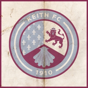
The current Keith badge is what I would describe as, ‘nothing to look at’. Not only does it violate ancient Scottish heraldic laws, but it also features the club’s initials, which is unfortunate due to their sharing of these initials with a more famous institution. For my redesign, I have decided to incorporate the symbols found in the Keith coat of arms. The first, in the upper-left position, symbolises the ancient Kirkton of Keith and the historical tenure of the Lordship of Regality, the land upon which the town of Keith is located. This Regality—granted by King William I, or ‘William the Lion’, who reigned from 1165 to 1214—was held by the Cistercian Abbey of Kinloss. As a result, this part of Keith’s history is represented by the Cistercian Order’s blue field with fleur-de-lys.
The upper-right position features a crowned lion from the Ogilvy coat of arms. This represents James Ogilvy, 5th Earl of Findlater and 2nd Earl of Seafield, and Fife, who united and enlarged the communities of Old and New Keith to form the settlement of Keith in 1750. The bottom position features a shell which represents the Duff coat of arms, also relating to James Ogilvy. These symbols have all been adapted to the colour scheme of Keith FC and are enclosed within a circle, indicating the club’s name and year of foundation.

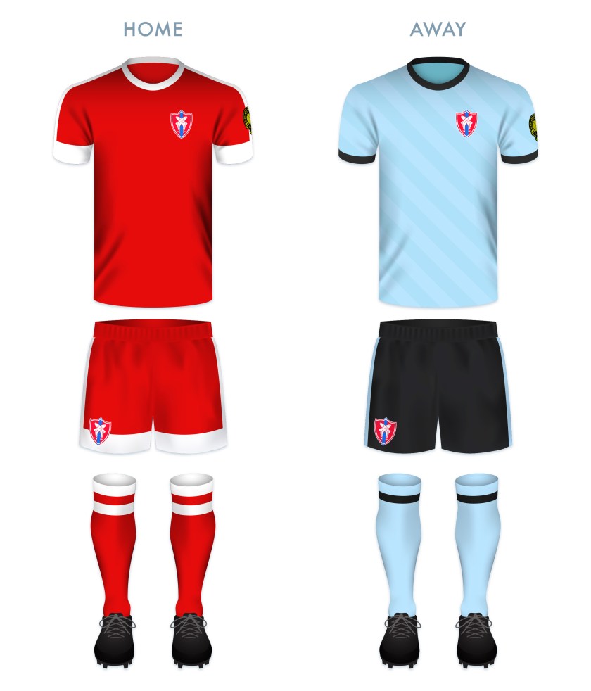
As the club has used their signature maroon home strip for many years—this giving the club its nickname, ‘the Maroons’—I decided to use maroon as the primary colour of the home strip, highlighted with light blue vertical stripes and accents. The away strip is again dominated by maroon and has white accents.


 Deveronvale Football Club was established in 1938 at the union of two pre-existing clubs, Deveron Valley and Banff Rovers. The club name comes from the River Deveron, which separates the twin fishing towns of Banff and Macduff on the northern Aberdeenshire coast.


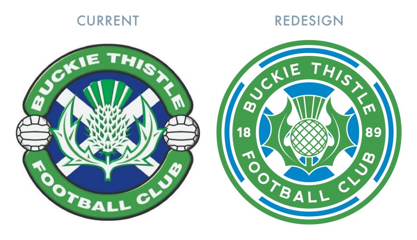
 The early history of Buckie Thistle Football Club is something of a mystery. Although the exact year of the club’s founding is unknown, it is accepted generally to have been established in 1889. The club’s green-and-white hooped home shirts resemble that of

