ellliottt

design & illustration

Menu

Skip to content
  • HOME
  • ABOUT
  • GRAPHIC
    • ALL GRAPHIC DESIGN
    • AUTOMOTIVUS
    • REBRAND: SPFL
      • Premiership
        • Aberdeen
        • Celtic
        • Dundee United
        • Heart of Midlothian
        • Hibernian
        • Kilmarnock
        • Livingston
        • Motherwell
        • Rangers
        • Ross County
        • St Johnstone
        • St Mirren
      • Championship
        • Arbroath
        • Ayr United
        • Cove Rangers
        • Dundee
        • Greenock Morton
        • Hamilton Academical
        • Inverness CT
        • Partick Thistle
        • Queen’s Park
        • Raith Rovers
      • League One
        • Airdrieonians
        • Alloa Athletic
        • Clyde
        • Dunfermline Athletic
        • FC Edinburgh
        • Falkirk
        • Kelty Hearts
        • Montrose
        • Peterhead
        • Queen of the South
      • League Two
        • Albion Rovers
        • Annan Athletic
        • Bonnyrigg Rose
        • Dumbarton
        • East Fife
        • Elgin City
        • Forfar Athletic
        • Stenhousemuir
        • Stirling Albion
        • Stranraer
    • REBRAND: SHFL
      • Brechin City
      • Brora Rangers
      • Buckie Thistle
      • Clachnacuddin
      • Deveronvale
      • Formartine United
      • Forres Mechanics
      • Fraserburgh
      • Huntly
      • Inverurie Loco Works
      • Keith
      • Lossiemouth
      • Nairn County
      • Rothes
      • Strathspey Thistle
      • Turriff United
      • Wick Academy
    • REBRAND: SLFL
      • Berwick Rangers
      • Bo’ness United
      • Broomhill
      • Caledonian Braves
      • Civil Service Strollers
      • Cowdenbeath
      • Cumbernauld Colts
      • Dalbeattie Star
      • East Kilbride
      • East Stirlingshire
      • Edinburgh University
      • Gala Fairydean Rovers
      • Gretna 2008
      • Spartans
      • Tranent Juniors
      • University of Stirling
  • 2D
  • 3D
    • ALL 3D
    • INSTALLATION
  • PHOTO
  • SHOP

lion

ReBrand: Keith FC

graphic

KFC badge new-01Keith Football Club was established in 1910 in the small Banffshire town from which it gets its name. The club competed on a junior level until it was admitted into the Highland Football League in 1924.

Throughout their history, Keith have experienced sporadic regional success. They have won the Highland Football League on seven occasions, including three consecutive seasons, between 1979 and 1981. The club boast ten Highland League Cups, including another span of three consecutive victories between 1974 and 1976. Keith have also been Aberdeenshire Cup holders on eight occasions and have won the Scottish Qualifying Cup (North) four times. But the club’s experience of the Scottish Cup might leave a bad taste in some supporters’ mouths, with a notable 1-10 defeat to Rangers in the 1995/96 Scottish Cup, which drew national attention for all the wrong reasons.

The current Keith badge is what I would describe as, ‘nothing to look at’. Not only does it violate ancient Scottish heraldic laws, but it also features the club’s initials, which is unfortunate due to their sharing of these initials with a more famous institution. For my redesign, I have decided to incorporate the symbols found in the Keith coat of arms. The first, in the upper-left position, symbolises the ancient Kirkton of Keith and the historical tenure of the Lordship of Regality, the land upon which the town of Keith is located. This Regality—granted by King William I, or ‘William the Lion’, who reigned from 1165 to 1214—was held by the Cistercian Abbey of Kinloss. As a result, this part of Keith’s history is represented by the Cistercian Order’s blue field with fleur-de-lys.

The upper-right position features a crowned lion from the Ogilvy coat of arms. This represents James Ogilvy, 5th Earl of Findlater and 2nd Earl of Seafield, and Fife, who united and enlarged the communities of Old and New Keith to form the settlement of Keith in 1750. The bottom position features a shell which represents the Duff coat of arms, also relating to James Ogilvy. These symbols have all been adapted to the colour scheme of Keith FC and are enclosed within a circle, indicating the club’s name and year of foundation.

KFC badge-01

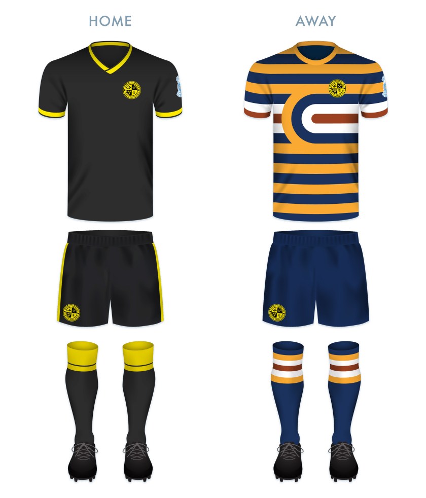
As the club has used their signature maroon home strip for many years—this giving the club its nickname, ‘the Maroons’—I decided to use maroon as the primary colour of the home strip, highlighted with light blue vertical stripes and accents. The away strip is again dominated by maroon and has white accents.

KFC kit-01

KFC badge new-01

Advertisement
28 January 201924 February 2020 E Tagged badge, Banffshire, crest, Europe, fleur-de-lis, fleur-de-lys, football, HFL, Highland Football League, Highlands, Keith, Keith FC, Keith Football Club, lion, logo, Maroons, Moray, Morayshire, rebrand, redesign, Scotland, Scottish Highland Football League, shell, SHFL, sport, texture, The Maroons, UK, United Kingdom 1 Comment

ReBrand: SPFL

graphic

SPFL badge new-01I first began redesigning Scottish football badges in 2013 as a personal challenge. Eventually, I lost a bit of steam, but have found myself reembarking on the endeavour as of late. In 2018, I set myself the task of tweaking or completely redesigning my initial rebrandings, particularly those which I have found uninspiring or too similar to current badges. I have also expanded beyond my original redesigns (the 2013/14 top tier and a smattering of lower division clubs) to include the entirety of the Scottish Professional Football League, as well as redesigns of home and away strips. As part of this project, I have also redesigned the SPFL logo and badges for the respective SPFL divisions. The lion’s head of this design derives heavily from the last Scottish Football League logo (used until the merger of the SFL and the Scottish Premier League in 2013, which resulted in the formation of the SPFL). The somewhat playful design of the football and ‘SPFL’ lettering is a direct reaction to what seems to be a move toward overly ‘futuristic’ league branding, not only in Scotland, but throughout the world.

SPFL badge-01

SPFL badge new-01

SPFL SP badge new-01

SPFL badges-01


22 September 201824 February 2020 E Tagged Europe, football, Ladbrokes Premiership, lion, logo, rebrand, redesign, Scotland, Scottish Championship, Scottish League 1, Scottish League 2, Scottish League One, Scottish League Two, Scottish Premiership, Scottish Professional Football League, SPFL, SPFL Championship, SPFL League 1, SPFL League 2, SPFL League One, SPFL League Two, SPFL Premiership, sport, texture, UK, United Kingdom Leave a comment

ReBrand: Livingston FC

graphic

LFC badge new-01The history of Livingston Football Club is one of the most tumultuous in all of Scottish football.

The club began its life in 1943, as the works team of Ferranti, who had set up a factory at Crewe Toll, Edinburgh for the manufacturing of gyro gunsights for Spitfire aircraft during the Second World War. The original club name was Ferranti Thistle FC. They played under that name until 1974, when the club gained admittance into the Scottish Football League.

Because their home ground, the former City Park, did not meet the SFL’s requirements, and because of controversy arising from a team bearing the name of a commercial company, Ferranti Thistle moved to the Commonwealth Stadium (later called Meadowbank) and changed their name to Meadowbank Thistle FC. The team struggled in the lower divisions for many years and in 1995, they relocated to Livingston, changing their name to Livingston FC in the process.

After this move to West Lothian, Livingston FC began to show promise. By 2001, the club had gained promotion into the top tier and in this first campaign, the Livi finished third in the table, which meant that they qualified for the UEFA Cup (now the Europa League). Livingston would meet further success when they defeated Hibernian in the final of the 2003/04 Scottish League Cup on 14 March 2004. But Livingston’s victory was bittersweet, as the club had entered administration on 3 February, eventually emerging in May 2005. That same month, Livingston avoided relegation narrowly. Ultimately, their stay in the top tier was ended when they finished the 2005/06 season at the bottom of the table.

In 2009, Livingston entered into administration for a second time and were in danger of outright liquidation. As a result of breaching rules on insolvency, the SFL took the decision to demote Livingston to the Third Division (the bottom tier). In the two subsequent seasons, Livingston won consecutive promotions, reaching the First Division in 2011.

In 2013, the SFL was replaced by the Scottish Professional Football League, and the First Division was renamed the Scottish Championship. At the end of the 2015/16 season, Livingston were relegated to League One (the third tier). But their stay in League One lasted only one season, with the club gaining promotion back to the Championship in 2017. In the 2017/18 season, Livingston secured second place in the Championship table. This gave them the opportunity to gain promotion to the top tier for the first time since 2006 via playoff, which they achieved in a 3-1 victory over Partick Thistle over two legs.

When redesigning Livingston’s badge and kit, I kept this challenging history very much in my mind. Because of the abundance of thistles among Scottish football club badges, I opted to omit the thistle image from the new badge (and save it for clubs with ‘thistle’ in their names, like Partick Thistle and Inverness Caledonian Thistle).

Being that the club has been based in Livingston since 1995, I wanted to capitalise on that local identity. The acorns represent West Lothian (whose coat of arms features an ‘oak tree fructed’) and the three cinqfoils are taken from the Livingston family coat of arms. The crossed pickaxes represent Livingston’s historical shale mining industry.

The Latin in the outer ring, Fortiter Omnia Vincit (‘Bravely Conquers All’) is the club motto, which was included in the club’s badge from 1995 until 1999. I feel this motto is especially appropriate given Livingston’s unlikely survival over the years. The lion rampant has featured in the Livingston badge since 1999 and I believe it is fitting for a Scottish club and accompanying the motto above.

LFC badge-01 2

For the home kit, I went with a black body and gold details, a colour scheme used numerous times since the club’s 1995 move. The away strip is more adventurous, calling back to the Ferranti works team who manufactured gyro gunsights for Spitfire. The scheme is based on the Types A.1 and C.1 roundels used on Spitfires during the Second World War.

LFC kit-01

LFC badge new-01

As ever, I am indebted to Dave at Historical Football Kits for some of the historical information used above.

2 May 201824 February 2020 E Tagged badge, brand, crest, Edinburgh, Europe, Ferranti, Ferranti Thistle, football, Ladbrokes Premiership, Latin, lion, Livingston, Livingston FC, Livingston Football Club, logo, Lothians, Meadowbank, Meadowbank Thistle, rebrand, redesign, Scotland, Scottish Premiership, Scottish Professional Football League, SPFL, SPFL Premiership, Spitfire, sport, Supermarine Spitfire, texture, Thistle, UK, United Kingdom, West Lothian Leave a comment
Widgets
Create a website or blog at WordPress.com
Privacy & Cookies: This site uses cookies. By continuing to use this website, you agree to their use.
To find out more, including how to control cookies, see here: Cookie Policy
  • Follow Following
    • ellliottt
    • Join 53 other followers
    • Already have a WordPress.com account? Log in now.
    • ellliottt
    • Customize
    • Follow Following
    • Sign up
    • Log in
    • Report this content
    • View site in Reader
    • Manage subscriptions
    • Collapse this bar
 

Loading Comments...