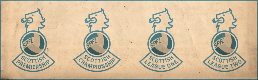
![]() I first began redesigning Scottish football badges in 2013 as a personal challenge. Eventually, I lost a bit of steam, but have found myself reembarking on the endeavour as of late. In 2018, I set myself the task of tweaking or completely redesigning my initial rebrandings, particularly those which I have found uninspiring or too similar to current badges. I have also expanded beyond my original redesigns (the 2013/14 top tier and a smattering of lower division clubs) to include the entirety of the Scottish Professional Football League, as well as redesigns of home and away strips. As part of this project, I have also redesigned the SPFL logo and badges for the respective SPFL divisions. The lion’s head of this design derives heavily from the last Scottish Football League logo (used until the merger of the SFL and the Scottish Premier League in 2013, which resulted in the formation of the SPFL). The somewhat playful design of the football and ‘SPFL’ lettering is a direct reaction to what seems to be a move toward overly ‘futuristic’ league branding, not only in Scotland, but throughout the world.
I first began redesigning Scottish football badges in 2013 as a personal challenge. Eventually, I lost a bit of steam, but have found myself reembarking on the endeavour as of late. In 2018, I set myself the task of tweaking or completely redesigning my initial rebrandings, particularly those which I have found uninspiring or too similar to current badges. I have also expanded beyond my original redesigns (the 2013/14 top tier and a smattering of lower division clubs) to include the entirety of the Scottish Professional Football League, as well as redesigns of home and away strips. As part of this project, I have also redesigned the SPFL logo and badges for the respective SPFL divisions. The lion’s head of this design derives heavily from the last Scottish Football League logo (used until the merger of the SFL and the Scottish Premier League in 2013, which resulted in the formation of the SPFL). The somewhat playful design of the football and ‘SPFL’ lettering is a direct reaction to what seems to be a move toward overly ‘futuristic’ league branding, not only in Scotland, but throughout the world.
![]()
![]()
![]()