graphic
LAUNCHCRAFT
2D, graphicSPACE SHUTTLE
2D, graphicAPOLLO
2D, graphicGEMINI
2D, graphicMERCURY
2D, graphicReBrand: Banks O’ Dee FC
graphicBanks O’ Dee Football Club was established in 1902. The club was originally called the Rechabites, the origins of which are quite peculiar. In the late nineteenth and early twentieth century, the temperance movement was at its height in the United Kingdom. The Independent Order of Rechabites is a fraternal organisation that was established in England in 1835. It was established based on a commitment to total abstinence from alcoholic beverages. (The name was related to the biblical people called the Rechabites, who were committed to abstaining from wine and living a nomadic life.) It was in this vein of thinking that the club set up shop beside the River Dee in Aberdeen. As the story goes, a club committee member discovered that some of the players were enjoying a bevvy in a local hostelry and the Rechabites name was abandoned in 1920 in favour of the current Banks O’ Dee.
For most of its existence, the Dee has competed in regional junior leagues. They have amassed a large number of junior league honours, including winning the Aberdeen District Junior League seven times, the subsequent North East Premier Division eleven times, and the current SJFA North Superleague five times. These figures set Banks O’ Dee apart from other regional junior clubs, though success on a broader stage has evaded the club. Perhaps Banks O’ Dee’s greatest success came in their first-ever participation in the 2008/09 Scottish Cup tournament. Their first-round 10–0 victory against then-Highland League outfit Fort William is of particular note. The following season, the Dee applied to join the Highland League, but were unsuccessful. Despite this, the club became full members of the Scottish Football Association in 2014.
After the ascendence of Cove Rangers from the Highland League to the SPFL in 2019, Banks O’ Dee was invited to submit an application to take Cove’s place in the Highland League. The Dee declined the offer, remaining in the SJFA North Superleague. Their continued participation in the North Superleague wouldn’t last long as the Dee won the league by an overwhelming margin (with 24 wins, two draws and no losses and amassing a +117 goal difference) in the 2021/22 season. This set them up for a two-leg play-off against Fort William for a place in the Highland League. Due to player eligibility rules, Fort William were forced to withdraw, cementing Banks O’ Dee’s admittance into the Highland League, where they compete presently.
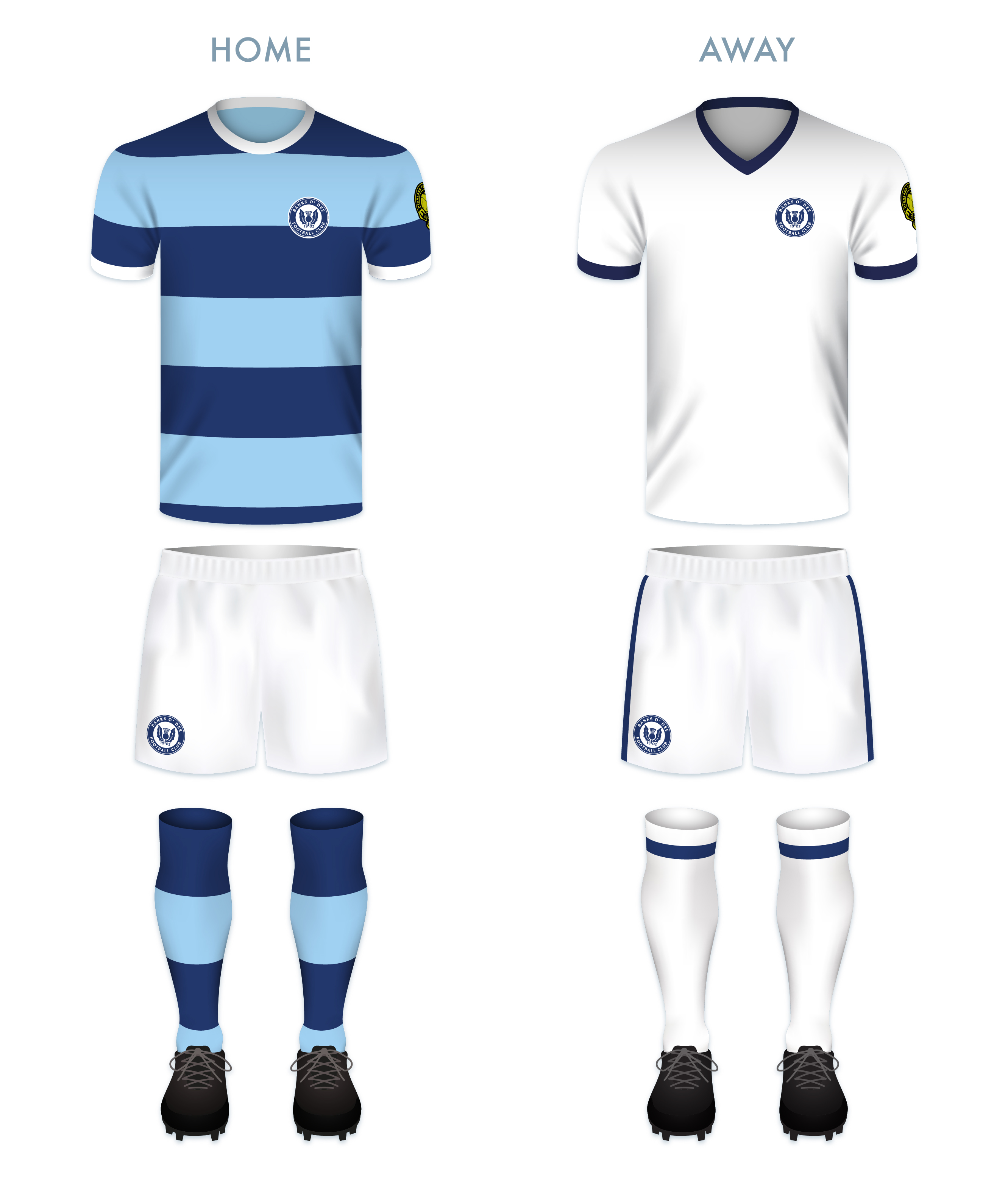
I find the current Banks O’ Dee badge endearing in its home-grown minimalism. My redesign is a ‘light’ reboot of the current badge, having clearned up the thistle design and incorporated a more bounded roundel.
The kit redesigns are based on the current colours used by the club.
ReBrand: Tranent Juniors FC
graphicTranent Juniors Football Club was established in 1911 in the town of Tranent, East Lothian. The Belters, as they are known, competed in the Scottish Junior Football Assocation for the vast majority of their existence. During their pre-Lowland League days, the greatest honour they enjoyed was winning the 1934/35 Scottish Junior Cup with a landslide 6–1 victory over Petershill at Ibrox Park (home of Rangers FC).
For the 2018/19 season, Tranent joined the East of Scotland League. Their time in this league was short, with the club winning the league in the 2021/22 season (finishing with 80 points, the same as Penicuik Athletic, but overwhelming the second-placed side with a +59 to +38 goal difference). This achievment reserved the Belters a spot in the three-match round robin Lowland League play-off. They faced the winners of the South of Scotland and West of Scotland Football Leagues (St Cuthbert Wanderers and Darvel, respectively).
During the mini-tournament, they trounced their opponents, finishing without conceding a goal and accumulating nine goals and two victories in the process. For the 2022/23 season, Tranent replaced Vale of Leithen (who were relegated from the Lowland League after finishing the 2021/22 season with a dismal record of one win, two draws and 31 losses). Upon entering the Lowland League, Tranent Juniors retained their name, despite having reached the heights of senior football, in order to call back to their long junior league heritage.
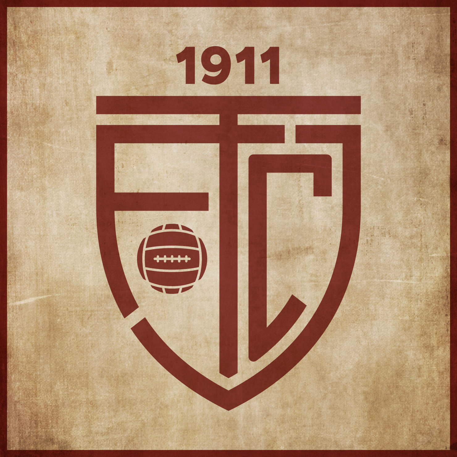
The current Tranent badge consists of a centerpiece of the Tranent coat of arms, topped with a banner containing the club’s name and another banner containing the club’s motto on the bottom. In redesigning this badge, I kept wanting to move away from the busy detail of the current badge. The Tranent coat of arms references the town’s assocaition with agriculture and coal-mining, with the left half portraying a farm worker harvesting by day and the right half portraying a coal-miner working by night. A crossed hammer and sickle would have served as an excellent minimalistic image, but its other associations would detract from the meaning of the badge. And while I appreciate the Scots ‘LIE FORRIT’ (‘lie forward’) motto, I decided to do away with all but the club’s initials (TJFC) and year of founding in the redesigned badge.
The kit redesigns are based on Tranent’s historical colour scheme (maroon and white) and current away colour scheme:
ReBrand: Bo’ness United FC
graphicFootball in the Central Lowland town of Bo’ness (officially, Borrowstounness, though no one calls it that) dates back to at least 1882, when Bo’ness Football Club was established. This original club competed in various amateur leagues until 1909, when they joined the old Central League (not to be confused with the current Central Scottish Amateur Football League, established in 1927).
With the outbreak of First World War in 1914, both this original Bo’ness club and the Central League closed their doors until the resumption of competition in 1919. By 1921, the Central League was subsumed into the Scottish Division Two and Bo’ness enjoyed relative success, even winning the league in the 1926/27 season and gaining promotion to the Scottish First Division with second-place Raith Rovers. The following season, the Rovers were able to retain their place in the top tier, though, unfortunately, Bo’ness came second-bottom and were relegated back to the second tier alongside the last-place Dunfermline Athletic.
By the 1932/33 season, Bo’ness were facing serious financial difficulties and were expelled from the Scottish Football League (alongside the struggling Armadale [1910-1935]) after only 14 matches. For the next decade, Bo’ness return to their hopping from amateur league to amateur league and even sat-out the 1937/38 season. By 1945, Bo’ness could no longer stand alone and merged with another junior side, Bo’ness Cadora, to form the current Bo’ness United. As United, Bo’ness enjoyed modest success in the amateur game, winning the Edinburgh & District League for three consecutive seasons (1946/47, 1947/48 and 1948/49). During these years, they also reached the final of the Scottish Junior Cup on two ocassions, winning in the 1947/48 season. They would repeat this Junior Cup victory twice more, in 1975/76 and 1983/84.
In April 2018, United—along with a number of other Junior East Region Super League clubs—became part of the East of Scotland Football League. The club made an immediate impact, winning the East of Scotland Football League Cup in their first season and topping the table in their second. This 2019/20 performance gained United admittance into both the Scottish Football Association and the Lowland League.
Bo’ness United’s current badge is a somewhat new rendering of their longtime ‘blue’ badge, featuring the club’s name, year of founding and a new motto. (From what I can gather, the ‘current’ badge is used for digital media while the ‘blue’ badge remains the one worn on the kit.) The centrepiece of the badge is a version of the Bo’ness coat of arms. Bo’ness itself was made a Royal Burgh in 1668, ‘in favour of Anne, Duchess of Hamilton’. The red and black fields represent the Hamiltons and the town’s historical coal mining industry, respectively. The ship in full sail calls back to Bo’ness’ historical place as the third-largest seaport in Scotland in the 1700s. The exact meaning of the lion passant is less clear, though this could either be connected to the Scottish lion rampant or even a reference to ‘the former Castle Lyon which stood near the sea and was probably the jointure house of Lady Margaret Lyon, daughter of the 7th Lord Glamis, and widow of John, 1st Marquess of Hamilton, whom she had married about 1577.’
For my redesign, I opted for the more traditional blue dominance and a re-rendered version of the coat of arms. I also included the club motto on a scroll beneath the badge.
The kit redesigns are based on United’s historical colour schemes, with the home kit calling back to the original Bo’ness FC kit worn from 1927 until at least 1933.
ReBrand: Caledonian Braves
graphicEdusport Academy was established as a residential football academy in 2011 with the aim of developing young French players and giving them the opportunity to improve their English language skills. The purpose behind refining these skills was to give the young footballers an edge in entering into the professional game in Britain.
The academy continues to operate as such, but in 2014, applied successfully to become members of the South of Scotland Football League, becoming the first private academy to participate in a senior league recognised by FIFA. The following season, Edusport applied to the Lowland Football League, but was rejected. This did not deter the club for long, as they were crowned champions of the South of Scotland League in 2017, gaining promotion to the Lowland League.
In 2018, club founder Chris Ewing launched ‘Our Football Club‘, an online membership scheme, giving supporters the opportunity to have a more democratic voice in the affairs of the club. With this, Ewing expressed the goal of establishing the senior Edusport team as a separate club in its own right with the ambitious aim of reaching the top tier of Scottish football by 2025.
In 2019, the club was rebranded as Caledonian Braves FC, complete with a new badge. The original badge employed the colours of the French tricolore and featured a small Saltire within its central football, representing the link between France and Scotland. While I appreciated the aim of this badge, I found it somewhat difficult to see as more than a relatively weak corporate brand. For a start, I found the colour scheme of ‘Edusport’ reminiscent of the uninspiring SportsDirect.com logo. Additionally, the original badge featured text within a shield – a ‘no-no’ under ancient Scottish heraldic law. For my first redesign, I went for a roundel which featured the club’s name with the French definite article le (l’). I also included the French name for Scotland, Écosse, which is recognised quite readily in Scotland. The centre of this first redesigned badge featured a stylised ‘EA’ monogram and a red circle representing a football.
I assume the current badge is the result a great deal of consultation with the club’s stakeholders. It futures the club’s name as part of a shield. The centrepiece of the current badge is an eagle in dark blue, behind which is what seems to be a fleur-de-lis in a lighter blue (perhaps a reference to the club’s French connection). The football and saltire from the original badge is found on the breast of the eagle. Being that this new badge continues to violate ancient Scottish heraldic law, I decided to have another shot at this redesign. The new design is very similar to my redesign of the original badge. Instead of the ‘EA’ monogram, the centre of the badge features a similar design to that of the current badge. The fleur-de-lis is depicted in red, with its side petals crossing over the eagle’s wings and the triple stalk acting as the eagle’s tailfeathers. I decided to omit the saltire as ‘Caledonian’ seems a sufficient reference to Scotland.
The kits are based upon previous incarnations of Edusport kits, with thick blue and black hoops on the home kit and red and dark red hoops on the away kit. To me, these seem simple, clean and dramatic.