![]() Football in the Central Lowland town of Bo’ness (officially, Borrowstounness, though no one calls it that) dates back to at least 1882, when Bo’ness Football Club was established. This original club competed in various amateur leagues until 1909, when they joined the old Central League (not to be confused with the current Central Scottish Amateur Football League, established in 1927).
Football in the Central Lowland town of Bo’ness (officially, Borrowstounness, though no one calls it that) dates back to at least 1882, when Bo’ness Football Club was established. This original club competed in various amateur leagues until 1909, when they joined the old Central League (not to be confused with the current Central Scottish Amateur Football League, established in 1927).
With the outbreak of First World War in 1914, both this original Bo’ness club and the Central League closed their doors until the resumption of competition in 1919. By 1921, the Central League was subsumed into the Scottish Division Two and Bo’ness enjoyed relative success, even winning the league in the 1926/27 season and gaining promotion to the Scottish First Division with second-place Raith Rovers. The following season, the Rovers were able to retain their place in the top tier, though, unfortunately, Bo’ness came second-bottom and were relegated back to the second tier alongside the last-place Dunfermline Athletic.
By the 1932/33 season, Bo’ness were facing serious financial difficulties and were expelled from the Scottish Football League (alongside the struggling Armadale [1910-1935]) after only 14 matches. For the next decade, Bo’ness return to their hopping from amateur league to amateur league and even sat-out the 1937/38 season. By 1945, Bo’ness could no longer stand alone and merged with another junior side, Bo’ness Cadora, to form the current Bo’ness United. As United, Bo’ness enjoyed modest success in the amateur game, winning the Edinburgh & District League for three consecutive seasons (1946/47, 1947/48 and 1948/49). During these years, they also reached the final of the Scottish Junior Cup on two ocassions, winning in the 1947/48 season. They would repeat this Junior Cup victory twice more, in 1975/76 and 1983/84.
In April 2018, United—along with a number of other Junior East Region Super League clubs—became part of the East of Scotland Football League. The club made an immediate impact, winning the East of Scotland Football League Cup in their first season and topping the table in their second. This 2019/20 performance gained United admittance into both the Scottish Football Association and the Lowland League.
Bo’ness United’s current badge is a somewhat new rendering of their longtime ‘blue’ badge, featuring the club’s name, year of founding and a new motto. (From what I can gather, the ‘current’ badge is used for digital media while the ‘blue’ badge remains the one worn on the kit.) The centrepiece of the badge is a version of the Bo’ness coat of arms. Bo’ness itself was made a Royal Burgh in 1668, ‘in favour of Anne, Duchess of Hamilton’. The red and black fields represent the Hamiltons and the town’s historical coal mining industry, respectively. The ship in full sail calls back to Bo’ness’ historical place as the third-largest seaport in Scotland in the 1700s. The exact meaning of the lion passant is less clear, though this could either be connected to the Scottish lion rampant or even a reference to ‘the former Castle Lyon which stood near the sea and was probably the jointure house of Lady Margaret Lyon, daughter of the 7th Lord Glamis, and widow of John, 1st Marquess of Hamilton, whom she had married about 1577.’
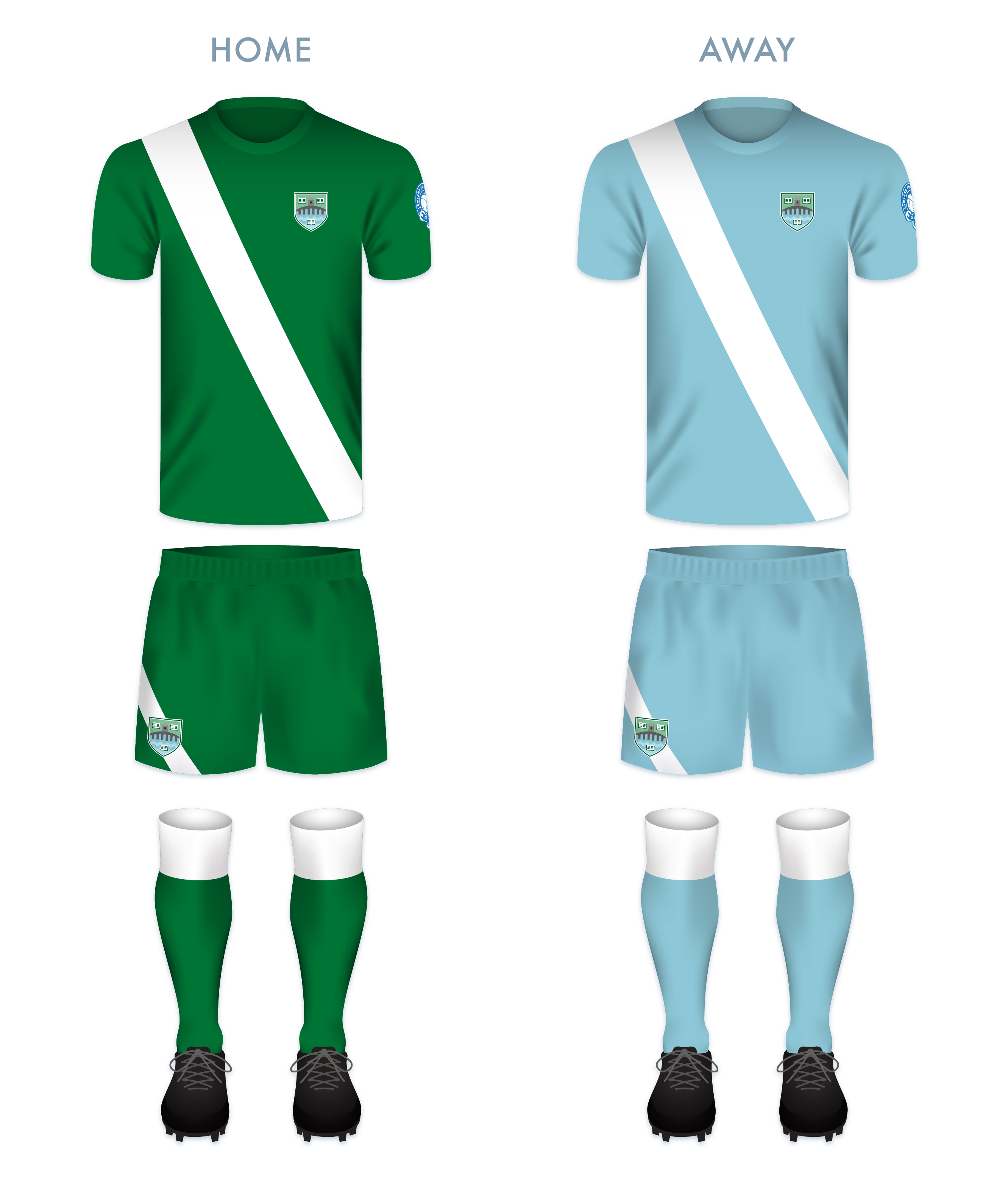
For my redesign, I opted for the more traditional blue dominance and a re-rendered version of the coat of arms. I also included the club motto on a scroll beneath the badge.
![]()
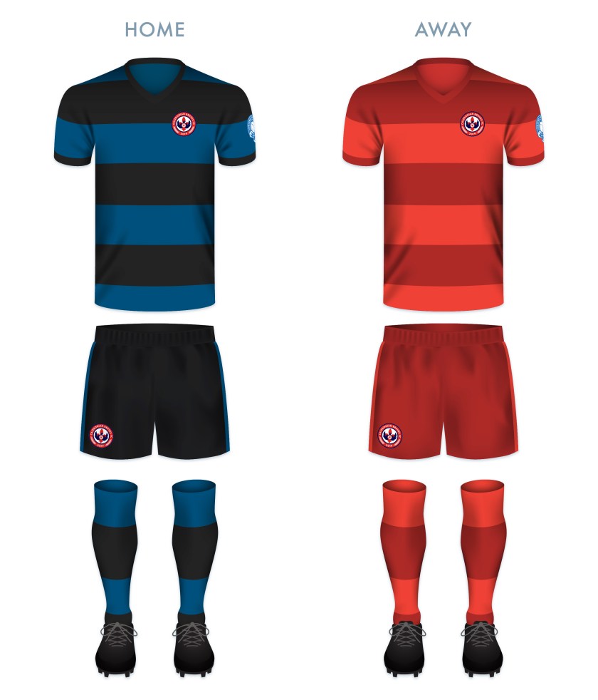
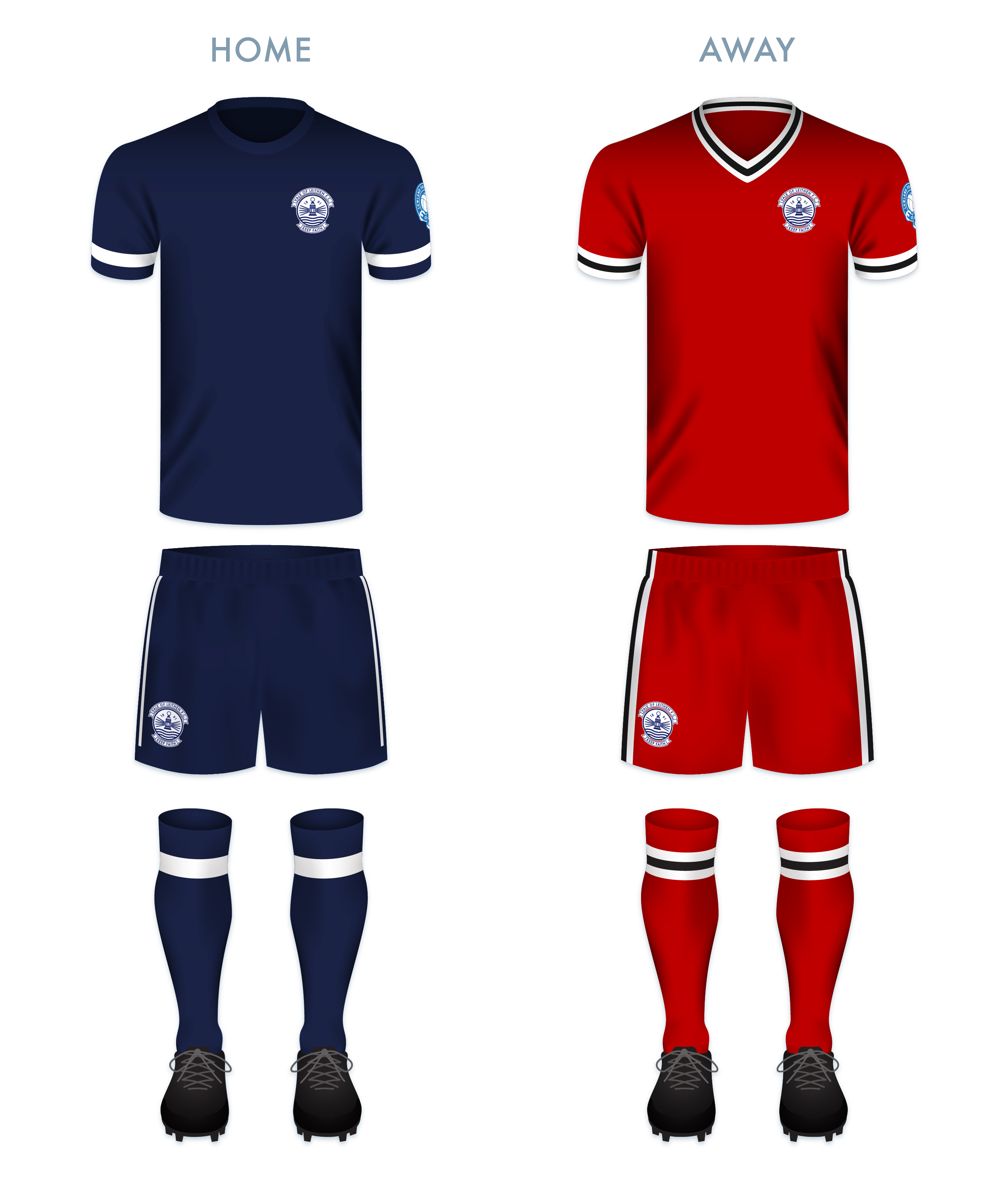
The kit redesigns are based on United’s historical colour schemes, with the home kit calling back to the original Bo’ness FC kit worn from 1927 until at least 1933.

![]()