ellliottt

design & illustration

Menu

Skip to content
  • HOME
  • ABOUT
  • GRAPHIC
    • ALL GRAPHIC DESIGN
    • AUTOMOTIVUS
    • REBRAND: SPFL
      • Premiership
        • Aberdeen
        • Celtic
        • Dundee United
        • Heart of Midlothian
        • Hibernian
        • Kilmarnock
        • Livingston
        • Motherwell
        • Rangers
        • Ross County
        • St Johnstone
        • St Mirren
      • Championship
        • Arbroath
        • Ayr United
        • Cove Rangers
        • Dundee
        • Greenock Morton
        • Hamilton Academical
        • Inverness CT
        • Partick Thistle
        • Queen’s Park
        • Raith Rovers
      • League One
        • Airdrieonians
        • Alloa Athletic
        • Clyde
        • Dunfermline Athletic
        • FC Edinburgh
        • Falkirk
        • Kelty Hearts
        • Montrose
        • Peterhead
        • Queen of the South
      • League Two
        • Albion Rovers
        • Annan Athletic
        • Bonnyrigg Rose
        • Dumbarton
        • East Fife
        • Elgin City
        • Forfar Athletic
        • Stenhousemuir
        • Stirling Albion
        • Stranraer
    • REBRAND: SHFL
      • Brechin City
      • Brora Rangers
      • Buckie Thistle
      • Clachnacuddin
      • Deveronvale
      • Formartine United
      • Forres Mechanics
      • Fraserburgh
      • Huntly
      • Inverurie Loco Works
      • Keith
      • Lossiemouth
      • Nairn County
      • Rothes
      • Strathspey Thistle
      • Turriff United
      • Wick Academy
    • REBRAND: SLFL
      • Berwick Rangers
      • Bo’ness United
      • Broomhill
      • Caledonian Braves
      • Civil Service Strollers
      • Cowdenbeath
      • Cumbernauld Colts
      • Dalbeattie Star
      • East Kilbride
      • East Stirlingshire
      • Edinburgh University
      • Gala Fairydean Rovers
      • Gretna 2008
      • Spartans
      • Tranent Juniors
      • University of Stirling
  • 2D
  • 3D
    • ALL 3D
    • INSTALLATION
  • PHOTO
  • SHOP

Falkirk

ReBrand: Bo’ness United FC

graphic

BUFC badge newFootball in the Central Lowland town of Bo’ness (officially, Borrowstounness, though no one calls it that) dates back to at least 1882, when Bo’ness Football Club was established. This original club competed in various amateur leagues until 1909, when they joined the old Central League (not to be confused with the current Central Scottish Amateur Football League, established in 1927).

With the outbreak of First World War in 1914, both this original Bo’ness club and the Central League closed their doors until the resumption of competition in 1919. By 1921, the Central League was subsumed into the Scottish Division Two and Bo’ness enjoyed relative success, even winning the league in the 1926/27 season and gaining promotion to the Scottish First Division with second-place Raith Rovers. The following season, the Rovers were able to retain their place in the top tier, though, unfortunately, Bo’ness came second-bottom and were relegated back to the second tier alongside the last-place Dunfermline Athletic.

By the 1932/33 season, Bo’ness were facing serious financial difficulties and were expelled from the Scottish Football League (alongside the struggling Armadale [1910-1935]) after only 14 matches. For the next decade, Bo’ness return to their hopping from amateur league to amateur league and even sat-out the 1937/38 season. By 1945, Bo’ness could no longer stand alone and merged with another junior side, Bo’ness Cadora, to form the current Bo’ness United. As United, Bo’ness enjoyed modest success in the amateur game, winning the Edinburgh & District League for three consecutive seasons (1946/47, 1947/48 and 1948/49). During these years, they also reached the final of the Scottish Junior Cup on two ocassions, winning in the 1947/48 season. They would repeat this Junior Cup victory twice more, in 1975/76 and 1983/84.

In April 2018, United—along with a number of other Junior East Region Super League clubs—became part of the East of Scotland Football League. The club made an immediate impact, winning the East of Scotland Football League Cup in their first season and topping the table in their second. This 2019/20 performance gained United admittance into both the Scottish Football Association and the Lowland League.

Bo’ness United’s current badge is a somewhat new rendering of their longtime ‘blue’ badge, featuring the club’s name, year of founding and a new motto. (From what I can gather, the ‘current’ badge is used for digital media while the ‘blue’ badge remains the one worn on the kit.) The centrepiece of the badge is a version of the Bo’ness coat of arms. Bo’ness itself was made a Royal Burgh in 1668, ‘in favour of Anne, Duchess of Hamilton’. The red and black fields represent the Hamiltons and the town’s historical coal mining industry, respectively. The ship in full sail calls back to Bo’ness’ historical place as the third-largest seaport in Scotland in the 1700s. The exact meaning of the lion passant is less clear, though this could either be connected to the Scottish lion rampant or even a reference to ‘the former Castle Lyon which stood near the sea and was probably the jointure house of Lady Margaret Lyon, daughter of the 7th Lord Glamis, and widow of John, 1st Marquess of Hamilton, whom she had married about 1577.’

For my redesign, I opted for the more traditional blue dominance and a re-rendered version of the coat of arms. I also included the club motto on a scroll beneath the badge.

BUFC badge

The kit redesigns are based on United’s historical colour schemes, with the home kit calling back to the original Bo’ness FC kit worn from 1927 until at least 1933.

BUFC kit

BUFC badge new

Advertisement
10 June 2021 E Tagged Bo'ness, Bo'ness Cadora, Bo'ness Cadora JFC, Bo'ness Cadora Junior Football Club, Bo'ness FC, Bo'ness Football Club, Bo'ness United, Bo'ness United FC, Bo'ness United Football Club, Borrowstounness, Europe, Falkirk, Falkirk Council, football, LFL, logo, Lowland Football League, Lowlands, rebrand, redesign, Scotland, Scottish Lowland Football League, SLFL, sport, texture, UK, United Kingdom, West Lothian Leave a comment

ReBrand: East Stirlingshire FC

graphic

ESFC badge new-01As with a number of other Scottish football clubs, the origins of East Stirlingshire Football Club can be traced back to cricket. In 1880, a local cricket club in the Bainsford area of Falkirk, the Bainsford Blue Bonnets (styled as ‘Bainsford Bluebonnets’ by some sources), formed a football side called Bainsford Britannia. Britannia had existed as part of the cricket club for a year, when, in 1881, the football club broke away and adopted the name ‘East Stirlingshire’ (after a previous occupant of their home ground, East Stirlingshire Cricket Club). The name East Stirlingshire refers to the historic county of Stirlingshire, of which the town of Falkirk was a part until 1975.
In 1900, when Linthouse FC folded, the Shire gained the vacant spot in the bottom tier (at that time, the Second Division) of the Scottish Football League. East Stirlingshire did not impress during this spell and, in 1915, the Second Division was dissolved due to the First World War. After the war, in 1921, the Second Division was reintroduced and the Shire gained admittance once again.

The club experienced its share of ups and downs over the comings decades. In 1932, East Stirlingshire finished the season at the top of the table, sharing the position with St Johnstone. Thanks to the Shire’s superior goal difference, they gained promotion to the top tier of Scottish football for the first time. Unfortunately, this spell would last only one season.

When the Second World War broke out in 1939, the league was suspended. After the war, the Shire was not permitted to return to the second tier. Alongside a number of other small clubs, East Stirlingshire competed in the new third tier. At various points, the Shire gained promotion to and were relegated from the second tier, but it was not until the 1963/64 season that the club competed in the top tier for a second time. As with their previous spell, they lasted only one season before relegation.

Although East Stirlingshire’s league performances have proven unremarkable, they have experienced moderate success in cup competitions, reaching the quarter-finals of the Scottish Cup on three occasions, most recently, in the 1980/81 competition. In that quarter-final, the Shire lost with a respectable 2-0 to cup-holders and eventual top tier champions Celtic.

At the end of the 2015/16 season, East Stirlingshire gained the dubious distinction of being the first club to have lost their place in the Scottish Professional Football League as a result of a play-off, relinquishing their place to the Lowland Football League champions, Edinburgh City 2-1 over two legs. Since that time, the Shire have competed in the Lowland League.

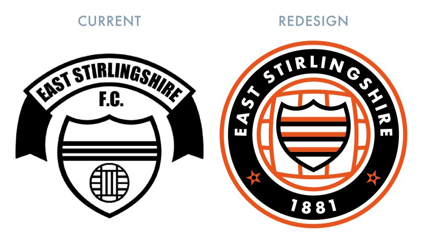
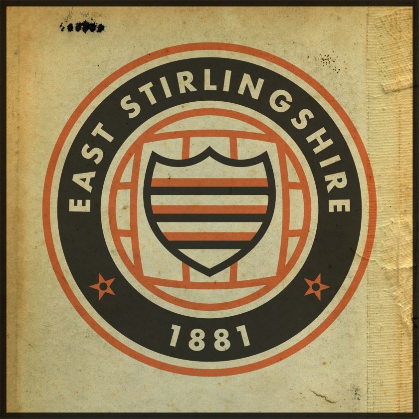
A version of East Stirlingshire’s current badge was first used in 1987. This first version incorporated orange as an accent colour, which first featured in the club’s 1980 badge. For my redesign, I have chosen to make use of the orange accent, which I find striking alongside the black and white. The roundel and the shield design call back to the 1980 badge, which I find particularly handsome. The two stars in the roundel call back to the old Stirlingshire coat of arms and depict two rowels (the spiked discs at the end of spurs).

ESFC badge-01

For the home kit redesign, I went with East Stirlingshire’s traditional black and white hoops (used in the vast majority of the club’s home kits from 1883 onward). The red socks first featured in 1946 and have been used often ever since. The home kit also features a 1970s-styled collar. The away kit makes use of the orange accent. The shorts for both kits feature only the central portion of the redesigned badge.

ESFC kit-01

ESFC badge new-01

10 June 201924 February 2020 E Tagged badge, Bainsford, Bainsford Blue Bonnets, Bainsford Blue Bonnets Cricket Club, Bainsford Britannia, Bainsford Britannia FC, Bainsford Britannia Football Club, crest, cricket, East Stirlingshire, East Stirlingshire FC, East Stirlingshire Football Club, Europe, Falkirk, football, LFL, logo, Lowland Football League, Lowlands, rebrand, redesign, Scotland, Scottish Lowland Football League, Shire, SLFL, sport, texture, The Shire, UK, United Kingdom Leave a comment

ReBrand: Stenhousemuir FC

graphic

SteFC badge new-01.jpgStenhousemuir Football Club was established in 1884 after breaking away from local junior side Heather Rangers Football Club. By 1890, the club was playing their home matches at Ochilview Park, where they have played ever since. In 2009, Stenhousemuir became the first football club in Scotland to become a Community Interest Company (CIC).
The club’s shirt did not feature a badge until 1984, marking their centenary year. This first badge was an odd number, featuring the club’s sponsor, Hogan Sports (written as ‘Hogan’s Sports’ on the badge). From 1985 until 1991, Stenhousemuir’s shirts featured a stylised ‘SFC’ monogram. This was replaced by a heraldic badge, which did not find favour with the club’s supporters. The heraldic emblem was abandoned after two seasons, when a round badge, derived from the 1985 monogram, was introduced. The Stenhousemuir badge has been based on this 1993 design ever since.

For my redesign, I wanted to hold to the spirit of the quirky brown-and-amber 1993 badge. I decided that the badge could benefit from a local or historical reference, without diving into a full-on heraldic design. The town of Stenhousemuir comes from a particular stone structure (‘sten house’ = ‘stone house’). This round structure, referred to as ‘Arthur’s O’en’ (‘Arthur’s Oven’) was most likely a Roman temple and stood to the north of the River Carron. It was demolished in 1743, but not before some detailed illustrations of it were made. One particular illustration of the foundation of the temple served as my inspiration as I found that it suited a round badge. The entrance to the temple also serves as a handsome frame for the lowest terminus of the ‘F’ in my new monogram. My redesign featuring a new monogram and an illustration of the temple’s foundation is found below:

SteFC badge-01

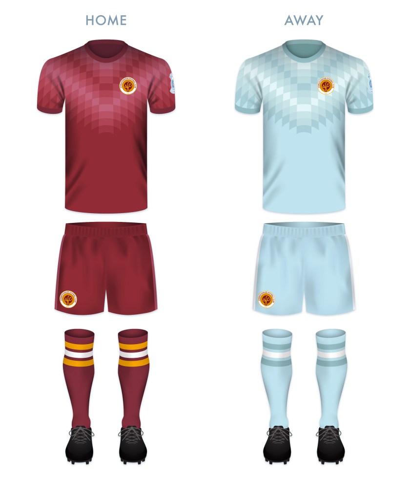
The redesigned kits are based on traditional Stenhousemuir colours, with the home kit inspired primarily by the 2017/18 home kit and the away kit inspired primarily by 2003/04 away kit, with a wee touch of 1980s Adidas kits.

SteFC kit-01

SteFC badge new-01.jpg

As ever, I am indebted to Dave at Historical Football Kits for some of the historical information used above.

16 May 201824 February 2020 E Tagged badge, brand, CIC, Community Interest Company, crest, design, Europe, Falkirk, football, Heather Rangers, Heather Rangers FC, Heather Rangers Football Club, Heather Rangers Juniors, logo, rebrand, redesign, Scotland, Scottish League 2, Scottish League Two, Scottish Professional Football League, SPFL, SPFL League 2, SPFL League Two, sport, Stenhousemuir, Stenhousemuir FC, Stenhousemuir Football Club, Stenhousemuir Football Club Community Interest Company, Stenny, Stenny FC, The Warriors, UK, United Kingdom, Warriors Leave a comment

ReBrand: Falkirk FC

graphic

FFC badge new-01Falkirk Football Club was established in 1876 and joined the Scottish Football Association two years later. During these early years, ‘the Bairns’ (a [primarily] eastern Scots word meaning ‘children’ and for natives of Falkirk, in general) competed in the early rounds of the Scottish Cup and played matches as part of the Stirlingshire Football Association.
In 1902, the top tier of the Scottish Football League expanded from 10 to 12 clubs, which opened two vacancies in the second tier. These went to Raith Rovers and Falkirk. After only three seasons, the Bairns were promoted to the top flight.

The club boasts such honours as two Scottish Cup victories (1912/13 and 1956/57) in five appearances, as well as the somewhat dubious honour of having won the Scottish Challenge Cup—a competition open only to clubs that do not play in the top tier—a record-tying four times (an honour shared with St Johnstone).

More recently, as a result of reaching the final of the 2008/09 Scottish Cup, Falkirk competed in the inaugural UEFA Europa League competition in the 2009/10 season. Despite tasting European competition for the first time, Falkirk was relegated from the top tier of the Scottish Professional Football League by the end of the season. The Bairns competed in the second tier until the end of the 2018/19 season, when the club was relegated to League One (the third tier) after finishing at the bottom of the table.

Some of Falkirk’s early shirts featured what may or may not be Masonic crosses as badges, but the club did not feature a regular badge until 1909, when a crest was utilised. This crest was based on the coat of arms of the burgh of Falkirk and featured a crowned lion supporting a shield which bore the coat of arms of the Callendar family, who long held a seat of power in Falkirk. The Falkirk shirt bore two other badges before 1974, when a variation of the current badge first appeared. This badge features a football bearing a highly-stylised silhouette of the Falkirk Town Steeple. With the exception of the 2007/08 season, the steeple-fronted football has remained the primary badge for the club.

Falkirk’s badge redesign is one with which I have wrestled for a time. Because of the effectiveness of this 1974 badge, I found it very difficult to depart from the steeple image. Despite this, given that the depiction of the steeple on the current badge in no way resembles the actual Falkirk Town Steeple, and because I don’t find the steeple particularly inspiring as far as what might be affected in the viewer from a more realistic rendering, I decided to do away with the steeple image all together – no doubt, a very controversial move to Falkirk supporters. Instead, I opted for something more in line with the traditional heraldry associated with the town and club.

The shape of the central shield is inspired by the shield that enclosed the steeple badge on the Falkirk strip from 2010 to 2013. The image in the shield is a depiction of the Callendar family coat of arms, used in the Falkirk coat of arms and similar to what was used in the original 1909 badge. This shows two sets of three billets (sheets of paper), divided by an embattled bend (a normal bend would appear as a solid ribbon running diagonally across a shield), representing the Antonine Wall (built by the Romans between 142 and c.154), which passed through the town. Within the bend we find two sets of shields and swords. These represent two significant battles in Falkirk history: King Edward I of England’s defeat of Sir William Wallace in 1298 and the Jacobite victory over the Hanoverian army in 1746. Between the two is a church, the ‘Fa’ Kirk’ (which may mean either ‘the speckled church’ or the ‘church by the wall’) from which the town gets its name.

FFC badge-01 2

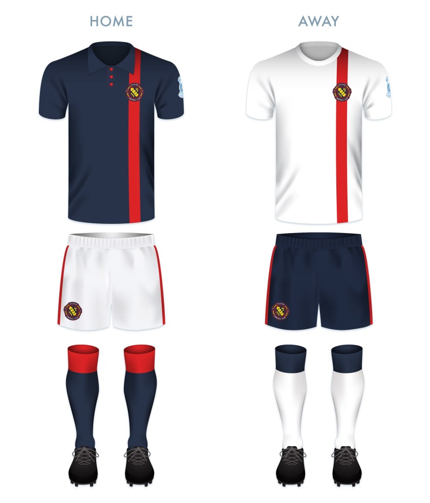
The kits are built on traditional Falkirk colour schemes. The home kit is inspired specifically by the 1937/38 home kit.

FFC kit-01

FFC badge new-01

As ever, I am indebted to Dave at Historical Football Kits for some of the historical information used above.

29 April 201824 February 2020 E Tagged badge, Bairns, brand, crest, Europe, Falkirk, Falkirk FC, Falkirk Football Club, football, logo, rebrand, redesign, Scotland, Scottish League 1, Scottish League One, Scottish Professional Football League, SPFL, SPFL Championship, SPFL League 1, SPFL League One, sport, texture, The Bairns, UK Leave a comment
Widgets
Create a website or blog at WordPress.com
Privacy & Cookies: This site uses cookies. By continuing to use this website, you agree to their use.
To find out more, including how to control cookies, see here: Cookie Policy
  • Follow Following
    • ellliottt
    • Join 53 other followers
    • Already have a WordPress.com account? Log in now.
    • ellliottt
    • Customize
    • Follow Following
    • Sign up
    • Log in
    • Report this content
    • View site in Reader
    • Manage subscriptions
    • Collapse this bar
 

Loading Comments...