ellliottt

design & illustration

Menu

Skip to content
  • HOME
  • ABOUT
  • GRAPHIC
    • ALL GRAPHIC DESIGN
    • AUTOMOTIVUS
    • REBRAND: SPFL
      • Premiership
        • Aberdeen
        • Celtic
        • Dundee United
        • Heart of Midlothian
        • Hibernian
        • Kilmarnock
        • Livingston
        • Motherwell
        • Rangers
        • Ross County
        • St Johnstone
        • St Mirren
      • Championship
        • Arbroath
        • Ayr United
        • Cove Rangers
        • Dundee
        • Greenock Morton
        • Hamilton Academical
        • Inverness CT
        • Partick Thistle
        • Queen’s Park
        • Raith Rovers
      • League One
        • Airdrieonians
        • Alloa Athletic
        • Clyde
        • Dunfermline Athletic
        • FC Edinburgh
        • Falkirk
        • Kelty Hearts
        • Montrose
        • Peterhead
        • Queen of the South
      • League Two
        • Albion Rovers
        • Annan Athletic
        • Bonnyrigg Rose
        • Dumbarton
        • East Fife
        • Elgin City
        • Forfar Athletic
        • Stenhousemuir
        • Stirling Albion
        • Stranraer
    • REBRAND: SHFL
      • Brechin City
      • Brora Rangers
      • Buckie Thistle
      • Clachnacuddin
      • Deveronvale
      • Formartine United
      • Forres Mechanics
      • Fraserburgh
      • Huntly
      • Inverurie Loco Works
      • Keith
      • Lossiemouth
      • Nairn County
      • Rothes
      • Strathspey Thistle
      • Turriff United
      • Wick Academy
    • REBRAND: SLFL
      • Berwick Rangers
      • Bo’ness United
      • Broomhill
      • Caledonian Braves
      • Civil Service Strollers
      • Cowdenbeath
      • Cumbernauld Colts
      • Dalbeattie Star
      • East Kilbride
      • East Stirlingshire
      • Edinburgh University
      • Gala Fairydean Rovers
      • Gretna 2008
      • Spartans
      • Tranent Juniors
      • University of Stirling
  • 2D
  • 3D
    • ALL 3D
    • INSTALLATION
  • PHOTO
  • SHOP

badge

ReBrand: Banks O’ Dee FC

graphic

BDFC badge new

Banks O’ Dee Football Club was established in 1902. The club was originally called the Rechabites, the origins of which are quite peculiar. In the late nineteenth and early twentieth century, the temperance movement was at its height in the United Kingdom. The Independent Order of Rechabites is a fraternal organisation that was established in England in 1835. It was established based on a commitment to total abstinence from alcoholic beverages. (The name was related to the biblical people called the Rechabites, who were committed to abstaining from wine and living a nomadic life.) It was in this vein of thinking that the club set up shop beside the River Dee in Aberdeen. As the story goes, a club committee member discovered that some of the players were enjoying a bevvy in a local hostelry and the Rechabites name was abandoned in 1920 in favour of the current Banks O’ Dee.

For most of its existence, the Dee has competed in regional junior leagues. They have amassed a large number of junior league honours, including winning the Aberdeen District Junior League seven times, the subsequent North East Premier Division eleven times, and the current SJFA North Superleague five times. These figures set Banks O’ Dee apart from other regional junior clubs, though success on a broader stage has evaded the club. Perhaps Banks O’ Dee’s greatest success came in their first-ever participation in the 2008/09 Scottish Cup tournament. Their first-round 10–0 victory against then-Highland League outfit Fort William is of particular note. The following season, the Dee applied to join the Highland League, but were unsuccessful. Despite this, the club became full members of the Scottish Football Association in 2014.

After the ascendence of Cove Rangers from the Highland League to the SPFL in 2019, Banks O’ Dee was invited to submit an application to take Cove’s place in the Highland League. The Dee declined the offer, remaining in the SJFA North Superleague. Their continued participation in the North Superleague wouldn’t last long as the Dee won the league by an overwhelming margin (with 24 wins, two draws and no losses and amassing a +117 goal difference) in the 2021/22 season. This set them up for a two-leg play-off against Fort William for a place in the Highland League. Due to player eligibility rules, Fort William were forced to withdraw, cementing Banks O’ Dee’s admittance into the Highland League, where they compete presently.

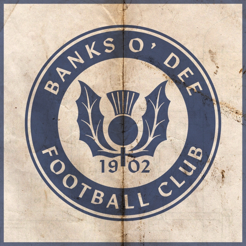
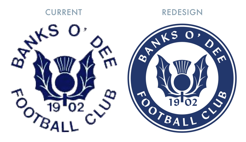
I find the current Banks O’ Dee badge endearing in its home-grown minimalism. My redesign is a ‘light’ reboot of the current badge, having clearned up the thistle design and incorporated a more bounded roundel.
BDFC badge

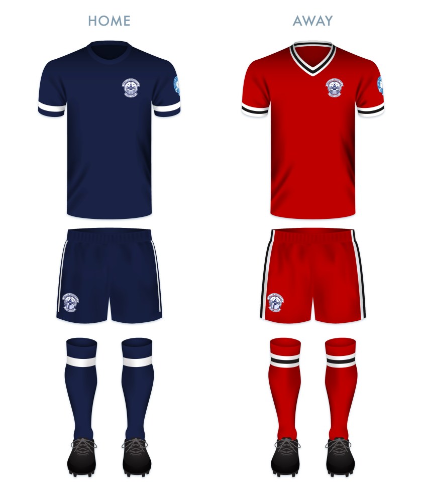
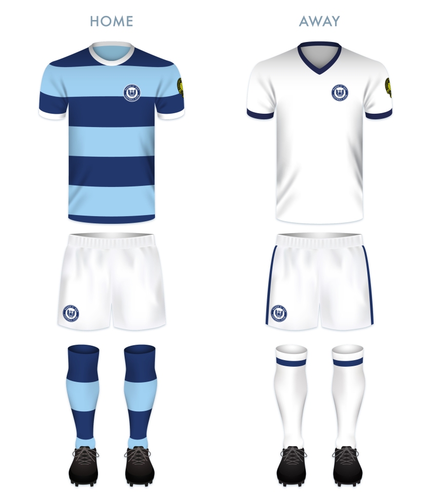
The kit redesigns are based on the current colours used by the club.
BDFC kit

BDFC badge new

Advertisement
4 August 2022 E Tagged Aberdeen, badge, Banks O' Dee, Banks O' Dee FC, Banks O' Dee Football Club, crest, Dee, Europe, football, HFL, Highland Football League, Highlands, logo, rebrand, Rechabites, redesign, Scotland, Scottish Highland Football League, SHFL, sport, texture, UK, United Kingdom Leave a comment

ReBrand: Caledonian Braves

graphic

CBFC badge newEdusport Academy was established as a residential football academy in 2011 with the aim of developing young French players and giving them the opportunity to improve their English language skills. The purpose behind refining these skills was to give the young footballers an edge in entering into the professional game in Britain.

The academy continues to operate as such, but in 2014, applied successfully to become members of the South of Scotland Football League, becoming the first private academy to participate in a senior league recognised by FIFA. The following season, Edusport applied to the Lowland Football League, but was rejected. This did not deter the club for long, as they were crowned champions of the South of Scotland League in 2017, gaining promotion to the Lowland League.

In 2018, club founder Chris Ewing launched ‘Our Football Club‘, an online membership scheme, giving supporters the opportunity to have a more democratic voice in the affairs of the club. With this, Ewing expressed the goal of establishing the senior Edusport team as a separate club in its own right with the ambitious aim of reaching the top tier of Scottish football by 2025.

In 2019, the club was rebranded as Caledonian Braves FC, complete with a new badge. The original badge employed the colours of the French tricolore and featured a small Saltire within its central football, representing the link between France and Scotland. While I appreciated the aim of this badge, I found it somewhat difficult to see as more than a relatively weak corporate brand. For a start, I found the colour scheme of ‘Edusport’ reminiscent of the uninspiring SportsDirect.com logo. Additionally, the original badge featured text within a shield – a ‘no-no’ under ancient Scottish heraldic law. For my first redesign, I went for a roundel which featured the club’s name with the French definite article le (l’). I also included the French name for Scotland, Écosse, which is recognised quite readily in Scotland. The centre of this first redesigned badge featured a stylised ‘EA’ monogram and a red circle representing a football.

EAFC badge-01

I assume the current badge is the result a great deal of consultation with the club’s stakeholders. It futures the club’s name as part of a shield. The centrepiece of the current badge is an eagle in dark blue, behind which is what seems to be a fleur-de-lis in a lighter blue (perhaps a reference to the club’s French connection). The football and saltire from the original badge is found on the breast of the eagle. Being that this new badge continues to violate ancient Scottish heraldic law, I decided to have another shot at this redesign. The new design is very similar to my redesign of the original badge. Instead of the ‘EA’ monogram, the centre of the badge features a similar design to that of the current badge. The fleur-de-lis is depicted in red, with its side petals crossing over the eagle’s wings and the triple stalk acting as the eagle’s tailfeathers. I decided to omit the saltire as ‘Caledonian’ seems a sufficient reference to Scotland.

CBFC badge-01

The kits are based upon previous incarnations of Edusport kits, with thick blue and black hoops on the home kit and red and dark red hoops on the away kit. To me, these seem simple, clean and dramatic.

CBFC kit-01

CBFC badge new

28 October 201924 February 2020 E Tagged academy, Annan, badge, crest, Dumfries and Galloway, Dumfriesshire, eagle, Edusport, Edusport Academy, Europe, fleur-de-lis, football, France, French, Galabank, LFL, logo, Lowland Football League, Lowlands, monogram, Our Football Club, rebrand, redesign, Scotland, Scottish Lowland Football League, SLFL, sport, texture, UK, United Kingdom Leave a comment

ReBrand: Vale of Leithen FC

graphic

VLFC badge new-01Vale of Leithen Football Club began its life as Leithen Vale Football Club in 1891, making it one of the oldest clubs in the Scottish Borders (a region traditionally dominated by rugby). The ‘Leithen Vale’ name was used only for the club’s first two matches (a victory against Gala Harp and a loss to Peebles Hibernian) before the change to Vale of Leithen. It has been suggested that the name change was made in order to bring to mind the successful Dunbartonshire club Vale of Leven FC (the original Vale of Leven was established in 1872 and folded in 1929, winning the Scottish Cup on three consecutive occasions between 1877 and 1879).

The Vale became full members of the Scottish Football Association in 1897 and competed in the Borders Football League at that time. By the 1910s, the Vale was playing in the Eastern Football League and for the 1923/24 season, joined the new East of Scotland Football League. The club would be crowned EoSFL champions the following season, but would not win the league again until 1977/78 (and then again the following season). The club’s final EoSFL championship came in 1986/87.

In 2013, the Vale became founding members of the Lowland Football League alongside Dalbeattie Star, East Kilbride, Edinburgh City, Gala Fairydean Rovers, Gretna 2008, Preston Athletic, Selkirk, Spartans, University of Stirling, Threave Rovers and Whitehill Welfare. The club’s best performance in the Lowland League came in 2013/14, when they finished in the sixth position.

Vale of Leithen’s current badge is one of my favourites in the Lowland League. According to legend, the town of Innerleithen was established in 737 CE by the Irish monk St Ronan (often referred to as St Ronan the Silent or St Ronan of Locronan), who travelled up the River Tweed (of which the Leithen Water is a tributary) in a coracle. St Ronan is the figure depicted in the current badge, with a crosier in his right hand and a lantern in his left, bringing the ‘light’ of the Christian faith to Innerleithen. This resembles the official blazon of Innerleithen.

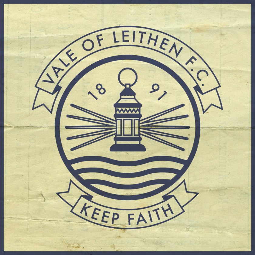
While I appreciate each of the design features of the current badge, for my redesign, I decided to make several changes. For a start, I determined that the club’s name feels a bit cramped within the circular portion of the badge – St Ronan’s crosier is nearly touching the ‘E’ of ‘VALE’. Inspired by the handsome ‘KEEP FAITH’ banner, I incorporated the same banner above the circular badge. I was resistant this depiction of St Ronan, especially since it does not resemble many other depictions of the saint and that the boat in which he travels is not suggestive of an Irish coracle (the aesthetic of which does not lend itself to minimalistic illustration).

Instead of a depiction of St Ronan in a boat, I decided to go with the sole image of a lantern to represent the saint. The lantern in my redesign is inspired by one found in a JaJa postcard illustration of the Innerleithen coat of arms from the early 1900s. Being that the Vale is one of the oldest clubs in the Borders, I also decided to include the date of the club’s founding.

VLFC badge-01

The colours for the kit redesigns are taken from the Vale’s traditional kit colour schemes.

VLFC kit-01

VLFC badge new-01

6 July 201928 February 2020 E Tagged badge, Borders, crest, Europe, football, Innerleithen, Leithen, Leithen Vale, Leithen Vale FC, Leithen Vale Football Club, Leithen Water, LFL, logo, Lowland Football League, Lowlands, Peeblesshire, rebrand, redesign, Ronan, Saint Ronan, Scotland, Scottish Borders, Scottish Lowland Football League, SLFL, sport, St Ronan, texture, Tweeddale, UK, United Kingdom, Vale, Vale of Leithen, Vale of Leithen FC, Vale of Leithen Football Club Leave a comment

ReBrand: University of Stirling FC

graphic

USFC badge new-01The University of Stirling was established in 1967. Two years later, the eponymous football club was founded. Among the six teams operated by USFC, the most senior of which has been competing in the Lowland Football League since its inaugural season in 2013/14.

Prior to competing in the Lowland League, in 2008, USFC was admitted to the East of Scotland Football League. In only their second season in the league, USFC won the First Division (at the time, the sole second tier in the EoSFL) title. This saw USFC compete in the Premier Division, the top tier of the EoSFL, in the 2010/11 season. That season, the club secure a second-place finish to Spartans. By the following season, 2011/12, USFC clinched the top spot in the Premier Division.

The 2012/13 season finished with Whitehill Welfare as champions and USFC finishing as runners-up, ahead of Spartans. The following season saw the transfer of these three, alongside Edinburgh City, Gretna 2008, Preston Athletic and Vale of Leithen admitted into the new Lowland League. In that inaugural season, USFC finished in second place, only four points behind the league champion Spartans.

As far as the club’s aesthetics go, the current badge is excellent. The features of the badge come directly from the coat of arms of the university. The university website states:

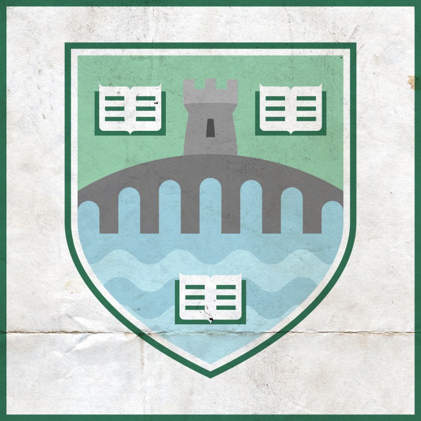
The coat of arms may be described as an arched bridge topped by a tower and surrounded by open books. The bridge may represent a governor or magistrate, the tower safety and guardianship, while the open books have clear associations with learning and knowledge. The imagery portrays the University as an official guardian entrusted with the safekeeping of the process of imparting knowledge, whilst willingly serving the public.

On a more visual level, the three elements of the coat of arms may be interpreted as a reflection of the University’s striking location in a historic Scotland, suggesting as they do Stirling Bridge, the National Wallace Monument and the University itself.

With the simplicity and cleanliness of the current badge, certain elements might not come across as clearly. For instance, without colour, the wavy lines, which represent water running under the bridge (perhaps the River Forth running under the Old Stirling Bridge) are not as obvious. I decided to stick with the simple design features of the current badge, adjusting various bits and pieces for aesthetic purposes (the normalisation of the ascending and descending arches of the bridge, the increased simplification—even a suggested digitisation—of the open books) and including colours which are akin to those in the official university coat of arms.

USFC badge-01

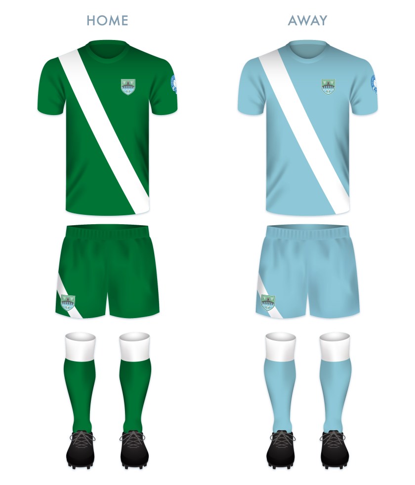
The home and away kits derive their colour schemes from the badge redesign. The predominantly green kit is the colour scheme of the traditional USFC home kit.

USFC kit-01

USFC badge new-01

1 July 201924 February 2020 E Tagged badge, crest, Europe, football, LFL, logo, Lowland Football League, Lowlands, rebrand, redesign, Scotland, Scottish Lowland Football League, SLFL, sport, Stirling, Stirling University, Stirling University FC, Stirling University Football Club, Stirlingshire, texture, UK, United Kingdom, University of Stirling, University of Stirling FC, University of Stirling Football Club Leave a comment

ReBrand: Bonnyrigg Rose AFC

graphic

BRAFC badge new-01The Midlothian town of Bonnyrigg was first home to a club called Bonnyrigg Swifts, who were established in 1874. The Swifts gained the nickname ‘the Rose’ and in 1881, a new club, Bonnyrigg Rose Athletic Football Club, was born of the Swifts. For the vast majority of their history, the Rose competed as a junior side, having won the Scottish Junior Cup on two occasions: 1966 and 1978.

In the twentieth century, the Rose joined the Scottish Junior Football East Region Super League and were crowned league champions on four occasions (2008/09, 2011/12, 2015/16 and 2017/18), making them the most successful side in the league’s history. With each Super League championship, the Rose qualified for the first preliminary round of the Scottish Cup. Their most successful outing took place in the 2016/17 competition. Having defeated Glasgow University and Burntisland Shipyard (the latter result of 14-0 being the competitions largest margin of victory since 1984, when Stirling Albion dealt Selkirk a 20-0 dismantling), the Rose proceded to the first round proper of the Scottish Cup. There, they defeated Highland League side Turriff United 4-1 in a replay. In the second round, the Rose faced and defeated another Highland League outfit, Cove Rangers.

By the third round, the Rose and Beith were the only junior sides remaining in the competition. There, they issued a shock defeat against SPFL side Dumbarton in a replay at Dumbarton’s home ground. The rose proceeded to the fourth round as the only remaining junior side, though their draw would prove too great a challenge. Playing at Hearts‘ home ground of Tynecastle, the Rose lost 1-8 against cup-holders Hibernian in January 2017 and exited the tournament.

After their 2017/18 season, the Rose joined the East of Scotland Football League and in their inaugural season, won their conference (B) and qualified for the league’s championship playoff. They competed against other conference winners, Penicuik Athletic (Conference A winners) and Broxburn Athletic (Conference C winners) in order to gain the prize of promotion to the Lowland Football League. Ultimately, the Rose defeated both of their opponents and on 14 June 2019, Bonnyrigg Rose gained admittance into the Scottish Football Association.

The Rose went from strength to strength in the Lowland League, finishing second-top in their inaugural season and third in 2020/21. The 2021/22 season proved to be Bonnyrigg’s finest, finishing with 28 wins, three draws and three losses, enough to secure their place as Lowland League champions and gaining a spot against Highland League champions Fraserburgh in the first round of the SPFL League Two play-off. The Rose prevailed 3-2 on aggregate, setting them up for a two-leg play-off against League Two bottom-dwellers, Cowdenbeath. Bonnyrigg defeated Cowdenbeath 4-0 over two legs and entered the SPFL for the 2022/23 season.

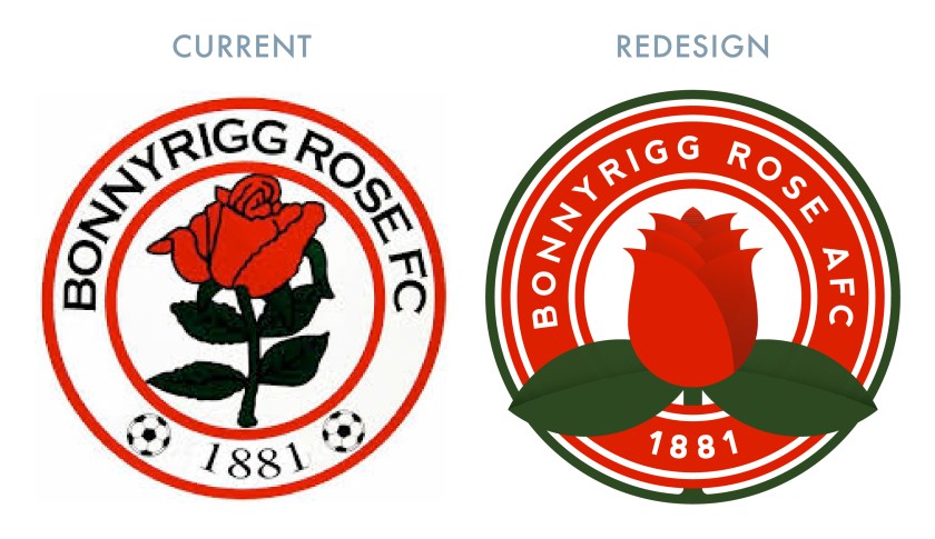
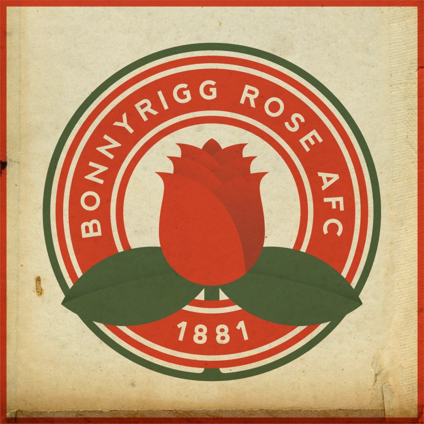
I’m going to come out and say it – I don’t like the current Bonnyrigg Rose badge. I find the club’s name to crammed together (it doesn’t even reflect the club’s actual name: Bonnyrigg Rose Athletic Football Club). Additionally, the typeface differs from that used in the club’s year of foundation. I also find the other features (the rose and the footballs) jarring. But this is the badge of a junior side and I’ve seen worse. Still, the Rose have climbed the ladder in phenomenal fashion and are now part of the Lowland League. Therefore, a redesign is in order. My design is simple and clean, incorporating a stylised (and more symmetrical) rose and opting to remove the footballs.

BRAFC badge-01

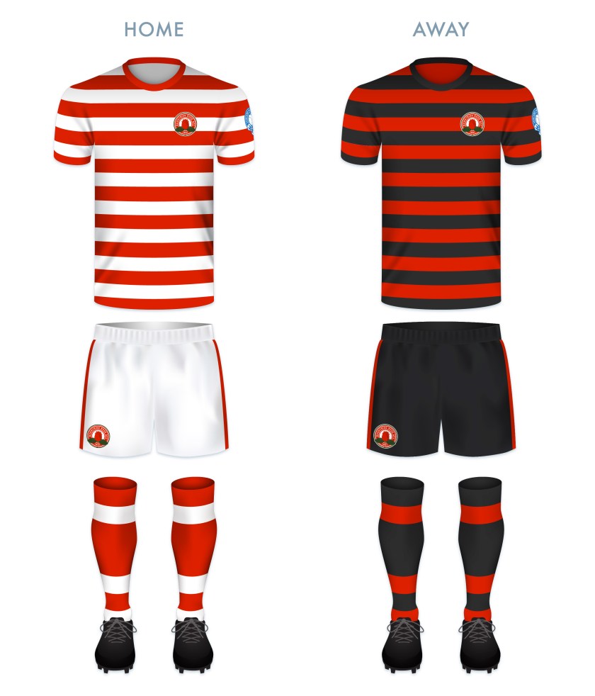
Bonnyrigg Rose’s home kits have long featured red and white hoops. For these kits, I have decided to borrow from the schemes for both the home and away kits of the 2018/19 season.

BRAFC kit-01

BRAFC badge new-01

1 July 20191 August 2022 E Tagged badge, Bonnyrigg, Bonnyrigg Rose, Bonnyrigg Rose AFC, Bonnyrigg Rose Athletic Football Club, Bonnyrigg Rose FC, Bonnyrigg Rose Football Club, Bonnyrigg Swifts, Bonnyrigg Swifts FC, Bonnyrigg Swifts Football Club, crest, Europe, football, logo, Lothians, Lowlands, Midlothian, rebrand, redesign, rose, Scotland, Scottish League 2, Scottish League Two, SPFL, SPFL League 2, SPFL League Two, sport, texture, The Rose, UK, United Kingdom Leave a comment

ReBrand: Spartans FC

graphic

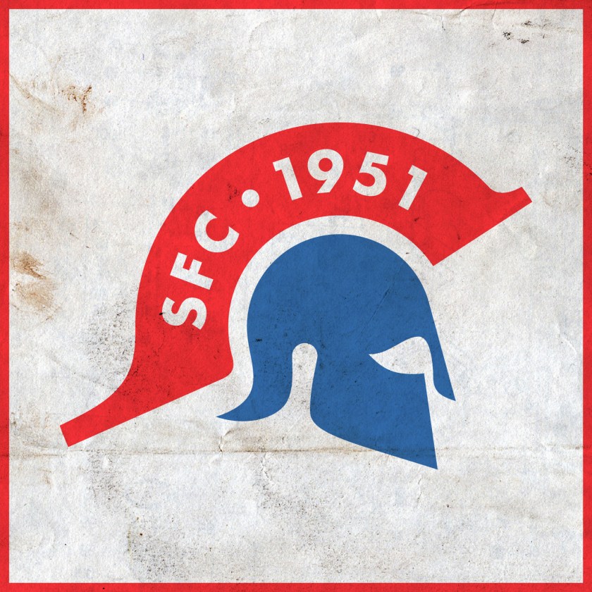
SFC badge new-01In 1951, the Spartans Football Club was established by Elliot Wardlaw and Jimmy Beaumont, two former Edinburgh University players. It was their intention that the club would field graduates of the university, though the constitution soon allowed for the admission of ‘other interested parties’.

Upon their founding, the Spartans were admitted into the East of Scotland Football League, where they would compete for more than six decades and amass nine league championships (including a spell of three consecutive championships between 2009 and 2011). It was also during this time that the Spartans pulled off some impressive Scottish Cup runs – advancing to the fourth round in the 2003/04 season after defeating Buckie Thistle and league sides Alloa Athletic and Arbroath. Eventually, this run would end at the hands of top-tier side Livingston. The club would reach the fourth round on two more occasions — in 2005/06 and in 2008/09 — defeating many league sides in the process.

In 2013, the Spartan’s long stay in the EoSFL ended when they became founding members of the Lowland Football League. During that first season, the club topped the table for the first time. Their greatest Scottish Cup performance came in the 2014/15 competition. By the fifth round (the round of 16), the Spartans were the only non-league side remaining. On 7 February 2015, the Spartans drew 1-1 with Berwick Rangers, forcing a replay. Ten days later, the Spartan’s run would end in England, with a 1-0 loss away at Berwick.

After winning the Lowland League in the 2017/18 season, the Spartans qualified for the League Two play-off semi-finals. As Lowland League champions, they faced the Highland Football League champions, Cove Rangers. Cove proved too strong over two legs and the Spartans went away losing 2-5 on aggregate.

For the badge redesign, I sought to capture and build upon the boldness and strength of the current badge. I decided upon a minimalist badge, incorporating a depiction of the Spartan helmet alone. Within the crest of the helmet is found the club’s initials and the year of the club’s founding.

SFC badge-01

The home kit incorporates the traditional Spartans strip of a white shirt with red shorts and white socks. The top features red details in a scheme resembling the handsome Admiral strips from the early 1980s. The away kit also incorporates a bold 1980s athletic feel, making use of the badge’s blue and red colour scheme while presenting the redesigned badge in white.

SFC kit-01

SFC badge new-01

27 June 201924 February 2020 E Tagged badge, crest, Edinburgh, Europe, football, LFL, logo, Lothians, Lowland Football League, Lowlands, rebrand, redesign, Scotland, Scottish Lowland Football League, SLFL, Spartans, Spartans FC, Spartans Football Club, sport, texture, The Spartans, The Spartans FC, The Spartans Football Club, UK, United Kingdom Leave a comment

ReBrand: Kelty Hearts FC

graphic

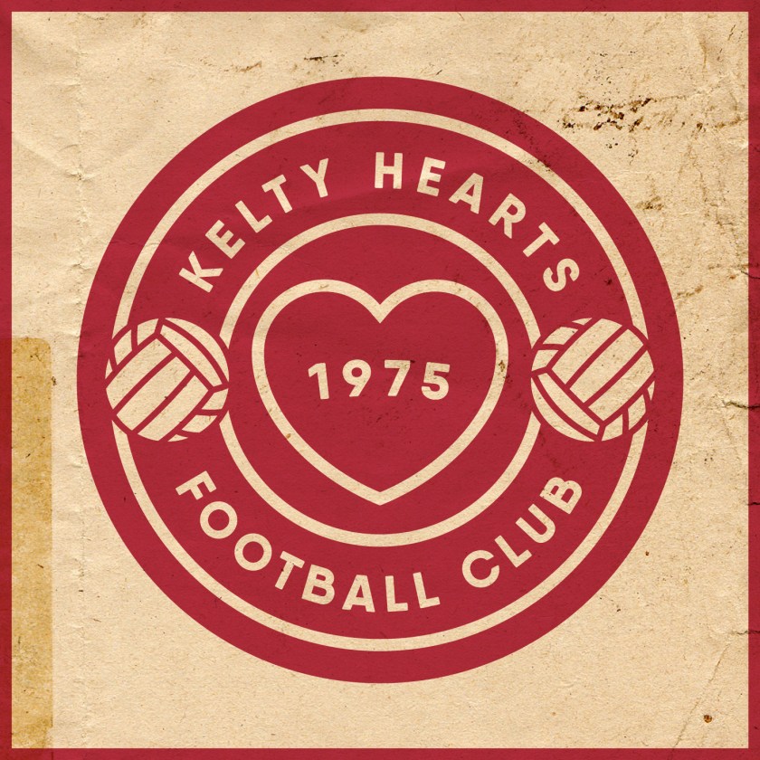
KHFC badge new-01Kelty Hearts Football Club was established as an amateur side in 1975. After the 1978/79 season, five of the club’s players were signed by Halbeath Juniors, prompting the amateurs to become a junior side in order to remain competitive. In June 1980, the club was accepted into the Scottish Junior Football Association, where they competed for the better part of the next three decades.

During their time as a junior side, the Hearts reached the Scottish Junior Cup final twice, in 1999 and in 2007, though finished as runners up on both occasions. By the 2010s, the club was looking more dominant in the East Region Super League, winning the league in 2015 and 2017. After their second league victory, Kelty Hearts applied for admission into the Scottish Football Association, which was granted in December 2017.

The club entered the East of Scotland Football League in 2018 and finished at the top of the table that same season. As EoSFL champions, the Hearts played Threave Rovers for a chance at gaining another promotion. Over two legs, the Hearts dominated the Rovers, amassing a comprehensive 10-0 aggregate score to seal their entry into the Lowland Football League.

Kelty’s success continued in the Lowland League, placing third in their inaugural season (behind East Kilbride and BSC Glasgow, in first and second place, respectively). They topped the table in both of the curtailed (as a result of the COVID-19 pandemic) 2019-20 and 2020-21 seasons. Because of the pandemic, neither the Highland nor Lowland League champions were given the chance to compete for promotion into the SPFL in the 2019-20 season. Despite having only played 13 matches in the 2020-21 season, Kelty were given the opportunity to play Brora Rangers, the Highland League champions, who they defeated 6-1 over two legs. Kelty then faced SPFL League Two bottom side, Brechin City. With their 3-1 victory over Brechin over two legs, Kelty gained promotion to the SPFL for the first time in their history and will compete in League Two for the 2021-22 season.

The current Kelty Hearts badge is quite a sight to behold. I imagine, judging from the design, that this badge has been used since the 1970s. While I admire its uniqueness, with the text set on straight lines within a circle, there is very little design coherence. All four linear elements — the heart, the club name, the date and football and the ‘F.C.’ banner — utilise completely different styles. In order to bring them into some sort of unity, I decided to incorporate each element within a new circular badge.

KHFC badge-01

Both the home and away kits make use of the traditional Kelty Hearts colours and have been inspired by 1970s kit styles.

KHFC kit

KHFC badge new-01

26 June 20199 June 2021 E Tagged badge, crest, Europe, Fife, football, Hearts, Jambos, Kelty, Kelty Hearts, Kelty Hearts FC, Kelty Hearts Football Club, logo, rebrand, redesign, Scotland, SPFL, SPFL Division 2, SPFL Division Two, SPFL League 2, SPFL League Two, sport, texture, The Hearts, The Jambos, UK, United Kingdom Leave a comment

ReBrand: Gretna FC 2008

graphic

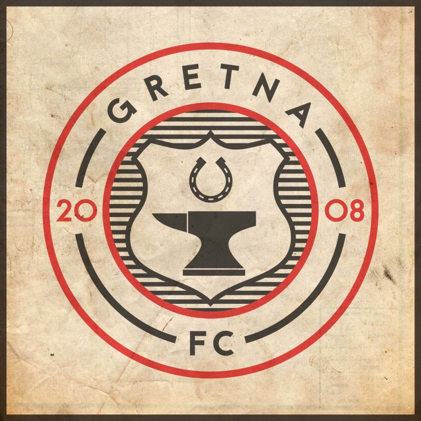
G2008FC badge new-01The original Gretna Football Club was established in 1946, competing in the Dumfries and District Junior League. Due to the town’s proximity to England, in 1947, the club began to compete in the Carlisle and District League. Gretna continued to play in English leagues until gaining admittance into the Scottish Football League in 2002 (replacing the original Airdrieonians, who had ceased operations).

Between 2005 and 2007, Gretna achieved phenomenal success in Scottish football. Over these three consecutive seasons, the club gained promotion from the bottom to the top tier.

In the 2005/06 season, Gretna’s 3-0 victory over Dundee in the semi-final sealed their place in history as the first team from the third tier to have reached the final of the Scottish Cup. Gretna would draw 1-1 with Hearts in the final, only to lose on penalties.

As a result of their admirable Scottish Cup performance, and by virtue of Hearts having already qualified for the Champions League for having finished second in the Scottish Premier League, Gretna became the first club from the Scottish third tier to have qualified for the UEFA Cup (the predecessor of the Europa League competition).

Eventually, Gretna became the victims of their own rapid ascension. Due to the unsuitability of the club’s home ground for top tier matches, Gretna was forced to play their home games at Motherwell‘s Fir Park, some 76 miles from Gretna itself. Additionally, the financial strain of the club’s rise began to show. This only exacerbated Gretna’s lacklustre debut season in the Scottish Premier League. By March 2008, the club had gone into administration and was deducted ten points under SPL regulations. Gretna was relegated on 29 March after a loss to St Mirren and ended the season with only 13 points.

The original Gretna Football Club resigned from the Scottish Football League on 3 June 2008 and was liquidated formally on 8 August. But before this liquidation had been made final, the Gretna Supporters’ Society formed ‘a new Gretna Football Club’, Gretna FC 2008, and were accepted into the East of Scotland Football League. By 2013, the new Gretna club was elected as a founding member of the Lowland Football League.

The current Gretna 2008 badge is derived from the original Gretna badge. Though the colour scheme and the shape of the shield itself has been altered, the essential elements remain – a representation of Sark Bridge above a horseshoe above an anvil that is flanked by thistles. As with the old Gretna badge, this badge also features the club’s name within the shield, which, as I have observed elsewhere, is a problem when it comes to a certain ancient Scottish heraldic law (see my redesigns for Airdrieonians and Ayr United for more information). I also find this collection of items to be a wee bit too busy. Ultimately, I found the Sark Bridge to represent too much of the ‘naff’ characterisation of Gretna being a place where English lovers could flee for a quick and easy wedding under Scots Law. Truth be told, the same can probably be said for both the horseshoe and anvil, but I consider those two images to represent a bit more of the resilience and durability of the footballing spirit in Gretna.

For my redesign, I employed a shield more akin to the shape of the original Gretna badge. Inside, it only includes an anvil and a horseshoe. Black and white horizontal lines, resembling the traditional Gretna black and white hoops, have been placed behind the shield. The badge is encircled by a ring bearing the club’s name.

G2008FC badge-01

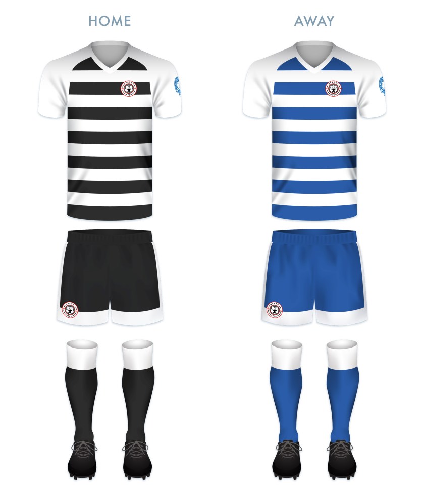
Both kit redesigns employ traditional Gretna colour schemes, with the home kit utilising the original club’s black and white hoops.

G2008FC kit-01

G2008FC badge new-01

26 June 201924 February 2020 E Tagged Anvils, badge, Black and Whites, crest, Dumfries and Galloway, Dumfriesshire, Europe, football, Gretna, Gretna 2008, Gretna FC, Gretna FC 2008, Gretna Football Club, Gretna Football Club 2008, LFL, logo, Lowland Football League, Lowlands, rebrand, redesign, Scotland, Scottish Lowland Football League, SLFL, sport, texture, The Anvils, The Black and Whites, UK, United Kingdom Leave a comment

ReBrand: Gala Fairydean Rovers FC

graphic

GFRFC badge new-01Gala Fairydean Rovers Football Club was established in the Borders town of Galashiels in 1894. Thirteen years later, in 1907, the club split into Gala Fairydean and Gala Rovers, with the Rovers acting as the reserve side for Fairydean. With the outbreak of the First World War, both sides ceased. In 1919, Fairydean alone resumed competition, becoming a founding member of the East of Scotland Football League four years later. It would not be until 1947 that the Gala Rovers name resurfaced, this time, as an amateur side.

Fairydean experienced relative success in the EoSFL, with their most fruitful period taking place in the 1960s. During this time, the club claimed six league championships (1960/61, 1961/62, 1963/64, 1964/65, 1965/66 and 1968/69). Fairydean went on to win the EoSFL championship twice more, in 1988/89 and 1990/91.

Over the coming years, Fairydean applied unsuccessfully to the Scottish Football League on four ocassions. Eventually, in 2013, Fairydean and Rovers merged, forming the modern incarnation of Gala Fairydean Rovers. That same year, the new club was granted membership in the new Lowland League.

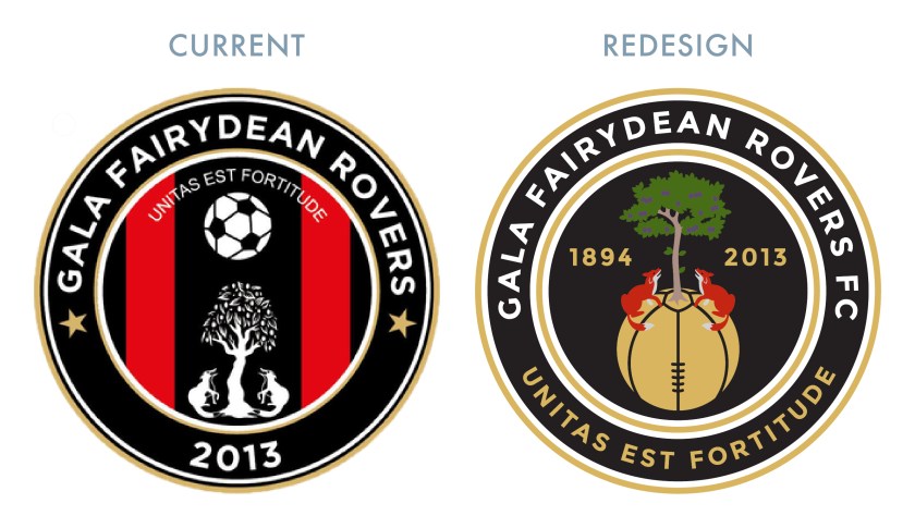
At some point during their time as Gala Fairydean, the club began to use a badge which featured the coat of arms of the Burgh of Galashiels. This coat of arms includes two foxes seated at the base of a plum tree, looking upward and a version of this image can be found in the current badge. The current badge also includes a hovering football, the Latin motto, UNITAS EST FORTITUDE (‘unity is strength’) and two red stripes over a black field, representing, in my best estimate, the traditional home kit of Gala Fairydean.

For my redesign, I decided that I wanted to retain the elements from the coat of arms and the Latin motto (which I find especially apt given Gala Fairydean Rovers’ history), but I was not convinced with the way that they are presented in the current badge. I opted to tie the foxes, the plum tree and the football together, with the former resting atop a redesigned, Victorian-styled football in gold. As I don’t feel as if the current badge’s foxes much resemble foxes, I went with a more ‘maximalist’ colour scheme. I also chose to include both the current club’s date of formation as well as the original Gala Fairydean Rovers’ date of formation. The Latin motto has been moved to the outer circle in gold.

GFRFC badge-01

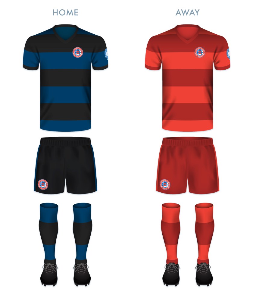
For the kit redesigns, I opted to go with some version of the current kits, bringing back the home kit’s red and black vertical stripes (which are absent from the club’s kit at present).

GFRFC kit-01

GFRFC badge new-01

13 June 201924 February 2020 E Tagged badge, Borders, crest, Europe, Fairydean, football, fox, foxes, Gala, Gala Fairydean, Gala Fairydean FC, Gala Fairydean Football Club, Gala Fairydean Rovers, Gala Fairydean Rovers FC, Gala Fairydean Rovers Football Club, Gala Rovers, Gala Rovers FC, Gala Rovers Football Club, Galashiels, GFR, Latin, LFL, logo, Lowland Football League, Lowlands, rebrand, redesign, Rovers, Scotland, Scottish Borders, Scottish Lowland Football League, SLFL, sport, texture, UK, United Kingdom Leave a comment

ReBrand: Edusport Academy

graphic

EAFC badge new-01Edusport Academy was established as a residential football academy in 2011 with the aim of developing young French players and giving them the opportunity to improve their English language skills. The purpose behind refining these skills was to give the young footballers an edge in entering into the professional game in Britain.

The academy continues to operate as such, but in 2014, applied successfully to become members of the South of Scotland Football League, becoming the first private academy to participate in a senior league recognised by FIFA. The following season, Edusport applied to the Lowland Football League, but was rejected. This did not deter the club for long, as they were crowned champions of the South of Scotland League in 2017, gaining promotion to the Lowland League.

In 2018, club founder Chris Ewing launched ‘Our Football Club‘, an online membership scheme, giving supporters the opportunity to have a more democratic voice in the affairs of the club. With this, Ewing expressed the goal of establishing the senior Edusport team as a separate club in its own right with the ambitious aim of reaching the top tier of Scottish football by 2025.

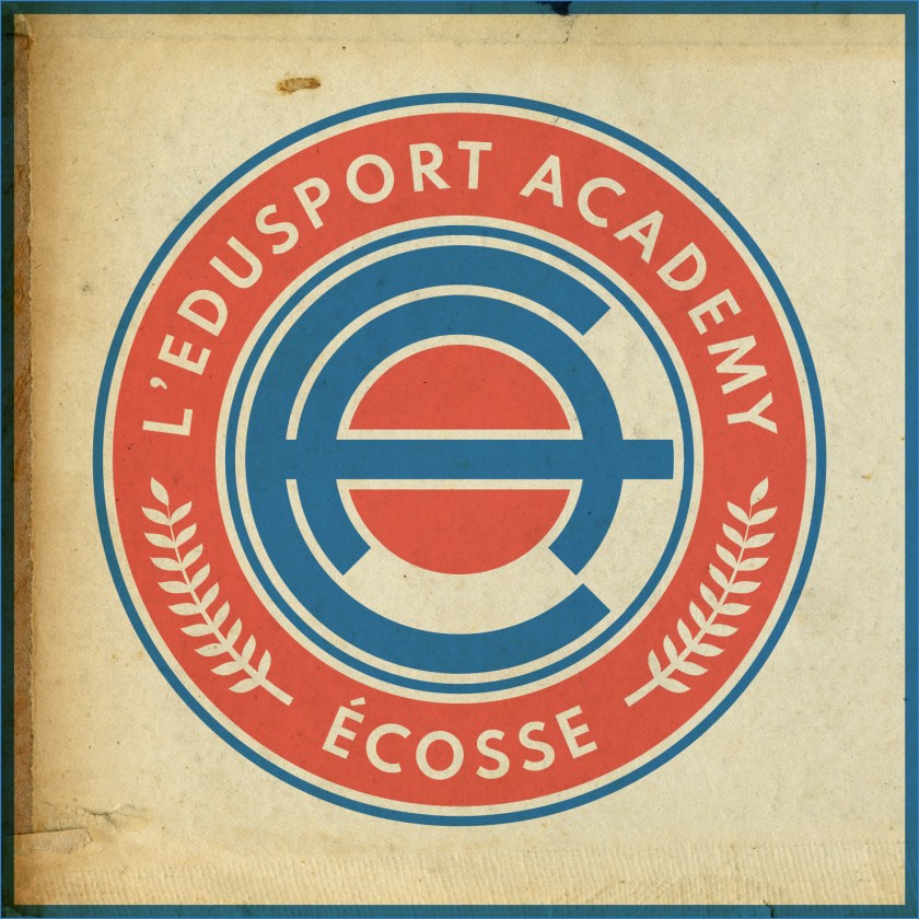
The current badge employs the colours of the French tricolore and features a small Saltire within its central football, representing the link between France and Scotland. While I appreciate the aim of this badge, I find it somewhat difficult to see as more than a relatively weak corporate brand. For a start, the colour scheme of ‘Edusport’ is reminiscent of the uninspiring SportsDirect.com logo. Additionally, the current badge features text within a shield – a ‘no-no’ under ancient Scottish heraldic law. For my redesign, I went for a roundel which features the club’s name with the French definite article le (l’). I have also included the French name for Scotland, Écosse, which is recognised quite readily in Scotland. Also within the outer circlet are found laurel branches, which are found in the current badge. The centre of the redesigned badge features a stylised ‘EA’ monogram and a red circle representing a football.

EAFC badge-01

The kits are based upon previous incarnations of Edusport kits, with thick blue and black hoops on the home kit and red and dark red hoops on the away kit. To me, these seem simple, clean and dramatic.

EAFC kit-01

EAFC badge new-01

13 June 201922 August 2019 E Tagged academy, Annan, badge, crest, Dumfries and Galloway, Dumfriesshire, Edusport, Edusport Academy, Europe, football, France, French, Galabank, LFL, logo, Lowland Football League, Lowlands, monogram, Our Football Club, rebrand, redesign, Scotland, Scottish Lowland Football League, SLFL, sport, texture, UK, United Kingdom Leave a comment

Posts navigation

← Previous
Widgets
Create a website or blog at WordPress.com
Privacy & Cookies: This site uses cookies. By continuing to use this website, you agree to their use.
To find out more, including how to control cookies, see here: Cookie Policy
  • Follow Following
    • ellliottt
    • Join 53 other followers
    • Already have a WordPress.com account? Log in now.
    • ellliottt
    • Customize
    • Follow Following
    • Sign up
    • Log in
    • Report this content
    • View site in Reader
    • Manage subscriptions
    • Collapse this bar
 

Loading Comments...