ellliottt

design & illustration

Menu

Skip to content
  • HOME
  • ABOUT
  • GRAPHIC
    • ALL GRAPHIC DESIGN
    • AUTOMOTIVUS
    • REBRAND: SPFL
      • Premiership
        • Aberdeen
        • Celtic
        • Dundee United
        • Heart of Midlothian
        • Hibernian
        • Kilmarnock
        • Livingston
        • Motherwell
        • Rangers
        • Ross County
        • St Johnstone
        • St Mirren
      • Championship
        • Arbroath
        • Ayr United
        • Cove Rangers
        • Dundee
        • Greenock Morton
        • Hamilton Academical
        • Inverness CT
        • Partick Thistle
        • Queen’s Park
        • Raith Rovers
      • League One
        • Airdrieonians
        • Alloa Athletic
        • Clyde
        • Dunfermline Athletic
        • FC Edinburgh
        • Falkirk
        • Kelty Hearts
        • Montrose
        • Peterhead
        • Queen of the South
      • League Two
        • Albion Rovers
        • Annan Athletic
        • Bonnyrigg Rose
        • Dumbarton
        • East Fife
        • Elgin City
        • Forfar Athletic
        • Stenhousemuir
        • Stirling Albion
        • Stranraer
    • REBRAND: SHFL
      • Brechin City
      • Brora Rangers
      • Buckie Thistle
      • Clachnacuddin
      • Deveronvale
      • Formartine United
      • Forres Mechanics
      • Fraserburgh
      • Huntly
      • Inverurie Loco Works
      • Keith
      • Lossiemouth
      • Nairn County
      • Rothes
      • Strathspey Thistle
      • Turriff United
      • Wick Academy
    • REBRAND: SLFL
      • Berwick Rangers
      • Bo’ness United
      • Broomhill
      • Caledonian Braves
      • Civil Service Strollers
      • Cowdenbeath
      • Cumbernauld Colts
      • Dalbeattie Star
      • East Kilbride
      • East Stirlingshire
      • Edinburgh University
      • Gala Fairydean Rovers
      • Gretna 2008
      • Spartans
      • Tranent Juniors
      • University of Stirling
  • 2D
  • 3D
    • ALL 3D
    • INSTALLATION
  • PHOTO
  • SHOP

HFL

ReBrand: Banks O’ Dee FC

graphic

BDFC badge new

Banks O’ Dee Football Club was established in 1902. The club was originally called the Rechabites, the origins of which are quite peculiar. In the late nineteenth and early twentieth century, the temperance movement was at its height in the United Kingdom. The Independent Order of Rechabites is a fraternal organisation that was established in England in 1835. It was established based on a commitment to total abstinence from alcoholic beverages. (The name was related to the biblical people called the Rechabites, who were committed to abstaining from wine and living a nomadic life.) It was in this vein of thinking that the club set up shop beside the River Dee in Aberdeen. As the story goes, a club committee member discovered that some of the players were enjoying a bevvy in a local hostelry and the Rechabites name was abandoned in 1920 in favour of the current Banks O’ Dee.

For most of its existence, the Dee has competed in regional junior leagues. They have amassed a large number of junior league honours, including winning the Aberdeen District Junior League seven times, the subsequent North East Premier Division eleven times, and the current SJFA North Superleague five times. These figures set Banks O’ Dee apart from other regional junior clubs, though success on a broader stage has evaded the club. Perhaps Banks O’ Dee’s greatest success came in their first-ever participation in the 2008/09 Scottish Cup tournament. Their first-round 10–0 victory against then-Highland League outfit Fort William is of particular note. The following season, the Dee applied to join the Highland League, but were unsuccessful. Despite this, the club became full members of the Scottish Football Association in 2014.

After the ascendence of Cove Rangers from the Highland League to the SPFL in 2019, Banks O’ Dee was invited to submit an application to take Cove’s place in the Highland League. The Dee declined the offer, remaining in the SJFA North Superleague. Their continued participation in the North Superleague wouldn’t last long as the Dee won the league by an overwhelming margin (with 24 wins, two draws and no losses and amassing a +117 goal difference) in the 2021/22 season. This set them up for a two-leg play-off against Fort William for a place in the Highland League. Due to player eligibility rules, Fort William were forced to withdraw, cementing Banks O’ Dee’s admittance into the Highland League, where they compete presently.

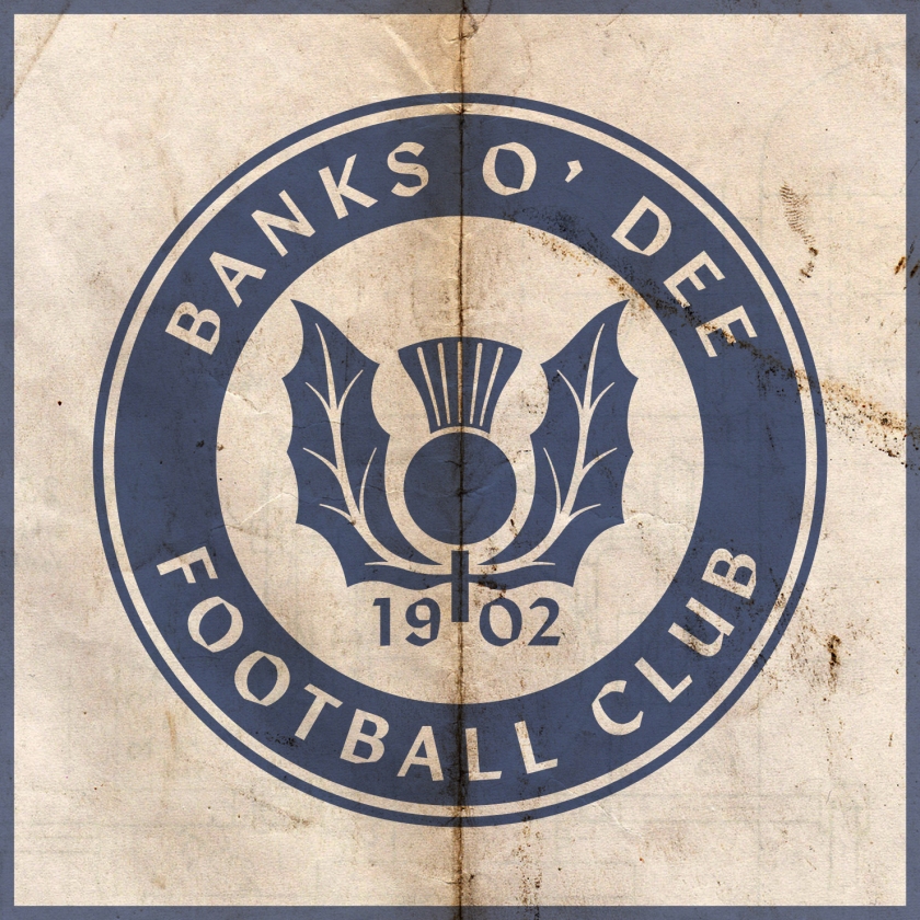
I find the current Banks O’ Dee badge endearing in its home-grown minimalism. My redesign is a ‘light’ reboot of the current badge, having clearned up the thistle design and incorporated a more bounded roundel.
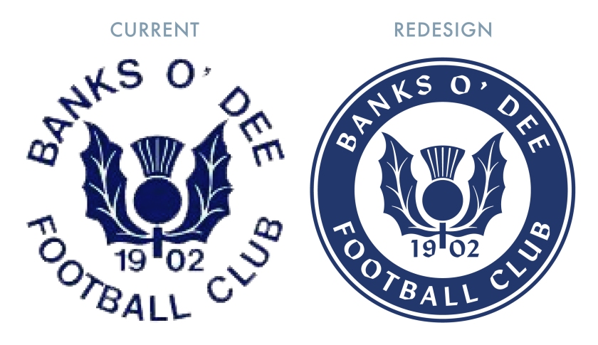
BDFC badge

The kit redesigns are based on the current colours used by the club.
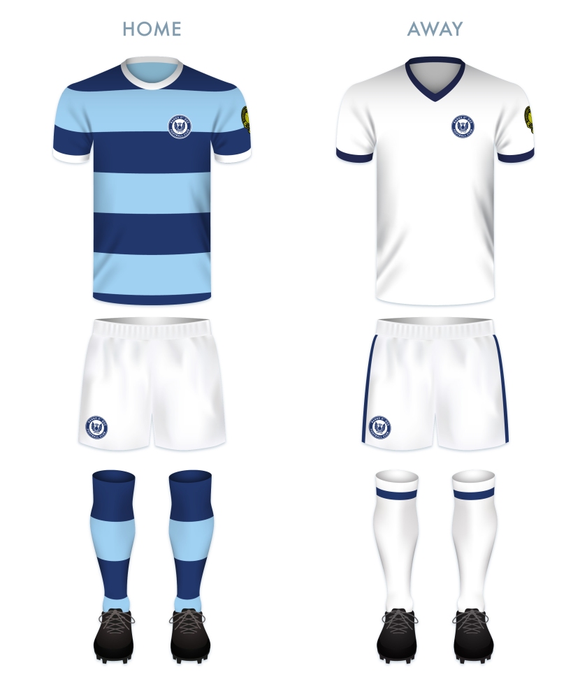
BDFC kit

BDFC badge new

Advertisement
4 August 2022 E Tagged Aberdeen, badge, Banks O' Dee, Banks O' Dee FC, Banks O' Dee Football Club, crest, Dee, Europe, football, HFL, Highland Football League, Highlands, logo, rebrand, Rechabites, redesign, Scotland, Scottish Highland Football League, SHFL, sport, texture, UK, United Kingdom Leave a comment

ReBrand: Wick Academy FC

graphic

WAFC badge new-01Wick Academy Football Club was established in 1893. The club’s name comes from the former Pulteneytown Academy (which closed in 2016) in Wick. The club’s link to the actual academy was tenuous and was only maintained when John Davidson, a teacher at Pultneytown Academy, was elected the first club captain (Davidson was listed as ‘leader’ in the minute of this first meeting).
It appears that Wick Academy, or the Scorries, as they are known, did not play competitive football until the formation of the Wick League in 1896. In 1911, the Scorries became members of the Scottish Football Association and continued to play in various regional leagues, most notably, the North Caledonian Football League, where they were crowned champions on five occasions between 1979 and 1987.

In 1994, the Scorries were admitted into the Highland Football League. For their first fourteen seasons in the Highland League, the club was never able to break into the top half of the table. Something of a breakthrough happened in the 2008/09 season, when the Scorries achieved ten successive league wins, finishing the season in the fifth position. Over the next few seasons, the Scorries slipped back down the table, but in the 2011/12 season, better fortunes would return. The Scorries climbed back into the top ten, finishing eighth and qualified for the 2012/13 Scottish Challenge Cup. Unfortunately, they would go on to exit in the first round after a respectable 2-4 home defeat to league-side Raith Rovers. This early exit did not prevent the club from achieving their highest-ever league finish, ending the season third in the table, only two points behind Formartine United and four points behind Highland League champions, Cove Rangers.

The current Wick Academy badge is simple and strong. The ship is derived from the Wick coat of arms and the open book is representative of the academy (I assume the whole design is derived from the crest of Pulteneytown Academy, but I cannot claim this with certainty). For my redesign, I incorporated the existing elements of the badge, but retooled them for a bolder look.

WAFC badge-01

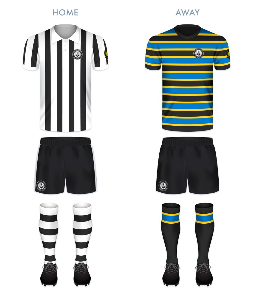
The home kit features Wick Academy’s traditional vertical black and white stripes. The colours of the hoops of the away kit are derived from the flag of Wick’s historic county of Caithness, which was adopted in 2016.

WAFC kit-01

WAFC badge new-01

10 February 201924 February 2020 E Tagged A' Ghàidhealtachd, badge, Caithness, cow, crest, Europe, football, HFL, Highland Football League, logo, rebrand, redesign, Scorries, Scotland, Scottish Highland Football League, SHFL, sport, texture, The Scorries, UK, United, United Kingdom, Wick, Wick Academy, Wick Academy FC, Wick Academy Football Club Leave a comment

ReBrand: Turriff United FC

graphic

TUFC badge new-01Turriff United Football Club was established as a junior side in 1954. Along with Formartine United and Strathspey Thistle, Turra were admitted to the Highland Football League in 2009.
Turra’s senior honours consist of three Aberdeenshire Shields (2010/11, 2012/13 and 2014/15) and at the end of the 2014/15 Highland League season, the club finished second top. Turra also made it to the fourth round of the Scottish Cup in 2012/13, losing to league-side Greenock Morton in an away replay at Cappielow Park in December 2012. In 2016, Turra took part in the Scottish Challenge Cup. During their campaign, the club overcame the St Johnstone U20s as well as league-side Montrose, before losing at home to Hibernian in the third round.

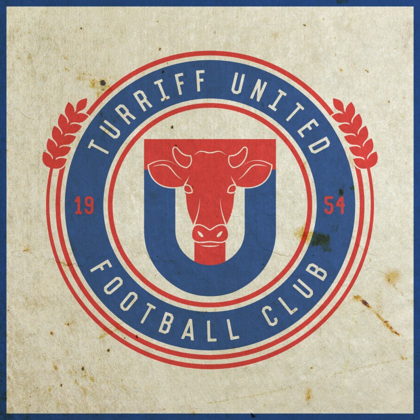
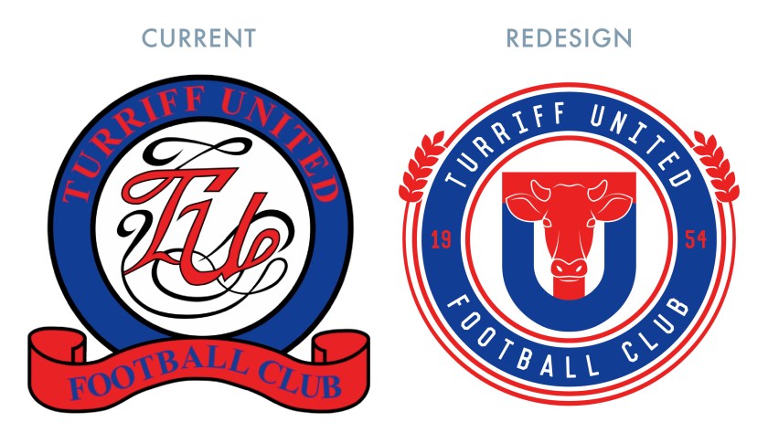
For the badge redesign, I used a minimalistic ‘TU’ monogram, featuring a cow’s head in the ‘T’. This, alongside the wheat which forms the outer circlet, are featured in the town’s coat of arms. The cow’s head also represents the legendary ‘Turra Coo’.

The story of the Turra Coo dates back to the 1910s, when the Liberal government unveiled the National Insurance Act 1911, compelling employers make national insurance contributions. In Turriff, local farmers felt that they were at a disadvantage and protests were held. A farmer called Robert Paterson refused to make these contributions and was fined £15 and arrears. Paterson paid the £15, but continued to refuse to pay the national insurance arrears. Local sheriff George Keith was ordered to seize property amounting to £7 from Paterson’s farm. Keith selected a white Ayrshire-Shorthorn cross dairy cow. This cow was to be auctioned off in order to raise the funds to pay off Paterson’s arrears, but on the intended day of the auction, a large protest erupted with locals decorating the cow with ribbons and painting the words ‘Lendrum to Leeks’ (Lendrum being the location of Paterson’s farm and leeks being a reference to Chancellor David Lloyd George’s Welsh origin) on the cow’s side. Due to the unrest, the sale of the cow did not proceed at that time.

Subsequently, Paterson and seven others were taken to Aberdeen to be put on trial for disorderly conduct, though all were acquitted. The Turra Coo was later sold in Aberdeen, but the community of Turriff rallied together to buy back the coo and return it to Paterson. The return of the cow in 1914 proved to be a major public event in Turriff, with some 3000 people gathering to celebrate. Since that time, the Turra Coo has become a local icon, with a roadside monument dedicated at Lendrum in 1971 and a sculpture in the town centre, unveiled in 2010. In 2014, Turriff United introduced a mascot based on the Turra Coo.

TUFC badge-01

TUFC kit-01

TUFC badge new-01

10 February 201924 February 2020 E Tagged Aberdeenshire, badge, cow, crest, Europe, football, HFL, Highland Football League, logo, rebrand, redesign, Scotland, Scottish Highland Football League, SHFL, sport, texture, Turra, Turra Coo, Turriff, Turriff United, Turriff United FC, Turriff United Football Club, UK, United, United Kingdom Leave a comment

ReBrand: Strathspey Thistle FC

graphic

STFC badge new-01Strathspey Thistle Football Club was established as a junior side in 1993. The name was chosen so as to reflect the club’s belonging to the Strathspey community and not only to Grantown-on-Spey, where the club is based. During their sixteen-year spell as a junior side, the Strathy Jags won several honours, though never topped the table.
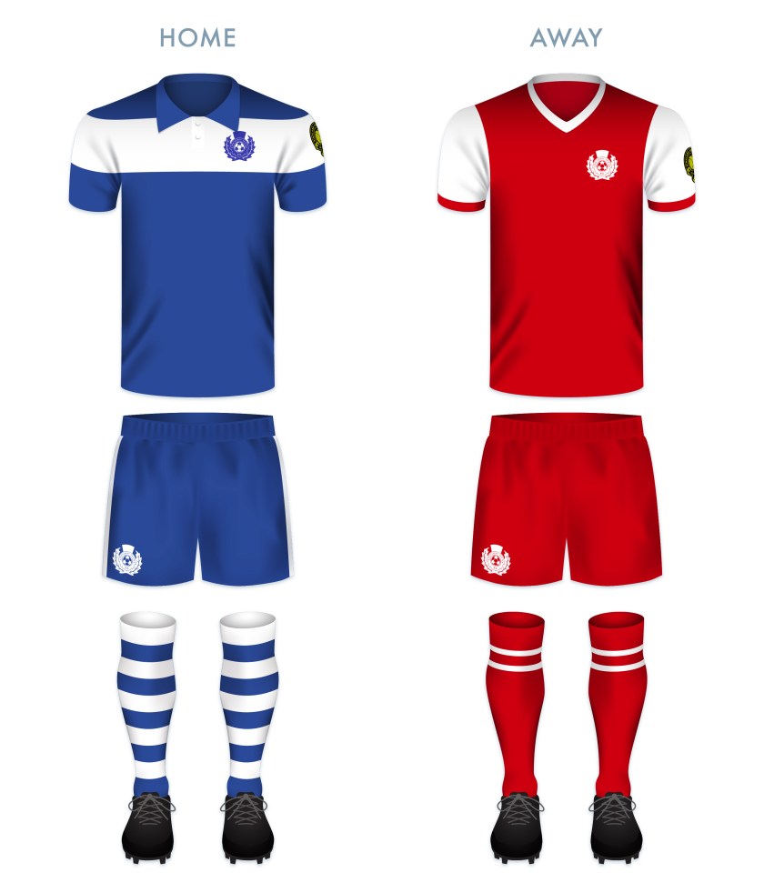
In 2009, the club became a senior side and gained admittance into the Highland Football League. Since that time, the Strathy Jags have been unable to break out of the bottom three in the league table, but being among the most recent club to join the league (alongside Formartine United and Turriff United), it is still ‘early days’.

The current badge is simple and requires no explanation. For my redesign, I incorporated elements of the current badge, bringing the club’s name into the heart of a stylised thistle image.

STFC badge-01

The home shirt below is based on an early Thistle home shirt by Umbro.

STFC kit-01

STFC badge new-01

9 February 201924 February 2020 E Tagged A' Ghàidhealtachd, badge, crest, Europe, football, Grantown, Grantown-on-Spey, HFL, Highland Football League, logo, Moray, Morayshire, rebrand, redesign, Scotland, Scottish Highland Football League, SHFL, Speyside, sport, Strathspey, Strathspey Thistle, Strathspey Thistle FC, Strathspey Thistle Football Club, Strathy, Strathy Jags, texture, The Strathy Jags, UK, United Kingdom Leave a comment

ReBrand: Rothes FC

graphic

RFC badge new-01Rothes Football Club was established in 1938 and joined the Highland Football League that same year. At the time, Rothes was home to five whisky distilleries, four of which remain in operation today. Local laird and whisky magnate, Douglas Mackessack, was an instrumental benefactor in these early years and the club’s home ground, Mackessack Park, is named in his honour.

The club boasts relatively few honours, with the 1958/59 proving to be their most successful to date. It was during this season that the Speysiders won both the Highland League as well as their first of two North of Scotland Cups. Despite their relative lack of success over the years, Rothes have endeared themselves to the ‘Highland League family’. When facing potential liquidation in the summer of 2015 due to an unpaid tax bill, the club chairman was approached by a number of other Highland League clubs who expressed their desire to help with Rothes’ financial difficulties. Ultimately, Rothes survived their financial scare thanks to help from local fans, including a significant contribution from local businessman Richard Forsyth.

In the autumn of 2015, following the resignation of much of the club’s board of directors, the Speysiders were able to make headlines in a more affirming manner, by fielding the league’s oldest-ever players, Derek Thomson, 51, and Gordon Younie, 55, during their league match against Wick Academy.

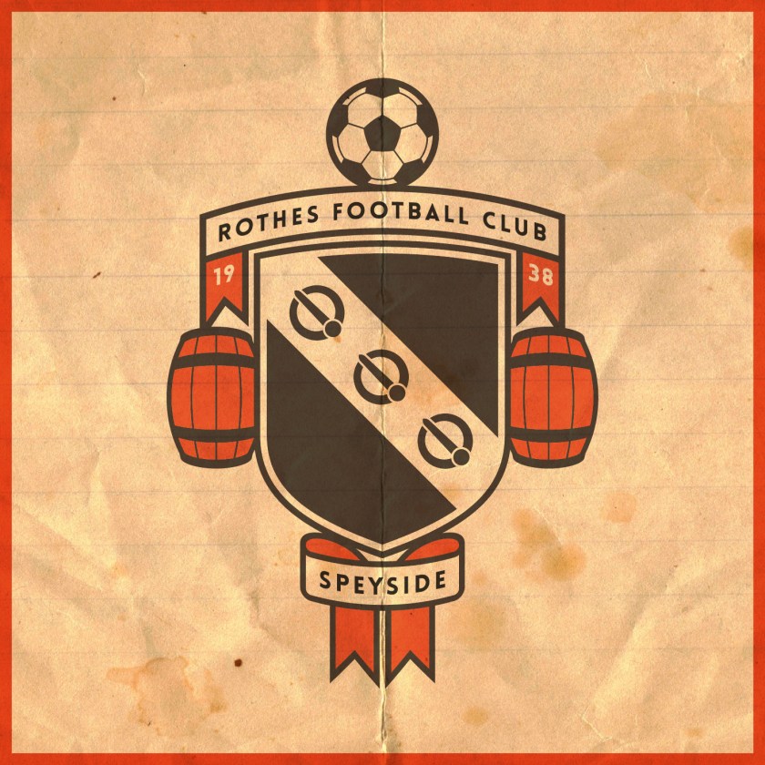
In redesigning the Rothes FC badge, I began by considering the local history. The current badge features a whisky barrel, reflecting the town’s relationship with the whisky industry. The club’s name and year of foundation being included within the shield are a violation of ancient Scottish heraldic law. For my redesign, I depicted the coat of arms of Rothes, which, traditionally, is represented by a blue field with a silver bend and three red buckles. I adopted the tangerine, black and white colour scheme in my depiction and included two barrels as supports.

RFC badge-01

The club adopted their tangerine shirts from Dundee United after the Terrors sold their old Tannadice Park floodlights to their Highland League brethren. For my kit redesigns, I decided to stick with the club’s current colour schemes, presented in a relatively minimalist fashion as a contrast to the relatively elaborate badge redesign.

RFC kit-01

RFC badge new-01

8 February 201924 February 2020 E Tagged badge, crest, Europe, football, HFL, Highland Football League, logo, Moray, Morayshire, rebrand, redesign, Rothes, Rothes FC, Rothes Football Club, Scotland, Scottish Highland Football League, SHFL, Speyside, Speysiders, sport, texture, The Speysiders, UK, United Kingdom Leave a comment

ReBrand: Nairn County FC

graphic

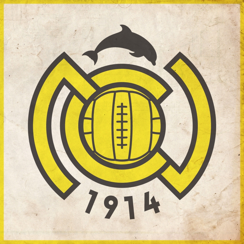
NCFC badge new-01Nairn County Football Club was established in 1914 and gained admittance into the Highland Football League that same year. Due to the disruption caused by the First World War, the cllub would not play its first Highland League match until 1919.
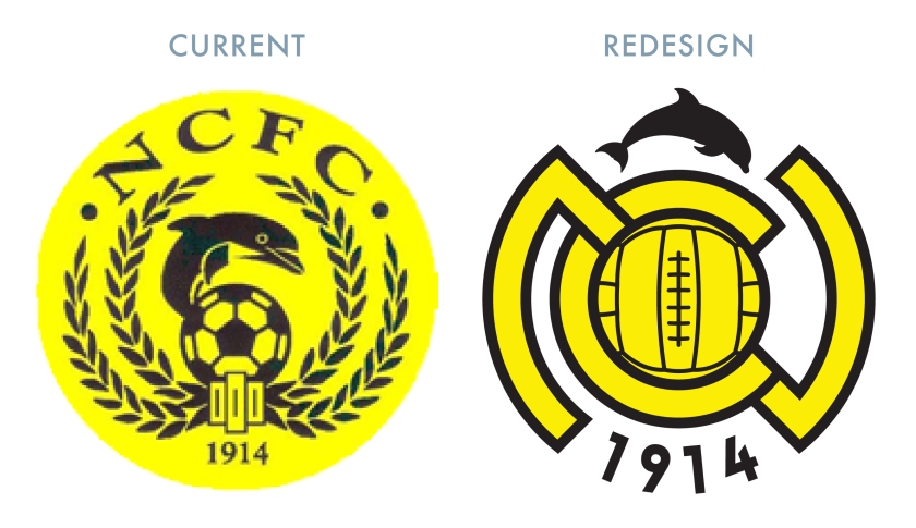
Nairn County’s first significant honour came in the 1956/57 season, when the club won the first of their seven North of Scotland Cups. Their second North of Scotland Cup came in the 1962/63 season. The following year, Nairn County repeated this feat, with the addition of their first of two Highland League Cups. The club’s greatest honour came in the 1975/76 season, when they were crowned Highland League Champions after a hard-fought victory in extra time in a play-off against Fraserburgh.

More recently, Nairn County advanced to the third round of the 2012/13 Scottish Cup, having bested Preston Athletic and league side Clyde, before bringing Forfar Athletic to a replay, which the Wee County lost 2-3 at their home ground of Station Park. But the club wouldn’t end the season empty handed, winning the North of Scotland Cup after defeating Wick Academy 1-2 in extra time.

In designing a new badge for the club, I wanted to go for something bolder, opting for an ‘NC’ monogram topped by a silhouette of a more anatomically-correct dolphin than the one in current use.

NCFC badge-01

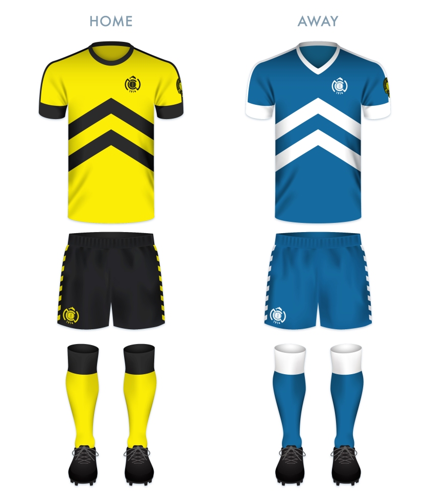
The kit redesigns are based on the current colours used by the club, with their classic ‘maize yellow’ and black v in the home shirt and their blue and white scheme for the away kit. The upward-pointing chevron on the shirts echoes the Nairnshire coat of arms.

NCFC kit-01

NCFC badge new-01

7 February 201924 February 2020 E Tagged A' Ghàidhealtachd, badge, crest, dolphin, Europe, football, HFL, Highland Football League, Highlands, logo, monogram, Nairn, Nairn County, Nairn County FC, Nairn County Football Club, Nairnshire, rebrand, redesign, Scotland, Scottish Highland Football League, SHFL, sport, texture, The Wee County, UK, United Kingdom, Wee County 1 Comment

ReBrand: Lossiemouth FC

graphic

lfc badge new-01Lossiemouth Football Club was established in 1945 and joined the Highland Football League the following year, where it has played ever since.

Despite competing in the Highland League for nearly three-quarters of a century, Lossiemouth has never won the league, one of only seven HFL clubs to have never achieved the honour (with the remaining six having joined the league much later: Fort William, who joined in 1985, Wick Academy, who joined in 1994, Inverurie Loco Works, who joined in 2001 and Formartine United, Strathspey Thistle and Turriff United, who joined in 2009).

The Coasters have a longstanding rivalry with their neighbours to the south, Elgin City, with City dominating most of their meetings until the early 1990s. The club’s first honour came in 1962, when they won the Highland League Cup. They would not add to their silverware until winning the 1994/95 North of Scotland Cup. They would repeat this victory the following two season and again in 2001 and 2003. The 1996/97 season proved to be Lossiemouth’s most successful, winning both the North of Scotland Cup as well as their second Highland League Cup and finishing the season fourth in the league table, being edged out of the third spot by Peterhead on goal difference alone.

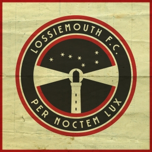
The current Lossiemouth badge features a lighthouse superimposed over a stylised football in red and white, the club’s colours. The lighthouse is a representation of Covesea Skerries Lighthouse, completed in 1846 and located very near the town of Lossiemouth. For my redesign, I wanted to keep the lighthouse image, but decided to depict a version of the lighthouse more true to its actual appearance. As lighthouses function primarily at night and in poor visibility, I depicted a night’s sky in black and a representation of Ursa Major, suggesting the northerly position of Lossiemouth (which sits at the northern tip of Morayshire). I also included the Latin motto PER NOCTEM LUX (which can be translated into English as something like ‘the light through the night’), found on a Lossiemouth and Branderburgh burgh seal from the late nineteenth century. The motto is a play on the town’s patron saint, St Gerardine (or St Gervadius), who, according to legend, would set up flaming torches alone the shore in order to ward ships away from wreckage on the rocks. As Lossiemouth continue to plug away in the Highland Football League, perhaps the prospect of future success can be their ‘light through the night’.

LFC badge-01

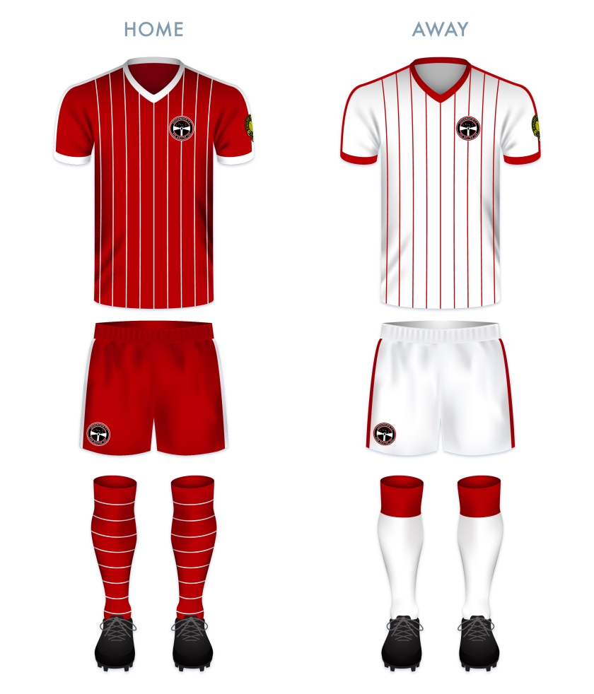
I designed the home kit as a clear homage to another LFC, drawing inspiration from 1982 Liverpool home kit in particular. This colour scheme is reversed in the away kit.

LFC kit-01

lfc badge new-01

29 January 201924 February 2020 E Tagged badge, Coasters, Covesea Lighthouse, crest, Europe, football, HFL, Highland Football League, Highlands, Latin, lighthouse, logo, Lossie, Lossiemouth, Lossiemouth FC, Lossiemouth Football Club, Moray, Morayshire, rebrand, redesign, Scotland, Scottish Highland Football League, SHFL, sport, texture, The Coasters, UK, United Kingdom Leave a comment

ReBrand: Keith FC

graphic

KFC badge new-01Keith Football Club was established in 1910 in the small Banffshire town from which it gets its name. The club competed on a junior level until it was admitted into the Highland Football League in 1924.

Throughout their history, Keith have experienced sporadic regional success. They have won the Highland Football League on seven occasions, including three consecutive seasons, between 1979 and 1981. The club boast ten Highland League Cups, including another span of three consecutive victories between 1974 and 1976. Keith have also been Aberdeenshire Cup holders on eight occasions and have won the Scottish Qualifying Cup (North) four times. But the club’s experience of the Scottish Cup might leave a bad taste in some supporters’ mouths, with a notable 1-10 defeat to Rangers in the 1995/96 Scottish Cup, which drew national attention for all the wrong reasons.

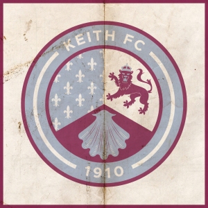
The current Keith badge is what I would describe as, ‘nothing to look at’. Not only does it violate ancient Scottish heraldic laws, but it also features the club’s initials, which is unfortunate due to their sharing of these initials with a more famous institution. For my redesign, I have decided to incorporate the symbols found in the Keith coat of arms. The first, in the upper-left position, symbolises the ancient Kirkton of Keith and the historical tenure of the Lordship of Regality, the land upon which the town of Keith is located. This Regality—granted by King William I, or ‘William the Lion’, who reigned from 1165 to 1214—was held by the Cistercian Abbey of Kinloss. As a result, this part of Keith’s history is represented by the Cistercian Order’s blue field with fleur-de-lys.

The upper-right position features a crowned lion from the Ogilvy coat of arms. This represents James Ogilvy, 5th Earl of Findlater and 2nd Earl of Seafield, and Fife, who united and enlarged the communities of Old and New Keith to form the settlement of Keith in 1750. The bottom position features a shell which represents the Duff coat of arms, also relating to James Ogilvy. These symbols have all been adapted to the colour scheme of Keith FC and are enclosed within a circle, indicating the club’s name and year of foundation.

KFC badge-01

As the club has used their signature maroon home strip for many years—this giving the club its nickname, ‘the Maroons’—I decided to use maroon as the primary colour of the home strip, highlighted with light blue vertical stripes and accents. The away strip is again dominated by maroon and has white accents.

KFC kit-01

KFC badge new-01

28 January 201924 February 2020 E Tagged badge, Banffshire, crest, Europe, fleur-de-lis, fleur-de-lys, football, HFL, Highland Football League, Highlands, Keith, Keith FC, Keith Football Club, lion, logo, Maroons, Moray, Morayshire, rebrand, redesign, Scotland, Scottish Highland Football League, shell, SHFL, sport, texture, The Maroons, UK, United Kingdom 1 Comment

ReBrand: Inverurie Loco Works FC

graphic

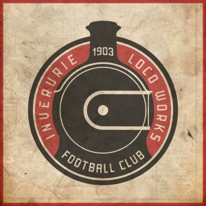
ILWFC badge new-01Inverurie Loco Works Football Club was established as a junior side by the workers of said locomotive workshops in 1903. Originally, these workshops were operated by the Great North of Scotland Railway (1854-1922) before becoming part of the London and North Eastern Railway (1923-1947).
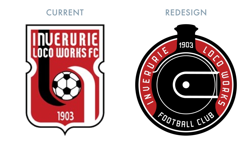
In 1948, the railway was nationalised with the forming of British Rail Engineering Limited and in 1969, the workshops closed in Inverurie. With the workshops closed, the club continued to compete at the junior level. In 2001, the Locos were admitted into the Highland Football League and became a senior side.

Since joining the Highland League, the Locos have won the Highland League Cup on two occasions (2007/08 and 2008/09). They also boast three Aberdeenshire Shields and two Scottish Qualifying Cups (North), but the Highland League title has eluded them.

The current badge is very strong, incorporating the club’s classic colour scheme, though giving far less of a hint of the club’s history and unusual name than a previous incarnation, which featured a generic steam engine in a round badge. For my redesign, I sought to avoid a breach of Scottish heraldic law by avoiding a shield. I also sought to incorporate something more symbolic of the historic Inverurie Locomotive Workshops. I decided upon the use of the distinctive Class F Gordon Highlander engine, which was restored at Inverurie (only ten locomotives would ever be built at Inverurie – the rest of the work done consisted of restorations and enhancements).

ILWFC badge-01

ILWFC kit-01

ILWFC badge new-01

28 January 201924 February 2020 E Tagged 62277 Gordon Highlander, Aberdeenshire, badge, BR 62277, BR 62277 Gordon Highlander, Class F, Class F Gordon Highlander, crest, Europe, football, GNSR, GNSR 49, GNSR 49 Gordon Highlander, Gordon, Gordon Highlander, Great North of Scotland Railway, HFL, Highland Football League, Highlands, Inverurie, Inverurie Loco Works, Inverurie Loco Works FC, Inverurie Loco Works Football Club, Inverurie Locomotive Works, LNER 6849, LNER 6849 Gordon Highlander, Locies, locomotive, Locos, logo, rebrand, redesign, Scotland, Scottish Highland Football League, SHFL, sport, texture, The Locies, The Locos, train, trains, UK, United Kingdom Leave a comment

ReBrand: Huntly FC

graphic

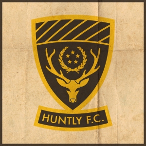
hfc badge new-01Huntly Football Club was established in 1928. and was admitted to the Highland Football League that same year. By their second season, they had won the league title. But this early success was not indicative of the club’s future form. Over the next six decades, Huntly would win two Highland League Cups and two Aberdeenshire Cups, but another league title evaded them.
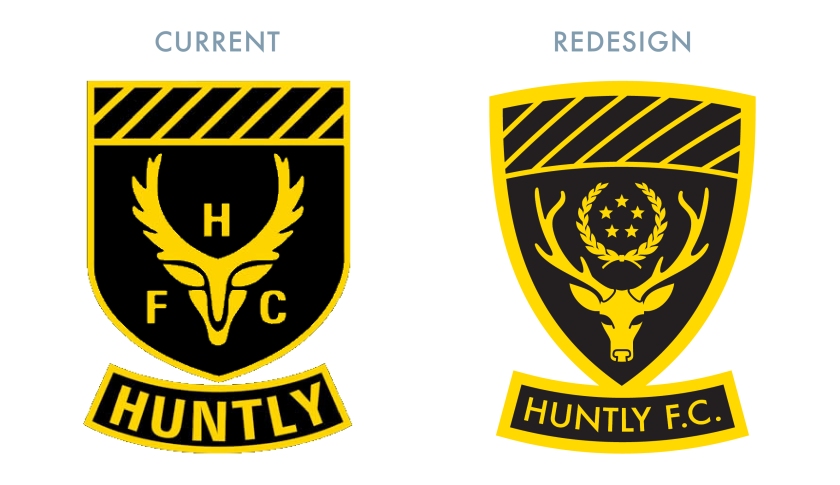
The 1990s proved to be the club’s most successful decade to date. In 1992, they won the Aberdeenshire Cup and in 1993, they won both the Highland League Cup and the Scottish Qualifying Cup (North). The following season, Huntly secured the Highland League title for the first time in 64 years. This triumph was accompanied by their second consecutive Highland League Cup and another Aberdeenshire Cup – a Highland treble. The club would go on to win a record five consecutive Highland League titles (1993/94, 1994/95, 1995/96, 1996/97, 1997/98), during which time they also won an additional Highland League Cup (1995/96), three consecutive Aberdeenshire Cups (1993/94, 1994/95, 1995/96) and two Scottish Qualifying Cups (North) (1994/95, 1996/97). The club would add to their silverware tally in the 1999/2000 season, winning one more Aberdeenshire Cup and one more Scottish Qualifying Cup (North). Huntly’s most recent Highland League title came in 2005.

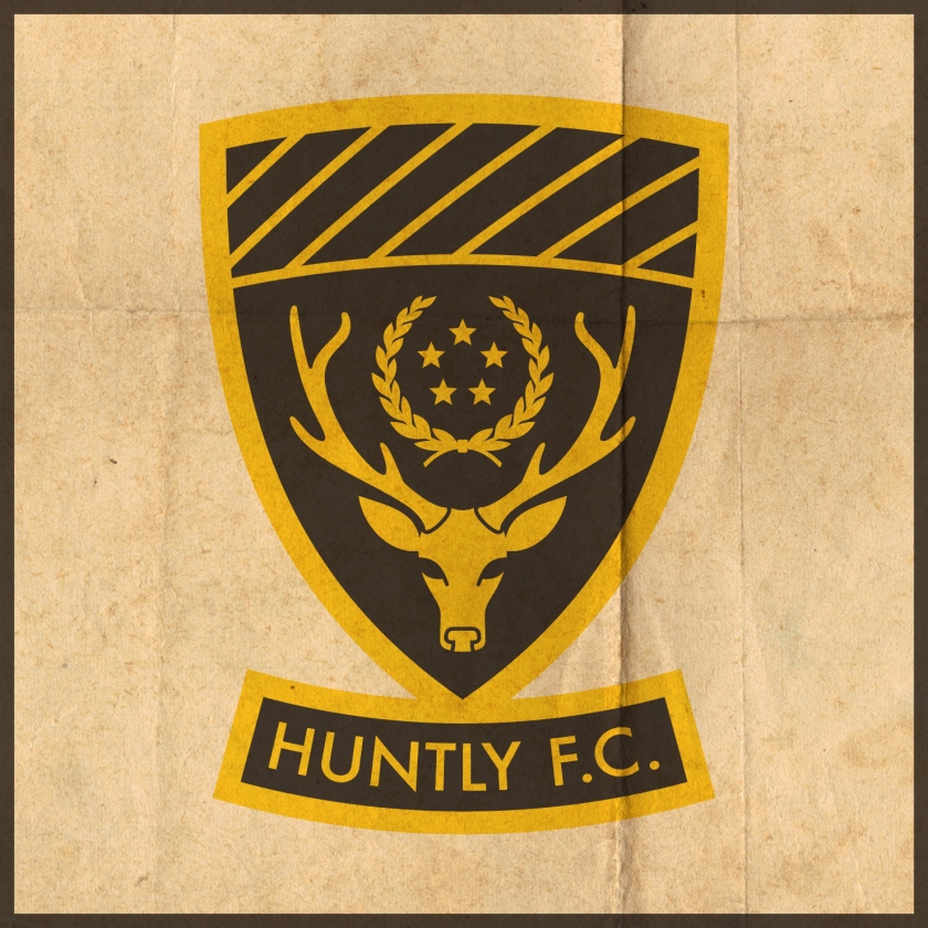
The current Huntly badge (and the overall Huntly colour scheme) is derived from the black and gold heraldic blazon of the Stewart Earls of Atholl (who were the Lords of Strathbogie, the former name of Huntly, in the Middle Ages). The stylised stag’s head comes from the arms of the Earl (and later, Marquess) of Huntly. For my redesign, I sought to keep the main features of the current badge, but to bring it into compliance with the heraldic laws of Scotland by removing the club’s initials from the shield itself. Although the stylised stag’s head is a striking design feature, my mind interprets the ears as the stag’s eyes. I decided to make a more anatomically accurate stag’s head for my redesign. The laurel wreath and five stars represent Huntly’s dominant form in the 1990s and standing record of five consecutive Highland League championships.

HFC badge-01

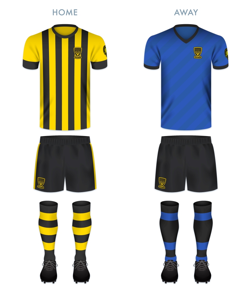
HFC kit-01

hfc badge new-01

28 January 201928 February 2020 E Tagged Aberdeenshire, badge, Black and Golds, crest, Europe, football, HFL, Highland Football League, Highlands, Huntly, Huntly FC, Huntly Football Club, logo, rebrand, redesign, Scotland, Scottish Highland Football League, SHFL, sport, texture, The Black and Golds, UK, United Kingdom Leave a comment

Posts navigation

← Previous
Widgets
Create a website or blog at WordPress.com
Privacy & Cookies: This site uses cookies. By continuing to use this website, you agree to their use.
To find out more, including how to control cookies, see here: Cookie Policy
  • Follow Following
    • ellliottt
    • Join 53 other followers
    • Already have a WordPress.com account? Log in now.
    • ellliottt
    • Customize
    • Follow Following
    • Sign up
    • Log in
    • Report this content
    • View site in Reader
    • Manage subscriptions
    • Collapse this bar
 

Loading Comments...