
![]() Caledonian Thistle Football Club was the result of a 1994 union between two historic Invernessian football clubs – Inverness Thistle and Caledonian, both established in 1885. In 1996, Inverness District Council requested that ‘Inverness’ be added to the club’s name. Instead of going the easy route with Inverness United FC or something of that ilk, we have the monstrosity that is ICTFC. More on that later.
Caledonian Thistle Football Club was the result of a 1994 union between two historic Invernessian football clubs – Inverness Thistle and Caledonian, both established in 1885. In 1996, Inverness District Council requested that ‘Inverness’ be added to the club’s name. Instead of going the easy route with Inverness United FC or something of that ilk, we have the monstrosity that is ICTFC. More on that later.
Caley began life in the lowest tier of the Scottish Football League alongside Highland rivals Ross County. Over the coming years, the club would work its way up the SFL ranks, gaining prominence through their notable Scottish Cup victories over Celtic in the third round of the 1999/2000 competition as well as in the quarter-finals of the 2002/03 competition. In the 2003/04 season, Caley finished at the top of the second tier table, gaining promotion to what was then called the Scottish Premier League. The club was relegated back to the second tier after five seasons, before returning to the top for the 2010/11 season.
The 2014/15 season proved to be Caley’s finest, finishing in the third spot of the Premiership table and defeating St Mirren, Partick Thistle, Raith Rovers, Celtic and, finally, Falkirk on their road to lifting the Scottish Cup. But the good times did not last forever. At the end of the 2016/17 season, the Highland Jags found themselves relegated to the Scottish Championship, where they continue to compete today.
Inverness Caledonian Thistle Football Club. ICTFC. If the name is a mouthful, the current badge is an eyeful. In this badge, we find a thistle (the symbol of Inverness Thistle), a golden eagle (the symbol of Caledonian) and a football. It’s not so much the presence of these symbols that make this badge challenging, but that there are at least two very distinctive illustrative styles employed in their depictions. Further insult is added to injury with a very poorly designed banner bearing the club’s name.
Over the years, I have attempted several redesigns of Caley’s badge. Among all Scottish football badges, I found this to be one of the most difficult. In each attempt, I sought to employ all of the information included in the current badge and each attempt yielded a slight improvement. Still, I found my redesigns difficult to stomach.
Eventually, I realised that in my desire to capture so much in a badge, I failed in Mies’ insistence that ‘less is more’. Therefore, I have attempted yet another redesign of this behemoth of a badge. In this redesign, minimalism has been my aim. No words. No dates. Only simple lines depicting the head of a golden eagle and a thistle.
![]()
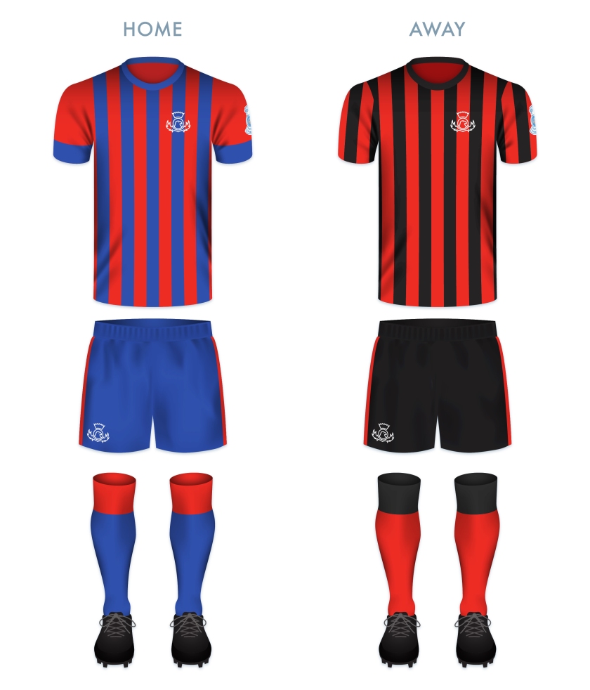
For the home shirt, I decided to go with Caley’s blue and red stripes, which have featured on most of the club’s kits since the union in 1994. The away shirt is inspired by the former Inverness Thistle’s home strips, with the black and red vertical stripes in near constant use in from 1894 until the union.
![]()
As ever, I am indebted to Dave at Historical Football Kits for some of the historical information used above.

9.5/10, Love this design, it’s a shame the eagle can’t be more visible but I think the brown wing style is the best way to cover this. Nice and simple, although I wouldn’t include the roman numerals. Top Class badge.