ellliottt

design & illustration

Menu

Skip to content
  • HOME
  • ABOUT
  • GRAPHIC
    • ALL GRAPHIC DESIGN
    • AUTOMOTIVUS
    • REBRAND: SPFL
      • Premiership
        • Aberdeen
        • Celtic
        • Dundee United
        • Heart of Midlothian
        • Hibernian
        • Kilmarnock
        • Livingston
        • Motherwell
        • Rangers
        • Ross County
        • St Johnstone
        • St Mirren
      • Championship
        • Arbroath
        • Ayr United
        • Cove Rangers
        • Dundee
        • Greenock Morton
        • Hamilton Academical
        • Inverness CT
        • Partick Thistle
        • Queen’s Park
        • Raith Rovers
      • League One
        • Airdrieonians
        • Alloa Athletic
        • Clyde
        • Dunfermline Athletic
        • FC Edinburgh
        • Falkirk
        • Kelty Hearts
        • Montrose
        • Peterhead
        • Queen of the South
      • League Two
        • Albion Rovers
        • Annan Athletic
        • Bonnyrigg Rose
        • Dumbarton
        • East Fife
        • Elgin City
        • Forfar Athletic
        • Stenhousemuir
        • Stirling Albion
        • Stranraer
    • REBRAND: SHFL
      • Brechin City
      • Brora Rangers
      • Buckie Thistle
      • Clachnacuddin
      • Deveronvale
      • Formartine United
      • Forres Mechanics
      • Fraserburgh
      • Huntly
      • Inverurie Loco Works
      • Keith
      • Lossiemouth
      • Nairn County
      • Rothes
      • Strathspey Thistle
      • Turriff United
      • Wick Academy
    • REBRAND: SLFL
      • Berwick Rangers
      • Bo’ness United
      • Broomhill
      • Caledonian Braves
      • Civil Service Strollers
      • Cowdenbeath
      • Cumbernauld Colts
      • Dalbeattie Star
      • East Kilbride
      • East Stirlingshire
      • Edinburgh University
      • Gala Fairydean Rovers
      • Gretna 2008
      • Spartans
      • Tranent Juniors
      • University of Stirling
  • 2D
  • 3D
    • ALL 3D
    • INSTALLATION
  • PHOTO
  • SHOP

France

ReBrand: Caledonian Braves

graphic

CBFC badge newEdusport Academy was established as a residential football academy in 2011 with the aim of developing young French players and giving them the opportunity to improve their English language skills. The purpose behind refining these skills was to give the young footballers an edge in entering into the professional game in Britain.

The academy continues to operate as such, but in 2014, applied successfully to become members of the South of Scotland Football League, becoming the first private academy to participate in a senior league recognised by FIFA. The following season, Edusport applied to the Lowland Football League, but was rejected. This did not deter the club for long, as they were crowned champions of the South of Scotland League in 2017, gaining promotion to the Lowland League.

In 2018, club founder Chris Ewing launched ‘Our Football Club‘, an online membership scheme, giving supporters the opportunity to have a more democratic voice in the affairs of the club. With this, Ewing expressed the goal of establishing the senior Edusport team as a separate club in its own right with the ambitious aim of reaching the top tier of Scottish football by 2025.

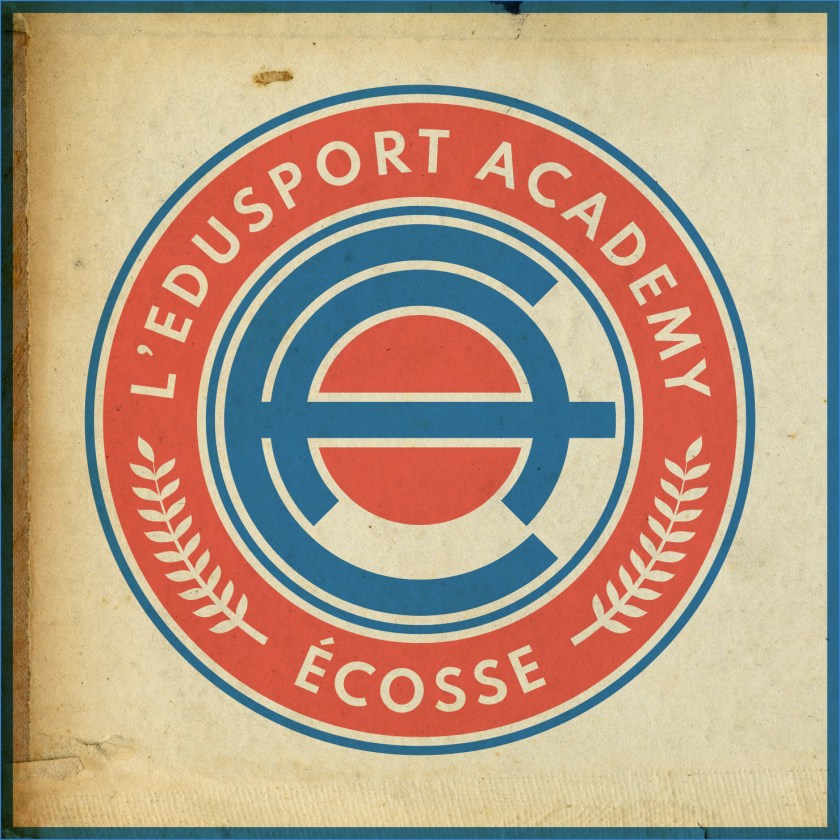
In 2019, the club was rebranded as Caledonian Braves FC, complete with a new badge. The original badge employed the colours of the French tricolore and featured a small Saltire within its central football, representing the link between France and Scotland. While I appreciated the aim of this badge, I found it somewhat difficult to see as more than a relatively weak corporate brand. For a start, I found the colour scheme of ‘Edusport’ reminiscent of the uninspiring SportsDirect.com logo. Additionally, the original badge featured text within a shield – a ‘no-no’ under ancient Scottish heraldic law. For my first redesign, I went for a roundel which featured the club’s name with the French definite article le (l’). I also included the French name for Scotland, Écosse, which is recognised quite readily in Scotland. The centre of this first redesigned badge featured a stylised ‘EA’ monogram and a red circle representing a football.

EAFC badge-01

I assume the current badge is the result a great deal of consultation with the club’s stakeholders. It futures the club’s name as part of a shield. The centrepiece of the current badge is an eagle in dark blue, behind which is what seems to be a fleur-de-lis in a lighter blue (perhaps a reference to the club’s French connection). The football and saltire from the original badge is found on the breast of the eagle. Being that this new badge continues to violate ancient Scottish heraldic law, I decided to have another shot at this redesign. The new design is very similar to my redesign of the original badge. Instead of the ‘EA’ monogram, the centre of the badge features a similar design to that of the current badge. The fleur-de-lis is depicted in red, with its side petals crossing over the eagle’s wings and the triple stalk acting as the eagle’s tailfeathers. I decided to omit the saltire as ‘Caledonian’ seems a sufficient reference to Scotland.

CBFC badge-01

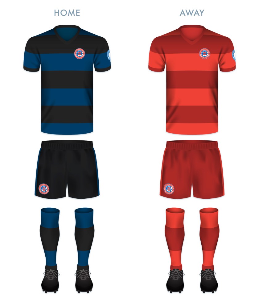
The kits are based upon previous incarnations of Edusport kits, with thick blue and black hoops on the home kit and red and dark red hoops on the away kit. To me, these seem simple, clean and dramatic.

CBFC kit-01

CBFC badge new

Advertisement
28 October 201924 February 2020 E Tagged academy, Annan, badge, crest, Dumfries and Galloway, Dumfriesshire, eagle, Edusport, Edusport Academy, Europe, fleur-de-lis, football, France, French, Galabank, LFL, logo, Lowland Football League, Lowlands, monogram, Our Football Club, rebrand, redesign, Scotland, Scottish Lowland Football League, SLFL, sport, texture, UK, United Kingdom Leave a comment

ReBrand: Edusport Academy

graphic

EAFC badge new-01Edusport Academy was established as a residential football academy in 2011 with the aim of developing young French players and giving them the opportunity to improve their English language skills. The purpose behind refining these skills was to give the young footballers an edge in entering into the professional game in Britain.

The academy continues to operate as such, but in 2014, applied successfully to become members of the South of Scotland Football League, becoming the first private academy to participate in a senior league recognised by FIFA. The following season, Edusport applied to the Lowland Football League, but was rejected. This did not deter the club for long, as they were crowned champions of the South of Scotland League in 2017, gaining promotion to the Lowland League.

In 2018, club founder Chris Ewing launched ‘Our Football Club‘, an online membership scheme, giving supporters the opportunity to have a more democratic voice in the affairs of the club. With this, Ewing expressed the goal of establishing the senior Edusport team as a separate club in its own right with the ambitious aim of reaching the top tier of Scottish football by 2025.

The current badge employs the colours of the French tricolore and features a small Saltire within its central football, representing the link between France and Scotland. While I appreciate the aim of this badge, I find it somewhat difficult to see as more than a relatively weak corporate brand. For a start, the colour scheme of ‘Edusport’ is reminiscent of the uninspiring SportsDirect.com logo. Additionally, the current badge features text within a shield – a ‘no-no’ under ancient Scottish heraldic law. For my redesign, I went for a roundel which features the club’s name with the French definite article le (l’). I have also included the French name for Scotland, Écosse, which is recognised quite readily in Scotland. Also within the outer circlet are found laurel branches, which are found in the current badge. The centre of the redesigned badge features a stylised ‘EA’ monogram and a red circle representing a football.

EAFC badge-01

The kits are based upon previous incarnations of Edusport kits, with thick blue and black hoops on the home kit and red and dark red hoops on the away kit. To me, these seem simple, clean and dramatic.

EAFC kit-01

EAFC badge new-01

13 June 201922 August 2019 E Tagged academy, Annan, badge, crest, Dumfries and Galloway, Dumfriesshire, Edusport, Edusport Academy, Europe, football, France, French, Galabank, LFL, logo, Lowland Football League, Lowlands, monogram, Our Football Club, rebrand, redesign, Scotland, Scottish Lowland Football League, SLFL, sport, texture, UK, United Kingdom Leave a comment

ReBrand: Íslenska karlalandsliðið í knattspyrnu

graphic

It’s been a long while since my last ReBrand post. Being that we’re in the latter stages of the 2016 Euros, I thought that I ought to branch out of the SFA (at least for this one design) and venture into the world of international football. And what better side to celebrate than those wonderful underdogs, Íslenska karlalandsliðið í knattspyrnu, or, to us non-Íslendingar, the Iceland national football team. Iceland’s top football division, Úrvalsdeild, was established in 1912, though their first international match did not take place until 29 July 1930, when Iceland won 1-0 at the Faroe Islands. The Football Association of Iceland (Knattspyrnusamband Íslands, or KSÍ), and in turn, Iceland’s FIFA membership, was not established until 1947.

This year’s Euros were Iceland’s first major tournament appearance. And whilst they are most definitely the smallest nation to have ever qualified for a major tournament (with a population of some 334,000), Iceland has inspired many viewers (and perhaps especially many of us in Scotland, who did not qualify for the tournament) with their surprising results. They opened up the group stage with 1-1 draws against Portugal and Hungary, before sealing their place in the Round of 16 with a 2-1 victory over Austria. Most shockingly, Iceland produced a stunning display against England (another 2-1 victory), advancing to the Quarter-finals. Their run was ended on 3 July by tournament hosts France (5-2).

Iceland’s spirit remains inspirational — sharing a 10,000+ person ritual (the now-famous ‘Viking clap’) upon their return home.

One thing that struck me about Iceland from the very start was the state of their kit, the KSÍ badge being perhaps the most distracting element for someone of my depraved disposition.

I have been impressed by Matthew Wolff, designer with New York City FC, who already had the idea to redesign the Iceland badge, basing it on a previous incarnation. Wolff’s design features a semi-runic styled KSÍ, flanked by two halves of a football, all set in front of an iceberg. He even pitched the idea to the KSÍ. Whilst Wolff’s design is striking, I’m not quite sure that an iceberg is representative of the whole of Iceland (with most of its sea ice originating from other places).

Coming up with [what I consider to be] a decent and somewhat meaningful rebrand for the KSÍ has been quite challenging, in part due to the fact that ancient Iceland produced a large number of compelling norse designs, such as Ægishjálmr (the Helm of Awe). But below I have settled on something perhaps more simplified.

KSÍ old

KSÍ final

6 July 20163 August 2017 E Tagged 2016 UEFA European Championship, Íslenska karlalandsliðið í knattspyrnu, badge, branding, Euro 2016, Europe, Euros, football, Football Association of Iceland, France, Iceland, Iceland national football team, island, Knattspyrnusamband Íslands, KSÍ, logo, Matthew Wolff, rebrand, sport, UEFA, UEFA Euro 2016 Leave a comment
Widgets
Create a website or blog at WordPress.com
Privacy & Cookies: This site uses cookies. By continuing to use this website, you agree to their use.
To find out more, including how to control cookies, see here: Cookie Policy
  • Follow Following
    • ellliottt
    • Join 53 other followers
    • Already have a WordPress.com account? Log in now.
    • ellliottt
    • Customize
    • Follow Following
    • Sign up
    • Log in
    • Report this content
    • View site in Reader
    • Manage subscriptions
    • Collapse this bar
 

Loading Comments...