ellliottt

design & illustration

Menu

Skip to content
  • HOME
  • ABOUT
  • GRAPHIC
    • ALL GRAPHIC DESIGN
    • AUTOMOTIVUS
    • REBRAND: SPFL
      • Premiership
        • Aberdeen
        • Celtic
        • Dundee United
        • Heart of Midlothian
        • Hibernian
        • Kilmarnock
        • Livingston
        • Motherwell
        • Rangers
        • Ross County
        • St Johnstone
        • St Mirren
      • Championship
        • Arbroath
        • Ayr United
        • Cove Rangers
        • Dundee
        • Greenock Morton
        • Hamilton Academical
        • Inverness CT
        • Partick Thistle
        • Queen’s Park
        • Raith Rovers
      • League One
        • Airdrieonians
        • Alloa Athletic
        • Clyde
        • Dunfermline Athletic
        • FC Edinburgh
        • Falkirk
        • Kelty Hearts
        • Montrose
        • Peterhead
        • Queen of the South
      • League Two
        • Albion Rovers
        • Annan Athletic
        • Bonnyrigg Rose
        • Dumbarton
        • East Fife
        • Elgin City
        • Forfar Athletic
        • Stenhousemuir
        • Stirling Albion
        • Stranraer
    • REBRAND: SHFL
      • Brechin City
      • Brora Rangers
      • Buckie Thistle
      • Clachnacuddin
      • Deveronvale
      • Formartine United
      • Forres Mechanics
      • Fraserburgh
      • Huntly
      • Inverurie Loco Works
      • Keith
      • Lossiemouth
      • Nairn County
      • Rothes
      • Strathspey Thistle
      • Turriff United
      • Wick Academy
    • REBRAND: SLFL
      • Berwick Rangers
      • Bo’ness United
      • Broomhill
      • Caledonian Braves
      • Civil Service Strollers
      • Cowdenbeath
      • Cumbernauld Colts
      • Dalbeattie Star
      • East Kilbride
      • East Stirlingshire
      • Edinburgh University
      • Gala Fairydean Rovers
      • Gretna 2008
      • Spartans
      • Tranent Juniors
      • University of Stirling
  • 2D
  • 3D
    • ALL 3D
    • INSTALLATION
  • PHOTO
  • SHOP

Lord Lyon

ReBrand: Ayr United FC

graphic

AUFC badge new-01In 1910, the two rival football clubs in Ayr, Ayr FC and Ayr Parkhouse FC, determined that their town was too small to both support two senior teams and for those teams to rival the leading Scottish clubs. The result of this realisation was the formation of Ayr United Football Club. (Historically, Ayr Football Club had already formed as an amalgamation of several clubs, the earliest of which was Ayr Eglinton, formed in 1875.)

Despite the noble intentions of the two clubs that formed Ayr United in 1910, the club has never been counted among the most competitive in Scotland. Still, they continue to survive, boasting such honours as reaching the final of the 2001/02 Scottish League Cup (where they were defeated by Rangers) and being crowned champions of the second tier on six occasions (1911/12, 1912/13, 1927/28, 1936/37, 1958/59 and 1965/66). More recently, Ayr United gained promotion to the Scottish Championship after topping the League One table in the 2017/18 season.

Ayr United’s kit first featured a badge in 1938. This badge consisted of a stylised black anchor within a white shield with a black border and was used until 1948. Another badge appeared for the 1967/68 season, though regular use of a badge wouldn’t feature until 1977. From that time until 2017, some form of this 1967/68 badge was used.

In 2016, an anonymous complaint to the Court of the Lord Lyon challenged the use of the club’s badge, noting that it featured both a Saltire and the club’s initials within a shield, both a breach of an ancient heraldic law in Scotland, the same which caused bother for Airdrieonians in 2015. Reluctantly, in 2016, Ayr United opened up a competition in which fans could vote on their favourite badge from a pool of finalists. A badge designed by Jamie Stevenson, a Scottish Ayr United supporter living abroad, came out on top, ganering 48% of the vote. This new badge, seen on the left below, was then incorporated into the kit for the 2017/18 season.

The current badge utilises several features from the previous badge, including the Saltire and a football within a cord of rope, the rope recalling the town’s maritime heritage. At the bottom of the badge is the club’s nickname, ‘The Honest Men’, which comes from the Robert Burns poem ‘Tam o’ Shanter’ (1790). The second verse of the poem reads,

‘This truth fand honest Tam o’ Shanter,
As he frae Ayr ae night did canter,
(Auld Ayr, wham ne’er a town surpasses,
For honest men and bonny lasses.)’

For my redesign, I decided to make use of some of the historical imagery of the club, though with a significant departure from the club’s current badge. The colours used—black, white and red—are consistent with the historic club colours. I omitted the Saltire in favour of a singular image of a horse rampant upon an anchor. The anchor calls back to the original Ayr United badge from 1938.

The stylised horse with a missing tail is a visual reference—which, in a badge, I prefer over an overt, written reference—to ‘Tam o’ Shanter’ and the club’s nickname. In the narrative poem, the eponymous character, Tam, is depicted as having a ‘gray mare, Meg’. In the climax of the poem, Tam, demonstrating his ‘honest’ character, is escaping from a ‘hellish legion’ of the devil, warlocks, and witches who have begun to shed their clothing (noting one particularly attractive witch, Nannie Dee, with an undersized ‘cutty-sark’ or ‘shirt’). When Tam is fleeing upon his trusty Meg, Nannie is able to grab hold of Meg’s ‘gray tail’, which is left behind.

AUFC badge-01

The home kit is based upon Ayr United’s traditional home colour scheme of a white top with black shorts. The away strip makes use of the club colours in a vertical stripe running down a dark blue kit, borrowing from the old Ayr FC’s early colours.

AUFC kit-01

AUFC badge new-01

As ever, I am indebted to Dave at Historical Football Kits for some of the historical information used above.

Advertisement
12 May 201824 February 2020 E Tagged anchor, Ayr, Ayr Eglinton, Ayr Eglinton FC, Ayr Eglinton Football Club, Ayr FC, Ayr Football Club, Ayr Parkhouse, Ayr Parkhouse FC, Ayr Parkhouse Football Club, Ayr United, Ayr United FC, Ayr United Football Club, Ayrshire, badge, Bard, branding, Burns, Championship Division, Court of the Lord Lyon, crest, Europe, football, Honest Men, horse, Jamie Stevenson, Ladbrokes Championship, logo, Lord Lyon, Lord Lyon King of Arms, Meg, Rab Burns, Rabbie Burns, rebrand, redesign, Robert Burns, Scotland, Scottish Championship, Scottish Professional Football League, shield, SPFL Championship, sport, Tam o' Shanter, The Honest Men, UK, United Kingdom Leave a comment

ReBrand: Airdrieonians FC

graphic

AirFC badge new-01The original Airdrieonians Football Club began its life as Excelsior Football Club in 1878. In 1881, the club’s name was changed to Airdrieonians and it continued as such until its demise in 2002.
Throughout the 1920s, this original Airdrieonians FC proved to be a competitive side within Scottish football. The club finished second in the league on four consecutive occasions from the 1922/23 season until the 1925/26 season (behind Rangers for the first three and Celtic for the fourth) and defeated Hibernian 2-0 in the 1923/24 Scottish Cup final. But after this era, Airdrieonians never again rose to such great heights.

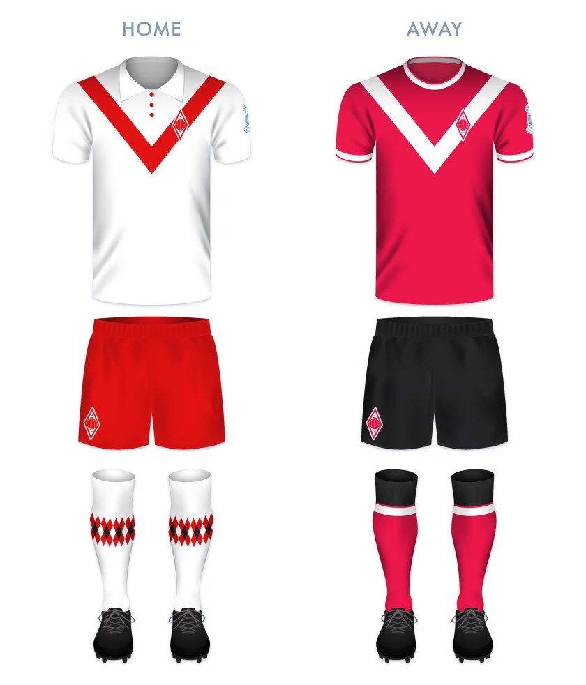
In 1912, Airdrieonians adopted its distinctive shirt designs – a white field featuring a red ‘diamond’ (seen as a ‘V’ on both the front and backs of the club’s shirts). As a result of this design, which the club used throughout the remainder of its existence, Airdrieonians became known as ‘the Diamonds’.

After this original club folded, a new Airdrie club, called Airdrie United, was formed. Technically speaking, Airdrie United’s admittance into the Scottish Football League was the result of the organisation’s buyout and subsequent renaming of the original Clydebank FC. Airdrie United then became, for all intents and purposes, the new Airdrieonians, using the same home ground (Excelsior Stadium) and wearing the same diamond motif on its white shirts. This club became known as Airdrie in 2012 and then revived the Airdrieonians name in 2013.

As far as badges go, recently, the club has been the subject of a rather widely-publicised campaign. The Airdrieonians badge, first used by the original AFC in 1974 and then adopted by the new AFC when it revived the name in 2013, featured a shield, within which were the club’s initials and two lions passant, one above and one below the initials. In March 2015, the Court of the Lord Lyon informed the club that this badge did not comply with an ancient Scottish law forbidding the use of lettering within an heraldic device, such as a shield (a legal challenge that has proven or could prove problematic with a number of other clubs). In response, the club adopted an altered badge, omitting the shield though all but implying it by including a red chevron shape where the base of the shield once was. This chevron was included so as to mirror the ‘diamond’ that had adorned the AFC kits for more than a century.

For my redesign, I considered the heraldic images in the current badge, but took minor issue with the current badge’s use of the chevron shape. It has long been the conviction of Airdrieonians supporters that the ‘V’ on the front of the shirt is, in fact, neither a ‘V’ nor a chevron, but one half of a diamond. Being that the club’s nickname is ‘the Diamonds’, I wanted to emphasise that shape. When elongated horizontally, the diamond would bear too much resemblance to the Umbro logo. A vertically-elongated diamond badge is used by the German club Borussia Mönchengladbach, but I thought that I might be able to produce a very different badge within the same shape.

I illustrated a nineteenth-century football to occupy the middle of the badge and built the simple ‘AFC’ lettering around it, which can be seen below. I include no founding date as the current club has only existed since 2002. But for those who see the current Airdrieonians FC as a continuation of the original club, I believe that both the retro football and the diamond shape call back to that heritage sufficiently.

AirFC badge-01

While I made a clear departure from the 1974 badge, I see the ‘Airdrie Diamond’ as the classic and essential AFC kit and for my kit redesigns, I only added my own personal touch, including the argyle-patterned socks.

AirFC kit-01

AirFC badge new-01

As ever, I am indebted to Dave at Historical Football Kits for some of the historical information used above.

6 May 201824 February 2020 E Tagged Airdrie, Airdrie FC, Airdrie Football Club, Airdrie United, Airdrie United FC, Airdrie United Football Club, Airdrieonians, Airdrieonians FC, Airdrieonians Football Club, badge, brand, Clydebank, Clydebank FC, Clydebank Football Club, Court of the Lord Lyon, crest, design, Europe, Excelsior, Excelsior FC, Excelsior Football Club, Excelsior Stadium, football, Ladbrokes League 1, Ladbrokes League One, League 1, League One, logo, Lord Lyon, Lord Lyon King of Arms, North Lanarkshire, rebrand, redesign, Scotland, Scottish Professional Football League, SPFL, SPFL League 1, SPFL League One, sport, texture, UK, United Kingdom Leave a comment

ReBrand: St Mirren FC

graphic

SMFC badge new-01St Mirren Football Club was established in 1877. Similarly to Kilmarnock in 1869, Heart of Midlothian in 1874 (potentially), St Johnstone in 1884 and Dunfermline Athletic in 1885, St Mirren FC was formed when members of St Mirren Cricket Club took a notion to play football in the winter months to keep up fitness levels. So highly were St Mirren regarded even in these early years that the club were invited to become founding members of the Scottish Football League in 1890.
By 1908, St Mirren reached the first of their six Scottish Cup finals, but their opponents, Celtic, proved too strong for the Buddies. St Mirren had another shot at glory against Celtic in the 1925/26 final, which would be their first of three Scottish Cup victories (the others being 1958/59 and 1986/87). More recently, the Buddies reached their first Scottish League Cup final on 17 March 2013, defeating Hearts 3-2 at Hampden Park.

Unfortunately for St Mirren, the high of their 2012/13 Scottish League Cup would be followed by the low of their relegation to the second tier at the end of the 2014/15 season. After three seasons in the Scottish Championship, the Buddies returned to the top tier for the 2018/19 season.

The St Mirren kit first included a badge—consisting of the Paisley coat of arms and a banner reading ‘St Mirren FC’—during the Second World War. A badge was not used consistently until the 1950s. Slight variations of this badge were used on and off throughout the sixties and seventies. From 1981 until 1984, a new badge was used, which reduced the size of the Paisley coat of arms inside a black and white striped shield. Supporters were not keen on this badge, and so the club reused the earlier coat of arms badge.

In 1995, the coat of arms was first placed inside a circle, though the inclusion of the traditional mural crown brought a legal challenge from the Court of the Lord Lyon, as a 1672 law requires that all coats of arms in Scotland must be registered. The club bypassed this challenge the following season by creating a more figurative mural crown of black and white stripes for which the Saints are known, present in the current badge.

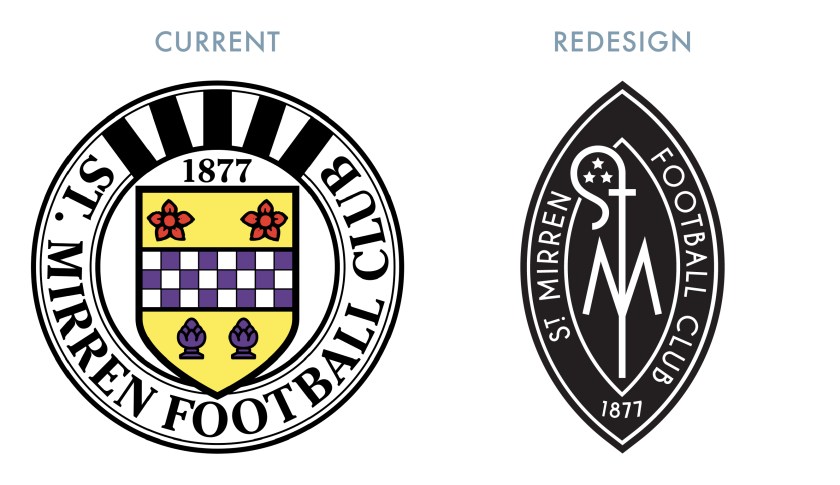
While I do not find the current St Mirren badge particularly weak, there is a displeasing heaviness to the design. We’ve got this busy coat of arms (with an intrusive and thick black border), surrounded by a clunky typeface and the heavy black and white stripes of the mural crown. These stripes, in particular, create an aesthetic incoherence.

For my redesign, I began by sketching a crosier (a hooked staff carried by an abbot or bishop as a symbol of pastoral office). Most depictions of Paisley’s coat of arms feature an abbot holding a crosier, as Paisley’s patron saint, Mirren (or St Mirin) is considered the founder of the community that occupied the site of what would become the Abbey of St James and St Mirren, now known as Paisley Abbey. Most heraldic depictions of abbots include the head of the crosier closed in on itself, like a spiral, indicating the abbot’s pastoral care for the ‘inward’ community of the monastery. The head of a bishop’s crosier, on the other hand, is depicted as terminating outward.

In my sketching, I realised that an outward-pointing crosier can be designed to look very much like an ‘S’. I chose to abandon the heraldic convention for the sake of the design in order to make the minimalistic monogram of the redesign. The ‘S’ and ‘T’, for ‘Saint’, are part of the crosier, with an ‘M’ passing through the middle. I have also included three stars within the crosier head to commemorate St Mirren’s three Scottish Cup victories. The crosier monogram is enclosed by a vesica piscis (Latin for ‘bladder of a dish’), calling back to aureolas (a diminutive of the Latin aurea—meaning ‘golden’—to signify the sacredness of a figure) in Christian art as well as to medieval seals and emblems.

SMFC badge-01

The kit colour schemes are based on traditional St Mirren kits, with the black and white vertical stripes for the home kit and the red featuring in the way kit.

SMFC kit-01

SMFC badge new-01

As ever, I am indebted to Dave at Historical Football Kits for some of the historical information used above.

4 May 201824 February 2020 E Tagged badge, brand, Buddies, Court of the Lord Lyon, crest, Europe, football, Ladbrokes Premiership, logo, Lord Lyon, Lord Lyon King of Arms, monogram, Paisley, rebrand, redesign, Renfrewshire, Saints, Scotland, Scottish Championship, Scottish Premiership, Scottish Professional Football League, SPFL, SPFL Premiership, sport, St Mirren, St Mirren FC, St Mirren Football Club, texture, The Buddies, The Saints, UK, United Kingdom 1 Comment
Widgets
Create a website or blog at WordPress.com
Privacy & Cookies: This site uses cookies. By continuing to use this website, you agree to their use.
To find out more, including how to control cookies, see here: Cookie Policy
  • Follow Following
    • ellliottt
    • Join 53 other followers
    • Already have a WordPress.com account? Log in now.
    • ellliottt
    • Customize
    • Follow Following
    • Sign up
    • Log in
    • Report this content
    • View site in Reader
    • Manage subscriptions
    • Collapse this bar
 

Loading Comments...