
Have you ever noticed how poor some of the designs that we in the Western World are forced to encounter actually are? I’ve noticed. It’s a pathetic thing to get hung up on, but if I was going to go through the effort of raising a sign for my storefront I’d have to make sure that I was satisfied with the aesthetic quality of the sign. That’s probably because I have problems. But say you wanted to investigate a particular establishment—a restaurant, a potential employer, a potential church, anything really—on the Internet and you could barely navigate your way through an out of date website. Some of these websites were never ‘in date’ to begin with. If a newspaper looks too busy or scattered, I don’t want to read it. If I wanted to buy a new pair of running shoes my inclination would be to choose a shop that looked legitimate, aesthetically legitimate. As a designer, the whole package is valuable to me. So, thanks to last night’s insomnia, I finally got around to starting a design project called ‘ReBrand’. My intention is to take common logos and brands and give them a wee bit of an adjustment. I’m not prepared to say that I can make any vast improvements, but I figured that when I’m taking wee breaks from my daily PhD research [anxiety setting in at the mere mention of PhD research…] I could occupy myself with this project. At the very least, I can focus my mind on other things and practise my design technique.
I’ve decided that I’d start this project with something close to my heart – football. And in Scottish football there’s no shortage of lazy designs. I’ll probably focus solely on the Scottish Premier League, as it is the top tier of professional Scottish football. So below you have the current SPL logo, and below it you have a quick wee redesign I’ve been playing with:
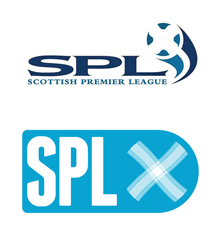
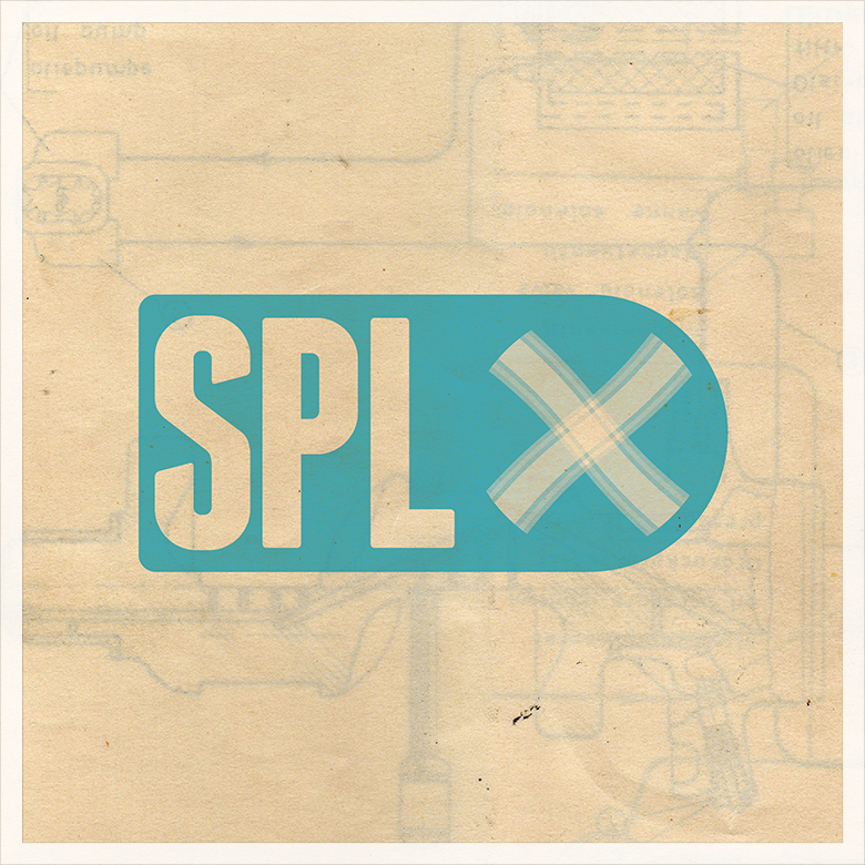
I thought that the saltire (Scottish flag) on the football was effective in the current logo, so I kept a subtle ball in there and added a bit of a tartan for the white cross. And here’s a texture for more fun…
UPDATE: This summer the SPL was abolished and replaced by the Scottish Premiership which is the top tier of the new Scottish Professional Football League. The new SPFL logo isn’t too bad:


I share your sentiment entirely. If it’s a pathetic way to be, well, you’re not the only one. Every day I notice these things, and it affects my desire, likely more than it should, to use/buy/patronize/attend/look at/read/etc something.
So, I certainly appreciate this project. I’ve really enjoyed what you’ve done so far.
Hope you’re well!