 Aberdeen Football Club was established in 1903. Since that time, the club has amassed a variety of honours. This includes seven Scottish Cups (fifth most, behind Celtic, Rangers, Queen’s Park and Hearts) and six Scottish League Cups (third most, behind Rangers and Celtic). The Dons have also been crowned Scottish Champions on four occasions (behind Celtic and Rangers and tied with Hearts and Hibernian, though the Dons’ 17 finishes in the second spot set them above both Hearts and Hibernian).
Within European competition, the Dons have won the UEFA Super Cup (1982/83 – the only Scottish club to have achieved this honour) and the now-defunct UEFA Cup Winners’ Cup (1982/83 – an honour shared only with Rangers, who won in 1971/72).
Additionally, the Dons are the last club outwith the Old Firm to have been crowned Scottish champions (1984/85). On the final day of the 2017/18 season, Aberdeen clinched the runners-up spot in the league table for the fourth consecutive season, demonstrating once again that they remain a formidable side within Scottish football.
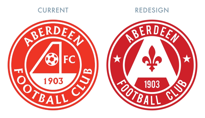
Aberdeen’s current crest has been in use since 1986. For most seasons since 2005, two stars have been placed above the badge, which represent the Dons’ two European honours. I consider this to be a very strong badge, but there are a few weak aspects. For instance, the football looks a bit dated and the ‘AFC’ in the middle is a wee bit redundant (unless used without the accompanying circlet, which Aberdeen did from 1979 until 1986 and then again for the 2014/15 season).
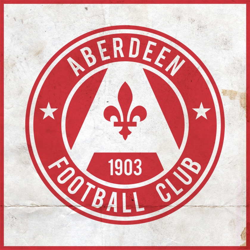
For this redesign, I changed the surrounding typeface and employed a central ‘A’ of my own design, with the silhouette of a fleur-de-lis used as the counter. Because Aberdeen FC was formed by the union of the three Aberdeen-based clubs—the original Aberdeen (1881), Orion (1885) and Victoria United (1889)—I wanted to have some echo of the history and heritage of the city. I settled on the simplicity of the fleur-de-lis, which is featured as a royal tressure within the orle of the coat of arms of the City of Aberdeen. According to tradition, this honour was granted to the city by Robert the Bruce (1274-1329), King of Scots, indicating royal favour.

For Aberdeen’s home kit, I went with the club’s traditional red and white colours. So fond am I of the 2013/14 home and 2015/16 away Adidas kits, that I decided to opt for a large patch of white at the top of the shirt. There away kit is a more elaborate variation of this design, utilising a black, white and gold colour scheme, similar to that used in Aberdeen’s 2015/16 away kit.


As ever, I am indebted to Dave at Historical Football Kits for some of the historical information used above.
