 Fraserburgh Football Club was established in 1910. In 1921, they gained admittance to the Highland Football League. Since that time, the club have won the league three times and have won the Highland League Cup on two occasions.
When the Scottish Qualifying Cup (North) was still used to give non-professional clubs the chance to compete in the tournament, Fraserburgh progressed on three occasions. Their most notable appearance came in January 1959, when they faced Dundee at their home ground of Bellslea Park in the first round of the Scottish Cup. At that time, Dundee were a competitive side in the top tier of the Scottish Football League and would finish the season in fourth place before topping the table in 1962. Fraserburgh’s victory was seen as a significant shock. Ultimately, the club would progress no further than the second round, losing narrowly to Stirling Albion 3-4 at home.
The home kit scheme of black and white vertical stripes has been used by the club for many years. It is said to have been inspired by the kit of Newcastle United by way of a local fisherman. Fraserburgh first used a badge on their kit in 1990 to celebrate their 80th anniversary. The centrepiece of this badge consisted of a shield divided into three segments, with the top left displaying two crossing flags, the top right displaying a football and the bottom portion displaying a lion rampant. The shield was topped with a thistle and flanked by mantling. A banner ran underneath the shield bearing the club’s name.
In 2010, the current badge came into use to commemorate the club’s centenary. The club’s nickname, ‘The Broch’, is taken from the Scots word for Fraserburgh. I find this current badge to be somewhat striking in concept, though lacking in execution. The ‘kink’ on the sides of the shield as it begins to curve in the lower-third rubs me the wrong way. Additionally, the presentation of the text is very basic (though I suspect that this is intentional) and apart from the nickname, it displays no symbols linking it to the club’s history nor the locality. I won’t even get started on the issue that the Court of the Lord Lyon might have with this badge.
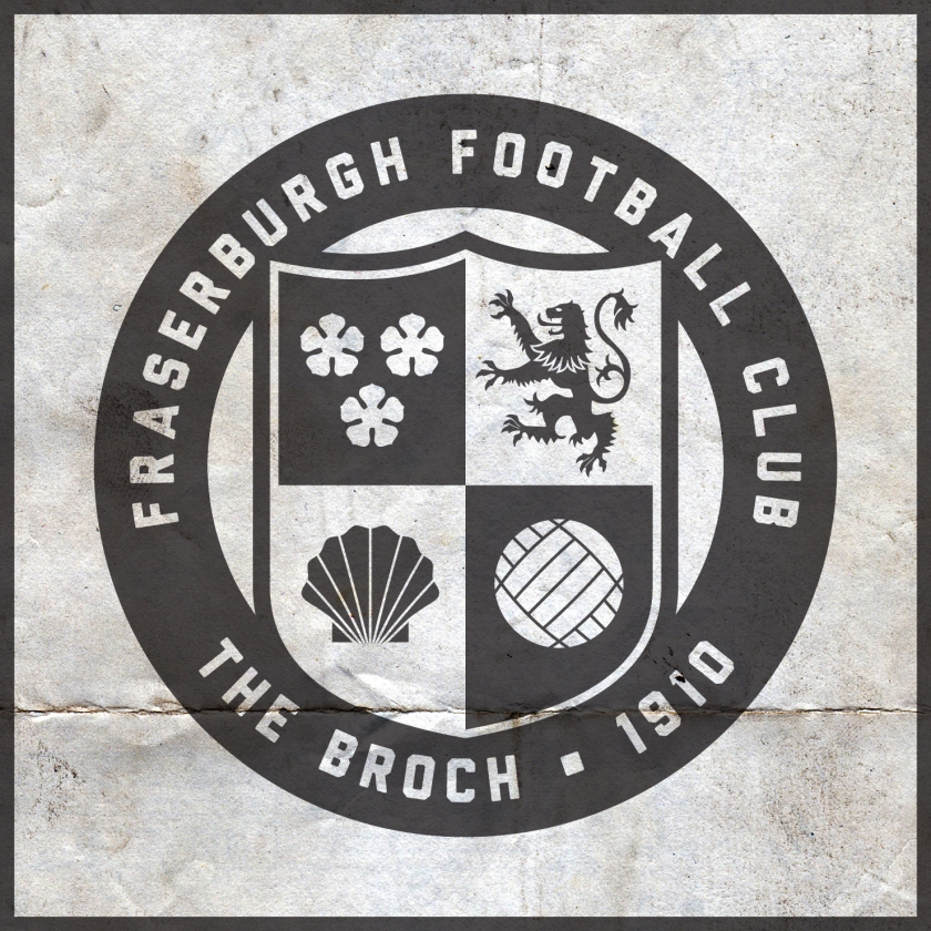
In redesigning this badge, I wanted to keep with the stark black-and-white colour scheme, but I wanted to present something that echoes some of the club and town’s history. Inspired by the Fraserburgh coat of arms, I designed a shield and divided it into four parts. The three cinquefoils and lion rampant mirror those included on the coat of arms. In the lower left quadrant, I included a shell as Fraserburgh is the largest shellfish port in Scotland and one of the largest in Europe.

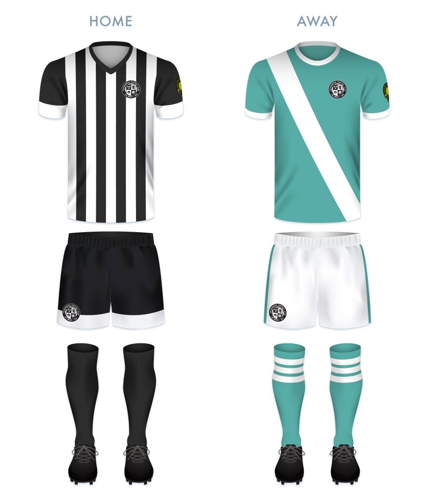
For the home kit, I did not stray from the boldness of Fraserburgh’s traditional black and white vertical stripes. The current away kit uses a sky blue, but I opted for a more of a sea green, reflecting the community’s dependence on the sea.


