 Like Kilmarnock in 1869, potentially Heart of Midlothian in 1874, St Mirren in 1877 and Dunfermline Athletic in 1885, St Johnstone Football Club was established by off-season cricketers in 1884.
St Johnstone was admitted into the Scottish Football League after the original Port Glasgow Athletic FC (1878), who finished second-bottom in the 1910/11 season, chose not to apply for re-election into the second tier and dissolved soon thereafter. Only three seasons later, the second tier folded, being replaced by two regional leagues. At this stage, St Johnstone suspended operations for several seasons before joining the Eastern Football League in 1919.
By 1920, St Johnstone had joined the Central Football League, in which clubs were permitted to pay their players higher wages than were permitted in the SFL. The draw of these Central League clubs was so great that the SFL, seeking to stifle their competitors, incorporated this Central League into a newly-formed Second Division.
St Johnstone became Second Division champions for the first time at the end of the 1923/24 season. The club returned to the Second Division after finishing at the bottom of the First Division in the 1929/30 season. St Johnstone would return to the top tier on several more occasions, gaining promotion most recently in the 2008/09 season. The club’s highest honour came in the 2013/14 season, when they beat Dundee United 2-0 in the Scottish Cup final at Celtic Park.
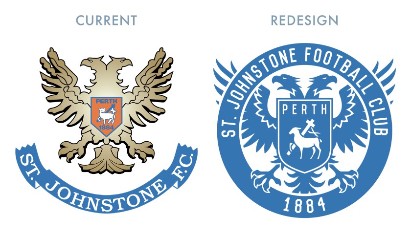
St Johnstone’s current badge was one of the biggest inspirations for my initial foray into redesigning Scottish football badges. The badge’s concept itself is strong, being derived from the historic Perth coat of arms. The central shield is born by a double-headed eagle (recalling an important Roman settlement called ‘Bertha’ near Perth). The shield features the AGNUS DEI (‘Lamb of God’), which represents St John the Baptist, the patron saint of Perth. This symbolism also informs the club’s name, as at one point, Perth was often referred to as ‘St John’s Toun’, or ‘St Johnstone’.
While I appreciate the historic symbolism of the current badge, I find the execution displeasing. With my redesign, I sought to retain the essential iconography of the current badge, but to present it with greater unity and clarity.

As far as the kits go, I went with a classic solid blue home shirt (complete with a 1970s-styled collar). For the away shirt, I decided to go with a vibrant yellow. To break up the field, I went with minimalist triangles that both hint at an argyle pattern while also suggesting the mountainous Highlands (as Perth is positioned near the Highland Boundary Fault and is sometimes referred to as the ‘Gateway to the Highlands’).


As ever, I am indebted to Dave at Historical Football Kits for some of the historical information used above.
