ellliottt

design & illustration

Menu

Skip to content
  • HOME
  • ABOUT
  • GRAPHIC
    • ALL GRAPHIC DESIGN
    • AUTOMOTIVUS
    • REBRAND: SPFL
      • Premiership
        • Aberdeen
        • Celtic
        • Dundee United
        • Heart of Midlothian
        • Hibernian
        • Kilmarnock
        • Livingston
        • Motherwell
        • Rangers
        • Ross County
        • St Johnstone
        • St Mirren
      • Championship
        • Arbroath
        • Ayr United
        • Cove Rangers
        • Dundee
        • Greenock Morton
        • Hamilton Academical
        • Inverness CT
        • Partick Thistle
        • Queen’s Park
        • Raith Rovers
      • League One
        • Airdrieonians
        • Alloa Athletic
        • Clyde
        • Dunfermline Athletic
        • FC Edinburgh
        • Falkirk
        • Kelty Hearts
        • Montrose
        • Peterhead
        • Queen of the South
      • League Two
        • Albion Rovers
        • Annan Athletic
        • Bonnyrigg Rose
        • Dumbarton
        • East Fife
        • Elgin City
        • Forfar Athletic
        • Stenhousemuir
        • Stirling Albion
        • Stranraer
    • REBRAND: SHFL
      • Brechin City
      • Brora Rangers
      • Buckie Thistle
      • Clachnacuddin
      • Deveronvale
      • Formartine United
      • Forres Mechanics
      • Fraserburgh
      • Huntly
      • Inverurie Loco Works
      • Keith
      • Lossiemouth
      • Nairn County
      • Rothes
      • Strathspey Thistle
      • Turriff United
      • Wick Academy
    • REBRAND: SLFL
      • Berwick Rangers
      • Bo’ness United
      • Broomhill
      • Caledonian Braves
      • Civil Service Strollers
      • Cowdenbeath
      • Cumbernauld Colts
      • Dalbeattie Star
      • East Kilbride
      • East Stirlingshire
      • Edinburgh University
      • Gala Fairydean Rovers
      • Gretna 2008
      • Spartans
      • Tranent Juniors
      • University of Stirling
  • 2D
  • 3D
    • ALL 3D
    • INSTALLATION
  • PHOTO
  • SHOP

Bible

ReBrand: Queen of the South FC

graphic

QSFC badge new-01Queen of the South Football Club was established in 1919. This new club was result of a union between three pre-existing clubs: Maxwelltown Volunteers FC (formed in 1896 and renamed 5th King’s Own Scottish Borderers in 1908), Dumfries FC (formed in 1897) and the Arrol-Johnston Motor Company works team. The name, ‘Queen of the South’, was taken from a local poet, David Dunbar, who, while standing for Parliament in the 1857 general election, called the town of Dumfries the ‘Queen of the South’ in one of his addresses.

After participating in various non-professional leagues for several seasons, ‘the Doonhamers’, as they are known (‘doonhamer’ being a colloquial term for natives of Dumfries, many of whom, in the nineteenth century, worked in Glasgow and referred to Dumfries as doon hame, Scots for ‘down home’), joined the newly-created Third Division of the Scottish Football League in the 1923/24 season.

The Doonhamers gained promotion from the bottom tier after their second season in the SFL. Promotion to the top tier came at the close of the 1932/33 season. In their first season in the top tier, Queen of the South finished fourth in the table with 45 points, behind Celtic (47), Motherwell (62) and Rangers (66). This finish remains the club’s finest performance in the top tier.

Although the Doonhamers have yet to win any senior cups, they reached the semi-finals of the Scottish Cup in 1949/50 and the Scottish League Cup in 1950/51 and 1960/61. In 2007/08, the club reached the Scottish Cup final, losing narrowly 2-3 to Rangers.

Queen of the South first featured a badge on their kit in 1947. This badge, found at the centre of the current badge, is strong, bearing a handsome monogram and the Dumfries motto, in Scots, A lore burne, referring to the Loreburn (or ‘muddy stream’), a stream that ran through a marsh near the town. In times of attack, this motto served as a rallying cry to the town. What I find less attractive in the current badge is the outer circle, bearing the club’s name and leaving a lot of negative space. Additionally, the current badge’s use of text within a shield is a violation of an ancient Scottish heraldic law.

When redesigning the Queen of the South badge, I struggled to come up with something that I found satisfying. I explored various heraldic motifs before settling on an updated ‘QS’ monogram bearing a ‘queen’s’ crown and featuring a football and the Dumfries motto in a banner.

QSFC badge-01

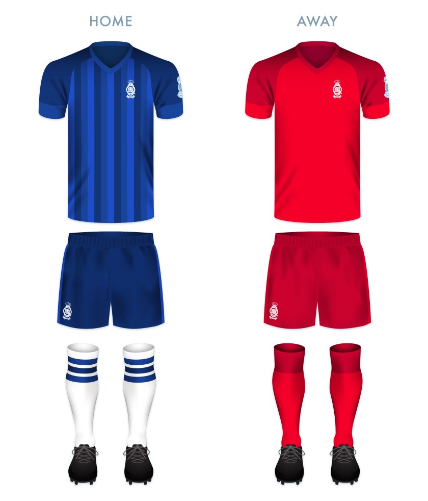
The kits make use of the Doonhamers’ traditional colours of blue (home) and red (away). The home strip is inspired in part by Bayern Munich’s handsome third kit from the 2013/14 season.

QSFC kit-01

QSFC badge new-01

As ever, I am indebted to Dave at Historical Football Kits for some of the historical information used above.

Advertisement
3 May 201824 February 2020 E Tagged 5th King's Own Scottish Borderers, 5th King's Own Scottish Borderers FC, 5th King's Own Scottish Borderers Football Club, 5th KOSB, 5th KOSB FC, 5th KOSB Football Club, A Lore Burne, Archangel Michael, Arrol-Johnston, Arrol-Johnston FC, Arrol-Johnston Football Club, badge, Bible, Book of Revelation, brand, Championship Division, County of Dumfries, crest, Dumfries, Dumfries and Galloway, Dumfries FC, Dumfries Football Club, Dumfrieshire, Dumfriesshire, Europe, football, Ladbrokes Championship, logo, Maxwelltown Volunteers, Maxwelltown Volunteers FC, Maxwelltown Volunteers Football Club, Michael, New Testament, Queen of the South, Queen of the South FC, Queen of the South Football Club, Queens, rebrand, redesign, Revelation, Revelation of St John, Saint Michael, Saint Michael the Archangel, Scotland, Scots, Scottish Championship, Scottish Professional Football League, SPFL, SPFL Championship, sport, St Michael, St Michael the Archangel, Taxiarch Archangel Michael, texture, UK, United Kingdom Leave a comment

Go out in joy

2D

Go out in joy

8 July 201328 May 2014 E Tagged Bible, Book of Isaiah, Christianity, doxology, God, Isaiah 55, landscape, mixed media, mountains, music, religion, text Leave a comment

Vanity of Vanities

2D

Vanity
oil on maple, 4′ x 5′, 2006

commissioned for Grace Brethren Church of Long Beach

15 May 200626 May 2014 E Tagged Bible, Christianity, church commission, colour, Ecclesiastes, Hebrew, Judaism, maple, oil, painting, rain, religion, Yod cloud Leave a comment
Widgets
Create a website or blog at WordPress.com
Privacy & Cookies: This site uses cookies. By continuing to use this website, you agree to their use.
To find out more, including how to control cookies, see here: Cookie Policy
  • Follow Following
    • ellliottt
    • Join 53 other followers
    • Already have a WordPress.com account? Log in now.
    • ellliottt
    • Customize
    • Follow Following
    • Sign up
    • Log in
    • Report this content
    • View site in Reader
    • Manage subscriptions
    • Collapse this bar
 

Loading Comments...