ellliottt

design & illustration

Menu

Skip to content
  • HOME
  • ABOUT
  • GRAPHIC
    • ALL GRAPHIC DESIGN
    • AUTOMOTIVUS
    • REBRAND: SPFL
      • Premiership
        • Aberdeen
        • Celtic
        • Dundee United
        • Heart of Midlothian
        • Hibernian
        • Kilmarnock
        • Livingston
        • Motherwell
        • Rangers
        • Ross County
        • St Johnstone
        • St Mirren
      • Championship
        • Arbroath
        • Ayr United
        • Cove Rangers
        • Dundee
        • Greenock Morton
        • Hamilton Academical
        • Inverness CT
        • Partick Thistle
        • Queen’s Park
        • Raith Rovers
      • League One
        • Airdrieonians
        • Alloa Athletic
        • Clyde
        • Dunfermline Athletic
        • FC Edinburgh
        • Falkirk
        • Kelty Hearts
        • Montrose
        • Peterhead
        • Queen of the South
      • League Two
        • Albion Rovers
        • Annan Athletic
        • Bonnyrigg Rose
        • Dumbarton
        • East Fife
        • Elgin City
        • Forfar Athletic
        • Stenhousemuir
        • Stirling Albion
        • Stranraer
    • REBRAND: SHFL
      • Brechin City
      • Brora Rangers
      • Buckie Thistle
      • Clachnacuddin
      • Deveronvale
      • Formartine United
      • Forres Mechanics
      • Fraserburgh
      • Huntly
      • Inverurie Loco Works
      • Keith
      • Lossiemouth
      • Nairn County
      • Rothes
      • Strathspey Thistle
      • Turriff United
      • Wick Academy
    • REBRAND: SLFL
      • Berwick Rangers
      • Bo’ness United
      • Broomhill
      • Caledonian Braves
      • Civil Service Strollers
      • Cowdenbeath
      • Cumbernauld Colts
      • Dalbeattie Star
      • East Kilbride
      • East Stirlingshire
      • Edinburgh University
      • Gala Fairydean Rovers
      • Gretna 2008
      • Spartans
      • Tranent Juniors
      • University of Stirling
  • 2D
  • 3D
    • ALL 3D
    • INSTALLATION
  • PHOTO
  • SHOP

Scottish Premier League

ReBrand: SPL

graphic

Have you ever noticed how poor some of the designs that we in the Western World are forced to encounter actually are? I’ve noticed. It’s a pathetic thing to get hung up on, but if I was going to go through the effort of raising a sign for my storefront I’d have to make sure that I was satisfied with the aesthetic quality of the sign. That’s probably because I have problems. But say you wanted to investigate a particular establishment—a restaurant, a potential employer, a potential church, anything really—on the Internet and you could barely navigate your way through an out of date website. Some of these websites were never ‘in date’ to begin with. If a newspaper looks too busy or scattered, I don’t want to read it. If I wanted to buy a new pair of running shoes my inclination would be to choose a shop that looked legitimate, aesthetically legitimate. As a designer, the whole package is valuable to me. So, thanks to last night’s insomnia, I finally got around to starting a design project called ‘ReBrand’. My intention is to take common logos and brands and give them a wee bit of an adjustment. I’m not prepared to say that I can make any vast improvements, but I figured that when I’m taking wee breaks from my daily PhD research [anxiety setting in at the mere mention of PhD research…] I could occupy myself with this project. At the very least, I can focus my mind on other things and practise my design technique.

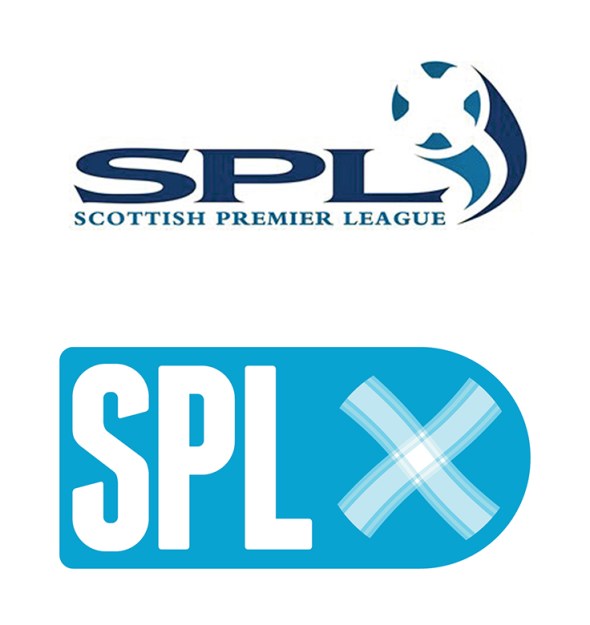
I’ve decided that I’d start this project with something close to my heart – football. And in Scottish football there’s no shortage of lazy designs. I’ll probably focus solely on the Scottish Premier League, as it is the top tier of professional Scottish football. So below you have the current SPL logo, and below it you have a quick wee redesign I’ve been playing with:

SPL old

I thought that the saltire (Scottish flag) on the football was effective in the current logo, so I kept a subtle ball in there and added a bit of a tartan for the white cross. And here’s a texture for more fun…

ReBrand SPL

UPDATE: This summer the SPL was abolished and replaced by the Scottish Premiership which is the top tier of the new Scottish Professional Football League. The new SPFL logo isn’t too bad:
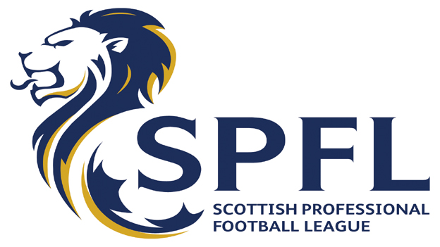
SPFL

20 May 20133 August 2017 E Tagged brand, Europe, football, logo, rebrand, redesign, Scotland, Scottish Premier League, Scottish Premiership, Scottish Professional Football League, SP, SPFL, SPL, sport, texture, UK, United Kingdom 1 Comment
Widgets
Create a website or blog at WordPress.com
Privacy & Cookies: This site uses cookies. By continuing to use this website, you agree to their use.
To find out more, including how to control cookies, see here: Cookie Policy
  • Subscribe Subscribed
    • ellliottt
    • Join 53 other subscribers
    • Already have a WordPress.com account? Log in now.
    • ellliottt
    • Subscribe Subscribed
    • Sign up
    • Log in
    • Report this content
    • View site in Reader
    • Manage subscriptions
    • Collapse this bar
 

Loading Comments...