ellliottt

design & illustration

Menu

Skip to content
  • HOME
  • ABOUT
  • GRAPHIC
    • ALL GRAPHIC DESIGN
    • AUTOMOTIVUS
    • REBRAND: SPFL
      • Premiership
        • Aberdeen
        • Celtic
        • Dundee United
        • Heart of Midlothian
        • Hibernian
        • Kilmarnock
        • Livingston
        • Motherwell
        • Rangers
        • Ross County
        • St Johnstone
        • St Mirren
      • Championship
        • Arbroath
        • Ayr United
        • Cove Rangers
        • Dundee
        • Greenock Morton
        • Hamilton Academical
        • Inverness CT
        • Partick Thistle
        • Queen’s Park
        • Raith Rovers
      • League One
        • Airdrieonians
        • Alloa Athletic
        • Clyde
        • Dunfermline Athletic
        • FC Edinburgh
        • Falkirk
        • Kelty Hearts
        • Montrose
        • Peterhead
        • Queen of the South
      • League Two
        • Albion Rovers
        • Annan Athletic
        • Bonnyrigg Rose
        • Dumbarton
        • East Fife
        • Elgin City
        • Forfar Athletic
        • Stenhousemuir
        • Stirling Albion
        • Stranraer
    • REBRAND: SHFL
      • Brechin City
      • Brora Rangers
      • Buckie Thistle
      • Clachnacuddin
      • Deveronvale
      • Formartine United
      • Forres Mechanics
      • Fraserburgh
      • Huntly
      • Inverurie Loco Works
      • Keith
      • Lossiemouth
      • Nairn County
      • Rothes
      • Strathspey Thistle
      • Turriff United
      • Wick Academy
    • REBRAND: SLFL
      • Berwick Rangers
      • Bo’ness United
      • Broomhill
      • Caledonian Braves
      • Civil Service Strollers
      • Cowdenbeath
      • Cumbernauld Colts
      • Dalbeattie Star
      • East Kilbride
      • East Stirlingshire
      • Edinburgh University
      • Gala Fairydean Rovers
      • Gretna 2008
      • Spartans
      • Tranent Juniors
      • University of Stirling
  • 2D
  • 3D
    • ALL 3D
    • INSTALLATION
  • PHOTO
  • SHOP

Highland Football League

ReBrand: Fraserburgh FC

graphic

ffc badge new-01Fraserburgh Football Club was established in 1910. In 1921, they gained admittance to the Highland Football League. Since that time, the club have won the league three times and have won the Highland League Cup on two occasions.

When the Scottish Qualifying Cup (North) was still used to give non-professional clubs the chance to compete in the tournament, Fraserburgh progressed on three occasions. Their most notable appearance came in January 1959, when they faced Dundee at their home ground of Bellslea Park in the first round of the Scottish Cup. At that time, Dundee were a competitive side in the top tier of the Scottish Football League and would finish the season in fourth place before topping the table in 1962. Fraserburgh’s victory was seen as a significant shock. Ultimately, the club would progress no further than the second round, losing narrowly to Stirling Albion 3-4 at home.

The home kit scheme of black and white vertical stripes has been used by the club for many years. It is said to have been inspired by the kit of Newcastle United by way of a local fisherman. Fraserburgh first used a badge on their kit in 1990 to celebrate their 80th anniversary. The centrepiece of this badge consisted of a shield divided into three segments, with the top left displaying two crossing flags, the top right displaying a football and the bottom portion displaying a lion rampant. The shield was topped with a thistle and flanked by mantling. A banner ran underneath the shield bearing the club’s name.

In 2010, the current badge came into use to commemorate the club’s centenary. The club’s nickname, ‘The Broch’, is taken from the Scots word for Fraserburgh. I find this current badge to be somewhat striking in concept, though lacking in execution. The ‘kink’ on the sides of the shield as it begins to curve in the lower-third rubs me the wrong way. Additionally, the presentation of the text is very basic (though I suspect that this is intentional) and apart from the nickname, it displays no symbols linking it to the club’s history nor the locality. I won’t even get started on the issue that the Court of the Lord Lyon might have with this badge.

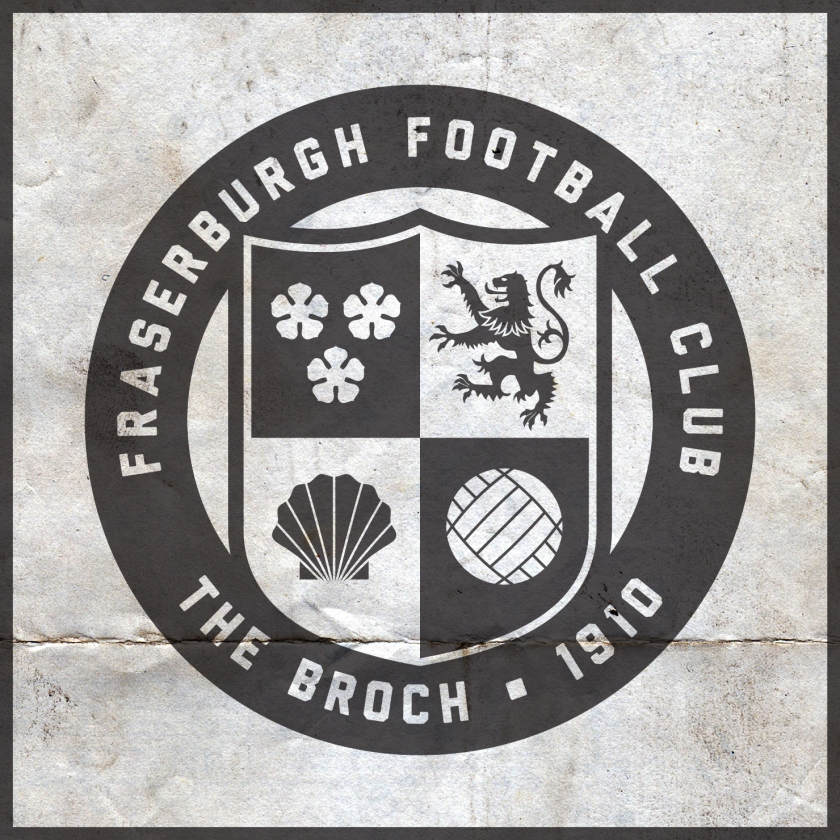
In redesigning this badge, I wanted to keep with the stark black-and-white colour scheme, but I wanted to present something that echoes some of the club and town’s history. Inspired by the Fraserburgh coat of arms, I designed a shield and divided it into four parts. The three cinquefoils and lion rampant mirror those included on the coat of arms. In the lower left quadrant, I included a shell as Fraserburgh is the largest shellfish port in Scotland and one of the largest in Europe.

FFC badge-01

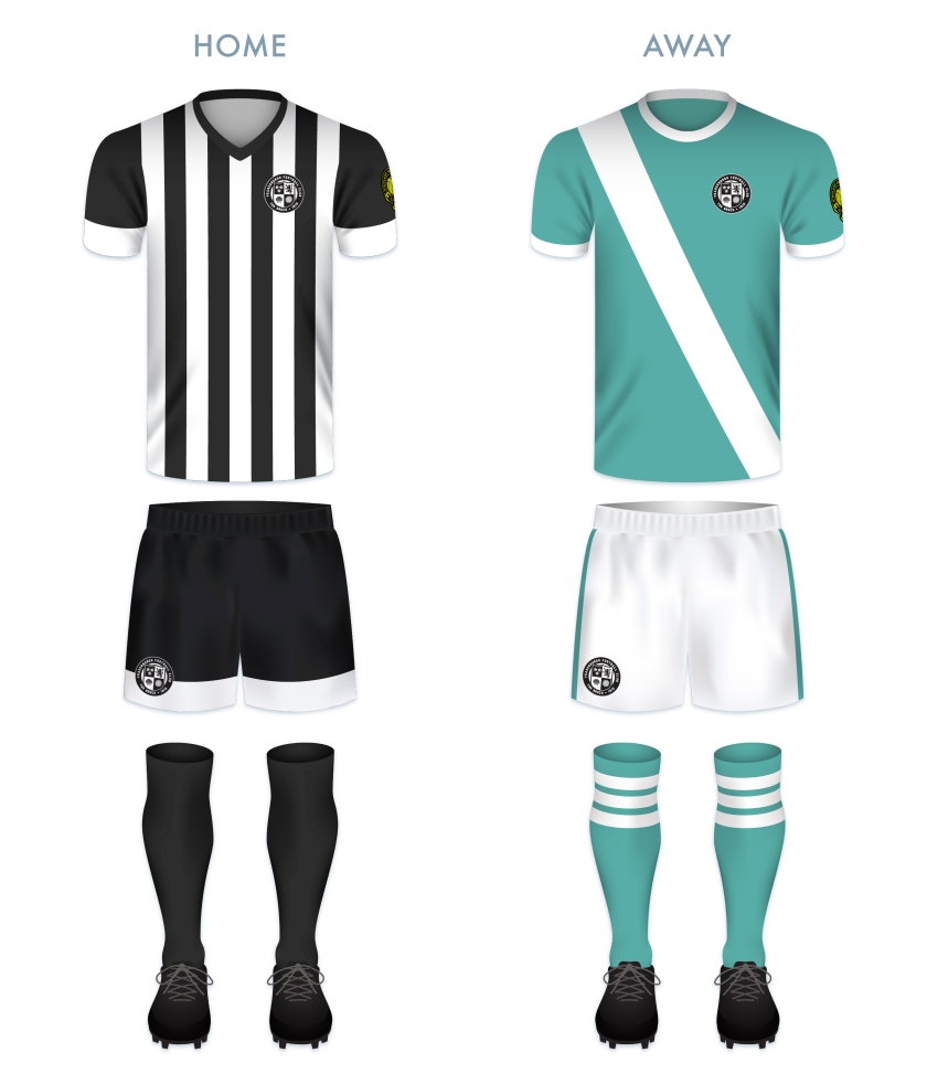
For the home kit, I did not stray from the boldness of Fraserburgh’s traditional black and white vertical stripes. The current away kit uses a sky blue, but I opted for a more of a sea green, reflecting the community’s dependence on the sea.
FFC kit-01

ffc badge new-01


Advertisement
15 January 201924 February 2020 E Tagged Aberdeenshire, badge, Broch, crest, Europe, football, Fraserburgh, Fraserburgh FC, Fraserburgh Football Club, HFL, Highland Football League, Highlands, logo, rebrand, redesign, Scotland, Scottish Highland Football League, SHFL, sport, texture, The Broch, UK, United Kingdom Leave a comment

ReBrand: Fort William FC

graphic

fwfc badge new-01Fort William Football Club was established in 1974, making the club the second-youngest in the Highland Football League (after Strathspey Thistle, established in 1993). From their formation, Fort William had campaigned unsuccessfully to gain admittance into the Highland Football League. They would not participate in a competitive league until joining the North Caledonian League in 1983.
In their first season with the NCL, Fort William finished second-top in the league table. By the end of the following season, they were crowned league champions. After this success, the club was finally granted a place in the Highland League.

Fort William’s time in the Highland League can be characterised as rocky. They have yet to achieve any honours and in 2018, all six club directors resigned. The club has survived, but the 2018/19 season is not proving especially fruitful, having won two points from two draws and having been deducted nine points to finish December at the bottom of the table with -7 points and a -149 goal difference after 21 matches.

Things are looking quite bleak for Fort William these days, but here’s hoping that the club can find some inspiration to fight on and produce some significant results.

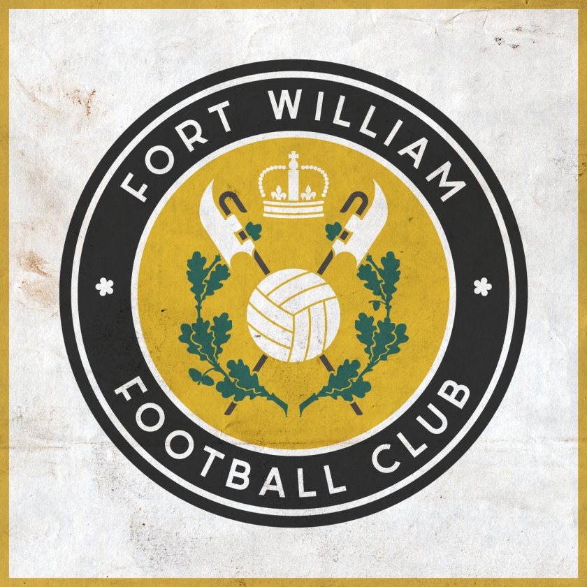
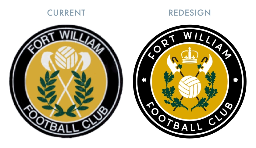
For the badge redesign, I decided to retool the current badge, which features a version of the Fort William coat of arms. The minimalism of the current badge is to be admired, though I have several issues with it. The first is that the Lochaber axes, crossed to form a Saltire – well, they don’t much resemble axes to me. Additionally, the Fort William coat of arms features a chaplet of oak branches, not of what appears to be olive branches. Lastly, the football takes the place of the crown found in the actual coat of arms. Cards on the table, I am not a monarchist, but the Fort William coat of arms is more about the town’s history than the present, with Fort ‘William’ having been named after William of Orange. Although the initial fort had been constructed during the rule of Oliver Cromwell, by the eighteenth century, it was used as an outpost against Jacobite forces.

For my redesign, I decided to include all of the traditional elements of the Fort William coat of arms and place a football, similar to the one in the current badge, at the centre. In order to avoid a clear association with ‘one side’ or the ‘other’ (read: Scottish sectarianism), I have also included two small white cinquefoils in the outer circlet, symbolising the Jacobite history of the region.

FWFC badge-01

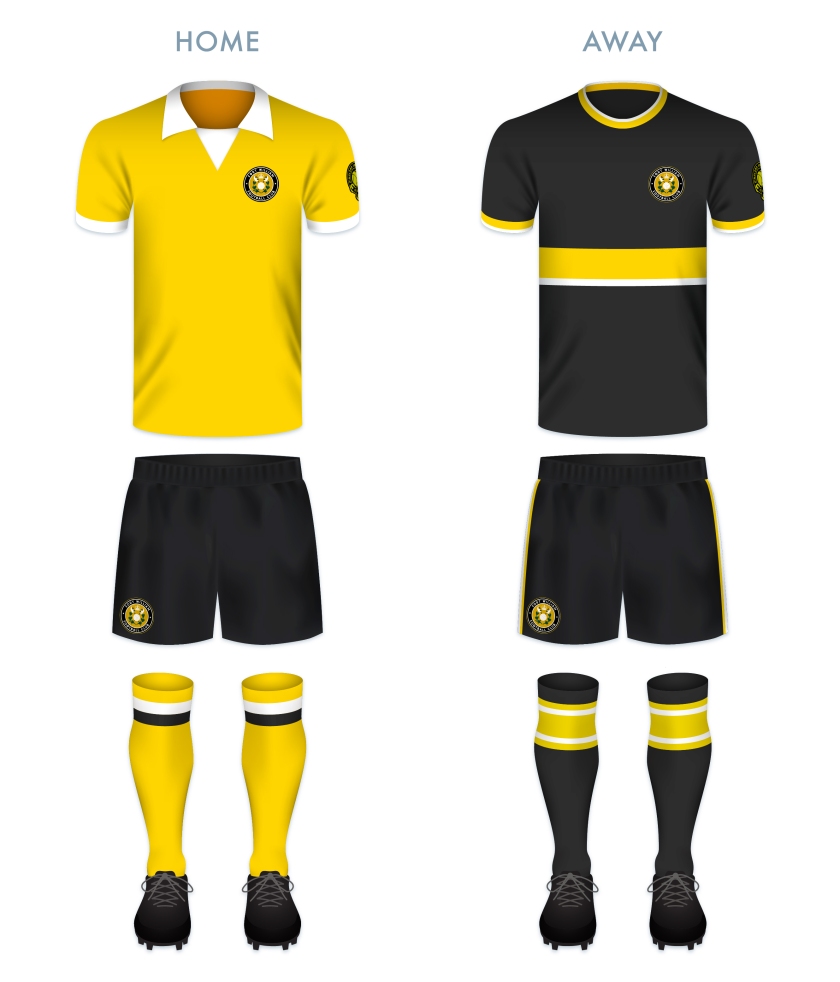
For the home kit redesign, I went with something that calls back to the club’s formation in 1974. The away kit makes use of the current black-dominated away colour scheme.

FWFC kit-01

fwfc badge new-01


15 January 201924 February 2020 E Tagged A' Ghàidhealtachd, badge, crest, Europe, football, Fort, Fort William, HFL, Highland, Highland Football League, Highlands, Lochaber, logo, rebrand, redesign, Scotland, Scottish Highland Football League, SHFL, sport, texture, The Fort, UK, United Kingdom Leave a comment

ReBrand: Forres Mechanics FC

graphic

FMFC badge new-01Forres Mechanics Football Club was established in 1884. Several different theories have been posited to explain the club’s unusual name. One theory suggests that the club was formed when students at an establishment called the Forres Mechanics Institute (a number of Mechanics Institutes were established throughout the United Kingdom and former British Empire from 1821) formed their own club.

A more likely explanation is found in the research of Colin G. Watson. In his 1984 book, Forres Mechanics: The First Hundred Years, Watson argues that the club was formed when players left a pre-existing club based in the town, St Lawrence (now, a cricket club exclusively). Watson also argues that the name ‘Mechanics’ has nothing to do with the Mechanics Institute, but rather, is a reference to the occupations of these early players.

The Highland Football League was established in 1893 by members of the Inverness Workman’s Club. Forres Mechanics were among the founding members of the league, which also included Caledonian, Cameron Highlanders, Clachnacuddin, Inverness Citadel, Inverness Thistle and Inverness Union. Cameron Highlanders, Inverness Citadel and Inverness Union have all ceased operations. In 1994, Caledonian and Inverness Thistle merged to form Inverness Caledonian Thistle, who have competed as professionals since that time. Of these founding members, only Clachnacuddin and Forres Mechanics remain.

The Mechanics’ honours include two Highland League titles, seven Highland League Cups, eight North of Scotland Cups and the 1963/64 Scottish Qualifying Cup (North). In 2016, the Mechanics qualified for the Scottish Cup competition and reached the third round—their highest ever advancement in the tournament—where they lost to League One side Stenhousemuir over two legs (having drawn the first 2-2 at home).

The current Forres Mechanics badge is distinctive. Its centrepiece is a version of the Forres coat of arms, which originates from at least the fifteenth century. It features the town’s patron saint, St Lawrence, standing between two victory palms. He holds the Gospels as well as a gridiron, upon which he met his martyrdom. It is most likely that the crescent and star relate to a paraphrase of Psalm 139.12 associated with Lawrence: ‘The darkness is no darkness to me, but the night is all as clear as the morning that shineth more and more unto the perfect day.’

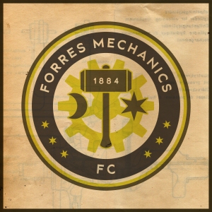
I have great affection for the current badge, but in my redesign I wanted to present something that was not simply a version of the town’s coat of arms. In wishing to tie in both the town and the ‘mechanics’ side of the club’s name and history, I included the crescent and star of St Lawrence, which are flanking a hammer, all set in front of a cog. Upon the head of the hammer is found the year of the club’s founding. I have also included three six-pointed stars on either side of the outer ring, calling back to the current badge. For the primary colour scheme, I utilised the club’s traditional gold and brown.

FMFC badge-01

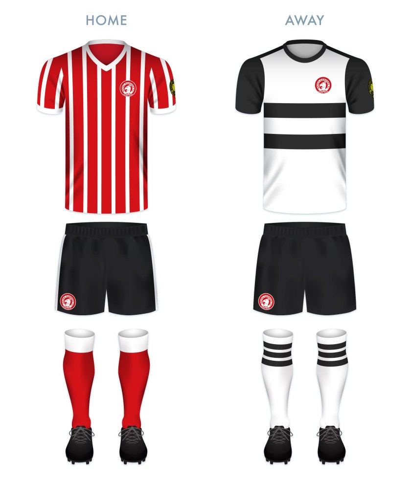
The kit designs were made in keeping with the club’s traditional colours and occasional use of hoops, both of which I find particularly attractive.

FMFC kit-01

FMFC badge new-01

15 January 201924 February 2020 E Tagged badge, Can Cans, Cans, crest, Europe, football, Forres, Forres Mechanics, Forres Mechanics FC, Forres Mechanics Football Club, HFL, Highland Football League, Highlands, logo, Mighty Cans, Moray, Morayshire, rebrand, redesign, Scotland, Scottish Highland Football League, SHFL, sport, texture, UK, United Kingdom Leave a comment

ReBrand: Formartine United FC

graphic

fufc badge new-01Formartine United Football Club was established in the village of Pitmedden, Aberdeenshire, in 1948. The exact circumstances of the club’s formation are something of a mystery. It is known that an amateur club, Pitmedden FC, played in the village prior to the founding of United, but the relationship between the two is unclear.
Formartine United played in the amateur league in Aberdeenshire until 1960, when they became a junior side. They continued to compete as a junior side for the nearly 50 years until, in 2008, the Highland Football League was expanded, opening three new places. These places went to Strathspey Thistle, Turriff United and Formartine United. By the end of the 2012/13 season, Formartine United had reached second-top in the Highland League table. That same season, the club secured their first senior honour, winning the Aberdeenshire Cup. United repeated their Aberdeenshire Cup victory in the 2017/18 season, a campaign during which they also won their first Highland League Cup.

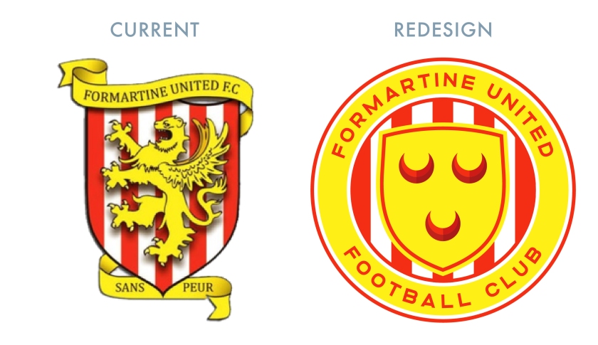
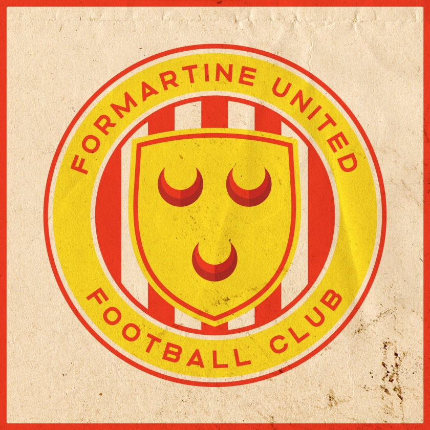
When looking at the current badge, we notice a red-and-white-striped shield upon which is found a golden griffin rampant. A golden banner wraps around the badge and includes the club name and the French motto SANS PEUR, ‘without fear’. The stripes on the shield echo the traditional red and white stripes of Formartine United home shirts. The French motto, that of Clan Sutherland, might have some connection to the club’s founding (perhaps one of the early movers in the club was called Sutherland). Given that United are based in Pitmedden, I decided to make greater use of the club’s locality. I omitted the French motto from this badge redesign (and included it in the redesign of Brora Rangers‘ badge) as Formartine is far from the traditional homelands of Clan Sutherland. The griffin has been replaced by a version of the Clan Seton coat of arms. This ties to the historic Pitmedden Gardens, which feature the coat of arms of Sir Alexander Seton, Lord Pitmedden (c. 1639-1719).

FUFC badge-01

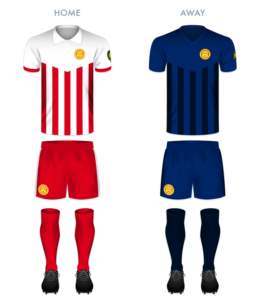
The home strip makes use of the traditional Formartine United red and white stripes, while the away strip inverts this colour scheme and replaces red with dark blue.

FUFC kit-01

fufc badge new-01


14 January 201928 February 2020 E Tagged Aberdeenshire, badge, Clan Seton, crest, Europe, football, Formartine, Formartine United Football Club, Fortmartine United, Fortmartine United FC, HFL, Highland Football League, Highlands, logo, Lord Pitmedden, Pitmedden, Pitmedden Gardens, rebrand, redesign, Scotland, Scottish Highland Football League, SHFL, sport, texture, UK, United, United Kingdom Leave a comment

ReBrand: Deveronvale FC

graphic

dfc badge new-01Deveronvale Football Club was established in 1938 at the union of two pre-existing clubs, Deveron Valley and Banff Rovers. The club name comes from the River Deveron, which separates the twin fishing towns of Banff and Macduff on the northern Aberdeenshire coast.
The name ‘Deveronvale’ was chosen so as to demonstrate that the club belonged to the communities of both Banff and Macduff. The current badge is a version of the first and only badge worn by the club, first employed in the 1970s. In order to further emphasise this shared ‘ownership’ of the club, the designer, local schoolteacher Chris Murray, decided upon a depiction of a seagull in order to avoid favouring one town over the other.

A year after the union, the club joined the Highland Football League, though it was not until 2003 that they won their first Highland League title. This achievement was repeated three years later. In addition to these two Highland League championships, Vale’s honours include eight Aberdeenshire Cups, two Aberdeenshire Shields and secured their place in the Scottish Cup tournaments of 1951/52 and 2001/02 by winning the Scottish Qualifying Cup (North) during those campaigns.

Designing a new badge for Vale was a challenge. The current badge is both unique to Scotland in its shape (it resembles Liverpool FC’s full badge very closely, especially the badge first included on Liverpool’s 1987/88 kits) and striking in its aesthetics and simplicity. But, although the centrepiece of the current badge is meant to be a seagull, I find it difficult to see – a Native American thunderbird or an eagle comes to my mind more readily.

Ultimately, I chose to reuse the current badge shape. In order to emphasise both the River Deveron and the twin fishing towns of Banff and Macduff, I placed a blue stripe through the middle of the badge, crossed by two fish (salmon). The salmon coming from the left crosses in front of the salmon coming from the right, emphasising that, while Deveronvale belongs to both Banff and Macduff, the town on the western bank of the River Deveron, Banff, has always been home to Deveronvale’s home ground.

DFC badge-01

The kit redesigns make use of traditional Deveronvale home and away colour schemes.

DFC kit-01

dfc badge new-01

14 January 201924 February 2020 E Tagged Aberdeenshire, badge, Banff, Banff and Buchan, Banff Rovers, Banffshire, crest, Deveron Valley, Deveronvale, Deveronvale FC, Deveronvale Football Club, Europe, football, HFL, Highland Football League, Highlands, logo, Macduff, rebrand, redesign, River Deveron, Scotland, Scottish Highland Football League, SHFL, sport, texture, typography, UK, United Kingdom, Vale Leave a comment

ReBrand: Cove Rangers FC

graphic

crfc badge new-01Cove Rangers Football Club was established in 1922. The club takes its name from Cove Bay, located in the southeastern corner of the city of Aberdeen, in which they play.
In 1947, the club became a founding member of the Aberdeen Amateur Football Association. That season, Cove Rangers won the first of their 11 amateur championships. In 1948, they began to play at Allen Park. Among them, their highlight came in the 1964/65 season, when the club went unbeaten in the league.

Cove Rangers competed as amateurs until 1985, when they became a junior side. The following season, they became a senior side and joined the Highland Football League. By the 1990s, Cove Rangers began to rack up local silverware and in 2001, they won the first of their six Highland League championships. In 2016, in order to comply with SPFL regulations, the club relocated from Allen Park to their new Balmoral Stadium ground.

The club continued their dominance of the Highland League, finishing at the top of the table over two consecutive seasons between 2017 and 2019. After being crowned league champions at the end of the 2017/18 season, Cove Rangers secured an SPFL promotion playoff by defeating the Lowland League champions Spartans. Ultimately, Cove Rangers lost 3-2 to Cowdenbeath over two legs to remain in the Highland League. The club remained competitive and secured another SPFL promotion playoff the following season with a 5-1 aggregate victory over Lowland League champions East Kilbride over two legs. This time, Cove Rangers faced Berwick Rangers. The Aberdeen side dominated Berwick, winning 0-7 over two legs and gaining promotion into the bottom tier of the SPFL for the 2019/20 season.

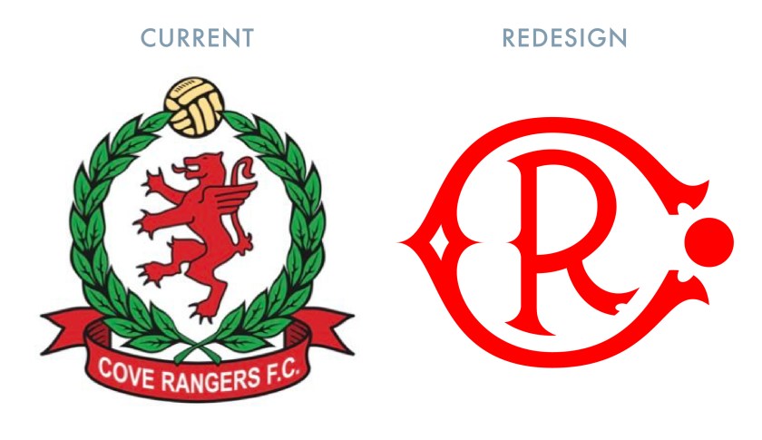
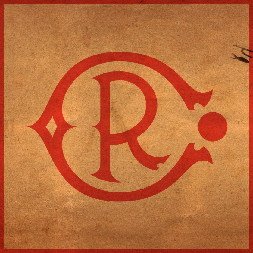
In redesigning the Cove Rangers badge, I wanted to call back to the early twentieth century. I was unconvinced by the olive branches encircling a griffin rampant and decided on a stylised monogram. After first illustrating the ‘C’, I realised that the ends of the legs resembled boots and decided to place a circle, representing a football, between them.

CRFC badge-01

For the home kit, I was inspired by the Cove home kit from the 1982/83 season. The layout of the away kit is also inspired by a Cove home kit from the 1980s – that used in the 1986/87 season.

CRFC kit-01

crfc badge new-01

14 January 201924 February 2020 E Tagged Aberdeen, badge, Cove, Cove Bay, Cove Rangers, Cove Rangers FC, Cove Rangers Football Club, crest, Europe, football, HFL, Highland Football League, Highlands, logo, monogram, rebrand, redesign, Scotland, Scottish Highland Football League, Scottish League 2, Scottish League Two, Scottish Professional Football League, SHFL, SPFL, SPFL League 2, SPFL League Two, sport, texture, Toonsers, typography, UK, United Kingdom, Wee Rangers Leave a comment

ReBrand: Clachnacuddin FC

graphic

CFC badge new-01Clachnacuddin Football Club was established in 1885. The name of the club is an Anglicisation of the Scottish Gaelic Clach na Cùdainn, meaning, ‘Stone of the Tub’, a reference to a particular landmark in the club’s locality, the Merkinch area of Inverness. (It is said that Merkinch, which is situated between the Caledonian Canal on the west and the River Ness on the east, was home to a particular stone at which locals would do their washing, hence the ‘tub’.)

In 2017, a very informative letter was written to The Inverness Courier by Alexander Chisholm, a former Clachnacuddin player and chairman, which sheds some light on the early years of the club. Mr Chisholm’s letter states that the club was established ‘by Donald Simpson who wanted a team of his own for the people of the Merkinch. The first Clach team was formed by the army Royal Artillery Volunteers stationed in Telford Road Barracks and played in the Carse on a plot of ground rented from the town council.’

In 1893, Clachnacuddin joined Caledonian, Cameron Highlanders, Forres Mechanics, Inverness Citadel, Inverness Thistle and Inverness Union to form the Highland Football League. Cameron Highlanders, Inverness Citadel and Inverness Union have all ceased operations. In 1994, Caledonian and Inverness Thistle merged to form Inverness Caledonian Thistle, who have competed as professionals since that time. Of these founding members, only Clachnacuddin and Forres Mechanics remain.

Clachnacuddin’s honours include 18 Highland League Championships (the most of any club in the Highland League), five Highland League Cups and 22 North of Scotland Cups. The 1947/48 season proved to be one of the club’s finest, having won the Scottish Qualifying Cup (North), the Highland League Cup, the North of Scotland Cup and the Inverness Charity Cup.

In 1990, the club faced extinction due to financial difficulties, but were rescued by a group of local businessmen, including Charlie Forbes, James Macdonald, Ken Macleod, Calum Grant, Colin Morgan and Alistair and David Dowling.

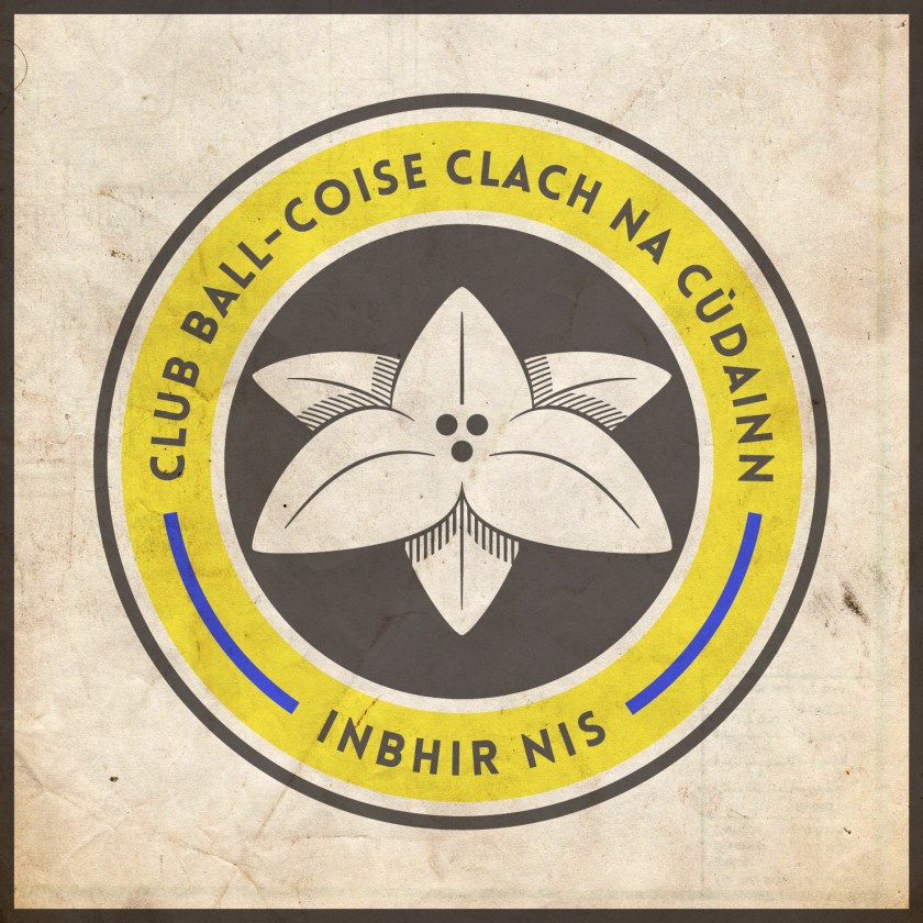
The current Clachnacuddin badge is interesting, but a bit busy. The two lilies are a play on the club’s nickname, ‘the Lilywhites’, due to their white home strip. For my redesign, I decided to illustrate a single simple, symmetrical lily as a centrepiece. In what might be a somewhat controversial move, I decided to include the club’s name and location in Scottish Gaelic. As Clachnacuddin is the only club in the Highland Football League whose name is Gaelic in origin (not including clubs named after their respective towns), and since Gaelic is a unique, but dying identity marker in the Scottish Highlands, I decided to capitalise on this connection. The two blue line segments in the outer circlet represent the Caledonian Canal and the River Ness, which, as mentioned before, flank Merkinch.

CFC badge-01

Both the home and away kits are relatively conservative and modern in their presentation, utilising the black, white and gold scheme from the badge.

CFC kit-01

CFC badge new-01

13 January 201924 February 2020 E Tagged badge, Clach, Clachnacuddin, Clachnacuddin Football Club, ClachnacuddinFC, crest, Europe, football, Gaelic, Gàidhlig, HFL, Highland Football League, Highlands, Inverness, Lillywhites, logo, Merkinch, rebrand, redesign, Scotland, Scottish Gaelic, Scottish Highland Football League, SHFL, sport, texture, The Clach, UK, United Kingdom Leave a comment

ReBrand: Buckie Thistle FC

graphic

BTFC badge new-01The early history of Buckie Thistle Football Club is something of a mystery. Although the exact year of the club’s founding is unknown, it is accepted generally to have been established in 1889. The club’s green-and-white hooped home shirts resemble that of Celtic FC, and it has been suggested that Buckie Thistle might have adopted the scheme after receiving a donation of Celtic strips at some point in their history. The date of the adoption of the hoops is potentially intriguing as Celtic did not incorporate their now-famous hoops until 1903. Could the Jags have inspired Celtic? Probably not. But the uncertainty of Buckie Thistle’s beginning does not detract from the club’s illustrious Highland Football League honours.
Since joining the Highland League in 1909, the Jags are eleven-time league champions (most recently, in 2016/17), eight-time Highland League Cup winners, and have won a large number of other regional honours. In October 1954, Buckie Thistle beat Queen’s Park 2-1 at Hampden Park in a replay of the fourth round of the Scottish Cup, becoming the first and only senior non-league club to have won a competitive match at Scotland’s national stadium.

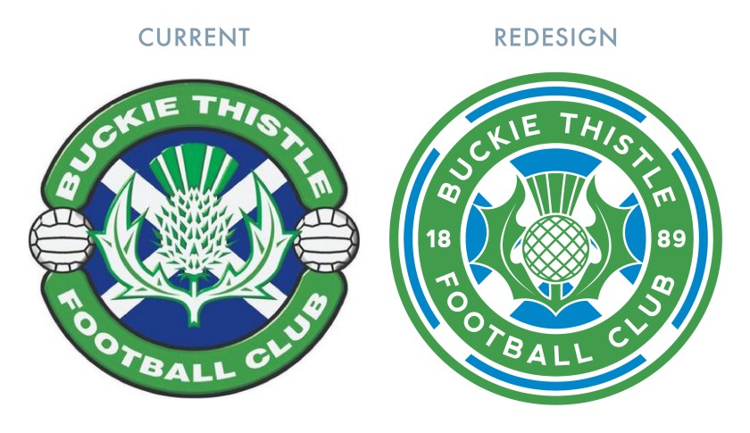
I have been unable to determine how long some version of the current badge has been in use, and while I would tend away from stereotypical Scottish symbols wherever possible, the Saltire and thistle seem wholly appropriate for the Highland Jags, as it does with Partick Thistle, Inverness Caledonian Thistle and fellow Highland Leaguers Strathspey Thistle. The design of the current badge seems dated (specifically, very 1990s in style), so I decided to reincorporate most of the current badge’s visual elements with a new, simpler design.

BTFC badge-01

While seeking to differentiate the home kit from that of Celtic, and with no intention of getting rid of the hoops associated with Buckie Thistle, I went with a subtle variation of using tight hoops in a cooler shade of green, complete with green details (Celtic’s are normally white) and green shorts (never worn by Celtic at home). The away strip makes use of vertical stripes of black and grey as well as some green details.

BTFC kit-01

BTFC badge new-01


13 January 201924 February 2020 E Tagged badge, Banff, Banffshire, Buckie, Buckie Thistle, Buckie Thistle FC, Buckie Thistle Football Club, crest, Europe, football, HFL, Highland Football League, Highlands, Jags, logo, rebrand, redesign, Scotland, Scottish Highland Football League, SHFL, sport, texture, The Jags, Thistle, UK, United Kingdom Leave a comment

ReBrand: Brora Rangers FC

graphic

BroRFC badge new-01Brora Rangers Football Club was established in the village of Brora, Sutherland in 1879. In 1933, the club became members of the Scottish Football Association and in 1962, they began to compete in the Highland Football League.
The club’s first taste of silverware came in 1981, when they won the North of Scotland Cup (a competition open to northern clubs from the Scottish Football League and now the Scottish Professional Football League, the Highland League and the North Caledonian Football League). Just a season earlier, Brora Rangers first qualified for the Scottish Cup competition by winning the now-defunct Scottish Qualifying Cup (North), though they progressed no further than the second round, losing out to Highland League rivals Buckie Thistle in a replay at home.

Brora Rangers repeated their 1981 North of Scotland Cup victory a decade later, and then again, four times in five years between 2014 and 2018. Their recent dominance in the Highlands is evidenced further by winning the Highland League for two consecutive seasons, 2013/14 and 2014/15, as well as winning the Highland League Cup in 2016.

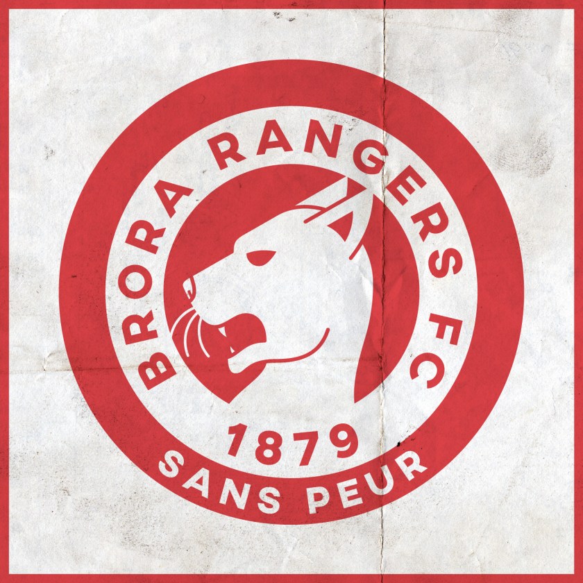
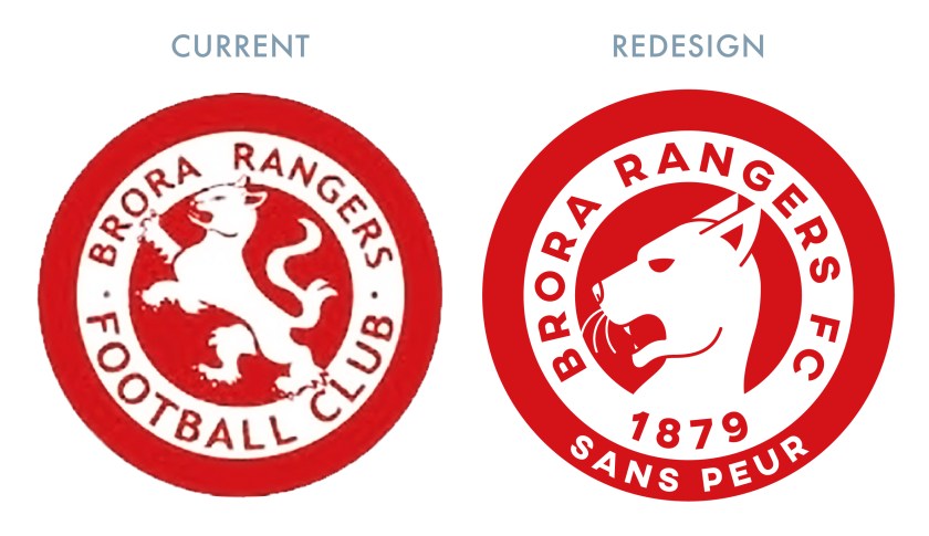
The club’s current badge is a play on their nickname, ‘the Cattachs’, a term relating to the ancient Pictish tribe of Cat (or Catt) that inhabited what would become Sutherland and Caithness (a Cattach is now a demonym for someone from Sutherland). In the badge, we find a white heraldic cat rampant. For the redesign, I did not wish to stray far from the current badge, as I find its broad red border very attractive. But I found the particular depiction of a cat rampant to be both confusing and somewhat innocuous. I decided to illustrate a close-up of a cat rampant head, which, I hope, suggests both a cat and the ‘rampant’ attitude of the club ready to ‘attack’. I also included the year of the club’s founding, being one of the older clubs in the Highland League, as well as the French motto of Clan Sutherland, Sans peur, ‘Without fear’.

BroRFC badge-01

For the home shirt redesign, I was inspired by the Milan-Europe shirt worn by Brora Rangers for the 1993/94 season. The black in both the home and away kits represents the Flow Country, vast expanses of peatland in Sutherland.

BroRFC kit-01

BroRFC badge new-01

13 January 201924 February 2020 E Tagged badge, Brora, Brora Rangers, Brora Rangers FC, Brora Rangers Football Club, Cattachs, Clan Sutherland, crest, Europe, football, French, HFL, Highland Football League, Highlands, logo, rebrand, redesign, Scotland, Scottish Highland Football League, SHFL, sport, Sutherland, texture, UK, United Kingdom 1 Comment

ReBrand: Highland Football League

graphic

hfl badge new-01I first began redesigning Scottish football badges in 2013 as a personal challenge. In 2018, I set myself the task of tweaking or completely redesigning my initial rebrandings, and completing badge and strip redesigns for the entirety of the Scottish Professional Football League.
Now that 2019 is upon us, I have decided to embark on the natrual next step on my obsessive design project: the Scottish Highland and Lowland Football Leagues. As things go, historical resources for many of the clubs in these non-professional Scottish leagues are lacking. But I have ventured to utilise as much as the respective club/local histories as is available more readily in order to develop significant and [hopefully] interesting designs. I began with this redesign of the Highland Football League badge.

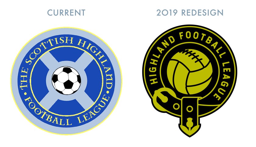
For this redesign, I decided to go with a black and mustard colour scheme, calling back to an earlier incarnation of the Highland Football League badge. Because the symbolism of the current badge, consisting only of a football and Saltire, doesn’t suggest a relationship with the highlands specifically, I decided to make use to of the strap and buckle found in many of the coats of arms of Scottish clans, which indicates that the wearer is aligned to a particular crest and motto (i.e., the clan chief). I also incorporated a small thistle on the end of the strap. As with the current badge, this redesigned badge is intended to be worn on the left sleeve of each club’s football shirt.

hfl logo-01

hfl badge new-01


12 January 201912 January 2019 E Tagged badge, crest, Europe, football, HFL, Highland Football League, Highlands, logo, rebrand, redesign, Scotland, Scottish Highland Football League, SHFL, sport, texture, UK, United Kingdom Leave a comment

Posts navigation

← Previous
Next →
Widgets
Create a website or blog at WordPress.com
Privacy & Cookies: This site uses cookies. By continuing to use this website, you agree to their use.
To find out more, including how to control cookies, see here: Cookie Policy
  • Follow Following
    • ellliottt
    • Join 53 other followers
    • Already have a WordPress.com account? Log in now.
    • ellliottt
    • Customize
    • Follow Following
    • Sign up
    • Log in
    • Report this content
    • View site in Reader
    • Manage subscriptions
    • Collapse this bar
 

Loading Comments...