ellliottt

design & illustration

Menu

Skip to content
  • HOME
  • ABOUT
  • GRAPHIC
    • ALL GRAPHIC DESIGN
    • AUTOMOTIVUS
    • REBRAND: SPFL
      • Premiership
        • Aberdeen
        • Celtic
        • Dundee United
        • Heart of Midlothian
        • Hibernian
        • Kilmarnock
        • Livingston
        • Motherwell
        • Rangers
        • Ross County
        • St Johnstone
        • St Mirren
      • Championship
        • Arbroath
        • Ayr United
        • Cove Rangers
        • Dundee
        • Greenock Morton
        • Hamilton Academical
        • Inverness CT
        • Partick Thistle
        • Queen’s Park
        • Raith Rovers
      • League One
        • Airdrieonians
        • Alloa Athletic
        • Clyde
        • Dunfermline Athletic
        • FC Edinburgh
        • Falkirk
        • Kelty Hearts
        • Montrose
        • Peterhead
        • Queen of the South
      • League Two
        • Albion Rovers
        • Annan Athletic
        • Bonnyrigg Rose
        • Dumbarton
        • East Fife
        • Elgin City
        • Forfar Athletic
        • Stenhousemuir
        • Stirling Albion
        • Stranraer
    • REBRAND: SHFL
      • Brechin City
      • Brora Rangers
      • Buckie Thistle
      • Clachnacuddin
      • Deveronvale
      • Formartine United
      • Forres Mechanics
      • Fraserburgh
      • Huntly
      • Inverurie Loco Works
      • Keith
      • Lossiemouth
      • Nairn County
      • Rothes
      • Strathspey Thistle
      • Turriff United
      • Wick Academy
    • REBRAND: SLFL
      • Berwick Rangers
      • Bo’ness United
      • Broomhill
      • Caledonian Braves
      • Civil Service Strollers
      • Cowdenbeath
      • Cumbernauld Colts
      • Dalbeattie Star
      • East Kilbride
      • East Stirlingshire
      • Edinburgh University
      • Gala Fairydean Rovers
      • Gretna 2008
      • Spartans
      • Tranent Juniors
      • University of Stirling
  • 2D
  • 3D
    • ALL 3D
    • INSTALLATION
  • PHOTO
  • SHOP

logo

ReBrand: Íslenska karlalandsliðið í knattspyrnu

graphic

It’s been a long while since my last ReBrand post. Being that we’re in the latter stages of the 2016 Euros, I thought that I ought to branch out of the SFA (at least for this one design) and venture into the world of international football. And what better side to celebrate than those wonderful underdogs, Íslenska karlalandsliðið í knattspyrnu, or, to us non-Íslendingar, the Iceland national football team. Iceland’s top football division, Úrvalsdeild, was established in 1912, though their first international match did not take place until 29 July 1930, when Iceland won 1-0 at the Faroe Islands. The Football Association of Iceland (Knattspyrnusamband Íslands, or KSÍ), and in turn, Iceland’s FIFA membership, was not established until 1947.

This year’s Euros were Iceland’s first major tournament appearance. And whilst they are most definitely the smallest nation to have ever qualified for a major tournament (with a population of some 334,000), Iceland has inspired many viewers (and perhaps especially many of us in Scotland, who did not qualify for the tournament) with their surprising results. They opened up the group stage with 1-1 draws against Portugal and Hungary, before sealing their place in the Round of 16 with a 2-1 victory over Austria. Most shockingly, Iceland produced a stunning display against England (another 2-1 victory), advancing to the Quarter-finals. Their run was ended on 3 July by tournament hosts France (5-2).

Iceland’s spirit remains inspirational — sharing a 10,000+ person ritual (the now-famous ‘Viking clap’) upon their return home.

One thing that struck me about Iceland from the very start was the state of their kit, the KSÍ badge being perhaps the most distracting element for someone of my depraved disposition.

I have been impressed by Matthew Wolff, designer with New York City FC, who already had the idea to redesign the Iceland badge, basing it on a previous incarnation. Wolff’s design features a semi-runic styled KSÍ, flanked by two halves of a football, all set in front of an iceberg. He even pitched the idea to the KSÍ. Whilst Wolff’s design is striking, I’m not quite sure that an iceberg is representative of the whole of Iceland (with most of its sea ice originating from other places).

Coming up with [what I consider to be] a decent and somewhat meaningful rebrand for the KSÍ has been quite challenging, in part due to the fact that ancient Iceland produced a large number of compelling norse designs, such as Ægishjálmr (the Helm of Awe). But below I have settled on something perhaps more simplified.

KSÍ old

KSÍ final

6 July 20163 August 2017 E Tagged 2016 UEFA European Championship, Íslenska karlalandsliðið í knattspyrnu, badge, branding, Euro 2016, Europe, Euros, football, Football Association of Iceland, France, Iceland, Iceland national football team, island, Knattspyrnusamband Íslands, KSÍ, logo, Matthew Wolff, rebrand, sport, UEFA, UEFA Euro 2016 Leave a comment

ReBrand: Partick Thistle FC Update

graphic

Back in May 2013, I tried my hand at redesigning the Partick Thistle Football Club badge. I wrote,

‘I actually think the current crest is very strong, but I experimented with trying to tie a bit more history into it. Being that Partick Thistle has actually played in Maryhill (as opposed to Partick) since 1909, I wanted to find a way to acknowledge their mixed history by blending elements of both the Partick and Maryhill coats of arms in order to form the crest centrepiece. But that design proved too busy (it might be able to be retooled later). So for Partick Thistle I simply changed the typeface and added a few rings to frame the crest better…’

Truth be told, I was never content with the redesign because it wasn’t much a redesign at all. So I revisited the badge (something I hope to do with some other Scottish Premiership badges in the near future) and came up with something very different:

Partick Thistle FC oldI decided to add a more stylised thistle atop a traditional shield. It’s something like a throwback to 1970s style and I find it different enough to satisfy me.

Partick Thistle FC final

18 November 20143 August 2017 E Tagged association football, badge, crest, Europe, football, Glasgow, logo, Maryhill, Partick, Partick Thistle, Partick Thistle FC, Partick Thistle Football Club, rebrand, redesign, Scotland, Scottish Football Association, Scottish Premiership, Scottish Professional Football League, SFA, SP, SPFL, sport, UK, United Kingdom Leave a comment

Renfield St Stephen’s Parish Church logo

graphic

RSSPC

26 May 201428 May 2014 E Tagged brand, Christianity, church, Church of Scotland, Europe, Glasgow, logo, religion, Renfield St Stephen's, Renfield St Stephen's Parish Church, RSS, Scotland, UK, United Kingdom, window Leave a comment

Renfield St Stephen’s logo

graphic

RSS

26 May 201428 May 2014 E Tagged branding, Europe, Glasgow, logo, Renfield St Stephen's, RSS, Scotland, UK, United Kingdom Leave a comment

Swim Team

graphic

SWIM TEAM BADGE SWIMMING COSTUMES WAVES

Facebook | Twitter

30 January 201428 May 2014 E Tagged badge, band, branding, Glasgow, logo, Matt Regan, music, Swim Team, texture, theatre Leave a comment

ReBrand: SPL

graphic

Have you ever noticed how poor some of the designs that we in the Western World are forced to encounter actually are? I’ve noticed. It’s a pathetic thing to get hung up on, but if I was going to go through the effort of raising a sign for my storefront I’d have to make sure that I was satisfied with the aesthetic quality of the sign. That’s probably because I have problems. But say you wanted to investigate a particular establishment—a restaurant, a potential employer, a potential church, anything really—on the Internet and you could barely navigate your way through an out of date website. Some of these websites were never ‘in date’ to begin with. If a newspaper looks too busy or scattered, I don’t want to read it. If I wanted to buy a new pair of running shoes my inclination would be to choose a shop that looked legitimate, aesthetically legitimate. As a designer, the whole package is valuable to me. So, thanks to last night’s insomnia, I finally got around to starting a design project called ‘ReBrand’. My intention is to take common logos and brands and give them a wee bit of an adjustment. I’m not prepared to say that I can make any vast improvements, but I figured that when I’m taking wee breaks from my daily PhD research [anxiety setting in at the mere mention of PhD research…] I could occupy myself with this project. At the very least, I can focus my mind on other things and practise my design technique.

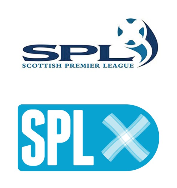
I’ve decided that I’d start this project with something close to my heart – football. And in Scottish football there’s no shortage of lazy designs. I’ll probably focus solely on the Scottish Premier League, as it is the top tier of professional Scottish football. So below you have the current SPL logo, and below it you have a quick wee redesign I’ve been playing with:

SPL old

I thought that the saltire (Scottish flag) on the football was effective in the current logo, so I kept a subtle ball in there and added a bit of a tartan for the white cross. And here’s a texture for more fun…

ReBrand SPL

UPDATE: This summer the SPL was abolished and replaced by the Scottish Premiership which is the top tier of the new Scottish Professional Football League. The new SPFL logo isn’t too bad:

SPFL

20 May 20133 August 2017 E Tagged brand, Europe, football, logo, rebrand, redesign, Scotland, Scottish Premier League, Scottish Premiership, Scottish Professional Football League, SP, SPFL, SPL, sport, texture, UK, United Kingdom 1 Comment

Posts navigation

Next →
Widgets
Create a website or blog at WordPress.com
Privacy & Cookies: This site uses cookies. By continuing to use this website, you agree to their use.
To find out more, including how to control cookies, see here: Cookie Policy
  • Subscribe Subscribed
    • ellliottt
    • Join 53 other subscribers
    • Already have a WordPress.com account? Log in now.
    • ellliottt
    • Subscribe Subscribed
    • Sign up
    • Log in
    • Report this content
    • View site in Reader
    • Manage subscriptions
    • Collapse this bar
 

Loading Comments...