ellliottt

design & illustration

Menu

Skip to content
  • HOME
  • ABOUT
  • GRAPHIC
    • ALL GRAPHIC DESIGN
    • AUTOMOTIVUS
    • REBRAND: SPFL
      • Premiership
        • Aberdeen
        • Celtic
        • Dundee United
        • Heart of Midlothian
        • Hibernian
        • Kilmarnock
        • Livingston
        • Motherwell
        • Rangers
        • Ross County
        • St Johnstone
        • St Mirren
      • Championship
        • Arbroath
        • Ayr United
        • Cove Rangers
        • Dundee
        • Greenock Morton
        • Hamilton Academical
        • Inverness CT
        • Partick Thistle
        • Queen’s Park
        • Raith Rovers
      • League One
        • Airdrieonians
        • Alloa Athletic
        • Clyde
        • Dunfermline Athletic
        • FC Edinburgh
        • Falkirk
        • Kelty Hearts
        • Montrose
        • Peterhead
        • Queen of the South
      • League Two
        • Albion Rovers
        • Annan Athletic
        • Bonnyrigg Rose
        • Dumbarton
        • East Fife
        • Elgin City
        • Forfar Athletic
        • Stenhousemuir
        • Stirling Albion
        • Stranraer
    • REBRAND: SHFL
      • Brechin City
      • Brora Rangers
      • Buckie Thistle
      • Clachnacuddin
      • Deveronvale
      • Formartine United
      • Forres Mechanics
      • Fraserburgh
      • Huntly
      • Inverurie Loco Works
      • Keith
      • Lossiemouth
      • Nairn County
      • Rothes
      • Strathspey Thistle
      • Turriff United
      • Wick Academy
    • REBRAND: SLFL
      • Berwick Rangers
      • Bo’ness United
      • Broomhill
      • Caledonian Braves
      • Civil Service Strollers
      • Cowdenbeath
      • Cumbernauld Colts
      • Dalbeattie Star
      • East Kilbride
      • East Stirlingshire
      • Edinburgh University
      • Gala Fairydean Rovers
      • Gretna 2008
      • Spartans
      • Tranent Juniors
      • University of Stirling
  • 2D
  • 3D
    • ALL 3D
    • INSTALLATION
  • PHOTO
  • SHOP

monogram

ReBrand: St Mirren FC

graphic

SMFC badge new-01St Mirren Football Club was established in 1877. Similarly to Kilmarnock in 1869, Heart of Midlothian in 1874 (potentially), St Johnstone in 1884 and Dunfermline Athletic in 1885, St Mirren FC was formed when members of St Mirren Cricket Club took a notion to play football in the winter months to keep up fitness levels. So highly were St Mirren regarded even in these early years that the club were invited to become founding members of the Scottish Football League in 1890.

By 1908, St Mirren reached the first of their six Scottish Cup finals, but their opponents, Celtic, proved too strong for the Buddies. St Mirren had another shot at glory against Celtic in the 1925/26 final, which would be their first of three Scottish Cup victories (the others being 1958/59 and 1986/87). More recently, the Buddies reached their first Scottish League Cup final on 17 March 2013, defeating Hearts 3-2 at Hampden Park.

Unfortunately for St Mirren, the high of their 2012/13 Scottish League Cup would be followed by the low of their relegation to the second tier at the end of the 2014/15 season. After three seasons in the Scottish Championship, the Buddies returned to the top tier for the 2018/19 season.

The St Mirren kit first included a badge—consisting of the Paisley coat of arms and a banner reading ‘St Mirren FC’—during the Second World War. A badge was not used consistently until the 1950s. Slight variations of this badge were used on and off throughout the sixties and seventies. From 1981 until 1984, a new badge was used, which reduced the size of the Paisley coat of arms inside a black and white striped shield. Supporters were not keen on this badge, and so the club reused the earlier coat of arms badge.

In 1995, the coat of arms was first placed inside a circle, though the inclusion of the traditional mural crown brought a legal challenge from the Court of the Lord Lyon, as a 1672 law requires that all coats of arms in Scotland must be registered. The club bypassed this challenge the following season by creating a more figurative mural crown of black and white stripes for which the Saints are known, present in the current badge.

While I do not find the current St Mirren badge particularly weak, there is a displeasing heaviness to the design. We’ve got this busy coat of arms (with an intrusive and thick black border), surrounded by a clunky typeface and the heavy black and white stripes of the mural crown. These stripes, in particular, create an aesthetic incoherence.

For my redesign, I began by sketching a crosier (a hooked staff carried by an abbot or bishop as a symbol of pastoral office). Most depictions of Paisley’s coat of arms feature an abbot holding a crosier, as Paisley’s patron saint, Mirren (or St Mirin) is considered the founder of the community that occupied the site of what would become the Abbey of St James and St Mirren, now known as Paisley Abbey. Most heraldic depictions of abbots include the head of the crosier closed in on itself, like a spiral, indicating the abbot’s pastoral care for the ‘inward’ community of the monastery. The head of a bishop’s crosier, on the other hand, is depicted as terminating outward.

In my sketching, I realised that an outward-pointing crosier can be designed to look very much like an ‘S’. I chose to abandon the heraldic convention for the sake of the design in order to make the minimalistic monogram of the redesign. The ‘S’ and ‘T’, for ‘Saint’, are part of the crosier, with an ‘M’ passing through the middle. I have also included three stars within the crosier head to commemorate St Mirren’s three Scottish Cup victories. The crosier monogram is enclosed by a vesica piscis (Latin for ‘bladder of a dish’), calling back to aureolas (a diminutive of the Latin aurea—meaning ‘golden’—to signify the sacredness of a figure) in Christian art as well as to medieval seals and emblems.

SMFC badge-01

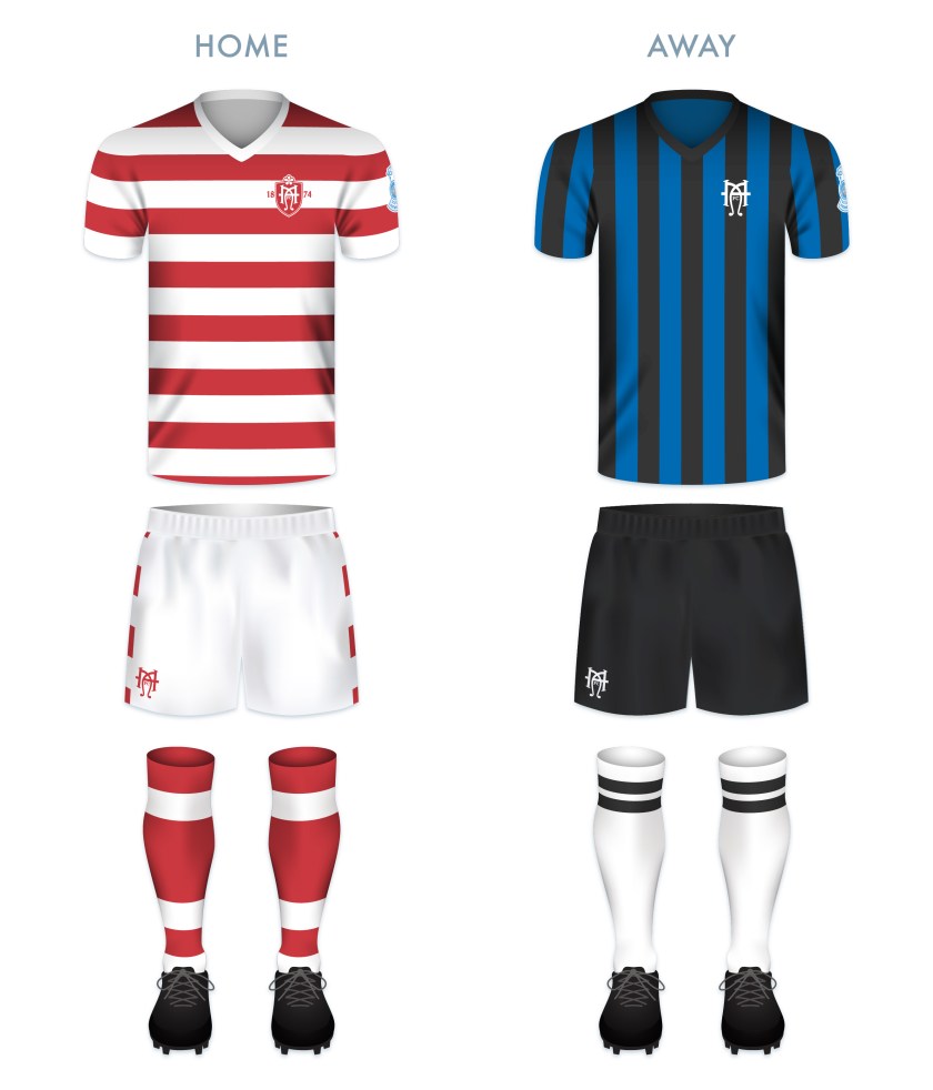
The kit colour schemes are based on traditional St Mirren kits, with the black and white vertical stripes for the home kit and the red featuring in the way kit.

SMFC kit-01

SMFC badge new-01

As ever, I am indebted to Dave at Historical Football Kits for some of the historical information used above.

4 May 201824 February 2020 E Tagged badge, brand, Buddies, Court of the Lord Lyon, crest, Europe, football, Ladbrokes Premiership, logo, Lord Lyon, Lord Lyon King of Arms, monogram, Paisley, rebrand, redesign, Renfrewshire, Saints, Scotland, Scottish Championship, Scottish Premiership, Scottish Professional Football League, SPFL, SPFL Premiership, sport, St Mirren, St Mirren FC, St Mirren Football Club, texture, The Buddies, The Saints, UK, United Kingdom 1 Comment

ReBrand: Greenock Morton FC

graphic

GMFC badge new-01Greenock Morton Football Club was established as Morton Football Club in 1874, making them the sixth oldest football club in Scotland. The precise origin of the name ‘Morton’ is unclear, though it may have been taken from ‘Morton Terrace’, a row of houses where some of the players stayed beside of the club’s original playing field.

Following the formation of the Scottish Football League in 1890, the original Second Division was formed in 1893, with Morton as one of the founding members. In the 1899/1900 season, Morton finished second, one point behind Partick Thistle. The following season, both clubs were admitted into the top tier, with Thistle finishing last and Morton coming in fourth with 21 points, behind Hibernian (25), Celtic (29) and Rangers (35).

Over the coming decade, Morton would remain in the bottom half of the table, but in the 1910s, the club began to show more promise. In the 1913/14 and 1914/15 seasons, Morton came in fourth, and by 1915/16, they finished third. Morton’s finest top tier performance came in the 1916/17 season, when the club finished in the second spot. Four years later, the club’s highest honour came when they won the 1921/22 Scottish Cup with a 1-0 victory over Rangers at Hampden Park.

In the 1926/27 season, Morton finished second-bottom and, alongside last place Dundee United, returned to the second tier for the first time since the 1899/1900 season. Over the coming decades, Morton would experience more promotions (10) and relegations (10) to and from the top tier than any other side in Scottish football, with their most recent spell in top flight football ending with relegation at the end of the 1987/88 season.

The current badge, derived from the Greenock coat of arms, is strong and some variation of it has been used since 1978. Before this, from 1964, a simpler badge, bearing the club’s name and three stars, was used on occasion.

In reworking such a strong badge, I did not want to design something that would appear too similar to other badges. I considered the other clubs which feature a ship in full sail on their badge: Stranraer, formed in 1870 and one of the oldest clubs in Scotland, and Clyde, formed in 1877. The ship on Stranraer’s badge was adopted in 1961, while the ship on Clyde’s badge, from what I can tell, came into being in the mid-1930s. If I wanted to defer either to the age of the club or longevity of the use of a ship in a club’s badge, Stranraer and Clyde, respectively, beat out Morton. The shipbuilding industry is tied very closely to Clyde’s name and it is possible that the presence of a ship on their badge predates the next earliest badge design by more than two decades, so I have gone with a ship in that redesign. It is possible that I have overthought this.

For Morton, I considered using the Free French Memorial on Lyle Hill in Greenock (which honours the fallen sailors of Free French Naval Forces who were based at Greenock from 1940 to 1945), or the James Watt Dock Crane (named after the 19th-century Greenock-born inventor). Ultimately, I departed from local symbolism entirely and adopted the main colours of the current Morton badge to form a modern ‘GM’ monogram (round so as to suggest a football).

GMFC badge-01

For the home shirt, I went with the traditional blue and white hoops, which have featured on the vast majority of Morton’s home shirts from their earliest days (an aborted departure from which caused great unrest among Morton supporters in 2016). For the away shirt, the body is yellow (used commonly among many Morton away strips), with a seafoam green for the collar and sleeves.

GMFC kit-01

GMFC badge new-01

GMFC badge new 02-01.jpg

As ever, I am indebted to Dave at Historical Football Kits for some of the historical information used above.


30 April 201824 February 2020 E Tagged badge, brand, Championship Division, Clyde, Clyde FC, Clyde Football Club, crane, crest, Europe, football, Free French Memorial, Greenock, Greenock Morton, Greenock Morton FC, Greenock Morton Football Club, Inverclyde, James Watt Dock Crane, Ladbrokes Championship, logo, Lyle Hill, monogram, Morton, Morton FC, Morton Football Club, Pride of the Clide, rebrand, redesign, River Clyde, Scotland, Scottish Championship, Scottish Professional Football League, ship, SPFL, SPFL Championship, sport, Stranraer, Stranraer FC, Stranraer Football Club, texture, The Ton, Ton, UK Leave a comment

ReBrand: Rangers FC

graphic

RFC badge new-01In February 1872, brothers and avid rowers Moses and Peter McNeil met with fellow rowers Peter Campbell and William McBeath at Flesher’s Haugh (now part of Glasgow Green), on the northern bank of the River Clyde. It was not rowing that monopolised their attention that morning, but the spectacle of a group of men playing football on the green. Their imaginations were captured and they decided that they would turn their energies to organising their own football team.

Since 1868, Charles Alcock, founding member of the Football Association in England, had been publishing the The Football Annual. While reading the latest Annual, Moses McNeil came across the name Swindon Rangers, an English rugby club. It is from this club that McNeil drew inspiration for his new club’s name. In May, Rangers played their first-ever match, resulting in a 0-0 draw against Callander FC (1872-74).

In these early years, prior to the founding of the Scottish Football League in 1890, Rangers showed themselves to be fierce competitors. Over the next 122 seasons, the club secured the Scottish championship 54 times, more top tier championships than any other football club in the world (as of the end of the 2018/19 season, Celtic, who are on pace for a record-tying nine league championships in-a-row, have amassed 50).

The recent hardships faced by Rangers are no secret in Scottish culture. In 2012, the club entered into administration and was eventually liquidated, with the assets of the club transferred to a new company. Although this reformed Rangers club was unable to regain its place in the top tier, they were accepted into what was then the Scottish Football League (now the Scottish Professional Football League) and began a campaign of securing two consecutive division championships, before stalling in the second tier until the end of the 2015/16 season, when Rangers won the second tier (the Scottish Championship), gaining automatic promotion to the top tier, where they have competed ever since.

Rangers did not incorporate a badge on their kit until 1968. When they did this, they chose a design featuring intertwined club initials. The earliest use of this design was featured in the 1881/82 season ticket. (Another design, which has never featured on a kit, includes a lion rampant and the club motto, ‘READY’. The earliest version of this design was used in 1959.) In 2003, following their fiftieth top tier championship, Rangers added five stars (one for each ten championships) to their badge.

I found this redesign especially difficult as I consider the ‘RFC’ monogram badge to be an outstanding design. But this personal project of rebranding Scottish football clubs has never been about abandoning the old. Instead, it’s an exploration of history and a personal challenge to try new things.

For the rebrand, I designed a typeface inspired by late-nineteenth century aesthetics. I opted to make all five stars the same size, to include the lion rampant as well as the year of Rangers’ founding. It’s nothing too frilly, but clean, simple and traditional.

RFC badge-01 2

The home strip is inspired by several Rangers home strips from the 1980s. The away strip is inspired by historical Rangers away strips from the middle of the twentieth century, especially those used between 1949 and 1952.

RFC kit-01

RFC badge new-01

As ever, I am indebted to Dave at Historical Football Kits for some of the historical information used above.


25 April 201824 February 2020 E Tagged association football, badge, crest, Europe, football, Gers, Glasgow, Glasgow Rangers, Ibrox, Ladbrokes Premiership, logo, monogram, Rangers, Rangers FC, Rangers Football Club, rebrand, redesign, Scotland, Scottish Football Association, Scottish Premiership, Scottish Professional Football League, SPFL Premiership, sport, The Gers, typeface, UK, United Kingdom Leave a comment

ReBrand: Hamilton Academical FC

graphic

HAFC badge new-01Hamilton Academical Football Club was established in 1874 by, as the name suggests, pupils and the rector of Hamilton Academy (1588-1972).

Although the academy’s colours were blue and green, the Accies played in red and white so as to distinguish themselves from the earlier Hamilton Football Club (which folded in 1878).

The Accies competed as founding members of the Lanarkshire Football League from 1893 until, following the resignation of Renton Football Club (1872-1922) in 1897, they were elected to the third division of the Scottish Football League. Since that time, the Accies have reached two Scottish Cup finals (1910/11 and 1934/35), though their spells in the top flight have been mixed. Their best ever top tier performance came in the 1934/35 season, when the Accies finished in fourth place with 48 points, behind Hearts (50), Celtic (52) and Rangers (55).

More recently, at the end of the 2013/14 season, the Accies gained promotion from the Scottish Championship to the Scottish Premiership, joining Dundee in the top tier for the 2014/15 season. Because of 2013’s launch of the Scottish Professional Football League and the restructuring of the Scottish league system, the Accies, who came in just behind Dundee in the Scottish Championship, had another opportunity for promotion by competing in several playoff rounds. There, they faced the Scottish Premiership‘s Hibernian in the second leg of their playoff schedule, playing away at Easter Road with a 0-2 deficit for which they had to make up in order to gain promotion. The Accies performed brilliantly, leading 1-0 at half time and adding a second goal in the 90th minute. After extra time, the score remained 2-0, leaving an aggregate score of 2-2 over two matches, forcing a penalty shootout. In the end, the Hamiltonians were victorious, sending Hibs down to the Scottish Championship and gaining promotion to the top tier for yet another shot at the top tier since their consecutive promotions and relegations in 2008 and 2011, respectively. The Accies’ stay in the top tier would last until the end of the 2020/21 season, when the club finished at the bottom of the table and were relegated to the Scottish Championship.

The Hamilton Academical kit did not feature a badge until 1979, when the current badge was introduced. This badge features a shield with three white cinquefoils derived from the Clan Hamilton coat of arms. The shield is encircled by a ring with the club’s name and founding date. For my redesign, I’ve drawn heavily from the original crest of Hamilton Academy, creating a minimalist ‘HA’ monogram within a shield, topped with a singular white cinquefoil.

HAFC badge-01

I went with the Accies’ classic red and white hoops (used for most home shirts from at least 1876) for the home top and a historical and [an unintentional, though admittedly Inter Milan-esque] black and blue-striped away top. The away strip and both pairs of shorts feature the ‘HA’ monogram alone.

HAFC kit-01

HAFC badge new-01.jpg

As ever, I am indebted to Dave at Historical Football Kits for some of the historical information used above.

23 April 20189 June 2021 E Tagged Accies, badge, crest, Europe, football, Hamilton, Hamilton Academical, Hamilton Academical FC, Hamilton Academical Football Club, Hamilton Academy, Lanarkshire, logo, monogram, rebrand, redesign, Scotland, Scottish Championship, Scottish Professional Football League, South Lanarkshire, SPFL, SPFL Championship, SPFL Premiership, sport, texture, The Accies, UK, United Kingdom Leave a comment

ReBrand: Dundee FC

graphic

DFC badge new-01Established in 1893 by way of a merger between two Dundee football clubs—East End and Our Boys (both formed in 1877)—throughout the club’s history, Dundee Football Club have experienced their fair share of glory. The club won the Scottish Cup in 1909/10, as well as the Scottish League Cup in 1951/52, 1952/53 and 1973/74. The Dee were also crowned 1961/62 Scottish champions and the following season, they reached the semi-final of the European Cup.

But in 2003, Dundee’s future was put in jeopardy. As a result of accruing a £23m debt, the club was placed in administration. The Dee was able to continue operations after selling their stadium and remained in the second tier until 2012, when they gained unexpected promotion into what was then the Scottish Premier League as a result of the financial collapse of Rangers. Unfortunately, Dundee was knocked back down to the second tier after just one season.

Demonstrating their resilience, Dundee fought successfully to win the 2013/14 Scottish Championship (the second tier in Scottish football after the 2013 founding of the Scottish Professional Football League), beating out Hamilton Academical for the title and gaining promotion back to the top tier. Dundee’s fortunes took another knock at the end of the 2018/19 season, when they finished at the bottom of the Premiership table and were relegated to the Championship once again.

In Dundee’s first season back in the Championship, they finished third, but upon the second asking, came in second behind Hearts, earning themselves a place in the Premiership play-off semi-final against Raith Rovers. Having dispatched the Rovers 3-1 over two legs, Dundee went on to face Premiership side Kilmarnock in the final. Dundee were able to hold on, defeating Killie 4-2 over two legs and joining their city rivals Dundee United in the top tier for the 2021/22 season.

In 1952, the Dee first began sporting a club badge on their tops, featuring ‘DFC’ laid out diagonally, enclosed in shield. In 1955, the club began using the current ‘DFC’ badge. By 1970, a new badge, replacing the shield with a circle and red detail, was used on the kit. 1973 saw the return of the ‘DFC’ monogram, though without a shield. This was used until 1987, when a new badge (a variation of the design that appeared after the Second World War on official blazers and publications) was adopted. In 2008, Dundee returned to their original 1955 badge.

While I have long admired the 1955 badge, for my redesign I wanted to draw out more of the club’s history and locale. I drew inspiration from the laurel wreath featured in the badge used from 1987 to 2008 (which has reappeared for the 2019/20 season), as well as the knotted dragons’ tails in the Dundee coat of arms. I also redesigned the lettering of the monogram to be more uniform and proportioned and have added some implied depth by interweaving the letters. In seeking to comply with the ancient Scottish heraldic law forbidding lettering within a shield which is not approved by the Court of the Lord Lyon (something against which clubs like Airdrieonians and Ayr United have struggled), I have omitted the handsome shield surrounding the monogram.

DFC badge-01 2

The home shirt makes use of the traditional Dundee FC colour scheme of dark blue, red and white in a striking geometric arrangement. The away kit is inspired by the 1971/72 home kit and various away kits over the years, most recently, the away kit used for the 2016/17 season.

DFC kit-01

DFC badge new-01

As ever, I am indebted to Dave at Historical Football Kits for some of the historical information used above.

23 April 20189 June 2021 E Tagged badge, crest, Dark Blues, Dee, Dees, DFC, Dundee, Dundee City, Dundee FC, Dundee Football Club, East End, East End FC, East End Football Club, Europe, football, logo, monogram, Our Boys, Our Boys FC, Our Boys Football Club, rebrand, redesign, Scotland, Scottish Premiership, Scottish Professional Football League, SPFL, SPFL Premiership, SPFL Scottish Premiership, sport, texture, The Dark Blues, The Dee, The Dees, UK Leave a comment

Posts navigation

Next →
Widgets
Create a website or blog at WordPress.com
Privacy & Cookies: This site uses cookies. By continuing to use this website, you agree to their use.
To find out more, including how to control cookies, see here: Cookie Policy
  • Subscribe Subscribed
    • ellliottt
    • Join 53 other subscribers
    • Already have a WordPress.com account? Log in now.
    • ellliottt
    • Subscribe Subscribed
    • Sign up
    • Log in
    • Report this content
    • View site in Reader
    • Manage subscriptions
    • Collapse this bar
 

Loading Comments...