ellliottt

design & illustration

Menu

Skip to content
  • HOME
  • ABOUT
  • GRAPHIC
    • ALL GRAPHIC DESIGN
    • AUTOMOTIVUS
    • REBRAND: SPFL
      • Premiership
        • Aberdeen
        • Celtic
        • Dundee United
        • Heart of Midlothian
        • Hibernian
        • Kilmarnock
        • Livingston
        • Motherwell
        • Rangers
        • Ross County
        • St Johnstone
        • St Mirren
      • Championship
        • Arbroath
        • Ayr United
        • Cove Rangers
        • Dundee
        • Greenock Morton
        • Hamilton Academical
        • Inverness CT
        • Partick Thistle
        • Queen’s Park
        • Raith Rovers
      • League One
        • Airdrieonians
        • Alloa Athletic
        • Clyde
        • Dunfermline Athletic
        • FC Edinburgh
        • Falkirk
        • Kelty Hearts
        • Montrose
        • Peterhead
        • Queen of the South
      • League Two
        • Albion Rovers
        • Annan Athletic
        • Bonnyrigg Rose
        • Dumbarton
        • East Fife
        • Elgin City
        • Forfar Athletic
        • Stenhousemuir
        • Stirling Albion
        • Stranraer
    • REBRAND: SHFL
      • Brechin City
      • Brora Rangers
      • Buckie Thistle
      • Clachnacuddin
      • Deveronvale
      • Formartine United
      • Forres Mechanics
      • Fraserburgh
      • Huntly
      • Inverurie Loco Works
      • Keith
      • Lossiemouth
      • Nairn County
      • Rothes
      • Strathspey Thistle
      • Turriff United
      • Wick Academy
    • REBRAND: SLFL
      • Berwick Rangers
      • Bo’ness United
      • Broomhill
      • Caledonian Braves
      • Civil Service Strollers
      • Cowdenbeath
      • Cumbernauld Colts
      • Dalbeattie Star
      • East Kilbride
      • East Stirlingshire
      • Edinburgh University
      • Gala Fairydean Rovers
      • Gretna 2008
      • Spartans
      • Tranent Juniors
      • University of Stirling
  • 2D
  • 3D
    • ALL 3D
    • INSTALLATION
  • PHOTO
  • SHOP

SPFL League 2

ReBrand: Stranraer FC

graphic

StrFC badge new-01Stranraer Football Club was established in 1870, making it the third-oldest club in Scotland, after Queen’s Park, (1867) and Kilmarnock (1869).

Due to Stranraer’s relatively remote location, fixtures in these early years were often played away from the town, in other parts of Wigtownshire, in Kirkcudbrightshire and even as far north as Ayrshire. Finally, in 1907, a permanent home was found in the town and Stair Park came to be. By the 1955/56 season, Stranraer began competing as full members of the Scottish Football League.

Stranraer first used a badge on their kit in the mid-1950s. This badge consisted of a red shield enclosing the club’s initials in white. This badge was used until 1961, when it was replaced with another red and white shield, this time, with the club’s initials above a ship at sea, the ship taken from the town’s coat of arms. Some variation of this badge remained until 1988, when a shield featuring only a ship at sea was enclosed by a ring with the club’s name and year of founding. The current badge in an updated version of this 1988 badge.

In redesigning Stranraer’s badge, I considered the two other clubs which feature a ship in full sail on their current badge: Greenock Morton (1874) and Clyde (1877). The ship on Clyde’s badge, from what I can tell, came into being in the mid-1930s. Morton’s badge did not feature a ship until 1978. Given the length of time that Clyde’s badge has been in use and given that I did not want my Stranraer badge redesign to be too similar to either the current badge or the Stranraer coat of arms, I decided to include a ship in my redesign of Clyde’s badge alone.

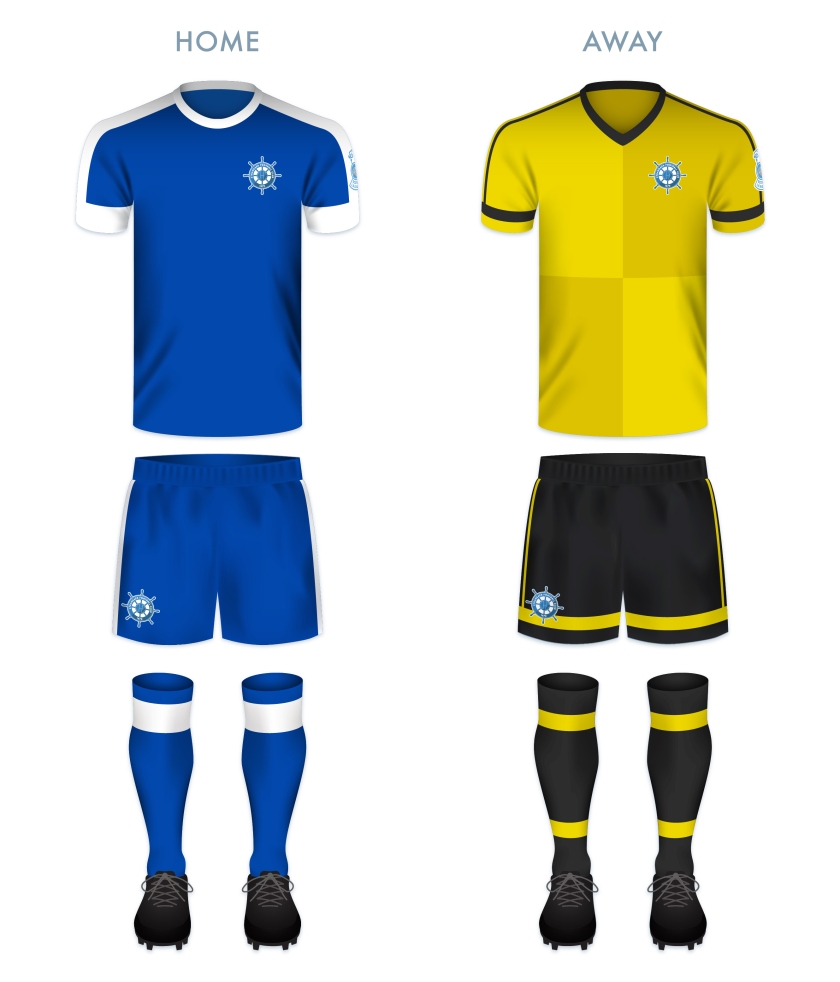
For Stranraer, I settled on a ship’s wheel, as it is distinct among all football badges, it is a timeless symbol (which ties both to the club’s age and to Stranraer’s significance as a port town) and it lends itself to a round badge. I have gone out on a limb so as to include the wheel’s handles beyond the bounds of the badge ring. A t-panelled football sits at the centre of the badge and I have added a second tone of blue to give the badge an extra bit of ‘pop’.

StrFC badge-01

In redesigning the home kit, I first experimented with a wave pattern, but determined that, along with the ship’s wheel badge, this would be over the top. Instead, I have used the traditional Stranraer blue shirt with white accents, drawing particular inspiration from the very tasteful 2008/09 home shirt. The away shirt is bright yellow, with a mustard harlequin pattern, inspired in part by the 1996/97 home kit.

StrFC kit-01

StrFC badge new-01

As ever, I am indebted to Dave at Historical Football Kits for some of the historical information used above.

18 May 201816 June 2020 E Tagged badge, Blues, brand, crest, design, Dumfries and Galloway, Dumfriesshire, Europe, football, Inch, logo, rebrand, redesign, Scotland, Scottish League 2, Scottish League Two, Scottish Professional Football League, SPFL, SPFL League 2, SPFL League Two, sport, Stranraer, Stranraer FC, Stranraer Football Club, The Blues, UK, United Kingdom Leave a comment

ReBrand: Stenhousemuir FC

graphic

SteFC badge new-01.jpgStenhousemuir Football Club was established in 1884 after breaking away from local junior side Heather Rangers Football Club. By 1890, the club was playing their home matches at Ochilview Park, where they have played ever since. In 2009, Stenhousemuir became the first football club in Scotland to become a Community Interest Company (CIC).

The club’s shirt did not feature a badge until 1984, marking their centenary year. This first badge was an odd number, featuring the club’s sponsor, Hogan Sports (written as ‘Hogan’s Sports’ on the badge). From 1985 until 1991, Stenhousemuir’s shirts featured a stylised ‘SFC’ monogram. This was replaced by a heraldic badge, which did not find favour with the club’s supporters. The heraldic emblem was abandoned after two seasons, when a round badge, derived from the 1985 monogram, was introduced. The Stenhousemuir badge has been based on this 1993 design ever since.

For my redesign, I wanted to hold to the spirit of the quirky brown-and-amber 1993 badge. I decided that the badge could benefit from a local or historical reference, without diving into a full-on heraldic design. The town of Stenhousemuir comes from a particular stone structure (‘sten house’ = ‘stone house’). This round structure, referred to as ‘Arthur’s O’en’ (‘Arthur’s Oven’) was most likely a Roman temple and stood to the north of the River Carron. It was demolished in 1743, but not before some detailed illustrations of it were made. One particular illustration of the foundation of the temple served as my inspiration as I found that it suited a round badge. The entrance to the temple also serves as a handsome frame for the lowest terminus of the ‘F’ in my new monogram. My redesign featuring a new monogram and an illustration of the temple’s foundation is found below:

SteFC badge-01

The redesigned kits are based on traditional Stenhousemuir colours, with the home kit inspired primarily by the 2017/18 home kit and the away kit inspired primarily by 2003/04 away kit, with a wee touch of 1980s Adidas kits.

SteFC kit-01

SteFC badge new-01.jpg

As ever, I am indebted to Dave at Historical Football Kits for some of the historical information used above.

16 May 201824 February 2020 E Tagged badge, brand, CIC, Community Interest Company, crest, design, Europe, Falkirk, football, Heather Rangers, Heather Rangers FC, Heather Rangers Football Club, Heather Rangers Juniors, logo, rebrand, redesign, Scotland, Scottish League 2, Scottish League Two, Scottish Professional Football League, SPFL, SPFL League 2, SPFL League Two, sport, Stenhousemuir, Stenhousemuir FC, Stenhousemuir Football Club, Stenhousemuir Football Club Community Interest Company, Stenny, Stenny FC, The Warriors, UK, United Kingdom, Warriors Leave a comment

ReBrand: Albion Rovers FC

graphic

ARFC badge new-01In 1882, two Coatbridge-based football clubs, Albion FC and Rovers FC, merged to form Albion Rovers Football Club. In 1903, these ‘Wee Rovers’ joined the Scottish Football League, competing in the Second Division. During the First World War, the Second Division was suspended and the Rovers would not return to the SFL until 1919. With that season came the club’s greatest achievement.

In the 1919/20 Scottish Cup, the Rovers first defeated Dykehead, advanced through the second round after their match with Huntingtower was scrapped and defeated St Bernard’s in the third round.

The Rovers’ first real challenge in the competition came when they faced Aberdeen in the fourth round. The Wee Rovers prevailed with a 2-1 victory, setting the stage for a semi-final against Rangers. The first match of the semi-final resulted in a 1-1 draw, necessitating a replay. This replay resulted in a 0-0 stalemate. Finally, by the third semi-final match, the Rovers pulled ahead with a 2-0 victory over Rangers.

In the final, the Rovers faced a rampant Kilmarnock side at Celtic Park. Kilmarnock edged their opposition narrowly with a 3-2 victory and the Rovers had to settle for leaving the tournament as runners-up.

Although greater success has eluded Albion Rovers ever since, they have demonstrated their ingenuity and ability to adapt to change by introducing a ‘pay what you can’ season ticket scheme for the 2014/15 season.

In 1961, the Rovers’ first introduced a badge, featuring symbols of the two parent clubs: a rose superimposed over a pair of crossing cutlasses. A variation of this badge has been in use since that time.

Being that the full ‘Albion Rovers’ name has never featured on the club’s kit, I included this within an outer ring. I also included the club’s founding date. For the central shield, I decided to divide the space into triangular quadrants, with a football in the top position and with redesigned versions of Albion FC’s rose and Rovers FC’s cutlasses in the left and right positions, respectively. In the bottom quadrant, I have placed an anvil below a flame. The latter images represent the Rovers’ locale, namely, Coatbridge. The Coatbridge coat of arms features a tower topped with flames, representing the iron and steel industries of Coatbridge. The Coatbridge burgh seal, introduced after the town gained burgh status in 1885, features an assortment of industrial images, including an anvil.

ARFC badge-01

The kit designs make use of the black, red and gold, a colour scheme used in various combinations since the introduction of the first badge in 1961.

ARFC kit-01

ARFC badge new-01


As ever, I am indebted to Dave at Historical Football Kits for some of the historical information used above.


7 May 201824 February 2020 E Tagged Albion FC, Albion Football Club, Albion Rovers, Albion Rovers FC, Albion Rovers Football Club, badge, branding, Coatbridge, crest, Europe, football, Ladbrokes League 2, logo, North Lanarkshire, rebrand, redesign, Rovers, Rovers FC, Rovers Football Club, Scotland, Scottish Cup, Scottish Football Association, Scottish Professional Football League, shield, SPFL League 2, SPFL League Two, sport, The Wee Rovers, UK, United Kingdom, Wee Rovers Leave a comment

Posts navigation

Next →
Widgets
Create a website or blog at WordPress.com
Privacy & Cookies: This site uses cookies. By continuing to use this website, you agree to their use.
To find out more, including how to control cookies, see here: Cookie Policy
  • Subscribe Subscribed
    • ellliottt
    • Join 53 other subscribers
    • Already have a WordPress.com account? Log in now.
    • ellliottt
    • Subscribe Subscribed
    • Sign up
    • Log in
    • Report this content
    • View site in Reader
    • Manage subscriptions
    • Collapse this bar
 

Loading Comments...