ellliottt

design & illustration

Menu

Skip to content
  • HOME
  • ABOUT
  • GRAPHIC
    • ALL GRAPHIC DESIGN
    • AUTOMOTIVUS
    • REBRAND: SPFL
      • Premiership
        • Aberdeen
        • Celtic
        • Dundee United
        • Heart of Midlothian
        • Hibernian
        • Kilmarnock
        • Livingston
        • Motherwell
        • Rangers
        • Ross County
        • St Johnstone
        • St Mirren
      • Championship
        • Arbroath
        • Ayr United
        • Cove Rangers
        • Dundee
        • Greenock Morton
        • Hamilton Academical
        • Inverness CT
        • Partick Thistle
        • Queen’s Park
        • Raith Rovers
      • League One
        • Airdrieonians
        • Alloa Athletic
        • Clyde
        • Dunfermline Athletic
        • FC Edinburgh
        • Falkirk
        • Kelty Hearts
        • Montrose
        • Peterhead
        • Queen of the South
      • League Two
        • Albion Rovers
        • Annan Athletic
        • Bonnyrigg Rose
        • Dumbarton
        • East Fife
        • Elgin City
        • Forfar Athletic
        • Stenhousemuir
        • Stirling Albion
        • Stranraer
    • REBRAND: SHFL
      • Brechin City
      • Brora Rangers
      • Buckie Thistle
      • Clachnacuddin
      • Deveronvale
      • Formartine United
      • Forres Mechanics
      • Fraserburgh
      • Huntly
      • Inverurie Loco Works
      • Keith
      • Lossiemouth
      • Nairn County
      • Rothes
      • Strathspey Thistle
      • Turriff United
      • Wick Academy
    • REBRAND: SLFL
      • Berwick Rangers
      • Bo’ness United
      • Broomhill
      • Caledonian Braves
      • Civil Service Strollers
      • Cowdenbeath
      • Cumbernauld Colts
      • Dalbeattie Star
      • East Kilbride
      • East Stirlingshire
      • Edinburgh University
      • Gala Fairydean Rovers
      • Gretna 2008
      • Spartans
      • Tranent Juniors
      • University of Stirling
  • 2D
  • 3D
    • ALL 3D
    • INSTALLATION
  • PHOTO
  • SHOP

logo

ReBrand: St Johnstone FC

graphic

SJFC badge new-01Like Kilmarnock in 1869, potentially Heart of Midlothian in 1874, St Mirren in 1877 and Dunfermline Athletic in 1885, St Johnstone Football Club was established by off-season cricketers in 1884.

St Johnstone was admitted into the Scottish Football League after the original Port Glasgow Athletic FC (1878), who finished second-bottom in the 1910/11 season, chose not to apply for re-election into the second tier and dissolved soon thereafter. Only three seasons later, the second tier folded, being replaced by two regional leagues. At this stage, St Johnstone suspended operations for several seasons before joining the Eastern Football League in 1919.

By 1920, St Johnstone had joined the Central Football League, in which clubs were permitted to pay their players higher wages than were permitted in the SFL. The draw of these Central League clubs was so great that the SFL, seeking to stifle their competitors, incorporated this Central League into a newly-formed Second Division.

St Johnstone became Second Division champions for the first time at the end of the 1923/24 season. The club returned to the Second Division after finishing at the bottom of the First Division in the 1929/30 season. St Johnstone would return to the top tier on several more occasions, gaining promotion most recently in the 2008/09 season. The club’s highest honour came in the 2013/14 season, when they beat Dundee United 2-0 in the Scottish Cup final at Celtic Park.

St Johnstone’s current badge was one of the biggest inspirations for my initial foray into redesigning Scottish football badges. The badge’s concept itself is strong, being derived from the historic Perth coat of arms. The central shield is born by a double-headed eagle (recalling an important Roman settlement called ‘Bertha’ near Perth). The shield features the AGNUS DEI (‘Lamb of God’), which represents St John the Baptist, the patron saint of Perth. This symbolism also informs the club’s name, as at one point, Perth was often referred to as ‘St John’s Toun’, or ‘St Johnstone’.

While I appreciate the historic symbolism of the current badge, I find the execution displeasing. With my redesign, I sought to retain the essential iconography of the current badge, but to present it with greater unity and clarity.

SJFC badge-01

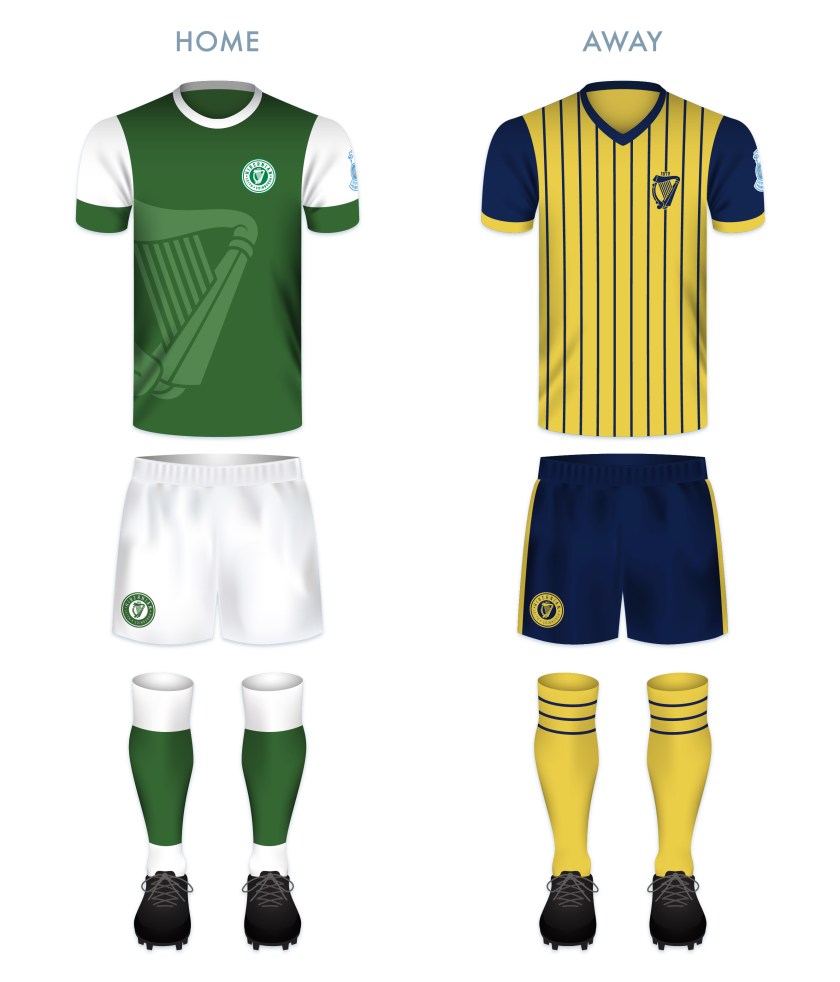
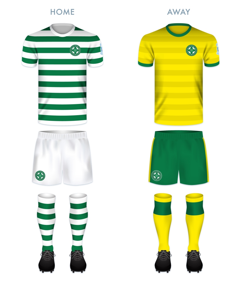
As far as the kits go, I went with a classic solid blue home shirt (complete with a 1970s-styled collar). For the away shirt, I decided to go with a vibrant yellow. To break up the field, I went with minimalist triangles that both hint at an argyle pattern while also suggesting the mountainous Highlands (as Perth is positioned near the Highland Boundary Fault and is sometimes referred to as the ‘Gateway to the Highlands’).

SJFC kit-01

SJFC badge new-01

As ever, I am indebted to Dave at Historical Football Kits for some of the historical information used above.

25 April 201824 February 2020 E Tagged brand, Europe, football, Ladbrokes Premiership, logo, Perth, Perth & Kinross, Perth and Kinross, rebrand, redesign, Saints, Scotland, Scottish Premiership, Scottish Professional Football League, SPFL, SPFL Premiership, sport, St Johnstone FC, St Johnstone Football Club, texture, The Saints, UK, United Kingdom 4 Comments

ReBrand: Rangers FC

graphic

RFC badge new-01In February 1872, brothers and avid rowers Moses and Peter McNeil met with fellow rowers Peter Campbell and William McBeath at Flesher’s Haugh (now part of Glasgow Green), on the northern bank of the River Clyde. It was not rowing that monopolised their attention that morning, but the spectacle of a group of men playing football on the green. Their imaginations were captured and they decided that they would turn their energies to organising their own football team.

Since 1868, Charles Alcock, founding member of the Football Association in England, had been publishing the The Football Annual. While reading the latest Annual, Moses McNeil came across the name Swindon Rangers, an English rugby club. It is from this club that McNeil drew inspiration for his new club’s name. In May, Rangers played their first-ever match, resulting in a 0-0 draw against Callander FC (1872-74).

In these early years, prior to the founding of the Scottish Football League in 1890, Rangers showed themselves to be fierce competitors. Over the next 122 seasons, the club secured the Scottish championship 54 times, more top tier championships than any other football club in the world (as of the end of the 2018/19 season, Celtic, who are on pace for a record-tying nine league championships in-a-row, have amassed 50).

The recent hardships faced by Rangers are no secret in Scottish culture. In 2012, the club entered into administration and was eventually liquidated, with the assets of the club transferred to a new company. Although this reformed Rangers club was unable to regain its place in the top tier, they were accepted into what was then the Scottish Football League (now the Scottish Professional Football League) and began a campaign of securing two consecutive division championships, before stalling in the second tier until the end of the 2015/16 season, when Rangers won the second tier (the Scottish Championship), gaining automatic promotion to the top tier, where they have competed ever since.

Rangers did not incorporate a badge on their kit until 1968. When they did this, they chose a design featuring intertwined club initials. The earliest use of this design was featured in the 1881/82 season ticket. (Another design, which has never featured on a kit, includes a lion rampant and the club motto, ‘READY’. The earliest version of this design was used in 1959.) In 2003, following their fiftieth top tier championship, Rangers added five stars (one for each ten championships) to their badge.

I found this redesign especially difficult as I consider the ‘RFC’ monogram badge to be an outstanding design. But this personal project of rebranding Scottish football clubs has never been about abandoning the old. Instead, it’s an exploration of history and a personal challenge to try new things.

For the rebrand, I designed a typeface inspired by late-nineteenth century aesthetics. I opted to make all five stars the same size, to include the lion rampant as well as the year of Rangers’ founding. It’s nothing too frilly, but clean, simple and traditional.

RFC badge-01 2

The home strip is inspired by several Rangers home strips from the 1980s. The away strip is inspired by historical Rangers away strips from the middle of the twentieth century, especially those used between 1949 and 1952.

RFC kit-01

RFC badge new-01

As ever, I am indebted to Dave at Historical Football Kits for some of the historical information used above.


25 April 201824 February 2020 E Tagged association football, badge, crest, Europe, football, Gers, Glasgow, Glasgow Rangers, Ibrox, Ladbrokes Premiership, logo, monogram, Rangers, Rangers FC, Rangers Football Club, rebrand, redesign, Scotland, Scottish Football Association, Scottish Premiership, Scottish Professional Football League, SPFL Premiership, sport, The Gers, typeface, UK, United Kingdom Leave a comment

ReBrand: Motherwell FC

graphic

MFC badge new-01Motherwell Football Club was established in 1886 at the merging of two Motherwell-based teams: Glencairn FC (established in 1877 and named after the soldier and politician John Glencairn Carter Hamilton, 1st Baron Hamilton of Dalzell) and Alpha FC (established as the Alpha Steam Crane and Engine Works team in 1881).

In 1893, Motherwell became founding members of the Scottish Second Division. By the middle of the 1920s, ‘the Steelmen’ (a reference to the town’s association with heavy industry), were proving themselves in the top tier. Between 1926 and 1934, Motherwell finished every season among the top three in Scottish football. Most notably, they topped the table in the 1931/32 season, becoming the first non-Old Firm club since Third Lanark in 1903/04 and the last until Hibernian in the 1947/48 season to be crowned Scottish champions. Other significant honours include Motherwell’s Scottish League Cup victory of 1950/51 as well as their two Scottish Cup victories in 1951/52 and 1990/91.

Prior to using their current badge (which has been in use since 1982), between 1969 and 1982, Motherwell’s kit featured two versions of the club’s initials, ‘MFC’. The current badge features three fir trees (which represent Fir Park, Motherwell’s home ground since 1895) above a football and the silhouette of the famous Ravenscraig Steelworks (which closed in 1992).

In keeping with Motherwell’s heritage, for my redesign I employed a similar colour scheme and a banner and shield that resemble those found in the current badge. I also updated the fir trees with a wee bit more definition and replaced the steelmill with a cogwheel. The cogwheel represents both the steel industry and the motto found on the Motherwell coat of arms: INDUSTRIA (Latin for ‘diligence’, ‘purpose’ or ‘industry’). The Roman numeral X at the top of the shield is a memorial for Phil O’Donnell, who died of cardiac arrest at age 35 on 29 December 2007, while playing for Motherwell against Dundee United at Fir Park.

MFC badge-01

For the shirts, I decided to go with a pronounced chevron design on the home strip and some thin red hoops on the away strip. The away kit also features a white version of the badge.

MFC kit-01

MFC badge new-01

As ever, I am indebted to Dave at Historical Football Kits for some of the historical information used above.

25 April 20186 March 2020 E Tagged badge, crest, Europe, football, Ladbrokes Premiership, Lanarkshire, logo, Motherwell, Motherwell FC, Motherwell Football Club, Phil O'Donnell, rebrand, redesign, Scotland, Scottish Premiership, Scottish Professional Football League, South Lanarkshire, SPFL, SPFL Premiership, sport, Steelmen, The Steelmen, UK, United Kingdom 2 Comments

ReBrand: Kilmarnock FC

graphic

KFC badge new-01Kilmarnock Football Club was formed in 1869, making it one of the oldest football clubs in the world. Before this time, Kilmarnock was an established cricket club, playing according to rugby football code in the cricket off-season. This rugby football code history is reflected in the naming of the club’s ground, Rugby Park.

Technically speaking, Killie is the 15th oldest association football club in the world (the fifth oldest still playing league football and the oldest competing in top tier league football) and the second oldest Scottish club now playing according to association football code, after Queen’s Park.

Killie’s honours include one top tier championship (1964/65)—which came after finishing as runners-up in four of the five preceding seasons—as well as three Scottish Cup victories (1919/20, 1928/29 and 1996/97) in eight appearances and one Scottish League Cup (2011/12) in six appearances.

The original Kilmarnock badge, featured on their strip from 1873 to 1887, consisted of a football topped with a hand of blessing. This hand symbol was borrowed from the Kilmarnock coat of arms, which itself is taken from the badge of Clan Boyd, whose seat is based in Kilmarnock. The hand represents the sixth-century disciple of St Columba, St Marnon (Gaelic: Cill Mhearnáig or Cill Mo-Ernóc), from whom the name Kilmarnock derives. From 1887 to 1977, the club’s shirt did not feature a badge.

In 1977, an early version of the current badge was incorporated into the kit.  This badge was altered in 1993 and is still used today. The current badge features a football and the hand of blessing, as well as additional heraldic symbols from the Kilmarnock/Boyd coat of arms, including the two supporting red squirrels and the blue and white heraldic wreath. The top of the badge features the Latin motto, Confidemus (‘We trust’), derived from the Boyd motto, Confido (‘I trust’). Below is my initial Kilmarnock redesign that was published on 10 August 2013:Kilmarnock FC oldI was never quite satisfied with the redesign above. I have long appreciated the content of the current Kilmarnock badge, but have found the execution to be lacking. Ultimately, with my redesign here, I decided to go for something far more minimalistic, calling back to the original badge used from 1873 to 1887.

KFC badge-01 2

As far as the kits go, the home strip utilises the established Kilmarnock vertical stripes, first featured on the 1896 home strip and used throughout most of Killie’s history. The away strip borrows its colour and buttoned collar from some of the club’s earliest home shirts.

KFC kit-01

KFC badge new-01

As ever, I am indebted to Dave at Historical Football Kits for some of the historical information used above.

24 April 20189 June 2021 E Tagged Ayrshire, badge, Confidemus, crest, East Ayrshire, Europe, football, Killie, Kilmarnock, Kilmarnock FC, Kilmarnock Football Club, Latin, logo, rebrand, redesign, Scotland, Scottish Championship, Scottish Professional Football League, SPFL, SPFL Championship, SPFL Scottish Championship, sport, St Marnon, UK, United Kingdom 3 Comments

ReBrand: Hibernian FC

graphic

HFC badge new-01During the challenging years of the Great Famine in the nineteenth century, many Irish emigrated to Scotland, with most settling in and around Glasgow. Smaller groups of Irish immigrants settled in the east, especially in Dundee and Edinburgh. A particularly concentrated Irish population settled in the Cowgate area of Edinburgh and it was there that in 1875, Irish-born priest Canon Edward Joseph Hannon of St Patrick’s Church was encouraged by Michael Whelahan to establish a football club in order to promote a life of temperance and religious adherence among the young Irish Catholic male population in Edinburgh. Hibernian Football Club was thus formed, with Whelahan acting as the club’s first captain and Canon Hannon acting as the club’s first manager.

By the late 1880s, Hibs were experiencing numerous difficulties due to mismanagement. When the Scottish Football League was established in 1890, the Hibees played no part in its formation. In 1891, the club’s lease on their home ground expired and many key players left to join the ranks of Celtic, who were already making their mark on the professional game in Scotland. Hibernian seemed all but lost.

The following year, the club was reconstituted and a new home was acquired, this time at Easter Road in Leith. By 1893, Hibs had joined the SFL. Since that time, the club has proven itself as one of the most competitive sides in Scotland by achieving a number of significant domestic honours. The club has been crowned champions of the top tier on four occasions (tied for third most alongside Aberdeen and Hearts), most recently, at the end of the 1951/52 season. Hibernian have also won both the Scottish Cup and the Scottish League Cup on three occasions each (1886/87, 1901/02 and 2015/16, and 1972/73, 1991/92 and 2006/07, respectively).

The first Hibernian badge consisted of a harp within a shield, reflecting their Irish identity. From 1876 to 1879, their shirts featured the letters ‘HFC’ in blackletter across the chest. The Hibs’ kits featured no badge from 1879 to 1980. It was during this period (1920) that Leith was incorporated into the City of Edinburgh. In 1981 the ‘crown crest’ was introduced, which consisted of a football topped by a crown and flanked by two olive branches. Some version of this badge was used until 1989, when a more modern badge was introduced. Hibs’ current badge has been in use since 2000 and reflects much of their history. It features a ship to represent Leith, a harp to represent their Irish heritage and a castle to represent the City of Edinburgh.

While I consider the current Hibs badge to be very strong, I find it a bit busy and disunited. In my redesign, I opted to go for a full-on vintage look, with a typeface that calls back to the time of their foundation and the reintroduction of a harp as the primary icon. I also desired to include both the Leith and Edinburgh heritage by including both names. I used a ‘V’ instead of the ‘U’ in Edinburgh in order to reflect the city’s current branding and the Latin in the club’s name (Hibernia being the Roman name for the island of Ireland).

HFC badge-01 2

I find the dominance of the white in the redesign especially striking against the green field of the home strip (which is based on the classic Hibernian home strip of a green body and white sleeves). I’ve also incorporated a larger, offset harp in a lighter shade of green on the body of the home shirt. For the away strip, I decided to go with a yellow and dark blue colour scheme and a minimalised harp badge, the harp calling back to the first Hibs kit.

HFC kit-01

HFC badge new-01

As ever, I am indebted to Dave at Historical Football Kits for some of the historical information used above.

24 April 201824 February 2020 E Tagged brand, Cabbage, crest, Edinburgh, Europe, football, Hibees, Hibernian, Hibernian FC, Hibernian Football Club, Hibs, Ireland, Ladbrokes Premiership, Latin, Leith, logo, rebrand, redesign, Scotland, Scottish Premiership, Scottish Professional Football League, SPFL, SPFL Premiership, SPL, The Cabbage, The Hibees, UK, United Kingdom 1 Comment

ReBrand: Heart of Midlothian FC

graphic

HMFC badge new-01The precise origin of the Heart of Midlothian Football Club is unclear. A report in The Scotsman from 1864 first mentions ‘Heart of Midlothian’ as a cricket club, though it is not known for certain whether—alongside the likes of Kilmarnock, St Johnstone, Dunfermline Athletic and St Mirren—this cricket club would eventually form the football club of the same name. What is known is that Heart of Midlothian adopted association football rules in 1874, which is considered the official year of the club’s formation.

In 2013, this illustrious club, bearing such domestic honours as four top tier (tied for third most), eight Scottish Cups (fourth most) and four Scottish League Cups (fourth most), began process of entering into administration. This resulted in disciplinary action by the Scottish Football Association, including an embargo on signing new players. Hearts were also forced to begin the 2013/14 season with a fifteen-point deduction.

By the end of the season, Hearts found themselves at the bottom of the top tier table and were relegated to the Scottish Championship (all other things being equal, had they not been deducted the 15 points, they still would have ended the season in a relegation playoff position). But demonstrating profound resilience, Hearts were able to secure promotion to the Scottish Premiership with seven games remaining in the 2014/15 season. With the events of the COVID-19 pandemic, resulting in the wrapping up of the 2019/20 season after 30 matches, Hearts found themselves relegated back to the Scottish Championship for the 2020/21 season. Their stay wouldn’t last long, as Hearts topped the table for a return to the Premiership for the 2021/22 season.

As far as badges go, the current Hearts badge is very strong. The image is based on a mosaic that can be found on the pavement near St Giles Cathedral on the Royal Mile in Edinburgh. The mosaic sits on the site of the Old Tolbooth (which stood between c.1400 and 1817), the former administrative centre of Edinburgh as well as the site of a prison and public executions.

With my redesign, I wanted to call back to an earlier age without doing away with the current badge completely, borrowing some features from the club’s previous badges, namely, the vertical bars supporting a central heart. I incorporated the more obtuse heart and gold lettering found in the current badge. I also incorporated a subtle Saltire in the inner and outer rings.

HMFC badge-01

For both the home and away kits, I went with a pared-down, 1970s look.

HMFC kit-01

HMFC badge new-01

As ever, I am indebted to Dave at Historical Football Kits for some of the historical information used above.

24 April 20189 June 2021 E Tagged badge, crest, Edinburgh, Europe, football, Heart of Midlothian, Heart of Midlothian FC, Heart of Midlothian Football Club, Hearts, Hearts FC, Hearts Football Club, HMFC, Jam Tarts, Jambos, logo, rebrand, redesign, Scotland, Scottish Premiership, Scottish Professional Football League, SPFL, SPFL Premiership, SPFL Scottish Premiership, sport, texture, The Jam Tarts, The Jambos, UK, United Kingdom 1 Comment

ReBrand: Hamilton Academical FC

graphic

HAFC badge new-01Hamilton Academical Football Club was established in 1874 by, as the name suggests, pupils and the rector of Hamilton Academy (1588-1972).

Although the academy’s colours were blue and green, the Accies played in red and white so as to distinguish themselves from the earlier Hamilton Football Club (which folded in 1878).

The Accies competed as founding members of the Lanarkshire Football League from 1893 until, following the resignation of Renton Football Club (1872-1922) in 1897, they were elected to the third division of the Scottish Football League. Since that time, the Accies have reached two Scottish Cup finals (1910/11 and 1934/35), though their spells in the top flight have been mixed. Their best ever top tier performance came in the 1934/35 season, when the Accies finished in fourth place with 48 points, behind Hearts (50), Celtic (52) and Rangers (55).

More recently, at the end of the 2013/14 season, the Accies gained promotion from the Scottish Championship to the Scottish Premiership, joining Dundee in the top tier for the 2014/15 season. Because of 2013’s launch of the Scottish Professional Football League and the restructuring of the Scottish league system, the Accies, who came in just behind Dundee in the Scottish Championship, had another opportunity for promotion by competing in several playoff rounds. There, they faced the Scottish Premiership‘s Hibernian in the second leg of their playoff schedule, playing away at Easter Road with a 0-2 deficit for which they had to make up in order to gain promotion. The Accies performed brilliantly, leading 1-0 at half time and adding a second goal in the 90th minute. After extra time, the score remained 2-0, leaving an aggregate score of 2-2 over two matches, forcing a penalty shootout. In the end, the Hamiltonians were victorious, sending Hibs down to the Scottish Championship and gaining promotion to the top tier for yet another shot at the top tier since their consecutive promotions and relegations in 2008 and 2011, respectively. The Accies’ stay in the top tier would last until the end of the 2020/21 season, when the club finished at the bottom of the table and were relegated to the Scottish Championship.

The Hamilton Academical kit did not feature a badge until 1979, when the current badge was introduced. This badge features a shield with three white cinquefoils derived from the Clan Hamilton coat of arms. The shield is encircled by a ring with the club’s name and founding date. For my redesign, I’ve drawn heavily from the original crest of Hamilton Academy, creating a minimalist ‘HA’ monogram within a shield, topped with a singular white cinquefoil.

HAFC badge-01

I went with the Accies’ classic red and white hoops (used for most home shirts from at least 1876) for the home top and a historical and [an unintentional, though admittedly Inter Milan-esque] black and blue-striped away top. The away strip and both pairs of shorts feature the ‘HA’ monogram alone.

HAFC kit-01

HAFC badge new-01.jpg

As ever, I am indebted to Dave at Historical Football Kits for some of the historical information used above.

23 April 20189 June 2021 E Tagged Accies, badge, crest, Europe, football, Hamilton, Hamilton Academical, Hamilton Academical FC, Hamilton Academical Football Club, Hamilton Academy, Lanarkshire, logo, monogram, rebrand, redesign, Scotland, Scottish Championship, Scottish Professional Football League, South Lanarkshire, SPFL, SPFL Championship, SPFL Premiership, sport, texture, The Accies, UK, United Kingdom Leave a comment

ReBrand: Dundee FC

graphic

DFC badge new-01Established in 1893 by way of a merger between two Dundee football clubs—East End and Our Boys (both formed in 1877)—throughout the club’s history, Dundee Football Club have experienced their fair share of glory. The club won the Scottish Cup in 1909/10, as well as the Scottish League Cup in 1951/52, 1952/53 and 1973/74. The Dee were also crowned 1961/62 Scottish champions and the following season, they reached the semi-final of the European Cup.

But in 2003, Dundee’s future was put in jeopardy. As a result of accruing a £23m debt, the club was placed in administration. The Dee was able to continue operations after selling their stadium and remained in the second tier until 2012, when they gained unexpected promotion into what was then the Scottish Premier League as a result of the financial collapse of Rangers. Unfortunately, Dundee was knocked back down to the second tier after just one season.

Demonstrating their resilience, Dundee fought successfully to win the 2013/14 Scottish Championship (the second tier in Scottish football after the 2013 founding of the Scottish Professional Football League), beating out Hamilton Academical for the title and gaining promotion back to the top tier. Dundee’s fortunes took another knock at the end of the 2018/19 season, when they finished at the bottom of the Premiership table and were relegated to the Championship once again.

In Dundee’s first season back in the Championship, they finished third, but upon the second asking, came in second behind Hearts, earning themselves a place in the Premiership play-off semi-final against Raith Rovers. Having dispatched the Rovers 3-1 over two legs, Dundee went on to face Premiership side Kilmarnock in the final. Dundee were able to hold on, defeating Killie 4-2 over two legs and joining their city rivals Dundee United in the top tier for the 2021/22 season.

In 1952, the Dee first began sporting a club badge on their tops, featuring ‘DFC’ laid out diagonally, enclosed in shield. In 1955, the club began using the current ‘DFC’ badge. By 1970, a new badge, replacing the shield with a circle and red detail, was used on the kit. 1973 saw the return of the ‘DFC’ monogram, though without a shield. This was used until 1987, when a new badge (a variation of the design that appeared after the Second World War on official blazers and publications) was adopted. In 2008, Dundee returned to their original 1955 badge.

While I have long admired the 1955 badge, for my redesign I wanted to draw out more of the club’s history and locale. I drew inspiration from the laurel wreath featured in the badge used from 1987 to 2008 (which has reappeared for the 2019/20 season), as well as the knotted dragons’ tails in the Dundee coat of arms. I also redesigned the lettering of the monogram to be more uniform and proportioned and have added some implied depth by interweaving the letters. In seeking to comply with the ancient Scottish heraldic law forbidding lettering within a shield which is not approved by the Court of the Lord Lyon (something against which clubs like Airdrieonians and Ayr United have struggled), I have omitted the handsome shield surrounding the monogram.

DFC badge-01 2

The home shirt makes use of the traditional Dundee FC colour scheme of dark blue, red and white in a striking geometric arrangement. The away kit is inspired by the 1971/72 home kit and various away kits over the years, most recently, the away kit used for the 2016/17 season.

DFC kit-01

DFC badge new-01

As ever, I am indebted to Dave at Historical Football Kits for some of the historical information used above.

23 April 20189 June 2021 E Tagged badge, crest, Dark Blues, Dee, Dees, DFC, Dundee, Dundee City, Dundee FC, Dundee Football Club, East End, East End FC, East End Football Club, Europe, football, logo, monogram, Our Boys, Our Boys FC, Our Boys Football Club, rebrand, redesign, Scotland, Scottish Premiership, Scottish Professional Football League, SPFL, SPFL Premiership, SPFL Scottish Premiership, sport, texture, The Dark Blues, The Dee, The Dees, UK Leave a comment

ReBrand: Celtic FC

graphic

CFC badge new-01This whole ReBrand project was first inspired by my toying around with the iconic Celtic badge over over many years. Established in 1888, Celtic has become one of the most adorned and respected football clubs in the world. As of the end of the 2018/19 season, their honours include being crowned Scottish champions on 50 occasions, 39 Scottish Cups and 18 Scottish League Cups.

Celtic’s most successful season came in 1966/67, when the club participated in five competitions (the Scottish First Division, the Scottish Cup, the Scottish League Cup, the Glasgow Cup and the European Cup), winning each one. Their 2-1 European Cup victory over Inter Milan made Celtic the first British and only Scottish club to have achieved the honour. In addition to these highlights, for three consecutive seasons (2016/17, 2017/18 and 2018/19), Celtic have won every domestic trophy on offer (nine), completing the first Scottish ‘treble-treble’ (no other Scottish side has even won the domestic treble in two consecutive seasons).

Redesigning the badge of such an iconic football club (with some of the most devoted supporters in the world) was a daunting task, even if my alterations were only for fun.

The beginning of Celtic can be dated from a meeting held in the hall of St Mary’s Catholic Church in the Calton district of Glasgow. The meeting was led by Marist Brother Walfrid (born Andrew Kerins in Ballymote, Ireland), who proposed that a football club be established to raise funds for the alleviation of the rampant poverty in Glasgow’s East End, similar to the mission of Edinburgh’s Hibernian Football Club when it was established in 1875. In fact, on 28 May 1888, when Celtic played their first match (a 5-2 victory over Rangers at Glasgow Green), many of the side’s players were borrowed from Hibernian.

Celtic’s original strip featured a green Celtic cross within a red oval. In 1889 they adopted vertical green and white stripes for their home shirt, without a badge. The vertical stripes were replaced by their now-famous hoops in 1903. During the first half of the twentieth century, the club’s home strip lacked a badge, but their away tops featured a large three-leafed shamrock from time to time between 1925 and 1965. Celtic’s shirts did not feature a regular badge until 1977 (based on a badge that first appeared on the cover of their 50th [Golden] Jubilee Dinner menu in 1938), upon which most of their subsequent badges have been based. In 1988, the club celebrated their centenary with a badge derived from the Celtic cross of their very first badge. The following season they reverted back to their 1977 badge.

In 1994, the badge was updated very slightly and this design remained unaltered until the 2007/08 season, when Celtic celebrated the 40th anniversary of their European Cup victory with the addition of a star.

Badge historyAfter the 2007/08 season, the star was retained and the badge remained the same until 2012/13 season, when Celtic celebrated their 125th anniversary by using a 1994 badge encircled by an attractive Celtic knot and an alternative badge featuring a Celtic cross.

125th-badges-sm.jpg

For the 2017/18 season, Celtic utilised the badge below, commemorating 50 years since their historic European Cup victory:

50th anniversary

I found the cross and the knot from the 2012/13 badges too attractive to disregard entirely. For my redesign, I have incorporated both (with the Celtic cross calling back to the original 1888 badge and the 1988 centenary badge). In addition to the Celtic knot and cross, I changed and centred the typeface.

CFC badge-01 2

For the home shirt, to depart from the classic hoops would be anathema. I am a particular fan of the narrow hoops, which saw recent use in the 2012/13 shirt. The away kit colour scheme is taken from many historical Celtic away kits dating from 1973.

CFC kit-01

CFC badge new-01

As ever, I am indebted to Dave at Historical Football Kits for some of the historical information used above.

23 April 201824 February 2020 E Tagged badge, Bhoys, brand, Celtic, Celtic cross, Celtic FC, Celtic Football Club, Celtic knot, Celts, crest, cross, Europe, European Cup, football, Glasgow, Glasgow Celtic, history, hoops, Ladbrokes Premiership, Lisbon Lions, logo, rebrand, redesign, Scotland, Scottish Premiership, Scottish Professional Football League, SP, SPFL, SPFL Premiership, sport, star, texture, The Bhoys, The Celts, The Hoops, UK, United Kingdom 4 Comments

ReBrand: Aberdeen FC

graphic

AFC badge new-01.jpgAberdeen Football Club was established in 1903. Since that time, the club has amassed a variety of honours. This includes seven Scottish Cups (fifth most, behind Celtic, Rangers, Queen’s Park and Hearts) and six Scottish League Cups (third most, behind Rangers and Celtic). The Dons have also been crowned Scottish Champions on four occasions (behind Celtic and Rangers and tied with Hearts and Hibernian, though the Dons’ 17 finishes in the second spot set them above both Hearts and Hibernian).

Within European competition, the Dons have won the UEFA Super Cup (1982/83 – the only Scottish club to have achieved this honour) and the now-defunct UEFA Cup Winners’ Cup (1982/83 – an honour shared only with Rangers, who won in 1971/72).

Additionally, the Dons are the last club outwith the Old Firm to have been crowned Scottish champions (1984/85). On the final day of the 2017/18 season, Aberdeen clinched the runners-up spot in the league table for the fourth consecutive season, demonstrating once again that they remain a formidable side within Scottish football.

Aberdeen’s current crest has been in use since 1986. For most seasons since 2005, two stars have been placed above the badge, which represent the Dons’ two European honours. I consider this to be a very strong badge, but there are a few weak aspects. For instance, the football looks a bit dated and the ‘AFC’ in the middle is a wee bit redundant (unless used without the accompanying circlet, which Aberdeen did from 1979 until 1986 and then again for the 2014/15 season).

For this redesign, I changed the surrounding typeface and employed a central ‘A’ of my own design, with the silhouette of a fleur-de-lis used as the counter. Because Aberdeen FC was formed by the union of the three Aberdeen-based clubs—the original Aberdeen (1881), Orion (1885) and Victoria United (1889)—I wanted to have some echo of the history and heritage of the city. I settled on the simplicity of the fleur-de-lis, which is featured as a royal tressure within the orle of the coat of arms of the City of Aberdeen. According to tradition, this honour was granted to the city by Robert the Bruce (1274-1329), King of Scots, indicating royal favour.

AFC badge-01

For Aberdeen’s home kit, I went with the club’s traditional red and white colours. So fond am I of the 2013/14 home and 2015/16 away Adidas kits, that I decided to opt for a large patch of white at the top of the shirt. There away kit is a more elaborate variation of this design, utilising a black, white and gold colour scheme, similar to that used in Aberdeen’s 2015/16 away kit.

AFC kit-01

AFC badge new-01.jpg

As ever, I am indebted to Dave at Historical Football Kits for some of the historical information used above.

23 April 201824 February 2020 E Tagged Aberdeen, Aberdeen FC, Aberdeen Football Club, AFC, brand, Dons, Europe, football, Ladbrokes Premiership, logo, Orion, Orion FC, Orion Football Club, rebrand, redesign, Scotland, Scottish Premiership, Scottish Professional Football League, SPFL, SPFL Premiership, sport, texture, The Dons, UK, United Kingdom, Victoria United, Victoria United FC, Victoria United Football Club 1 Comment

Posts navigation

← Previous
Next →
Widgets
Create a website or blog at WordPress.com
Privacy & Cookies: This site uses cookies. By continuing to use this website, you agree to their use.
To find out more, including how to control cookies, see here: Cookie Policy
  • Subscribe Subscribed
    • ellliottt
    • Join 53 other subscribers
    • Already have a WordPress.com account? Log in now.
    • ellliottt
    • Subscribe Subscribed
    • Sign up
    • Log in
    • Report this content
    • View site in Reader
    • Manage subscriptions
    • Collapse this bar
 

Loading Comments...