ellliottt

design & illustration

Menu

Skip to content
  • HOME
  • ABOUT
  • GRAPHIC
    • ALL GRAPHIC DESIGN
    • AUTOMOTIVUS
    • REBRAND: SPFL
      • Premiership
        • Aberdeen
        • Celtic
        • Dundee United
        • Heart of Midlothian
        • Hibernian
        • Kilmarnock
        • Livingston
        • Motherwell
        • Rangers
        • Ross County
        • St Johnstone
        • St Mirren
      • Championship
        • Arbroath
        • Ayr United
        • Cove Rangers
        • Dundee
        • Greenock Morton
        • Hamilton Academical
        • Inverness CT
        • Partick Thistle
        • Queen’s Park
        • Raith Rovers
      • League One
        • Airdrieonians
        • Alloa Athletic
        • Clyde
        • Dunfermline Athletic
        • FC Edinburgh
        • Falkirk
        • Kelty Hearts
        • Montrose
        • Peterhead
        • Queen of the South
      • League Two
        • Albion Rovers
        • Annan Athletic
        • Bonnyrigg Rose
        • Dumbarton
        • East Fife
        • Elgin City
        • Forfar Athletic
        • Stenhousemuir
        • Stirling Albion
        • Stranraer
    • REBRAND: SHFL
      • Brechin City
      • Brora Rangers
      • Buckie Thistle
      • Clachnacuddin
      • Deveronvale
      • Formartine United
      • Forres Mechanics
      • Fraserburgh
      • Huntly
      • Inverurie Loco Works
      • Keith
      • Lossiemouth
      • Nairn County
      • Rothes
      • Strathspey Thistle
      • Turriff United
      • Wick Academy
    • REBRAND: SLFL
      • Berwick Rangers
      • Bo’ness United
      • Broomhill
      • Caledonian Braves
      • Civil Service Strollers
      • Cowdenbeath
      • Cumbernauld Colts
      • Dalbeattie Star
      • East Kilbride
      • East Stirlingshire
      • Edinburgh University
      • Gala Fairydean Rovers
      • Gretna 2008
      • Spartans
      • Tranent Juniors
      • University of Stirling
  • 2D
  • 3D
    • ALL 3D
    • INSTALLATION
  • PHOTO
  • SHOP

crest

ReBrand: Deveronvale FC

graphic

dfc badge new-01Deveronvale Football Club was established in 1938 at the union of two pre-existing clubs, Deveron Valley and Banff Rovers. The club name comes from the River Deveron, which separates the twin fishing towns of Banff and Macduff on the northern Aberdeenshire coast.

The name ‘Deveronvale’ was chosen so as to demonstrate that the club belonged to the communities of both Banff and Macduff. The current badge is a version of the first and only badge worn by the club, first employed in the 1970s. In order to further emphasise this shared ‘ownership’ of the club, the designer, local schoolteacher Chris Murray, decided upon a depiction of a seagull in order to avoid favouring one town over the other.

A year after the union, the club joined the Highland Football League, though it was not until 2003 that they won their first Highland League title. This achievement was repeated three years later. In addition to these two Highland League championships, Vale’s honours include eight Aberdeenshire Cups, two Aberdeenshire Shields and secured their place in the Scottish Cup tournaments of 1951/52 and 2001/02 by winning the Scottish Qualifying Cup (North) during those campaigns.

Designing a new badge for Vale was a challenge. The current badge is both unique to Scotland in its shape (it resembles Liverpool FC’s full badge very closely, especially the badge first included on Liverpool’s 1987/88 kits) and striking in its aesthetics and simplicity. But, although the centrepiece of the current badge is meant to be a seagull, I find it difficult to see – a Native American thunderbird or an eagle comes to my mind more readily.

Ultimately, I chose to reuse the current badge shape. In order to emphasise both the River Deveron and the twin fishing towns of Banff and Macduff, I placed a blue stripe through the middle of the badge, crossed by two fish (salmon). The salmon coming from the left crosses in front of the salmon coming from the right, emphasising that, while Deveronvale belongs to both Banff and Macduff, the town on the western bank of the River Deveron, Banff, has always been home to Deveronvale’s home ground.

DFC badge-01

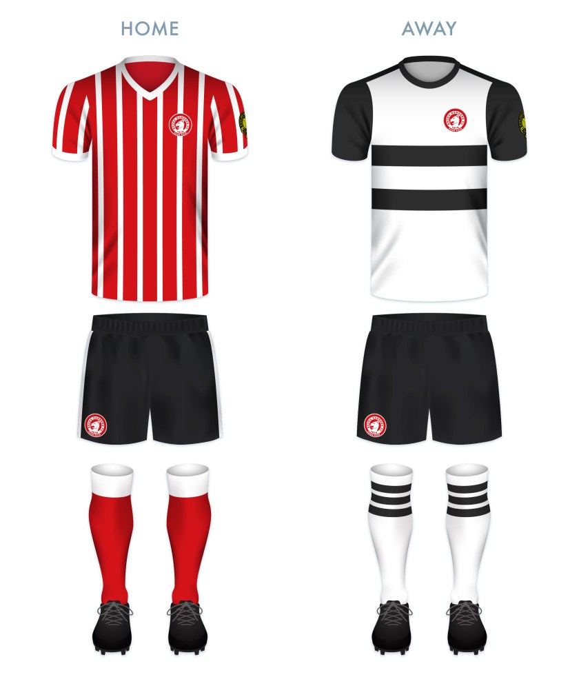
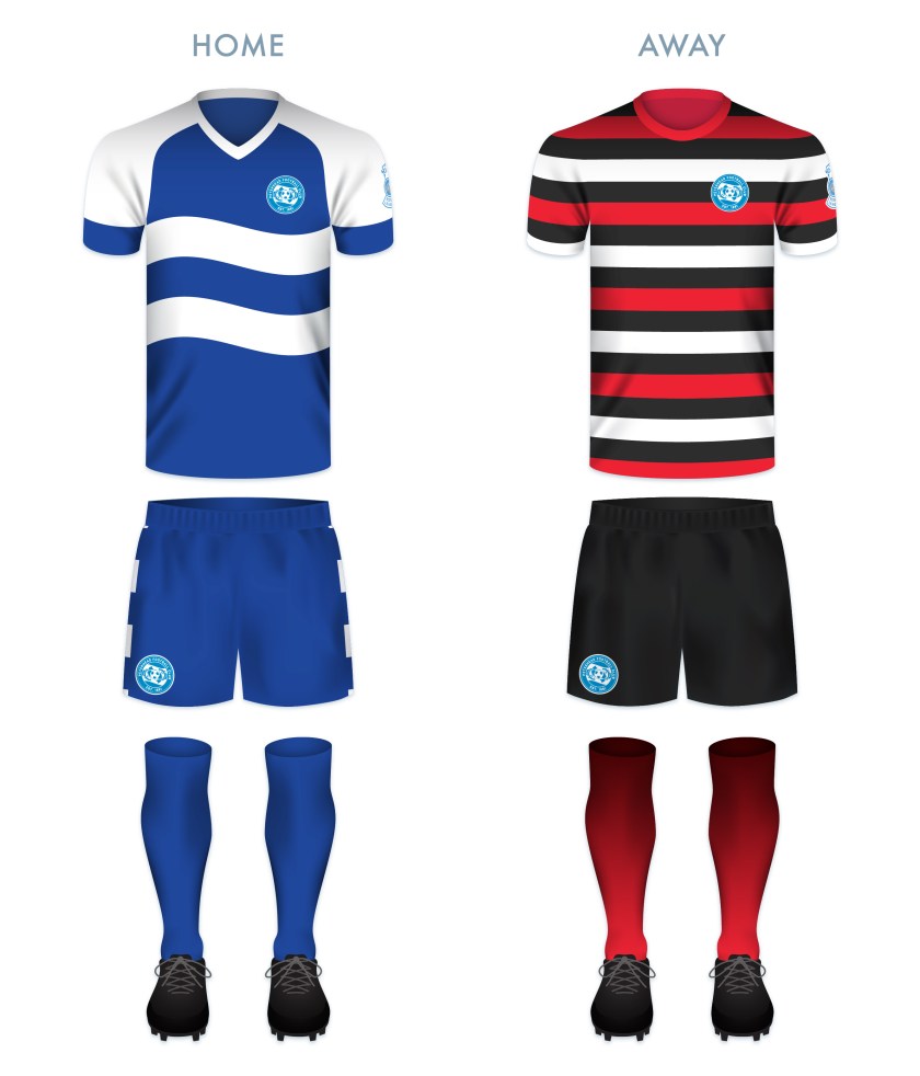
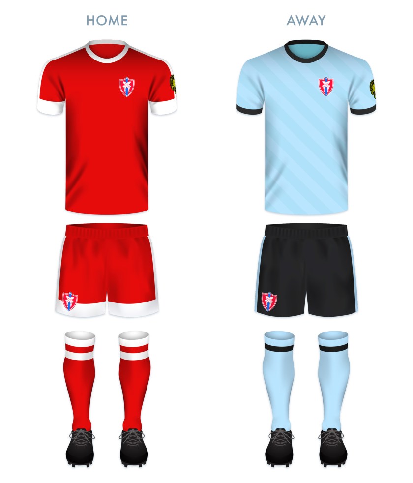
The kit redesigns make use of traditional Deveronvale home and away colour schemes.

DFC kit-01

dfc badge new-01

14 January 201924 February 2020 E Tagged Aberdeenshire, badge, Banff, Banff and Buchan, Banff Rovers, Banffshire, crest, Deveron Valley, Deveronvale, Deveronvale FC, Deveronvale Football Club, Europe, football, HFL, Highland Football League, Highlands, logo, Macduff, rebrand, redesign, River Deveron, Scotland, Scottish Highland Football League, SHFL, sport, texture, typography, UK, United Kingdom, Vale Leave a comment

ReBrand: Cove Rangers FC

graphic

crfc badge new-01Cove Rangers Football Club was established in 1922. The club takes its name from Cove Bay, located in the southeastern corner of the city of Aberdeen, in which they play.

In 1947, the club became a founding member of the Aberdeen Amateur Football Association. That season, Cove Rangers won the first of their 11 amateur championships. In 1948, they began to play at Allen Park. Among them, their highlight came in the 1964/65 season, when the club went unbeaten in the league.

Cove Rangers competed as amateurs until 1985, when they became a junior side. The following season, they became a senior side and joined the Highland Football League. By the 1990s, Cove Rangers began to rack up local silverware and in 2001, they won the first of their six Highland League championships. In 2016, in order to comply with SPFL regulations, the club relocated from Allen Park to their new Balmoral Stadium ground.

The club continued their dominance of the Highland League, finishing at the top of the table over two consecutive seasons between 2017 and 2019. After being crowned league champions at the end of the 2017/18 season, Cove Rangers secured an SPFL promotion playoff by defeating the Lowland League champions Spartans. Ultimately, Cove Rangers lost 3-2 to Cowdenbeath over two legs to remain in the Highland League. The club remained competitive and secured another SPFL promotion playoff the following season with a 5-1 aggregate victory over Lowland League champions East Kilbride over two legs. This time, Cove Rangers faced Berwick Rangers. The Aberdeen side dominated Berwick, winning 0-7 over two legs and gaining promotion into the bottom tier of the SPFL for the 2019/20 season.

In redesigning the Cove Rangers badge, I wanted to call back to the early twentieth century. I was unconvinced by the olive branches encircling a griffin rampant and decided on a stylised monogram. After first illustrating the ‘C’, I realised that the ends of the legs resembled boots and decided to place a circle, representing a football, between them.

CRFC badge-01

For the home kit, I was inspired by the Cove home kit from the 1982/83 season. The layout of the away kit is also inspired by a Cove home kit from the 1980s – that used in the 1986/87 season.

CRFC kit-01

crfc badge new-01

14 January 201924 February 2020 E Tagged Aberdeen, badge, Cove, Cove Bay, Cove Rangers, Cove Rangers FC, Cove Rangers Football Club, crest, Europe, football, HFL, Highland Football League, Highlands, logo, monogram, rebrand, redesign, Scotland, Scottish Highland Football League, Scottish League 2, Scottish League Two, Scottish Professional Football League, SHFL, SPFL, SPFL League 2, SPFL League Two, sport, texture, Toonsers, typography, UK, United Kingdom, Wee Rangers Leave a comment

ReBrand: Clachnacuddin FC

graphic

CFC badge new-01Clachnacuddin Football Club was established in 1885. The name of the club is an Anglicisation of the Scottish Gaelic Clach na Cùdainn, meaning, ‘Stone of the Tub’, a reference to a particular landmark in the club’s locality, the Merkinch area of Inverness. (It is said that Merkinch, which is situated between the Caledonian Canal on the west and the River Ness on the east, was home to a particular stone at which locals would do their washing, hence the ‘tub’.)

In 2017, a very informative letter was written to The Inverness Courier by Alexander Chisholm, a former Clachnacuddin player and chairman, which sheds some light on the early years of the club. Mr Chisholm’s letter states that the club was established ‘by Donald Simpson who wanted a team of his own for the people of the Merkinch. The first Clach team was formed by the army Royal Artillery Volunteers stationed in Telford Road Barracks and played in the Carse on a plot of ground rented from the town council.’

In 1893, Clachnacuddin joined Caledonian, Cameron Highlanders, Forres Mechanics, Inverness Citadel, Inverness Thistle and Inverness Union to form the Highland Football League. Cameron Highlanders, Inverness Citadel and Inverness Union have all ceased operations. In 1994, Caledonian and Inverness Thistle merged to form Inverness Caledonian Thistle, who have competed as professionals since that time. Of these founding members, only Clachnacuddin and Forres Mechanics remain.

Clachnacuddin’s honours include 18 Highland League Championships (the most of any club in the Highland League), five Highland League Cups and 22 North of Scotland Cups. The 1947/48 season proved to be one of the club’s finest, having won the Scottish Qualifying Cup (North), the Highland League Cup, the North of Scotland Cup and the Inverness Charity Cup.

In 1990, the club faced extinction due to financial difficulties, but were rescued by a group of local businessmen, including Charlie Forbes, James Macdonald, Ken Macleod, Calum Grant, Colin Morgan and Alistair and David Dowling.

The current Clachnacuddin badge is interesting, but a bit busy. The two lilies are a play on the club’s nickname, ‘the Lilywhites’, due to their white home strip. For my redesign, I decided to illustrate a single simple, symmetrical lily as a centrepiece. In what might be a somewhat controversial move, I decided to include the club’s name and location in Scottish Gaelic. As Clachnacuddin is the only club in the Highland Football League whose name is Gaelic in origin (not including clubs named after their respective towns), and since Gaelic is a unique, but dying identity marker in the Scottish Highlands, I decided to capitalise on this connection. The two blue line segments in the outer circlet represent the Caledonian Canal and the River Ness, which, as mentioned before, flank Merkinch.

CFC badge-01

Both the home and away kits are relatively conservative and modern in their presentation, utilising the black, white and gold scheme from the badge.

CFC kit-01

CFC badge new-01

13 January 201924 February 2020 E Tagged badge, Clach, Clachnacuddin, Clachnacuddin Football Club, ClachnacuddinFC, crest, Europe, football, Gaelic, Gàidhlig, HFL, Highland Football League, Highlands, Inverness, Lillywhites, logo, Merkinch, rebrand, redesign, Scotland, Scottish Gaelic, Scottish Highland Football League, SHFL, sport, texture, The Clach, UK, United Kingdom Leave a comment

ReBrand: Buckie Thistle FC

graphic

BTFC badge new-01The early history of Buckie Thistle Football Club is something of a mystery. Although the exact year of the club’s founding is unknown, it is accepted generally to have been established in 1889. The club’s green-and-white hooped home shirts resemble that of Celtic FC, and it has been suggested that Buckie Thistle might have adopted the scheme after receiving a donation of Celtic strips at some point in their history. The date of the adoption of the hoops is potentially intriguing as Celtic did not incorporate their now-famous hoops until 1903. Could the Jags have inspired Celtic? Probably not. But the uncertainty of Buckie Thistle’s beginning does not detract from the club’s illustrious Highland Football League honours.

Since joining the Highland League in 1909, the Jags are eleven-time league champions (most recently, in 2016/17), eight-time Highland League Cup winners, and have won a large number of other regional honours. In October 1954, Buckie Thistle beat Queen’s Park 2-1 at Hampden Park in a replay of the fourth round of the Scottish Cup, becoming the first and only senior non-league club to have won a competitive match at Scotland’s national stadium.

I have been unable to determine how long some version of the current badge has been in use, and while I would tend away from stereotypical Scottish symbols wherever possible, the Saltire and thistle seem wholly appropriate for the Highland Jags, as it does with Partick Thistle, Inverness Caledonian Thistle and fellow Highland Leaguers Strathspey Thistle. The design of the current badge seems dated (specifically, very 1990s in style), so I decided to reincorporate most of the current badge’s visual elements with a new, simpler design.

BTFC badge-01

While seeking to differentiate the home kit from that of Celtic, and with no intention of getting rid of the hoops associated with Buckie Thistle, I went with a subtle variation of using tight hoops in a cooler shade of green, complete with green details (Celtic’s are normally white) and green shorts (never worn by Celtic at home). The away strip makes use of vertical stripes of black and grey as well as some green details.

BTFC kit-01

BTFC badge new-01


13 January 201924 February 2020 E Tagged badge, Banff, Banffshire, Buckie, Buckie Thistle, Buckie Thistle FC, Buckie Thistle Football Club, crest, Europe, football, HFL, Highland Football League, Highlands, Jags, logo, rebrand, redesign, Scotland, Scottish Highland Football League, SHFL, sport, texture, The Jags, Thistle, UK, United Kingdom Leave a comment

ReBrand: Brora Rangers FC

graphic

BroRFC badge new-01Brora Rangers Football Club was established in the village of Brora, Sutherland in 1879. In 1933, the club became members of the Scottish Football Association and in 1962, they began to compete in the Highland Football League.

The club’s first taste of silverware came in 1981, when they won the North of Scotland Cup (a competition open to northern clubs from the Scottish Football League and now the Scottish Professional Football League, the Highland League and the North Caledonian Football League). Just a season earlier, Brora Rangers first qualified for the Scottish Cup competition by winning the now-defunct Scottish Qualifying Cup (North), though they progressed no further than the second round, losing out to Highland League rivals Buckie Thistle in a replay at home.

Brora Rangers repeated their 1981 North of Scotland Cup victory a decade later, and then again, four times in five years between 2014 and 2018. Their recent dominance in the Highlands is evidenced further by winning the Highland League for two consecutive seasons, 2013/14 and 2014/15, as well as winning the Highland League Cup in 2016.

The club’s current badge is a play on their nickname, ‘the Cattachs’, a term relating to the ancient Pictish tribe of Cat (or Catt) that inhabited what would become Sutherland and Caithness (a Cattach is now a demonym for someone from Sutherland). In the badge, we find a white heraldic cat rampant. For the redesign, I did not wish to stray far from the current badge, as I find its broad red border very attractive. But I found the particular depiction of a cat rampant to be both confusing and somewhat innocuous. I decided to illustrate a close-up of a cat rampant head, which, I hope, suggests both a cat and the ‘rampant’ attitude of the club ready to ‘attack’. I also included the year of the club’s founding, being one of the older clubs in the Highland League, as well as the French motto of Clan Sutherland, Sans peur, ‘Without fear’.

BroRFC badge-01

For the home shirt redesign, I was inspired by the Milan-Europe shirt worn by Brora Rangers for the 1993/94 season. The black in both the home and away kits represents the Flow Country, vast expanses of peatland in Sutherland.

BroRFC kit-01

BroRFC badge new-01

13 January 201924 February 2020 E Tagged badge, Brora, Brora Rangers, Brora Rangers FC, Brora Rangers Football Club, Cattachs, Clan Sutherland, crest, Europe, football, French, HFL, Highland Football League, Highlands, logo, rebrand, redesign, Scotland, Scottish Highland Football League, SHFL, sport, Sutherland, texture, UK, United Kingdom 1 Comment

ReBrand: Highland Football League

graphic

hfl badge new-01I first began redesigning Scottish football badges in 2013 as a personal challenge. In 2018, I set myself the task of tweaking or completely redesigning my initial rebrandings, and completing badge and strip redesigns for the entirety of the Scottish Professional Football League.

Now that 2019 is upon us, I have decided to embark on the natrual next step on my obsessive design project: the Scottish Highland and Lowland Football Leagues. As things go, historical resources for many of the clubs in these non-professional Scottish leagues are lacking. But I have ventured to utilise as much as the respective club/local histories as is available more readily in order to develop significant and [hopefully] interesting designs. I began with this redesign of the Highland Football League badge.

For this redesign, I decided to go with a black and mustard colour scheme, calling back to an earlier incarnation of the Highland Football League badge. Because the symbolism of the current badge, consisting only of a football and Saltire, doesn’t suggest a relationship with the highlands specifically, I decided to make use to of the strap and buckle found in many of the coats of arms of Scottish clans, which indicates that the wearer is aligned to a particular crest and motto (i.e., the clan chief). I also incorporated a small thistle on the end of the strap. As with the current badge, this redesigned badge is intended to be worn on the left sleeve of each club’s football shirt.

hfl logo-01

hfl badge new-01


12 January 201912 January 2019 E Tagged badge, crest, Europe, football, HFL, Highland Football League, Highlands, logo, rebrand, redesign, Scotland, Scottish Highland Football League, SHFL, sport, texture, UK, United Kingdom Leave a comment

Kingdom of Fife Football

graphic

Kingdom of Football-01

Building on my SPFL badge redesigns, I’ve made a wee map of Fife with the new badges and some club information.

6 August 2018 E Tagged badge, Beath, Blue Brazil, brand, branding, Cowden, Cowdenbeath, Cowdenbeath FC, Cowdenbeath Football Club, crest, DAFC, Dunfermline Athletic, Dunfermline Athletic FC, Dunfermline Athletic Football Club, East Fife, East Fife FC, East Fife Football Club, EFFC, emblem, Europe, Fife, Fifers, football, Kingdom of Fife, Kirkcaldy, logo, map, Methil, Miners, Pars, Raith, Raith Rovers, Raith Rovers FC, Raith Rovers Football Club, rebrand, redesign, Rovers, RRFC, Scotland, Scottish Professional Football League, SPFL, sport, texture, UK, United Kingdom 1 Comment

ReBrand: Stirling Albion FC

graphic

SAFC badge new-01Stirling Albion Football Club was established in 1945. The club’s formation was tied closely to the end of the Second World War and the dissolution of an earlier Stirling-based club, King’s Park FC (1875). King’s Park were members of the Scottish Football League from 1931 until 1939. In 1940, their home ground, Forthbank Park, was bombed by the Luftwaffe and King’s Park never played again.

After the war, coal magnate and former managing director of King’s Park, Tom Fergusson, purchased the Annfield Estate in Stirling, developing the site as a new football ground and establishing a new football club, Stirling Albion. This new club was accepted into the Scottish Football League for the 1946/47 season and has remained there ever since.

For the first two decades of their existence, Stirling Albion hopped between the top and second tiers, earning the unfortunate nickname, ‘the Yo-Yos’. The club has never soared to especially great heights, their best finish being 12th in the top tier in the 1958/59 season. To date, the 1967/68 season was Stirling Albion’s last spell in top flight football.

The club’s first badge consisted of a rendering of the Stirling coat of arms, composed primarily of a Saltire and lion rampant within a shield. This badge was used from 1961 until 1964. In 1966, Stirling Albion became the first British club to tour Japan. During this tour, a new badge was designed for the club’s blazers. Annfield House, the club’s offices and changing rooms, formed the centrepiece of this badge. Rather humorously, this badge also featured a yo-yo running through its centre. In 1987, the club began to use this badge on their kits.

In 1993, the club left Annfield for a new stadium, called Forthbank after King’s Park FC’s Forthbank Park. The badge featuring Annfield House remained until 2000, when the current badge was chosen as its replacement. The centrepiece of this badge consists of the National Wallace Monument atop Abbey Craig, with the Ochil Hills in the background.

Although the Wallace Monument is a striking structure, being neither ancient (built between 1861 and 1869) nor very central, I find its inclusion to be relatively unrepresentative of both Stirling and the football club. I opted to stay away from a depiction of an architectural landmark and instead, I designed a modern monogram of the club’s initials. The wide-set ‘A’ resembles a set of goals, while the ‘S’ cradles a football into the net (or is it being saved by the keeper?). I decided to keep the red and black colour scheme of the current badge, though, on my kit renderings, the monogram is displayed in one colour.

SAFC badge-01

The home kit is inspired by the classic Stirling Albion home kits from the late 1950s through the mid-1960s, particularly the home kit from the 1964/65 season. The away kit is inspired primarily by the handsome Macron 2015/16 away kit. On this kit, the monogram is presented in yellow on the dark blue field.

SAFC kit-01

SAFC badge new-01

As ever, I am indebted to Dave at Historical Football Kits for some of the historical information used above.

11 June 201824 February 2020 E Tagged badge, Binos, crest, emblem, Europe, football, insignia, King's Park, King's Park FC, King's Park Football Club, Ladbrokes League 2, logo, monogram, rebrand, redesign, Scotland, Scottish League 2, Scottish League Two, Scottish Professional Football League, SPFL, SPFL League 2, SPFL League Two, sport, Stirling, Stirlingshire, The Binos, The Yo-Yos, UK, United Kingdom, Yo-Yos Leave a comment

ReBrand: Queen’s Park FC

graphic

QPFC badge new-01Queen’s Park Football Club was established in 1867, making it the oldest football club in Scotland. It can be argued that no single club has had such an influence on the game of football in Britain—and in turn, the world—than Queen’s Park. They invented the passing game (as opposed to the tactic of a ‘rolling-maul’ like that used in rugby, the primary tactic employed by all other football clubs of this early era), as well as the crossbar on goals, the half-time interval and free kicks.

Having been established in 1871, the [English] Football Association Cup competition predates the Scottish Cup by two years. In these early years, Queen’s Park was invited to participate in the FA Cup and reached the final in 1883/84 and 1884/85, losing to Blackburn Rovers in both. Although other Scottish clubs were invited to participate in early editions of the FA Cup (including Cowlairs, Hearts, Partick Thistle, Rangers, Renton and Third Lanark ), Queen’s Park are the only Scottish club to have ever played in the final.

In Scotland, Queen’s Park won the first three Scottish Cup finals and had amassed ten Scottish Cup final victories between 1873 and 1893. The club’s record would only be surpassed by Celtic in 1922/23 and Rangers in 1935/36. This means that, despite not having won the competition for 125 years, Queen’s Park remain in the third position for all-time Scottish Cup victories.

Another distinguishing feature of this historic club is the fact that Queen’s Park was, until November 2019, an amateur side, reflected in the club’s Latin motto, Ludere causa ludendi, ‘To play for the sake of playing’. So committed had Queen’s Park been to retaining their amateur ideals, that they resisted joining the Scottish Football League when it formed in 1890. Eventually, in 1900, Queen’s Park applied for membership into the SFL and were admitted directly to the top tier. But that season saw Queen’s Park beaten by Celtic in the Scottish Cup final, heralding the end of the amateurs’ dominance of Scottish football.

The Queen’s Park kit did not feature a regular badge until 1928, which has more-or-less remained the same ever since. This badge is heraldic in nature, featuring a black and white hooped shield (reminiscent of the iconic Queen’s Park home shirt, from which their nickname, ‘the Spiders’, is derived) tilted anti-clockwise. The shield is topped by a helmet, from which emerges mantling, a torse and a crest of a lion rampant in red. The club motto is displayed on a scroll beneath the shield.

Given the club’s illustrious history, I found the Spiders’ badge one of the most difficult to redesign. Being that they are the oldest club in Scotland, I found it essential to include the year of their formation, as well as the club’s initials and the Latin motto. I have included all of these features in a typeface of my own design, inspired by the script in several medieval illuminated manuscripts. As a centrepiece, I have included an illustration of a Victorian era football.

QPFC badge-01

Both of the kit redesigns are based on historic Queen’s Park kits. The home kit features the club’s traditional tight black and white hoops (in use since 1873). In particular, this kit is inspired by the 1927/28 home kit and variations on said kit used until 1960. The away kit is inspired primarily by the home kit worn from 1872 to 1873, with dark blue and white hooped socks. This similar dark blue and grey colour scheme was also used in the home kit between 2016 and 2018 to commemorate the club’s 150th anniversary.

QPFC kit-01

QPFC badge new-01

As ever, I am indebted to Dave at Historical Football Kits for some of the historical information used above.

10 June 20189 June 2021 E Tagged badge, Blackburn Rovers, Blackburn Rovers FC, Blackburn Rovers Football Club, crest, emblem, Europe, FA Cup, football, Football Association Cup, Glasgow, insignia, Ladbrokes League 2, Lanarkshire, Latin, logo, QPFC, Queen's Park, Queen's Park FC, Queen's Park Football Club, rebrand, redesign, Scotland, Scottish Cup, Scottish Professional Football League, SPFL, SPFL League 1, SPFL League One, Spiders, sport, The Spiders, UK, United Kingdom 1 Comment

ReBrand: Peterhead FC

graphic

PFC badge new-01Peterhead Football Club was established in 1891 by a number of local football enthusiasts. The passion of this young club caught the attention of the town’s Feuars Managers and a plot of land was gifted to the club within Peterhead’s Raemoss Park. Recreation Park, as it this original home ground was called, opened that same year. Although the stage was set for competition, Peterhead would have to wait until their admittance into the small Aberdeenshire Football Association (consisting of only six sides) in 1900 before playing competitive football.

In 1931, Peterhead would join the larger Highland Football League, where they would be crowned champions three times in four seasons (1946/47, 1948/49, 1949/50) and then twice more, in 1988/89 and 1998/99. The club also won the Highland League Cup on five occasions (1962/63, 1965/66, 1967/68, 1980/81 and 1988/89).

After competing for over a century as a non-league side, Peterhead would gain admittance into the Scottish Football League in 2000. Their application was aided by their relocation to Balmoor in 1997.

In 2013/14, Peterhead topped the Scottish League Two table, gaining promotion to League One. Their stay in League One lasted only three seasons, though they came close to returning to the third tier after finishing second in the 2017/18 League Two season. This led to a play-off, in which the club was defeated by fellow League Two side, Stenhousemuir over two legs, despite the latter having finished the season 22 points behind Peterhead. Undeterred, Peterhead returned to the third tier after winning League Two in the 2018/19 season.

Peterhead adopted their nickname ‘the Blue Toon’, from their town, which itself probably comes from the fact that the historical fishermen of the port town were known for wearing blue worsted stockings. Accordingly, blue has been Peterhead FC’s primary colour since their early days.

The club’s kit first featured a badge in 1947. This badge consisted of the club’s ‘PFC’ initials within a shield and was used for one season before being revived during the early 1960s. Several variations of the club’s initials appeared on their kits at various points in the 1980s.

In 1989, when Peterhead won the Highland League title (their first such honour since 1950), the club adopted a new badge to celebrate the achievement. This badge featured of a version of the Peterhead coat of arms. In 1993, the club became a limited company and adopted their current badge. This badge consists of a downward-pointing triangle with a wavy top, representing the sea. Within the triangle is an illustration of a football and a fish—the fish representing the town’s fishing industry—superimposed over a net. The badge also features an outer ring and the club’s nickname.

For my redesign, I wanted to create something more unified and balanced than the current badge. I decided to omit the triangle so as to avoid any resemblance to the much older Dunfermline Athletic badge. I illustrated a new football, encircled by two haddock fishes for the centrepiece of the badge. I also included blue and white waves to represent the sea.

PFC badge-01

For Peterhead’s home shirt, I employed a blue and white colour scheme, with the waves on the body of the kit echoing the waves in the badge. The home socks are all blue, calling back to the blue worsted stockings from which the Blue Toon gets its nickname. The away shirt colour scheme of red, white and black is taken from many historical Peterhead away strips.

PFC kit-01

PFC badge new-01

As ever, I am indebted to Dave at Historical Football Kits for some of the historical information used above.

5 June 201824 February 2020 E Tagged Aberdeenshire, badge, Blue Toon, crest, emblem, Europe, fish, football, herringbone, insignia, Ladbrokes League 2, logo, Peterhead, Peterhead FC, Peterhead Football Club, rebrand, redesign, Scotland, Scottish League 2, Scottish League Two, Scottish Professional Football League, SPFL, SPFL League 2, SPFL League Two, sport, The Blue Toon, UK, United Kingdom 1 Comment

Posts navigation

← Previous
Next →
Widgets
Create a website or blog at WordPress.com
Privacy & Cookies: This site uses cookies. By continuing to use this website, you agree to their use.
To find out more, including how to control cookies, see here: Cookie Policy
  • Subscribe Subscribed
    • ellliottt
    • Join 53 other subscribers
    • Already have a WordPress.com account? Log in now.
    • ellliottt
    • Subscribe Subscribed
    • Sign up
    • Log in
    • Report this content
    • View site in Reader
    • Manage subscriptions
    • Collapse this bar
 

Loading Comments...