ellliottt

design & illustration

Menu

Skip to content
  • HOME
  • ABOUT
  • GRAPHIC
    • ALL GRAPHIC DESIGN
    • AUTOMOTIVUS
    • REBRAND: SPFL
      • Premiership
        • Aberdeen
        • Celtic
        • Dundee United
        • Heart of Midlothian
        • Hibernian
        • Kilmarnock
        • Livingston
        • Motherwell
        • Rangers
        • Ross County
        • St Johnstone
        • St Mirren
      • Championship
        • Arbroath
        • Ayr United
        • Cove Rangers
        • Dundee
        • Greenock Morton
        • Hamilton Academical
        • Inverness CT
        • Partick Thistle
        • Queen’s Park
        • Raith Rovers
      • League One
        • Airdrieonians
        • Alloa Athletic
        • Clyde
        • Dunfermline Athletic
        • FC Edinburgh
        • Falkirk
        • Kelty Hearts
        • Montrose
        • Peterhead
        • Queen of the South
      • League Two
        • Albion Rovers
        • Annan Athletic
        • Bonnyrigg Rose
        • Dumbarton
        • East Fife
        • Elgin City
        • Forfar Athletic
        • Stenhousemuir
        • Stirling Albion
        • Stranraer
    • REBRAND: SHFL
      • Brechin City
      • Brora Rangers
      • Buckie Thistle
      • Clachnacuddin
      • Deveronvale
      • Formartine United
      • Forres Mechanics
      • Fraserburgh
      • Huntly
      • Inverurie Loco Works
      • Keith
      • Lossiemouth
      • Nairn County
      • Rothes
      • Strathspey Thistle
      • Turriff United
      • Wick Academy
    • REBRAND: SLFL
      • Berwick Rangers
      • Bo’ness United
      • Broomhill
      • Caledonian Braves
      • Civil Service Strollers
      • Cowdenbeath
      • Cumbernauld Colts
      • Dalbeattie Star
      • East Kilbride
      • East Stirlingshire
      • Edinburgh University
      • Gala Fairydean Rovers
      • Gretna 2008
      • Spartans
      • Tranent Juniors
      • University of Stirling
  • 2D
  • 3D
    • ALL 3D
    • INSTALLATION
  • PHOTO
  • SHOP

crest

ReBrand: Elgin City FC

graphic

ElgCFC badge new-01Elgin City Football Club was established when two Elgin-based clubs, Rovers FC (1887) and Vale of Lossie FC (1888) united in 1893. For more than a century, the club competed in the Highland Football League, amassing a number of regional honours.

In the 1967/68 Scottish Cup, Elgin City defeated Albion Rovers, Tarff Rovers, Forfar Athletic and Arbroath to teach the quarter-final. Their opponents, Greenock Morton proved too strong for the Highland League outfit and Elgin City left the tournament after a 2-1 loss. No other Highland League club, before or since, has progressed as far in the Scottish Cup.

In 2000, the Scottish Premier League (the top tier in Scottish football at the time) expanded from 10 to 12 clubs, opening the door for the admittance of two new clubs into the bottom tier of the Scottish Football League. Elgin City, along with fellow Highland Leaguers Peterhead, were successful in their application and have competed in the SFL (and subsequent Scottish Professional Football League) ever since.

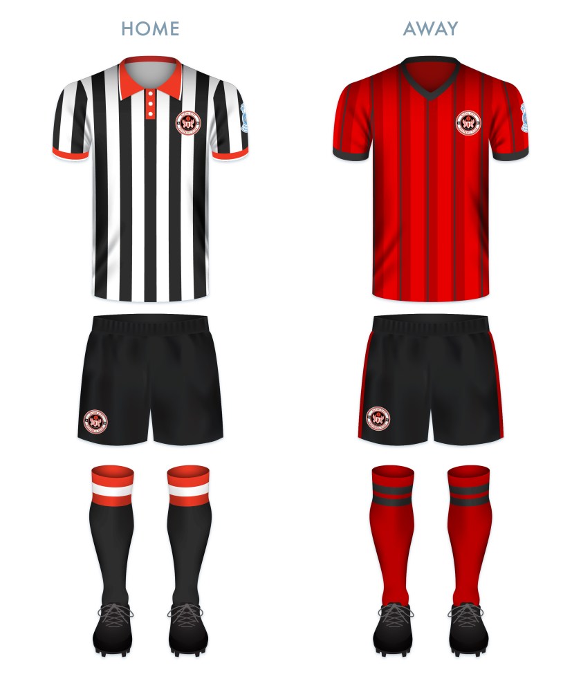
Throughout the vast majority of the club’s history, Elgin City’s home shirt has consisted of black and white vertical stripes. It was not until 1990 that the kit featured a badge, which is still used today. This badge, a rendering of the coat of arms of the city and royal burgh of Elgin, features the patron saint of Elgin, St Giles, supported by two angels and bears the motto, Sic itur ad astra (Latin for ‘Thus one goes to the stars’ or ‘Such is the way to immortality’, from Virgil’s Aeneid, IX). The angels and motto refer to the legend that at his death, St Giles was brought by angels to heaven.

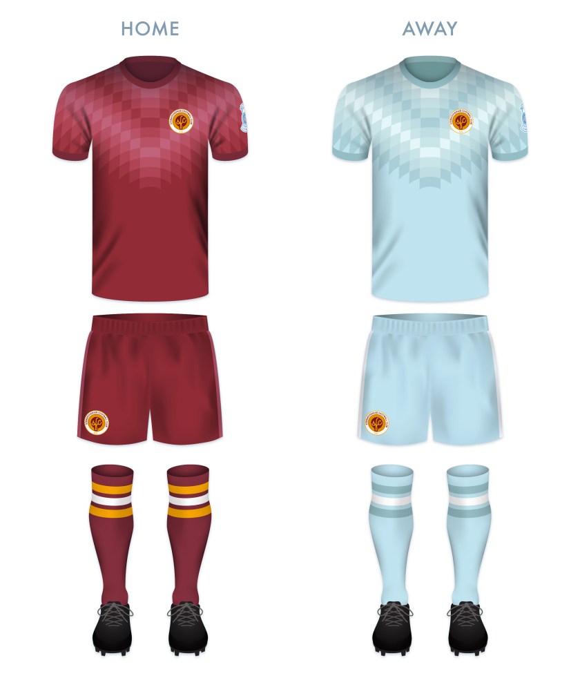
Despite the conceptual strength of the current badge, I find its execution lacking. While I admire the strength of a minimalist depiction of figures within a badge, I wanted to add more details so as to better resemble traditional depictions of the Elgin coat of arms and to create more depth.

As I wished to include the fine Latin motto, I did away with the shield (so as to avoid conflict with the ancient Scottish heraldic law forbidding the use of lettering within shields that are not approved by the Court of the Lord Lyon) as well as the stone compartment in which the motto was written in the original badge. I placed this redesign within a circular badge and added a football to occupy the negative space above the shield bearing St Giles. The dominant colours of the redesigned badge (red and white) are in line with the specified colours of the Elgin coat of arms, which are taken from the traditional colours of the Moray region.

ElgCFC badge-01

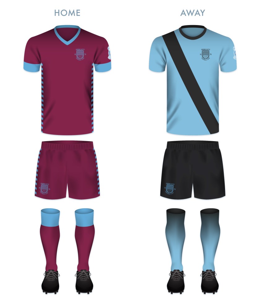
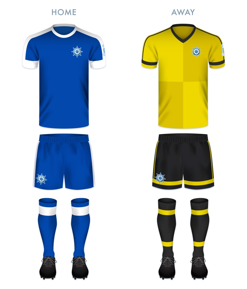
Both kit redesigns make use of traditional Elgin City colours. The home kit redesign is inspired primarily by the Elgin City kit used from 1991 to 1993.

ElgCFC kit-01

ElgCFC badge new-01

As ever, I am indebted to Dave at Historical Football Kits for some of the historical information used above.

4 June 201824 February 2020 E Tagged badge, Black & Whites, Black and Whites, brand, cathedral, city, coat of arms, crest, Elgin, Elgin Cathedral, Elgin City, Elgin City FC, Elgin City Football Club, emblem, football, Ladbrokes League 2, Latin, logo, Moray, Morayshire, Rovers, Rovers FC, Rovers Football Club, Scotland, Scottish League 2, Scottish League Two, Scottish Professional Football League, SPFL, SPFL League 2, SPFL League Two, sport, St Giles, The Black & Whites, The Black and Whites, UK, United Kingdom, Vale of Lossie, Vale of Lossie FC, Vale of Lossie Football Club Leave a comment

ReBrand: Edinburgh City FC

graphic

FCE badge newEdinburgh City Football Club was first formed in 1928 as an amateur side, akin to Queen’s Park. Although the club joined the Scottish Football League in 1931, they struggled throughout the fifteen subsequent seasons and reverted to junior status in 1946. By 1955, the lease at their playing ground (City Park) expired and the football club folded, continuing only as a social club.

In 1966, Postal United Football Club was established and adopted the Edinburgh City name in 1986. By the mid-1990s, this new incarnation of Edinburgh City FC became members of the Scottish Football Association. After competing in the East of Scotland Football League for a number of years, Edinburgh City, along with Gretna 2008, Preston Athletic, Spartans, the University of Stirling, Vale of Leithen and Whitehill Welfare, transferred to the new Lowland Football League for the 2013/14 season.

Edinburgh City were crowned Lowland League champions in the second year of the competition, giving them the opportunity to compete in the Scottish League Two play-off semi-final for a spot in the Scottish Professional Football League. Unfortunately, Edinburgh City lost to the Highland Football League champions, Brora Rangers over two legs. (Brora Rangers would go on to lose to last-place League Two side, Montrose 3-2 on aggregate.)

Edinburgh City would have better luck when they won the Lowland League again in the 2015/16 season. This time, the club faced Cove Rangers in the semi-final. After winning with a 4-1 aggregate score over two legs, Edinburgh City faced the last-place League Two side, East Stirlingshire. The first leg ended in a 1-1 draw. In the second leg, Edinburgh City took the spoils with a 0-1 victory, gaining promotion to the SPFL.

Edinburgh City performed well during its first few seasons in League Two and finished the 2021/22 season in fourth place. This enabled them to enter into the SPFL League One play-off, where they first faced Dumbarton. The Citizens advanced to the next round after having defeated Dumbarton 5-2 over two legs. Next came Annan Athletic, who Edinburgh City beat narrowly (3-2), securing their admittance into League One. After the end of that season, Edinburgh City’s name was changed Football Club of Edinburgh, or simply FC Edinburgh, before reverting back to Edinburgh City FC in June 2023.

In their early years, the kit of the original Edinburgh City FC featured the coat of arms of Edinburgh. By 1938, the club used an ‘ECFC’ monogram as their badge. Upon the adoption of the Edinburgh City name by Postal United, a new badge, featuring a castle above the club’s initials was used. In 1998, a new club badge was launched, featuring the same castle from 1986, encircled by the club’s full name. For the 2018/19 season, an update on this badge was introduced which included a gold accent. With the most recent renaming of the club, a simple castle is used as the club’s badge.

For this redesign, I opted to include a varation on the stylised football ECFC monogram I had employed in an earlier design, topped with a version of the castle in current use:

FCE badge

The redesigned home kit consists of a white top with black shorts, the traditional colour scheme since 1928. The top features black details in a scheme resembling Admiral strips from the early 1980s. The away kit is inspired primarily by the 2016/17 Edinburgh City away kit.

FCE kit

FCE badge new

As ever, I am indebted to Dave at Historical Football Kits for some of the historical information used above.

31 May 201822 August 2025 E Tagged badge, crest, Edinburgh, Edinburgh City, Edinburgh City FC, Edinburgh City Football Club, Europe, football, Ladbrokes League 2, logo, monogram, Postal United, Postal United FC, Postal United Football Club, rebrand, redesign, Scotland, Scottish Football Association, Scottish League 2, Scottish League Two, Scottish Professional Football League, SPFL, SPFL League 2, SPFL League Two, sport, UK, United Kingdom Leave a comment

ReBrand: Annan Athletic FC

graphic

AAFC badge new-01Annan Athletic Football Club was established as a junior side in 1942. Following the dissolution of the Dumfries and District Junior League in the early 1950s, Annan Athletic joined the Carlisle and District Football League.

In the 1977/78 season, Annan returned to Scottish football, competing in the South of Scotland Football League. During their spell in the SoSFL, Annan won the league on two occasions (1983/84 and 1986/87). By the 1987/88 season, Annan joined the East of Scotland Football League. They continued their non-professional success, winning the EoSFL four times (1989/90, 1999/2000, 2000/01 and 2006/07).

In 2008, the original Gretna FC folded, making way for the admission of another club into the Scottish Football League. Annan’s application was successful, beating out Cove Rangers, Spartans, Preston Athletic and Edinburgh City. Since joining the SFL, Annan have yet to gain promotion from the bottom tier, but showed promise in the 2015/16 Scottish Cup, advancing to the fifth round before being knocked out by Greenock Morton.

Annan first used a badge on their kits around 1978, and this original badge remains in use today. It features a torch being carried, within a shield, flanked by two thistles. Although Annan are known as ‘the Black and Golds’, the colours of the badge are based upon the colours of the coat of arms of the former royal burgh of Annan.

For my redesign, I opted to go the route of a round badge, with a monogram at its centre. The monogram consists of two ‘A’s, tilted at a 45° anti-clockwise angle so as to resemble the town of Annan’s coat of arms (which features a yellow shield bearing a red saltire). At a stretch, the monogram includes the full ‘AAFC’ initials. A t-panelled football is superimposed over the monogram. The club’s name and two thistles occupy the outer ring.

AAFC badge-01 2

AAFC monogram breakdown-01

Both of the redesigned kits take their colours from Annan’s traditional home and away kits. The home kit is inspired primarily by Annan’s handsome 1989/90 Umbro home kit.

AAFC kit-01

AAFC badge new-01

As ever, I am indebted to Dave at Historical Football Kits for some of the historical information used above.


19 May 201824 February 2020 E Tagged Annan, Annan Athletic, Annan Athletic FC, Annan Athletic Football Club, badge, Black and Golds, brand, crest, Dumfries and Galloway, Europe, football, Galabankies, Ladbrokes League 2, logo, monogram, rebrand, redesign, Scotland, Scottish League 2, Scottish League Two, Scottish Professional Football League, SPFL, SPFL League 2, SPFL League Two, sport, The Black and Golds, UK, United Kingdom Leave a comment

ReBrand: Stranraer FC

graphic

StrFC badge new-01Stranraer Football Club was established in 1870, making it the third-oldest club in Scotland, after Queen’s Park, (1867) and Kilmarnock (1869).

Due to Stranraer’s relatively remote location, fixtures in these early years were often played away from the town, in other parts of Wigtownshire, in Kirkcudbrightshire and even as far north as Ayrshire. Finally, in 1907, a permanent home was found in the town and Stair Park came to be. By the 1955/56 season, Stranraer began competing as full members of the Scottish Football League.

Stranraer first used a badge on their kit in the mid-1950s. This badge consisted of a red shield enclosing the club’s initials in white. This badge was used until 1961, when it was replaced with another red and white shield, this time, with the club’s initials above a ship at sea, the ship taken from the town’s coat of arms. Some variation of this badge remained until 1988, when a shield featuring only a ship at sea was enclosed by a ring with the club’s name and year of founding. The current badge in an updated version of this 1988 badge.

In redesigning Stranraer’s badge, I considered the two other clubs which feature a ship in full sail on their current badge: Greenock Morton (1874) and Clyde (1877). The ship on Clyde’s badge, from what I can tell, came into being in the mid-1930s. Morton’s badge did not feature a ship until 1978. Given the length of time that Clyde’s badge has been in use and given that I did not want my Stranraer badge redesign to be too similar to either the current badge or the Stranraer coat of arms, I decided to include a ship in my redesign of Clyde’s badge alone.

For Stranraer, I settled on a ship’s wheel, as it is distinct among all football badges, it is a timeless symbol (which ties both to the club’s age and to Stranraer’s significance as a port town) and it lends itself to a round badge. I have gone out on a limb so as to include the wheel’s handles beyond the bounds of the badge ring. A t-panelled football sits at the centre of the badge and I have added a second tone of blue to give the badge an extra bit of ‘pop’.

StrFC badge-01

In redesigning the home kit, I first experimented with a wave pattern, but determined that, along with the ship’s wheel badge, this would be over the top. Instead, I have used the traditional Stranraer blue shirt with white accents, drawing particular inspiration from the very tasteful 2008/09 home shirt. The away shirt is bright yellow, with a mustard harlequin pattern, inspired in part by the 1996/97 home kit.

StrFC kit-01

StrFC badge new-01

As ever, I am indebted to Dave at Historical Football Kits for some of the historical information used above.

18 May 201816 June 2020 E Tagged badge, Blues, brand, crest, design, Dumfries and Galloway, Dumfriesshire, Europe, football, Inch, logo, rebrand, redesign, Scotland, Scottish League 2, Scottish League Two, Scottish Professional Football League, SPFL, SPFL League 2, SPFL League Two, sport, Stranraer, Stranraer FC, Stranraer Football Club, The Blues, UK, United Kingdom Leave a comment

ReBrand: Stenhousemuir FC

graphic

SteFC badge new-01.jpgStenhousemuir Football Club was established in 1884 after breaking away from local junior side Heather Rangers Football Club. By 1890, the club was playing their home matches at Ochilview Park, where they have played ever since. In 2009, Stenhousemuir became the first football club in Scotland to become a Community Interest Company (CIC).

The club’s shirt did not feature a badge until 1984, marking their centenary year. This first badge was an odd number, featuring the club’s sponsor, Hogan Sports (written as ‘Hogan’s Sports’ on the badge). From 1985 until 1991, Stenhousemuir’s shirts featured a stylised ‘SFC’ monogram. This was replaced by a heraldic badge, which did not find favour with the club’s supporters. The heraldic emblem was abandoned after two seasons, when a round badge, derived from the 1985 monogram, was introduced. The Stenhousemuir badge has been based on this 1993 design ever since.

For my redesign, I wanted to hold to the spirit of the quirky brown-and-amber 1993 badge. I decided that the badge could benefit from a local or historical reference, without diving into a full-on heraldic design. The town of Stenhousemuir comes from a particular stone structure (‘sten house’ = ‘stone house’). This round structure, referred to as ‘Arthur’s O’en’ (‘Arthur’s Oven’) was most likely a Roman temple and stood to the north of the River Carron. It was demolished in 1743, but not before some detailed illustrations of it were made. One particular illustration of the foundation of the temple served as my inspiration as I found that it suited a round badge. The entrance to the temple also serves as a handsome frame for the lowest terminus of the ‘F’ in my new monogram. My redesign featuring a new monogram and an illustration of the temple’s foundation is found below:

SteFC badge-01

The redesigned kits are based on traditional Stenhousemuir colours, with the home kit inspired primarily by the 2017/18 home kit and the away kit inspired primarily by 2003/04 away kit, with a wee touch of 1980s Adidas kits.

SteFC kit-01

SteFC badge new-01.jpg

As ever, I am indebted to Dave at Historical Football Kits for some of the historical information used above.

16 May 201824 February 2020 E Tagged badge, brand, CIC, Community Interest Company, crest, design, Europe, Falkirk, football, Heather Rangers, Heather Rangers FC, Heather Rangers Football Club, Heather Rangers Juniors, logo, rebrand, redesign, Scotland, Scottish League 2, Scottish League Two, Scottish Professional Football League, SPFL, SPFL League 2, SPFL League Two, sport, Stenhousemuir, Stenhousemuir FC, Stenhousemuir Football Club, Stenhousemuir Football Club Community Interest Company, Stenny, Stenny FC, The Warriors, UK, United Kingdom, Warriors Leave a comment

ReBrand: Raith Rovers FC

graphic

RRFC badge new-01Raith Rovers Football Club was established in 1883. The club draws its name, Raith, from a vague historical association with the region of Fife from Kirkcaldy (where the club is based) to Lochgelly.

Throughout their history, the Rovers have won the second tier on five occasions and have appeared in the Scottish Cup final once, losing 2-0 to Falkirk in 1912/13. The club reached the final of the 1948/49 Scottish League Cup, but experienced another 2-0 loss, this time to Rangers. The club would have to wait until 1994/95 League Cup final to receive their first and only major honour to date, defeating Celtic 6-5 on penalties after ending extra time 2-2.

The Rovers first used a badge on their kits during the 1912/13 season. This early badge included a lion rampant holding a belt buckle, the latter of which being derived from the Kirkcaldy coat of arms. A variation of this badge was used until the 1949/50 season, when the Scottish royal coat of arms, featuring a yellow shield with a red lion rampant, was used to mark the Rovers’ promotion to the Scottish top tier. The following season, the more traditional badge returned to the kit.

By the 1960s, crests became less popular in Scottish football in favour of calligraphic club initials. A new badge was used intermittently between 1976 and 1985, when another badge came into use. By 1998, the traditional badge was again reinstated and some variation of this badge has been used ever since.

For years I assumed, having only seen the badge at a relative distance or in a low resolution, that the Rovers’ insignia was a depiction of a horse holding a globus cruciger (Latin for ‘cross-bearing orb’), a medieval symbol representing the authority of Christ or Christianity over the world. For my redesign, I sought to make both the lion rampant and the buckle more identifiable. I have also included the club’s name within a banner, which resembles the Scottish Football Association crest used until 2012. This is also a call back to the 1949/50 season, when the Rovers were promoted to the top tier and their badge was nearly identical to that used by the Scottish national team.

RRFC badge-01

The home kit is inspired by the Rovers’ home kits from 1950 to 1954, in particular, the kit worn during the 1953/54 season. The away kit is a hooped version of the Rovers’ traditional red away colour scheme.

RRFC kit-01

RRFC badge new-01

As ever, I am indebted to Dave at Historical Football Kits for some of the historical information used above.

16 May 201824 February 2020 E Tagged badge, brand, buckle, crest, design, Europe, Ferguson, Fife, football, Kirkcaldy, lion rampant, logo, Raith, Raith Rovers, Raith Rovers FC, Raith Rovers Football Club, rebrand, redesign, Rovers, RRFC, Scotland, Scottish League 1, Scottish League One, Scottish Professional Football League, SPFL, SPFL League 1, SPFL League One, sport, The Rovers, UK, United Kingdom 1 Comment

ReBrand: Montrose FC

graphic

MoFC badge new-01Established in 1879, Montrose Football Club were founding members of the Forfarshire Football Association in 1883. It would be another 40 years before Montrose would join the ranks of the Scottish Football League. Since that time, the club has been been hacking away in the lower leagues of Scottish football with little to show for it apart from local cup victories (they are ten-time winners of the Forfarshire Cup) and a handful of appearances in the later stages of the Scottish Cup and Scottish League Cup.

Despite a history of many disappointments, the 2017/18 season was strong for Montrose, with the club finishing at the top of the Scottish League Two table, thus gaining promotion to League One (Montrose’s first departure from the bottom tier since the 1995/96 season). This is all the more significant due to the fact that only a few seasons earlier, in 2014/15, Montrose narrowly avoided losing their place in the Scottish Professional Football League by defeating the Highland Football League champions, Brora Rangers in a play-off.

Except for different versions of the club’s initials, the current badge, introduced in 1990, is the only badge that Montrose has ever used. This features a rose (from the folk etymology of Montrose, ‘Mount of Roses’), a football, the club name and the date of the club’s founding.

I first attempted to redesign the Montrose badge in 2014. For this initial redesign, I drew inspiration from a badge that was used for only one season (1973/74), featuring an ‘M’ flanked by an ‘F’ and a ‘C’. In this initial redesign, the diagonal strokes on the ‘M’ meet well below the baseline. In addition to the very deep crotch on the ‘M’, I decided to add the rose and the date of the club’s founding to create a stronger sense of centrality. This initial redesign, on the left below, was published on 3 November 2014:

Montrose FC oldI was quite sold on my 2014 redesign, but I thought that I ought to challenge myself further in this round by tackling the badge from another angle. Using the same rose motif, I constructed a round badge, with the rose superimposed over a football. I was aiming for clean and basic with this design.

MoFC badge-01

The home kit is inspired by Montrose kits from 1959 to 1970. The away strip makes use of the colour scheme of the badge, dominated by red. The shorts for both kits feature only the central badge image of the rose superimposed over the football.

MoFC kit-01

MoFC badge new-01

As ever, I am indebted to Dave at Historical Football Kits for some of the historical information used above.

15 May 201824 February 2020 E Tagged Angus, badge, brand, branding, crest, Europe, football, Gable Endies, Ladbrokes League 1, Ladbrokes League One, logo, Montrose, Montrose FC, Montrose Football Club, rebrand, redesign, rose, Scotland, Scottish League 1, Scottish League One, Scottish Professional Football League, SPFL, SPFL League 1, SPFL League One, sport, The Gable Endies, UK, United Kingdom Leave a comment

ReBrand: Ayr United FC

graphic

AUFC badge new-01In 1910, the two rival football clubs in Ayr, Ayr FC and Ayr Parkhouse FC, determined that their town was too small to both support two senior teams and for those teams to rival the leading Scottish clubs. The result of this realisation was the formation of Ayr United Football Club. (Historically, Ayr Football Club had already formed as an amalgamation of several clubs, the earliest of which was Ayr Eglinton, formed in 1875.)

Despite the noble intentions of the two clubs that formed Ayr United in 1910, the club has never been counted among the most competitive in Scotland. Still, they continue to survive, boasting such honours as reaching the final of the 2001/02 Scottish League Cup (where they were defeated by Rangers) and being crowned champions of the second tier on six occasions (1911/12, 1912/13, 1927/28, 1936/37, 1958/59 and 1965/66). More recently, Ayr United gained promotion to the Scottish Championship after topping the League One table in the 2017/18 season.

Ayr United’s kit first featured a badge in 1938. This badge consisted of a stylised black anchor within a white shield with a black border and was used until 1948. Another badge appeared for the 1967/68 season, though regular use of a badge wouldn’t feature until 1977. From that time until 2017, some form of this 1967/68 badge was used.

In 2016, an anonymous complaint to the Court of the Lord Lyon challenged the use of the club’s badge, noting that it featured both a Saltire and the club’s initials within a shield, both a breach of an ancient heraldic law in Scotland, the same which caused bother for Airdrieonians in 2015. Reluctantly, in 2016, Ayr United opened up a competition in which fans could vote on their favourite badge from a pool of finalists. A badge designed by Jamie Stevenson, a Scottish Ayr United supporter living abroad, came out on top, ganering 48% of the vote. This new badge, seen on the left below, was then incorporated into the kit for the 2017/18 season.

The current badge utilises several features from the previous badge, including the Saltire and a football within a cord of rope, the rope recalling the town’s maritime heritage. At the bottom of the badge is the club’s nickname, ‘The Honest Men’, which comes from the Robert Burns poem ‘Tam o’ Shanter’ (1790). The second verse of the poem reads,

‘This truth fand honest Tam o’ Shanter,
As he frae Ayr ae night did canter,
(Auld Ayr, wham ne’er a town surpasses,
For honest men and bonny lasses.)’

For my redesign, I decided to make use of some of the historical imagery of the club, though with a significant departure from the club’s current badge. The colours used—black, white and red—are consistent with the historic club colours. I omitted the Saltire in favour of a singular image of a horse rampant upon an anchor. The anchor calls back to the original Ayr United badge from 1938.

The stylised horse with a missing tail is a visual reference—which, in a badge, I prefer over an overt, written reference—to ‘Tam o’ Shanter’ and the club’s nickname. In the narrative poem, the eponymous character, Tam, is depicted as having a ‘gray mare, Meg’. In the climax of the poem, Tam, demonstrating his ‘honest’ character, is escaping from a ‘hellish legion’ of the devil, warlocks, and witches who have begun to shed their clothing (noting one particularly attractive witch, Nannie Dee, with an undersized ‘cutty-sark’ or ‘shirt’). When Tam is fleeing upon his trusty Meg, Nannie is able to grab hold of Meg’s ‘gray tail’, which is left behind.

AUFC badge-01

The home kit is based upon Ayr United’s traditional home colour scheme of a white top with black shorts. The away strip makes use of the club colours in a vertical stripe running down a dark blue kit, borrowing from the old Ayr FC’s early colours.

AUFC kit-01

AUFC badge new-01

As ever, I am indebted to Dave at Historical Football Kits for some of the historical information used above.

12 May 201824 February 2020 E Tagged anchor, Ayr, Ayr Eglinton, Ayr Eglinton FC, Ayr Eglinton Football Club, Ayr FC, Ayr Football Club, Ayr Parkhouse, Ayr Parkhouse FC, Ayr Parkhouse Football Club, Ayr United, Ayr United FC, Ayr United Football Club, Ayrshire, badge, Bard, branding, Burns, Championship Division, Court of the Lord Lyon, crest, Europe, football, Honest Men, horse, Jamie Stevenson, Ladbrokes Championship, logo, Lord Lyon, Lord Lyon King of Arms, Meg, Rab Burns, Rabbie Burns, rebrand, redesign, Robert Burns, Scotland, Scottish Championship, Scottish Professional Football League, shield, SPFL Championship, sport, Tam o' Shanter, The Honest Men, UK, United Kingdom Leave a comment

ReBrand: Arbroath FC

graphic

ArbFC badge new-01Arbroath Football Cub was established in 1878 and as early as 1885, their shirts featured a badge consisting of a golden portcullis sewn into a large shield, representing the entrance to the ruined Arbroath Abbey (famous, in part, for its association with the Declaration of Arbroath), derived from the Arbroath coat of arms. That same year, Arbroath boasted a victory of 36-0 against the now-defunct Aberdonian side Bon Accord FC (who competed from 1884 until 1892), the largest margin of victory in world football until 2002 (the current record of 149-0 between Malagasy sides AS Adema and SO l’Emyrne was thrown, with SO l’Emyrne scoring 149 own-goals in protest to a previous refereeing decision made which saw them out of contention for the Malagasy title).

After competing in the Northern Football League for a number of years, Arbroath joined the Central Football League from its formation in 1909. Twelve years later, the Central League was incorporated into the Scottish Football League.

During their years in the SFL, ‘the Red Lichties’ have advanced to the semi-finals of the Scottish Cup and Scottish League Cup on two occasions. In the 1946/47 Scottish Cup, Arbroath triumphed over Stenhousemuir, Raith Rovers and Hearts before losing 0-2 to Aberdeen, who would go on to win the tournament. Arbroath reached their second major cup semi-final in the 1959/60 season, losing 3-0 to Third Lanark.

At the end of the 2018/19 season, Arbroath finished at the top of the League One table, securing promotion to the Scottish Championship (the second tier) for the first time since their relegation to the third tier after the 2002/03 season.

For several periods from 1953 until 1992, the Arbroath kit featured some variation of the club initials, sometimes in a shield. In 1980, a single colour version of the current badge saw regular use. This badge was updated with light blue and yellow in 1992. In recent years, the colours have been more in line with the 1980 version.

I have always been impressed with Arbroath’s 1992 badge. I would commend its timelessness, if not for the dated typeface and colours. For my redesign, I stripped the shield away and retooled the portcullis so that it forms something similar to a traditional Iberian shield found in some historical depictions of the Arbroath coat of arms. I also swapped the typeface for something more Romanesque, recalling the historical significance of the town.

ArbFC badge-01

The Arbroath home shirt first featured in maroon in 1882. Typically, this was accompanied with white details and shorts, not dissimilar to Hearts kits over the years. Arbroath first used a fully maroon kit in 1997 (Hearts did not use this scheme until 2002). I decided to capitalise on the attractive look of a fully maroon kit, with light blue details. My redesigned away kit is dominated by this light blue, with black shorts and details.

ArbFC kit-01

ArbFC badge new-01

As ever, I am indebted to Dave at Historical Football Kits for some of the historical information used above.

11 May 201824 February 2020 E Tagged Angus, Arbroath, Arbroath Abbey, Arbroath FC, Arbroath Football Club, badge, Bon Accord, Bon Accord FC, Bon Accord Football Club, branding, crest, football, Ladbrokes Championship, logo, rebrand, Red Lichties, redesign, Scotland, Scottish Championship, Scottish Professional Football League, Smokies, SPFL, SPFL Championship, sport, texture, The Red Lichties, The Smokies, UK, United Kingdom Leave a comment

ReBrand: Alloa Athletic FC

graphic

AAFC badge new-01Alloa Athletic Football Club was established as Clackmannan County Football Club in 1878. The following season, the club changed its name to the Alloa Association Football Club. The local press misinterpreted ‘AAFC’ as Alloa Athletic Football Club, which became the club’s official name from 1883. That same year, the club was admitted to the Scottish Football Association.

In these early decades, Alloa competed in the now-defunct Scottish Football Union and then the Central Football League. After the First World War, in 1921, the Central Football League was absorbed into the Scottish Football League as the Second Division. That season, Alloa won the title, gaining promotion to the top flight for the first time. This spell was short-lived, as the club was relegated after only one season. Alloa returned to the top flight in the 1938/39 season, but with the outbreak of the Second World War, regular league football was put on hold and Alloa would not return to the top tier.

Alloa’s first shirt, from its Clackmannan County days, consisted of black and orange hoops. From 1898 until 1972, the black and orange (or gold) hoops became the club’s standard and they gained the nickname ‘the Wasps’. (The hoops disappeared for a couple of decades, apparently as a cost-saving measure.) Alloa’s kit first featured a badge in 1985. This badge consisted of a more-or-less anatomically accurate rendering of a wasp within a shield. Some version of this badge remained until the current badge was adopted in 2010.

Due to the state of the club’s current badge—in my opinion, far and away the most absurd badge in all of Scottish professional football—I have had my sights set on redesigning Alloa’s badge from several years. Ignoring the illustrative style (which I consider to be farcical, at best), I have difficulty connecting the sleeveless, muscular wasp (with only two limbs, neither of which are legs) with a football club. I toyed with utilising a more identifiably wasp-like illustration, similar to those used by the club from 1985 until 2010, but ultimately, I found the use of the wasp altogether unsatisfactory.

In searching for an alternative, the hexagonal honeycomb concept came to mind. Wolverhampton Wanderers have used a hexagonal badge since 2002 (adapted from the shape of their minimalistic wolf’s head, first used in 1979), though their badge, which sees the hexagon set at 30°, played no influence in my redesign.

The football at the centre of my redesigned badge is of nineteenth-century design, though its sharp angles are made to emphasise the modernistic feel of the new badge. The black band running through the centre of the badge, which bears the year of the club’s founding, echoes the hoop design of the traditional Alloa home shirt.

AAFC badge-01

For the home kit redesign, I went with the classic black and gold hoops, complete with a 1970s-styled collar (an admitted anachronism given that this type of collar was used during the ‘cost-saving-no-hoops’ kits of the 1970s). Clean lines throughout emphasise the modern element of the kit. The away kit a variation of the current away kit, with an inadvertent Boca Juniors feel.

AAFC kit-01

AAFC badge new-01

As ever, I am indebted to Dave at Historical Football Kits for some of the historical information used above.

11 May 20189 June 2021 E Tagged Alloa, Alloa AFC, Alloa Association FC, Alloa Association Football Club, Alloa Athletic, Alloa Athletic FC, Alloa Athletic Football Club, badge, brand, Championship Division, Clackmannan County, Clackmannan County FC, Clackmannan County Football Club, Clackmannanshire, crest, Europe, football, logo, rebrand, redesign, Scotland, Scottish Professional Football League, SPFL, SPFL League 1, SPFL League One, sport, texture, The Wasps, UK, Wasps Leave a comment

Posts navigation

← Previous
Next →
Widgets
Create a website or blog at WordPress.com
Privacy & Cookies: This site uses cookies. By continuing to use this website, you agree to their use.
To find out more, including how to control cookies, see here: Cookie Policy
  • Subscribe Subscribed
    • ellliottt
    • Join 53 other subscribers
    • Already have a WordPress.com account? Log in now.
    • ellliottt
    • Subscribe Subscribed
    • Sign up
    • Log in
    • Report this content
    • View site in Reader
    • Manage subscriptions
    • Collapse this bar
 

Loading Comments...