ellliottt

design & illustration

Menu

Skip to content
  • HOME
  • ABOUT
  • GRAPHIC
    • ALL GRAPHIC DESIGN
    • AUTOMOTIVUS
    • REBRAND: SPFL
      • Premiership
        • Aberdeen
        • Celtic
        • Dundee United
        • Heart of Midlothian
        • Hibernian
        • Kilmarnock
        • Livingston
        • Motherwell
        • Rangers
        • Ross County
        • St Johnstone
        • St Mirren
      • Championship
        • Arbroath
        • Ayr United
        • Cove Rangers
        • Dundee
        • Greenock Morton
        • Hamilton Academical
        • Inverness CT
        • Partick Thistle
        • Queen’s Park
        • Raith Rovers
      • League One
        • Airdrieonians
        • Alloa Athletic
        • Clyde
        • Dunfermline Athletic
        • FC Edinburgh
        • Falkirk
        • Kelty Hearts
        • Montrose
        • Peterhead
        • Queen of the South
      • League Two
        • Albion Rovers
        • Annan Athletic
        • Bonnyrigg Rose
        • Dumbarton
        • East Fife
        • Elgin City
        • Forfar Athletic
        • Stenhousemuir
        • Stirling Albion
        • Stranraer
    • REBRAND: SHFL
      • Brechin City
      • Brora Rangers
      • Buckie Thistle
      • Clachnacuddin
      • Deveronvale
      • Formartine United
      • Forres Mechanics
      • Fraserburgh
      • Huntly
      • Inverurie Loco Works
      • Keith
      • Lossiemouth
      • Nairn County
      • Rothes
      • Strathspey Thistle
      • Turriff United
      • Wick Academy
    • REBRAND: SLFL
      • Berwick Rangers
      • Bo’ness United
      • Broomhill
      • Caledonian Braves
      • Civil Service Strollers
      • Cowdenbeath
      • Cumbernauld Colts
      • Dalbeattie Star
      • East Kilbride
      • East Stirlingshire
      • Edinburgh University
      • Gala Fairydean Rovers
      • Gretna 2008
      • Spartans
      • Tranent Juniors
      • University of Stirling
  • 2D
  • 3D
    • ALL 3D
    • INSTALLATION
  • PHOTO
  • SHOP

crest

ReBrand: Albion Rovers FC

graphic

ARFC badge new-01In 1882, two Coatbridge-based football clubs, Albion FC and Rovers FC, merged to form Albion Rovers Football Club. In 1903, these ‘Wee Rovers’ joined the Scottish Football League, competing in the Second Division. During the First World War, the Second Division was suspended and the Rovers would not return to the SFL until 1919. With that season came the club’s greatest achievement.

In the 1919/20 Scottish Cup, the Rovers first defeated Dykehead, advanced through the second round after their match with Huntingtower was scrapped and defeated St Bernard’s in the third round.

The Rovers’ first real challenge in the competition came when they faced Aberdeen in the fourth round. The Wee Rovers prevailed with a 2-1 victory, setting the stage for a semi-final against Rangers. The first match of the semi-final resulted in a 1-1 draw, necessitating a replay. This replay resulted in a 0-0 stalemate. Finally, by the third semi-final match, the Rovers pulled ahead with a 2-0 victory over Rangers.

In the final, the Rovers faced a rampant Kilmarnock side at Celtic Park. Kilmarnock edged their opposition narrowly with a 3-2 victory and the Rovers had to settle for leaving the tournament as runners-up.

Although greater success has eluded Albion Rovers ever since, they have demonstrated their ingenuity and ability to adapt to change by introducing a ‘pay what you can’ season ticket scheme for the 2014/15 season.

In 1961, the Rovers’ first introduced a badge, featuring symbols of the two parent clubs: a rose superimposed over a pair of crossing cutlasses. A variation of this badge has been in use since that time.

Being that the full ‘Albion Rovers’ name has never featured on the club’s kit, I included this within an outer ring. I also included the club’s founding date. For the central shield, I decided to divide the space into triangular quadrants, with a football in the top position and with redesigned versions of Albion FC’s rose and Rovers FC’s cutlasses in the left and right positions, respectively. In the bottom quadrant, I have placed an anvil below a flame. The latter images represent the Rovers’ locale, namely, Coatbridge. The Coatbridge coat of arms features a tower topped with flames, representing the iron and steel industries of Coatbridge. The Coatbridge burgh seal, introduced after the town gained burgh status in 1885, features an assortment of industrial images, including an anvil.

ARFC badge-01

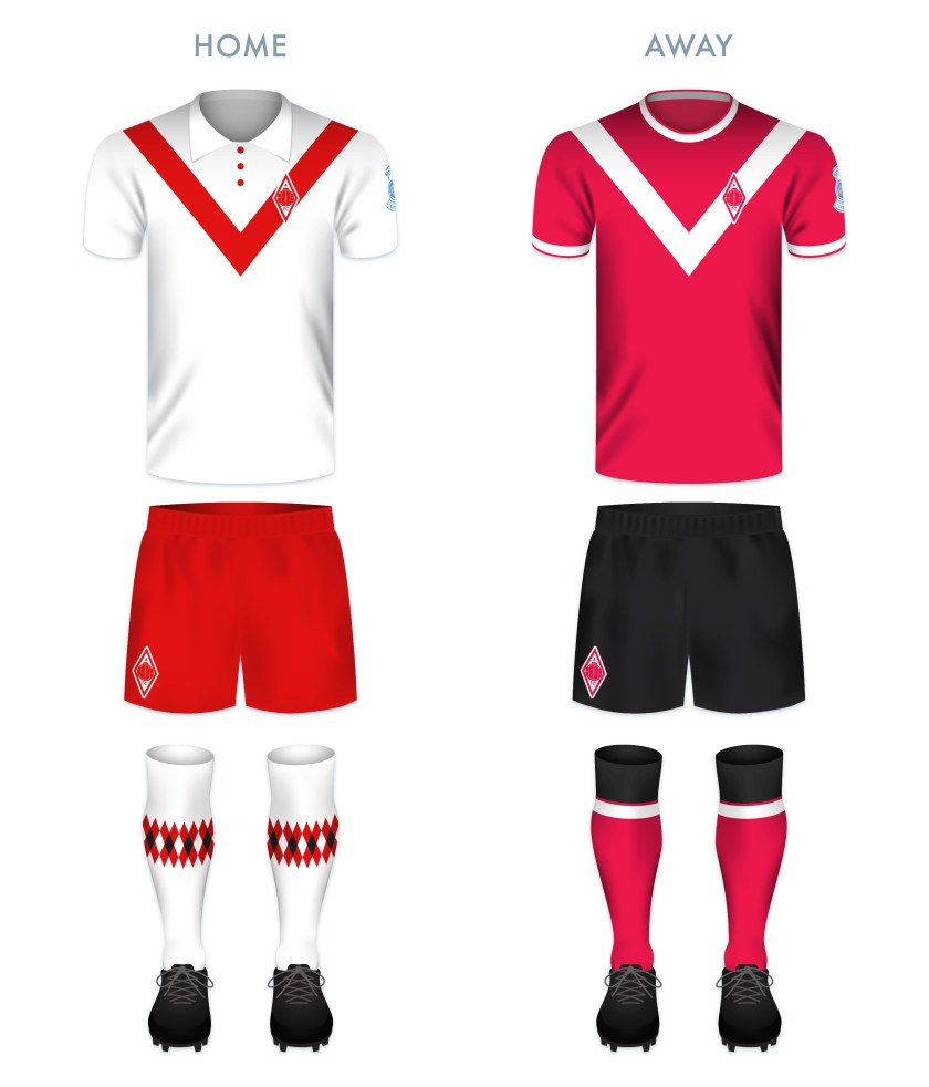
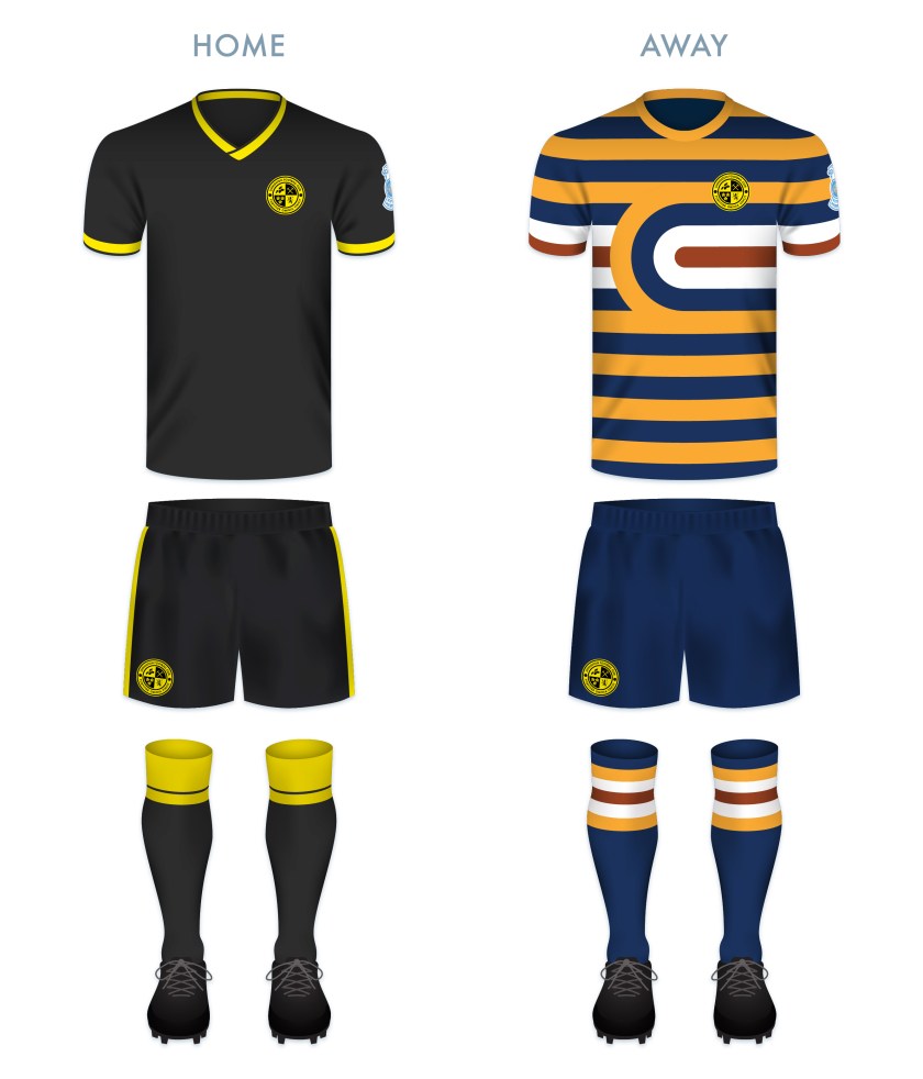
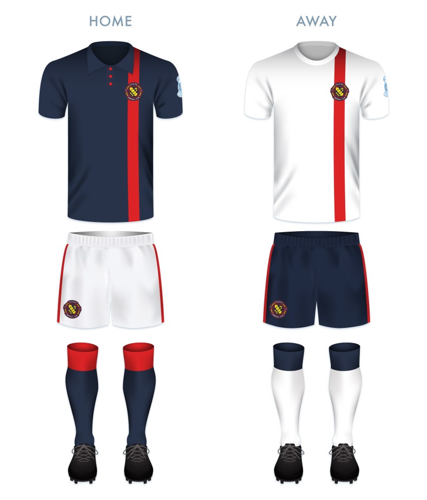
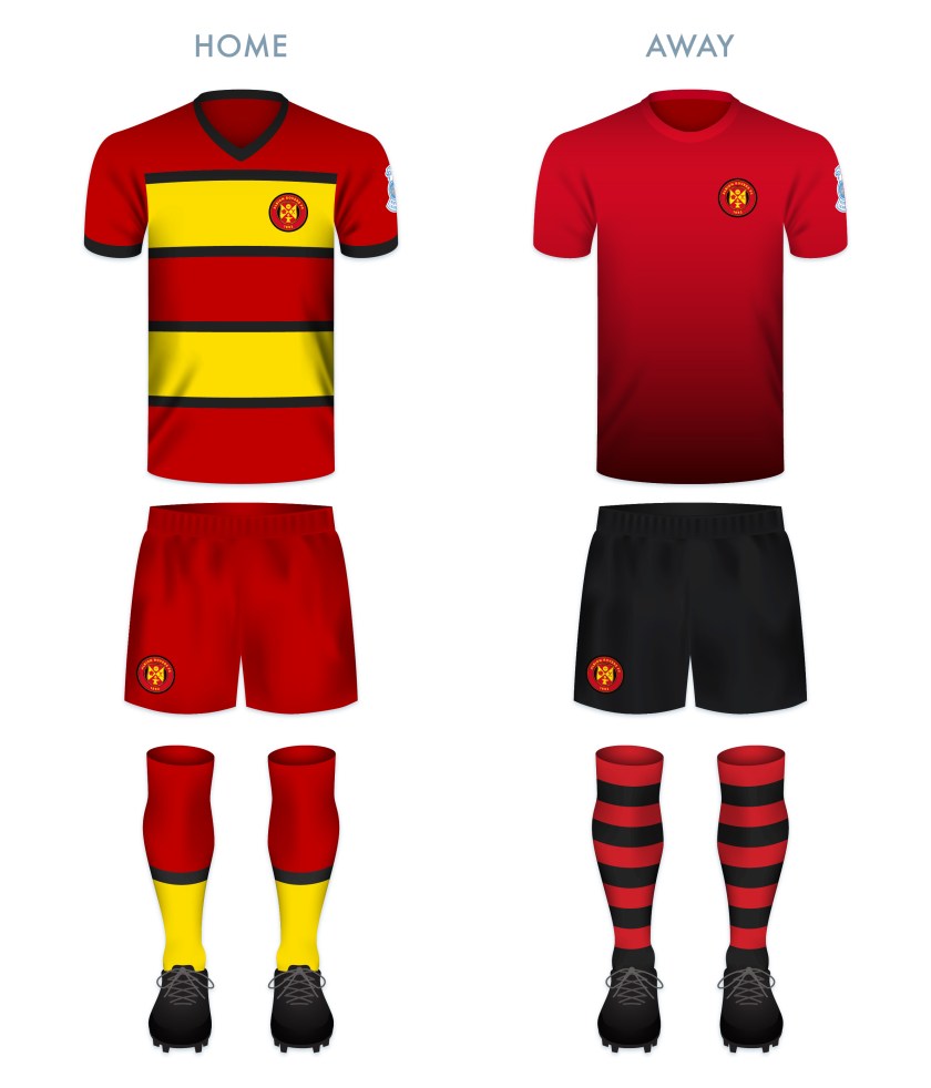
The kit designs make use of the black, red and gold, a colour scheme used in various combinations since the introduction of the first badge in 1961.

ARFC kit-01

ARFC badge new-01


As ever, I am indebted to Dave at Historical Football Kits for some of the historical information used above.


7 May 201824 February 2020 E Tagged Albion FC, Albion Football Club, Albion Rovers, Albion Rovers FC, Albion Rovers Football Club, badge, branding, Coatbridge, crest, Europe, football, Ladbrokes League 2, logo, North Lanarkshire, rebrand, redesign, Rovers, Rovers FC, Rovers Football Club, Scotland, Scottish Cup, Scottish Football Association, Scottish Professional Football League, shield, SPFL League 2, SPFL League Two, sport, The Wee Rovers, UK, United Kingdom, Wee Rovers Leave a comment

ReBrand: Airdrieonians FC

graphic

AirFC badge new-01The original Airdrieonians Football Club began its life as Excelsior Football Club in 1878. In 1881, the club’s name was changed to Airdrieonians and it continued as such until its demise in 2002.

Throughout the 1920s, this original Airdrieonians FC proved to be a competitive side within Scottish football. The club finished second in the league on four consecutive occasions from the 1922/23 season until the 1925/26 season (behind Rangers for the first three and Celtic for the fourth) and defeated Hibernian 2-0 in the 1923/24 Scottish Cup final. But after this era, Airdrieonians never again rose to such great heights.

In 1912, Airdrieonians adopted its distinctive shirt designs – a white field featuring a red ‘diamond’ (seen as a ‘V’ on both the front and backs of the club’s shirts). As a result of this design, which the club used throughout the remainder of its existence, Airdrieonians became known as ‘the Diamonds’.

After this original club folded, a new Airdrie club, called Airdrie United, was formed. Technically speaking, Airdrie United’s admittance into the Scottish Football League was the result of the organisation’s buyout and subsequent renaming of the original Clydebank FC. Airdrie United then became, for all intents and purposes, the new Airdrieonians, using the same home ground (Excelsior Stadium) and wearing the same diamond motif on its white shirts. This club became known as Airdrie in 2012 and then revived the Airdrieonians name in 2013.

As far as badges go, recently, the club has been the subject of a rather widely-publicised campaign. The Airdrieonians badge, first used by the original AFC in 1974 and then adopted by the new AFC when it revived the name in 2013, featured a shield, within which were the club’s initials and two lions passant, one above and one below the initials. In March 2015, the Court of the Lord Lyon informed the club that this badge did not comply with an ancient Scottish law forbidding the use of lettering within an heraldic device, such as a shield (a legal challenge that has proven or could prove problematic with a number of other clubs). In response, the club adopted an altered badge, omitting the shield though all but implying it by including a red chevron shape where the base of the shield once was. This chevron was included so as to mirror the ‘diamond’ that had adorned the AFC kits for more than a century.

For my redesign, I considered the heraldic images in the current badge, but took minor issue with the current badge’s use of the chevron shape. It has long been the conviction of Airdrieonians supporters that the ‘V’ on the front of the shirt is, in fact, neither a ‘V’ nor a chevron, but one half of a diamond. Being that the club’s nickname is ‘the Diamonds’, I wanted to emphasise that shape. When elongated horizontally, the diamond would bear too much resemblance to the Umbro logo. A vertically-elongated diamond badge is used by the German club Borussia Mönchengladbach, but I thought that I might be able to produce a very different badge within the same shape.

I illustrated a nineteenth-century football to occupy the middle of the badge and built the simple ‘AFC’ lettering around it, which can be seen below. I include no founding date as the current club has only existed since 2002. But for those who see the current Airdrieonians FC as a continuation of the original club, I believe that both the retro football and the diamond shape call back to that heritage sufficiently.

AirFC badge-01

While I made a clear departure from the 1974 badge, I see the ‘Airdrie Diamond’ as the classic and essential AFC kit and for my kit redesigns, I only added my own personal touch, including the argyle-patterned socks.

AirFC kit-01

AirFC badge new-01

As ever, I am indebted to Dave at Historical Football Kits for some of the historical information used above.

6 May 201824 February 2020 E Tagged Airdrie, Airdrie FC, Airdrie Football Club, Airdrie United, Airdrie United FC, Airdrie United Football Club, Airdrieonians, Airdrieonians FC, Airdrieonians Football Club, badge, brand, Clydebank, Clydebank FC, Clydebank Football Club, Court of the Lord Lyon, crest, design, Europe, Excelsior, Excelsior FC, Excelsior Football Club, Excelsior Stadium, football, Ladbrokes League 1, Ladbrokes League One, League 1, League One, logo, Lord Lyon, Lord Lyon King of Arms, North Lanarkshire, rebrand, redesign, Scotland, Scottish Professional Football League, SPFL, SPFL League 1, SPFL League One, sport, texture, UK, United Kingdom Leave a comment

ReBrand: St Mirren FC

graphic

SMFC badge new-01St Mirren Football Club was established in 1877. Similarly to Kilmarnock in 1869, Heart of Midlothian in 1874 (potentially), St Johnstone in 1884 and Dunfermline Athletic in 1885, St Mirren FC was formed when members of St Mirren Cricket Club took a notion to play football in the winter months to keep up fitness levels. So highly were St Mirren regarded even in these early years that the club were invited to become founding members of the Scottish Football League in 1890.

By 1908, St Mirren reached the first of their six Scottish Cup finals, but their opponents, Celtic, proved too strong for the Buddies. St Mirren had another shot at glory against Celtic in the 1925/26 final, which would be their first of three Scottish Cup victories (the others being 1958/59 and 1986/87). More recently, the Buddies reached their first Scottish League Cup final on 17 March 2013, defeating Hearts 3-2 at Hampden Park.

Unfortunately for St Mirren, the high of their 2012/13 Scottish League Cup would be followed by the low of their relegation to the second tier at the end of the 2014/15 season. After three seasons in the Scottish Championship, the Buddies returned to the top tier for the 2018/19 season.

The St Mirren kit first included a badge—consisting of the Paisley coat of arms and a banner reading ‘St Mirren FC’—during the Second World War. A badge was not used consistently until the 1950s. Slight variations of this badge were used on and off throughout the sixties and seventies. From 1981 until 1984, a new badge was used, which reduced the size of the Paisley coat of arms inside a black and white striped shield. Supporters were not keen on this badge, and so the club reused the earlier coat of arms badge.

In 1995, the coat of arms was first placed inside a circle, though the inclusion of the traditional mural crown brought a legal challenge from the Court of the Lord Lyon, as a 1672 law requires that all coats of arms in Scotland must be registered. The club bypassed this challenge the following season by creating a more figurative mural crown of black and white stripes for which the Saints are known, present in the current badge.

While I do not find the current St Mirren badge particularly weak, there is a displeasing heaviness to the design. We’ve got this busy coat of arms (with an intrusive and thick black border), surrounded by a clunky typeface and the heavy black and white stripes of the mural crown. These stripes, in particular, create an aesthetic incoherence.

For my redesign, I began by sketching a crosier (a hooked staff carried by an abbot or bishop as a symbol of pastoral office). Most depictions of Paisley’s coat of arms feature an abbot holding a crosier, as Paisley’s patron saint, Mirren (or St Mirin) is considered the founder of the community that occupied the site of what would become the Abbey of St James and St Mirren, now known as Paisley Abbey. Most heraldic depictions of abbots include the head of the crosier closed in on itself, like a spiral, indicating the abbot’s pastoral care for the ‘inward’ community of the monastery. The head of a bishop’s crosier, on the other hand, is depicted as terminating outward.

In my sketching, I realised that an outward-pointing crosier can be designed to look very much like an ‘S’. I chose to abandon the heraldic convention for the sake of the design in order to make the minimalistic monogram of the redesign. The ‘S’ and ‘T’, for ‘Saint’, are part of the crosier, with an ‘M’ passing through the middle. I have also included three stars within the crosier head to commemorate St Mirren’s three Scottish Cup victories. The crosier monogram is enclosed by a vesica piscis (Latin for ‘bladder of a dish’), calling back to aureolas (a diminutive of the Latin aurea—meaning ‘golden’—to signify the sacredness of a figure) in Christian art as well as to medieval seals and emblems.

SMFC badge-01

The kit colour schemes are based on traditional St Mirren kits, with the black and white vertical stripes for the home kit and the red featuring in the way kit.

SMFC kit-01

SMFC badge new-01

As ever, I am indebted to Dave at Historical Football Kits for some of the historical information used above.

4 May 201824 February 2020 E Tagged badge, brand, Buddies, Court of the Lord Lyon, crest, Europe, football, Ladbrokes Premiership, logo, Lord Lyon, Lord Lyon King of Arms, monogram, Paisley, rebrand, redesign, Renfrewshire, Saints, Scotland, Scottish Championship, Scottish Premiership, Scottish Professional Football League, SPFL, SPFL Premiership, sport, St Mirren, St Mirren FC, St Mirren Football Club, texture, The Buddies, The Saints, UK, United Kingdom 1 Comment

ReBrand: Queen of the South FC

graphic

QSFC badge new-01Queen of the South Football Club was established in 1919. This new club was result of a union between three pre-existing clubs: Maxwelltown Volunteers FC (formed in 1896 and renamed 5th King’s Own Scottish Borderers in 1908), Dumfries FC (formed in 1897) and the Arrol-Johnston Motor Company works team. The name, ‘Queen of the South’, was taken from a local poet, David Dunbar, who, while standing for Parliament in the 1857 general election, called the town of Dumfries the ‘Queen of the South’ in one of his addresses.

After participating in various non-professional leagues for several seasons, ‘the Doonhamers’, as they are known (‘doonhamer’ being a colloquial term for natives of Dumfries, many of whom, in the nineteenth century, worked in Glasgow and referred to Dumfries as doon hame, Scots for ‘down home’), joined the newly-created Third Division of the Scottish Football League in the 1923/24 season.

The Doonhamers gained promotion from the bottom tier after their second season in the SFL. Promotion to the top tier came at the close of the 1932/33 season. In their first season in the top tier, Queen of the South finished fourth in the table with 45 points, behind Celtic (47), Motherwell (62) and Rangers (66). This finish remains the club’s finest performance in the top tier.

Although the Doonhamers have yet to win any senior cups, they reached the semi-finals of the Scottish Cup in 1949/50 and the Scottish League Cup in 1950/51 and 1960/61. In 2007/08, the club reached the Scottish Cup final, losing narrowly 2-3 to Rangers.

Queen of the South first featured a badge on their kit in 1947. This badge, found at the centre of the current badge, is strong, bearing a handsome monogram and the Dumfries motto, in Scots, A lore burne, referring to the Loreburn (or ‘muddy stream’), a stream that ran through a marsh near the town. In times of attack, this motto served as a rallying cry to the town. What I find less attractive in the current badge is the outer circle, bearing the club’s name and leaving a lot of negative space. Additionally, the current badge’s use of text within a shield is a violation of an ancient Scottish heraldic law.

When redesigning the Queen of the South badge, I struggled to come up with something that I found satisfying. I explored various heraldic motifs before settling on an updated ‘QS’ monogram bearing a ‘queen’s’ crown and featuring a football and the Dumfries motto in a banner.

QSFC badge-01

The kits make use of the Doonhamers’ traditional colours of blue (home) and red (away). The home strip is inspired in part by Bayern Munich’s handsome third kit from the 2013/14 season.

QSFC kit-01

QSFC badge new-01

As ever, I am indebted to Dave at Historical Football Kits for some of the historical information used above.

3 May 201824 February 2020 E Tagged 5th King's Own Scottish Borderers, 5th King's Own Scottish Borderers FC, 5th King's Own Scottish Borderers Football Club, 5th KOSB, 5th KOSB FC, 5th KOSB Football Club, A Lore Burne, Archangel Michael, Arrol-Johnston, Arrol-Johnston FC, Arrol-Johnston Football Club, badge, Bible, Book of Revelation, brand, Championship Division, County of Dumfries, crest, Dumfries, Dumfries and Galloway, Dumfries FC, Dumfries Football Club, Dumfrieshire, Dumfriesshire, Europe, football, Ladbrokes Championship, logo, Maxwelltown Volunteers, Maxwelltown Volunteers FC, Maxwelltown Volunteers Football Club, Michael, New Testament, Queen of the South, Queen of the South FC, Queen of the South Football Club, Queens, rebrand, redesign, Revelation, Revelation of St John, Saint Michael, Saint Michael the Archangel, Scotland, Scots, Scottish Championship, Scottish Professional Football League, SPFL, SPFL Championship, sport, St Michael, St Michael the Archangel, Taxiarch Archangel Michael, texture, UK, United Kingdom Leave a comment

ReBrand: Livingston FC

graphic

LFC badge new-01The history of Livingston Football Club is one of the most tumultuous in all of Scottish football.

The club began its life in 1943, as the works team of Ferranti, who had set up a factory at Crewe Toll, Edinburgh for the manufacturing of gyro gunsights for Spitfire aircraft during the Second World War. The original club name was Ferranti Thistle FC. They played under that name until 1974, when the club gained admittance into the Scottish Football League.

Because their home ground, the former City Park, did not meet the SFL’s requirements, and because of controversy arising from a team bearing the name of a commercial company, Ferranti Thistle moved to the Commonwealth Stadium (later called Meadowbank) and changed their name to Meadowbank Thistle FC. The team struggled in the lower divisions for many years and in 1995, they relocated to Livingston, changing their name to Livingston FC in the process.

After this move to West Lothian, Livingston FC began to show promise. By 2001, the club had gained promotion into the top tier and in this first campaign, the Livi finished third in the table, which meant that they qualified for the UEFA Cup (now the Europa League). Livingston would meet further success when they defeated Hibernian in the final of the 2003/04 Scottish League Cup on 14 March 2004. But Livingston’s victory was bittersweet, as the club had entered administration on 3 February, eventually emerging in May 2005. That same month, Livingston avoided relegation narrowly. Ultimately, their stay in the top tier was ended when they finished the 2005/06 season at the bottom of the table.

In 2009, Livingston entered into administration for a second time and were in danger of outright liquidation. As a result of breaching rules on insolvency, the SFL took the decision to demote Livingston to the Third Division (the bottom tier). In the two subsequent seasons, Livingston won consecutive promotions, reaching the First Division in 2011.

In 2013, the SFL was replaced by the Scottish Professional Football League, and the First Division was renamed the Scottish Championship. At the end of the 2015/16 season, Livingston were relegated to League One (the third tier). But their stay in League One lasted only one season, with the club gaining promotion back to the Championship in 2017. In the 2017/18 season, Livingston secured second place in the Championship table. This gave them the opportunity to gain promotion to the top tier for the first time since 2006 via playoff, which they achieved in a 3-1 victory over Partick Thistle over two legs.

When redesigning Livingston’s badge and kit, I kept this challenging history very much in my mind. Because of the abundance of thistles among Scottish football club badges, I opted to omit the thistle image from the new badge (and save it for clubs with ‘thistle’ in their names, like Partick Thistle and Inverness Caledonian Thistle).

Being that the club has been based in Livingston since 1995, I wanted to capitalise on that local identity. The acorns represent West Lothian (whose coat of arms features an ‘oak tree fructed’) and the three cinqfoils are taken from the Livingston family coat of arms. The crossed pickaxes represent Livingston’s historical shale mining industry.

The Latin in the outer ring, Fortiter Omnia Vincit (‘Bravely Conquers All’) is the club motto, which was included in the club’s badge from 1995 until 1999. I feel this motto is especially appropriate given Livingston’s unlikely survival over the years. The lion rampant has featured in the Livingston badge since 1999 and I believe it is fitting for a Scottish club and accompanying the motto above.

LFC badge-01 2

For the home kit, I went with a black body and gold details, a colour scheme used numerous times since the club’s 1995 move. The away strip is more adventurous, calling back to the Ferranti works team who manufactured gyro gunsights for Spitfire. The scheme is based on the Types A.1 and C.1 roundels used on Spitfires during the Second World War.

LFC kit-01

LFC badge new-01

As ever, I am indebted to Dave at Historical Football Kits for some of the historical information used above.

2 May 201824 February 2020 E Tagged badge, brand, crest, Edinburgh, Europe, Ferranti, Ferranti Thistle, football, Ladbrokes Premiership, Latin, lion, Livingston, Livingston FC, Livingston Football Club, logo, Lothians, Meadowbank, Meadowbank Thistle, rebrand, redesign, Scotland, Scottish Premiership, Scottish Professional Football League, SPFL, SPFL Premiership, Spitfire, sport, Supermarine Spitfire, texture, Thistle, UK, United Kingdom, West Lothian Leave a comment

ReBrand: Inverness CT FC

graphic

ICTFC badge new-01Caledonian Thistle Football Club was the result of a 1994 union between two historic Invernessian football clubs – Inverness Thistle and Caledonian, both established in 1885. In 1996, Inverness District Council requested that ‘Inverness’ be added to the club’s name. Instead of going the easy route with Inverness United FC or something of that ilk, we have the monstrosity that is ICTFC. More on that later.

Caley began life in the lowest tier of the Scottish Football League alongside Highland rivals Ross County. Over the coming years, the club would work its way up the SFL ranks, gaining prominence through their notable Scottish Cup victories over Celtic in the third round of the 1999/2000 competition as well as in the quarter-finals of the 2002/03 competition. In the 2003/04 season, Caley finished at the top of the second tier table, gaining promotion to what was then called the Scottish Premier League. The club was relegated back to the second tier after five seasons, before returning to the top for the 2010/11 season.

The 2014/15 season proved to be Caley’s finest, finishing in the third spot of the Premiership table and defeating St Mirren, Partick Thistle, Raith Rovers, Celtic and, finally, Falkirk on their road to lifting the Scottish Cup. But the good times did not last forever. At the end of the 2016/17 season, the Highland Jags found themselves relegated to the Scottish Championship, where they continue to compete today.

Inverness Caledonian Thistle Football Club. ICTFC. If the name is a mouthful, the current badge is an eyeful. In this badge, we find a thistle (the symbol of Inverness Thistle), a golden eagle (the symbol of Caledonian) and a football. It’s not so much the presence of these symbols that make this badge challenging, but that there are at least two very distinctive illustrative styles employed in their depictions. Further insult is added to injury with a very poorly designed banner bearing the club’s name.

Over the years, I have attempted several redesigns of Caley’s badge. Among all Scottish football badges, I found this to be one of the most difficult. In each attempt, I sought to employ all of the information included in the current badge and each attempt yielded a slight improvement. Still, I found my redesigns difficult to stomach.

Eventually, I realised that in my desire to capture so much in a badge, I failed in Mies’ insistence that ‘less is more’. Therefore, I have attempted yet another redesign of this behemoth of a badge. In this redesign, minimalism has been my aim. No words. No dates. Only simple lines depicting the head of a golden eagle and a thistle.

ICTFC badge-01

For the home shirt, I decided to go with Caley’s blue and red stripes, which have featured on most of the club’s kits since the union in 1994. The away shirt is inspired by the former Inverness Thistle’s home strips, with the black and red vertical stripes in near constant use in from 1894 until the union.

ICTFC kit-01

ICTFC badge new-01

As ever, I am indebted to Dave at Historical Football Kits for some of the historical information used above.

30 April 201824 February 2020 E Tagged badge, brand, Caley, Caley Jags, Caley Thistle, Championship Division, crest, Europe, football, ICT, Inverness, Inverness Caledonian Thistle FC, Inverness Caledonian Thistle Football Club, Inverness CT, Inverness CT Football Club, Ladbrokes Championship, logo, Pride of the Highlands, rebrand, redesign, Scotland, Scottish Championship, Scottish Professional Football League, SPFL, SPFL Championship, sport, texture, The Caley Jags, The Pride of the Highlands, UK, United Kingdom 1 Comment

ReBrand: Greenock Morton FC

graphic

GMFC badge new-01Greenock Morton Football Club was established as Morton Football Club in 1874, making them the sixth oldest football club in Scotland. The precise origin of the name ‘Morton’ is unclear, though it may have been taken from ‘Morton Terrace’, a row of houses where some of the players stayed beside of the club’s original playing field.

Following the formation of the Scottish Football League in 1890, the original Second Division was formed in 1893, with Morton as one of the founding members. In the 1899/1900 season, Morton finished second, one point behind Partick Thistle. The following season, both clubs were admitted into the top tier, with Thistle finishing last and Morton coming in fourth with 21 points, behind Hibernian (25), Celtic (29) and Rangers (35).

Over the coming decade, Morton would remain in the bottom half of the table, but in the 1910s, the club began to show more promise. In the 1913/14 and 1914/15 seasons, Morton came in fourth, and by 1915/16, they finished third. Morton’s finest top tier performance came in the 1916/17 season, when the club finished in the second spot. Four years later, the club’s highest honour came when they won the 1921/22 Scottish Cup with a 1-0 victory over Rangers at Hampden Park.

In the 1926/27 season, Morton finished second-bottom and, alongside last place Dundee United, returned to the second tier for the first time since the 1899/1900 season. Over the coming decades, Morton would experience more promotions (10) and relegations (10) to and from the top tier than any other side in Scottish football, with their most recent spell in top flight football ending with relegation at the end of the 1987/88 season.

The current badge, derived from the Greenock coat of arms, is strong and some variation of it has been used since 1978. Before this, from 1964, a simpler badge, bearing the club’s name and three stars, was used on occasion.

In reworking such a strong badge, I did not want to design something that would appear too similar to other badges. I considered the other clubs which feature a ship in full sail on their badge: Stranraer, formed in 1870 and one of the oldest clubs in Scotland, and Clyde, formed in 1877. The ship on Stranraer’s badge was adopted in 1961, while the ship on Clyde’s badge, from what I can tell, came into being in the mid-1930s. If I wanted to defer either to the age of the club or longevity of the use of a ship in a club’s badge, Stranraer and Clyde, respectively, beat out Morton. The shipbuilding industry is tied very closely to Clyde’s name and it is possible that the presence of a ship on their badge predates the next earliest badge design by more than two decades, so I have gone with a ship in that redesign. It is possible that I have overthought this.

For Morton, I considered using the Free French Memorial on Lyle Hill in Greenock (which honours the fallen sailors of Free French Naval Forces who were based at Greenock from 1940 to 1945), or the James Watt Dock Crane (named after the 19th-century Greenock-born inventor). Ultimately, I departed from local symbolism entirely and adopted the main colours of the current Morton badge to form a modern ‘GM’ monogram (round so as to suggest a football).

GMFC badge-01

For the home shirt, I went with the traditional blue and white hoops, which have featured on the vast majority of Morton’s home shirts from their earliest days (an aborted departure from which caused great unrest among Morton supporters in 2016). For the away shirt, the body is yellow (used commonly among many Morton away strips), with a seafoam green for the collar and sleeves.

GMFC kit-01

GMFC badge new-01

GMFC badge new 02-01.jpg

As ever, I am indebted to Dave at Historical Football Kits for some of the historical information used above.


30 April 201824 February 2020 E Tagged badge, brand, Championship Division, Clyde, Clyde FC, Clyde Football Club, crane, crest, Europe, football, Free French Memorial, Greenock, Greenock Morton, Greenock Morton FC, Greenock Morton Football Club, Inverclyde, James Watt Dock Crane, Ladbrokes Championship, logo, Lyle Hill, monogram, Morton, Morton FC, Morton Football Club, Pride of the Clide, rebrand, redesign, River Clyde, Scotland, Scottish Championship, Scottish Professional Football League, ship, SPFL, SPFL Championship, sport, Stranraer, Stranraer FC, Stranraer Football Club, texture, The Ton, Ton, UK Leave a comment

ReBrand: Falkirk FC

graphic

FFC badge new-01Falkirk Football Club was established in 1876 and joined the Scottish Football Association two years later. During these early years, ‘the Bairns’ (a [primarily] eastern Scots word meaning ‘children’ and for natives of Falkirk, in general) competed in the early rounds of the Scottish Cup and played matches as part of the Stirlingshire Football Association.

In 1902, the top tier of the Scottish Football League expanded from 10 to 12 clubs, which opened two vacancies in the second tier. These went to Raith Rovers and Falkirk. After only three seasons, the Bairns were promoted to the top flight.

The club boasts such honours as two Scottish Cup victories (1912/13 and 1956/57) in five appearances, as well as the somewhat dubious honour of having won the Scottish Challenge Cup—a competition open only to clubs that do not play in the top tier—a record-tying four times (an honour shared with St Johnstone).

More recently, as a result of reaching the final of the 2008/09 Scottish Cup, Falkirk competed in the inaugural UEFA Europa League competition in the 2009/10 season. Despite tasting European competition for the first time, Falkirk was relegated from the top tier of the Scottish Professional Football League by the end of the season. The Bairns competed in the second tier until the end of the 2018/19 season, when the club was relegated to League One (the third tier) after finishing at the bottom of the table.

Some of Falkirk’s early shirts featured what may or may not be Masonic crosses as badges, but the club did not feature a regular badge until 1909, when a crest was utilised. This crest was based on the coat of arms of the burgh of Falkirk and featured a crowned lion supporting a shield which bore the coat of arms of the Callendar family, who long held a seat of power in Falkirk. The Falkirk shirt bore two other badges before 1974, when a variation of the current badge first appeared. This badge features a football bearing a highly-stylised silhouette of the Falkirk Town Steeple. With the exception of the 2007/08 season, the steeple-fronted football has remained the primary badge for the club.

Falkirk’s badge redesign is one with which I have wrestled for a time. Because of the effectiveness of this 1974 badge, I found it very difficult to depart from the steeple image. Despite this, given that the depiction of the steeple on the current badge in no way resembles the actual Falkirk Town Steeple, and because I don’t find the steeple particularly inspiring as far as what might be affected in the viewer from a more realistic rendering, I decided to do away with the steeple image all together – no doubt, a very controversial move to Falkirk supporters. Instead, I opted for something more in line with the traditional heraldry associated with the town and club.

The shape of the central shield is inspired by the shield that enclosed the steeple badge on the Falkirk strip from 2010 to 2013. The image in the shield is a depiction of the Callendar family coat of arms, used in the Falkirk coat of arms and similar to what was used in the original 1909 badge. This shows two sets of three billets (sheets of paper), divided by an embattled bend (a normal bend would appear as a solid ribbon running diagonally across a shield), representing the Antonine Wall (built by the Romans between 142 and c.154), which passed through the town. Within the bend we find two sets of shields and swords. These represent two significant battles in Falkirk history: King Edward I of England’s defeat of Sir William Wallace in 1298 and the Jacobite victory over the Hanoverian army in 1746. Between the two is a church, the ‘Fa’ Kirk’ (which may mean either ‘the speckled church’ or the ‘church by the wall’) from which the town gets its name.

FFC badge-01 2

The kits are built on traditional Falkirk colour schemes. The home kit is inspired specifically by the 1937/38 home kit.

FFC kit-01

FFC badge new-01

As ever, I am indebted to Dave at Historical Football Kits for some of the historical information used above.

29 April 201824 February 2020 E Tagged badge, Bairns, brand, crest, Europe, Falkirk, Falkirk FC, Falkirk Football Club, football, logo, rebrand, redesign, Scotland, Scottish League 1, Scottish League One, Scottish Professional Football League, SPFL, SPFL Championship, SPFL League 1, SPFL League One, sport, texture, The Bairns, UK Leave a comment

ReBrand: Dunfermline Athletic FC

graphic

DAFC badge new-01The history of association football in Scotland is tied inextricably to cricket. Along with clubs such as Kilmarnock, St Johnstone, St Mirren and potentially Heart of Midlothian, Dunfermline Athletic was established as a winter sporting pursuit in the cricket off-season.

The original club was called Dunfermline Football Club and was established in 1874. In order that non-cricket club members could join, Dunfermline FC broke away from the cricket club and became Dunfermline Athletic FC in 1885.

Dunfermline Athletic, or ‘the Pars’, as they are known, had a shot at their first major honour when they reached the final of the 1949/50 Scottish League Cup at Hampden Park. There, they faced their fellow Fifers, East Fife, who had won the competition two years earlier. The Pars were unlucky that day, losing 3-0, but a decade later they would have another opportunity at silverware.

On 26 April 1961, the Pars defeated Celtic 2-0 in the Scottish Cup final replay. Celtic would return the favour by defeating the Pars 3-2 in the 1964/65 final of the same competition. But the Pars’ tenacity brought the Scottish Cup back to East End Park after the club defeated Hearts in the 1967/68 final. It should also be noted that the Pars beat holders Celtic, fresh off of their illustrious 1966/67 season, in the first round of the 1967/68 Scottish Cup.

The Dunfermline Athletic kit did not include a badge until the 1958/59 season, when the club employed the skills of Dunfermline High School art teacher Colin Dymock. Dymock’s badge was thoroughly modern in shape, colour and design. It took the shape of a downward-pointing triangle and featured Malcolm’s Tower, a local landmark, as its centrepiece. This original badge was dropped from the kit in 1962.

The Pars’ shirt featured an encircled ‘DAFC’ monogram for the 1971/72 season and then from 1977 until 1986, home shirts featured the club’s initials alone. For the 1986/87 season, the club began to use a slight variation on Dymock’s 1958 badge design, and similar badges have adorned the breast of the Dunfermline Athletic shirt ever since.

The current Dunfermline Athletic badge is a cracker. When the first version was introduced in 1958, it would have been ground-breaking (and perhaps polarising). But it has become a cherished staple of the Dunfermline Athletic identity. That being stated, I find the badge very unrelatable. Malcolm’s Tower, named after Malcolm III of Scotland (Gaelic: Máel Coluim mac Donnchada, who reigned from 1058 to 1093), is a very historically significant site as it marks the move of the seat of royal power from Forteviot in Strathearn (modern-day Perth and Kinross) to Dunfermline. A crude depiction of the tower has featured in the Dunfermline coat of arms for centuries. But all that remains of the tower today is a foundational ruin and its precise design is unknown. As a result, Dymock’s design is simply an interpretation of what the tower might have looked like, and in a fragmented, modern style.

The challenge of redesigning such a unique and iconic badge has been floating around in my mind for a while now. I struggled while considering what iconography I might employ. Given my perception of the unrelatable nature of the 1958 badge, I wanted to offer something either more familiar or entirely different. I opted to retain the iconic triangular shape of the badge, but instead of Malcolm’s Tower, I decided to make use of one of Dunfermline’s most physically prominent and handsome landmarks: the clock tower of the City Chambers. With its striking green roof of oxidised copper and its skilful combination of French, Gothic and Scots baronial architectural styles, I believe that the clock tower proves to be a very fitting centrepiece for the redesigned badge. I also incorporated the zig-zagged white cloud stripes from the 1958 badge and lightened the blue background to sky blue.

DAFC badge-01

For the home shirt, I decided to continue with the Pars’ long tradition of black and white vertical stripes (in near-constant use since 1909), but with a pattern that echoes the triangular badge. For the away strip, I decided to make use of red (the predominant away strip colour over the last two decades) with a black gingham pattern (inspired by the 1996/97 home strip).

DAFC kit-01

DAFC badge new-01

As ever, I am indebted to Dave at Historical Football Kits for some of the historical information used above.

28 April 201824 February 2020 E Tagged badge, brand, Championship Division, Colin Dymock, crest, DAFC, design, Dunfermline, Dunfermline Athletic, Dunfermline Athletic FC, Dunfermline Athletic Football Club, Dunfermline City Chambers, Dunfermline Cricket Club, Dunfermline FC, Dunfermline Football Club, emblem, Europe, Fife, football, James Campbell Walker, Kingdom of Fife, Ladbrokes Championship, logo, Malcolm III, Malcolm III of Scotland, Pars, rebrand, redesign, Scotland, Scottish Championship, Scottish Professional Football League, SPFL, SPFL Championship, sport, texture, The Pars, UK, United Kingdom 2 Comments

ReBrand: Dundee United FC

graphic

DUFC badge new-01It is recorded that by the middle of the nineteenth century, nearly 20% of Dundee’s population were Irish-born immigrants. As Hibernian had been established in 1875 in order to provide opportunity for young Irish Catholic immigrants in Edinburgh, the Irish Catholic community in Dundee formed their own club in 1879 – Dundee Harp.

One match of note took place on 12 September 1885, when Dundee Harp racked up a remarkable 35-0 victory over Aberdeen Rovers (who competed from 1884 until 1889). What makes this feat even more peculiar is that it happened on the very same day that Arbroath achieved their record 36-0 victory over Bon Accord, the largest margin of victory in world football until 2002. Needless to say, 12 September 1885 was a bad day to be an Aberdonian club.

By 1894, Dundee Harp was facing serious financial difficulties, resulting in suspension by the SFA and eventual dissolution.

In 1909, Dundee Hibernian Football Club was formed with a mission similar to that of Edinburgh’s Hibernian, Dundee Harp and Celtic. After only one season, Dundee Hibernian were admitted into the Scottish Football League. In order to appeal to a base beyond the Irish Catholic community in Dundee, the club changed their name to Dundee United in 1923. The name ‘Dundee City FC’ had been floated, but this was protested by the club’s cross-town rivals, Dundee FC.

In the 1924/25 season, Dundee United secured promotion to the top tier for the first time. They remained there for two seasons, being relegated in 1927 and then returning in 1929. This 1928/29 second tier championship would be United’s last major honour for more than 50 years, when they won two consecutive Scottish League Cups (1979/80 and 1980/81). These League Cup victories signalled the beginning of the ‘New Firm’, when both United and Aberdeen would prove themselves as worthy competitors against Celtic and Rangers. United was also a relatively formidable football club on the European scene in the mid-1980s.

More recently, United won the 2009/10 Scottish Cup (their second victory in ten Scottish Cup final appearances). Having experienced a period of bad form in the 2015/16 season, United were relegated from the top tier. With the events of the COVID-19 pandemic, the 2019/20 season ended prematurely. At that point, United had all but won the second-tier championship with a commanding 14-point lead after 28 matches. Although the second-place Inverness Caledonian Thistle had a game in-hand, the final decision regarding the table placement came down to a ‘points per game’ ranking in which United’s 2.11 secured their first-place finish over ICT’s 1.67.

With my redesign, I have decided to stick with the somewhat jarring black and tangerine colour scheme because it’s been a ‘DUFC’ trademark since the late 1960s. But I found the black text on an orange field very unpleasing to the eye. I replaced the clunky, emboldened (and overused) Roman typeface and added the year of the club’s founding, 1909. The lion rampant has been replaced by two dragons for historical reasons, as the former Dundee Hibernian’s original crest was inspired by the Dundee coat of arms, featuring two dragons supporting an entwined ‘DH’. This was done away with when the club was renamed Dundee United. The lion rampant, which had featured on match programmes from 1956, was incorporated into a badge in 1967.

DUFC badge-01

Because of Dundee United’s place as part of the ‘New Firm’ that dominated Scottish football in the 1980s, the home strip redesign is inspired by the classic Adidas kits worn during that period. The away strip redesign is inspired by United home shirts from the late 1920s.

DUFC kit-01

DUFC badge new-01

As ever, I am indebted to Dave at Historical Football Kits for some of the historical information used above.


26 April 201816 June 2020 E Tagged Aberdeen, Aberdeen FC, Aberdeen Football Club, Aberdeen Rovers, Aberdeen Rovers FC, Aberdeen Rovers Football Club, Arabs, badge, brand, Championship Division, crest, design, dragon, DUFC, Dundee, Dundee Harp, Dundee Harp FC, Dundee Harp Football Club, Dundee Hibernian, Dundee Hibernian FC, Dundee Hibernian Football Club, Dundee United FC, Dundee United Football Club, emblem, Europe, football, Hibernian, Hibernian FC, Hibernian Football Club, Ladbrokes Championship, Ladbrokes Premiership, logo, New Firm, rebrand, redesign, Scotland, Scottish Premiership, Scottish Professional Football League, SPFL, SPFL Premiership, sport, Tangerines, Terrors, texture, The Arabs, The Tangerines, The Terrors, UK, United Kingdom 3 Comments

Posts navigation

← Previous
Next →
Widgets
Create a website or blog at WordPress.com
Privacy & Cookies: This site uses cookies. By continuing to use this website, you agree to their use.
To find out more, including how to control cookies, see here: Cookie Policy
  • Subscribe Subscribed
    • ellliottt
    • Join 53 other subscribers
    • Already have a WordPress.com account? Log in now.
    • ellliottt
    • Subscribe Subscribed
    • Sign up
    • Log in
    • Report this content
    • View site in Reader
    • Manage subscriptions
    • Collapse this bar
 

Loading Comments...